
Mobile app design process: how to design a great app
We will teach you all about mobile app design process to achieve a great mobile app design.
“Good artists copy, great artists steal.”
It’s one of the more controversial statements made by the late Apple co-founder Steve Jobs.
But whether you agree or not, you must admit that looking at successful examples from the pros can help your work.
As app designers, we believe in getting inspiration rather than outright copying.
Because following the example of the greats can not only get you ideas, but also allow you to learn from their mistakes.
To get you started, here are some app designs we think deserve a spot on your inspiration wall.
Table of Contents
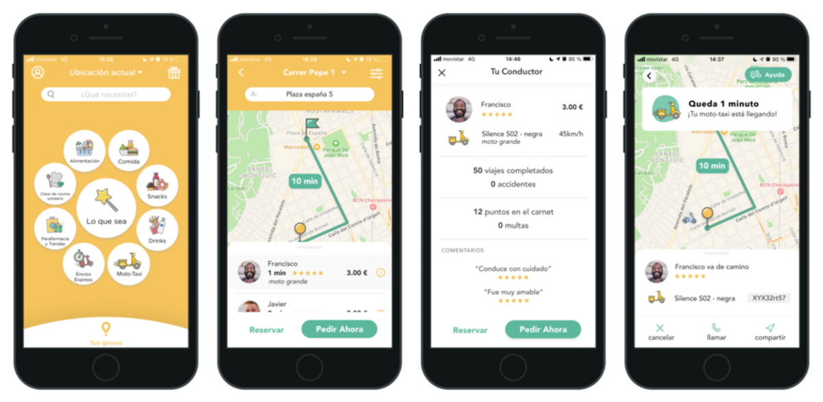
Glovo is an all-around delivery app that you can use to obtain just about any product, like groceries, medicines, and office supplies.
The Spain-based app startup currently has a presence in over 20 countries in Europe and Africa.
But Glovo is best known, by far, as a food delivery app. And it shows in its UI design.
Source: Michimich
The first thing you’ll notice is the bright yellow color scheme of the app.
This is no coincidence, as yellow is often associated with feelings of happiness and cheerfulness.
More importantly, yellow is known to stimulate the appetite, subtly encouraging users to order food.
The app design itself is minimalistic, with few text instructions. Fortunately, the navigation is intuitive, so users won’t have any trouble using the app.
This lean UI also helps draw attention to the food more.
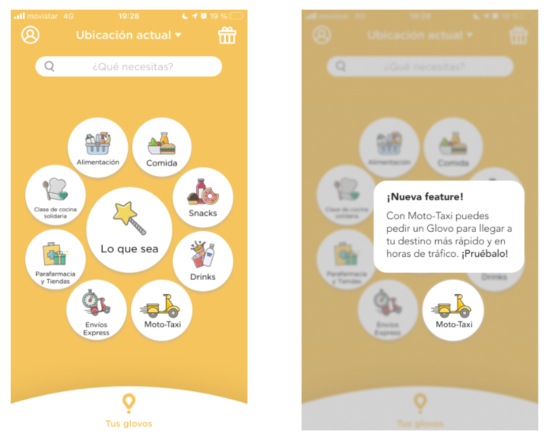
The circular menu on the homepage is fun and delightful to use. It allows you to search for specific categories in a given location easily.
Most of them are self-explanatory – but in case of confusion, tooltips appear the first time a user encounters them. This is a great UI technique to use, especially for progressive onboarding.
Source: Michimich
The combination of bright colors, cartoon-like illustrations, and intuitive UI makes the Glovo app a joy to use.
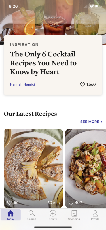
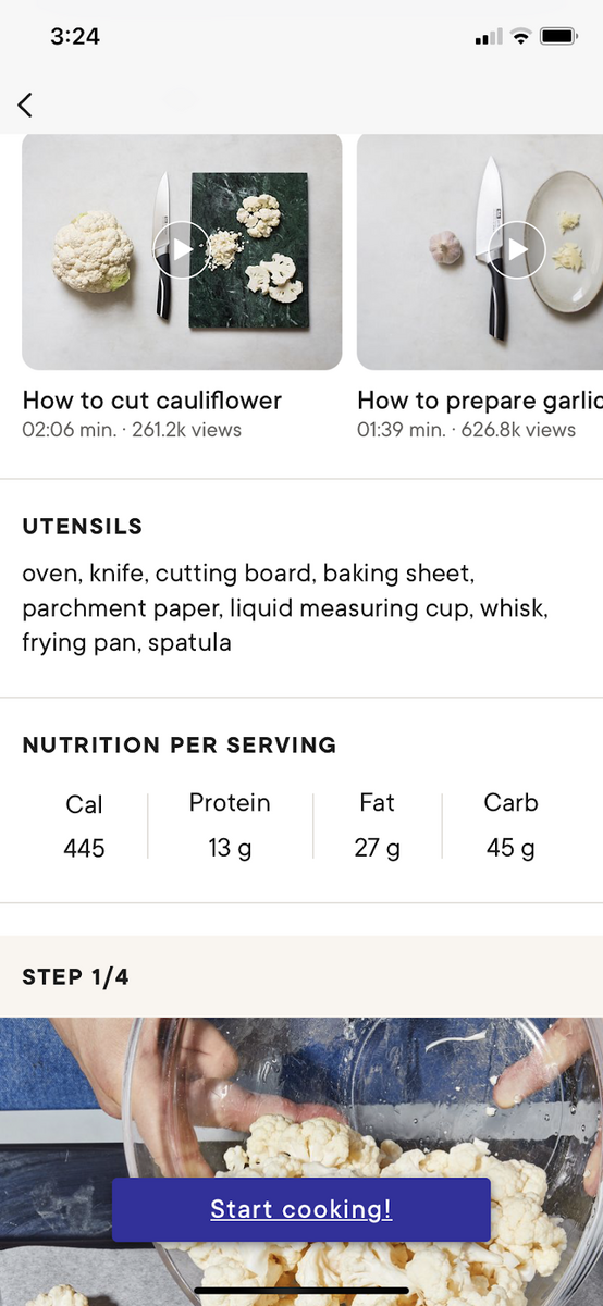
Kitchen Stories is an app that helps users become better home cooks. It contains a collection of recipes from other users, complete with step-by-step instructions and photos.
The main challenge of any recipe app is the sheer amount of content. Many recipe variations exist depending on cuisine, category, cooking technique, or ingredient.
Sorting through such a huge list can be a hassle.
But Kitchen Stories manages to make it less daunting with a clean and minimalistic UI. There are no elements that steal attention from the real stars of the app—the photos of the food.
Source: Kitchen Stories
Plenty of appealing design touches make Kitchen Stories stand out from other recipe apps. One example is the time indicator, which tells users how long a recipe will take at a glance.
This is great if someone is looking for a delicious yet quick meal.
The recipe page is also clearly geared towards the beginner cook.
Aside from step-by-step instructions with clear photos for reference, users can also watch how-to videos on basic skills like proper knife techniques.
Source: Kitchen Stories
No doubt Kitchen Stories is one of the best recipe apps we’ve ever seen. And a big part of that is due to its thoughtful UI design that fits its target users perfectly.
We’re willing to bet that the developers did exceptional market research to achieve this.
Zero is an intermittent fasting app that offers easy ways for people to start the habit.
But more than tracking your fasting, it also helps you monitor other health metrics like hours slept and calorie intake.
Like most apps on this list, Zero adopts a clean UI design. There are no clunky navigation schemes or hidden menus. Everything you need can be accessed via the bottom menu.
The home page contains fasting presets that enable newbies to jump right in.
This is a fantastic approach instead of making them do their fasting schedule from scratch, as it pushes the user to experience the app right away.
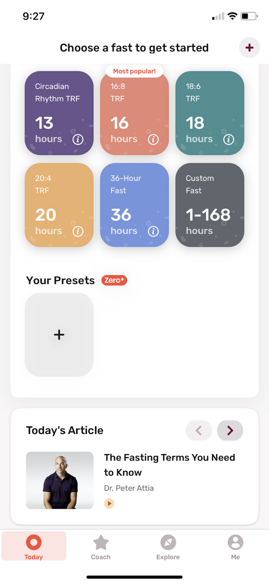
Source: Zero
The app is a masterclass on cramming lots of content in an uncluttered and clean UI.
For example, educational content has its own tab and is arranged in categories so users can easily browse through them.
Users can also monitor their fast and health metrics in the Me tab. Data is thoughtfully organized and presented in the UI.
Despite the volume of information, the layout isn’t overwhelming at all. And it’s designed to visualize your progress.
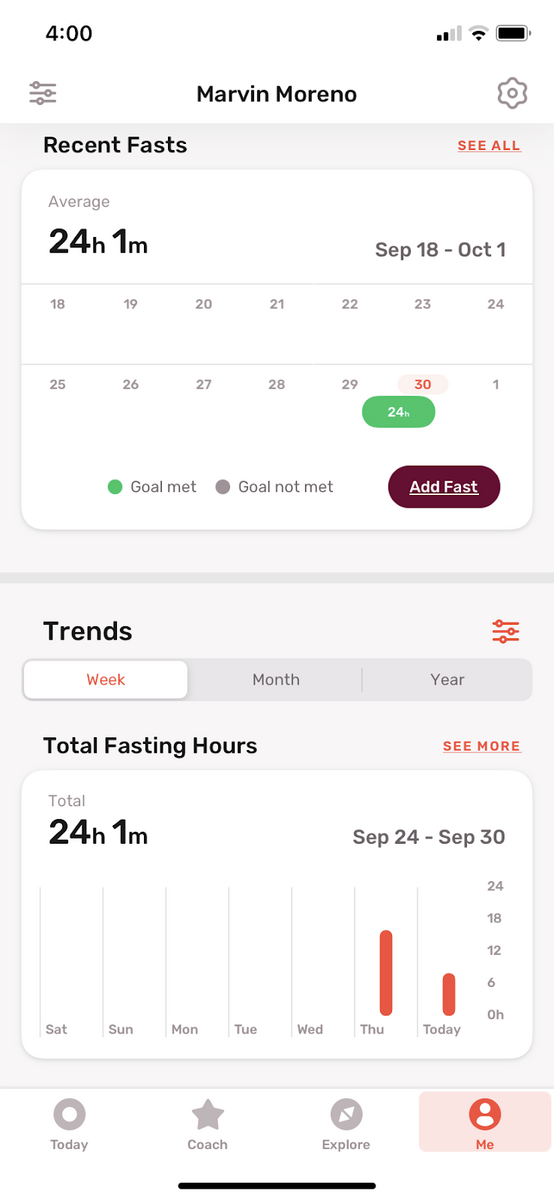
Source: Zero
The Zero app proves that even a minimalistic UI can still contain plenty of content. You simply need to be clever with your layout.
Evernote is perhaps one of the most popular note-taking apps in the app stores. It’s well-loved thanks to its versatility and flexibility.
The app’s main selling point is that it allows users to record, store, and manage notes anywhere. And this is incorporated rather well in the app’s UI design.
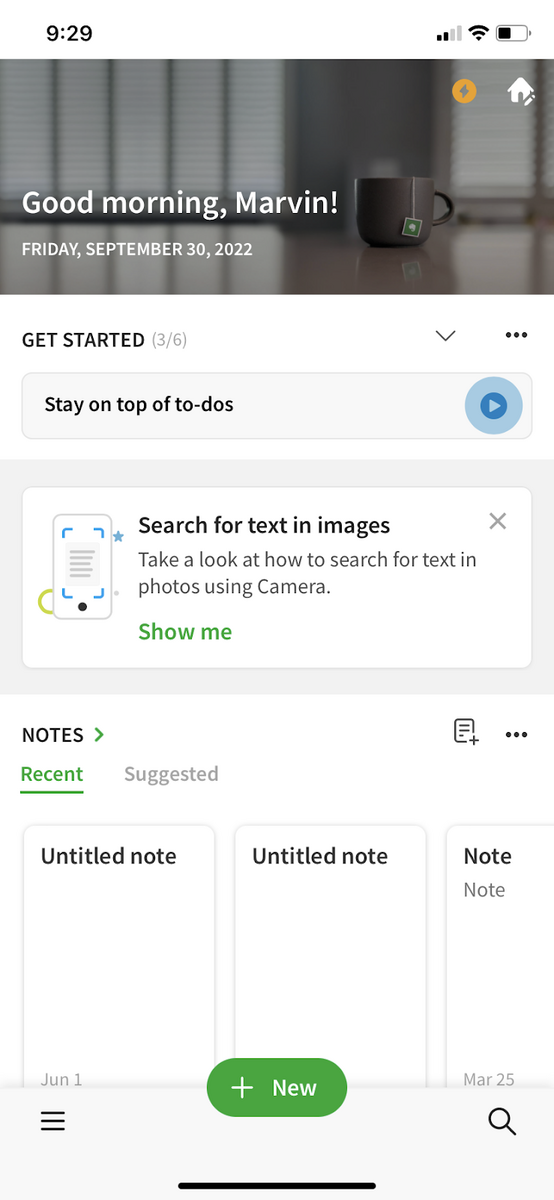
Source: Evernote
Most actions in the Evernote app are never more than a few taps away. This makes the app efficient to use and easy to navigate.
One great UI element is the floating button, which changes depending on the context.
For example, on the home screen, the floating button is present in the form of a + New button that allows you to create a note quickly. But when you tap on a note, it becomes an Edit button.
But one of our favorite features has got to be the scratchpad:
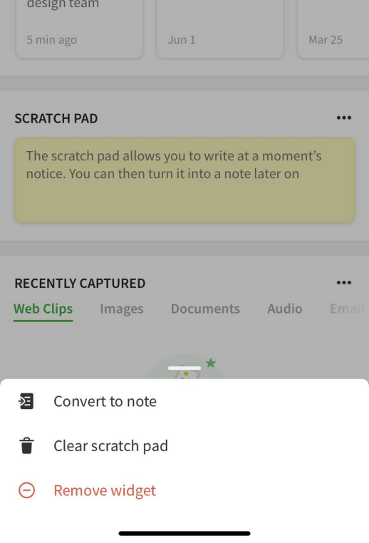
Source: Evernote
The scratchpad is just what it sounds like—a temporary place where you can quickly jot down notes.
It allows you to write down things even more rapidly, and you can then convert them to a proper note later on.
Overall, the Evernote app’s new UI design is a welcome change from previous versions. It’s much more streamlined and minimalistic, while retaining its productivity.
Slack is a popular communication platform used primarily for remote work. It probably owes its widespread use to its streamlined yet effective UI.
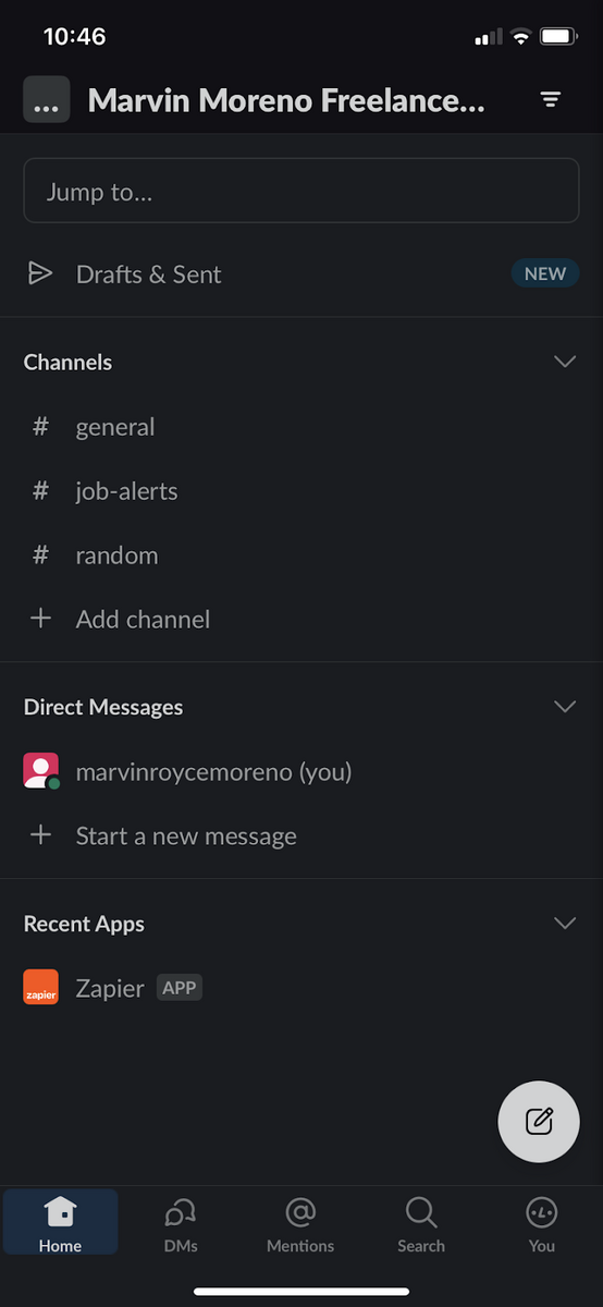
Source: Slack
We like the minimalist design, which lets users focus on communicating with people in their respective workspaces.
The Home screen gives you a quick overview of the channels and users in your workspace. You can also view all your messages in the DMs tab.
But what we liked best was the Mentions tab, which contains the messages that directly involve you (and are most likely urgent).
This layout choice helps the user focus on crucial information and minimize distractions.
We also think Slack’s excellent onboarding design makes it stand out.
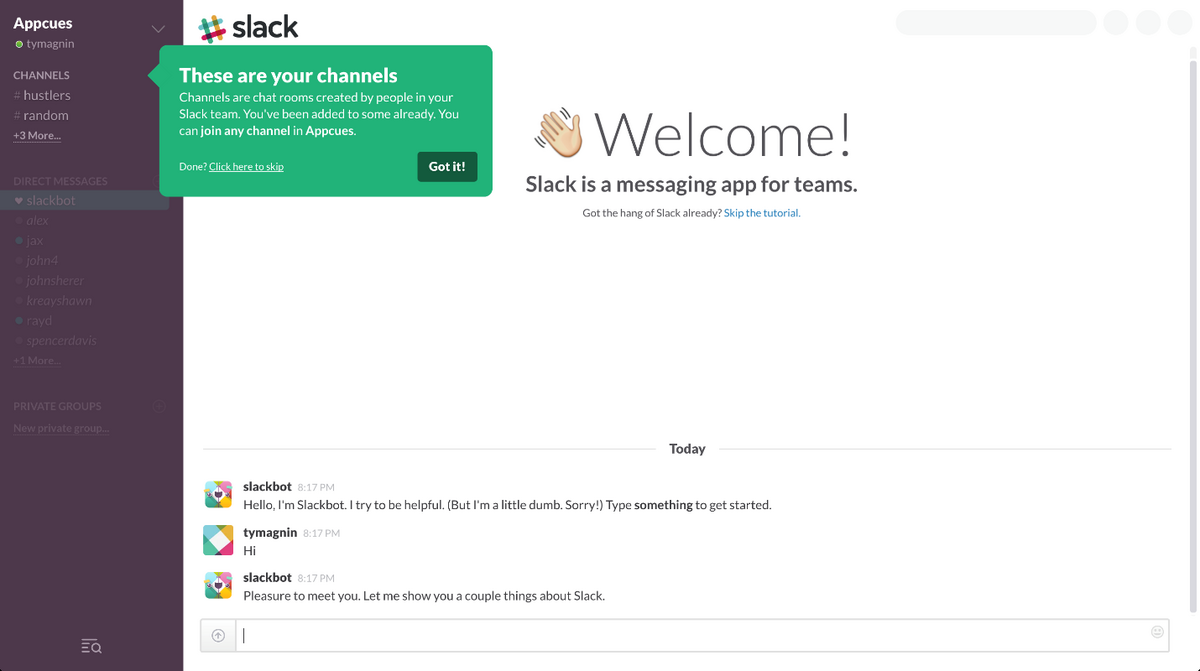
Source: Good UX
Slack uses progressive onboarding, which guides the user through pop-ups that explain each feature as they’re using it.
This learning-by-doing approach helps users adopt the Slack platform much faster – perfect for busy professionals who don’t have time to read through an article.
It also helps teach users crucial tasks like joining workspaces or creating channels.
Overall, the clean feel of the Slack app UI perfectly complements its onboarding sequence and well-thought-out layout. It’s the perfect design to help users communicate much more effectively.
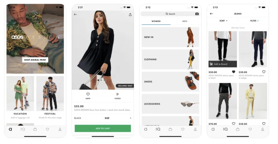
ASOS is an e-commerce app aimed primarily at the Gen Z generation who do their shopping on their smartphones.
Thus, the developers crafted an app design that delivers a great mobile experience.
Source: UXPin
ASOS’s UI design features an ultra-minimalist approach.
It primarily uses high-resolution photos and a few other graphic elements, save for key components like buttons and a bottom navigation bar.
For a fashion-forward app, this works exceptionally well. The clothing items are front and center, giving users a distraction-free shopping experience.
The layout is streamlined and intuitive. Users can visit any product category or brand in just a few taps.
The navigation bar includes the features shoppers use most, like the shopping cart and saved items.
Source: ASOS
This makes the ASOS experience much better than your typical e-commerce platform. It follows UX practices like predictable navigation design.
The content hierarchy is also clearly seen, making it easy for users to find their way around the app.
ASOS’s UI design works because it takes on a more organizational role. It takes a step back visually, helping make the fashion photos shine.
Hopper is an all-in-one website where users can book flights, hotels, and other travel services.
Sure, there are plenty of other apps like that, but what makes Hopper particularly attractive is its fun and cute aesthetic.
And it’s a welcome change from the serious tone of most airline and hotel websites.

Source: Hopper
From the get-go, you’ll be greeted by its cute bunny mascot. You’ll see him and other cartoon characters throughout, which helps lighten the mood immediately.
But Hopper is more than just superficial visuals. Its UI design also enhances the user experience.
For instance, the app color codes flights based on their price tier. It’s a simple design choice, yet it helps the user to book a flight that is within their price range much more quickly.
Source: Hopper
Overall, the bright and cheerful vibe of the Hopper app is a refreshing alternative to the usual drab aesthetics of other travel platforms.
Booking a vacation is stressful enough, and the Hopper app can make it less dreary and more fun.
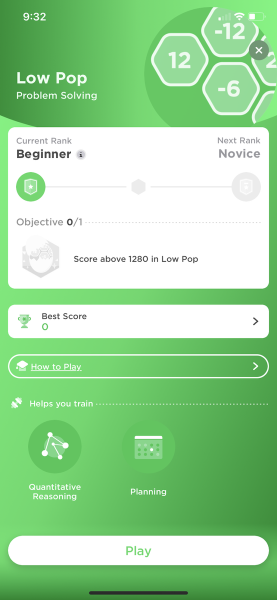
Peak is an app that helps users train their brains to become sharper, quicker, and wittier. It does that through a series of mini-games that test mental skills like memory, language, and logic.
Not surprisingly, Peak employs plenty of gamification techniques to help make the UX design itself more engaging and addicting.
Source: Peak
The central gamification element is the Peak Brain Score (PBS), the main way the app measures your progress.
You can also use it to compare yourself with other Peak users. Naturally, people would want to achieve a high PBS, encouraging them to play.
Each game also has a rank. The better you play, the higher you rank in the game. But it also means the difficulty will go up.
This is a great gamification element that furthers the competitiveness of the app.
To complement this, the Peak app provides many ways to visualize your stats. Everything is presented engagingly, which is why users will most likely revisit this screen the most.
Source: Peak
Of course, the app would be mere eye candy if the games weren’t fun and engaging. Fortunately, they are, helping hook users even more.
Peak’s UX design is an excellent example of gamification done right.
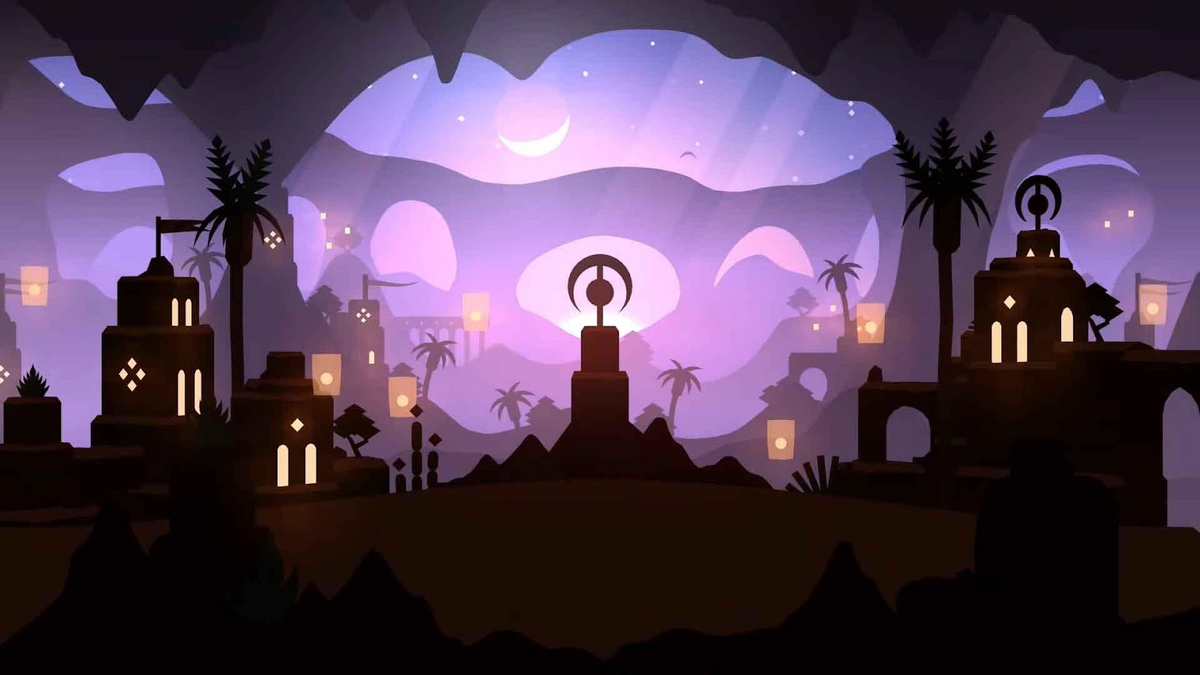
In a time where games are one-upping each other with photorealistic effects and extravagant visual effects, Alto’s Odyssey stands out as an example of how a minimalist approach can be just as effective.
Source: Gamervines
Alto’s Odyssey is an award-winning side scroller where players sandboard through levels, performing tricks to increase their score.
It has similar gameplay to Temple Run in that the levels are endless.
But what makes Alto’s Odyssey stand out are its simple yet stunning low-poly graphics, with beautiful gradient colors continuously shifting in the background.
There’s also plenty of variety in the areas, which makes playing through them a visual treat.
Its minimalist aesthetic helps the gamer focus on polished gameplay, which is where Alto’s Odyssey shines.
The game has been praised for having responsive and easy controls, assisting the player in maneuvering effortlessly through tougher levels.

Source: Pocket Gamer
There’s also a great attempt to introduce parallax scrolling.
This is a real-life phenomenon where things that are far away (such as the background) appear to move slower than those nearer (or in the foreground). This gives the game a boost of realism.
To top it all off, Alto’s Odyssey also features a beautiful soundtrack that ties in perfectly with the visuals.
Alto’s Odyssey is a great case study of how simple elements, when put together creatively, can produce a stunning result.
We hope these app designs have given you an idea or two on what to do for your next project.
Of course, inspiration is the first step. Turning it into reality is the next.
And that’s where we come in!
DECODE is a mobile app development agency with many successful projects on our belt. So no doubt we have the experience and expertise to help on your next app!
Interested in working with us? Get in touch with us today, and let’s talk!

Petar leads Shake (DECODE’s sister company) as CEO, delivering the product to a growing number of happy, innovative clients. Day-to-day, he ensures the engineering, design, product, marketing and sales teams all work in harmony. Before moving to Shake, Petar led DECODE. Although an engineer by schooling, his natural talent soon saw him making an impact on the marketing, sales and branding side of things. Petar’s passions include architecture, skiing, sailing, and a good glass of red wine.
We will teach you all about mobile app design process to achieve a great mobile app design.
In this article, we will give you a brief overview of 17 mobile app design elements.
In this article, we will talk about the fundamentals of the mobile UX design, specifically about do's and don'ts.