
App UX design: Top mistakes to avoid when creating an app
We teach you about top mistakes when creating an UX design and how to avoid them.
User experience (UX) is perhaps the most important ingredient for any app’s success. In many ways, it’s the glue that holds an app idea together.
Great features, a compelling idea, a novel promise—these will all fall short without proper UX.
Indeed, a study showed that 70% of online businesses fail due to bad UX. On the flipside, UX can deliver an impressive 9,900% ROI if done right.
Now, UX isn’t just about great visuals or an eye-catching interface. It’s a much more holistic approach than that.
But it all starts with the following five fundamental design principles.
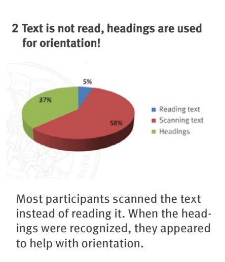
A primary goal of UX is to influence the user’s visual focus.
This is important because not all users will read every part of your screen. A study by SensoMotoric Instruments of iPhone users clarifies this fact:
Source: Neil Patel
Consider that 95% of users will miss some parts of your app page. Thus, good design should immediately direct the viewer’s attention to the essential bits.
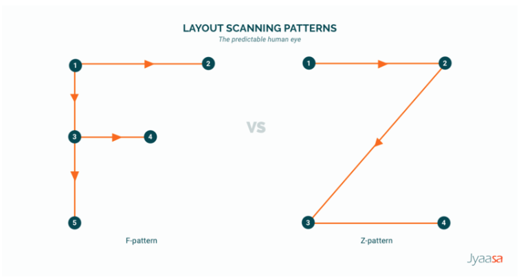
To achieve this, designers tend to use two well-known layouts: the F-shape and the Z-shape.
Both of these patterns describe how the eye of a typical reader travels when scanning a page.
Source: Line Design Medium Page
The idea is to place the important elements of the app screen on the numbered “fixation” points. That gives it the best chance of getting noticed by the user.
First, let’s describe the F-pattern.
Here, a user reads across the top part of the screen horizontally. He or she then moves a few lines down the page and reads it horizontally as well, albeit not fully across.
Finally, the user scans the left side of the screen vertically until the bottom.
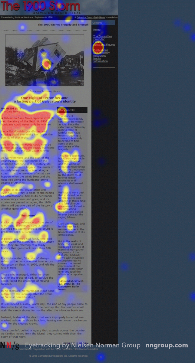
The F-pattern is the natural human behavior when scanning text, as shown by this heatmap:
Source: Nielsen Norman Group
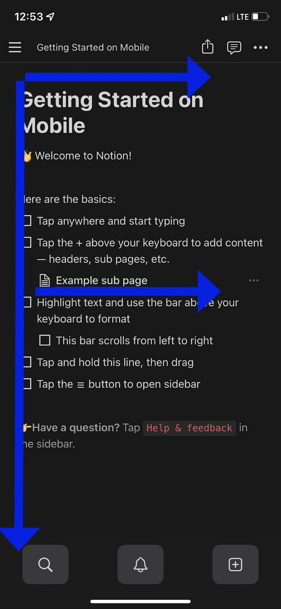
Thus, the F-layout is best used for app screens that have large blocks of text, such as help articles or resources.
The best approach here is to place the key information near the top of the page, such as the header and the first paragraph of the text body.
The smart use of formatting and visuals (such as borders) is also a good way to maximize the F-pattern.
Source: Notion
The Z-shape pattern, on the other hand, starts the same as the F-shape pattern.
But instead of scanning downward vertically, the user reads across the page diagonally, before finally reading horizontally again. This forms a characteristic “Z” shape.
The Z-layout is the ideal choice for pages that have a mix of visuals and copy, such as app home screens or landing pages. Consider, for instance, how you would scan the Netflix app:
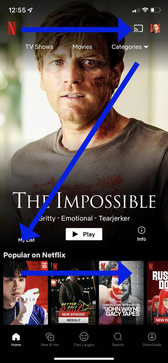
Source: Netflix
Notice how the important parts of the screen are located at or near the junction points of the arrows.
The bottom line is that neither type of layout is better than the other.
The clever use of both Z-shape and F-shape patterns can help users consume your app more naturally, leading to better UX.
Good UX is about avoiding cognitive overload. In other words, users shouldn’t have to think about how to navigate around your app. It should be natural and predictable.
The best way to do this is to stick with app navigation conventions as much as possible.
And the reason why is best explained by a quote from Jakob Nielsen of the Nielsen Norman Group:
“Users spend most of their time on other sites. This means they prefer your site to work the same way as all the other sites they already know.”
Think of the “X” icon. Everyone knows that when you tap on it, it will close the current window or screen. There’s no need to guess because you know exactly what will happen.
Now, imagine if you changed the behavior of the “X” button in your app. It’s guaranteed to disorient the user and frustrate them dramatically.
Another example is the hamburger icon. Everyone knows it will bring up the main navigation menu.
Source: Just in Mind
Another good approach is to use real-world metaphors to guide navigation.
The classic example of this is the computer desktop, which mimics how a person can move notes and items around a physical desk.
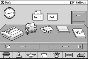
Source: Colton Zuvich
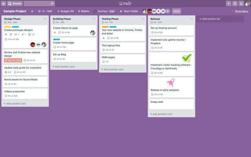
In mobile apps, card-based project management platforms like Trello are another good example of that kind.
Using the metaphor of a whiteboard filled with post-it notes, users intuitively know that they can write tasks in individual cards and drag them around the workspace.
Source: Everhour
Simplicity is an aspect of predictability, and you can simplify your app by keeping navigation as short and logical as possible.
As a rule of thumb, users should be able to reach any screen in your app in three taps or less.
Again, this prevents mental strain because users don’t need to remember where they are.
If you have a complex navigation system several layers deep, a good workaround is to have a breadcrumb trail that shows users their exact location in the app.
Source: Smashing Magazine
Breadcrumbs not only provide location cues, but they should also provide a way for users to instantly jump back to the main app screen in case they get lost.
Finally, keep in mind that every OS will have navigation nuances that users will already be familiar with. Tampering with them can be risky.
Here’s an example:
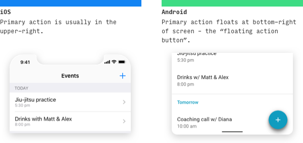
Source: Lean UI Design Blog
Placing the + icon on the upper right of an Android app might make sense from a usability standpoint. But for existing Android users, it can be jarring.
Our best advice here is to avoid reinventing the wheel as much as you can. If you need to introduce a new navigation scheme, be sure you have valid reasons for doing so.
And, as always, thorough usability testing is key.
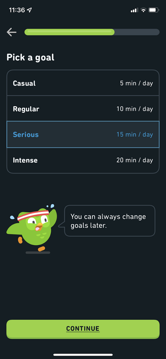
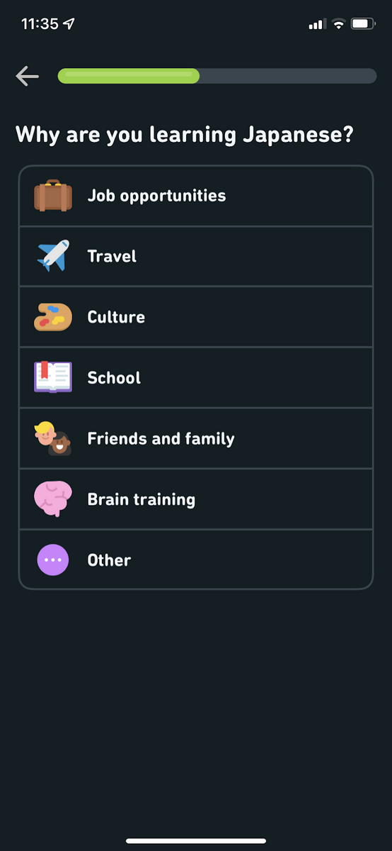
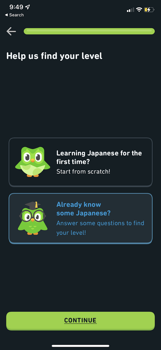
One of the big challenges of app design is the limited space on mobile screens. You want the app to be feature-rich, but you don’t want it to be overwhelming, either.
The best approach? Use multiple, simple screens.
For instance, when creating an account on a desktop, you’ll often face a long form with multiple fields. Doing that on a small mobile screen would be very frustrating, indeed.
Instead, you want to separate that into multiple screens, each with at most one or two fields.
Take a look at Duolingo’s registration process.
Source: Duolingo
Notice how registration is divided into multiple screens, each dedicated to asking only one thing from the user. The simple layout helps users focus more on the task at hand.
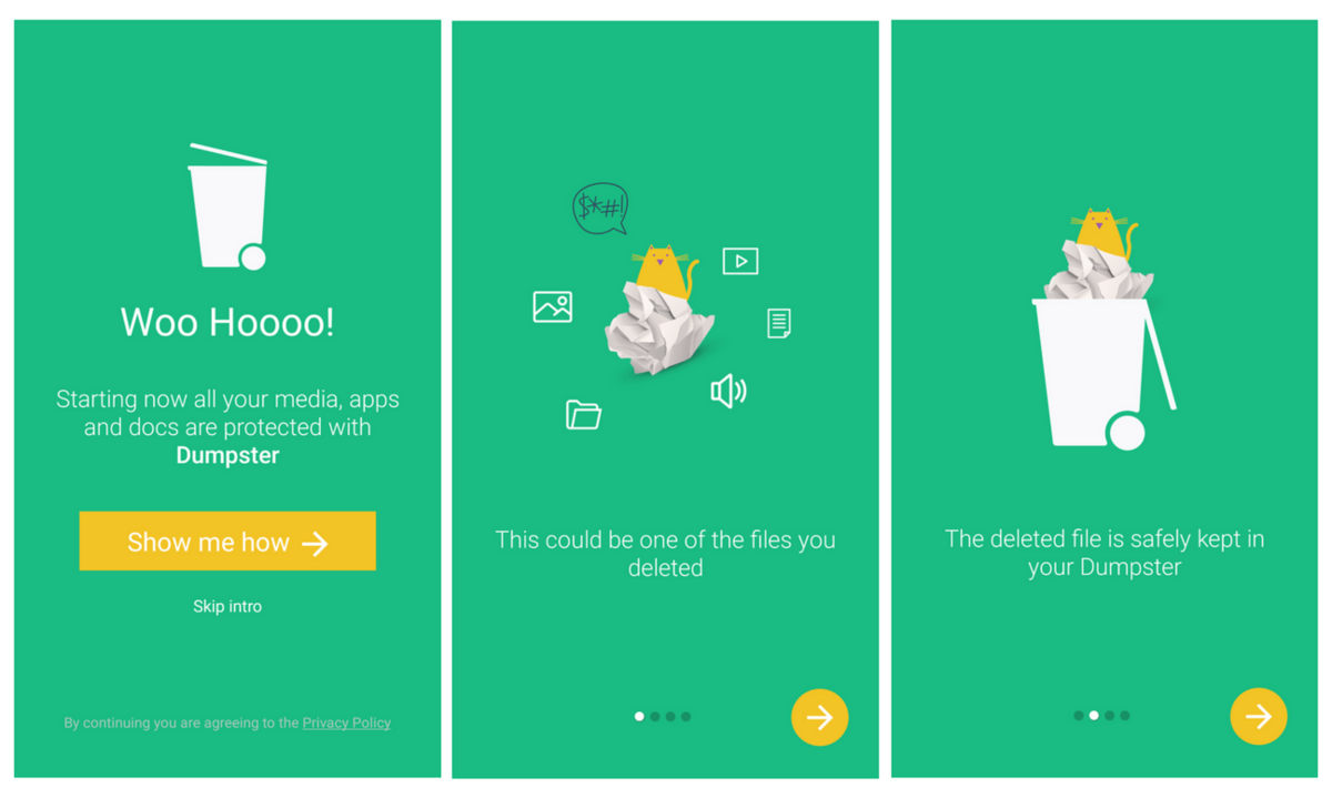
Simple screens are essential for explaining important concepts.
For instance, the file recovery app Dumpster uses multiple splash screens to give an overview of how it works.
Each screen only describes one step for maximum focus and retention.
Source: Altexsoft
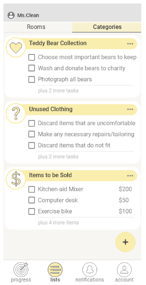
If you need to include more information on an app screen, it’s best to hide them first.
Then, give users the option to reveal them through side menus, pop-up boxes, or a read more link.
Adding a visual cue that there are hidden data, however, is crucial. For instance, the note “plus 2 more tasks” is helpful for apps that deal with long lists.
Source: UX Collective
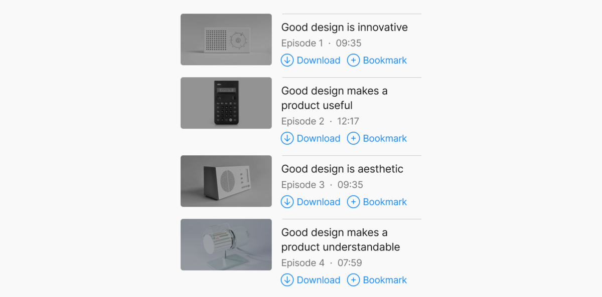
The strategic use of whitespace and borders can also make an otherwise cluttered screen look more streamlined.
Take a look at the app screen below. Without the whitespace and line dividing each element, it would be hard to distinguish between the items on the list.
Source: UX Collective
But to achieve simplicity in app design, you need to create a proper information architecture first.
This is like a blueprint that shows what your app will look like, including the flow of individual screens.
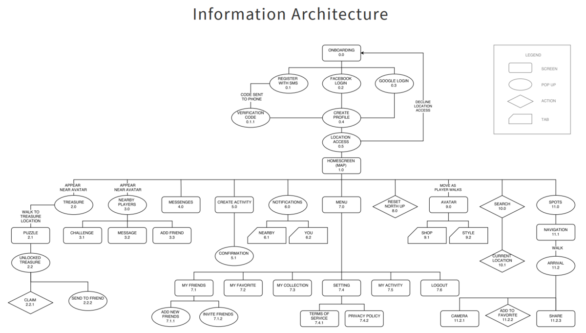
Source: Toptal
By fleshing everything out, you can better separate features into multiple screens or know which information to show or hide.
This gives you the best chance to design minimal, uncluttered apps.
It seems obvious that mobile apps use finger gestures as the primary input, rather than mice and keyboard. Yet many developers still design apps as if the latter were the case.
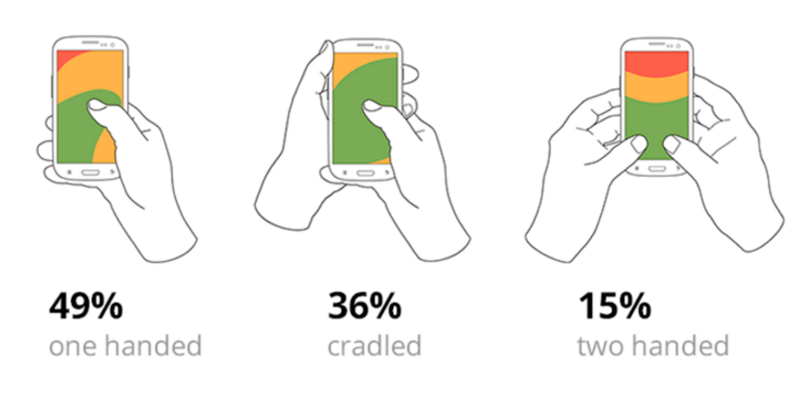
The most basic best practice here is to design for efficient single-thumb presses, because that’s how 85% of people use their phones.
Source: Bootcamp
There are two considerations here.
The first is the thumb zone. This refers to the area of the screen (colored green in the diagram below) that a typical user can comfortably reach with their thumb.
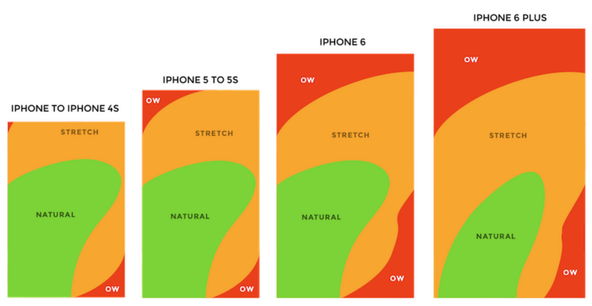
Source: Bootcamp
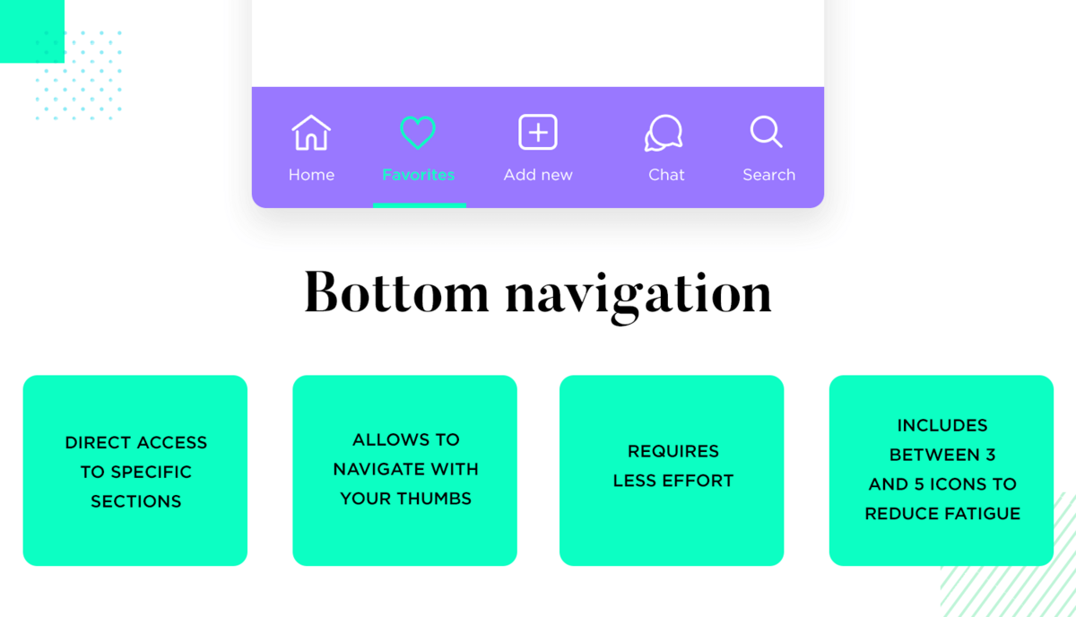
The thumb zone is the reason why the primary app navigation is placed at the bottom of the screen.
It allows users to quickly go through the app comfortably, regardless of the manner in which they hold their device.
Source: Just in Mind
A good practice is to place the most crucial navigation elements within this zone.
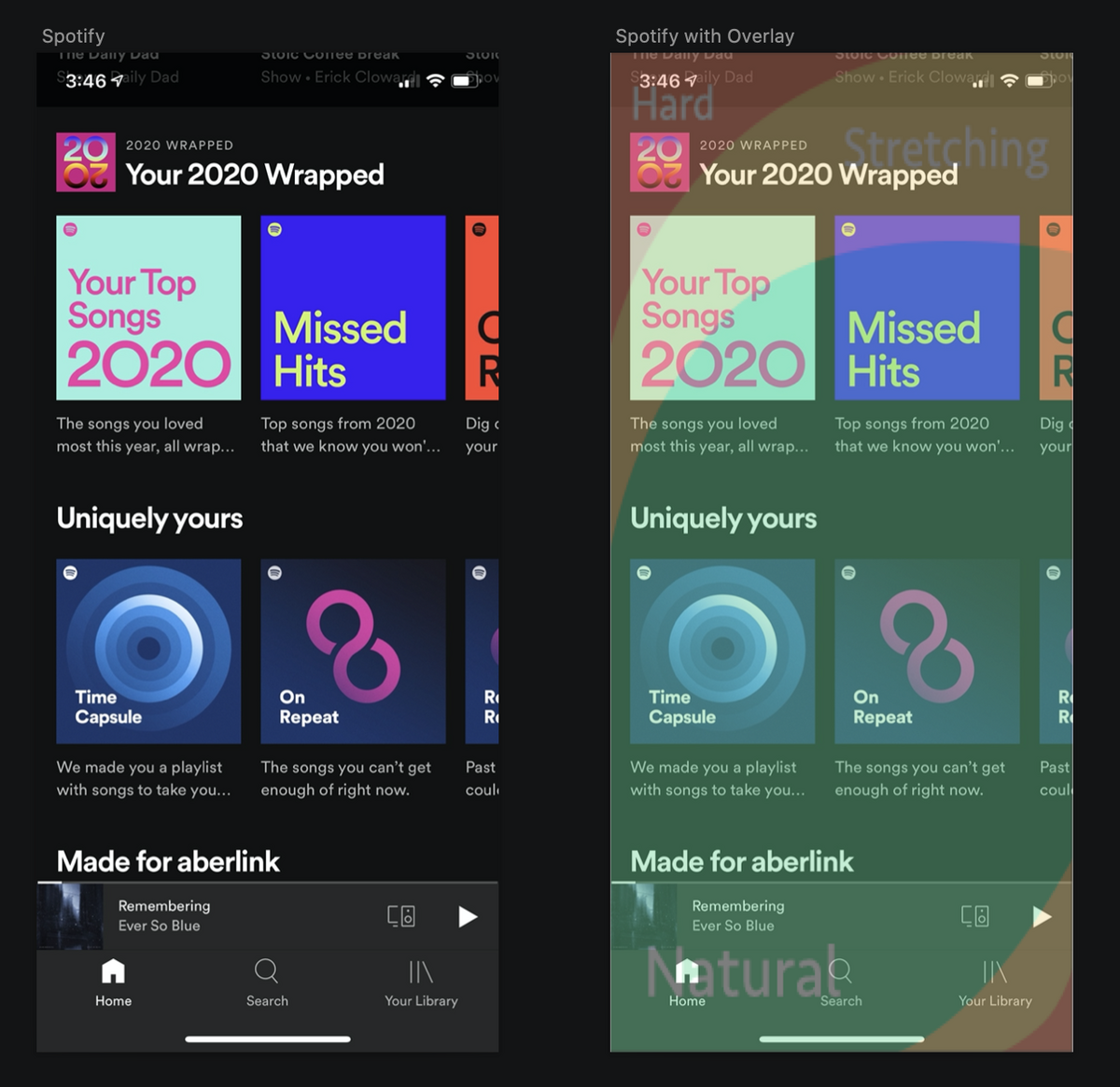
For instance, note how the primary navigation and controls in Spotify are placed in the lower portion of the app.
Source: Phil Wijs
You’ll also observe that most search bars, like in Spotify, are placed in the upper part of the screen, outside the thumb zone.
And the reason is that typing in the search bar requires two hands. So anytime you want to include input elements on your screen, it’s best to place them there.
The other consideration is thumb size. As a rule, you should always design for bigger thumbs and fingers.
In other words, tappable areas should be large enough and spaced apart from other interactive elements to prevent accidental tapping.
The best is to go for a tappable region of 8mm with a 2mm boundary in between elements. For elements outside the thumb zone, you can go for a slightly smaller size of 7mm.
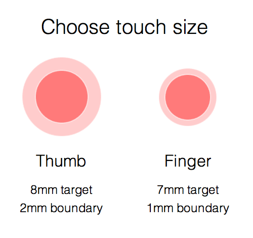
Source: Peerbits
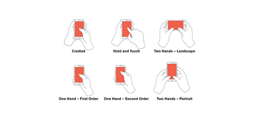
However, the one-handed thumb hold isn’t the only way people use mobile phones. Users can switch to a different hold, depending on the context.
Good design should be able to account for these changes.
Source: UX Matters
The last thing we want to point out is the use of gestures. It’s best to stick with the well-known ones, like tapping and swiping, since these are familiar to every app user.
If you want to use special gestures, always give a UI alternative (like a button) for the same action.
If there’s one word we can use to describe amazing UX, it’s consistency.
Your app’s design should be consistent with how humans use apps, including navigation and UI elements.
More importantly, every detail should be consistent across your app’s design.
For example, if you used a certain aesthetic for your menu icons, you should use that throughout.
Using a different color scheme or design element can cause confusion and disrupt the user’s experience.
Consistency is also important for branding and marketing. It’s the best way to build trust and familiarity among users.
In fact, studies show that consistency can improve your bottom line by 33%.
For best results, your design should also be consistent across platforms—including websites and desktop applications.
An iOS and an Android version of an app might have core differences, but it’s the similar elements that tie them together.
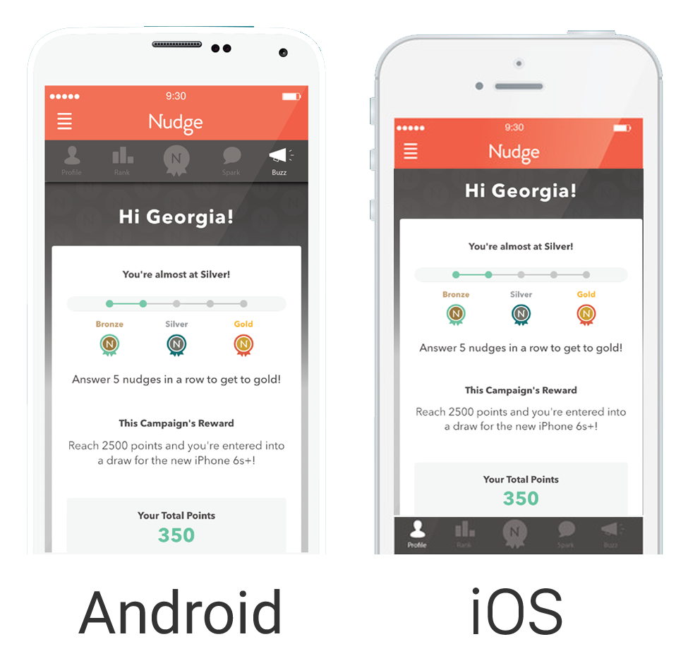
Source: Nudge Rewards
You’d want not only consistency in design, but function as well. This is beneficial for users that make the jump between devices.
After all, the core task of uploading photos to Instagram should be handled similarly on both iOS and Android.
Remember, good UX is designing an app that fits well with your users’ behavior and expectations, which you can learn through market research.
When you create UX elements that cater to the needs and expectations of your user base, the end result will be worth it.
Need help with UX or market research? Get in touch with us today, and see how we can make a difference.

Ante is a true expert. Another graduate from the Faculty of Electrical Engineering and Computing, he’s been a DECODEr from the very beginning. Ante is an experienced software engineer with an admirably wide knowledge of tech. But his superpower lies in iOS development, having gained valuable experience on projects in the fintech and telco industries. Ante is a man of many hobbies, but his top three are fishing, hunting, and again, fishing. He is also the state champ in curling, and represents Croatia on the national team. Impressive, right?
We teach you about top mistakes when creating an UX design and how to avoid them.
How do you engage, educate, and gain the trust of app users quickly enough so they don't leave? We share the key fintech app onboarding tips to achieve that.

Achieving excellent UX is a huge challenge, but it’s not impossible to get it right. Have a look at these fintech app UX tips to increase your chances.