
App design: 9 main types of app screens

Screens are to apps like organs are to a human body.
Each component is useless on its own, but combined the right way, they can achieve something truly exceptional.
However, unlike the body, apps can be made up of different combinations of screens.
Some are universal (like the home screen), and some are more specialized (like the audio player screen).
As a developer, getting to know these screens is the first step to creating a fantastic app. So let’s do a quick run-through of the most common ones.
Log-in screen
The log-in screen is the primary way users can sign in to their app account.
It might seem like a trivial screen to design, so many developers tend to overlook it. But the importance of the log-in screen cannot be understated.
If poorly designed, it can introduce unnecessary friction.
Here are some of the elements we think should be on every log-in screen, courtesy of Hubspot.
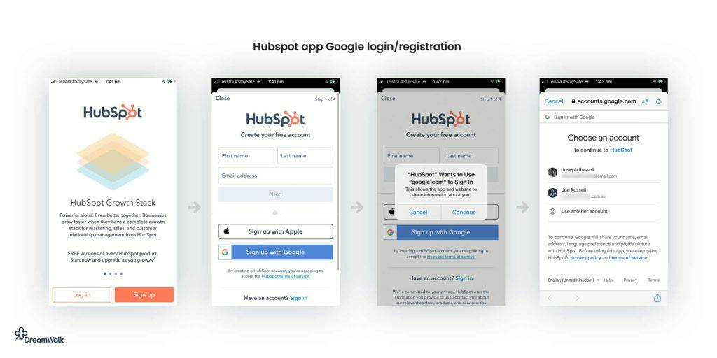
Source: UX Magazine
As you’ll notice, the Hubspot app offers two options upfront: to either log in to an existing account or sign up for one.
This is a better approach than opening with “Don’t have an account? Create one!” It doesn’t seem as pushy and therefore doesn’t alienate users as much.
You’ll also notice that the app offers multiple ways to log in or sign in, such as using existing social media accounts.
This greatly simplifies account creation, making it possible with just a single click, reducing friction and bounce rate.
Another crucial part of log-in screens (not pictured above) is account recovery.
This is because despite the multiple authentication procedures available nowadays, many people still rely on passwords—which they tend to forget.
Here’s a good example from eToro
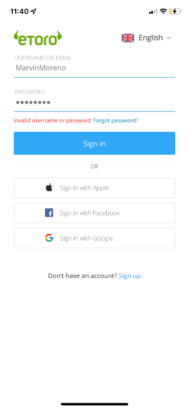
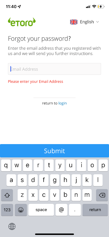

Source: eToro
As you can see, eToro’s process is simple and straight to the point.
UX is crucial for account recovery. People are already dealing with a frustrating event (forgetting their password), so your app shouldn’t annoy them further.
Indeed, eToro had the lowest friction index for password recovery among financial apps, according to an Incognia study. So, it’s worth emulating.
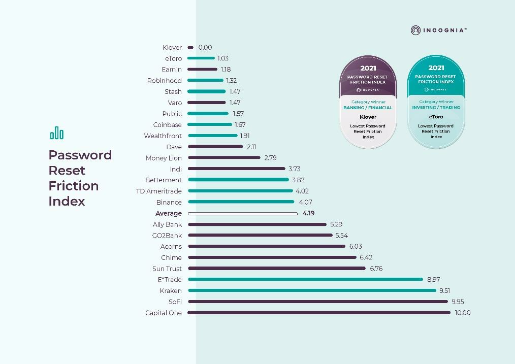
Source: Incognia
The most important thing for a log-in screen is minimalistic design. Users should be able to get into your app (whether by logging or signing in) as fast as possible.
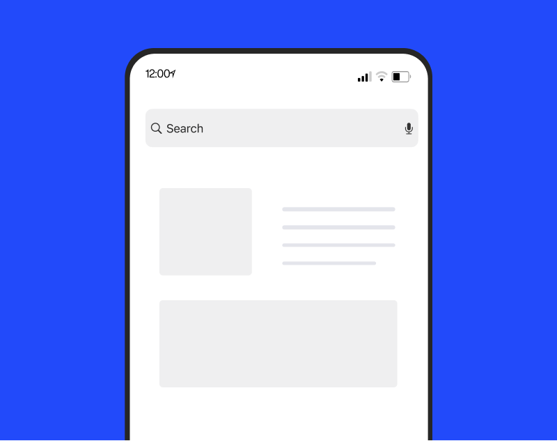
Home screen
A home screen is the most vital UI of any app. It acts as the hub that connects all the other screens and features; hence, it’s where most users begin their journey.
Aside from this, home screens also act as a dashboard that updates the user on critical app-related data.
For example, for a smart house app, the home screen will indicate key info like temperature and security.
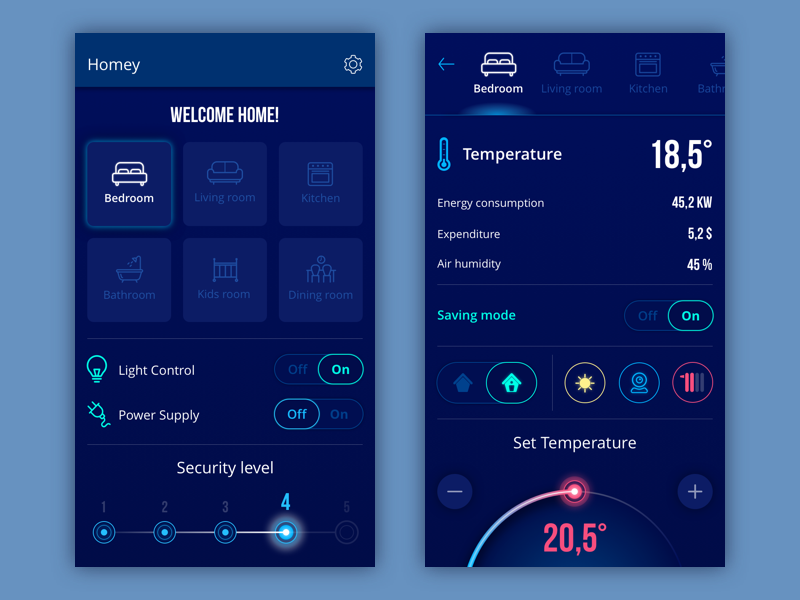
Source: Tubik
As the glue that holds the app together, home screens are incredibly crucial. Thus, they should be very user-friendly and intuitive, despite the amount of information they provide.
They should also provide a great navigation experience. Everything in your app must be accessible from the home screen in one way or another.
A search bar is fantastic for this, which is why it’s a popular home screen element.
Home screens are also essential for giving users a roadmap—or the ideal steps they need to take.
This is crucial for apps with hundreds of content and features, where users can get lost in the mix.
The meditation app Headspace, for example, gives users a set of daily meditation tasks, depending on their goal.
It ensures that they can accomplish these right away despite a busy schedule.

You’ll also notice that the Headspace app lets you add favorite content on the home screen. This is yet another aspect of great home screens—personalization.
By doing this, users will find it much better to navigate around the app because it’s tailor-fit to their preferences.
The bottom line is that home screens are your app’s north star. It must be the last place users get lost.
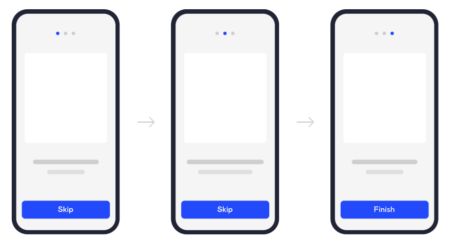
Onboarding tutorial screens
Onboarding is an important part of both creating or using the modern app. Guiding new users can help boost your retention rate and give them a fantastic user experience.
Hence, your onboarding screen deserves as much attention as the rest of your app—even though users will only go through them once.
The golden rule here is not to overload users. That’s the fastest way to scare them off. Here are a few guidelines so designers can help avoid that:

Onboarding serves many purposes, but one of these is info gathering. Screens for this purpose should be simple and straightforward to minimize friction.
Also, try to ask only one thing per screen so that users aren’t overwhelmed.

Another onboarding screen worth putting is a slideshow showcasing your app’s features and/or benefits.
The goal is to compel users to use the app and (in most cases) sign up for an account.
As a rule of thumb, it’s best to focus on three core features or benefits only, as with the Jira app.

Finally, an important part of any onboarding screen is the Skip button. Realize that not everyone is willing to go through onboarding; some might not even need to.
Allowing users to skip will prevent frustrating these users.
Source: DECODE
If you need more tips on designing effective onboarding flows and screens, check out this helpful article.
Feed screen
Feed screens display the latest content, such as news or posts. You’ll often see them in apps with a constant stream of data, for example, on social media.
Perhaps the best example of a feed screen is the Facebook feed. Indeed, it’s also a good benchmark of what elements should be in a feed screen.
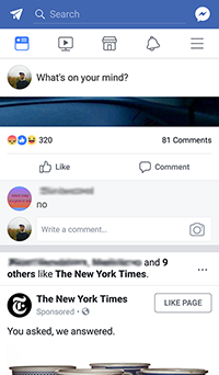
Source: Wikipedia
Like any app screen, simplicity is the name of the game with feed screens. Therefore, minimal UI elements should get in the way of the information being presented to the user.
Another consideration is the proper separation of information in the feed screen.
For example, visual indicators should allow users to identify a piece of news or post from others on the feed.
The Instagram app does this quite well.
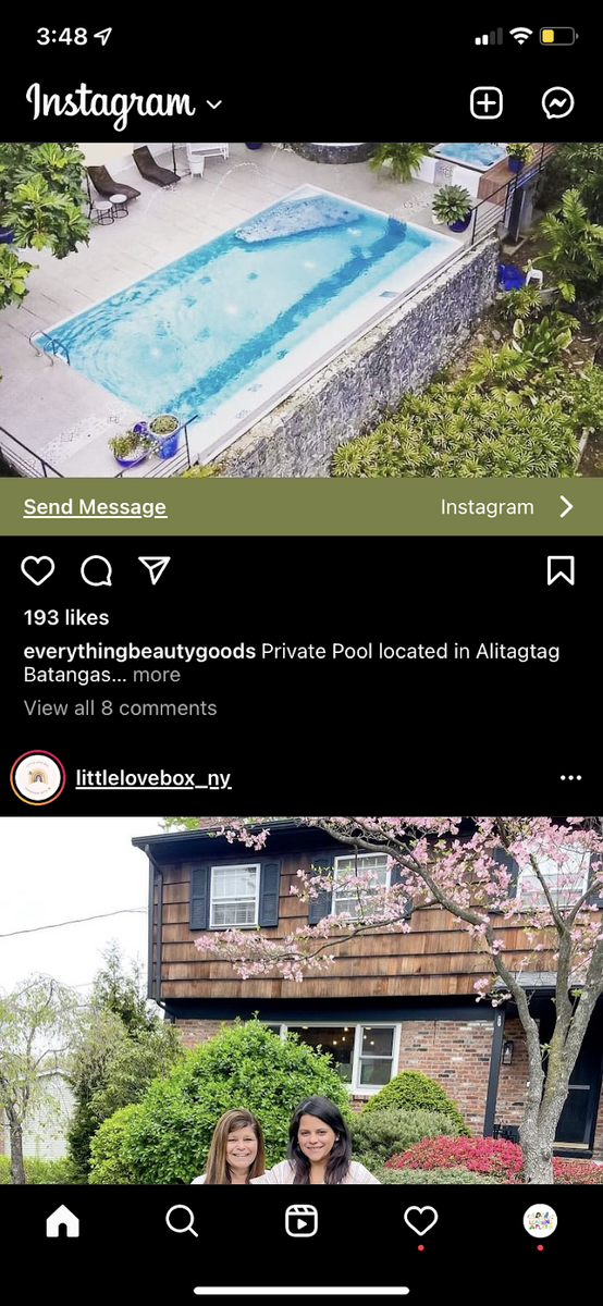
Source: Instagram
In this case, the header with the icon acts as the separating element, subtly letting users know when a post begins and ends.
The dimensions of each post are also roughly the same, which creates predictability while scrolling.
Lastly, consider how the typical user scrolls through the feed screen relatively fast. The UI design of each item is important to ensure they don’t miss out on content that matters.
For example, news apps like the Wall Street Journal contain a headline and summary of what each news piece is about.
It helps users decide whether that content is worth clicking on or not.
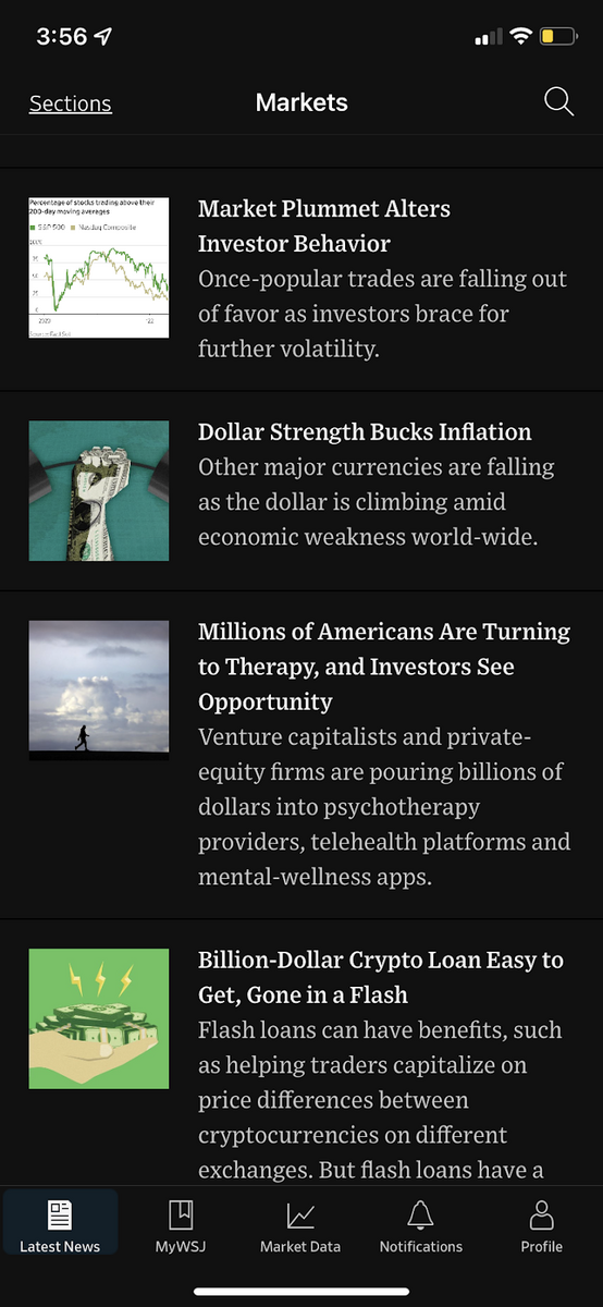
Source: WSJ
Minimalism and simplicity are the key characteristics of a news feed. It ensures that users get the information they need when they need it.
Splash screen
A splash screen is often the first thing a user sees when they open your app. Usually, it is a minimalistic screen with the app’s logo front and center.

But more than just for branding, splash screens have an important, albeit hidden, function.
They hide the fact that your app is loading and give users something better to look at while waiting.
Indeed, it’s better than showing users a frozen loading UI that isn’t ready yet, as that might cause users to think the app is broken.
There are a few guidelines when designing splash screens other than to make it simple. At most, it should feature a visual element and a few words at the center of the screen.
That’s because you want splash screens to be lightweight and fast-loading.

In fact, splash screens should be visible for 3 seconds at most—even less for certain apps.
If you make it too long, it will annoy your users every time they open the app. Should you wish to add animation, do so sparingly.
However, sometimes your splash screen will inevitably overstay its welcome, for instance, when the app takes too long to load or encounters a slow network connection.
You should have a contingency in case that happens.
The best approach is to show a loading indicator, like a progress bar or spinning wheel. This communicates to the user:
“Relax, things are loading in the background. This is normal.”

If a failure prevents the app from opening, it’s a good idea for the splash screen to show it. Again, keeping the user in the loop makes your app responsive and user-friendly.

Splash screens might be simple, but they actually play a key UX role. So, it pays to give them an appropriate amount of attention.
Product card screen
Product screens are the mainstay of e-commerce apps like Amazon and Etsy.
Their purpose is to show users the details of a selected product to help drive their decision to buy or not.
But at the same time, it should also respect UX rules by not making the interface too cluttered.
Information hierarchy is the most critical element in effective product screens. In UX, this is the practice of visually arranging elements on a screen based on importance.
Key features are highlighted and emphasized, while less important ones are relegated to the background.
Without information hierarchy, product screens will look like a uniform blob of text that’s difficult to consume.

You can see this hierarchy in action on the Amazon app’s product screen.
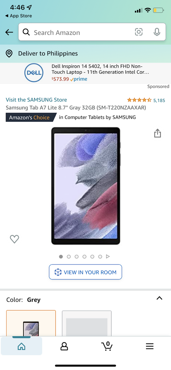
Source: Amazon
Notice how the most important information—the product photo—occupies the most space.
The star rating, color, and price (once you scroll down a bit) also occupy prominent positions in the design.
This is no accident. These are the screening criteria that a typical buyer would look at first when online shopping.
It is only once they scan it that users scroll down further to read about the product’s description, dimensions, features, etc.
This is a much more efficient way of shopping online than reading every product page.
Airbnb’s rental page, where the rentals are essentially the product sold, offers a similar structure.
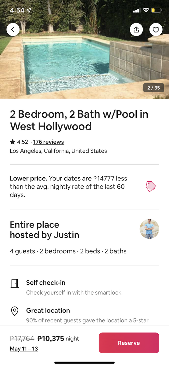
Source: Airbnb
Like the Amazon page, photos and prices are also emphasized on the Airbnb app product page.
But here, certain elements are much more prominent, such as the specs of the accommodation (rooms and baths). Cost savings are also much more apparent.
Of course, all these reflect how travelers browse through the platform.
Designing product pages is arguably where thorough market research has the most impact.
Because only by knowing what matters to your shoppers can you devise a proper information hierarchy for your product page.
But product pages are only one part of the equation for ecommerce apps. The checkout screen is on the other side of it.
Checkout screen
Checkout screens are perhaps the most vital part of any retail app because that’s where your earnings are determined.
It doesn’t matter if you have a user-friendly app; if you fall short on the checkout screen, it won’t succeed.
And if you need convincing, maybe this infographic from CleverTap will do the trick.

So why do only 20% of users complete the checkout process? Mostly, it’s due to UX issues.
And optimizing checkout forms is perhaps the most effective way to solve many of these obstacles.
That means only asking them for information to complete the transaction. If they can guest check out (thus eliminating the need to create an account), all the better.
In fact, users were 1.2 times more likely to choose this option than to log in.
Reducing the number of steps (and therefore screens) should be a top priority. Pre-fill fields whenever you can.
Or better yet, allow logged-in users to skip entire screens entirely. One study found that doing this led to higher conversion rates.

The second flow in the picture above had higher conversion rates.
Remember, checkout pages only have one goal: to increase conversion rates. Everything from seamless UI design to great copy is one point towards more closed sales.
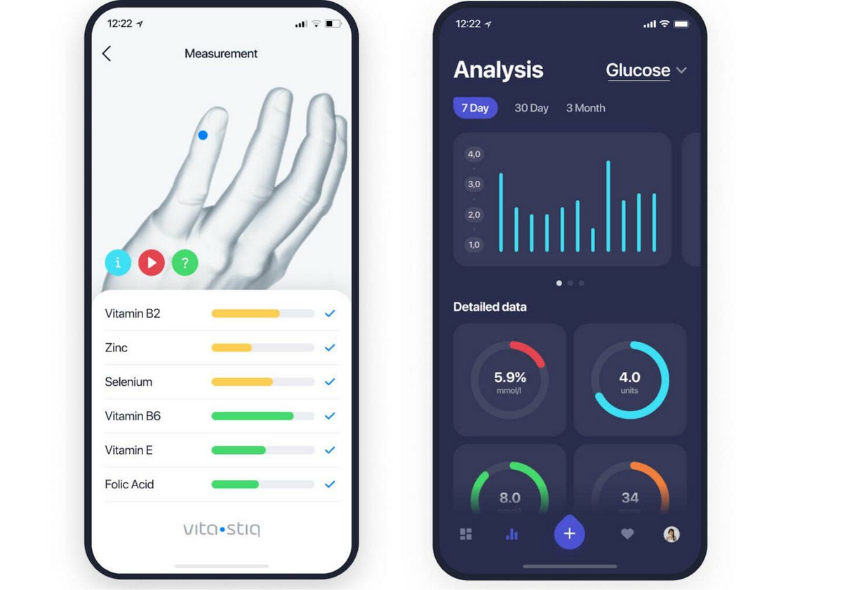
Statistics screen
Many apps, especially in the fintech niche, use stat screens extensively. Their purpose is to display relevant data to the user.
Here’s an example of statistics screen in fintech.

The above screen can tell you a lot about what goes into a good stat screen.
Perhaps the most important point is using visualization—or representing data with graphic elements such as graphs and charts.
Doing this helps make information much easier and exciting to consume for casual users.
Not only that, but visualization can also present data more compactly, thus helping avoid screen clutter.
Source: DECODE
However, you should also avoid overdoing visualization. At most, don’t place more than two elements on the screen at a time.
A good example is this screen from Mint. Notice how data is displayed beautifully in the stat screen thanks to a controlled mix of visual elements, text, and color cues.
Source: Relevant
Stat screens might be one of the most challenging to design, especially if you need to present plenty of data. It’s as much about what to leave out as what to put in.
Audio player screen
A player screen is just what it sounds—it’s where users can play audio tracks in a music app.
If you want to know what the ideal audio player screen would be like, look no further than Spotify
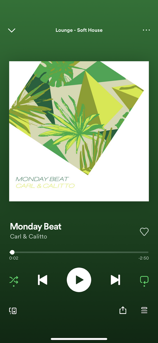
Source: Spotify
As you can see, it gives the listener all the control they need to optimize their listening experience.
Aside from the usual commands like Play and Next, it also allows users to scrub through the track quite easily.
The whole screen adopts a minimalist approach to focus on the music and the album artwork.
What we also like about Spotify’s player is that it adopts the controls based on the media being played.
For example, if you play a podcast, you get two new controls that let you skip/rewind for 15 seconds.
This is very useful if you missed out on what the speaker said and would like to backtrack a bit.

Source: Spotify
Designing audio controls is perhaps the easiest because conventions are already pretty well established. That allows you to get creative with other elements.
These are just the basics
We’ve only covered a small set of screens you can see in modern apps.
With today’s variety, there are a dozen more we haven’t discussed, like chat screens or map screens on navigation apps.
But do they share one common feature – they all need sound UX design to become effective.
Want to learn more? Check out our rundown of the best design tools for app developers.