

7 thrilling mobile app design trends to know about
In this article, we'll reveal seven thrilling mobile app design trends we feel you should know about.
For any craftsman, mastery of their tools is essential.
A painter must know the various kinds of paints and what they do.
A carpenter needs to know the difference between a hammer and a mallet and when to use each.
And it would be impossible for a composer to write a song if he or she didn’t know the notes.
It’s the same with mobile app designers.
Their tools of choice are the various UI components that, when thoughtfully put together, allow them to create exceptional mobile apps.
Here are 17 of these elements that you’ll use.
Input control components allow you to enter information or direct your app to do something.
Without them, you’ll mostly have a static app that does nothing! Here are some of the key elements you’ll use.
Buttons are elements that perform an action when tapped, such as submitting a form or closing a window.
It’s often rectangular with rounded corners. The label can be either an image or text, which should be readable with a clear and concise copy.
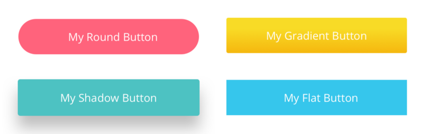
Source: Linda Wilson | Medium
Buttons usually have bright colors that draw the eye in, such as red and yellow. This is because most buttons are very important elements, so they should be noticeable at all times.
You can also make buttons react to user input, for instance, by changing colors when you tap on them. This is a good practice for UX as it makes your app more responsive.
Text fields are UI elements where you can input words. They’re often part of a form.
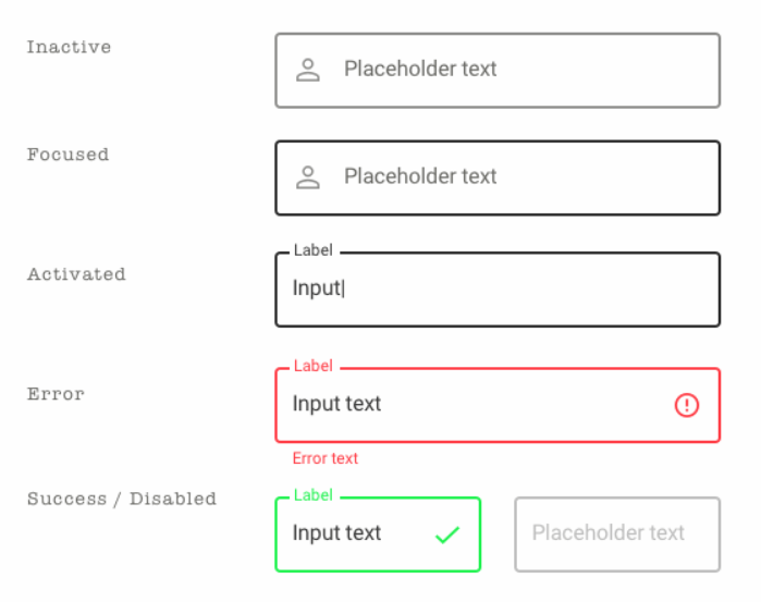
Source: Sketch App Sources
A good practice for text fields is to have indicators that communicate their state. Most commonly, this is done with colored borders or small icons.
For instance, a red text field can indicate that you entered something wrong, while a grayed-out border means the text field is inactive.
It’s also important to vary the size of the text field based on the estimated input length. This prevents awkward cropping.
A dropdown list is an element that presents a list of options when you tap on it. You can only choose one item from it, which becomes the default display after you pick it.
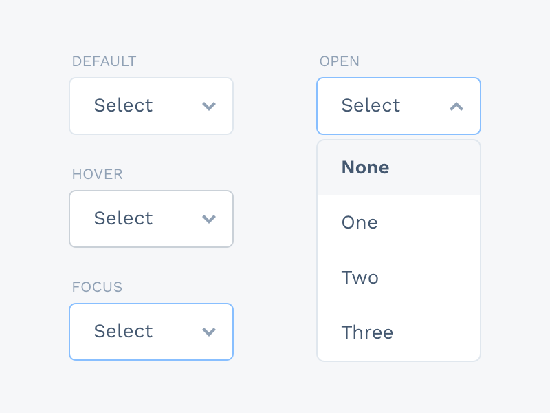
Source: Sketch App Sources
Dropdown lists are often part of a form (which we’ll discuss later in this article). They’re useful for presenting long and variable lists of items without taking up too much space.
For example, let’s say you want users to choose among the employees in your company. A dropdown is the best approach since the choices (employees) can vary over time.
Like text boxes and buttons, dropdown lists can also be responsive—for instance, they can change border colors when you tap on them.
Like a dropdown list, a radio button lets you pick one option from several choices. But in this case, all items are already laid out. Any invalid choices are grayed out.
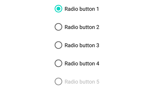
Source: Material.io
Radio buttons let you present a long but fixed list of items that you’re sure won’t change in the future.
Days of the week or months in a year are a good example. They’re also popular elements when configuring settings in your app.
A checkbox is similar to a radio button in that it lays out a list of fixed options for you to choose from. But the big difference is that you can select more than one item at a time.
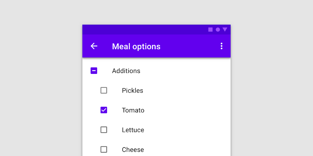
Source: Material.io
Checkboxes are useful for questions that accept more than one input. For instance, a health app can ask users to check all the symptoms that apply to them.
This element is often presented as a vertical list but can also be laid out in multiple columns. This is especially useful if you want to compare lists with each other.
A toggle is basically an on/off switch that allows users to set a variable by choosing between two states.
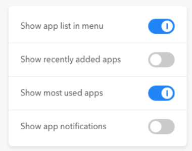
Source: UX Movement
A toggle is ideal whenever you want the user to activate or deactivate something in your app. It’s no surprise, then, that this element is mostly used in your app’s settings screen.
With toggles, it’s a good practice to make the on state visually distinct from the off state so that users can differentiate between them at a glance.
A common approach is using gray to represent the inactive state.
Navigational components help users move through the app. They’re crucial because the app’s flow would be disrupted without them. This can lead to friction.
The best navigational schemes are intuitive and predictable. Here are some components that could help you achieve this.
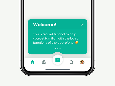
The hamburger menu is so-named because the three-line icon looks like an abstract representation of a burger. When clicked, it brings up a hidden menu.
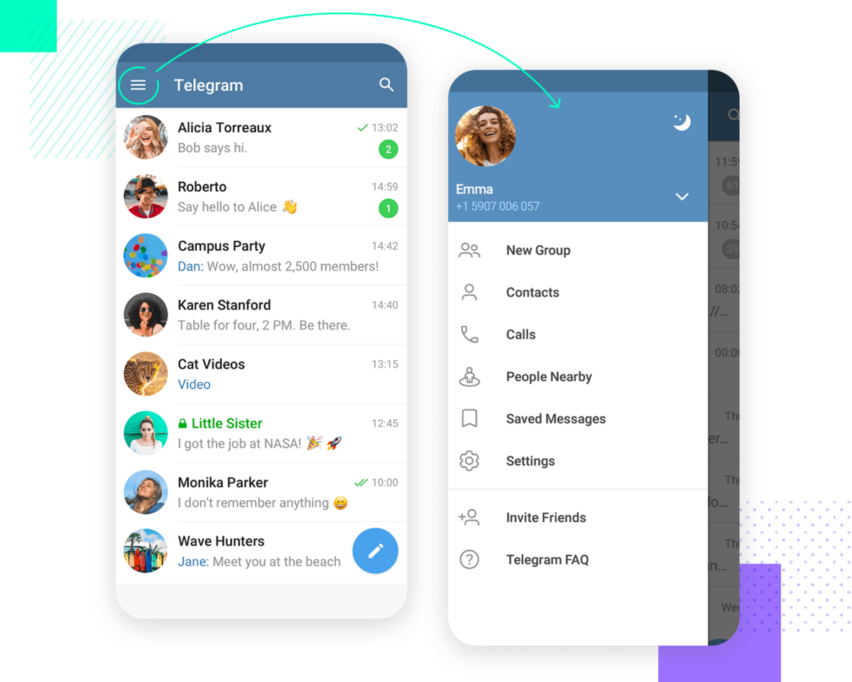
Source: Just in Mind
The hamburger menu is a popular navigation scheme in apps because it’s universally well-known. People instinctively know what happens when they tap on it.
In addition, hidden menus allow you to include extensive menus without cluttering the screen.
It’s also good for UX since users can bring up the side menu only when needed, reducing overwhelm.
A sidebar is a hidden menu item that pops up on the left or right side of the screen whenever users tap a button or perform a swiping gesture.
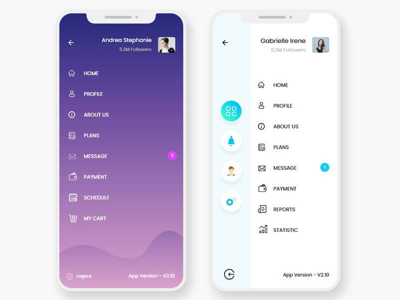
Source: Epic Pxls
The biggest advantage of sidebars is that they’re excellent space savers. That makes them indispensable for creating minimalistic user interfaces.
Tab bars are a common navigation scheme in iOS. It’s a series of menu icons that run on the bottom of the screen, each representing a major section of the app.
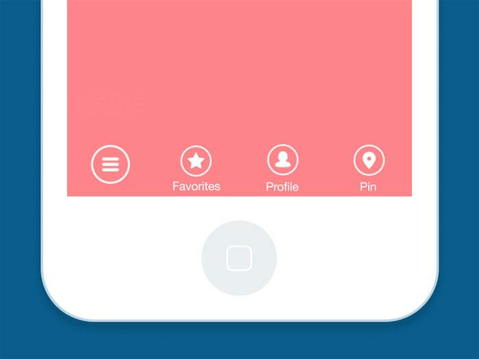
Source: Design Your Way
Tab bars make it easy to navigate quickly from one part of the app to another, similar to how browser tabs facilitate switching from one website to another.
The other reason they’re widespread is that they’re located at the bottom of the device.
Thus, people who hold their phones one-handed can comfortably tap the buttons using only their thumb.
Carousels allow users to swipe horizontally to browse through a series of UI elements quickly, mostly images.
The dots below the carousel indicate how many items you’re browsing through and which item you’re currently at.
A carousel creates an experience akin to flipping through the pages of a book, which is a familiar feeling for most users.
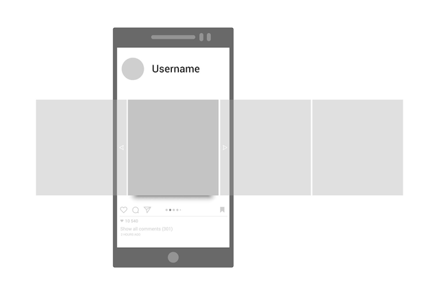
Source: Freepik
The main benefit of carousels is that they help save time and effort since it’s faster to swipe through images than to tap on them individually.
They’re also ideal if users need to compare multiple items or photos.
Informational components are crucial for communicating to the user. The app can use them to give feedback, alert the user to important updates, and provide helpful in-app hints.
Here are some of the common informational components that you’ll likely use.
Notifications are off-app elements (as they appear when the user is outside the app) that alerts the user to something important.
This can be a new update, an error, or a critical event that needs their attention.
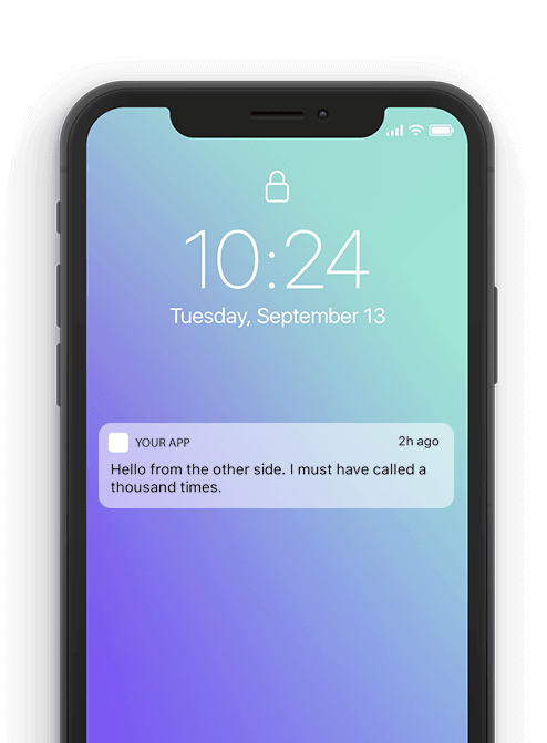
Source: Mo Engage
Notifications are great at improving retention. That’s because they subtly encourage the user to return to the app, especially if they haven’t used it for a while.
However, it’s very important not to overdo sending notifications. Too many of them can annoy users, leading them to uninstall the app.
The notification content should also be relevant, personalized, and beneficial. Also, don’t forget to ask for permissions properly to encourage click-through.
Progress bars communicate to users how far along they are in a series of steps. They can be as simple as a bar with a percent indicator below it.
Or they could also include a breakdown of the steps, as depicted below.
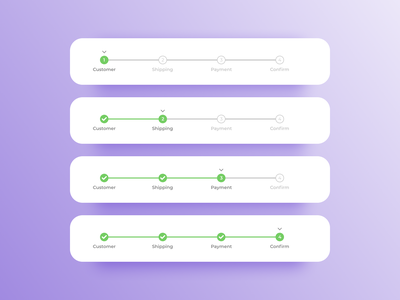
Source: Dribbble
Progress bars can help make a long task manageable by breaking it down into chunks. It also sets the user’s expectations on the time commitment needed to complete it.
From a psychological perspective, a progress bar gives a feeling of fulfillment once you complete it. This can have a tremendously positive effect on your app’s UX.
Tooltips are text bubbles that pop up in context. Their purpose is to teach the user about a particular UI element or feature as they’re using it.
Source: Dribbble
Tooltips are commonly activated automatically when a user encounters an app screen for the first time.
Alternatively, you can also set tooltips to appear only when users tap on an icon (like a question mark).
Tooltips are vital for progressive onboarding and product walkthroughs, where users learn an app as they use it.
Loaders are elements that indicate that the app is working in the background. It’s a subtle way of telling users to wait.
In apps, the most common loader is the spinner, which starts gray but gradually gains color as the task progresses. The spinner has the benefit of taking up minimal space.
Alternatively, if space permits, you can also go for a classic loading bar.
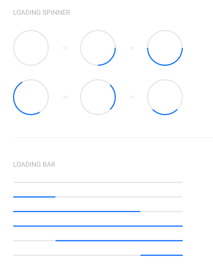
Source: Dribbble
Loaders are important for UX as they communicate that the app is working fine instead of frozen.
They can also hide app latency and speed issues, especially if you have an engaging loading screen.
Container components hold related elements together in your app. Their main purpose is to help organize the UI to look less cluttered.
Some containers also hide UI elements when unnecessary to prevent overwhelming the user.
Here are some common container components.
Accordions are components with collapsible and expandable sections, allowing users to hide and show items when they tap on them.
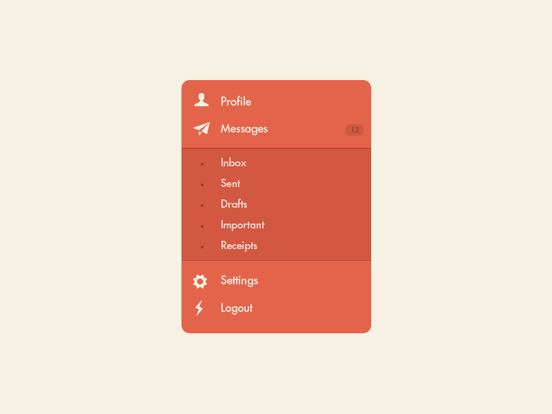
Source: Dribbble
The main purpose of an accordion is to organize a long list of elements into manageable chunks so users have an easier time browsing through them.
They’re essential for mobile apps, enabling you to show more information on a smaller screen.
For instance, if you have an e-commerce app with dozens of products, you can have each category as an entry in an accordion.
That way, users can tap only on product categories that interest them, hiding everything else to reduce clutter.
Cards are small elements that contain relevant groups of information in your app UI. It’s so named because they resemble real-life calling or credit cards.
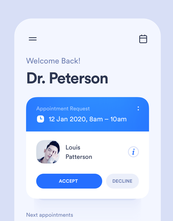
Source: UX Planet
Cards are often used to summarize or recap information with a button or link that enables users to view more details if they choose to.
They’re also being increasingly used as a navigation tool, as seen in the Headspace app.
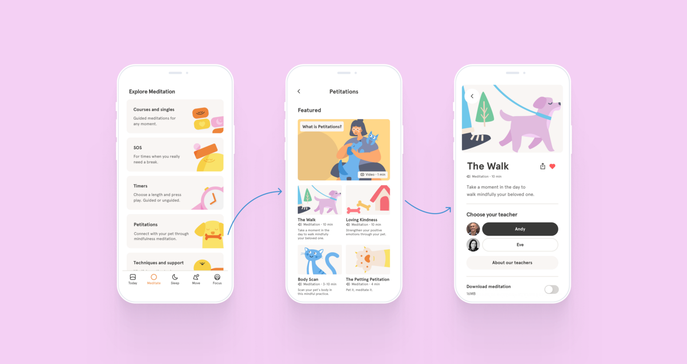
Source: Bootcamp
This tells you that cards can be very flexible. Anytime you need to organize information into a visual hierarchy in your UI, cards can be your go-to component.
Forms are components that help apps collect and process related data, such as contact details or order information.
It’s analogous to filling out forms when opening a bank account or filing your tax returns.
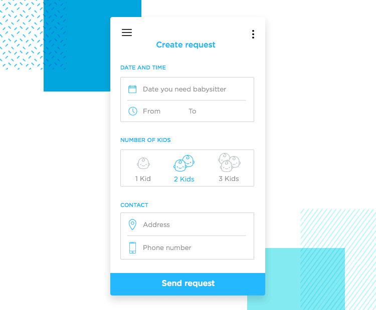
Source: Just in Mind
A form comprises individual input components, and a submit button at the end. When users tap this button, all the data in these input components will be processed or sent to a server.
One danger with forms, however, is that they can get very long and cumbersome.
A good workaround is dividing your form into multiple screens, each including only around three to four input components. This can help reduce clutter.
Knowing the various UI components at your disposal is crucial, but they’re only the first step.
Because to create exceptional app designs, you must discover how to put them together.
And that requires mastering app design principles, such as shape patterns and predictable navigation.
Luckily, we have just the resource for you.
Check out our article on the five fundamental app design principles you need to follow.

Petar leads Shake (DECODE’s sister company) as CEO, delivering the product to a growing number of happy, innovative clients. Day-to-day, he ensures the engineering, design, product, marketing and sales teams all work in harmony. Before moving to Shake, Petar led DECODE. Although an engineer by schooling, his natural talent soon saw him making an impact on the marketing, sales and branding side of things. Petar’s passions include architecture, skiing, sailing, and a good glass of red wine.
In this article, we'll reveal seven thrilling mobile app design trends we feel you should know about.

There's no easy way to achieve great UX design. This article will discuss mobile app design best practices to help you create a successful app.
This article will help you understand the importance of UX. It starts with the five fundamental mobile app design principles and then goes into a practical guide for implementing them.