
7 thrilling mobile app design trends to know about
In this article, we'll reveal seven thrilling mobile app design trends we feel you should know about.
First impressions matter—that’s true in design as it is in life.
Case in point: studies show that 94% of a website’s first impressions are due to its design.
But a successful design is more than just color and typography. It’s also about the user experience (UX)—how usable your app is and how effectively it solves your users’ problems.
Achieving that involves getting the fundamentals right while steering clear of the pitfalls. Here are some of them:
First, let’s start with the UX principles that you need to get right, starting with solid research.
If you don’t know your users, how can you create an app that satisfies their needs? No wonder failing to conduct market research is the top reason for app failure.
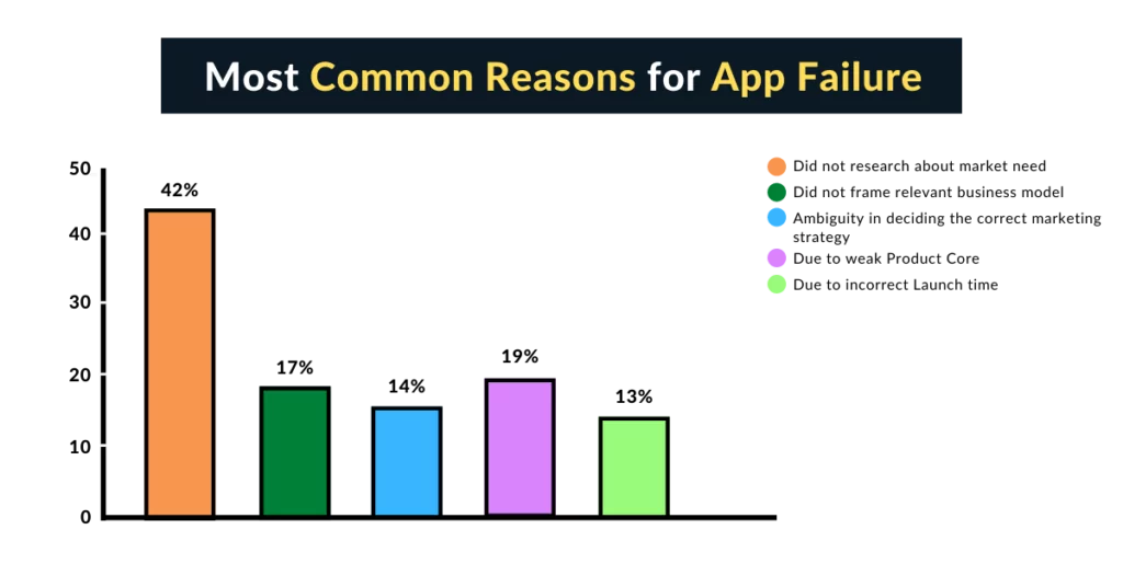
Source: The WebApp Market
That’s why thorough UX research should be the first step when developing any app.
Specifically, you need to discover your target users’ biggest problems so that you can craft an effective app solution for them.
But it’s not enough to merely know basic demographic information like location, age, and income level—although those are important.
Psychographic data is arguably much more valuable in UX because it delves into your audience’s deeper attitudes and needs.
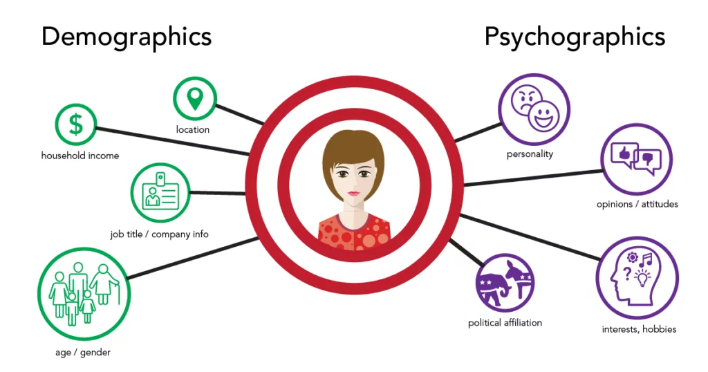
Source: Branding Compass
You need a mix of quantitative and qualitative research methods to achieve this.
Don’t rely on questionnaires and surveys—uncover more insights through involved approaches like interviews and focus groups.
Also, don’t forget to check out your competitors. Knowing what’s already working (and not) in the market can inform you of the UX approaches to adopt and avoid.
The bottom line is that research should form the bedrock of your entire UX strategy because, without it, you’re going in blind.
A good UX should only focus on the essential features that fulfill your app’s purpose.
Many app designers mistakenly cram too many features in an app, thinking it would make it more robust and valuable. Unfortunately, that’s very detrimental to UX.
That’s because too much going on will confuse and frustrate your users. It has something to do with the paradox of choice, which states that too many options can paralyze a user into inaction.
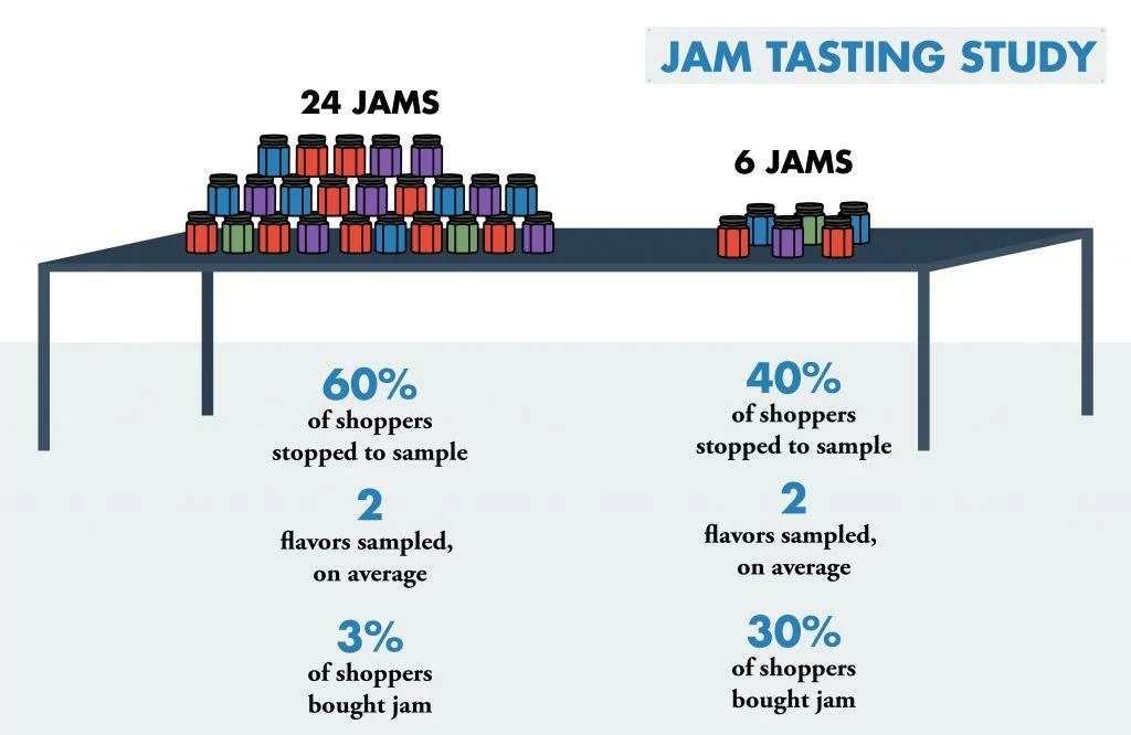
Source: Cart Stack
To get around this problem, you should prioritize your features list using a tool like the MoSCoW matrix.
Here, you try to segregate your features into four quadrants based on their impact on your app and the effort involved in implementing them.
Features on the first quadrant—must-have—are the core features you need to focus on.
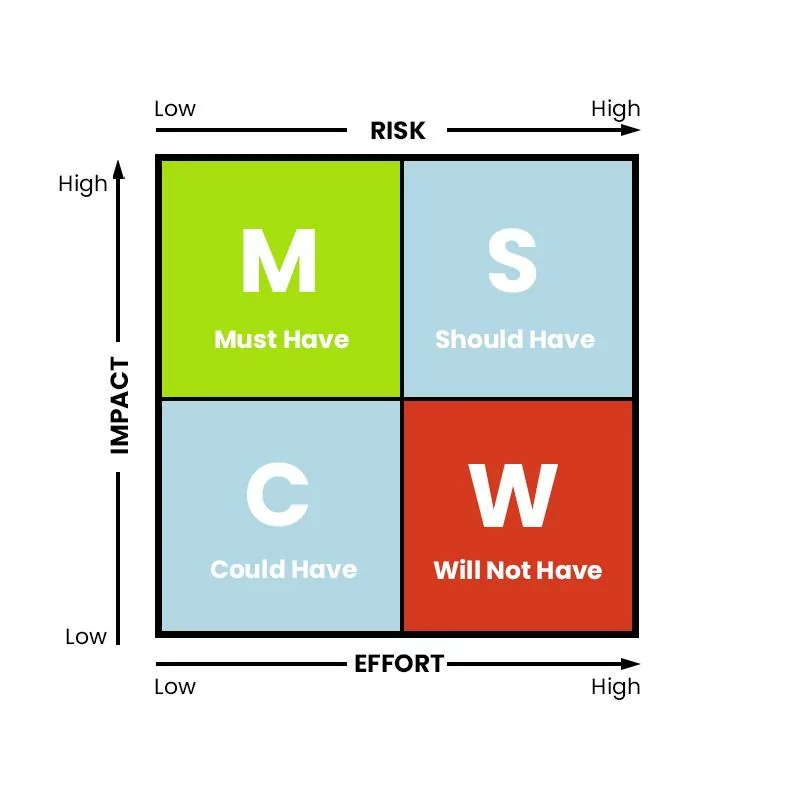
Source: DECODE
Of course, sometimes you can’t avoid having too many features. In these cases, you can employ UX tactics to make it less overwhelming to users.
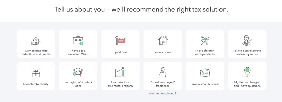
TurboTax provides an example of a good approach. During onboarding, it asks the user their reasons for using the app. It then only shows the relevant features so as not to overload the UI.
Source: Appcues
But focusing on only a few core features is just one way of making your UI nice and clean. Here are other ways you can declutter your app.
A minimal, clutter-free UI is critical for apps.
It’s easy to fill up a small mobile screen with too many elements. Unfortunately, this clutter can overwhelm the user, reduce their retention, and cause them to disengage.
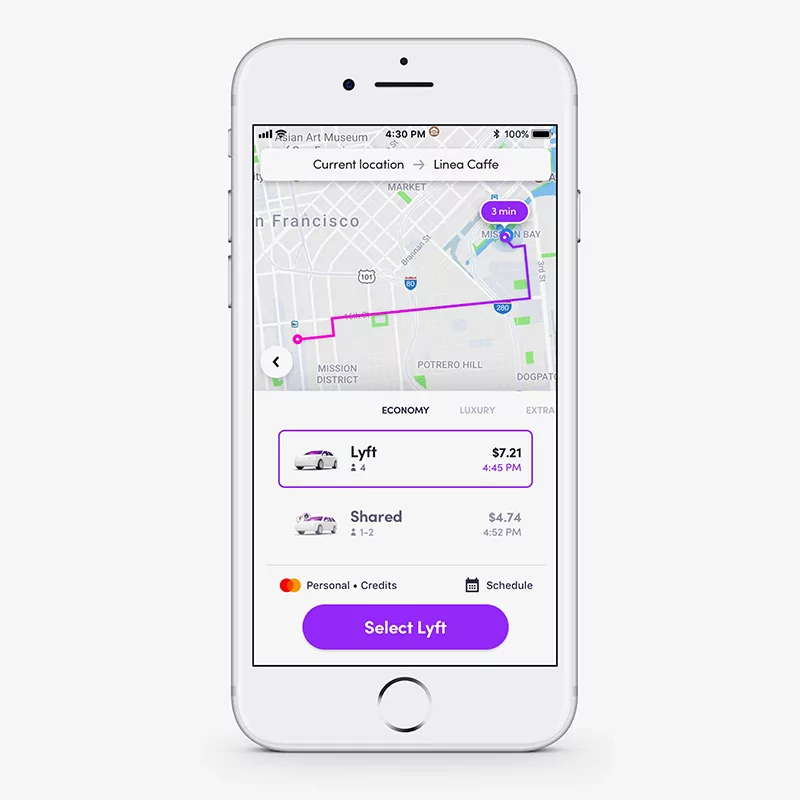
To prevent this, it helps to focus on only one thing on every app screen as much as possible. For example, notice how the screenshot below tackles only one task—booking a ride.
Source: Appinventiv
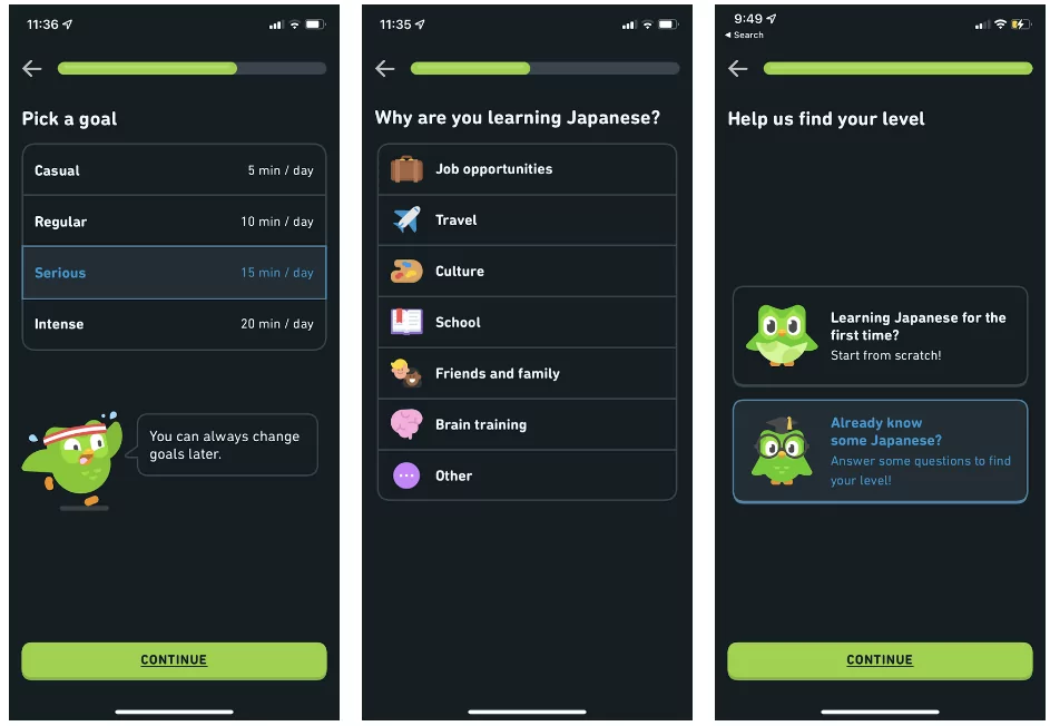
A good approach is to separate your UI into multiple screens, focusing only on one topic or feature. That way, the user can dedicate their full attention to it.
Here’s an example from Duolingo.
Source: Duolingo
If you’ve used Duolingo before, you know they have a pretty extensive onboarding sequence. But you hardly get overwhelmed because they space everything nicely into multiple screens.
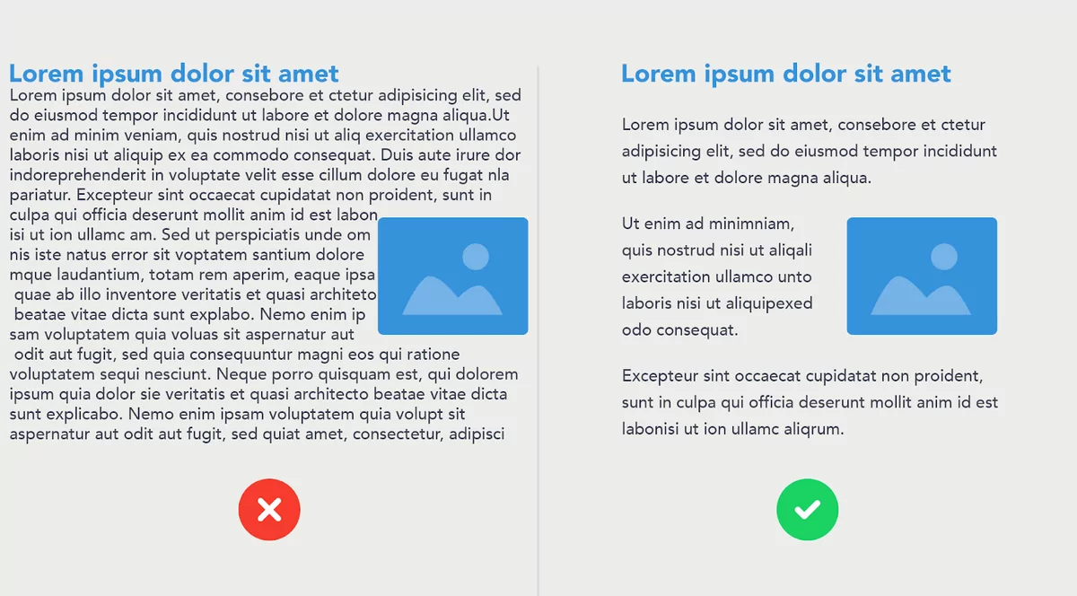
Poorly designed UIs can make it appear cluttered, even when it isn’t.
For instance, notice how the long text block on the left looks harder to read than the one on the right.
Source: PSD2HTML
Design principles like whitespaces and shape patterns can help streamline your UI and make it less cluttered. Check out our guide here if you’d like to learn more about these fundamentals,
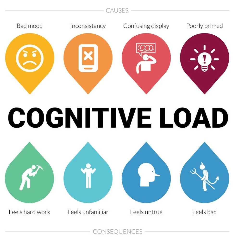
For the best UX, your app navigation should be as predictable and natural as possible.
In a nutshell, if a user is unfamiliar with your interface, it causes them to think harder to navigate through it. That might lead them to disengage.
Familiarity is the best way to reduce cognitive overload.
Source: Boagworld
And the best way to make your navigation predictable is to use what’s already out there.
For instance, everyone knows that clicking the hamburger icon will reveal a menu sidebar. Users instantly know what to do—you don’t need to take time to teach them.
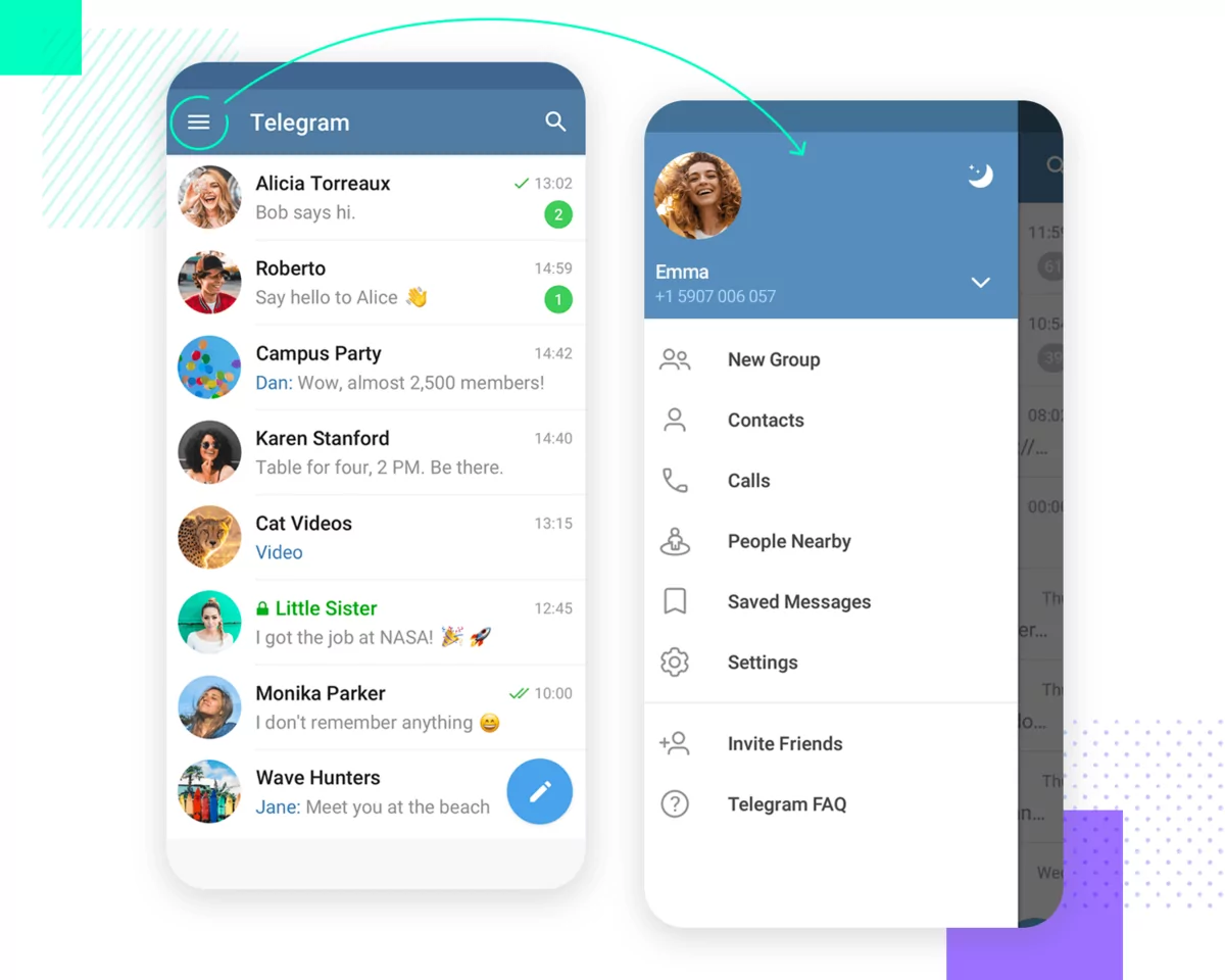
Source: Just in Mind
It’s also important to consider that iOS and Android have their own navigation conventions that users are already used to. Thus, deviating from these can be jarring for them.
One good example is the floating action button, which is common on Android apps, whereas iOS apps rarely have them.
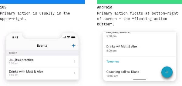
Source: Lean UI Design Blog
But perhaps the best way to ensure intuitive navigation is to adopt what your successful competitors are doing.
Take Lyft and Uber, for instance.
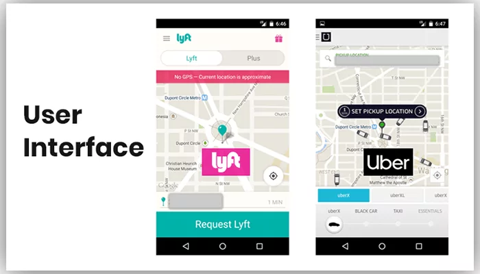
Source: Mobile App Daily
Mirroring (but not 100% copying) Uber’s interface enabled Lyft to have a user-friendly and predictable app from the get-go.
One of the more overlooked UX mistakes is having buttons that are too small. Users with larger fingers can find it hard to tap on them, or they might accidentally tap on the button beside it.
Thus, good UX dictates that you consider various thumb sizes when designing your buttons and interactive elements.
An MIT study found that the average finger is around 8–10 mm wide.
Thus, the best approach is to aim for a minimum tappable region of 10 mm with a 2mm boundary for elements that are meant to be pressed with your thumb.

Source: Just in Mind
For other elements that are meant to be pressed with your index finger, you can use a smaller size of around 7 mm.
Generally, these will be the elements that are outside your UI’s thumb zone, which is the area of your screen that users can comfortably reach with their thumb using a one-handed grip.
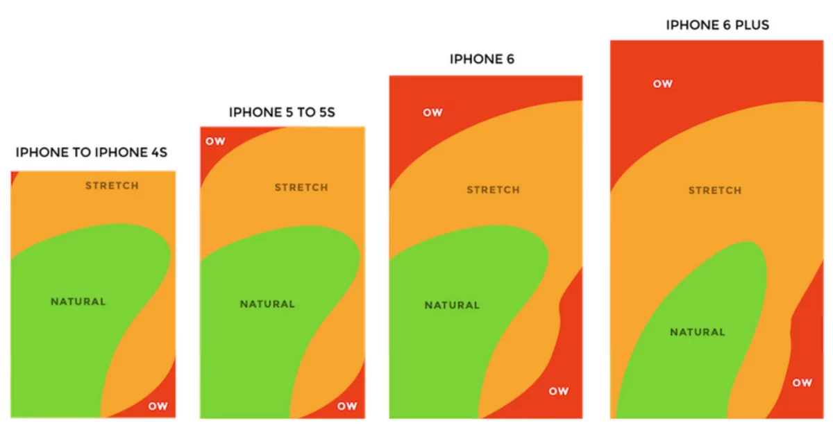
Source: Bootcamp
When in doubt, it’s best to stick with bigger buttons and elements. And you can only do that if you have a streamlined UI design with plenty of space.
UX design is full of pitfalls and mistakes that new developers tend to make. Here are some of the most common.
No matter how good you think your UX is, you really won’t know for sure until you run it by your users.
That’s why you should never skip usability testing.
Usability testing is a non-functional test focused solely on UX metrics, such as user-friendliness, UI design, and app flow.
Unlike your other internal testing methods, a usability test involves your end users as participants.
The main benefit of a usability test is that it helps you uncover problems and spot opportunities in your design.
You might even learn something new from your users that you can incorporate into your UX.
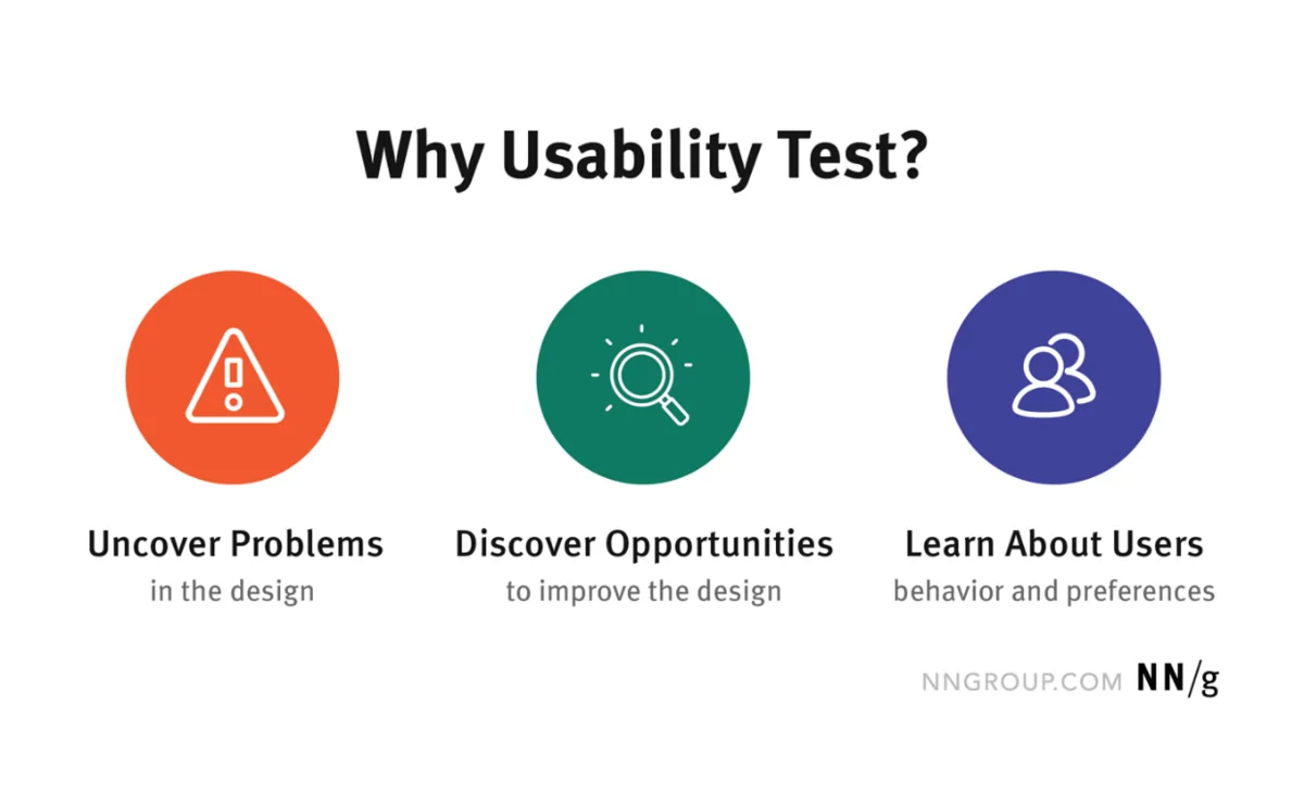
Source: Nielsen Norman Group
You’d also want to do usability testing to evaluate your app on different devices and dimensions.
That way, you’ll see if your design breaks on certain screen sizes, which will enable you to fix it before launch.
Testing on an actual device also helps you check the responsiveness and stability of your app. At the very least, it will help you define the minimum requirements for installing it.
Our suggestion to do usability testing emphasizes the importance of feedback in app development.
The reality is that you need insights from your users to help improve your app. It helps prevent confirmation bias, or the tendency to let your beliefs influence your decisions.
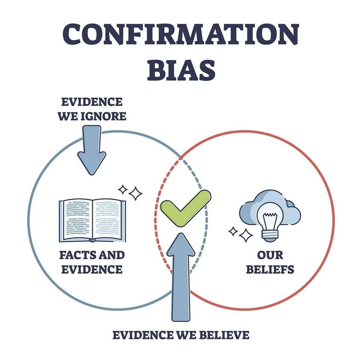
Source: Simply Psychology
As a simple example, say you believe that red is the best color scheme for your banking app because it’s exciting.
In reality, however, your users may think it’s very jarring and loud. If you don’t seek feedback, then you’ll never realize this.
Of course, it’s human nature to be defensive when others criticize your creation.
That’s why cultivating a be glad to fail mindset is important. It helps you embrace the fact that failures and mistakes are actually beneficial if you want to create a successful app.
As a result, you end up welcoming feedback and not blocking it.
Feedback is also important because of one fundamental fact of app development: you won’t get it right the first time.
Chances are, the first UX design of your app won’t be the best one. It will most likely be riddled with mistakes, issues, and bugs.
And that’s okay. In fact, it’s normal.
The best developers know this. That’s why they build their app using a feedback loop.
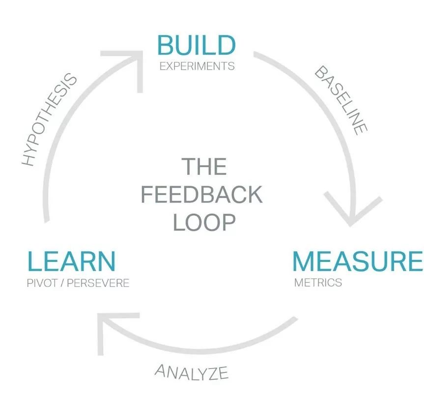
Source: Prototypr
The idea is that an app should be built rapidly using a prototype or MVP. You then test this early app version with stakeholders and end users to get their feedback.
Finally, incorporate the feedback into a new app version, and test it again.
Repeat this process until you arrive at an app you’re happy with.
Using this approach helps you save time, money, and effort in the long run. After all, you don’t want to spend years on your app only to discover that users don’t like it!
Speed and responsiveness are two of the most crucial metrics in an app. Indeed, a study shows that 63% of users would uninstall an app that took more than five seconds to load.
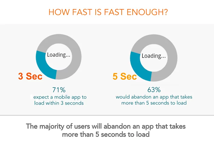
Source: APM Digest
Thus, you should strive never to let your users wait for your content to load. This is especially true during onboarding because that’s people’s first impression of your app.
Fortunately, there are plenty of ways to speed up the app. These include simplifying the code, compressing images, and updating third-party plug-ins.
You should also consider using content delivery networks (CDN) to reduce app latency.
However, reducing loading times to zero is impossible, as certain factors, like network delays, are outside your control.
The best UX approach here is to give the impression of speed—or, at the very least, entertain users while they’re waiting.
The easiest way is to have an engaging loading screen, like the ones you see in mobile games.

Source: Doc Pop
Having an interesting loading screen helps keep users’ minds off the fact that they’re waiting. Plus, it shows that your app is doing something, not just frozen.
Sending permission requests to the user can be a double-edged sword.
On the one hand, they’re often required for an app to work properly. For instance, a photography app would need permission to access the camera.
But asking for too many permissions too early can overwhelm the user. It’s like proposing to someone on your very first date! In both cases, you need to establish trust first.
Timing and context are critical when sending permission requests. And this handy guide by Google can help you decide when to send them.
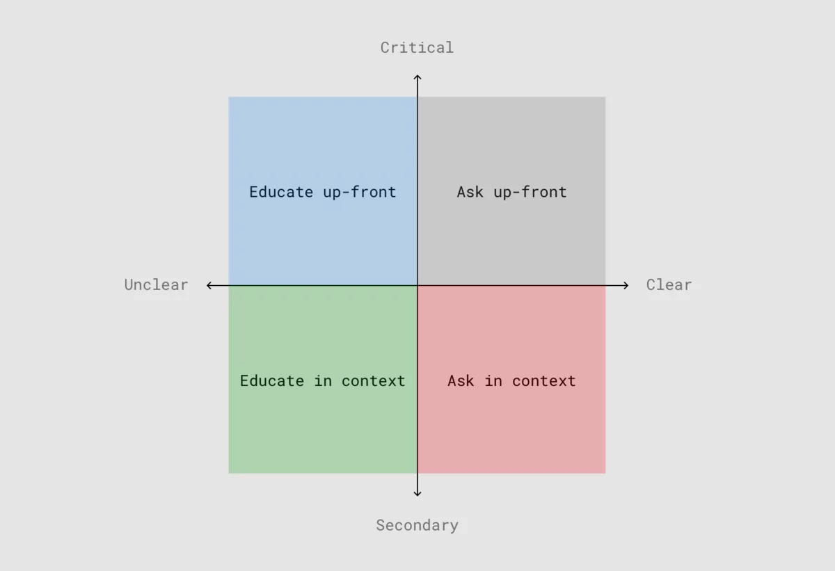
Source: Google
The above diagram suggests dividing permission requests into critical and secondary categories.
Critical permissions should be asked upfront because they’re essential to an app’s core function.
On the other hand, secondary permissions should only be requested the moment the app needs them.
In either case, certain permissions requests, particularly those that may be unknown or unclear to the user, warrants education first.
For example, the Emma app explains why turning on notifications is a good idea.
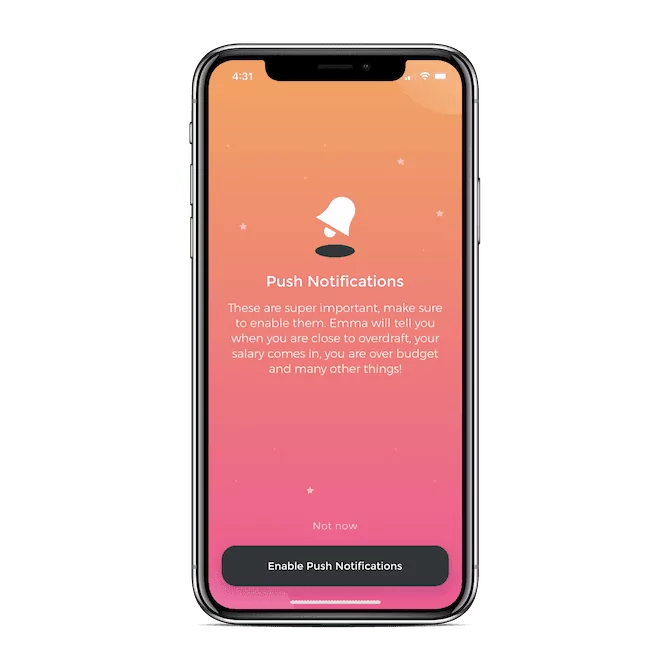
Source: Telerik
Educating users is the best way to get a positive response, especially if you focus on the benefits they’ll get.
At its core, UX is pretty simple. It’s simply creating something that users will enjoy using.
Of course, achieving that goal isn’t always straightforward. There are dozens of micro-decisions that you need to get right to reach it.
Nevertheless, we hope this list has started you on the right path to having great UX in your app.
Need help with your app’s UX? Get in touch with us today, and see how we can make a difference.

Petar leads Shake (DECODE’s sister company) as CEO, delivering the product to a growing number of happy, innovative clients. Day-to-day, he ensures the engineering, design, product, marketing and sales teams all work in harmony. Before moving to Shake, Petar led DECODE. Although an engineer by schooling, his natural talent soon saw him making an impact on the marketing, sales and branding side of things. Petar’s passions include architecture, skiing, sailing, and a good glass of red wine.
In this article, we'll reveal seven thrilling mobile app design trends we feel you should know about.

UX and UI design can take lots of effort and resources, but it’s all worth it in the end. In this article, we'll discuss five UI/UX app design benefits.

All you need to know about the process of app design.