
7 thrilling mobile app design trends to know about
In this article, we'll reveal seven thrilling mobile app design trends we feel you should know about.
Look at a visually pleasing app like Duolingo and Waze, and you’ll hardly be able to determine the effort that went into the design.
After all, it’s just a few simple components and icons put together. How difficult could it be?
But it turns out that even the most minimalistic app design takes months of ideation, testing, collaboration, and refining to get right.
The process behind designing an app is anything but simple.
If you have an app project in the works, heads up! Here are the steps needed to achieve a great mobile app design.
Before you design your UI, you must polish your user flow first.
Flow is how users move from one screen to another. Put another way – it’s the series of steps people must take to accomplish anything in your app.
Here’s an example of the flow of ordering food in a delivery app.
A user begins by logging in to the app. It then shows a list of available restaurants in his or her area. The user can pick an establishment she or he wants, and it will show the menu.
They can select items from the menu and add them to their cart. Finally, he or she checks out, enters his delivery information, and pays for the order.
After laying out the steps, it helps to turn them into a user flow diagram. It looks similar to this:
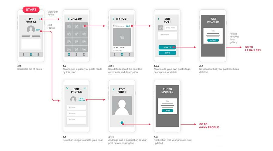
Source: Mockplus
Flows are essential to optimize your app’s UX. With a flow diagram, you can easily visualize the steps for every task and feature.
This allows you to plan exactly the screens and assets you need to design, saving you tremendous time and effort.
Another benefit of this diagram is that it helps you uncover any issues with your app flow that may lead to friction early.
Friction is any obstacle that hinders the user experience. It occurs at three different levels:
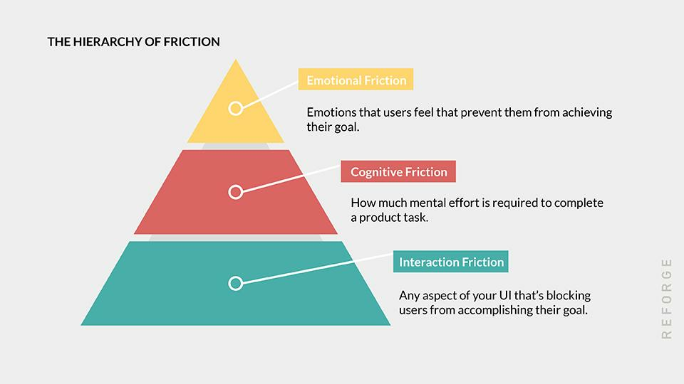
Source: Reforge
User flows are great at detecting and fixing friction issues at every level.
For instance, one of the most common UX issues is having too many unnecessary steps from point A to B.
It mostly causes interaction friction, hindering users from accomplishing a task efficiently.
But it could also cause cognitive friction as it requires more mental effort, and emotional friction as it could cause frustration.
With an app flow diagram, you can spot these issues and eliminate these friction sources in one go.
Hence, taking time with your app flow diagram is important. And don’t expect to get it right on the first try. It would be best if you iterated through it to refine your user flow.
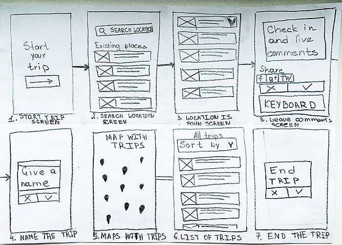
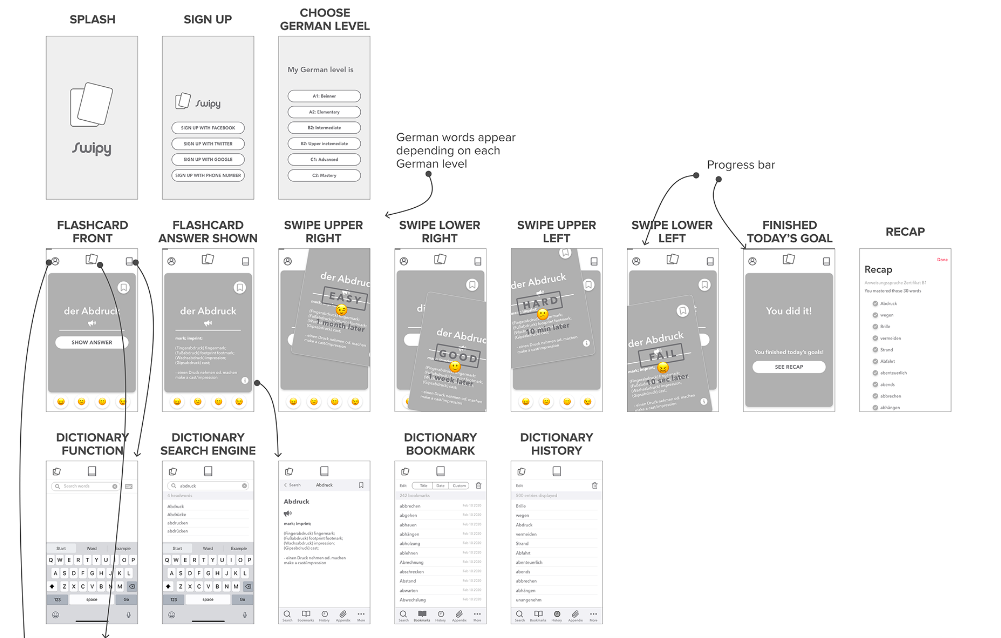
With your app flow ready, the next step is to start fleshing out the individual screens. To do this, start by doing a low-fidelity wireframe.
Think of a low-fidelity wireframe as your initial outline. It tells you roughly the content, layout, and purpose of each screen in your app.
Source: DECODE
The primary purpose of a low-fidelity wireframe is to visualize your app idea rapidly so other people can give you feedback. These insights are crucial for refining your app idea further.
Wireframes also allow you to spot potential issues and bottlenecks with your UI.
And once approved, a low-fidelity wireframe can be the foundation from which you can build your final app design.
By definition, low-fidelity wireframes should be composed only of simple shapes representing UI elements and content.
Images and graphics aren’t appropriate at this point because they take too much time to create.
Remember, you want to create and revise your wireframe as quickly as possible, so you can rapidly optimize your app design.
It’s also why we believe you should start your low-fidelity wireframe as a simple sketch.
Source: Agente Studio
Sketching (or paper prototyping) is beneficial because you can do it anytime and anywhere. You don’t need to learn complex software or tools—you just need paper and a pencil.
And revising your sketch is as simple as erasing it.
Jakob Nielsen, often dubbed the king of usability, is also a champion of sketch wireframes.
According to him, they help make your design 100 times cheaper since you can spot and fix UI issues early.
It’s also a good idea to put annotations in your wireframe. These are text labels that clarify certain elements in your UI.
You can also use annotations in your wireframe to specify user gestures, UI behaviors, and hidden components.
This enables you to depict dynamic elements in an otherwise static illustration.
Here’s an example by UX designer Risa Nakajima. Notice how easy it is to visualize the final product.
Source: Risa Nakajima
The point of a low-fidelity wireframe is clarity. It enables you to lay out your vision clearly, so you can collaborate with others to optimize it.
After you have a low-fidelity wireframe that you’re happy with, it’s time to turn it into a high-fidelity wireframe.
A high-fidelity wireframe is a more polished representation of your app.
It should already contain elements close to the final app design, such as graphics, images, icons, color schemes, and content.
The goal here is to evaluate your app’s UX and spot and fix nuances and minor errors in the layout.
A high-fidelity wireframe is also great for showcasing your design to external stakeholders, who might not have the design-savvy to evaluate a low-fidelity sketch properly.
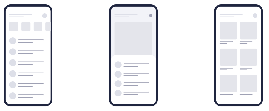
To give you an idea, here are depictions of a sketch, a low-fidelity wireframe, and a high-fidelity wireframe:
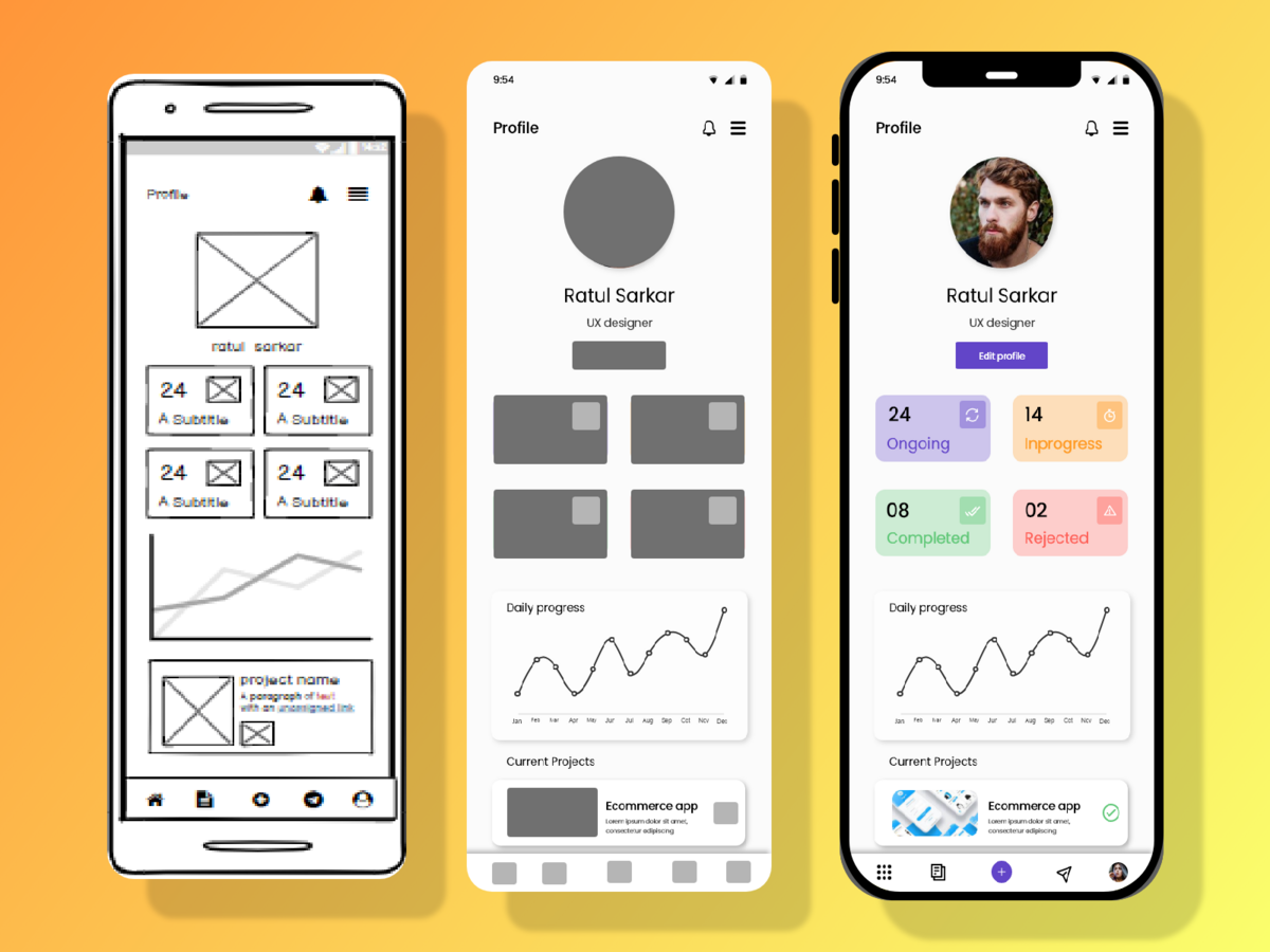
Source: Dribbble
A high-fidelity wireframe is where you start to pay attention to the visual hierarchy of your UI.
Visual hierarchy is the way you arrange the elements on the screen in order of importance through design. It helps direct your user to the most crucial UI elements.
For instance, the heading usually has a bigger font because it should be the first thing a user must notice.
It’s also good to move away from dummy text (lorem ipsum) and use real copy in your wireframe.
It doesn’t mean you have to use the actual content, but it should be a close representation.
Using real copy helps you approximate the space you’ll need for the text in your final UI design. It helps avoid clutter with long text blocks, such as this:
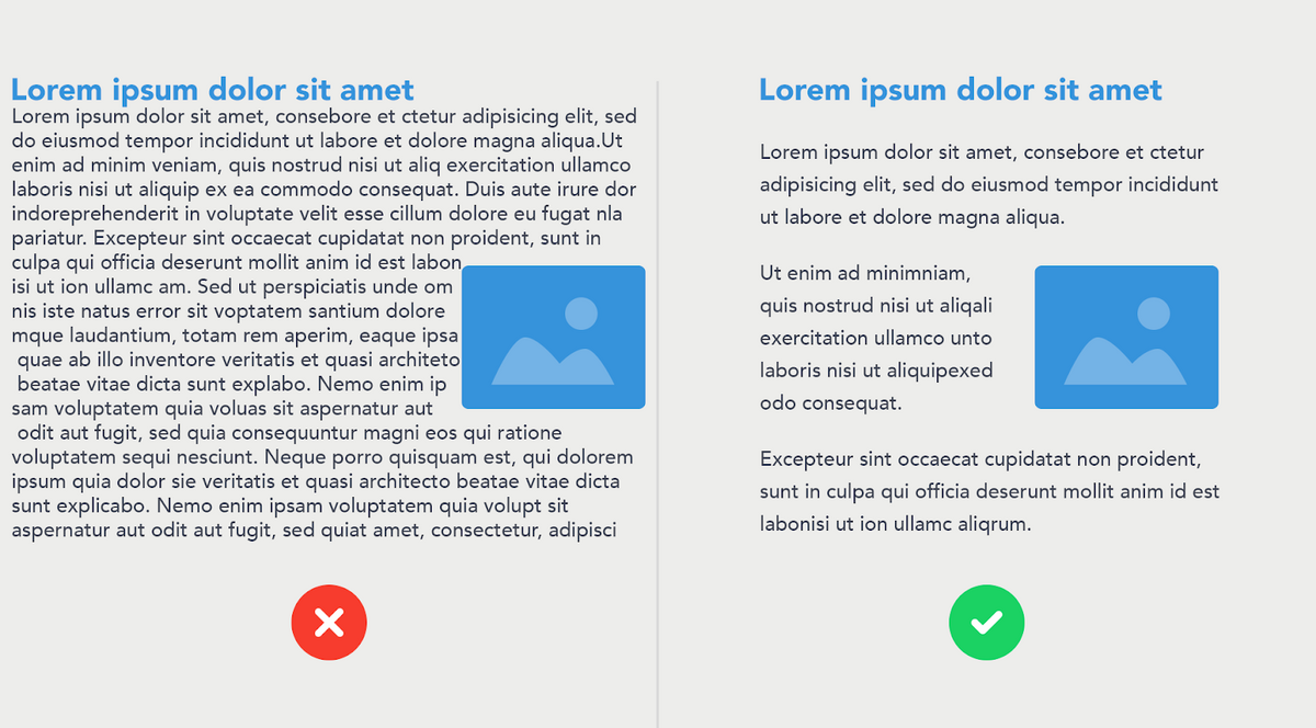
Source: PSD2HTML
You can also make your high-fidelity interactive, which makes it a prototype.
A prototype is great for testing usability and giving insights to refine your UI design.
For instance, if you find out that most users are having trouble making an app gesture, you can include a button as an alternative.
But probably the best benefit of a high-fidelity wireframe is that it clearly communicates what the app should look like. This can guide developers and designers on what they need to do.
With an approved high-fidelity wireframe on hand, it’s time to create the actual app design.
This is where you create the actual assets that you’ll include in the final app. You should also decide on design aspects like color, layout, icons, images, illustrations, and sounds.
A high-fidelity wireframe is where you apply app design principles like shape patterns.
Shape patterns describe how a typical user scans through a page. The idea is to place key elements on the fixation points so users can immediately notice them.
There are two common patterns, the F-shape and Z-shape.
The F-shape is best used for UI layouts with large blocks of text, such as articles. The Z-shape, meanwhile, is ideal for UI screens with more visuals.
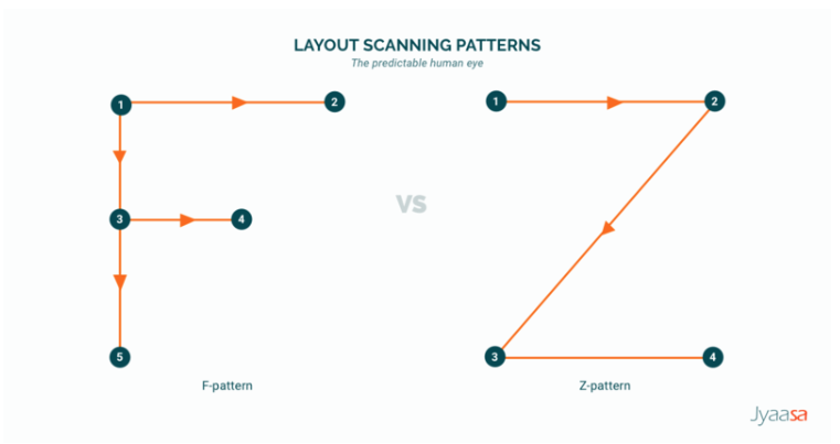
Source: Line Design Medium Page
You should also design your interface to account for one- and two-handed operations because this can influence where you place certain UI elements.
Specifically, you should watch out for the thumb zone, which is the area of the screen users can comfortably reach with their thumb.
Ideally, key elements like navigation icons should be within it.
The problem is that this zone (depicted in green below) varies depending on the grip, so you must find common ground that works for all your users.
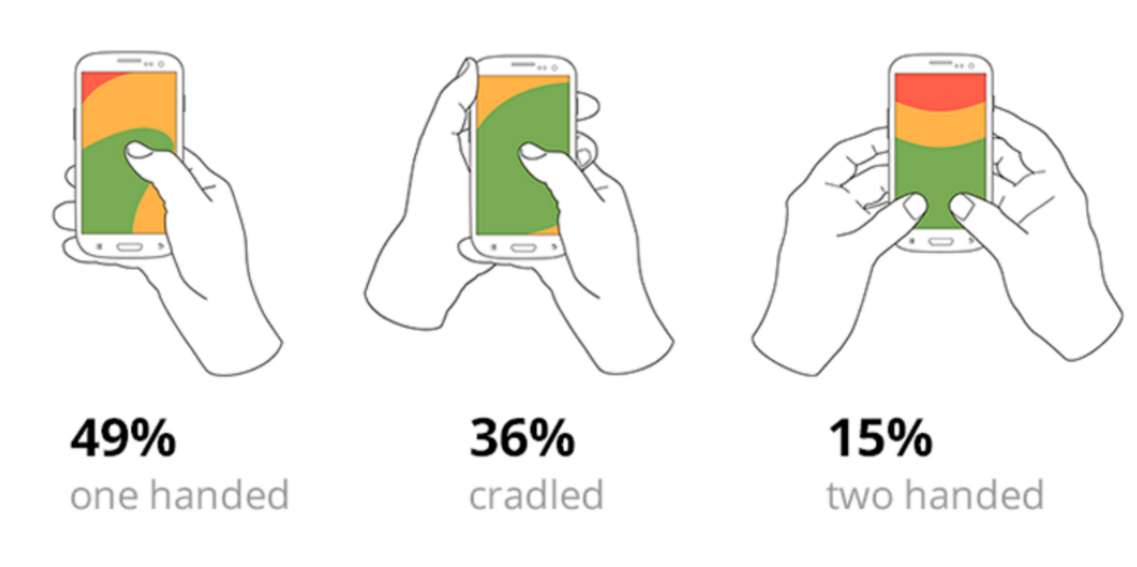
Source: Bootcamp
However, many designers overlook the design nuances between iOS and Android.
They might be subtle, but tampering with them is risky. That’s because most users will be so used to them that changing them can be jarring and unfamiliar.
Thus, it’s best to stick with them as much as possible.
One good example is the navigation system between the two operating systems, as shown below:
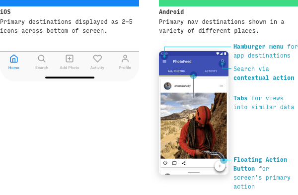
Source: Learn UI Design Blog
These are just a few tips for designing great app UIs. There are many more best practices that we cover here. You should also watch out for the common design mistakes you should avoid.
With your UI design ready, all that’s left is to pass it off to developers to implement it in the final app. However, it’s not as straightforward as sending them a file and calling it a day.
Before the hand-off, you have to create product specifications.
Product specifications are a kind of guide that tells developers the exact requirements of the design assets to be used in the app. In other words, creating this guide enables developers to implement your design accurately, with zero room for interpretation.
Important information in a product specification includes dimensions, file formats, color hex codes, and font names.
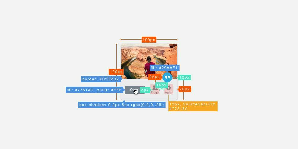
Source: Phase
Product specifications are also vital for showing the different states of your UI components, which might not be readily apparent when looking at your design or wireframe.
Button states are a good example. Well-made product specifications should show what the button looks like when active, pressed, or disabled.
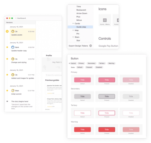
Source: Zeplin
You can create a product specification document yourself easily.
Alternatively, some tools, such as Zeplin, can automatically generate a specification from your existing design once you export it to a developer.
Once your product specifications are ready, you have everything you need to submit your design to developers.
However, you need plenty of preparation if you want the process to go smoothly.
Your biggest obstacle is communication. Remember that developers and designers are in separate worlds, each with their own jargon and way of interpreting things.
A successful hand-off must bridge this gap to ensure that both teams are on the same page.
While we’re on the subject, here’s what Avani Miriyala, founder of Matcha Design Labs, had to say about why a successful hand-off is so important:
Product specifications facilitate this at a certain level, but there are more steps you can take.
First, don’t just send the design assets via email or cloud storage. Instead, have a formal hand-off meeting.
Explain the UI design in detail, including your expectations. This is also an opportunity to ask questions and clarify issues.
And don’t just end it with one meeting. Have several over the course of development.
Communicating with the developers throughout the development process, not just during hand-off, is also advisable. Admittedly, this takes more conscious effort and planning to execute.
One approach you could use is called the Hot Potato Process, shown below:
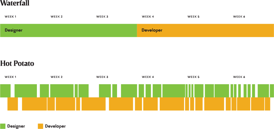
Source: Dan Mall / Adobe
Here, you constantly toss design ideas back and forth. That way, the developer is already familiar with your requirements at hand-off.
You should also establish a dedicated communication channel with the development team. For instance, you can use a platform like Google Drive or Dropbox for sharing files.
Finally, be prepared for any contingency.
You might discover that one of your design elements might not be feasible to code. In this case, collaborating with developers on the best solution is key.
We hope you’ve gained a deeper appreciation of what goes into an app’s design. It truly is no small feat!
But as challenging as designing is, that’s just one part of the process. There’s also app coding, testing, deployment, and marketing that you need to worry about.
To pull that off, you need an experienced agency like DECODE to back you up.
We have the expertise and track record to help make your app a success—be it development or design.
Interested? Get in touch with us today, and let’s discuss your project!

Petar leads Shake (DECODE’s sister company) as CEO, delivering the product to a growing number of happy, innovative clients. Day-to-day, he ensures the engineering, design, product, marketing and sales teams all work in harmony. Before moving to Shake, Petar led DECODE. Although an engineer by schooling, his natural talent soon saw him making an impact on the marketing, sales and branding side of things. Petar’s passions include architecture, skiing, sailing, and a good glass of red wine.
In this article, we'll reveal seven thrilling mobile app design trends we feel you should know about.

There's no easy way to achieve great UX design. This article will discuss mobile app design best practices to help you create a successful app.
Design is a critical element of mobile app development. Without a user-friendly and intuitive mobile design, it’s nearly impossible for an app to enjoy any market success.