

Do’s and don’ts of mobile UX design
In this article, we will talk about the fundamentals of the mobile UX design, specifically about do's and don'ts.
Color is perhaps one of the most powerful aspects of UX design.
Indeed, research shows that 90% of first impressions of a product are based on color.
The right colors can evoke emotions, spur your user to action, or even change their beliefs. Unfortunately, the opposite is also true—misusing a color palette can ruin your UX.
Picking a color for your app might seem trivial. However, there’s actually much consideration that goes into this decision.
From looking at the cultural beliefs of your target audience to using color scheme generators properly, here’s how to choose the best palette for your mobile app design.
The first step in determining your color palette is to research your audience and determine how they perceive different colors so that you can use the appropriate ones for your app.
See, while each person will have their favorite colors, you’d be surprised by how universal some choices are.
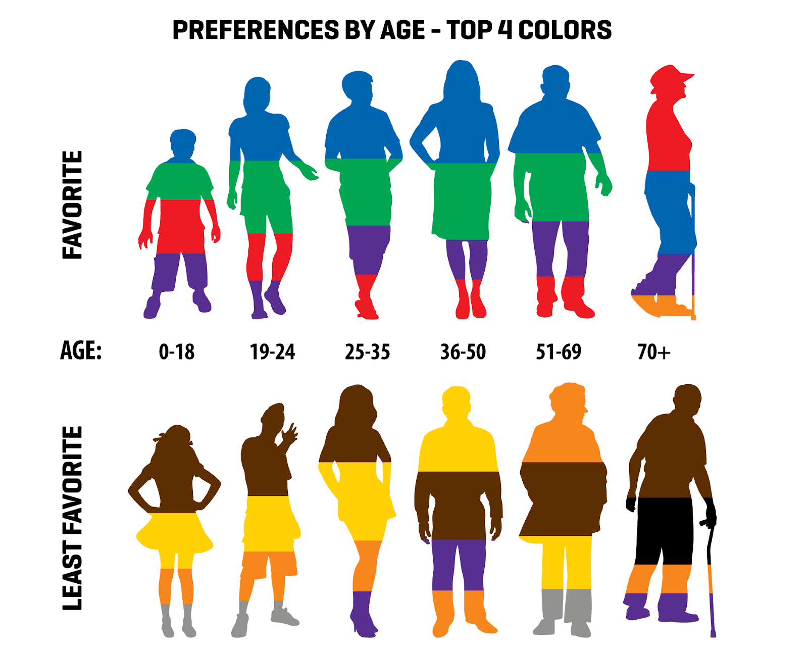
For instance, several studies have shown that people of the same age tend to have similar color preferences.
Here are the results of one survey that’s been ongoing since 2011:
Source: Hot Design
You’ll also realize that color preferences tend to change as we grow older.
Notice how people cite blue as their favorite color most of their life but suddenly shift to red once they reach an advanced age (over 70 years old).
But age is just one factor. Gender also plays a role. Here’s a study by Joe Hallock that illustrates this:

Source: AZ Design
From both studies above, you’ll see that blue is a universally loved color, which is why it’s a safe bet when designing your apps.
The reason is that blue is commonly associated with safety and tranquility—desirable qualities at any age and gender.
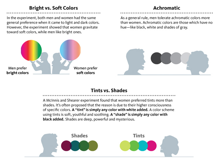
But the type (whether blue, red, etc.) is just one aspect of color. There are other things like tints, shades, and vividness, which also affect perception.
For example, a follow-up study in 2007 discovered that males prefer brighter colors while women prefer softer colors.
Hence, if you were to create an app aimed mostly at women, going with softer colors is ideal.
Source: Digital Synopsis
An interesting thing about these studies is that respondents came from various countries, meaning color choices tend to be universal worldwide.
However, that doesn’t mean you should disregard the impact of culture on color choices because they can be significant.
For instance, red is commonly used in UI design to connote danger or a warning. But in Asian cultures, it’s often a symbol of happiness and celebration.
On the other hand, in Latin American cultures, it could mean conflict when combined with black.
It’s, therefore, crucial to double-check the cultural significance of your color scheme to avoid offending some of your users.

Source: Colours and Materials
Ultimately, these findings are just guidelines. It’s still best to get the exact color preferences of your target audience through market research methods like surveys and interviews.
A simpler alternative is to look at the colors your competitors are using.
Studying your competitors is a must when doing market research. And more than giving you ideas on how to refine your app idea, you could also glean insights about color usage.
In other words, you can review the successful apps in your niche and check what colors are working for them.
You can easily do this by going to the Apple App Store or Google Play Store and checking the top charts in your chosen category.
Alternatively, you could also search for apps using relevant keywords.
Icons are a great shortcut for comparing the color schemes of different apps at once because icon color tends to be the same as UI color.
Let’s take this listing of top fitness apps in 2020 as an example:

Source: Mobile Action
You’ll notice that the vast majority of exercise apps use the red and orange color scheme. No surprise there, as they give the impression of energy and activity.
So, using the same colors is a good idea if you’re building your own fitness app.
However, adopting isn’t always the best approach. Sometimes, you want to know what everyone’s using so you can be different and stand out.
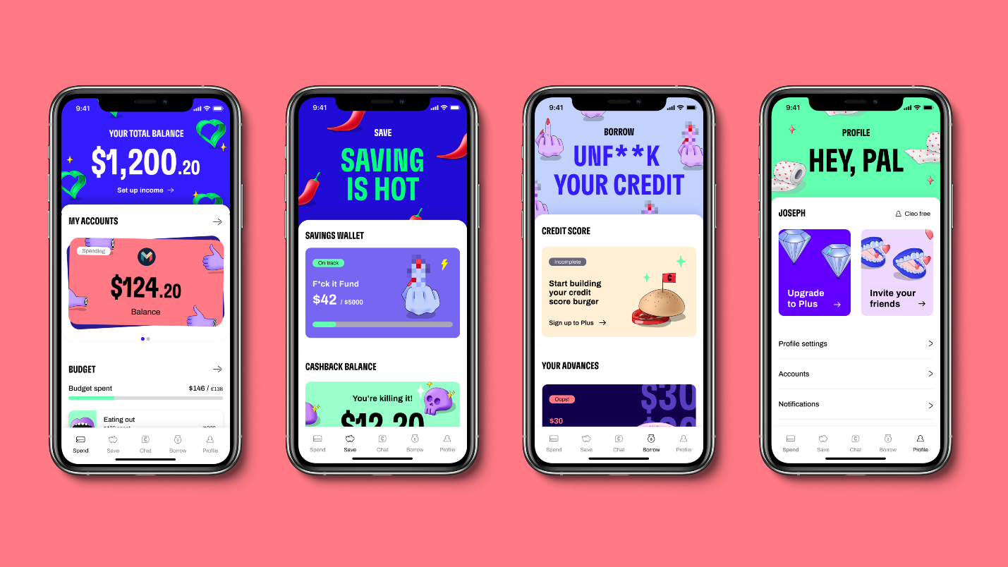
Take the neobank Cleo.
Source: Lauren Rowe
The UI design veered away from the typical blue or white color schemes of financial apps. Instead, it opted for a bright and colorful palette.
It was an intentional move to showcase the fresh and irreverent nature of Cleo.
So, if you want to aim for the same vibe in your app, you already have proof of concept.
Ultimately, that’s the advantage of checking your competitors. It allows you to evaluate if your color scheme works for your target market—without doing it yourself.
Minimalism is a crucial principle to consider if you want to achieve the best palette for your app. That’s because it helps prevent your UI design from becoming a colorful mess like this:

Source: Sitepoint
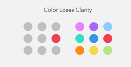
The main way to achieve a more minimalist approach and avoid this eyesore is to use visual hierarchy.
Visual hierarchy is the practice of arranging UI elements based on importance by emphasizing crucial areas like the headline. And one of the primary methods of doing this is through color.
For example, notice that most call-to-action (CTA) buttons use a bright color like red or green to stand out.
But it can only achieve this if no other surrounding UI elements use the same hues, as the illustration below shows.
Source: UX Movement
Thus, you should limit your UI design’s palette to a maximum of four colors, then rely on whitespace or monochromatic hues for everything else.
One would be the primary or dominant color you’ll use most in your app design. Examples would be the title bar or menu icons.
The primary color is often derived from your brand colors, and it’s a great way to enforce your branding throughout the app.
You can also use various shades of your primary color to have more options in your design.
For example, notice how the UI design below uses different shades from only one primary color. That way, you can stick with one palette but still create enough contrast between elements.
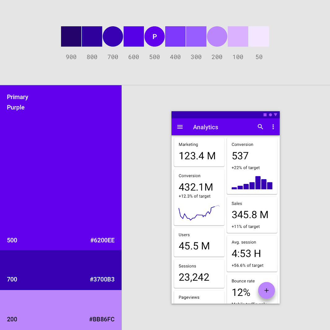
Source: Material.io
The other colors are secondary, and used to accent certain elements such as buttons, switches, or text selection highlights.
Because they’re only used as accents, secondary colors should be used only sparingly.
Remember, they shouldn’t compete with your primary color, or else it would break your visual hierarchy.
There are exceptions, of course.
Black or white is almost always used for body text, thanks to their legibility. And some colors are universal, like red, for denoting errors.
According to research, people make snap judgments about a product within the first 90 seconds of seeing it.
And a lot of these split-second decisions are based on color psychology.
Color psychology is the emotional effect colors have on people. This is powerful for a UI designer since you can alter a user’s state and mood by using the right colors.
At the core of color psychology is the notion of warmth and coolness.
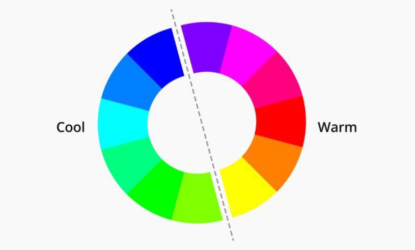
Source: Glovory Design
Warm colors are generally considered more dynamic and active. However, they can evoke either happiness and passion or danger and hostility.
Cool colors, on the other hand, are calmer and more soothing. But they could also be used to represent sadness.
But these are just broad strokes.
Specific colors also have their associated emotion and mood. Check out this chart:

Source: Huffpost
Once you know color psychology, you’ll begin to understand why some apps gravitate towards one color over another.
For example, notice that many financial apps use blue as their primary color. That’s because blue gives a feeling of trust and reliability, which is important when handling people’s money.
On the flip side, fun apps like games often use a red or orange palette. That’s because both are warm colors, meaning they’re dynamic.
Not only that, but they also evoke feelings of excitement, friendliness, and confidence in the user.
Color psychology can even influence users’ actions to help drive conversion rates.
For instance, this research shows that red is the most effective color for a buy button because it evokes a sense of urgency.
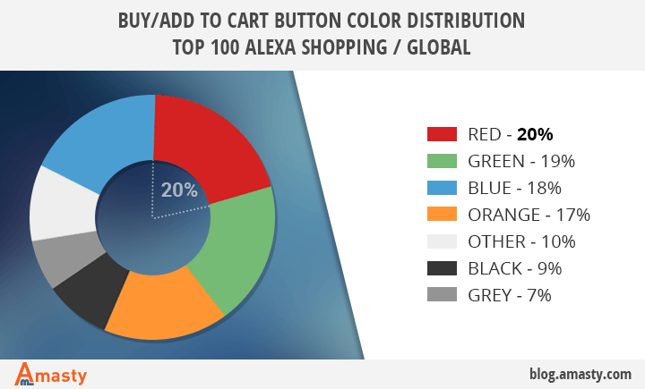
Source: Amasty
But as with anything else, these findings aren’t hard and fast truths.
For example, when the researchers conducted the study above in the consumer electronics industry, a green buy button drove the highest conversion.
Ultimately, combining color psychology with solid market research will deliver the best results.
In most cases, apps in the same category tend to share similar color palettes. Thus, it’s a good idea to adopt the same palette as the other apps in your niche.
Following the color conventions of your chosen app category isn’t just trendy. It helps users to associate your app with other apps in your niche. In most cases, it serves a practical purpose.
Take social media apps. Notice that most of them have a blue color scheme:

Source: Dew Solutions
Blue is popular because it goes well with text, which social media apps have in abundance. Furthermore, many users are already familiar with social media going with a blue palette.
Another example is the trend of delivery apps using red hues.

Source: Apptunix
Remember that red is associated with energy and speed, which are desirable qualities for delivery services.
Furthermore, red can also instill hunger and appetite in a person, which is why many fast food restaurants use the color.
Using red in your delivery app is like borrowing these already established qualities. People would come to expect that your app provides a fast service.
The only thing you need to do is to deliver on that promise.
Now, breaking the color convention of your category can be risky, but there are situations where it could be wise.
One good example is if you want to stand out among a sea of apps with the same hues.
But in most cases, it’s easier (and safer) to stick with what’s working.
Palette generators are arguably the most useful tool for deciding which color to use in your UI design.
The truth is that picking a group of colors that go well together is no easy feat. The science of doing this is called color theory.
At the heart of color theory is the color wheel, a circular diagram that arranges colors strategically, like so:
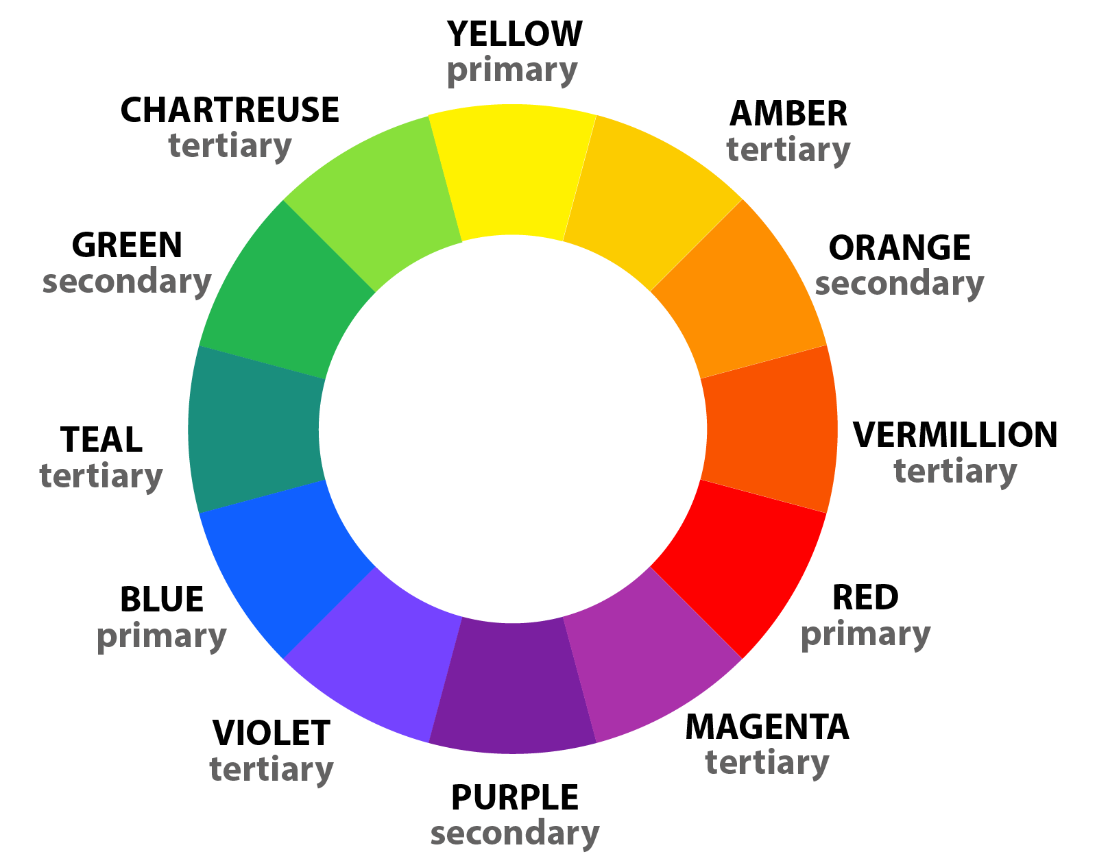
Source: Color Meanings
To pick colors, you can use different color schemes, depending on the effect that you want to achieve.
For example, a monochromatic approach picks shades from only one color (such as dark purple and light purple from purple). This is great for minimalistic designs.
On the other hand, a complementary approach picks two opposite colors in the color wheel.
Complementary colors deliver stark contrast, which helps make elements stand out in the design.
If you want to balance three colors in a design, you could consider picking triadic colors.
Indeed, there are other methods to choose from:

Source: Interaction Design Foundation
It seems like a lot to keep in mind.
But the main benefit of a palette generator is that it automates the process for you.
You can pick which method you want, and the software will choose the right sets of colors for you with minimal guesswork involved.
Some generators even have a random feature so you can browse through color palettes for inspiration.
Fortunately, there’s no shortage of color generators online, both paid and free. Good tools to start with include Coolors and Muzli Colors.
No doubt picking the right colors can do wonders for your app’s UX.
But that’s just one aspect of it. Achieving excellent UX is tricky and challenging, with many best practices and pitfalls to remember.
And the best way to prepare for this is by acquiring knowledge.
For further reading, we suggest going over the top UX mistakes to avoid. You can also familiarize yourself with the top UX trends that could help your app succeed.

Petar leads Shake (DECODE’s sister company) as CEO, delivering the product to a growing number of happy, innovative clients. Day-to-day, he ensures the engineering, design, product, marketing and sales teams all work in harmony. Before moving to Shake, Petar led DECODE. Although an engineer by schooling, his natural talent soon saw him making an impact on the marketing, sales and branding side of things. Petar’s passions include architecture, skiing, sailing, and a good glass of red wine.
In this article, we will talk about the fundamentals of the mobile UX design, specifically about do's and don'ts.

In this article, we'll reveal seven thrilling mobile app design trends we feel you should know about.

UX and UI design can take lots of effort and resources, but it’s all worth it in the end. In this article, we'll discuss five UI/UX app design benefits.