
App design process: The ultimate guide
All you need to know about the process of app design.
Like in fashion and architecture, app design trends tend to make a comeback.
Take minimalism, for example—it was the trend not too many years ago, before taking a backseat to dynamic and loud design.
But with consumers nowadays suffering from information overload, a return to a cleaner minimalistic UI was the natural direction.
That’s what a good design trend should be—adapting to the needs of the current market.
Here are seven other exciting app design trends we feel you should know about.
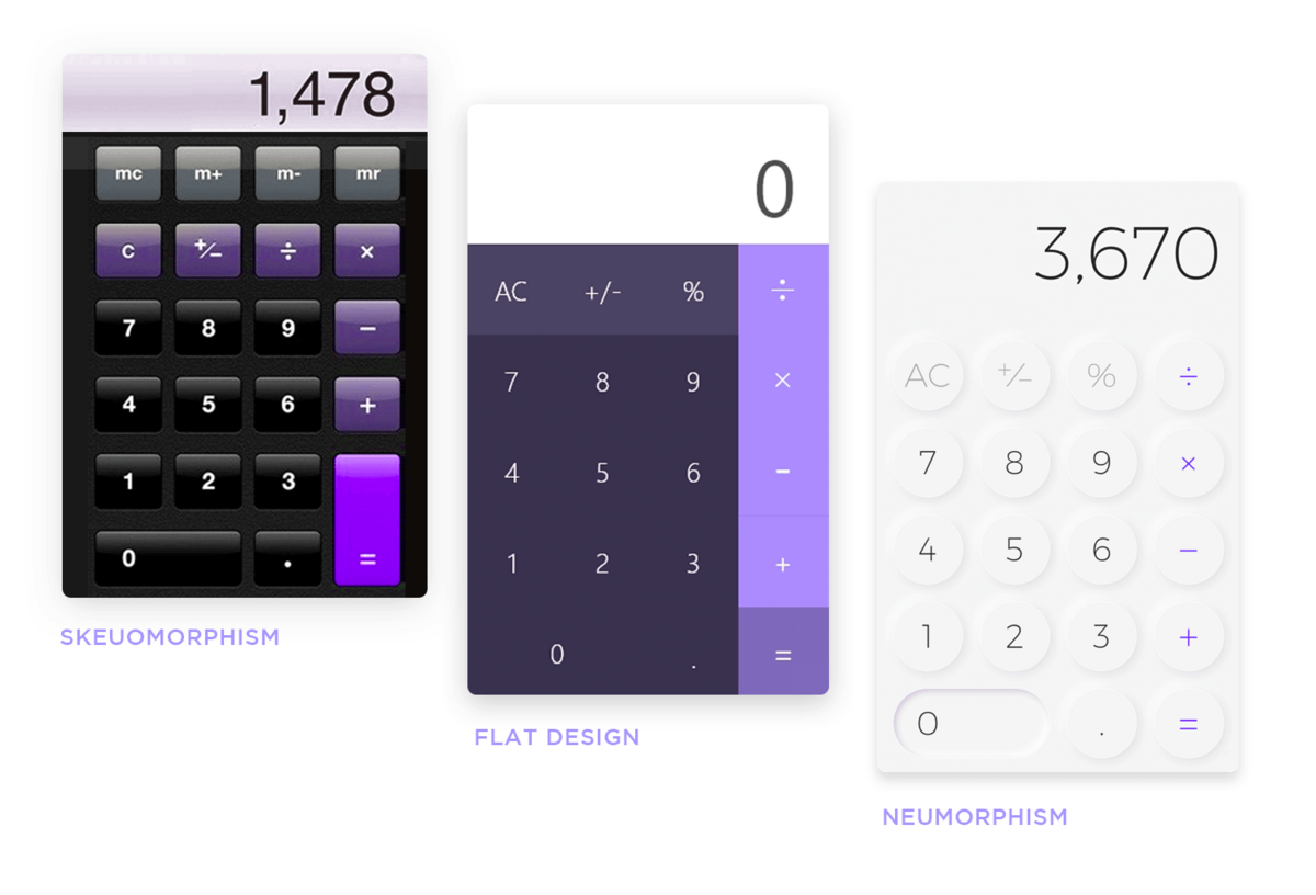
Neumorphism is a UI design trend focusing on simulated but not photorealistic-looking elements.
It’s a design approach born out of two trends that came before it—skeuomorphism and flat design.
In fact, neuromorphic design is best described as a cross between flat and skeuomorphic approaches.
Source: Just in Mind
A skeuomorphic design aims to simulate a real-life object as much as possible, thus its liberal use of shadows, highlights, and 3D effects.
Steve Jobs’s philosophy of mirroring the real world in his UI design led to Apple adopting this approach, which is why it was popular during the early years of smartphones.
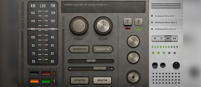
When taken to the extreme, skeuomorphism makes apps look like actual devices, such as this dashboard:
Source: Muzli
On the other end of the spectrum is the flat design approach, which favors minimalism and simplicity.
Developers and designers began to prefer it because it delivered a clean feel to the UI. Plus, it was easier and faster to implement than a skeuomorphic design.
Neumorphism combines the best attributes of these two trends into a new paradigm. It focuses on three key design principles.
The first one is low contrast. You’ll find that a neuromorphic design feels soft and contains minimal harsh lines or colors. This is meant to soothe the eye, making the UI visually pleasing.
Next is soft shadows. This is what differentiates neuromorphic from a flat design.
The addition of soft shadows creates a sense of depth, without aiming to look realistic because that often requires hard shadows that can break the soft aesthetic.
The third is a monochromatic color scheme. Neumorphism follows minimalistic design standards, sticking with only one primary color and a secondary hue (often white or gray).
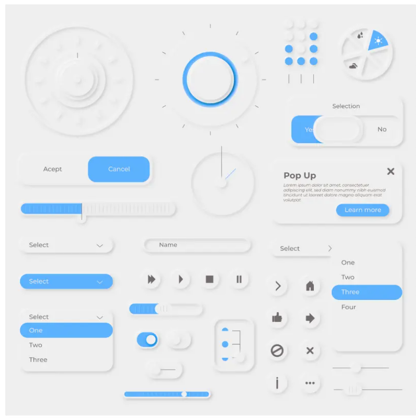
Put that all together, and you get designs like these:
Source: Net Solutions
Neumorphism isn’t without its skeptics. The biggest concern with this design approach is accessibility.
The low contrast can make it hard to navigate for people with visual disabilities, especially text.
Nevertheless, neumorphism can be a beneficial design approach for its minimalistic and soft aesthetics.
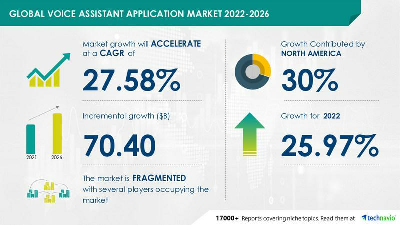
The introduction of Amazon Alexa and Siri has led to the popularity of voice-user interfaces or VUIs.
In fact, it’s one of the fastest-growing app trends in recent years. Insider Intelligence predicts that 48% of Americans will use this technology in the next three years.
And 42.7% of them will do it through a smartphone app.
Technavio released similar positive growth projections for the voice assistant market.
Source: PRNewswire
This trend should come as no surprise. Voice assistant technology can help make app interaction much more convenient.
Its hands-free approach is beneficial when handling a smartphone is disallowed or dangerous, such as driving a car.
For instance, the navigation app Waze enables drivers to interact with the app using voice commands. They simply have to announce their destination, and Waze will chart a course.
It makes driving safe—considering that smartphone use contributes to 1.6 million accidents in the US alone.
The appeal of VUIs is the wide range of use cases for them, according to a ComScore study.
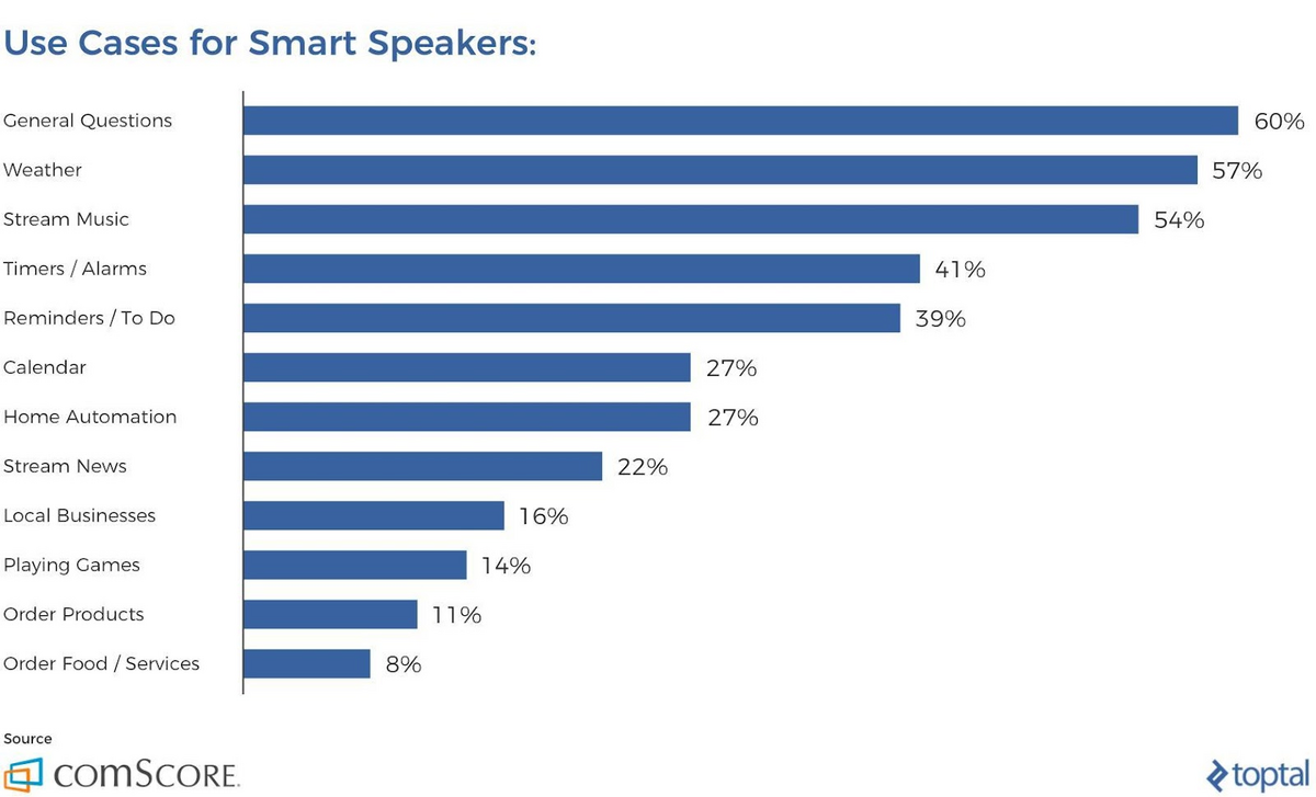
Source: Toptal
And the technology is getting smarter. For example, you can now book a restaurant reservation with Google Assistant via voice commands.
The app will then automatically call the establishment and attempt to reserve a table for you as if it were a real human.
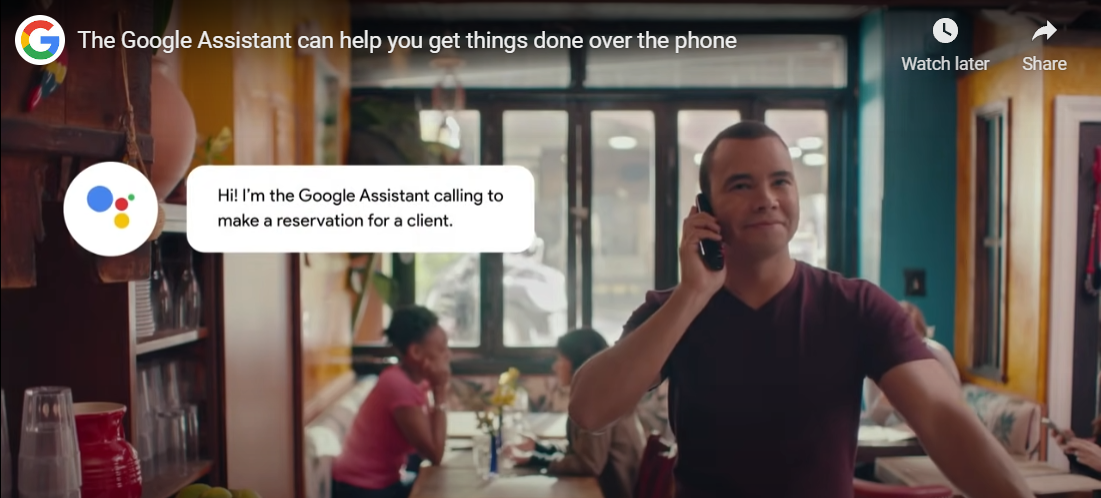
Source: Google
No doubt that AI, machine learning, and natural language processing will further innovate the voice user interface space. It might be wise to incorporate this feature into your next app.
Dark mode is one of the simpler yet wildly popular app design approaches.
A recent study shows that 81.9% of smartphone users prefer dark mode. And it’s also spilled over to web design, with 64.6% preferring it when they visit websites.
In short, people simply love dark mode, and for a good reason.
This display setting can effectively reduce eye strain by lowering the screen’s overall brightness.
It is especially beneficial for users that want to use their phone in a darkened room, where the excessive screen brightness can overwhelm the eye.
Dark mode can also help users converse battery life. That’s because it uses fewer bright pixels, which require more energy.
It can also help prolong the life of smartphones with OLED (organic light-emitting diode) displays.
Not to mention that dark mode can give your UI a cool and edgy feel.
Source: Mobindustry
Dark mode is the opposite of a standard UI. Instead of having dark elements on a white background, it has white elements on a dark background, thus giving it a distinct look.
Of course, not everyone prefers dark mode, which is why most apps allow users to toggle between dark and the standard light mode.
Some apps and OS even support scheduled dark mode, which only activates at night.
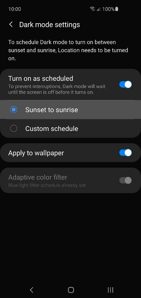
Source: Gadget Hacks
Dark mode might seem simple, but it can significantly impact usability and accessibility. It’s proof that you don’t need complicated solutions in app design.
With the advent of minimalism and neumorphism in app design, designers had to find creative ways to introduce multiple colors without cluttering the UI.
The solution was to introduce gradients.
A gradient is a smooth transition between two colors, creating various shades in between.
The example below shows a shade that occurs in the transition between blue and purple.
Source: Design Modo
A gradient is a good approach if you want to stick with a flat design but need to make it stand out better. It adds a nice accent to an otherwise boring UI.
While purely aesthetic, gradients can also serve a deeper purpose.
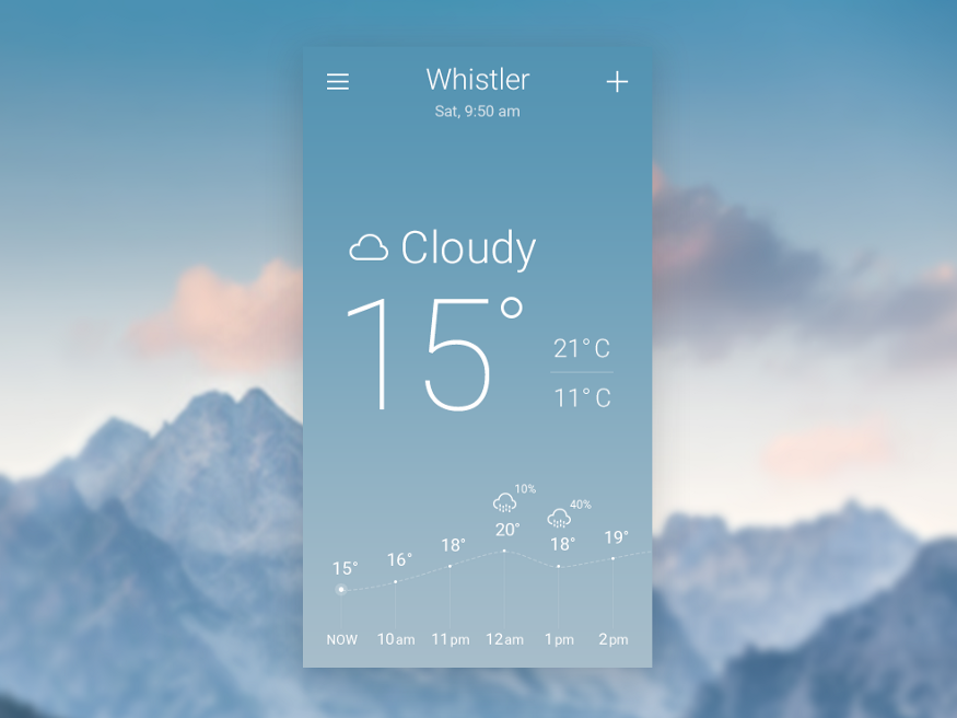
For instance, a weather app can use gradients to represent various sky colors reflecting the current weather conditions.
A sunny day can have a yellow to orange gradient, while a cloudy day can go for a subtle gray and blue.
Source: UX Planet
You can also use gradients to incorporate your brand colors into the UI design. Repeated viewings can help imprint your colors on the user’s mind, creating a psychological connection.
Of course, gradients can also convey emotions in your app, just like any color scheme would.
For example, a blue gradient creates a sense of calmness and trust, which is why it’s good for financial apps.
Source: Vandelay Design
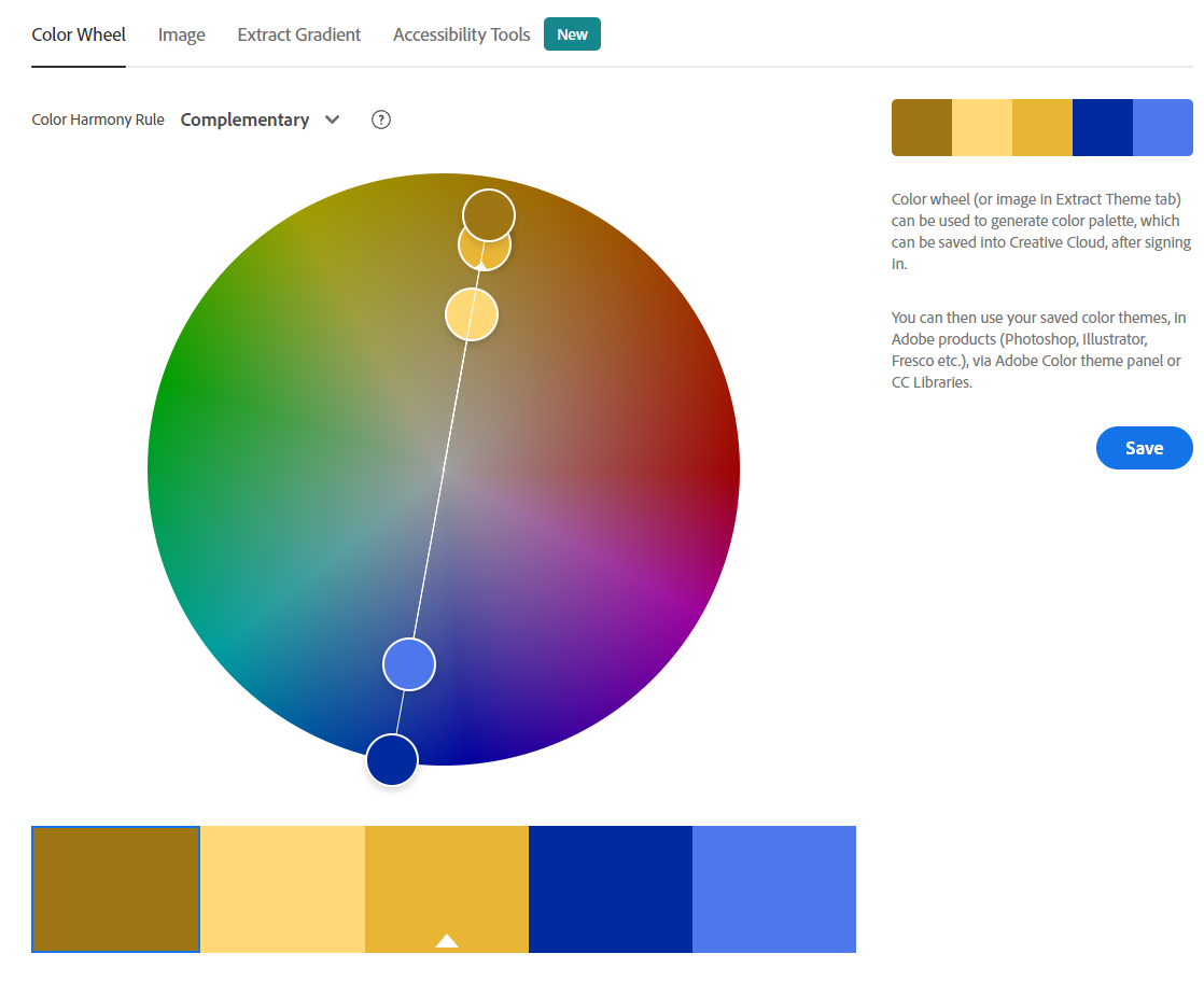
However, if you plan to use gradients, it’s crucial to do so properly. To be safe, always stick with no more than three complementary colors so they create harmonious shades in between.
You can use a tool like Adobe Color to help you choose the best colors to pair. The tool even gives you a preview to help you decide.
Source: Adobe
Also, always account for the legibility and visibility of text. Remember, gradients should play a supporting role, not distract the user.
You’ll undoubtedly notice that many apps today adopt rounded corners instead of the square corners of traditional interfaces.
And the reason for this trend is simple—it looks better that way. Rounded corners evoke a more natural and organic feel.
They’re not as harsh as sharp corners—thus, they’re more pleasant to look at.
Indeed, a survey has found that 65% of respondents liked buttons with a rounded corner better.
But did you know that this is all rooted in psychology?
Experts conclude that sharp corners take more time for the brain to process visually than round corners. It has something to do with safety.
Specifically, our minds instantly think that sharp corners are dangerous. As a result, we tend to veer away from them.
Round corners, in contrast, look approachable and friendly, like a fluffy pillow or couch.
Source: UX Planet
Rounded borders can also help direct the eye towards the content within it. This can help emphasize key areas in your app UI.
For example, most call-to-action (CTA) buttons have rounded corners to highlight their importance.
However, it pays to know the limitations of rounded corners. One of their biggest cons is that they take up more space on the horizontal axis.
Thus, you need to compensate by having a larger button, which inevitably takes up more space.
Here are some guidelines on when to use rounded corners, courtesy of Andrea Perera:
Source: Andrea Perera
But in general, it won’t hurt to incorporate rounded shapes in your app design. When in doubt, just use it subtly or sparingly.
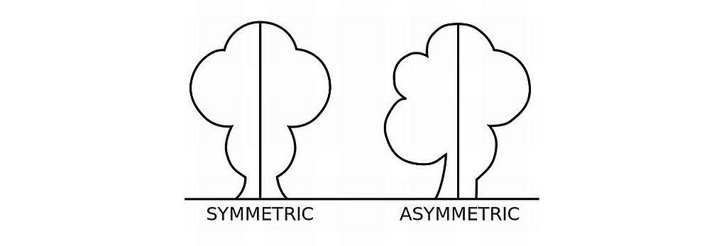
Asymmetrical design is a trend that’s breaking long-held design principles. And that’s what makes it interesting in some cases.
In design, symmetry refers to a layout where elements are distributed evenly, thus creating a pleasing balance. An absence of this quality is called asymmetry.
Source: Interaction Design Foundation
For a long time, app and web design followed a symmetrical layout thanks to the prevalence of the grid system.
This tool divides a UI into sections so you know where to place elements to achieve balance.
Source: Elementor
An asymmetrical design abandons this grid in favor of a more unbalanced but dynamic layout.
One of the mainstream apps that popularized asymmetrical design is Pinterest. Notice how the elements are misaligned on the horizontal rows in the Pinterest app:
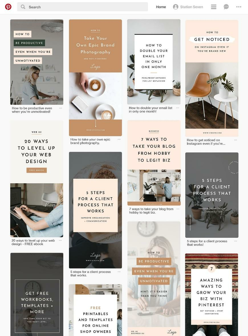
Source: Pinterest
It’s asymmetrical, but it works well. The approach helps make the gallery look more fresh and natural compared to the grid system’s orderly but almost robotic nature.
Asymmetry also works well for emphasizing certain elements in the UI. For example, overlaying multiple elements can naturally draw the eye there, as the below example shows:
Source: Dribbble
However, if you misuse asymmetry, it can lead to a cluttered and confusing UI. A good way to prevent this is to use a hybrid design combining symmetrical and asymmetrical elements.
Here’s a good example from Google:
Source: Sympli
Notice how the headline and placement of the image cards are done asymmetrically, giving it an interesting edge.
To provide the layout with a sense of balance, however, the navigation bar at the bottom is placed symmetrically.
The gist is that asymmetry can help make a UI layout more interesting by breaking the rules. But it pays to know when and how to do this to avoid making a mess.
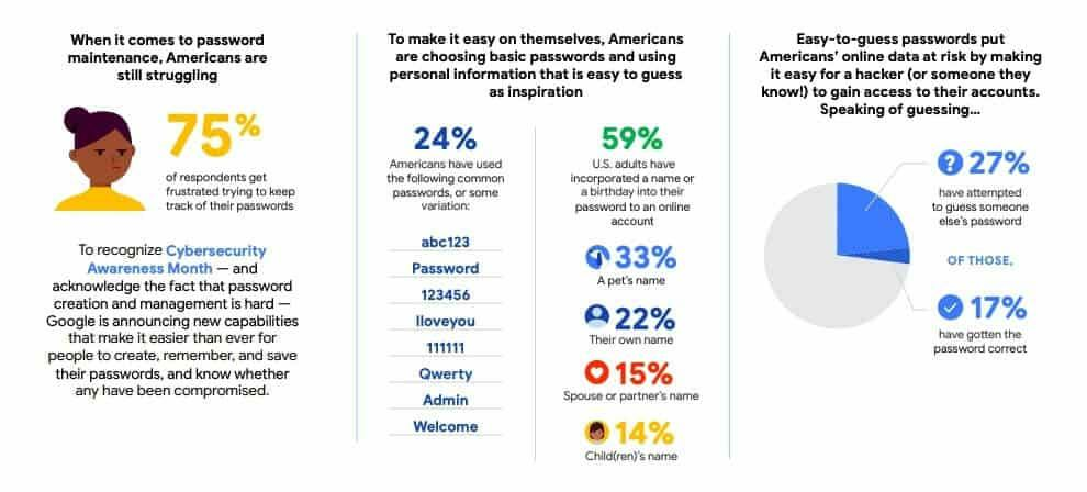
From a UX perspective, passwords are inefficient. People are prone to forgetting them, since a person needs to manage so many of them.
Moreover, security-wise, hackers can easily steal them through social engineering attacks.
It’s no wonder 75% of Americans are struggling with password maintenance.
Source: Comparitech
This is the reason why passwordless logins are gaining popularity—protocols that replace passwords to authenticate a user.
Their biggest advantage in terms of UX is convenience.
For example, one of the more common passwordless login methods is biometrics. It involves using a person’s unique physical characteristics to authenticate them.
To log in, a person simply scans their finger or shows their face. There’s no need for them to remember and type their password.
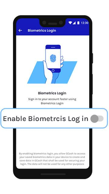
Source: GCash
Another popular approach is the login link. This involves authenticating the user once, then sending a special link to a secure channel (such as their email).
Logging in is as simple as clicking on the link—it already contains all the relevant credentials for the user.
Undoubtedly, we’ll see more passwordless login methods like voice drive this trend in the future.
We hope you’ve been enlightened with the most exciting app design trends you’ll continue to see in the immediate future.
But adopting the latest UI design trend is only a small part of creating an engaging and successful app.
User experience (UX) should be your biggest consideration.
To help you achieve this, we’ve written an article on six exciting UX trends that you should check out.

Petar leads Shake (DECODE’s sister company) as CEO, delivering the product to a growing number of happy, innovative clients. Day-to-day, he ensures the engineering, design, product, marketing and sales teams all work in harmony. Before moving to Shake, Petar led DECODE. Although an engineer by schooling, his natural talent soon saw him making an impact on the marketing, sales and branding side of things. Petar’s passions include architecture, skiing, sailing, and a good glass of red wine.
All you need to know about the process of app design.
This article is a quick guide to the most common screens in an app. We cover 9 main types and help you create a great app.
We teach you about top mistakes when creating an UX design and how to avoid them.