

How to choose the best color palette for your mobile app design
Color is perhaps one of the most powerful aspects of UX design. This guide will help you decide on the best color palette for apps.
Color is one of the most powerful marketing tools you have at your disposal.
It can evoke emotions, change moods, and sway minds. It can even make you seem more successful than you are, according to a study by the Xerox Corporation.
But as with any tool, using color properly is crucial to realize its benefits.
And this is easier said than done.
After all, there are hundreds of hues, tones, and shades available. How do you choose the right one?
That’s where color schemes come in.
A color scheme is like a guideline. It helps narrow down your color choices to only a select few, depending on what you want to achieve in your UI design.
Here are some trendy color schemes you should know.
Table of Contents
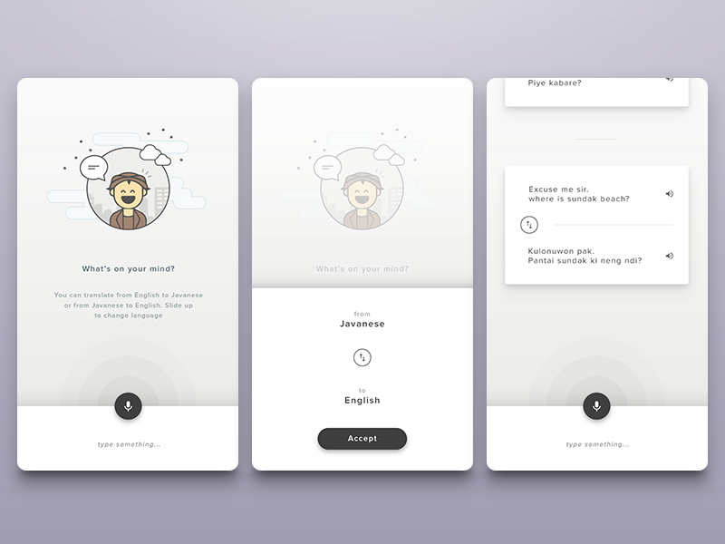
Minimalism is a trend that focuses on the less is more philosophy. It aims to remove anything unnecessary from a design so that the user can concentrate on the essential elements.
This approach can be applied to color schemes as well. Instead of filling the UI design with color, you use it sparingly, filling the empty space with plenty of white or gray tones.
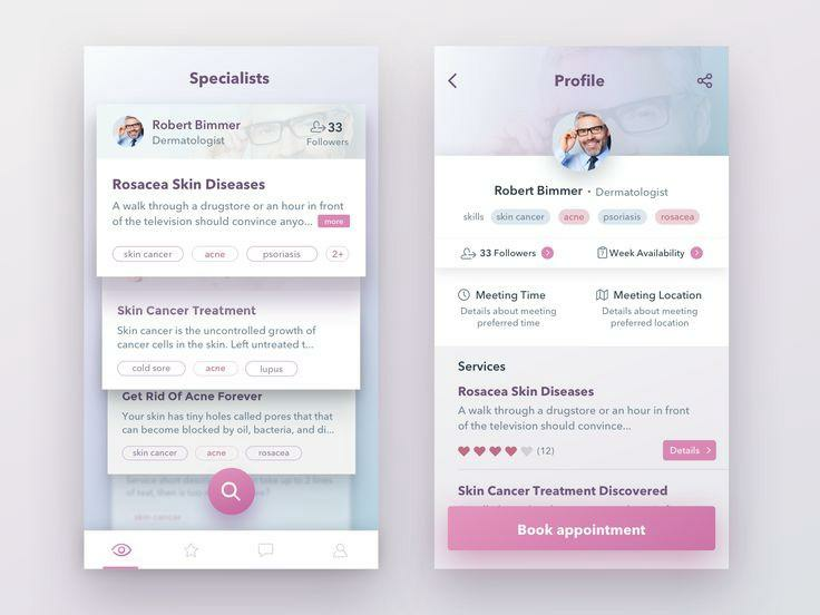
The primary color in a minimalistic scheme is mostly used for key UI controls like buttons and sliders. Here’s a good example of a minimalistic color scheme:
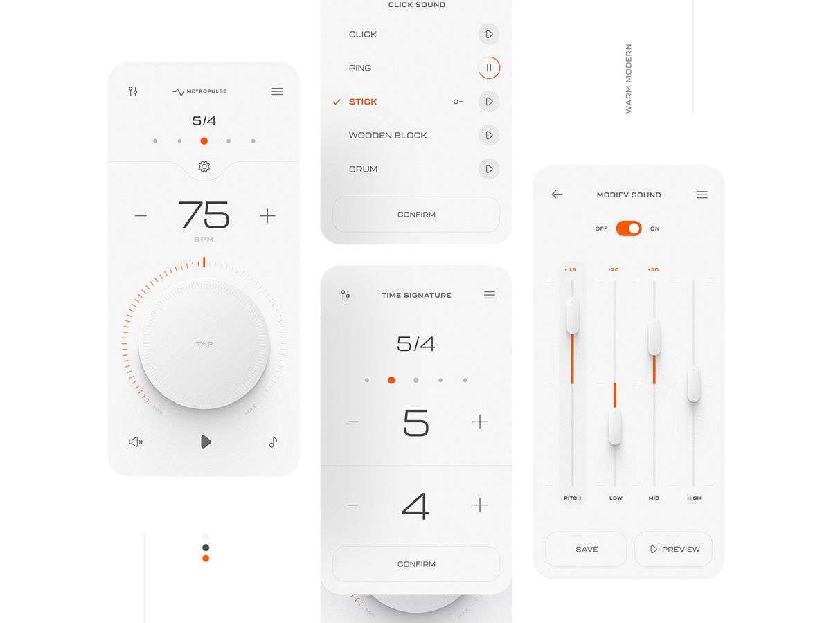
Source: Dribbble
Minimalism often uses only one or two colors maximum to reduce the risk of muddying up the screen with too many hues.
However, you can successfully use multiple colors in a minimalistic design. The important thing is how you layout them out.
Colors in a minimalistic scheme can be picked using any method (such as complementary, triadic, or analogous).
But mostly, it features softer shades. Vibrant colors, if any, are rarely used.

Source: Jordan Prindle Designs
A minimalistic color scheme is very popular because it’s great for UX.
The liberal use of white space makes finding elements on the screen easier because there’s plenty of contrast.
A clean design is also very easy on the eyes, which could make your app relaxing to use.
Minimalism also lends a certain elegance to your design that could make it stand out from the crowd.
It looks more professional, which fits well if you’re designing more serious apps for financial or corporate niches.
Source: Dribbble
Plus, you design fewer elements when you adopt a minimalist approach. This could help speed up your development time and lower costs.
However, don’t make the mistake of thinking that minimalism is easy or lazy. Figuring out what to take out of a design takes experience and skill.
But if you can pull it off, you’ll be rewarded with a color scheme that most users will appreciate.
A monochromatic scheme uses various shades, tones, and tints of a single color.
Here’s an example of what it looks like:
Source: Medium
The main benefit of a monochromatic color scheme is that you can easily create harmony in your design. It’s perfect if you can’t invest too much time designing your app UI.
Normally, you’ll need extra care to ensure individual elements in your design go well together, especially if they are in different colors.
But the shades and tints of a single hue already blend well, guaranteeing that your UI looks great.
Source: Dribbble
Monochromatic colors also help make other elements in your UI stand out. For example, black or white text will easily stand out if you have a blue motif (like most social media apps).
From a psychological perspective, monochromatic schemes also help users process your UI much more quickly.
That’s because, according to Gestalt psychology, the brain is always looking for familiar patterns and repeating colors.
In many ways, a monochromatic palette offers similar benefits as a minimalist color scheme. In fact, one of the most effective ways to nail down minimalism is to use only a single color.
Source: Dribbble
A monochromatic color palette is also a crucial aspect of a neumorphic design.
Neumorphism is a UI design trend that simulates real-world elements but not to the point of making them photorealistic.
It’s characterized by low contrast, soft shadows, and a monochromatic palette.
Here’s what a neumorphic design looks like, compared to two other popular approaches—flat design and skeuomorphism.
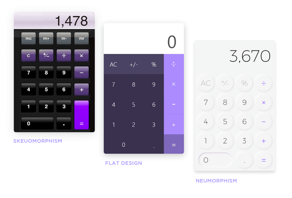
Source: Just in Mind
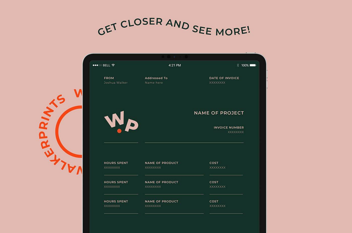
A monochromatic color scheme is also excellent for incorporating brand colors into the app design.
For example, look at how this UI design successfully implemented the familiar yellow scheme of the McDonald’s logo.
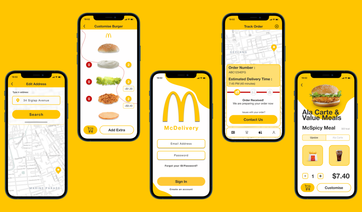
Source: Farah Iskandar
The bottom line is that a monochrome palette is a great go-to scheme if you want to achieve color harmony with minimal effort.
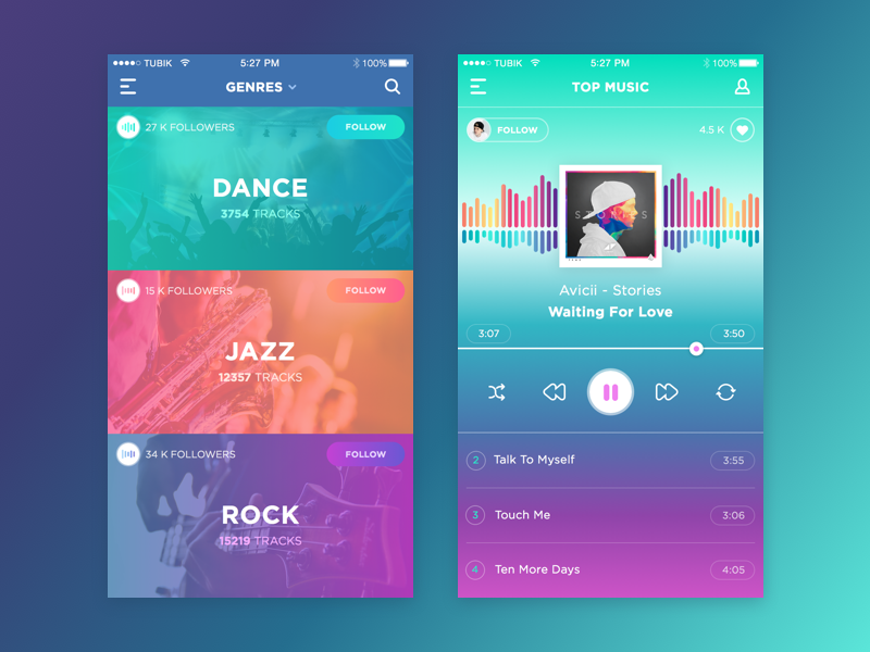
Vibrant color schemes use bright and saturated hues as the primary color in the design instead of just accents, as with other palettes.
To separate elements, you typically use high-contrast colors, as in the illustration below:
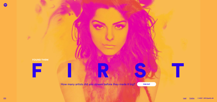
Source: Adobe Blog
Vibrant color schemes are all about making a statement. They’re typically very bold and, thus, very effective at attracting users.
They also make your app instantly recognizable and memorable compared to your competitors.
For instance, look at the vibrant and quirky color palette used by the Cleo app. They aim to stand out from the other digital banking apps in the market — and they’ve succeeded.
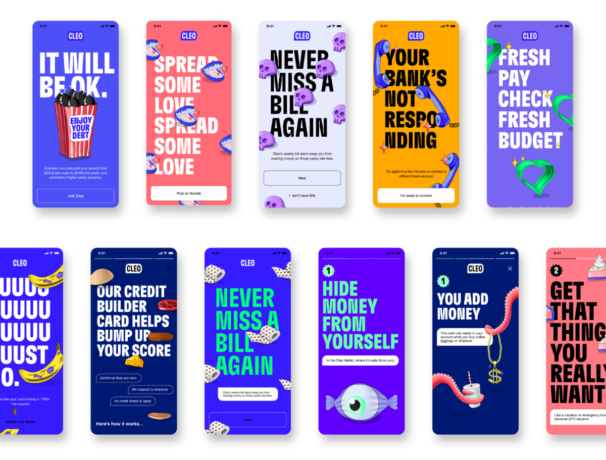
Source: Lauren Rowe
A vibrant color scheme is great at stirring the emotions of your user. Their high energy often translates to feelings of passion and happiness in the user.
But the palette isn’t just limited to that. It could also evoke other sentiments, like trustworthiness.
Here’s an example from the Tide app. Notice how the bright blue hues and purple/green accents work well to highlight stability and safety.
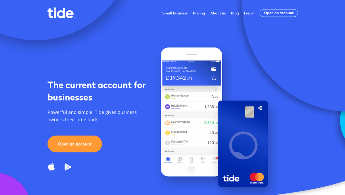
Source: Toptal
What’s more, vibrant color palettes are very flexible. You can use saturated shades of a single color to create a monotone, rich palette.
Or, you can combine various colors to achieve something truly bold.
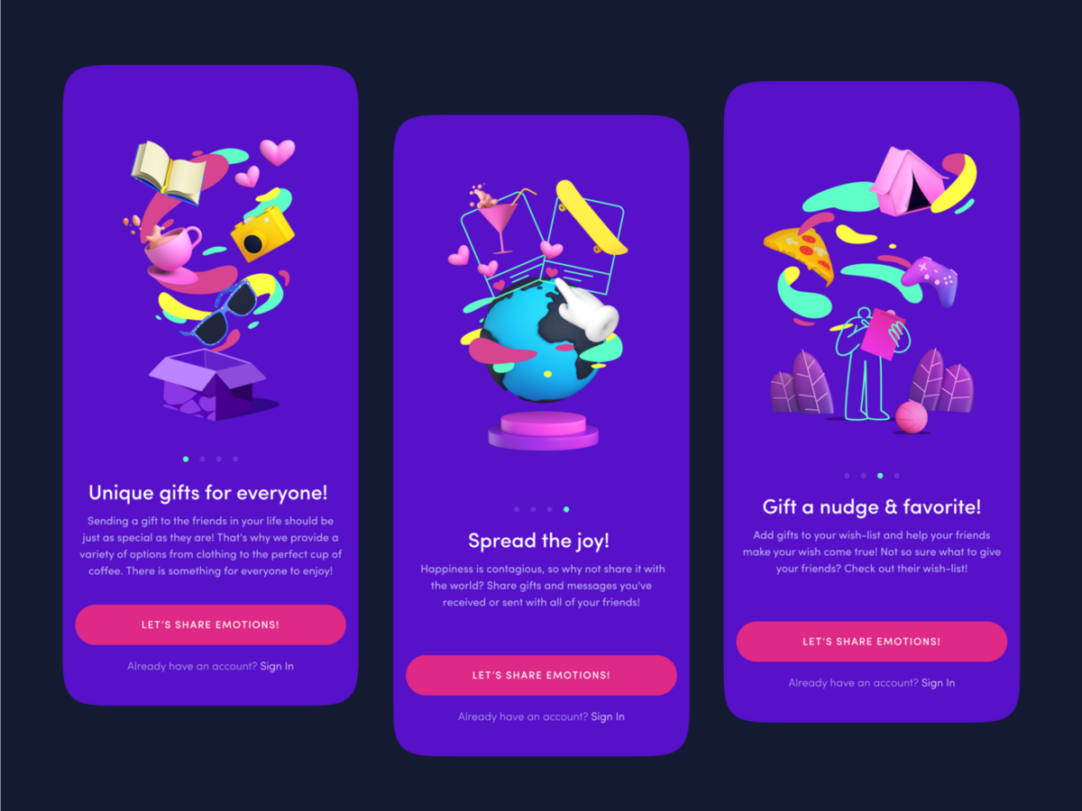
Source: Dribbble
Indeed, the possibilities are endless with a vibrant color palette. It’s great if you want to get creative with your UI design.
However, a vibrant color scheme is also a double-edged sword. It’s easy to overdo it and create a colorful mess.
Thus, we suggest some restraint and plenty of usability testing to find the right balance that your users will accept.
A pastel color is a primary or secondary color with more white in the mix, giving it high brightness but low saturation. This results in the characteristic paleness of pastel colors.
Pastel color schemes are on the opposite spectrum of the vibrant palette we just discussed. Instead of using saturated colors, a pastel one focuses more on toned-down hues.
Here’s an illustration putting them side-by-side so that you can see the difference.
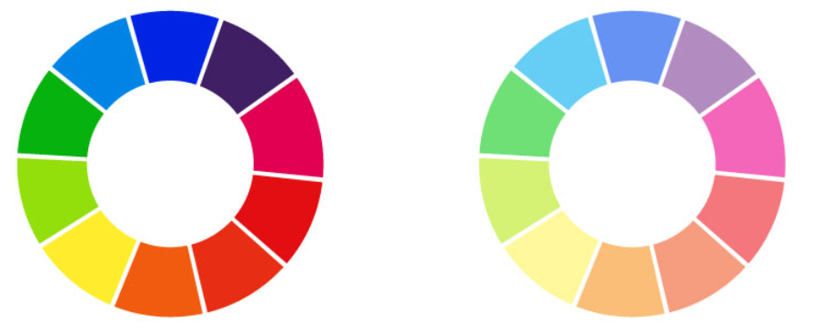
Source: Building the Blog
The main benefit of a pastel color scheme is its soft and feminine quality. This makes them the de facto color choice for apps aimed at women or even kids.
However, pastel colors can be used for more than that. They also give a soothing effect on the eyes, making your UI a joy to look at.
This can also help calm emotions and nerves, which is why they’re a popular palette for wellness apps.
For instance, look at the UI design for the meditation app Headspace and its liberal use of pastel colors.
Notice that the UI is very soothing, despite having a variety of colors in the design. Imagine if it were bright colors instead—it would probably be very tiring for your eyes!
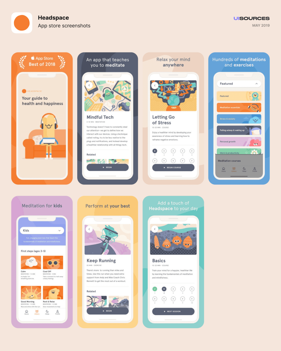
Source: UI Sources
This illustrates that pastel color schemes can evoke various emotions as well.
There’s a misconception that softer colors can be boring and artificial, yet the Headspace app still captured a feeling of fun in its UI design.
But most of all, pastels can effectively convey a warm and welcoming feeling. Here’s an example:
Source: Get Feedback
The fact is that pastel colors can attract users to your UI just as effectively as a loud, vibrant palette. They just do it in different ways.
Muted colors are similar to pastel colors in that they have low saturation.
However, the difference is that instead of adding white to primary colors, you add darker colors like gray, black, or brown.
The result is a less vivid color that’s a good contrast against more vibrant colors. Here’s an example:
Source: Medium
Muted colors share the same soothing quality as pastels, so they can also be used in designs where you want a softer feel.
However, because they’re not as colorful, muted palettes seem more serious.
This color palette also tends to have a sophisticated and elegant feeling. Look at how regal the app screenshot below with a muted color scheme is.
Source: fontsinuse
Muted colors are neutral, which means they can make up most of the UI design. They mostly play a supporting role, allowing other colors and elements to stand out in the design.
A good approach combines muted tones as the base color with more vibrant or pastel colors as accents.
This can help emphasize those elements more and direct your user’s eyes towards them. In addition, it helps keep your UI design interesting without changing the overall mood.
Here’s an example of this in action. Notice how the muted green background emphasizes the vibrant dot of the logo much better.
Source: Behance
Muted colors might not play a starring role in most UI designs, but they’re crucial nonetheless. They’re the background colors that can make your other elements shine.
Gradients refer to the gradual transitions from one color to another, which creates interesting hues in the middle.
For example, a gradient from red to yellow creates various shades of orange.
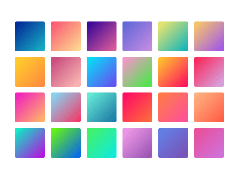
Source: Sketch App Resources
Gradients help attract users to your UI by making it seem visually interesting. They can add a certain character and personality to an otherwise ordinary design.
Using gradients also gives your UI a natural feel. That’s because gradients are everywhere in the real world, from the reds and yellows in a sunset to the blue and green tinge of the ocean.
Another great thing about gradients is that they’re very versatile. They can enhance any of the previous color palettes we’ve listed above.
In the UI design below, notice how using gradients makes the vibrant color palette more interesting and dynamic.
Source: Medium
Gradients have practical applications as well.
One technique is to use gradients to guide the user’s eye through the design. You can see this in the example below.
The user would most likely look at the heading first because it’s the most prominent.
From there, the transition from light to dark helps direct the user’s gaze downwards towards the call-to-action (CTA) below.
Source: Web Designer Depot
However, like most bold color choices, it’s easy to overdo gradients. This can clutter your design instead of helping it. Thus, restraint should be exercised.
A good approach is to use muted or pastel colors that aren’t far apart in the color wheel. This creates less dramatic transitions, resulting in a subtler gradient.
In the below example, look at how the pastel gradients create a soothing background. Even if they’re not as prominent, you’ll still feel their effect on the design.
Source: Medium
Gradients can also be used as accents to color text, buttons, icons, and other smaller elements.
The bottom line is that gradients are great for spicing up a UI design. But as with anything else, you should use them only when it makes sense.
After reading this article, we hope you already have an idea of the color scheme you want to use in your app.
But as complex as color selection is, it’s just the beginning. You also need to consider other aspects of your UI design, such as typography, layout, and navigation.
To learn more about this topic, you can read our article on mobile app design principles.
Or, if you want to skip the learning part, why not just partner with DECODE? We have the experience and track record to help achieve a great design that your users will love.
Interested? Get in touch with us today, and let’s talk!

Petar leads Shake (DECODE’s sister company) as CEO, delivering the product to a growing number of happy, innovative clients. Day-to-day, he ensures the engineering, design, product, marketing and sales teams all work in harmony. Before moving to Shake, Petar led DECODE. Although an engineer by schooling, his natural talent soon saw him making an impact on the marketing, sales and branding side of things. Petar’s passions include architecture, skiing, sailing, and a good glass of red wine.
Color is perhaps one of the most powerful aspects of UX design. This guide will help you decide on the best color palette for apps.

We will teach you all about mobile app design process to achieve a great mobile app design.

In this article, we will give you a brief overview of 17 mobile app design elements.