
5 benefits of great mobile app UI/UX design
UX and UI design can take lots of effort and resources, but it’s all worth it in the end. In this article, we'll discuss five UI/UX app design benefits.
“Design is not just what it looks and feels like. Design is how it works.”
These are the immortal words of Steve Jobs, perhaps the greatest creative mind of our generation.
And it smashes the widespread misconception that UX design is just about colors and aesthetics.
It’s much more than that.
A well-designed app isn’t just great to look at but also engaging to use. And if you wish for your app to succeed, this should be your primary goal.
Here are the mobile app design best practices that can help you.
Making your app design intuitive is perhaps the most important best practice to keep in mind.
That’s because UI and UX design principles only have one overarching goal—to reduce the cognitive load.
This refers to how hard a user has to think while using your app.
Making users work too hard to complete their intended action will confuse, overwhelm, and even make them distrust your app, among other negative effects.

Source: Boagworld
The best way to avoid this is to make your app predictable.
Jakob Nielsen, dubbed the king of usability, offers a clue on how you can achieve this:
“Users spend most of their time on other sites. This means they prefer your site to work the same way as all the other sites they already know.”
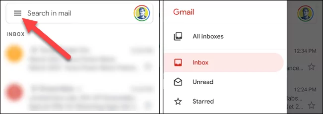
So, start by using already established UI rules in your app as much as possible.
For instance, most users know by now that the three-line symbol popularly known as the hamburger icon indicates a hidden menu.
Using that in your app is easier for users than trying to introduce a unique way to show a collapsible menu.
Source: How to Geek
Using established navigation structures also makes your app intuitive.
Not only does it reduce the cognitive load on users, but it’s also easier and cheaper to design during app development.
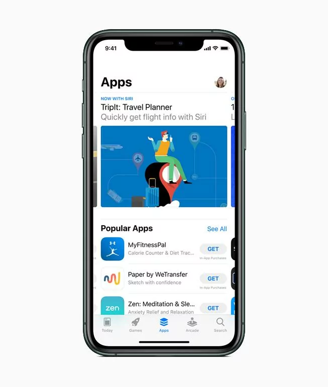
For example, many iOS apps place the main navigation menus at the bottom of the screen, with the active menu highlighted.
Most iOS users will be familiar with this, so it’s easy for them to pick up.
Source: Apple
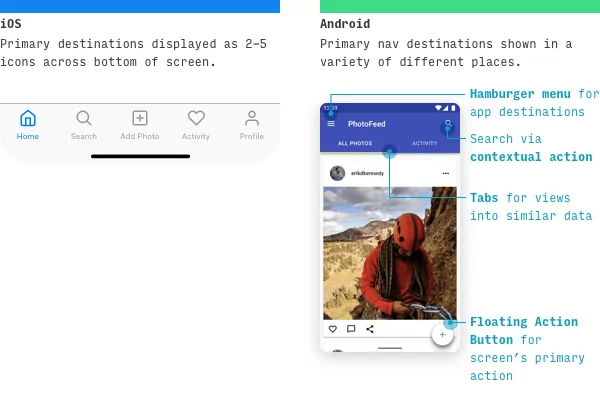
Also, don’t forget to stick to OS conventions. iOS and Android have UI nuances that their users will be familiar with, so it’s best to keep your app in line with them whenever possible.
For example, we mentioned above that most iOS apps have their primary navigation at the bottom of the screen. With Android apps, it’s a bit different—take a look:
Source: Learn UI Design Blog
Adopting the iOS navigation style might seem more intuitive and usable. But it can be a jarring change for an Android user.
But it’s not just other app designs that you should consider when developing your own. Drawing inspiration from real-world elements is also an effective approach.
Card-based project management apps like Trello and Asana are the best example of this. They use the metaphor of a whiteboard filled with post-it notes as their main interface.
For most people in corporate jobs, that would be instantly familiar.
Sources: David Siegel, Asana
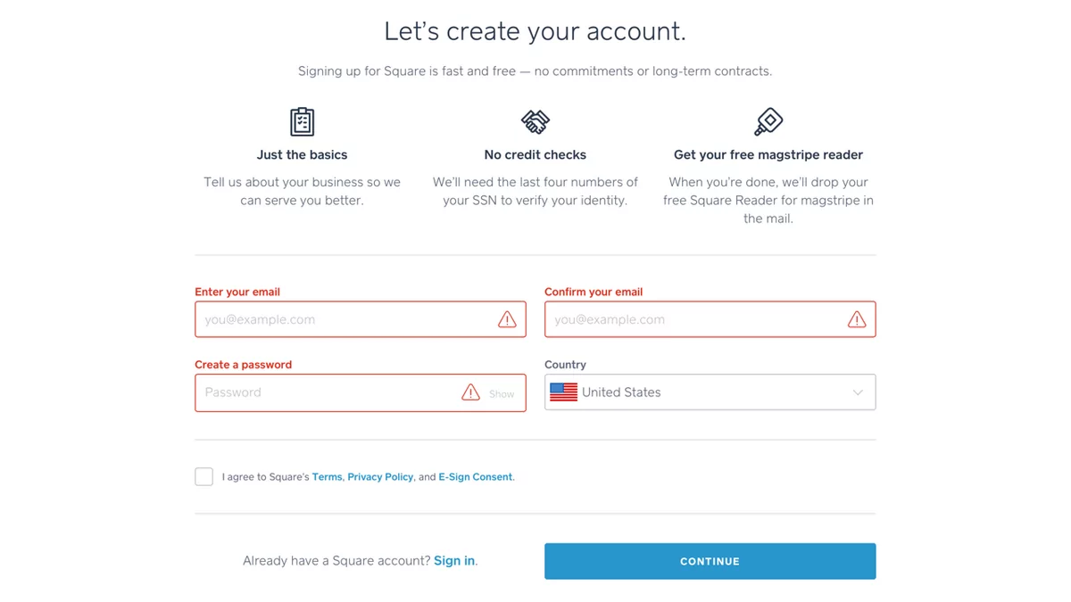
Lastly, ensure that your app design is intuitive for all your users. That means considering accessibility for persons with visual, hearing, or motor disabilities.
For instance, you should not rely on sound alone to convey important app feedback to account for users with hearing problems.
Likewise, you should place visual indicators other than color for color-blind people.
Here’s an example from Square. Notice they also use warning icons apart from the red highlight.
Source: UX Collective
However, remember that conventions are just suggestions. Some design principles might not fit your app, no matter how popular they are.
It’s still best to filter them through your own lens, so they’re 100% suitable for your situation.
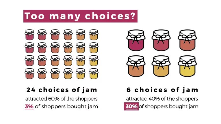
A clean and uncluttered design should be your top priority when developing your app. It prevents overwhelming your users with too much information, which creates cognitive overload.
See, many developers mistakenly think that jamming the app with as many features as possible will make it seem more robust and rich to users.
But an app that promises to do too many things at once can trigger a phenomenon called the paradox of choice.
Simply put, too many options will paralyze people into inaction.
Source: Your Marketing Rules
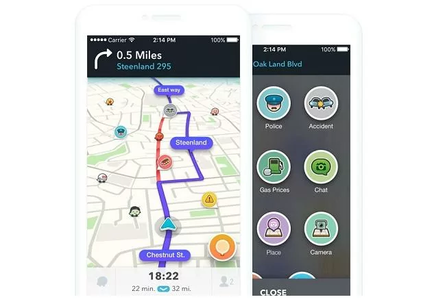
The best rule of thumb to help you here is the concept of one screen, one task.
For example, consider the UI for the navigation app Waze. You’ll notice that its main screen focuses only on one task—showing drivers where to go.
Things like the search and menu bar are hidden, while other features appear only when appropriate.
Source: Jewish News
This concept is especially important if you require a lot of information from your user.
The long form with multiple fields that’s a staple in webpages won’t cut it on the smaller screens of a mobile device.
The solution is to cut it up into multiple screens.
Take Fastic’s onboarding sequence, for example. Notice how they only ask one question per screen, thus allowing the user to focus on it entirely. This helps reduce overwhelm and friction.

Source: Fastic
You’ll also notice that Fastic uses white space liberally throughout its UI design. This is a great way to make your app look cleaner.
Because even if you’re only focusing on one thing per screen, a cluttered design will still make your app look overwhelming.
That’s because white space has a psychological effect. Studies show that it can increase a user’s attention on a screen element by 20%.
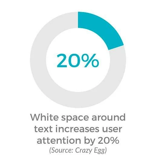
Source: Designial
Using white space is just one part of creating a proper visual hierarchy, which every app should have.
It means that UI elements in your app should be ranked in order of priority, using design techniques like contrast and scale.
Proper visual hierarchy helps direct your user throughout the UI design, ensuring they don’t get lost. It also helps separate visual elements from each other, reducing clutter.
For example, a good approach is highlighting your screen’s call to action (CTA) with red to indicate its importance, as shown below.
You’ll also notice that the headline has a larger font than the rest of the body text. That ensures it’s the first thing your eye notices.
Source: Adobe
A clutter-free design should be your goal, even if you have a data-packed app. It’s perhaps the best way to reduce visual cognitive overload.
A key consideration in app UI design is how users hold their mobile devices. This influences where critical elements (like the navigation buttons) are placed for easy access.
First, realize that not everyone holds their phone the same way, as this infographic shows:
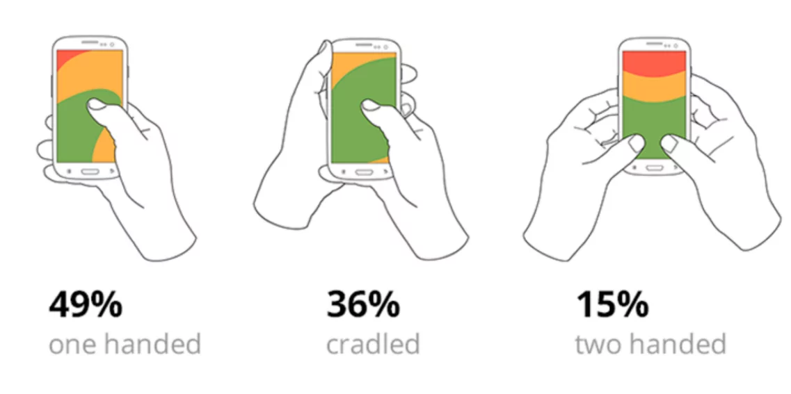
Source: Bootcamp
Notice the green section? That’s called the thumb zone. It refers to the screen area users can comfortably reach with their thumb.
Anything beyond that (the yellow and red regions) will cause the person to strain their fingers and cause discomfort.
Thus, as a UX rule of thumb (no pun intended!), key interactive elements should be placed within the one-handed thumb zone since that’s what most users adopt.
However, the above diagram only accounts for the typical right-handed person. A true thumb zone is an overlap between the green zones of right and left-handed people, as shown below:
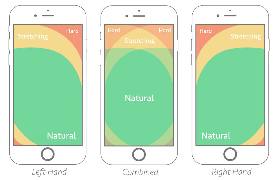
Source: Smashing Magazine
When designing any screen in your app, you should do the thumb zone test. Simply take the combined thumb zone above and overlay it on your UI.
Then, ensure the key elements in your design fall within the green areas.
This is why the bottom navigation panel is a popular UI design choice. It allows users to easily access your entire app using only their thumb.
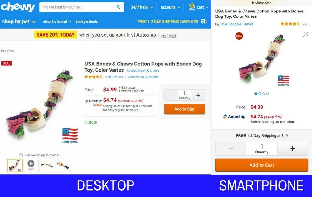
It’s also a good idea to put CTAs at the bottom of the app.
For instance, this e-commerce app has its quantity and Add to Cart button at the lowest portion of the UI—a far departure from its desktop counterpart.
Source: Practical Ecommerce
Let’s discuss what elements you can put outside the thumb zone. Non-interactive elements like titles and minor links are good candidates, but probably the best one is the search bar.
Why is the search bar – which many people arguably use—placed outside the thumb zone?
Well, typing is a two-handed operation, so the assumption is that you’ll tap the search bar with your free hand in preparation for this.
When in doubt, always do a usability test with users on an actual device. They will tell you if your UI is suitable for one-handed operation or not.
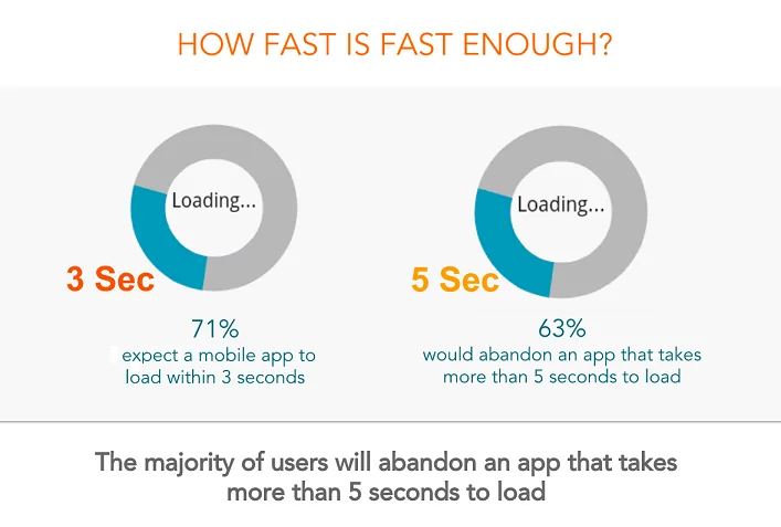
Of the many things that will cause users to uninstall your app, speed is perhaps the top reason.
Surveys show that 63% of users would abandon an app if it takes more than five seconds to load.
Source: APM Digest
That’s admittedly a very narrow window.
And while there are lots of things to keep your app fast and stable, it’s impossible to bring it down to zero load time.
For instance, you can’t control certain factors like app latency or delays caused by the user’s network.
A good solution here is to use design techniques to give the appearance of speed or, at the very least, hide any delays.
The easiest approach is to have an engaging loading screen. The idea is that users should have something entertaining or useful to look at while waiting.
For example, look at how Slack gives helpful hints while it’s loading:
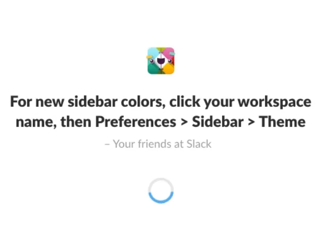
Source: Free Code Camp
Giving users a rundown on what the app is doing in the background is also a good approach.
Not only does it give users something to read, but it also assures them that the app is hard at work and not just frozen.
Below is an example from TurboTax.
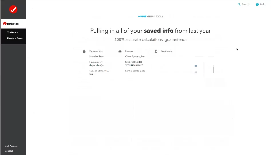
Source: Appcues
The interesting thing with TurboTax’s approach is that they intentionally prolonged the loading time to show this screen.
It seems counterintuitive, but usability testing showed that users felt more reassured when they saw this.
Now, if a task will take a while, it’s best to inform users about it. This sets their expectations, so they don’t anticipate an immediate response from the app.
A simple pop-up, such as the one below, is more than enough.
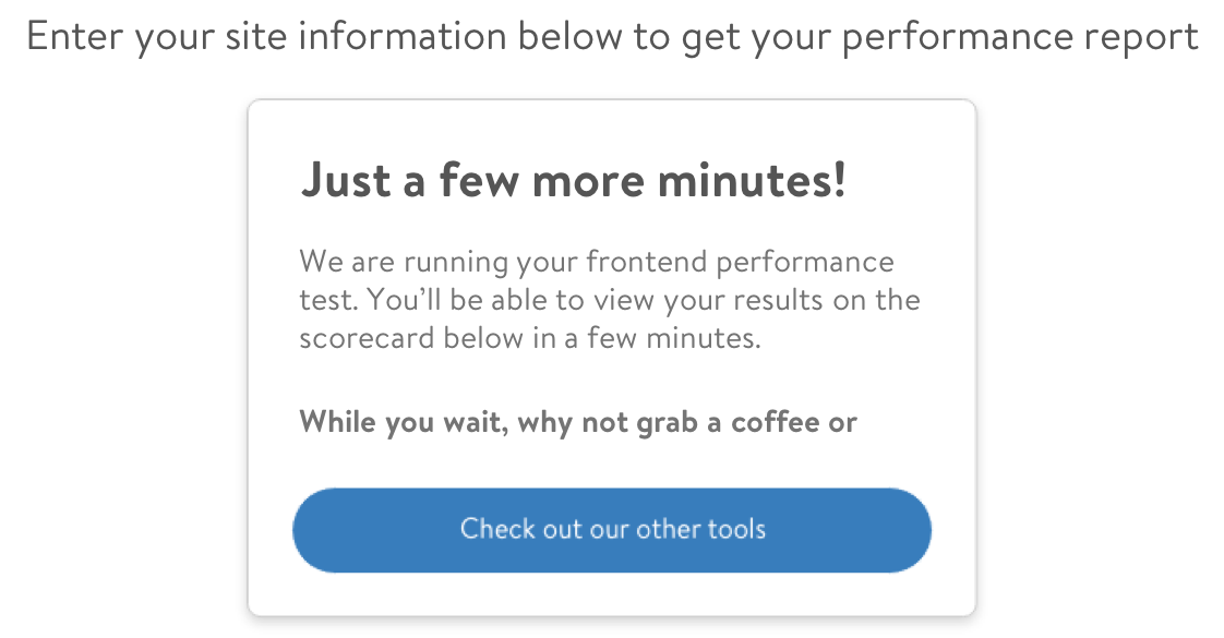
Source: Walmart Global Tech Blog
Of course, these design tricks are only band-aid solutions for a slow app. It’s still best to work on your code and infrastructure to keep your app as fast as possible.
Notifications are undoubtedly one of the more divisive elements in app design.
On the one hand, they could improve user retention by up to 190%, according to an Airship study.
But on the flip side, they’re also easy to abuse, which will annoy users and cause them to drop out.
The key to maximizing them is balance. Only send relevant and useful push notifications and in moderation.
How much is too much, though? Well, this study by Helplama offers a good ballpark. It shows the percentage of users that disable push notifications once it reaches a certain threshold.
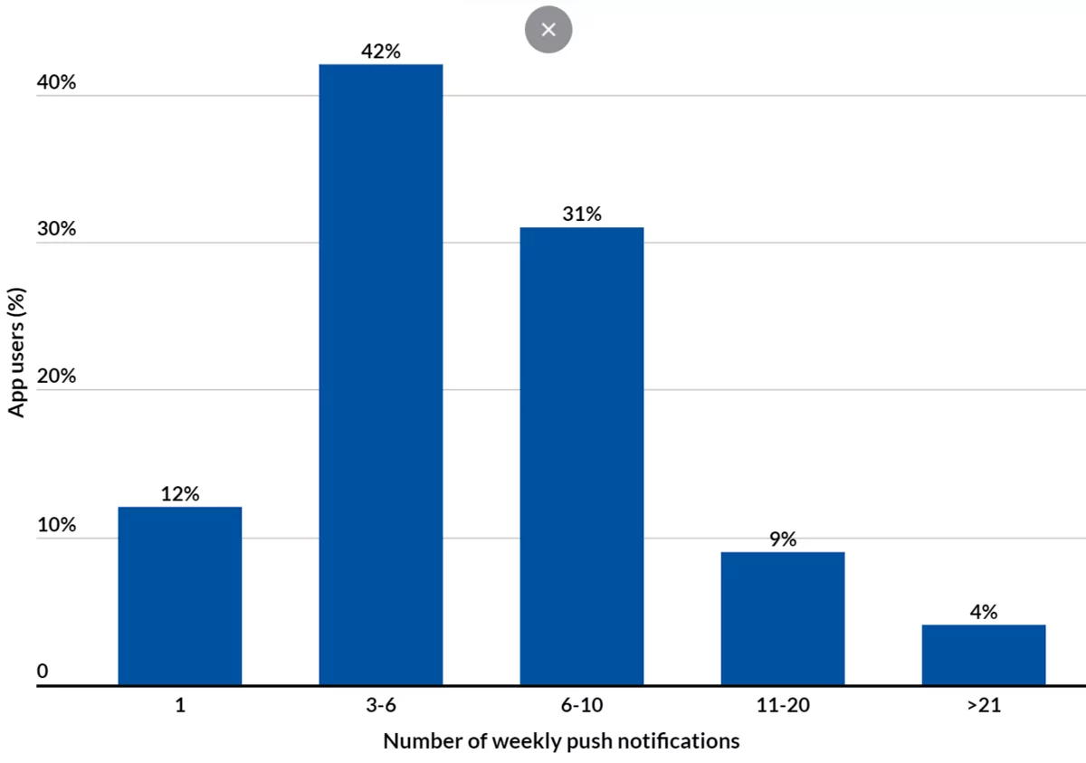
Source: Helplama
The content, timing, and relevance of the push notification matter, too. The more useful they are to the user, the more they’ll appreciate and even anticipate them in the future.
For example, the Groupon app informs users of good offers and discounts. The potential cost savings will be highly appreciated by many.

Source: Hi5
Push notifications that remind users will also be well-received. For instance, health apps can regularly check in with users.
Or a banking app can give timely information about a person’s bank account transactions.
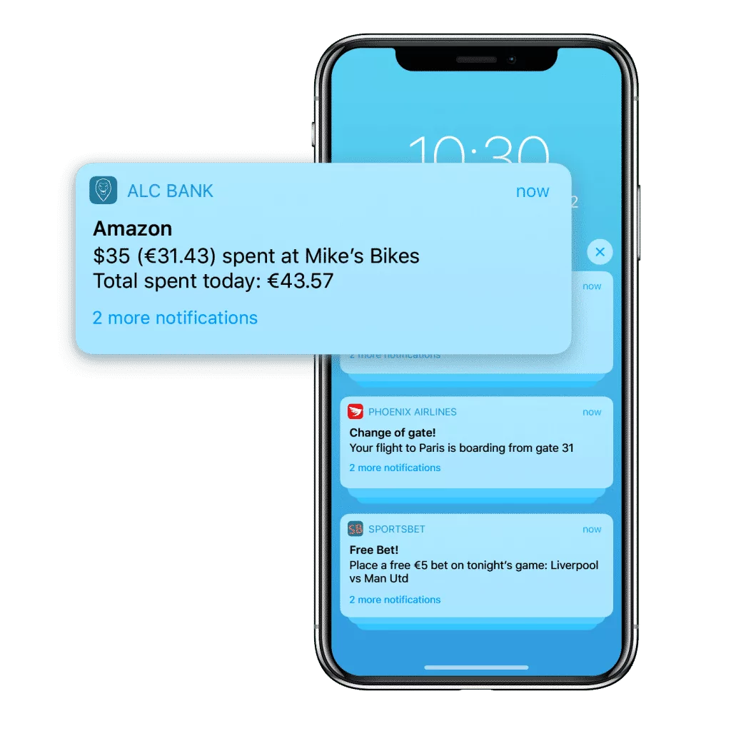
Source: Xtreme Push
It’s also important to ask users for permission to send them push notifications during onboarding. For the best opt-in, state the benefits of agreeing, such as the example below:
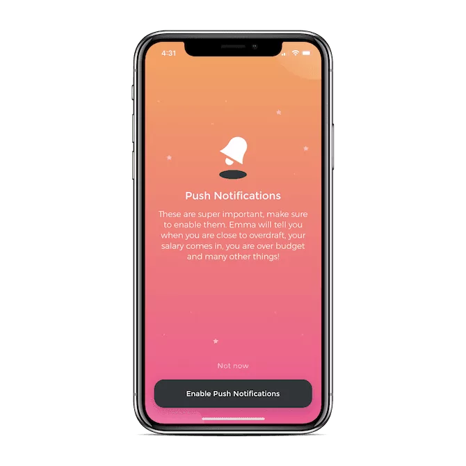
Source: Telerik
The key with push notifications, as with any other design principle, is restraint. Treat them like seasonings in a dish—they taste great in the proper amounts but horrible when overdone.
UI and UX design are perhaps one of the most challenging aspects of developing an app. And rightfully so, since they are the glue that holds an app together.
There’s no easy way to achieve exceptional UX design. You’ll need plenty of trial and error, experience, and knowledge to pull it off.
To help you out, we invite you to read our other UI and UX design articles. You can start with the fundamental principles you need to follow, then follow up with the top UX mistakes to avoid.

Petar leads Shake (DECODE’s sister company) as CEO, delivering the product to a growing number of happy, innovative clients. Day-to-day, he ensures the engineering, design, product, marketing and sales teams all work in harmony. Before moving to Shake, Petar led DECODE. Although an engineer by schooling, his natural talent soon saw him making an impact on the marketing, sales and branding side of things. Petar’s passions include architecture, skiing, sailing, and a good glass of red wine.
UX and UI design can take lots of effort and resources, but it’s all worth it in the end. In this article, we'll discuss five UI/UX app design benefits.

All you need to know about the process of app design.
This article will help you understand the importance of UX. It starts with the five fundamental mobile app design principles and then goes into a practical guide for implementing them.