
How to build trust in your fintech app
Trust is fundamental to the success of apps that involve a person's hard-earned money. Here's how you can build trust in your fintech app.
Finance apps enjoy one of the highest retention rates of any category. The 90-day average sits at 58% (way above the 48% benchmark for other apps), while annual retention rates are 38%.
This is partly due to the nature of fintech apps. Sending payments and checking bank balances are things users tend to do every day, so naturally, fintech apps get used more often.
But a huge part of that retention success comes down to the strategies and features that the best fintech apps employ.
So if you also want to achieve the same results or raise the bar even higher, here are some user retention tactics you can employ.
User retention isn’t just about making the app more engaging or fun to use. In fintech, a sense of security is vital. After all, if a user’s money is at risk with your app, they’ll stop using it.
One of the best strategies for app security is biometric authentication. And the biggest reason is that it’s inherently more secure than traditional authentication methods like passwords.
In fact, biometrics is widely accepted even for high-security situations, such as airport screening and military applications.
It’s the same sentiment in tech. Take a look at this Spiceworks survey, which asked IT professionals what they consider the most secure forms of authentication:
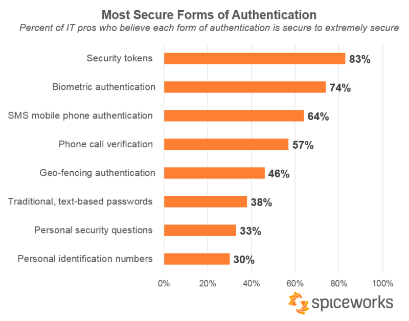
Source: Spiceworks
As you can see, biometric authentication comes in at a close second, as 74% of respondents believe it’s extremely secure.
The strength of biometric authentication lies largely in its resilience to theft.
A hacker would need to steal your face to bypass facial recognition—a near-impossible feat to pull off. Your face and fingerprints are also hard to replicate, especially online.
From the user’s perspective, biometrics also has another huge benefit besides security: convenience.
Biometric characteristics like a user’s face or fingerprints are always available; unlike a password, users can’t forget or lose it.
And there’s no need to type long passwords. They can open the app with a simple scan of their face.
This can drastically speed up authentication times and is a key driver for making seamless cashless payments and bank transfers.
Mobile phone authentication systems are also becoming more sophisticated. For example, iPhone’s Face ID technology has an error rate of roughly 0.000001%.
That means if a stranger tried to unlock your phone with Face ID, there would be only a 1 in a million chance they’d succeed.
Major businesses trust us to handle their mobile banking solutions, and we help agile startups disrupt mobile payments, stock trading and the rest of the rapidly evolving sector.
At any rate, biometrics is a key driver for both security and convenience in today’s fintech apps. And the fact that you can easily implement it means there’s no reason not to.
Voice-assisted banking allows users to perform app tasks via voice commands.
In digital banking and fintech, voice-assisted technology is an emerging trend. But everywhere else, it’s pretty commonplace.
Ever since the release of Apple’s Siri and Google’s Alexa, digital voice assistance has been on the rise. Indeed, Statista estimates that 8.4 billion voice assistants will be in use worldwide by 2024—a 258% rise since 2019.
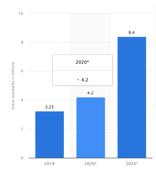
Source: Statista
Banks and financial institutions have begun to go with this trend and integrate these voice assistants into their apps. For instance, British bank Barclays allowed users to make app payments through Siri.
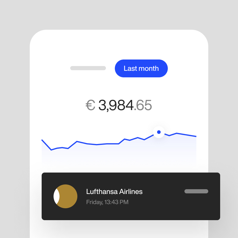
Some banks decided to use a proprietary solution, such as Bank of America’s Erica. Users can ask the digital assistant to perform everything from managing credit cards to getting your financial information—all through voice:
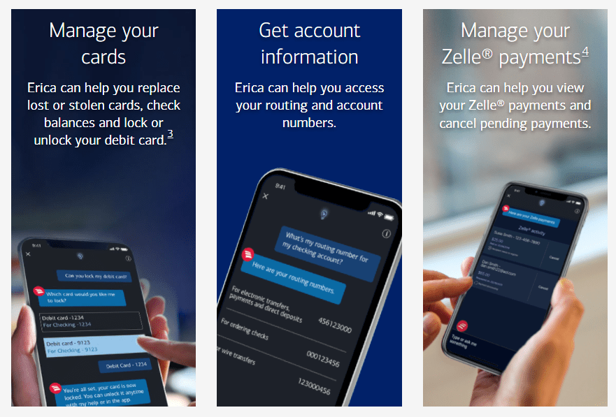
Source: Bank of America
Voice commands can make interactions with a fintech app incredibly convenient and fast versus tapping and typing commands. Ankit Bhatt, Senior VP at U.S. Bank, agrees with this observation:
“I believe voice is a more effective medium than touch. It’s certainly faster. People can type 40 words per minute, but they can speak at about 130 words per minute.”
Bhatt references the U.S. Bank Smart Assistant technology whose goal is to mimic the way users interact with a bank teller. Having this imitation of a human touch can do fantastic things to your retention.
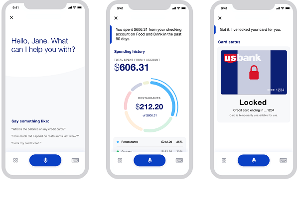
Source: Voicebot.ai
And just like Erica and the U.S. Bank Smart Assistant, most voice-assisted banking apps also have AI aspects. This can further reduce the number of steps users need to do for their banking tasks.
Voice-assisted banking boosts your user retention by making them spend less screen time with your app. It’s ironic, but it works wonders nonetheless!
Easy navigation is a basic ingredient of app engagement—every developer knows it. But what many fail to realize is that the goal of navigation is to reduce the time the user spends in the app.
It depends on the context, of course. If it’s a game, you’d want them to spend hours at a time.
But in a banking app? Not so much. If they do, that might signify that they’re having a hard time finding their way around.
A Statista study confirms this:
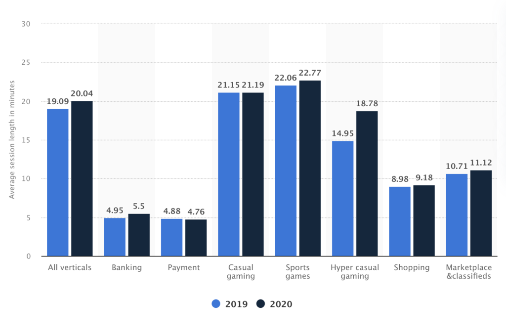
Source: Storyly
See the comparatively short session lengths of banking and payment apps? That’s a good benchmark to aim for. And the reason is that most fintech apps are designed to be used regularly but for only minutes at a time.
Of course, there are exceptions. For instance, users of accounting apps would probably spend an hour or two on it.
Regardless, though, your goal is still the same: users should move as quickly and effortlessly as possible around your app. That means eliminating any unnecessary obstacles that get in their way.
When it comes to navigation, the fewer steps, the better.
You should consider not asking for too much information from users beyond what’s essential.
For example, Venmo only requires an email to send payments.
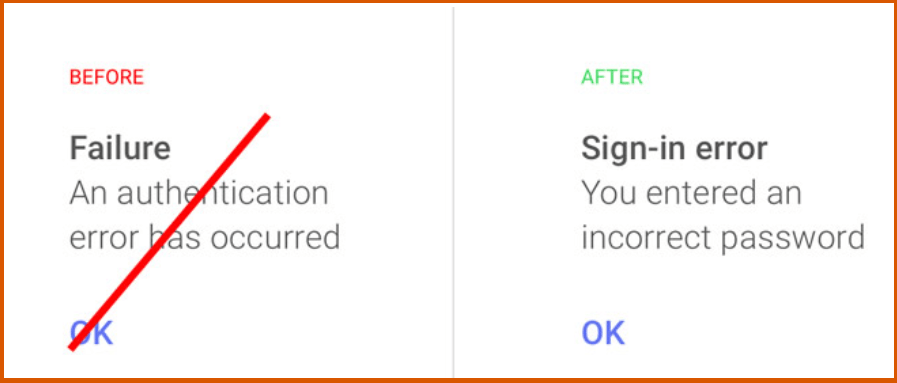
Simple but engaging copy is also a crucial element of app navigation. The key here is to talk in the language of the user.
This is especially vital when it comes to error notifications because you want to give users clear direction and avoid confusing them further.
Source: Usability Geek
Many other things go into navigation, such as layout and the number of menu items. But the goal is the same: keep session lengths at a minimum. It’s an ironic goal, but trust us, it’s key for retention.
There’s no better way to make users patronize your app than to make them feel that it was made especially for them. This is why personalizing the experience is key for app retention.
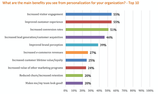
Personalization is one of the hottest marketing trends in recent years, and for very good reason— it’s very effective. Apart from engagement, it can also improve brand reception and long-term loyalty.
Source: Startup Bonsai
In fintech, an app works best when it adapts to each user’s journey and behavior. Not only will the user feel understood, but it can also avoid overwhelming them with information.
A veteran stock user, for example, will appreciate a screen full of charts. However, that kind of setup will easily overload a newbie investor.
Personalized investment apps like Betterment are the perfect embodiment of this. The entire experience—from stock picks to features—is shaped to suit the user’s needs and goals.
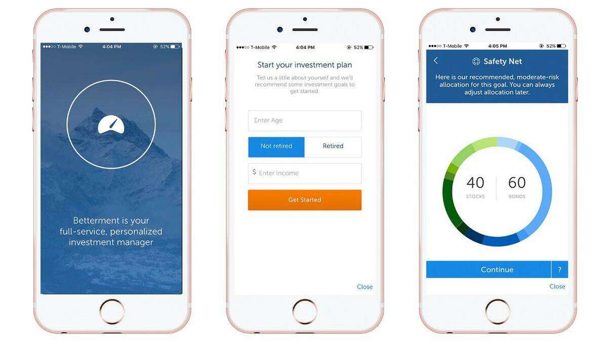
Source: Go Banking Rates
You can also allow users to disable certain app features they won’t need. That gives your app more focus and less clutter, enhancing the experience tremendously. For instance, the budgeting app Buddy lets users pick only the notifications relevant to them.
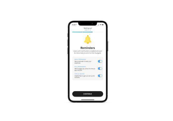
Source: Telerik
But you don’t have to make sweeping changes to your app to make it personalized. Sometimes, it’s the small touches that have a big impact. Allowing users to pick a language, displaying their name, or modifying their home screen are simple examples.
As they summed it up over on TMS:
“If we design it well enough, perhaps they won’t know it’s a financial service at all.”
Here’s the bottom line: financial concepts are inherently complex and complicated. A fintech app’s job is to make it simple, and design plays a big role in achieving that.
Forms are parts of your app where users need to enter data, such as sending payments or registering for an account. Keeping this as friction-free as possible is vital for improving UX—and retention.
As we mentioned, friction is anything that gets in the way of app users getting from point A to B. In apps, this can be confusing copy, tiny fields that are hard to tap, or a cluttered layout.

Source: Shopify
Proper error validation is a key foundation of frictionless forms. Users will often make mistakes, and it’s your job to make the app react as helpfully as possible.
The best approach is to highlight errors in real-time, explain them in layman’s terms, and give suggestions on fixing them.
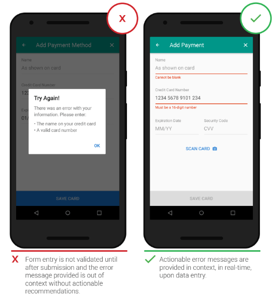
Source: Smashing Magazine
You should also have clear labels and captions that clearly explain each field and what users need to enter. This is where it’s recommended to “dumb it down” for the user. Clarity is your aim here.
If you have a longer form, consider breaking it down into multiple screens. This makes data entry manageable and less overwhelming for the user. Here’s a good example from the investment app Fisdom.
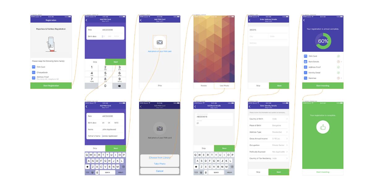
Source: Toptal
Sometimes, the best forms don’t require users to type anything, so you should consider keyboard alternatives. Scanning credit cards instead of typing them or using Facebook to log in are good examples.
Thankfully, creating frictionless forms isn’t too challenging. Thus, it’s a great and quick way to score higher on your retention rate.
Data visualization is a fantastic driver for user experience and, in turn, retention.
Humans are visual creatures. We’re better at absorbing and interpreting the information we see represented in graphic form, rather than read. Hence, visualization is a key tool for simplifying complex financial terms into something more manageable to the user.
For instance, imagine having to absorb this information purely as a text:
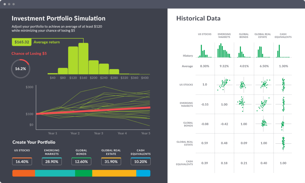
Source: Espeo
That would be a nightmare, wouldn’t it? Not to mention boring.
Visualization is also great for seeing trends and patterns. For instance, the Mint app graphs your bank balances in a graph, so you can easily see drastic changes in your spending behavior or income flow.
Source: Relevant
Aside from ease of processing, visualized data is also much more fun to look at. That can motivate users to absorb the information that they would normally skip.
However, a key challenge with data visualization in fintech apps is optimizing them for the smaller screens of mobile phones.
That means there should be much greater thought given to font size, colors, layout, and the type of graphs you’ll use.
You want to present as much information as possible without cluttering the UI.
You should also consider the different viewing circumstances of the user. For instance, some people might use night mode, and you have to make sure your visualization doesn’t clash with that color scheme.
Above all, remember a key tenet with visualization: simplicity is king.
The correct APIs and third-party tools can do wonders for your user retention by allowing you to incorporate features that can raise engagement.
In many apps, integration is crucial to the user experience. For example, personal finance apps require connection with a user’s bank accounts via the Open Banking initiative.
Without it, users can’t manage their money through the app, and it loses its main selling point.
Some APIs are also crucial for offering app features that would otherwise be difficult, time-consuming, or impossible to pull off. A good example of this is the Banking-as-a-Service (BaaS) architecture that allows apps to use a bank’s existing services:
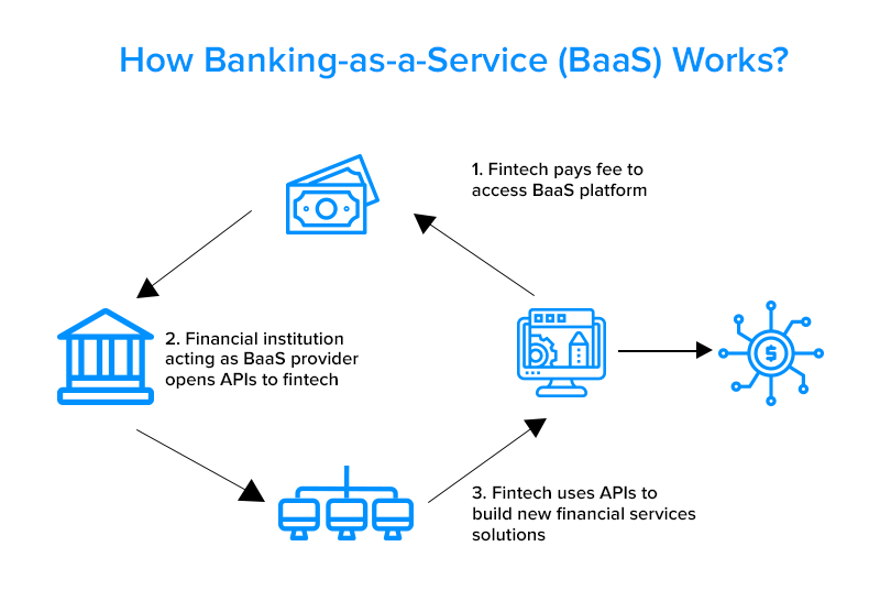
Source: Finextra
Another common example is Siri integration with apps like Paypal, giving the developer access to advanced features without developing them from scratch.
However, it’s important to keep in mind the goal of your app integrations. Offering new features and tools just because it’s unique and cool might not be the best approach. Doing this runs the risk of cluttering your app and diluting its purpose.
User retention is all about the user—what would make them stay with your app? Adding only the APIs that serve this aim is your best approach.
Knowing the features and tactics of the most engaging apps is one thing. However, it’s another matter to implement them in your project successfully.
That’s why the most important part of your user retention strategy is to have the right partner to develop these features for you.
And as an award-winning app developer, we might know a thing or twenty when it comes to retaining your users.
So if you have an app idea or just need ideas to improve your retention rates, drop us a line! We’ll be happy to talk.

Skilled in React Native, iOS and backend, Toni has a demonstrated knowledge of the information technology and services industry, with plenty of hands-on experience to back it up. He’s also an experienced Cloud engineer in Amazon Web Services (AWS), passionate about leveraging cloud technologies to improve the agility and efficiency of businesses. One of Toni’s most special traits is his talent for online shopping. In fact, our delivery guy is convinced that ‘Toni Vujević’ is a pseudonym for all DECODErs.
Trust is fundamental to the success of apps that involve a person's hard-earned money. Here's how you can build trust in your fintech app.

Achieving consistent fintech app user engagement is challenging, but it’s not impossible, thanks to these few simple strategies.

A tiny error can have devastating consequences when developing a fintech app. These are some common fintech app mistakes to look out for.