How to create a top-notch digital banking app
How do you create a digital banking app that stands out on the market? Here are the steps to take to build a top-notch digital banking app.
In a 1998 interview with Business Week, Steve Jobs once quipped that “simple can be harder than complex.”
In a way, this sums up what the user experience (UX) in your fintech app should be. Because while the result must be straightforward, accomplishing it is anything but.
Indeed, excellent UX is tricky to pull off. It’s why the industry average for 90-day app retention rates is only at 20 – 30%.
But while UX is a huge challenge, it’s not impossible to get it right. So here are some tips to increase your chances.
One of the central challenges of UX design in fintech is how to avoid overwhelming the user. The best way is to simplify the flow of your app.
Flow describes the steps that a user must make to use specific features or accomplish goals in your app.
For instance, if someone needs to withdraw money from a banking app, they might need to tap on the Withdraw icon on the home screen, specify an amount, then authorize the transaction.
For the best UX, the number of necessary steps must be as low as possible.
Any unnecessary or confusing ones will create friction, which is anything that hinders users from completing an action.
Shopify summed up friction best with this simple illustration:

Source: Shopify
In other words, if withdrawing from a banking app can be done in three steps, don’t complicate things by making it five.
However, keep in mind that, in some situations, friction is actually necessary for UX, especially in fintech apps.
That’s because a little hindrance will force users to think twice about making critical transactions and help avoid mistakes.
The best example of such a situation is payment confirmation. Most fintech apps require an extra confirmatory step whenever you send money.
This can be done through a simple confirm button, biometric authorization, or in the case of Apple Cash, a double press on the side button:
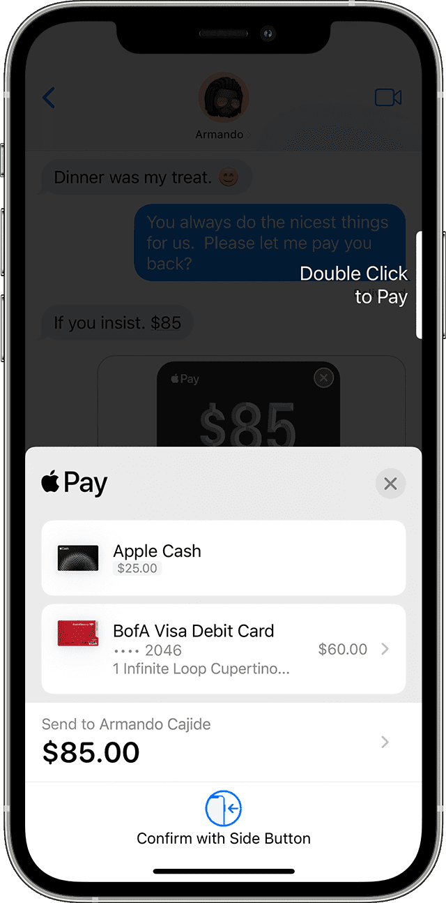
Source: Apple.com
Creating the best user flow is essentially a balance between adding positive friction and removing the negative kind. Doing this successfully requires one thing—knowing the user inside and out.
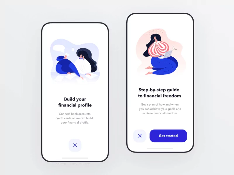
The Indian investment app Fisdom illustrates this point nicely.
Regulations in India require that users complete a time-consuming and tedious Know Your Customer (KYC) process before investing.
However, when Fisdom developers did a usability test, they found that the KYC process was a significant source of friction, increasing their churn rate.
So they redid the user flow. Now, instead of requiring KYC before the user can access the Fisdom app (as most apps do), they only ask for it right before the user is ready to invest.
That gives users time to explore the app, familiarize themselves with the investment options, and build trust.
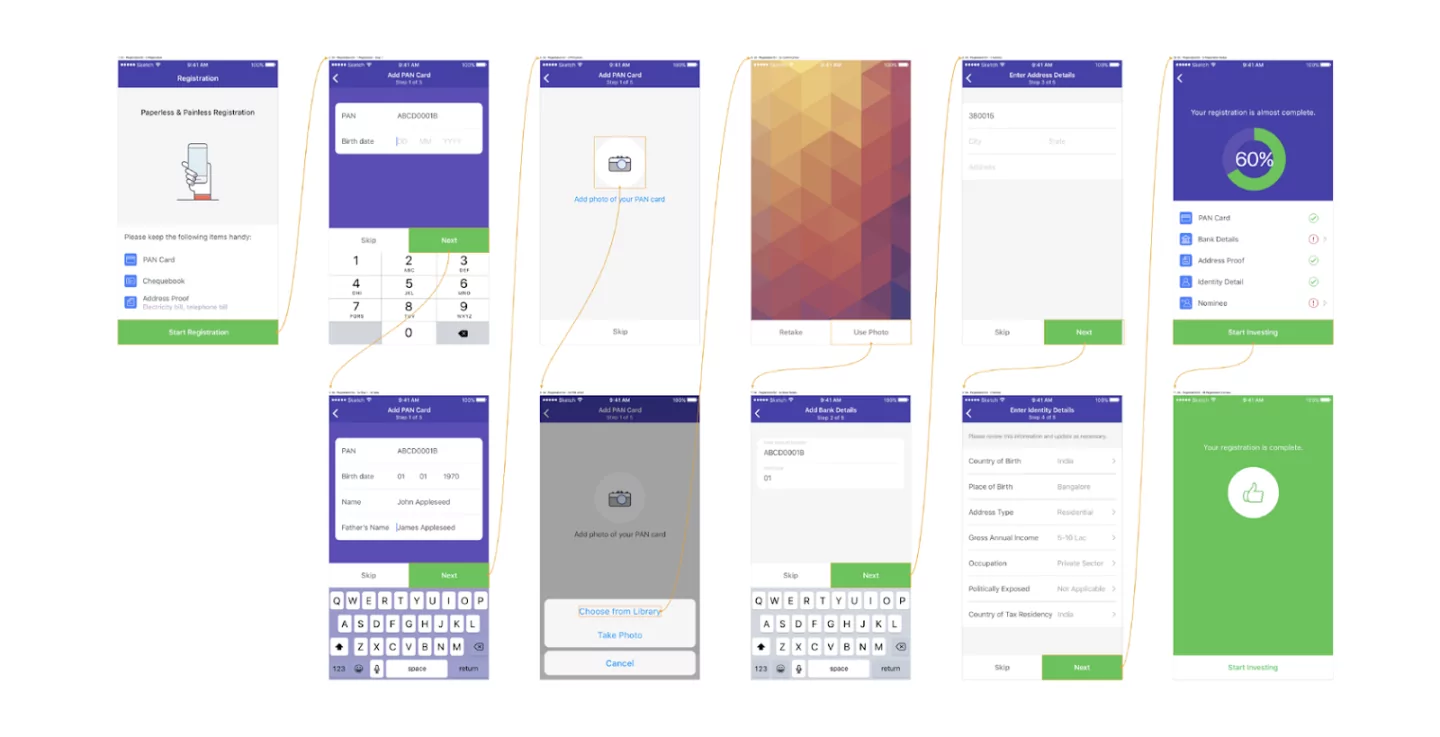
For comparison, here are their old and new flow next to each other:
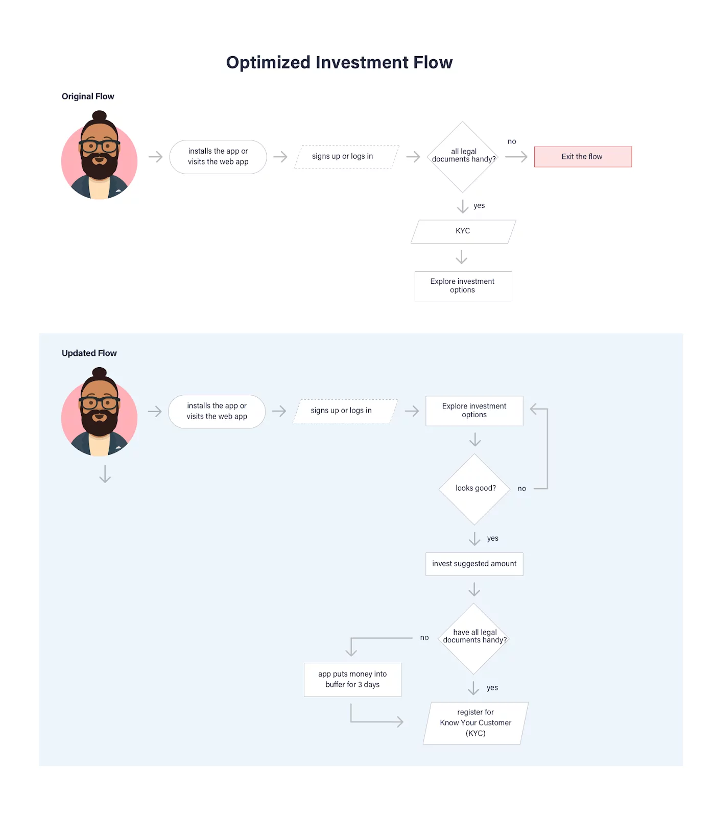
Source: Toptal
Sometimes, coming up with the best flow is about questioning the status quo and asking yourself: “Is there an easier, faster, and safer way to do this for the user?”
So don’t be afraid to divide screens, hide certain elements, or completely flip around flows—as long as it makes the user’s life easier.
A CNBC article once described financial terms as “a race to use the most syllables to describe one concept.” While that’s good from an academic point of view, it’s also the reason why finance is so complicated.
But fintech apps can’t afford to make the same mistake.
Remember, they exist to make financial services easy and accessible to as many people as possible. And the best way to achieve this is through simple language.
That means not using any financial jargon and terms.
The goal here is to make sure that anyone, even first-time users of financial services, knows exactly what’s going on in the app.
But having users drop out of your app isn’t the only risk with complicated copy. It’s also a risk for compliance issues and even lawsuits.
That’s what happened with the popular trading app Robinhood.
In 2021, they were fined by the Financial Industry Regulatory Authority (FINRA) for $70 million.
Among other things, it was because they provided users with wrong or misleading information.
This leads us to our next point: it’s not enough to avoid complicated copy when you’re running a fintech app. It must go the extra mile by simplifying complex financial concepts. That way, they can understand the potential risks involved.
A good example is the Monzo loan calculator. Instead of using specialized terms, the app uses everyday language that the user can understand right away.
It also clearly states how much the user will pay per month, as you can see below:
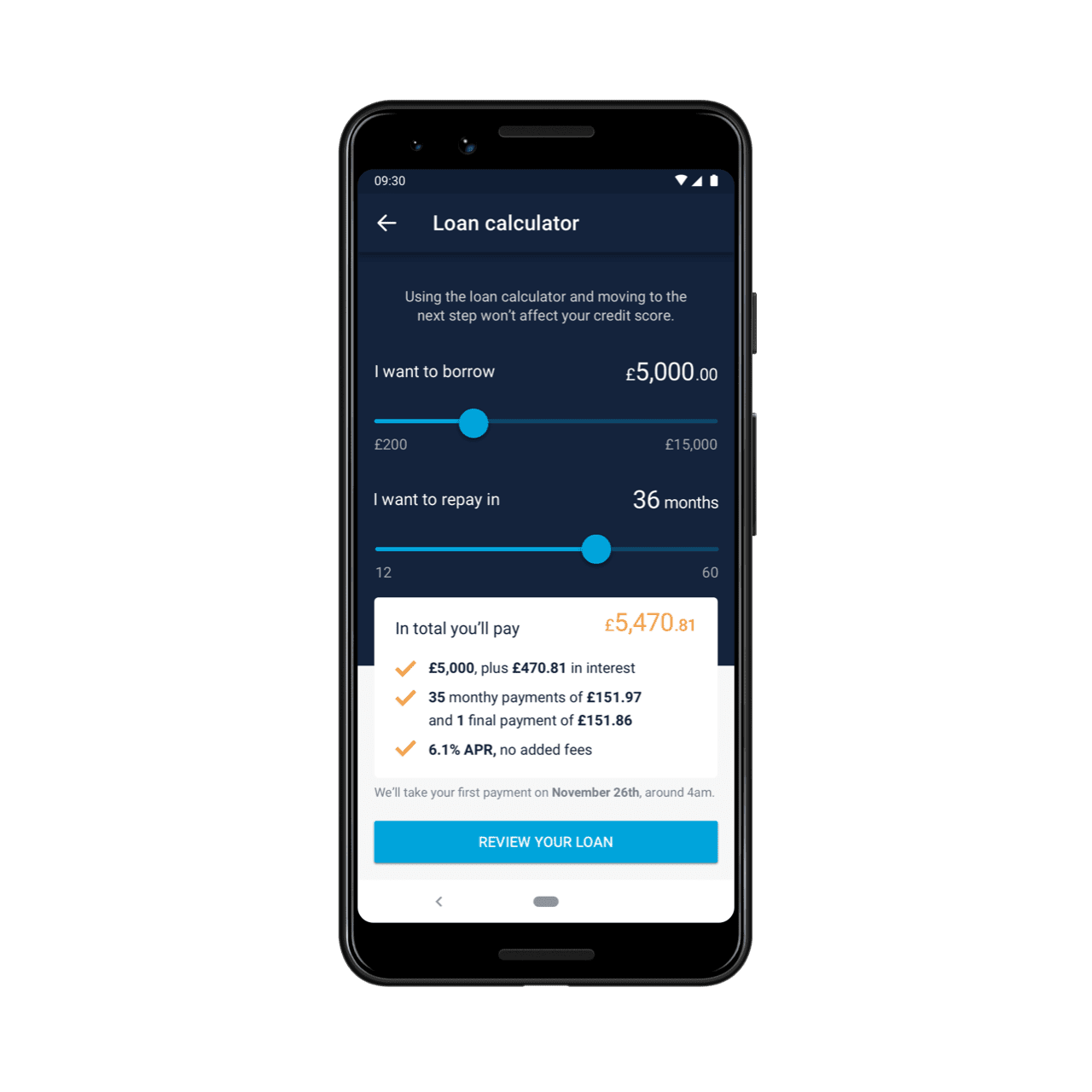
Source: Monzo
Thanks to the app laying out the terms in a straightforward way, users know exactly what they’re getting into when they get a Monzo loan.
Hiring a talented UX writer is essential for ensuring your app has the same simplicity and clarity.
Not only can they bridge financial concepts to everyday words, but they can also do the same for technical concepts.
It helps you avoid UX issues like this:
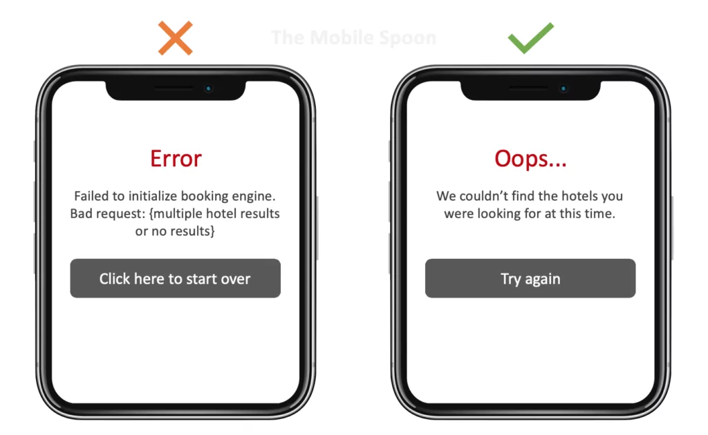
Source: Usability Geek
It’s also useful to have the financial expert on your team list out all the terms and definitions you’ll use in the app, so your writer can break them down.
While the goal of UX writing is simplicity, the process itself is anything but simple. There are many guidelines to remember, like using concise sentences or keeping the brand voice in mind.
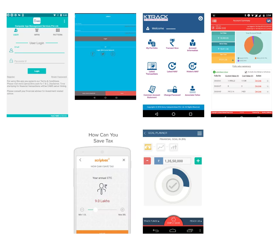
People have this impression that finance is boring. And while the complicated language plays a role, the cold and almost corporate look of many kinds of financial software is also partly to blame.
For instance, when Fisdom app developers were doing competitor research, they realized how boring and uninspired fintech apps appeared:
Source: Toptal
Creating an attractive user interface is one of the most effective ways to improve your UX. It helps make your app more inviting and a joy to use – even when doing complicated tasks.
That’s what software vendor ITTI experienced when they partnered with UXDA to revamp their back-end banking solution.
The new UI was a departure from their clunky, slow and complicated old version. See the comparison below:
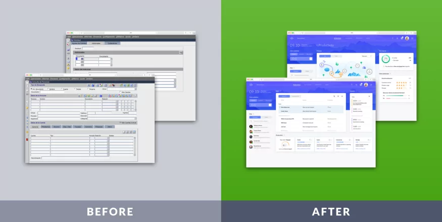
Source: UXDA
The result was phenomenal. As the people of ITTI put it:
“The end result over-delivered on our expectations, not only because it proved the possibility to combine the complex functionality with user-centricity in an enjoyable, beautiful and delightful design, but also because we became live witnesses of the huge mindset shift a user-centered thinking creates in our organization.”
Visuals can also influence your users at a deeper psychological level.
For example, studies have shown that blue has a calming effect that can help foster trust. It’s the reason why many big corporations—including banks—use it in their logos and branding.
Other colors evoke different emotions:
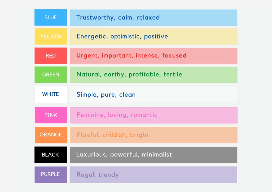
Source: UX Collective
You can use this knowledge to your advantage when deciding on the color scheme for your app.
There are plenty more techniques to make your UIs a little more exciting.
Using curves and rounded buttons is a great way, as they look more natural and pleasing to the eye. So, too, do decorative fonts (just make sure to ensure readability in the body copy).
Using illustrations and animation makes your app interesting. Moreover, they can be more effective at communicating concepts.
However, the most important tip to remember is that your UI should be beautiful and functional. It’s best to ensure that all elements serve a purpose and aren’t just mere eye candy.
Most financial apps require plenty of user data to work, including bank account details and personal information.
Unfortunately, entering all of these into the app can be a significant source of user friction.
Thus, making data entry effortless is an excellent way to improve UX.
Even though most of us don’t admit it, typing on a smartphone is onerous. And a study by the University of Cambridge backs up this sentiment.
Among the many interesting tidbits in that study, researchers found that most people averaged only 36 words per minute. Plus, most also misspelled 1 out of 5 words.
This is something you should take into account.
There are many ways to optimize data entry. However, the most important thing is to ask for relevant information only when it’s needed.
Too often, apps ask for additional data solely for marketing purposes. While that’s useful for you, it can be a nuisance for the user.
What’s more, collecting too much information from users is a potential security risk as well.
Also, gone are the days of data forms that have dozens of fields.
Instead, if you need to gather multiple pieces of information, it’s better to break it into manageable steps. This helps reduce overwhelm and foster better focus.
Source: Toptal
You should also consider keyboard alternatives for data entry. For example, entering credit card information is one of the most tedious parts of making online payments.
The Microblink API solves this problem by allowing smartphone users to scan their credit cards, saving users 50+ keystrokes in the process.
Another good practice is to leverage a person’s existing accounts (such as a Facebook or Google login) to get their necessary information.
A Google case study showed that Pinterest saw a 126% increase in sign-ups using Google One Tap. According to Lena Ziskin from Pinterest:
“Google One Tap allows our users to easily access the best of Pinterest and supports our vision of removing friction and making authentication intuitive.”
This eliminates the need for users to fill up a registration form or even enter a password every time they log in, which can drastically reduce friction.
It’s no secret that everyone loves playing games and getting the thrill of the win. Gamification is merely exploiting this natural tendency for your app’s benefit.
Gamifying a fintech app involves using gaming mechanics to make the user experience much more exciting and rewarding.
It’s one of the surefire ways to turn a “boring” fintech app into something your users will want to engage with every day.
And if you think gamifying an app is only a fun gimmick for a younger audience, think again.
A study by Finances Online showed that 97% of employees aged 45 and older believed that gamification improved their work.
The same study also uncovered the top gamification strategies that would work best with adult users:
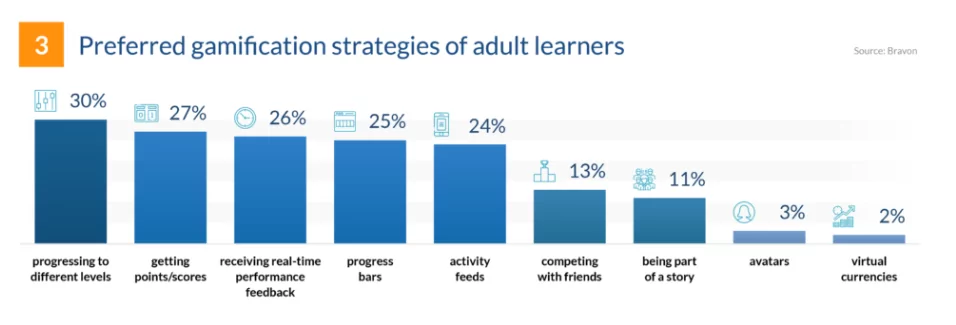
Source: Finances Online
As you can see, level progression is the most effective strategy you can use. You can easily integrate this into a fintech app by asking your user to define their goal (such as saving an X amount of money) and breaking it down into milestones.
You can then let them see their progress as they try to reach that goal.
This is a common technique for most savings and investing apps, such as Qapital.
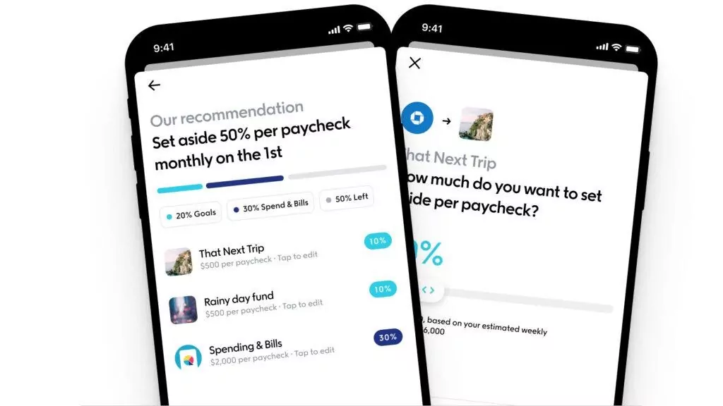
Source: Qapital
Earning points and rewards is probably the oldest gamification strategy because it appeals to almost everyone. The thrill of winning something is why rewards programs are so popular.
The Cake app is quite popular because it rewards its users with cashback, creating an addictive incentive.
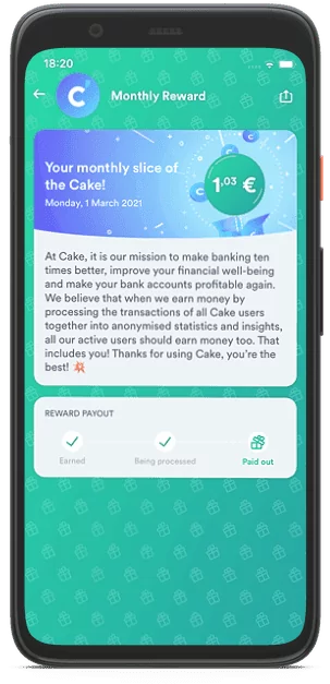
Source: Cake
You don’t even need to reward your users with something tangible like cash or items for this strategy to work (although it will certainly help). Virtual rewards like badges or trophies can give people enough of a high to continue using your app.
Then there are the fintech apps that take gamification to a whole new level by making the entire app feel like a game.
A perfect example is Fortune City, a SimCity-like game where you can build your virtual town by tracking your spending and saving money.
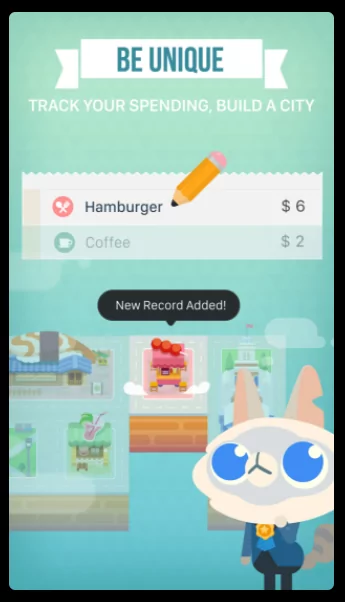
Source: Fortune City
With that said, though, you need to implement gamification the right way; otherwise, it will harm your UX more than help it.
Balance is key. Goals need to be challenging enough to motivate users but not too difficult to frustrate them. Rules should also be fair and clear.
Remember, gamification should motivate and inspire your users to act.
The ubiquity of fintech apps means that users expect them to work, regardless of the device they’re using.
The problem is that there’s a wide variety of screen resolutions in use worldwide. You can see that clearly in this study:
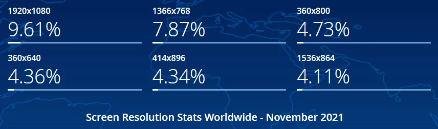
Source: Stat Counter
This variety is why device adaptability is important. Your app should be flexible enough to change the UI based on any resolution.
Consequently, it must also decide which information to display at any given time.
Aside from this, there are also the aesthetics and features of the device and OS in mind.
Tackling this problem requires understanding how to develop a native vs. cross-platform app. You can read all about it here.
Accessibility is also another often overlooked aspect of adaptability.
Your UI should accommodate people with cognitive or physical disabilities as much as possible.
For instance, relying on color alone to convey critical information is bad for color-blind users. Instead, using other cues, such as text, sound, or images, is a much better approach.
You can also use larger fonts, a zoom feature, or text-to-speech technology to help people with vision problems.
The bottom line is that adaptability and accessibility are just another way of ensuring the best UX to the widest range of users possible.
The most important UX tip of all is worth leaving out last—a talented development team.
Because only an agency with the experience, knowledge, and skill to launch award-winning apps can successfully integrate all of the above UX tips. And we think DECODE fits that description quite nicely.
So if you have an app idea you’re itching to bring to life, do get in touch! We’ll be happy to talk it through with you.

Marko started DECODE with co-founders Peter and Mario, and a decade later, leads the company as CEO. His role is now almost entirely centred around business strategy, though his extensive background in software engineering makes sure he sees the future of the company from every angle. A graduate of the University of Zagreb’s Faculty of Electrical Engineering and Computing, he’s fascinated by the architecture of mobile apps and reactive programming, and a strong believer in life-long learning. Always ready for action. Or an impromptu skiing trip.
How do you create a digital banking app that stands out on the market? Here are the steps to take to build a top-notch digital banking app.
Personal finance apps are a great entry point to get into the fintech space. Here’s how to build a personal finance app users will love.

So before going any further with your Fintech project, here are seven things you have to consider first.