App UX design: Top mistakes to avoid when creating an app

According to a Statista study, roughly 25% of apps are only used once.
There could be many reasons for this, but we’re pretty confident that bad UX is a major one.
This is especially true since achieving great UX is notoriously difficult, and only a handful of apps do it right.
But with the right strategy and knowledge, you can join the small percentage of developers who’ve achieved exceptional UX.
And it starts with knowing the UX pitfalls that you need to avoid.
Not understanding your users’ needs
Almost every UX design mistake can be attributed to one root cause: failing to understand your users well enough.
In fact, it’s one of the top reasons apps fail overall, according to this survey:
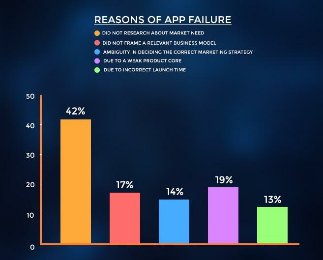
Source: Business of Apps
Not knowing your users’ needs when designing UX is like driving without a map. You risk introducing design decisions that aren’t aligned with your audience.
One good example of what not to do comes from the messaging app WhatsApp. When you accidentally send a message and delete it after, the receiver will see this:
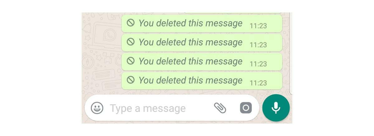
Source: Career Foundry
While giving feedback on an action is good UX, it’s inappropriate in this case, as it violates the sender’s need for discreetness, making it even more awkward for them.
So, how can you ensure that you’re in tune with your audience?
The best approach is to do proper user research, then use that to create a need statement.
This sentence describes who the user is, what they need, and why it’s beneficial for them to fulfill those needs.
In our above WhatsApp example, the user statement might go something like this:
“People who send messages by mistake (who) need a way to delete it discreetly (need) so that they get to avoid awkward situations (benefit).”
There are many approaches to developing a need statement, but it should always start with user research. This ensures that any conclusions you have are all backed by real data.
Source: Maze
Once you have sufficient insights, you can use IBM’s process for formulating your need statement. This involves a brainstorming session with all team members for better insights.
Start with a whiteboard and write out the need statement template below:
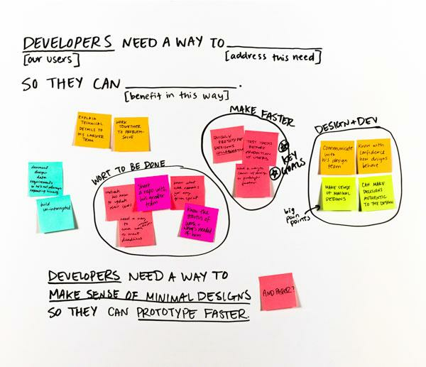
Source: IBM
Then have everyone in your team use post-its to write out ideas to fill out the prompt. Remember to avoid writing features; one clue is if you write in computer terms like tap or export.
Once you have enough ideas, try to group similar ones together. You’ll eventually arrive at common themes, which you can try to enter into the need statement template.
Repeat as necessary for any idea clusters remaining.
When done with structure and intention, it’s easy to come up with need statements that reflect your user’s reality.
Overloaded user interface
One of the main tenets of great UX is simplicity; a cluttered interface will only confuse users and make them quit your app.
Unfortunately, it’s easy to overcomplicate things by adding too many features.
Many assume (incorrectly!) that users want comprehensive, feature-packed apps where they can do everything. But too many options can lead to decision-making paralysis.
This phenomenon is called the paradox of choice, first explored in a now-famous study by psychologists Sheena Iyengar and Mark Lepper:
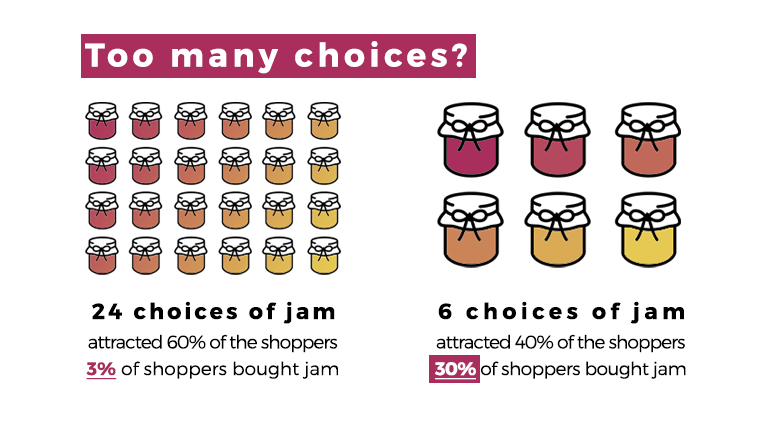
Source: Your Marketing Rules
You can see this paradox pop up in apps all the time. Here’s one common example—an extremely long drop-down menu:
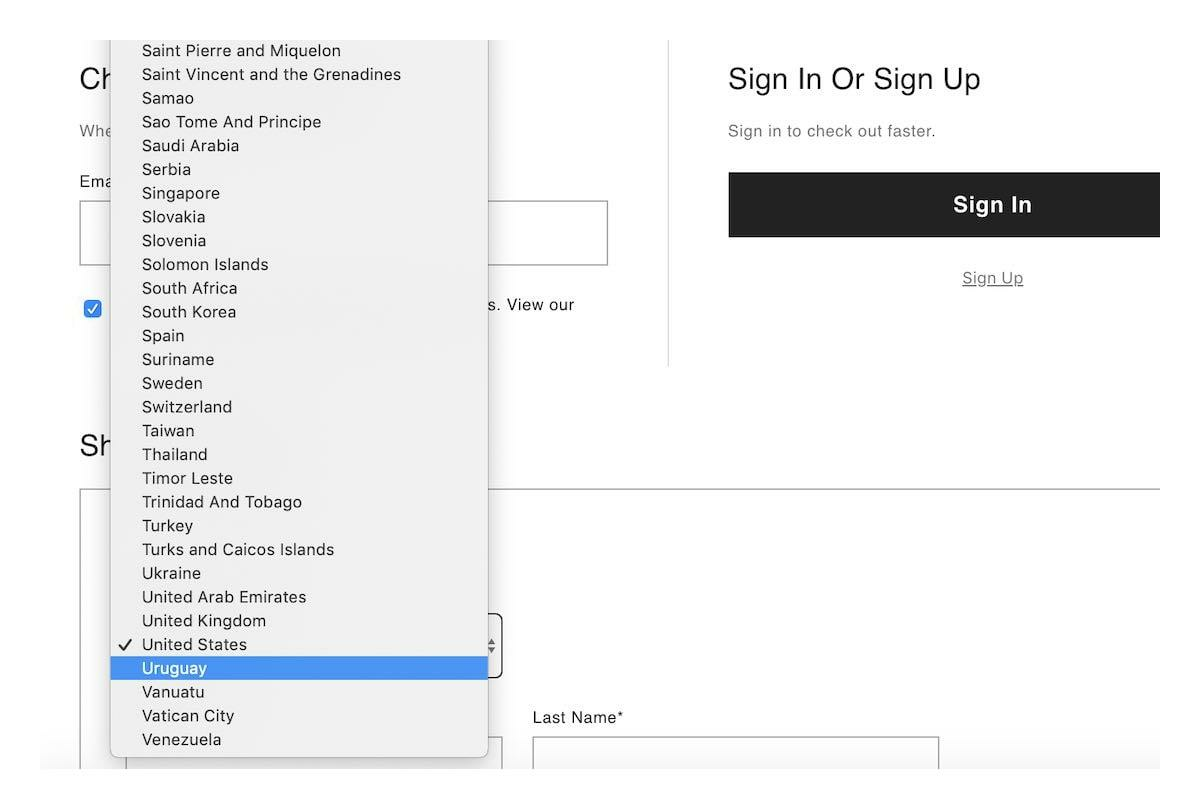
Source: Career Foundry
Fortunately, the solution to overloaded interfaces is relatively straightforward—just trim them.
Of course, that’s never easy. What if your app has too many features and you can’t remove any of them?
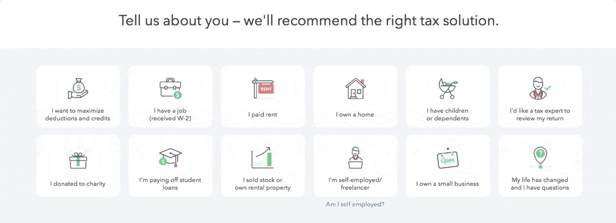
A good approach is to personalize the app by only presenting relevant features to a user, thus reducing possible choices.
For example, TurboTax asks the user what specific tax solutions they need. It then presents only these features so that it doesn’t overload the UI.
Source: Appcues
Sometimes, the UI can look overloaded simply because of poor design choices.
Thus, you should always balance the visual and textual elements on your screen, then lay them out in an organized manner.
For example, you don’t want your UI to look like this:

Source: UX Planet
You should also replace text with visual representation whenever possible.
This is especially crucial in analytics dashboards that involve a lot of data. The solution here is data visualization.
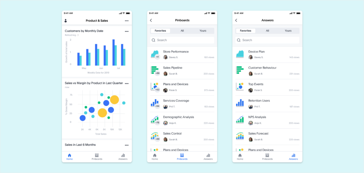
Source: ThoughtSpot
But at the end of the day, a streamlined UI can only come from uncompromising decluttering.
Justify every element’s purpose on the screen, and don’t be afraid to cut out anything that isn’t useful. Remember, clutter breeds confusion.
Not having great app copy
App copy is one of the crucial UX elements developers often forget to optimize. It can lead to issues like this:
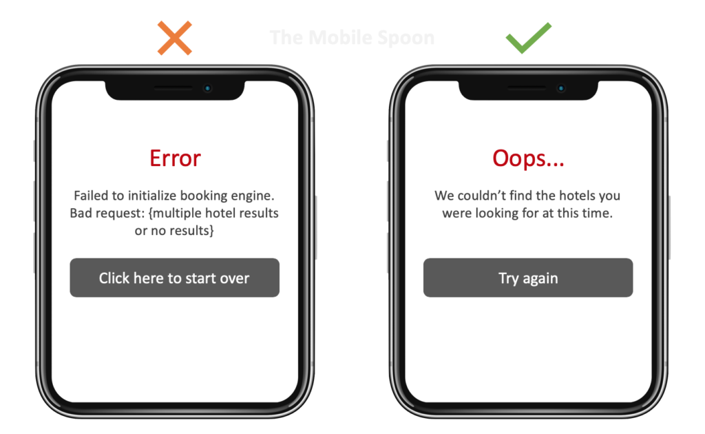
Source: Usability Geek
Unfortunately, such unclear copy will only confuse and alienate users. And confusion will always lead to churn.
The best approach to avoid this is to practice proper UX writing. Its goal is to direct users around your app in the most intuitive and frictionless way possible.
Let’s look at some best practices.
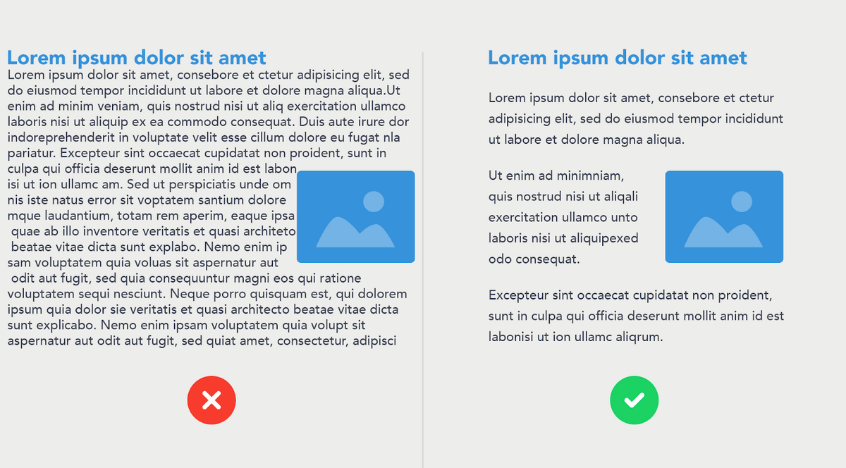
The first thing you want to avoid is a big wall of text. You can easily solve this issue by utilizing whitespace wisely.
Try to divide the text into paragraphs at most 9 lines long and 60 characters wide.
Source: PSD2HTML
Notice how the second example is more pleasing to the eye and inviting to read.
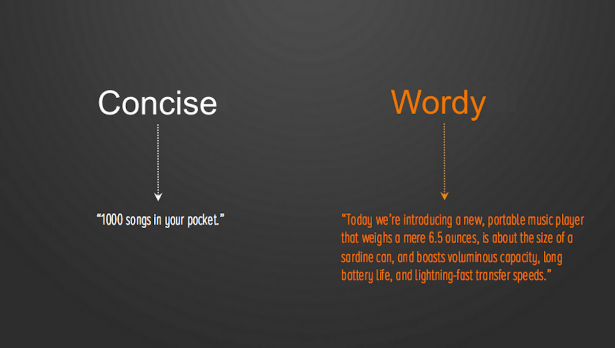
Keeping your copy concise and using the least words to convey the same meaning is also one of the cornerstones of good UX. Check out this famous example from Apple:
Source: Shopify
You’ll be amazed how much meaning you can cram into just a few simple words.
On the other hand, jargon is a major UX copywriting sin. A good benchmark here is asking yourself: “will an 8-year-old understand this?”
If the answer is yes, then you’re on the right track.
Here’s a common example:
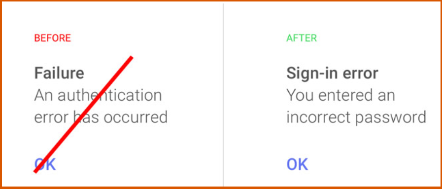
Source: Usability Geek
A developer would know what “authentication error” means, but a regular user probably won’t. Also, it’s important to use the active voice.
This is much more dynamic since app copy exists to direct users to do something.
Using numbers is also a good UX practice. Not only do they make your copy more compact, but they also leap off the page more.
For example, seeing that your revenues grew by “512%” is much more impactful than reading “five hundred and twelve percent.”
These best practices point to one critical principle of writing app copy—clarity. By being clear and direct with your writing, you can improve UX dramatically.
While we’re on the subject of app copy, there’s one other UX element we need to mention here, because the two are tightly linked: CTAs.
Missing calls to action
Calls to action (CTAs) are the most crucial element in your app. If you think about it, everything in your app moves because of CTAs.
Registering for an account? Confirming an action? Purchasing an item? Deleting a photo? All of these are done through CTAs.
However, you’d be surprised to learn how many apps hide their CTAs or make them less prominent in a clean design.
Let’s make sure you don’t make that mistake in your app.
And the best way to make it stand out is to use CTA buttons instead of text links.
Email software Campaign Monitor realized this when they optimized one of their emails. Simply switching from a text link to a button raised their conversion rate by 127%.
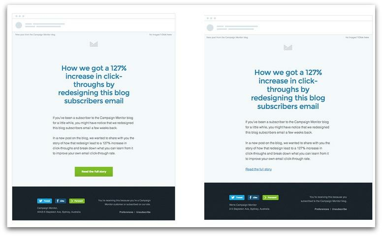
Source: Sumo
To make it more prominent, your CTA button should be different from other buttons in your app.
In fact, it should contrast with every other element on your UI. Otherwise, there’s a chance that users might miss it.
A simple way to ensure this is by using a striking color or design with your CTA button.
For example, a common approach is to make regular buttons have an outlined design while the CTA button is filled.
Like this:
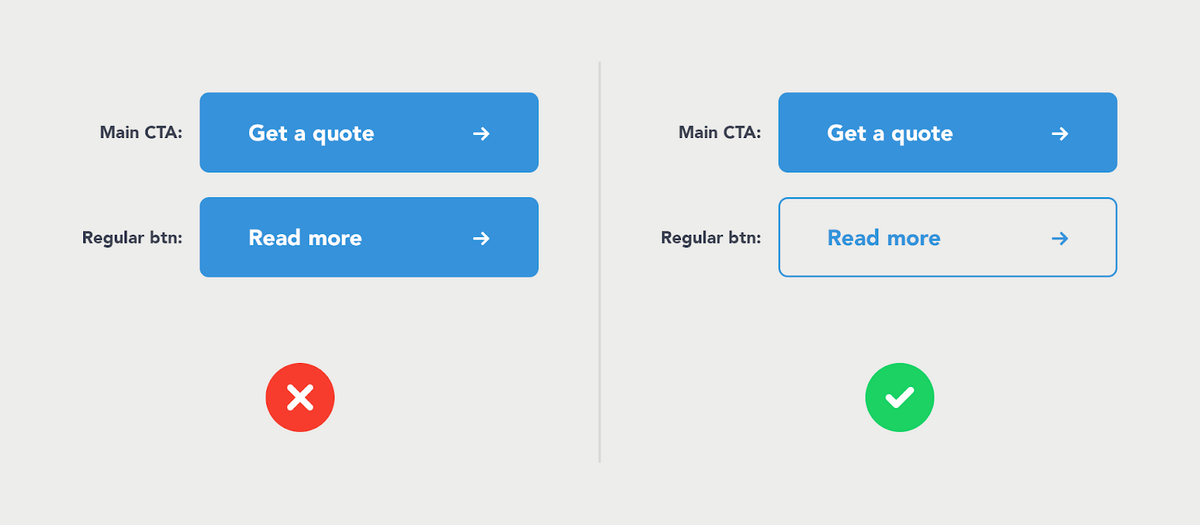
Source: PSD2HTML
Making your CTA bigger is also a common approach. Indeed, Apple recognizes this and shares that a good CTA button should be at least 44 x 44 pixels.
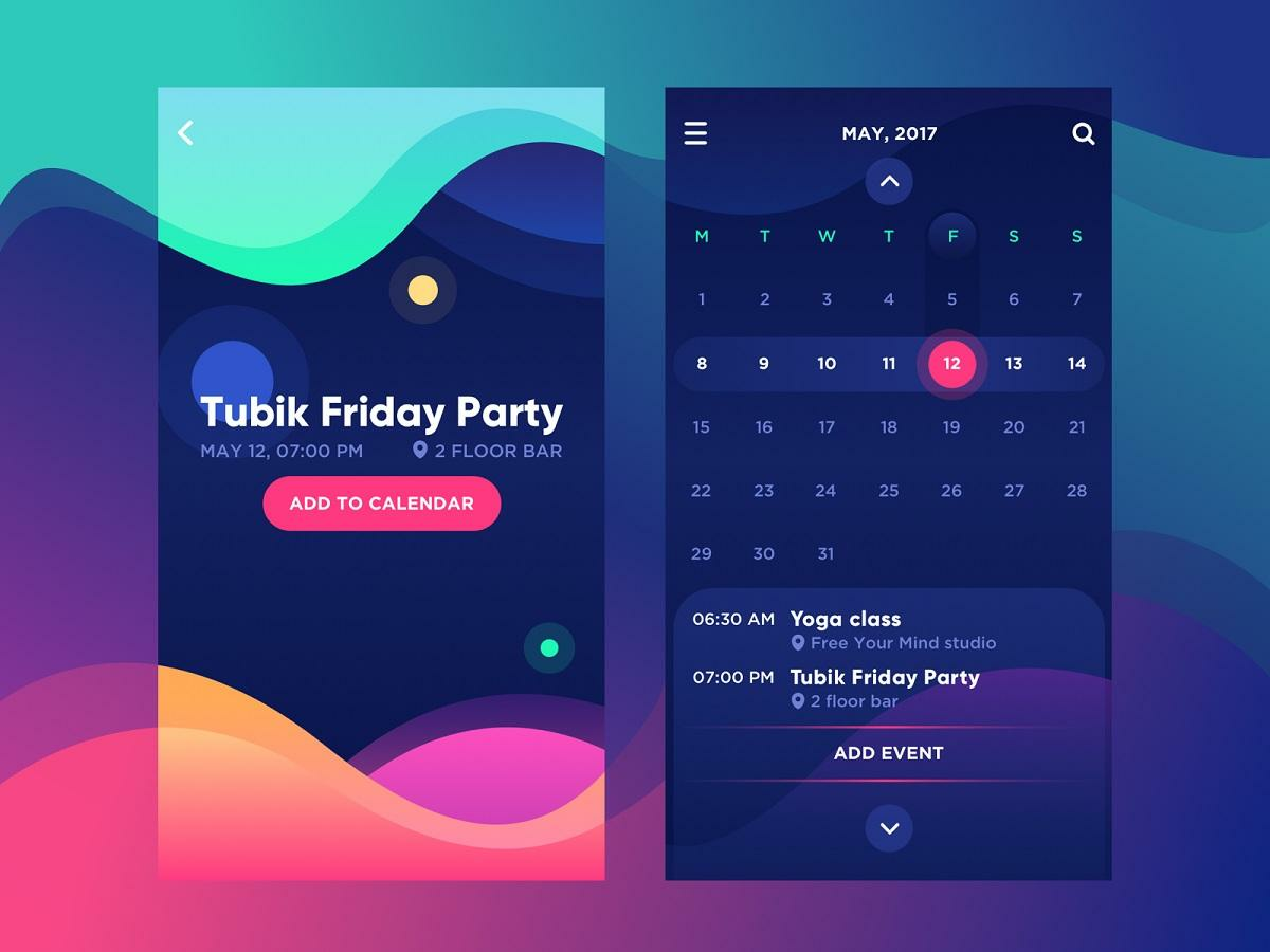
Source: Tubik
CTA copy is just as important as its appearance. Like good UX copywriting, it should be concise yet meaningful.
The fewer words you use, the faster it is for users to process your CTA mentally.
For instance, instead of saying Complete the form, a simple Submit is more powerful and direct.
Finally, avoid putting too many CTAs on a page, as it can dilute the power of the individual button. Stick with one at most, like what Airbnb did.

Source: Sumo
CTAs are powerful UX elements, and rightfully so. They have the power to make users perform what you want them to. So, it’s worth optimizing them.
Too many annoying notifications
Notifications are powerful tools that can do wonders for your retention and UX. But unfortunately, it’s also very easy to abuse them and harm your app.
In fact, sending too many annoying notifications is the number one reason people uninstall apps. They are regarded as an even worse offender than intrusive ads!
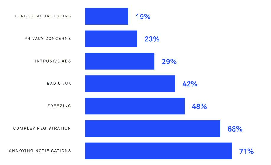
Source: DECODE
However, notice the keyword annoying. If you can make your notifications relevant and valuable, they’ll be much more appreciated by your users.
The best practice here is to ask permission first. Let your users know what notifications you’ll be sending them and, more importantly, how it will benefit them.
Take the Fastic app, for example. Their onboarding states that notifications will increase their users’ chances of success by 89%. Now, who wouldn’t want that?
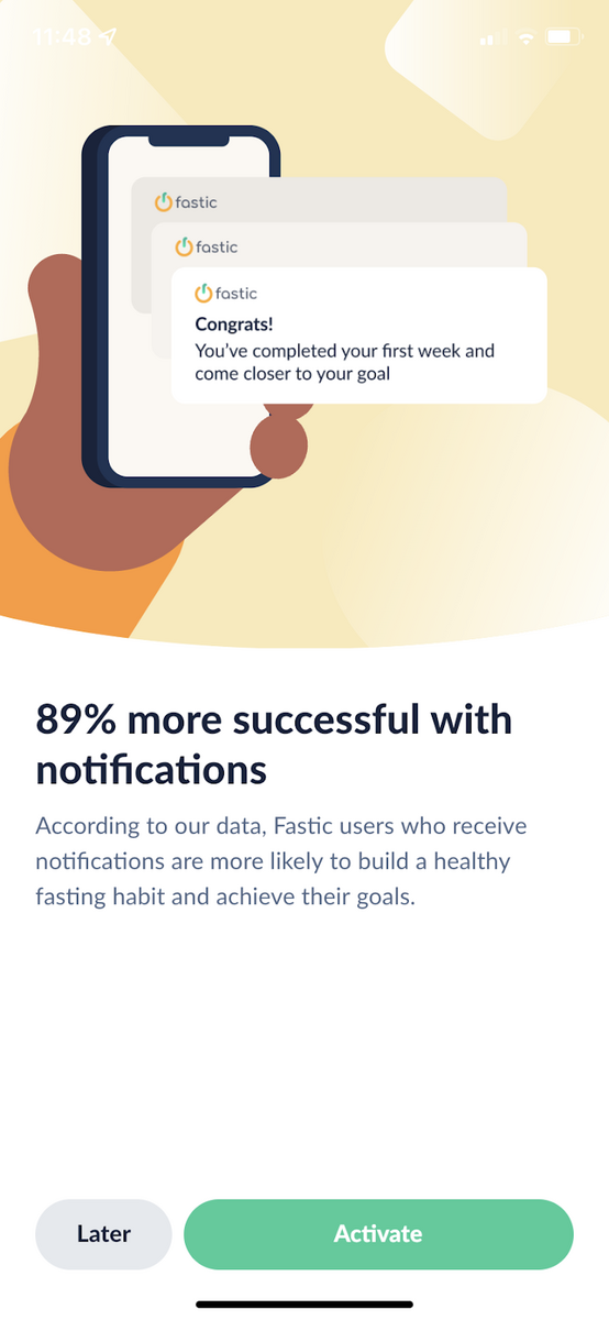
Source: DECODE
Even with valuable notifications, that’s still no excuse to overdo it. But what’s considered a healthy amount to send, though?
Well, that depends on the app niche, as this study shows:
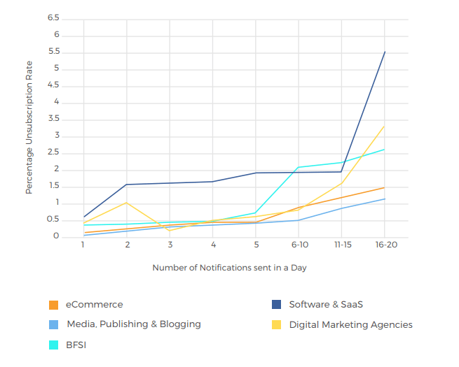
Source: Business of Apps
Regardless of your niche, we recommend starting on the safe side first. For most apps, that’s around one notification per day.
Then try to increase it over time gradually and look at your churn rate. That should help you detect what the sweet spot is for your users.
But remember, the focus with notifications is more on the quality rather than the frequency. So as long your messages deliver real value, users wouldn’t mind them.
Ignoring the app architecture
When you’re doing UX design, it’s easy to focus on the aesthetic side of things. While they’re undoubtedly important, many lose sight of the app’s navigation and logic flow.
The analogy is like having a house with a beautiful coat of paint but weak foundations. It will eventually crumble.
Effective UX requires streamlined navigation. It ensures that the app’s flow is as frictionless as possible. In other words, users can get from point A to point B in your app in the smallest possible number of steps. A rule of thumb is around 2 or 3.
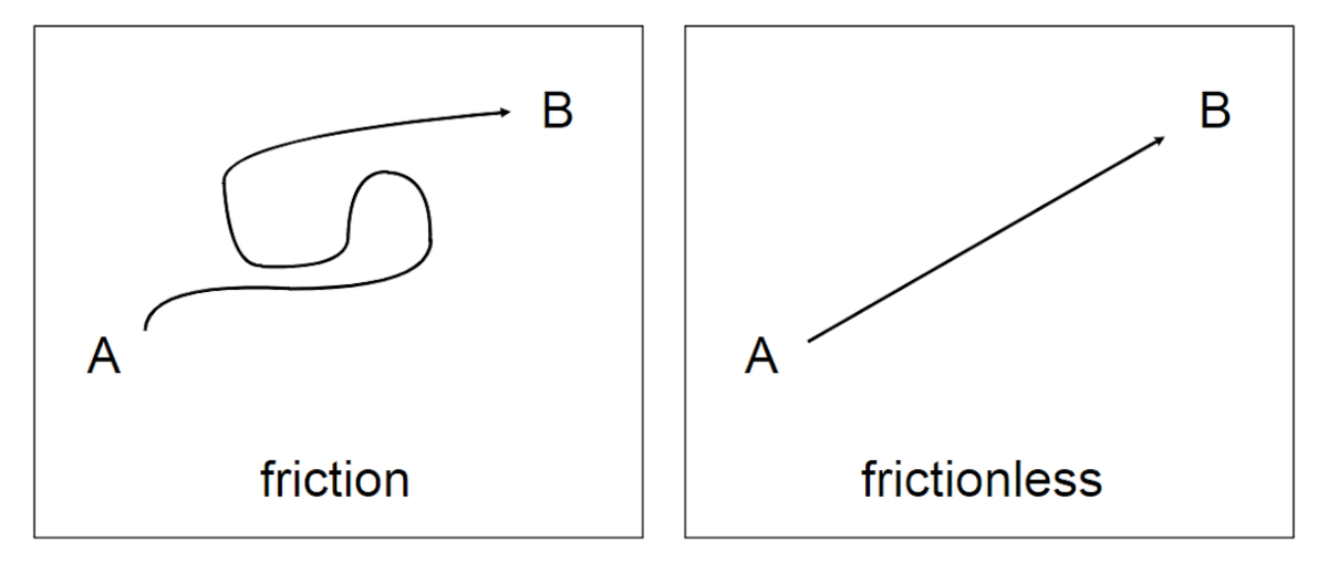
Source: Shopify
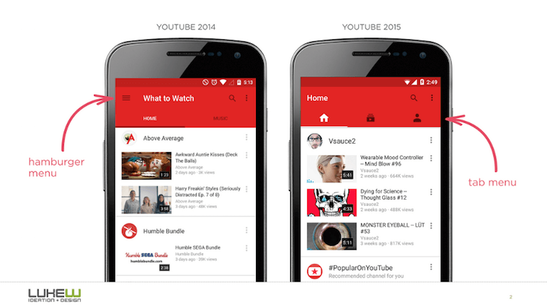
Users shouldn’t feel lost when they’re navigating through your app. You can avoid this by using visual cues that let them know where they are in your interface.
For example, YouTube uses a simple heading to tell someone their exact location. If you use a tab menu for navigation, highlighting the active tab can also do the job.
Source: Smashing Magazine
In the same way that a lack of visual cues can make someone feel lost, the lack of progress signals can also keep users in the dark on what’s happening with your app.
This is a common problem when paying online with a bad connection.
Unfortunately, most browsers will simply freeze while the transaction is in progress, and the user will not know if their payment is going through. If you’ve experienced this, you know how frustrating it can be.
A simple solution is to use a progress indicator like this:
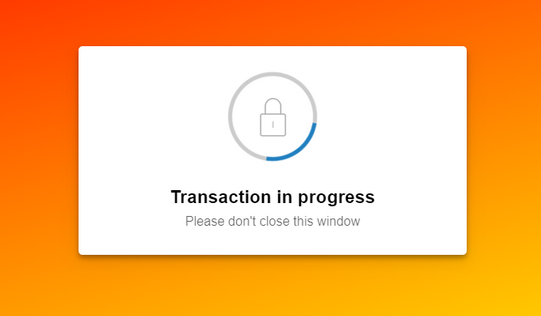
Source: Paypal
It’s a trivial addition, but it makes all the difference. It’s like telling the user: “sit tight; we’re working on it.”
Giving users a feeling of control and direction is, really, the main point of UX.
Great UX is more than just avoiding mistakes
At its heart, UX is about giving a seamless and delightful experience to your users.
Avoiding the common mistakes we’ve listed here is a start. But more than that, great UX is about empathizing with the user’s needs and offering an experience to address them.
And that requires engineering every little detail of your app to support that.
It’s not easy, but it’s truly worth the effort.
Want more UX tips? Check out our excellent article here.