How to improve your app onboarding process

Every developer knows onboarding is a crucial part of running an app.
But to truly appreciate how, it pays to look at some statistics.
According to Wyzowl, 63% of users rely on a successful onboarding process to make crucial decisions post-sale.
And nearly 86% of customers are loyal to businesses that educate them on how to use a product.
Indeed, onboarding builds trust because it shows you care about users.
So, how do you ensure the best onboarding experience possible? You can start with these six helpful tips.
Create skippable login forms
One of the biggest causes of friction is asking users to log in or sign up for an account too early. Thus, it makes sense to skip it altogether during onboarding.
The numbers back this up.
According to an Onfido report, 43% of users abandon the onboarding process because they feel frustrated while verifying their identity or creating an account.
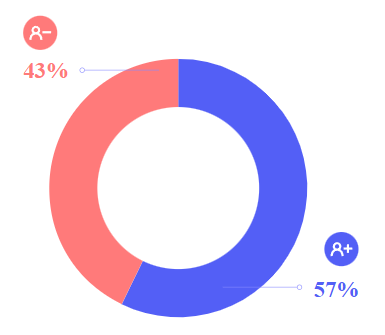
Source: Onfido
There are many factors to this hesitation, including fears about data privacy and security. But mostly because it feels like an obstacle that users must traverse.
The conventional wisdom is that you should create an account for everything. From a business standpoint, it makes sense.
When users log in, you can better track their behavior or get their information.
But if you look at it, accounts aren’t mostly needed from a user experience standpoint.
Take the Hotels.com app. You’d think that booking a hotel would require an account, but it’s not needed in this case.
As a first-time user, you can skip the login form and go straight to searching for hotels.
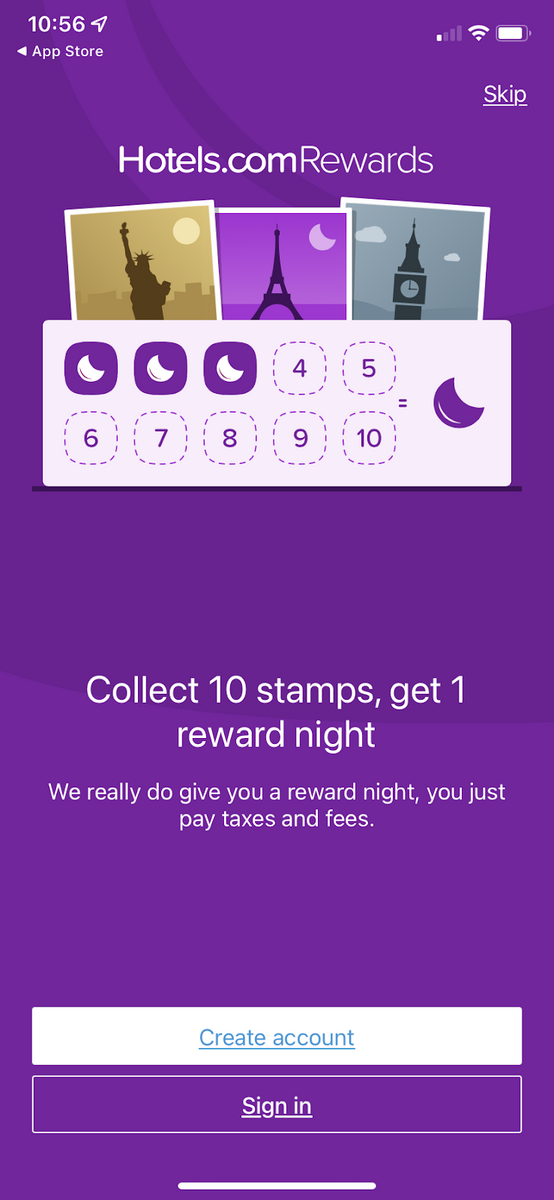
Source: Hotels.com
Of course, users can’t always skip logging in. For example, many apps like fintech or fitness require access to the user’s information to function properly.
In these cases, the solution is to keep logins as simple as possible.
The easiest path is to allow users to log in with their existing social media accounts. That eliminates the need for a long form.
You can do this with third-party libraries like OAuth, as Canva did here.
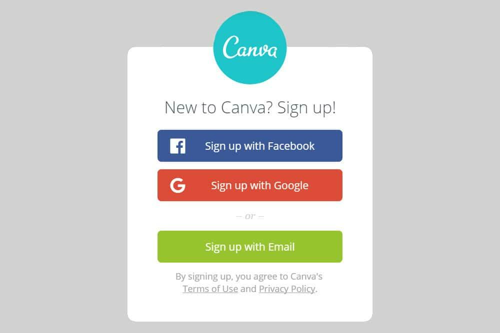
Source: Science ABC
Sometimes, though, you need additional data that a social media login can’t provide. In these cases, the best approach is to ask for information seamlessly throughout onboarding.
The finance app Expensify does a fantastic job with this. Instead of a traditional login form, the app frames it via the Concierge feature—basically a digital assistant.
Pending onboarding tasks are placed in an inbox, so you can get to them at your convenience.
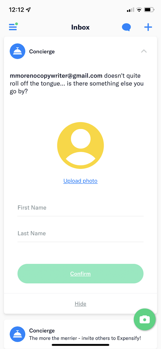
Source: Expensify
Contrary to what many think, logging in isn’t always required in apps. If the user experience won’t be affected, skipping it entirely is a great way to improve your onboarding process.
Make your instructions brief
UX copywriting is probably the last thing on a developer’s mind when creating an app. But it’s one of the most important factors of app success, especially during onboarding.
Great UX copy is all about focus. It ensures that all instructions during onboarding are concise, clear, and only asking for one thing at a time.
This eliminates confusion and frustration with your users.
The last thing you want is for users to overthink with unclear copy like this:
Source: Usability Geek
Compared to the option on the right, the copy of the one on the left is unnecessarily long. It also tends to use jargon and technical terms.
Unfortunately, the typical user may struggle to understand what it means.
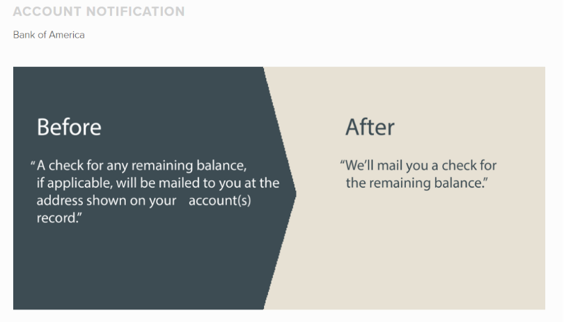
Fintech apps are notorious for this since the finance world is full of complicated phrases and academic-sounding terms.
Here’s an example from Bank of America. Notice how a long-winded sentence can be reduced to just nine words.
Source: Usability Geek
Sometimes, the best copy is no copy at all. This is especially true when explaining features that are already self-explanatory.
For example, take a look at this pop-up dialog from Citi:

Source: User Pilot
The above copy is unnecessary because everyone already knows what a search bar is. Not only is it a waste of space, but it might even come off as patronizing.
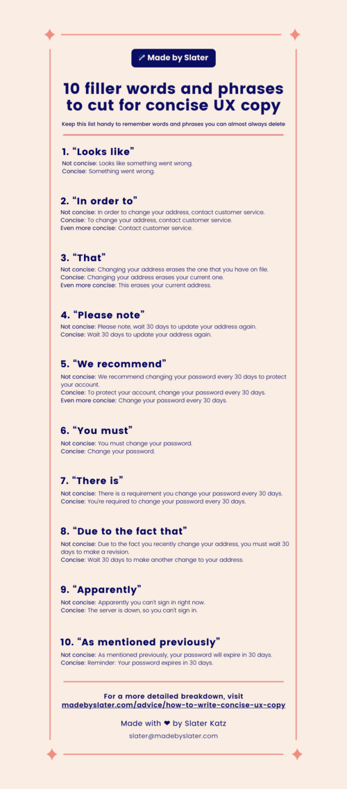
Fortunately, keeping your onboarding instructions brief isn’t difficult. You just need to be ruthless in cutting words and shortening sentences while keeping the meaning intact.
To give you an idea of how, here’s a guideline from Made by Slater:
Source: Made by Slater
Notice that many of the words we use in everyday language, such as “you must” and “in order to,” are just filler. Removing them makes the copy much more punchy.
More than anything, you should make every word count.
Look at it this way: every bit of space on your app is precious. Each word and sentence should have a purpose; if not, it’s only harming your user experience in the long run.
Source: Appcues
However, successful copy isn’t just about having the shortest sentences. It’s also important to make it sound appealing.
Communicate like a human, not a robot
When Chelsea Armstrong of Copyhackers described UX copywriting, she nailed its most important point:
“UX copywriting, or user-experience copywriting, is the act of writing and structuring copy that moves digital users, like visitors and customers, toward accomplishing a goal in an intuitive way.”
Take note of the words “digital users” and “intuitive.” That means copy must talk to users in natural human language to get them to do anything.
The key here is a casual and friendly tone, as if you’re talking to a friend. Fortunately, you know how to do this since you’re human.
Slack’s Slackbot is perhaps one of the best examples of this.
The way a user chats with the bot is no different from communicating with other people on the platform. In fact, most might mistake him for a colleague!
Just look at how the Slackbot handles onboarding:
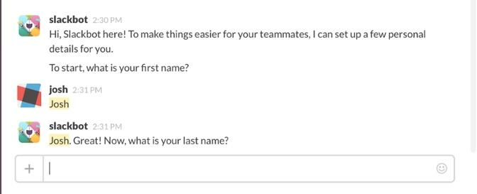
Source: Zendesk
An easy way to sound human is to add a touch of humor to the mix (only when appropriate, of course).
Even something as serious as finance can be taken to the next level with a little bit of humor.
A great example is the Cleo app. Using the app feels very intuitive and refreshing because you interact with it by sending messages much like you would a friend.
But what sets it apart is its wicked sense of humor:
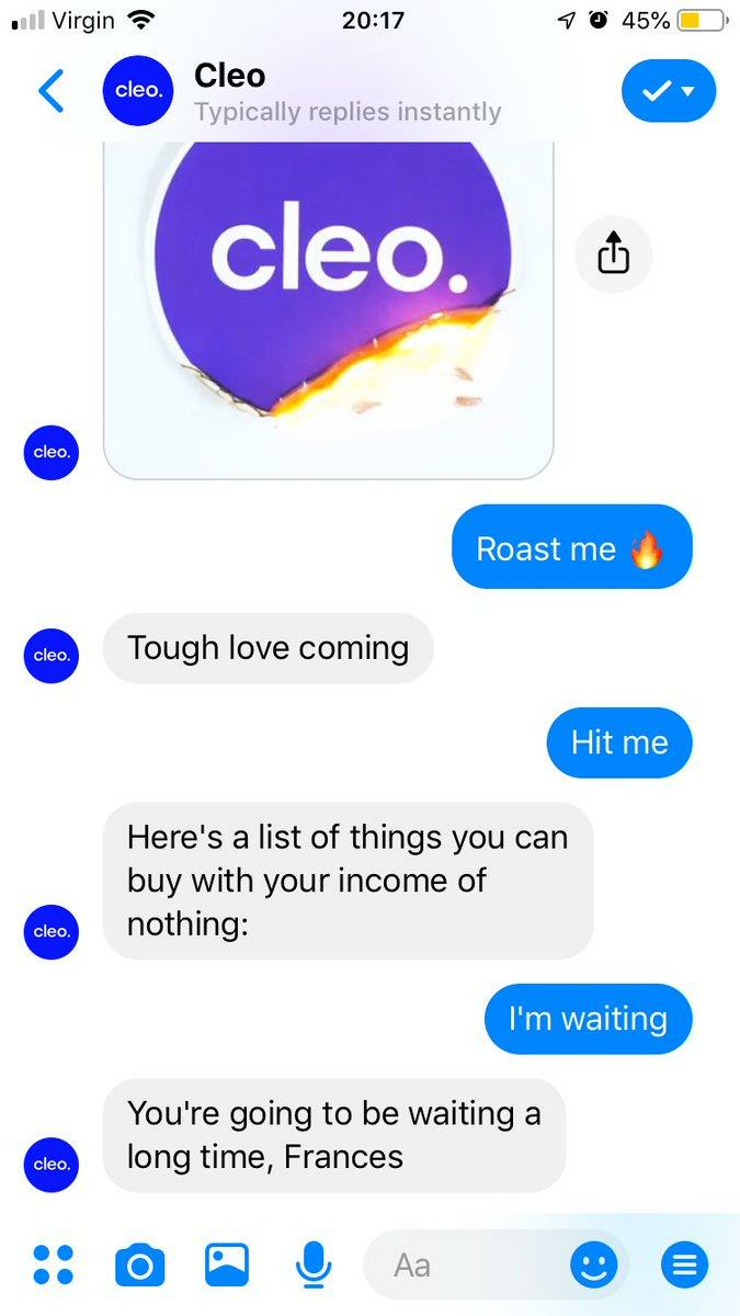
Source: Twitter / @Frankieboo94
Such back and forth banter makes Cleo very fun to use. And when an app is fun, people tend to stick with it.
Human speak is especially crucial if your app deals with a complicated or traditionally boring subject matter.
This is what the philosophy app Alter Ego is trying to accomplish.
By turning classical philosophers into characters you can interact with, they’ve made learning such a serious subject much more relatable.

Source: Alter Ego
The bottom line is that apps are meant for human users. And if your app talks like one, that’s one step closer to building trust.
Use animation while giving instructions
No matter how natural and concise your copy is, it can still be ineffective on its own. For best results, you should mix in visual content, like animation, during onboarding.
Our brain’s penchant for visual processing is no secret.
An Entrepreneur article reveals that humans process and retain visual information 60,000 times better than text.
Video is also the preferred medium for many people, including senior executives:

Source: Entrepreneur
Adding animation to onboarding is a great way to hold a user’s attention throughout the process and make a good first impression.
This is especially crucial if you want to encourage users to opt for a paid offer.
This is the route Strava took when they redesigned their onboarding.
They combined a benefits-oriented approach with some slick animation to make a compelling case for people to subscribe:
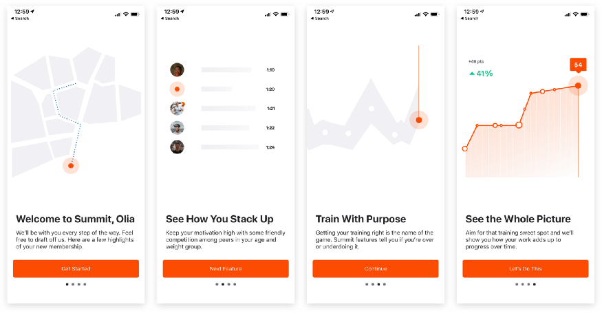
Source: Strava
Animation is also a smart way to explain more concepts with less space instantly.
For instance, look at this onboarding concept by Netguru.
Instead of describing how a card-based task management system is flexible and intuitive, it just shows it via animation:
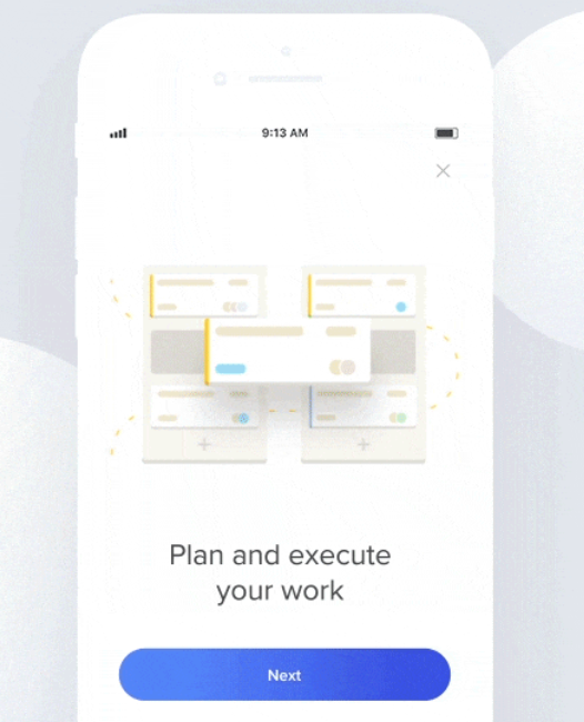
Source: Icons 8
Animation is most useful when asking the user to do something complicated.
Adding visuals helps ensure that they’re on the right track and don’t fall prey to misinterpretation of your instruction.
Here’s a static screenshot from an animation by Ramotion.
Source: Ramotion
But you need to be careful with animation because it’s easy to overdo it.
Remember that it should support and streamline the onboarding experience and not hog the spotlight.
The worst mistake is making the animation so involved that it slows down your app.
Used sparingly, however, it can dramatically increase your onboarding completion rates. It’s just one of the many ways to fulfill an onboarding best practice: show, don’t tell.
Show real examples, not just text
Learning by doing is one of the best ways humans learn. App onboarding is no different.
Why is this so? According to Logan Fiorella and Richard Meyer in their book Learning as a Generative Activity, people remember information better if they construct it for themselves, rather than reading it passively.
In other words, you learn how to throw a ball by throwing it, not by reading about it.
The most effective way to do this in your app is via progressive, action-oriented onboarding.
An apt analogy for this approach is a guided tour. Rather than overloading users down with instructions upfront, take them straight into the app.
Then guide them as they go along through the clever use of pop-up dialogs and tutorial elements.
The Todoist app is a great example of this:
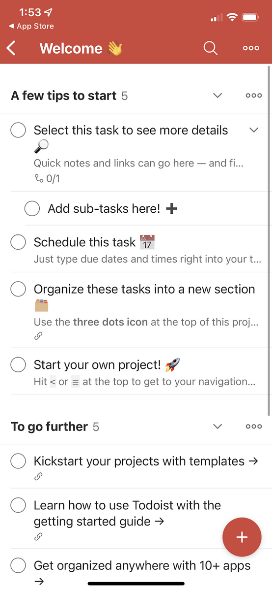
Source: Todoist
Here, the app invites the user to perform basic actions like creating a sub-task or adding a due date.
Furthermore, users can use the tutorial content as a template, so they don’t need to create one from scratch.
Another example is Snapchat. You’ll see how it takes you through the fundamentals of taking a photo via tooltips:
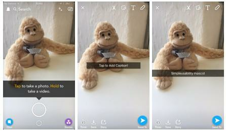
Source: Simple Usability
Giving instructions in context is especially important. It ensures that users receive information only when they need it, thus increasing the chance of retaining it and avoiding overload.
If you want to make an action-based onboarding process even more effective, use gamification for added motivation.
For example, Evernote users can level up in the app through tokens, which they can earn by performing tasks:
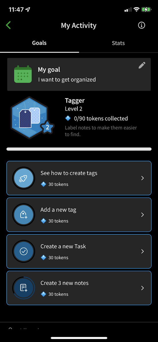
Source: Evernote
Even if there’s no physical reward, users’ pride and accomplishment are motivation enough.
Progressive onboarding is a great approach for any app. However, it works best for those with advanced features, complex interfaces, or hidden features.
Give instant feedback notifications
Feeling lost and confused is the top reason a user will quit your onboarding. To avoid that, they need to know where they are and what they’re doing at all times.
You can ensure this through instant feedback notifications.
This is especially crucial for error handling. People will make mistakes, so you need to guide them and teach them how to fix those mistakes.
Furthermore, explaining to people why they made a mistake is crucial for clarity and trust-building.
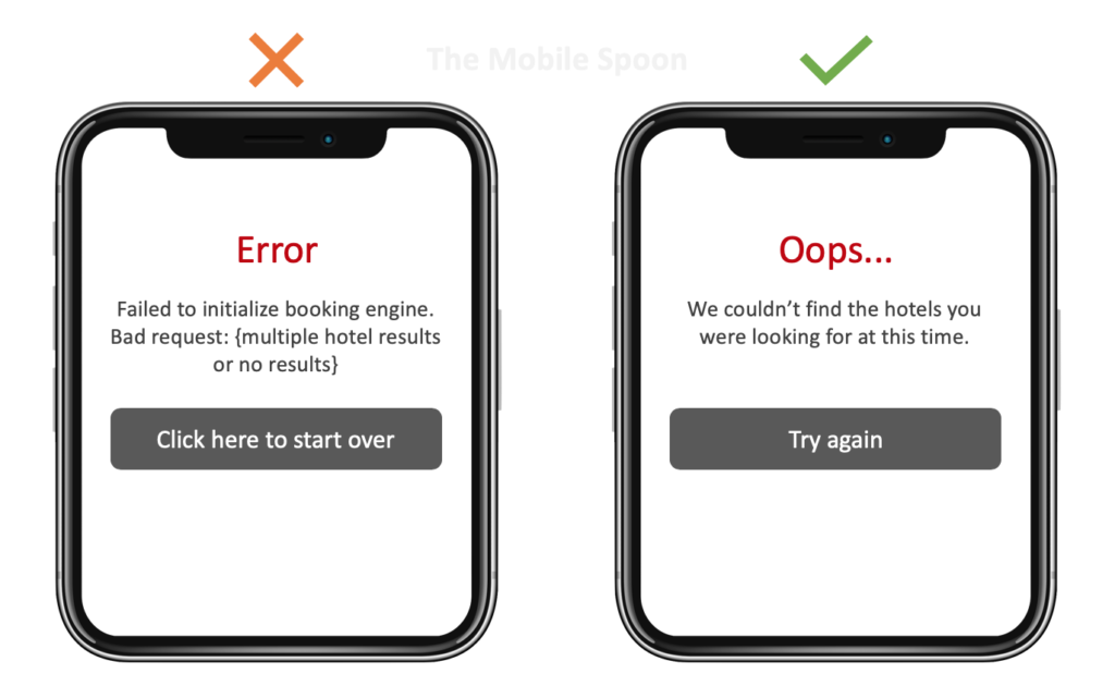
For instance, this certainly isn’t the way to do it:
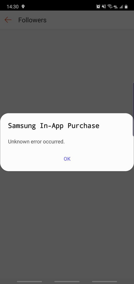
Source: Samsung Community
Not only is the above error message vague, but it also doesn’t tell the user how to fix the problem.
Here’s a better example:
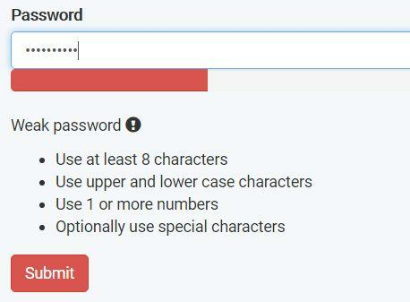
Source: JQuery Script
Notice how the form clearly states the reason for the error, then suggests helpful guidelines to fix it.
Notifications should also inform your users of the immediate effects of their action, especially if it were successful.
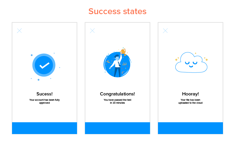
Source: Appinventiv
Seeing a message like this can give users a small dose of pride in completing something, no matter how minor.
Moreover, it can encourage them to further go through your onboarding.
Keeping users engaged is all about eliminating frustration. And that happens when your onboarding is responsive and adaptive.
Onboarding optimization isn’t a one-time thing
We’ve given you just six ways to improve your onboarding. Indeed, there are a dozen more approaches you can try, from gamification to personalization.
But our advice is not to do it all simultaneously. Instead, try one or two tactics first, then see how it affects your results. Then, once you’ve mastered them, add more strategies.
Remember, onboarding is a long-haul game, much like anything in app development. And if you’re committed for the long haul, there’s a better chance for success.
Want to optimize your onboarding? Maybe our award-winning team can help! So get in touch with us today, and see what we can do.