
How to improve your app onboarding process
Onboarding is a long-haul game, much like anything in app development. And if you're committed for the long haul, there's a better chance for success.
It’s fascinating how people can pick up an app for the first time yet learn to use it almost immediately. It’s just like magic.
Of course, there’s no magic going in there. That’s just the product of great UX and onboarding.
In many ways, onboarding is the modern equivalent of an instruction manual. It prepares your user to become an expert on your app.
And just like there are different styles of instruction, there are also various types of onboarding. Let’s explore them in this article.
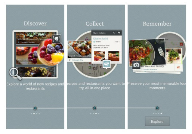
Onboarding is the welcome sequence of your app. Its goal is to take users from zero knowledge to confidently using your app in the shortest time possible.
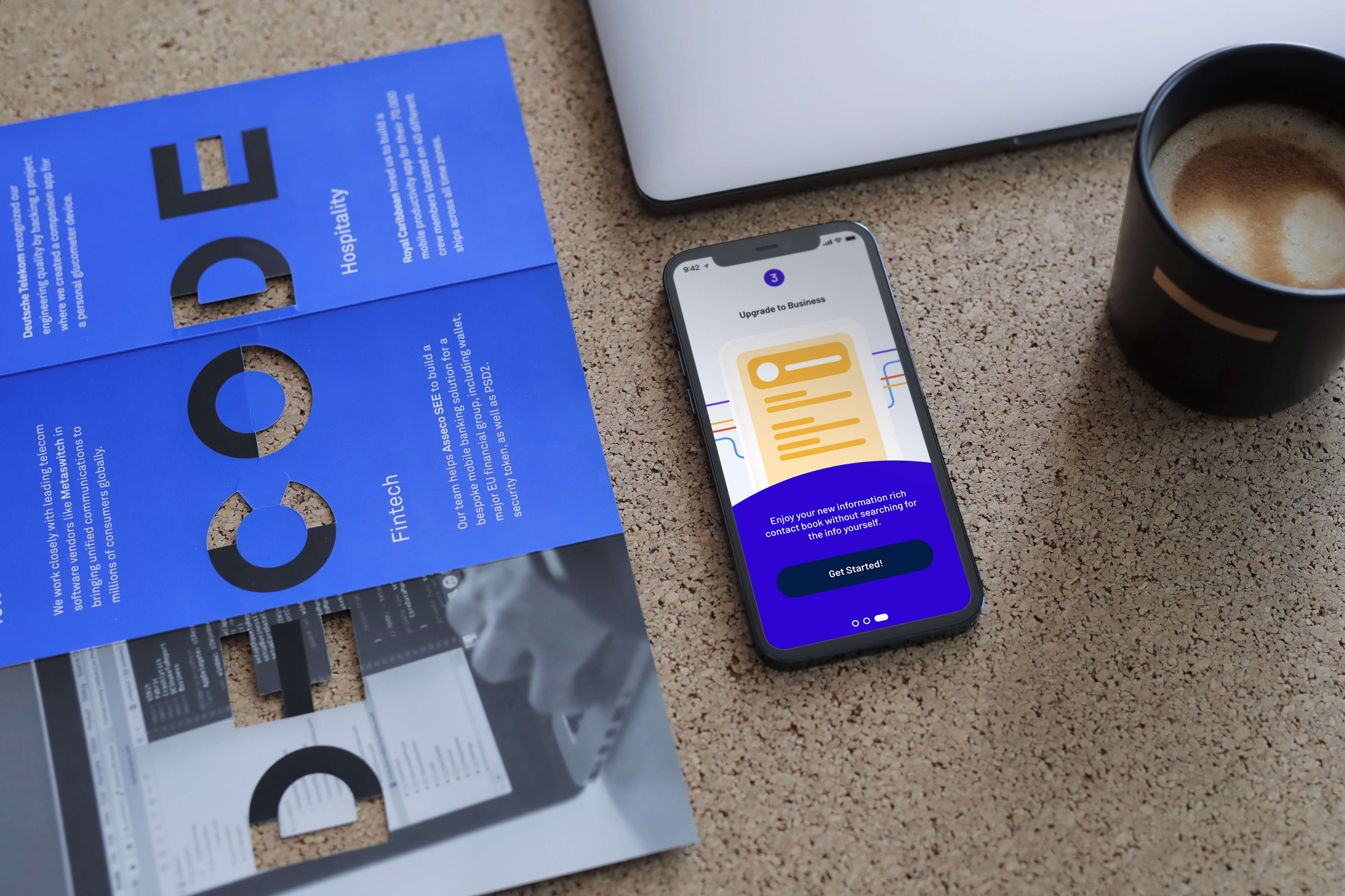
It covers three aspects: education, setup, and personalization.

Source: DECODE
Education ensures that users know how to use your app. It can be as involved as running an interactive tutorial to run them through the basics.
Or it can be as simple as laying out the benefits of the app so that users get excited to use it.
Setup gathers the necessary information from the user so they can create an account on the app. The key here is to make this process as fun and engaging as possible.
Lastly, personalization makes the app experience more special and meaningful by tailor-fitting it to the user.
This can include asking for their preferences, turning on notifications, or customizing the app’s UI to their liking.
Source: Wally
Onboarding is a fundamental strategy to improve your app’s retention rates and engagement. It ensures that the user gets a positive first impression during the critical initial weeks.
Without onboarding, you run the risk of leaving users confused and frustrated. And they will eventually uninstall your app (which is what 80% of users do).
As the name suggests, progressive onboarding unfolds gradually as the user goes through your app. It’s commonly done through pop-up screens that explain or highlight features in the UI.
Source: Usability Geek
The main advantage of progressive onboarding is that it doesn’t overwhelm the user.
Each new piece of information is revealed in context, thus giving them the chance to try it out. It also minimizes roadblocks that prevent users from trying your app right away.
Progressive onboarding is a good example of gradual engagement, a principle championed by Luke Wroblewski, Product Director at Google. He explains the benefits as:
“With gradual engagement, we can communicate what our mobile apps do and why people should care by actually allowing people to interact with them right away. We can capitalize on all the hard work it takes to get a download instead of turning 75% of our potential audience away with sign-up requirements.”
Progressive onboarding also encourages learning while doing.
Numerous studies, such as this one by the National Training Laboratory, have shown that actual practice can improve information retention by 75% (reading, meanwhile, only retains 10%).
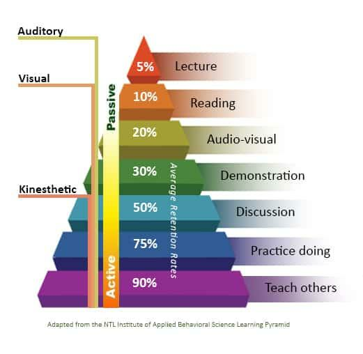
Source: Education Corner
It’s why almost no one reads the instruction manual when buying gadgets – they often just use the product straightaway.
Progressive onboarding works best for complex apps with hidden elements and uncommon features.
This is where interactive tutorials work best. Fortune City’s onboarding sequence is a great example.
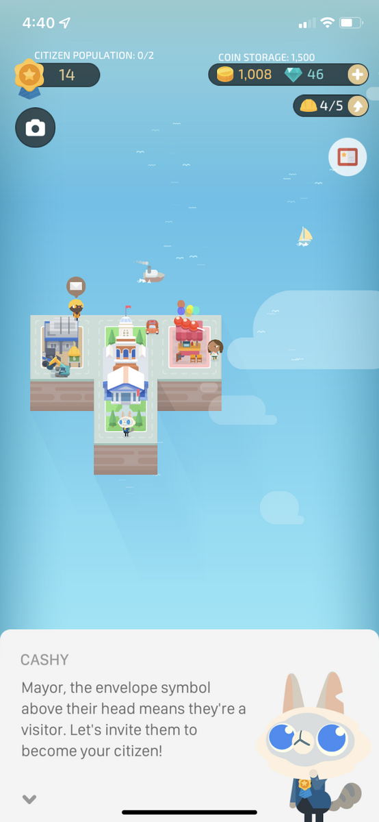
Source: Fortune City
Taking users step-by-step through the basics is especially useful for mobile games and gamification-heavy apps like Fortune City.
These apps tend to introduce unique features and elements that take some getting used to.
Apps that function like a tool, such as video editors, also do well with progressive onboarding. Here’s an example from the stop motion app Stop Motion Studio.
Source: Stop Motion Studio
The app shows helpful tooltips for showing gesture controls and other tips while using the app. It even includes a short video snippet that users can mimic.
What’s great here is that some users might miss out on the gesture command if it weren’t for this pop-up screen.
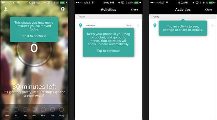
Indeed, apps with complex and uncommon gestures are also great with progressive onboarding, like this example from Timely.
Source: Smashing Magazine
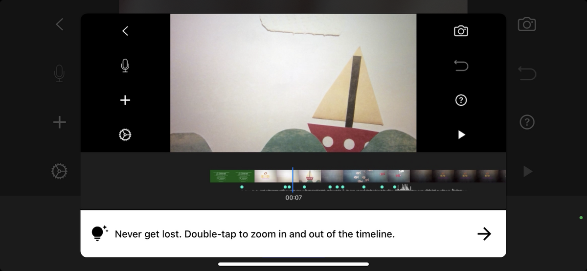
The document scanner app CamScanner is an excellent example of an onboarding sequence that uses multiple progressive techniques.
It uses labels and tooltips that explain certain features or direct you to the important ones.

Source: CamScanner
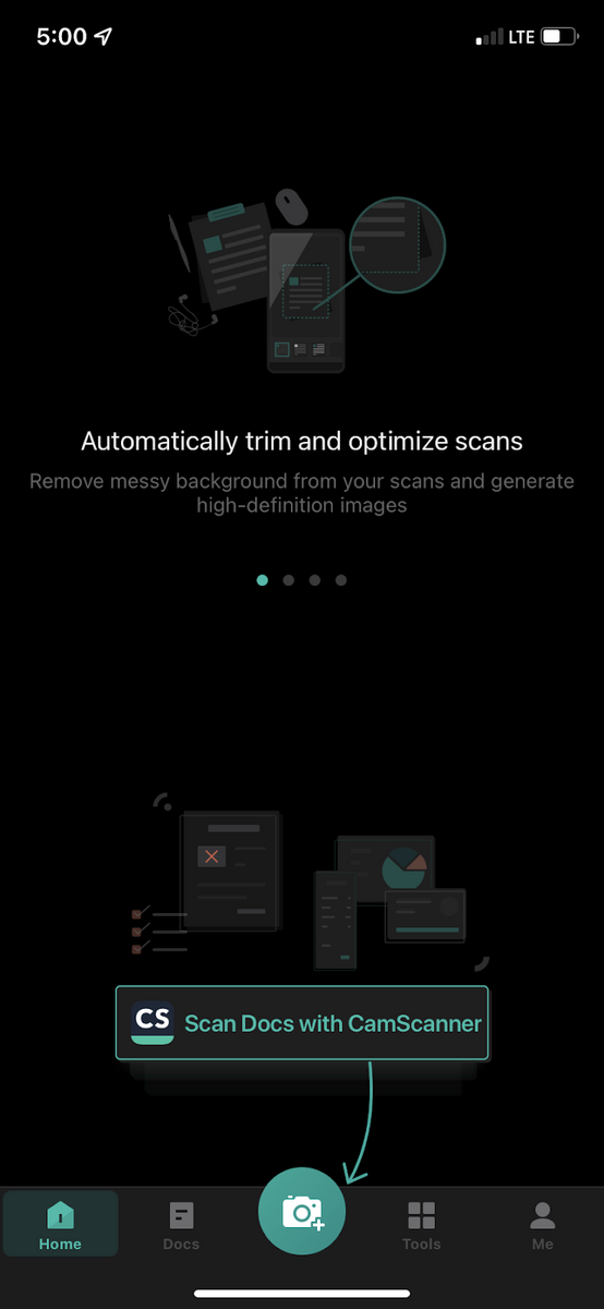
But the notable thing that CamScanner got right is that it provided demo content. Even if the user doesn’t have a document on hand, they can still practice the scanning process.

Source: CamScanner
By providing demo content, the CamScanner app removed any hindrance or excuses that prevented the user from completing the onboarding sequence.
The Todoist app also uses demo content quite effectively, which also helps prevent empty states:
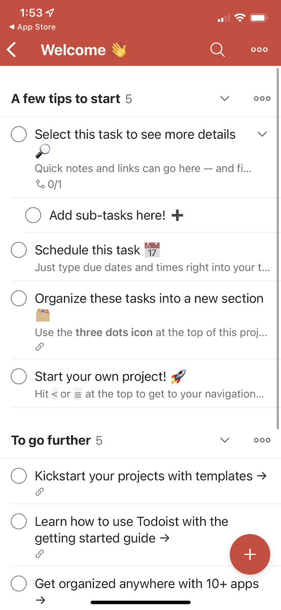
Source: Todoist
As you can see, there are so many ways to do progressive onboarding. That’s why it’s the best approach if you want to make the experience fresh and engaging.
Function-oriented onboarding puts the features of your app front and center.
This is shown as a slideshow that shows your app’s core functionality and, more commonly, how or why you should use it.
Source: Smashing Magazine
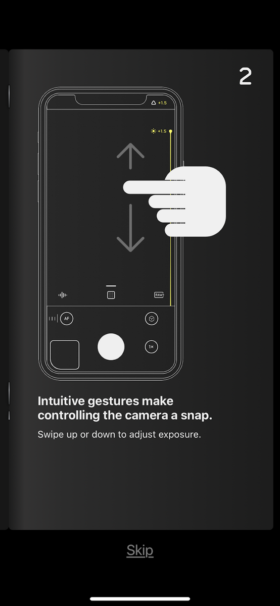
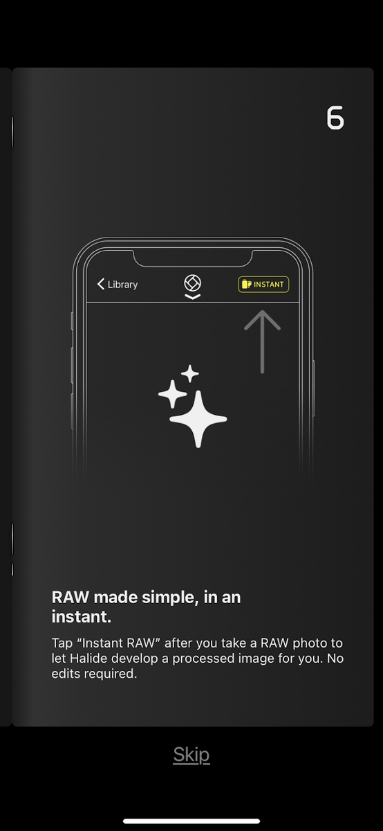
Function-oriented onboarding is great for apps with complex or unique features as a selling point. It can also be a good choice if the app deals with a challenging task.
A good example is pro camera apps like the Halide Mark II. As an app that mimics an SLR, it banks on the complexity of its features rather than the direct benefit you’ll get using them.
Hence, it focuses on these in its onboarding.
One nice touch we particularly like is that the Halide app’s onboarding resembles an instruction manual. It even has a flip animation as if you were holding a physical booklet.
The line drawings also add to the effect.

Source: Halide Mark II
A crucial thing to remember with function-oriented onboarding is to only focus on the core features. It’s useless – and even harmful – if you include trivial functionality.
Some users might find it condescending that you’re trying to highlight something so simple. At best, it’s a waste of space.
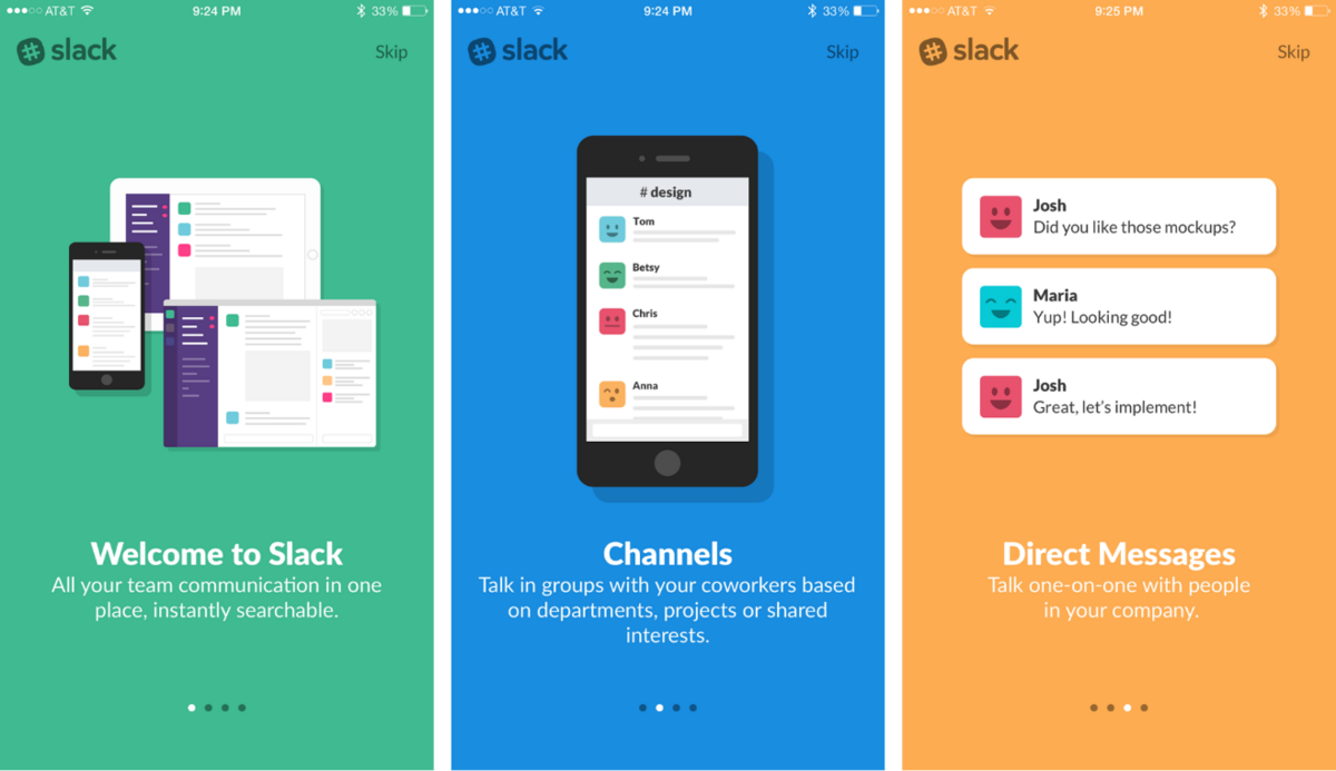
As a rule of thumb, it’s best to include only 3 – 5 features during onboarding. If there are more, you can always have them later as in-app tips.
Slack is a good example of this. We all know that it’s a robust app with lots of fantastic features, but they only focused on the most crucial ones in their onboarding.
Source: UX Booth
Realize that the end goal of a function-oriented onboarding is to convince users to take the next step – whether it’s to use your app or sign up for an account.
Thus, you should build towards that.
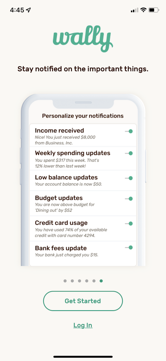
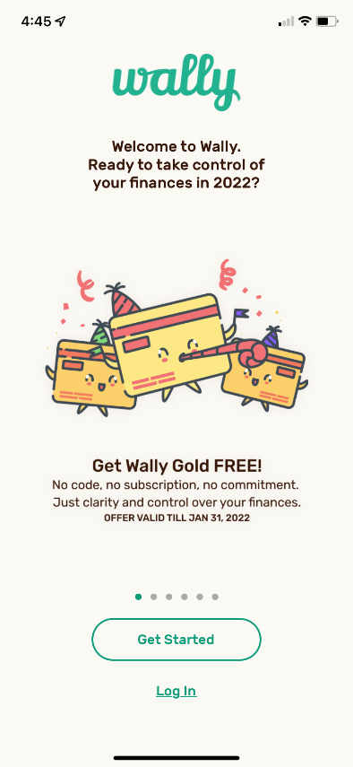
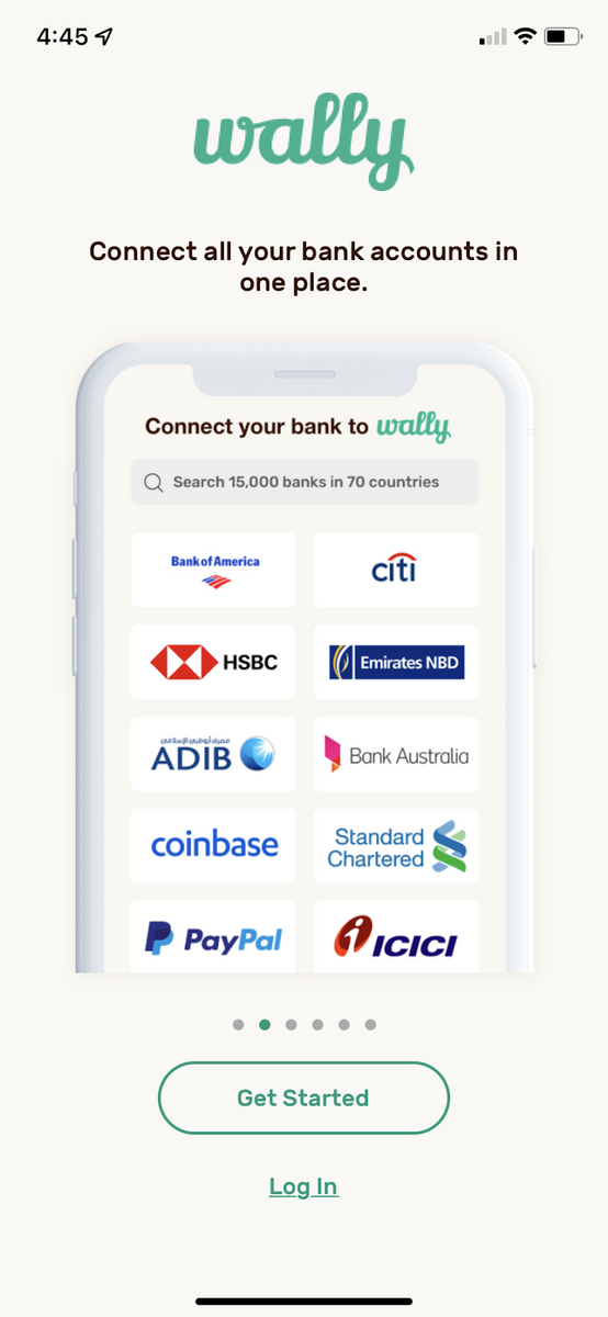
As an example, look at the onboarding for the personal finance app Wally:

Source: Wally
We love how the app seamlessly transitions from explaining the features to asking for their email address.
The Wally app also included a promotion at the beginning of the onboarding sequence and before asking users to sign up to sweeten the deal.
Many get the impression that function-oriented onboarding is boring or passive, but it doesn’t have to be.
You can make it engaging and fun by spicing it up with nice little touches, as the Halide app did.
A benefits-oriented onboarding is similar to the function-oriented approach but focuses on the benefits.
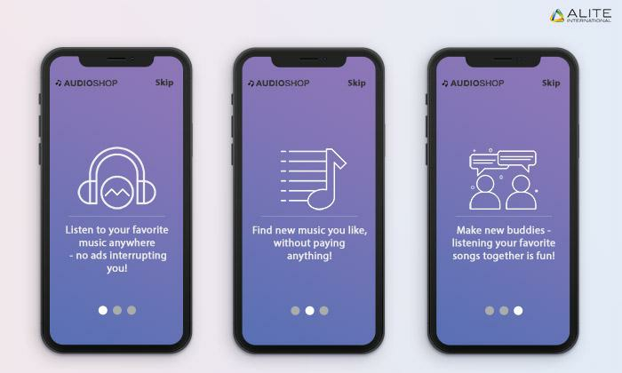
Source: Alite International
Benefits-oriented onboarding is highly effective because it taps on the user’s emotions. With that, here’s a key thing to remember:
“People don’t care what your app does. They only care about what it can do for them.“
Take the Uber app, for example. It’s wildly popular because it’s much more convenient and cheaper than buying and driving a car. People like it because of the benefit they get.
As with function-oriented onboarding, you should only focus on the 3 – 5 biggest benefits or your value proposition.
This is the unique and compelling idea behind your app that will change your user’s life. Once you have it locked down, you should put it front and center.

Source: DECODE
Evernote’s onboarding is a good example. In three simple slides, it explained the value proposition of the app – taking notes anywhere.
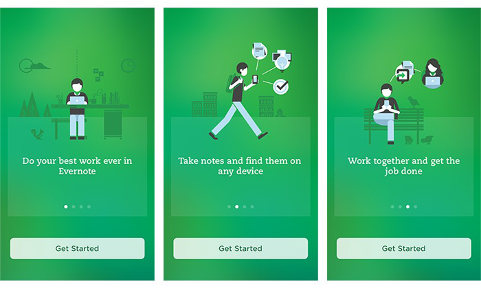
Source: The Manifest | Medium
Another good example is Trip.com, a masterclass in distilling core benefits in a few short sentences. As you can see, it’s easier to consume, plus it gets to the point straight away.
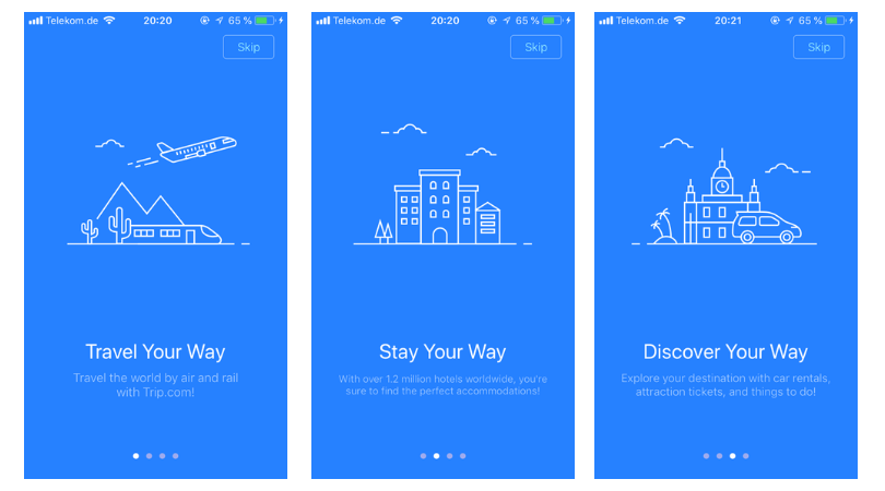
Source: UX Cam
Indeed, this is the level of conciseness that you should aim for. Because if you need multiple paragraphs or screens to explain your core benefit, then it’s not really your core benefit.
You need to distill it further.
Of course, stating benefits directly isn’t the only way to do this type of onboarding. You can spice things up a bit to make it even more compelling.
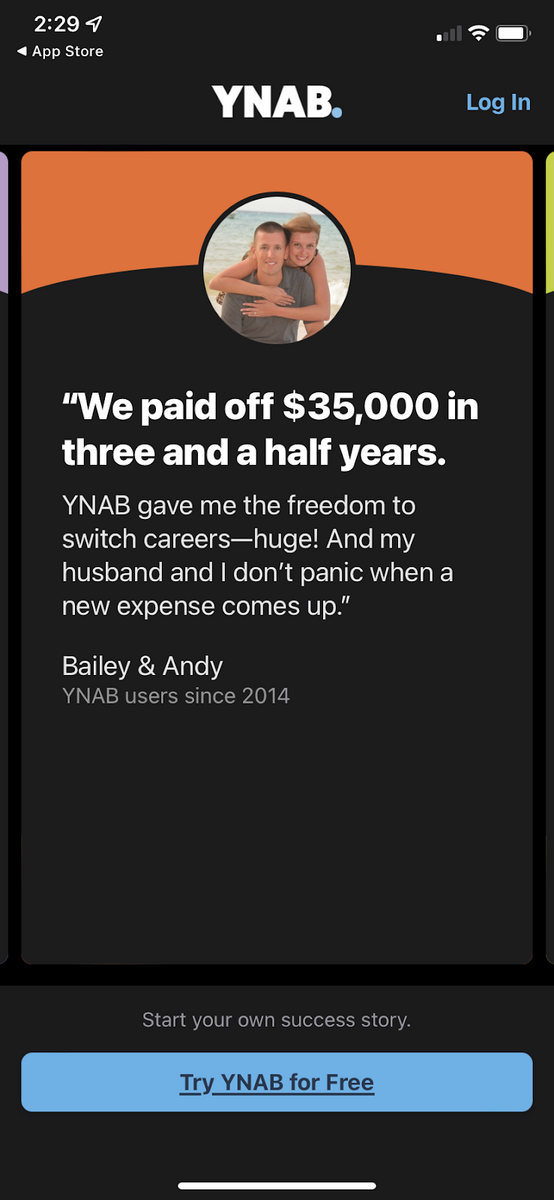
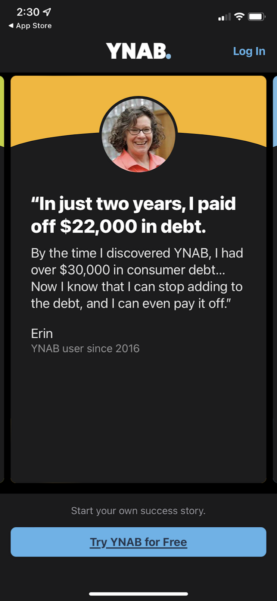
A fascinating and unique approach is by the budgeting app You Need a Budget (YNAB). Take a look:
Source: YNAB
Instead of stating the benefits outright, they used testimonials from real users instead.
Social proof is exceptionally effective because it psychologically tells the user that the benefits are attainable. After all, if a normal person did it, they can, too.
By stating the benefit indirectly, the YNAB app made it much more powerful.
Ultimately, you have a great deal of freedom when designing your onboarding sequence. As long as it keeps users engaged, feel free to try anything out.
One important role of onboarding is to encourage the user to create an account.
That’s because registering for one can cause user friction. After all, no one likes to fill out forms.
This isn’t just our observation, by the way. Countless studies and analytics have shown that signup forms are one of the biggest causes of user drop off:
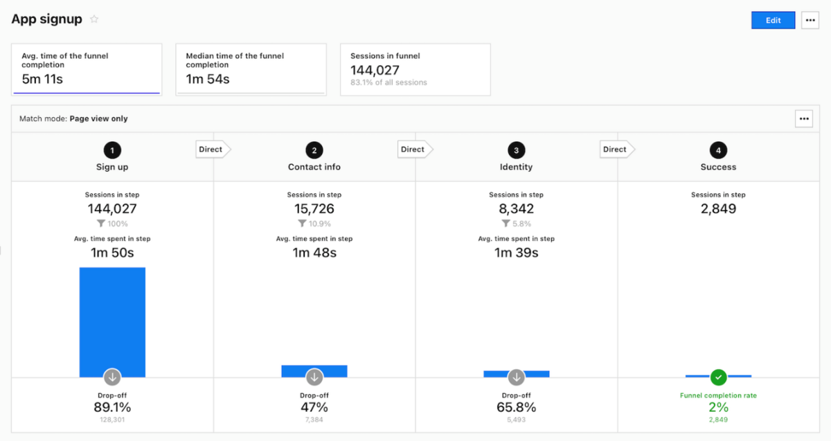
Source: Piwik
Thus, your onboarding needs to make account setups easy, short, or fun – or all three.
Top of mind example of an app that does this right is Duolingo and its gamified approach to account creation.
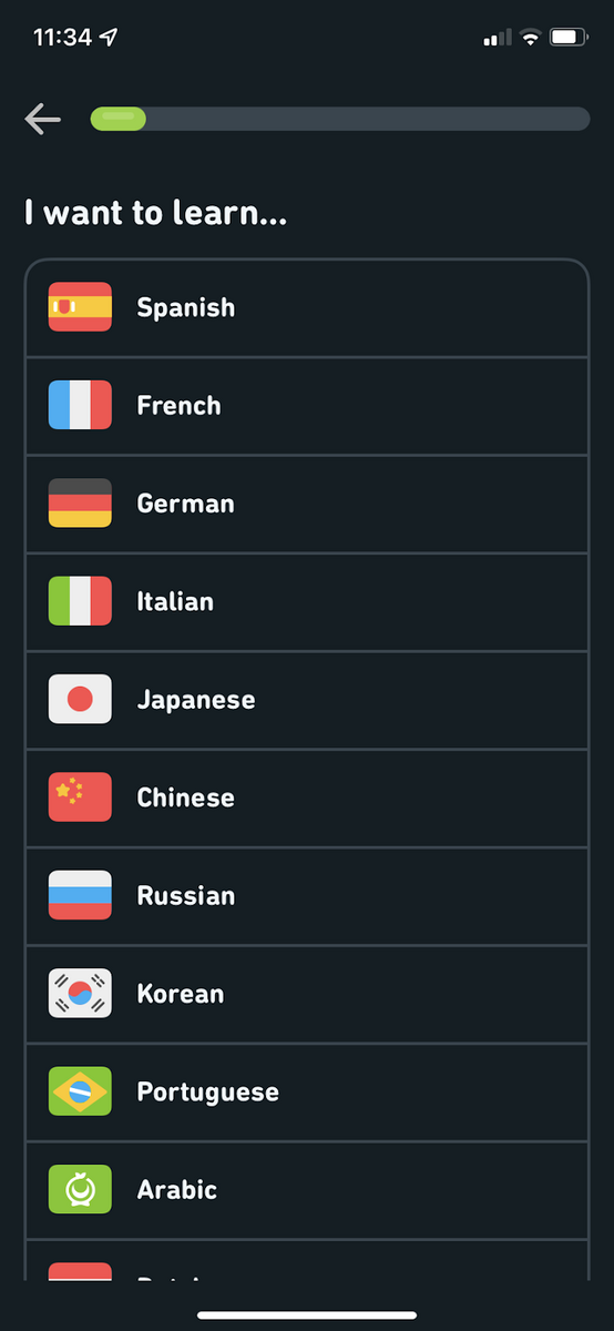

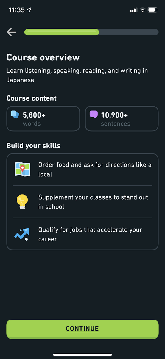
Source: Duolingo
There are plenty of useful gems here.
First, instead of one long-form, Duolingo breaks its account signup into manageable chunks. This is a good practice since it makes the process less tedious and time-consuming.
Another nice addition is the progress bar. Its purpose is to let users know where they are in the process.
Plus, it signals that the person has an unfinished task. And according to the Zeigarnik Effect, it would create an unbearable mental tension that will only go away if they complete it.
Finally, you’ll notice that they also included a quiz. Interactive elements like these can make account registration much more fun and engaging.
As a final touch, the entire sequence is presented in a fun way with bright graphics and a cute mascot.
Let’s look at another noteworthy example: Coinbase.
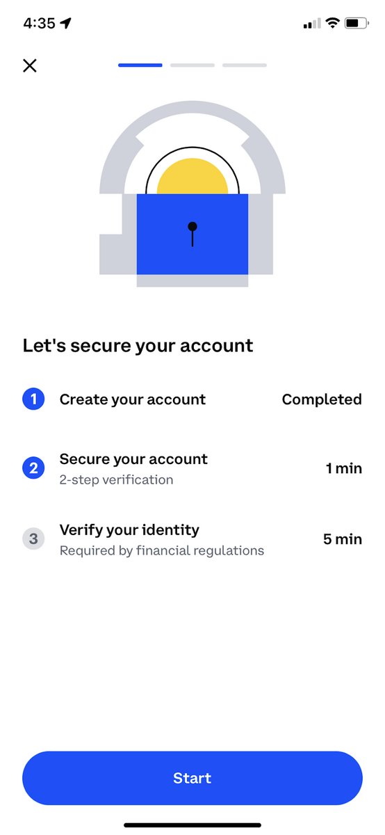
Source: Coinbase
The good thing the app did here is to indicate the estimated time it’ll take to complete each account creation step. This gives the impression that it won’t take much time.
Thus the user will be more likely to achieve it.
Adding the note “required by financial regulations” is also an effective touch.
Because, as shown by Robert Cialdini in his book Influence, stating a reason can often get better compliance from someone.
As the last example, let’s look at the social networking site Strava.
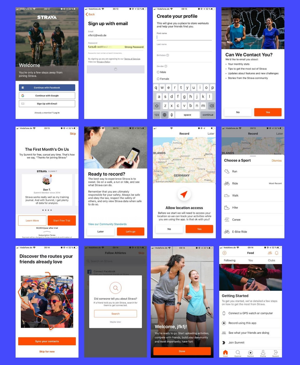
Source: UX Cam
What we like best about their account creation process is that they give lots of explanations every time they ask for your information.
For example, if they ask users to turn on location services, they state the benefits of doing so. This is a fantastic way of building trust.
They also seamlessly blend upsells (starting a free trial, asking to be added to a mailing list) into the account creation process.
While that can often cause friction, we feel it was tastefully done here.
These examples show that account creation doesn’t need to cause friction with users. As long as you make it less of a chore and more like a great conversation, you’ll do fine.
We hope this article gave you an idea of how to approach onboarding on your next app.
Of course, reading about onboarding is one thing. But you can learn a lot more by seeing how these principles are applied in real projects.
Interested? Check out the top 6 apps with the best onboarding. For additional reading, check out our article on onboarding best practices and the top mistakes to avoid.

Marko started DECODE with co-founders Peter and Mario, and a decade later, leads the company as CEO. His role is now almost entirely centred around business strategy, though his extensive background in software engineering makes sure he sees the future of the company from every angle. A graduate of the University of Zagreb’s Faculty of Electrical Engineering and Computing, he’s fascinated by the architecture of mobile apps and reactive programming, and a strong believer in life-long learning. Always ready for action. Or an impromptu skiing trip.
Onboarding is a long-haul game, much like anything in app development. And if you're committed for the long haul, there's a better chance for success.

In this article, we will explain how onboarding can do more harm than good if not set up properly. In particular, we will go through the 6 most common app onboarding mistakes you should avoid.
We give you six great mobile app onboarding examples.