
How to design a user-friendly onboarding in fintech apps
How do you engage, educate, and gain the trust of app users quickly enough so they don't leave? We share the key fintech app onboarding tips to achieve that.
Any app worth its salt should have its onboarding game on point.
Why? Because it’s such an important part of improving your app’s user retention and engagement.
Surprisingly, not many do it well. In fact, a recent survey reveals that 90% of customers feel that most brands could do better when onboarding new customers.
Nevertheless, a small percentage of apps understood the assignment and came up with exceptional onboarding sequences. We cover six of them in this article.
Duolingo is a popular language app that does many things right, including gamification. Onboarding is another one of those things.
When you open the app, you’re immediately greeted by their iconic mascot, the owl. This gives the sense that this is a fun app that makes learning fun.
The mascot is accompanied by a short but powerful value proposition.

Source: Duolingo
This is a strong start for any onboarding process. By stating the benefits clearly, you’re most likely to motivate users to go through with learning how your app works.
Once you tap on Get Started, you go through Duolingo’s easy-to-follow registration process.
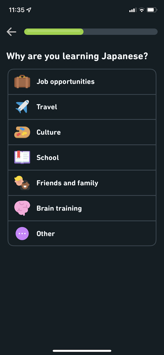
First, you’ll be asked to pick the language you want to learn and, more importantly, why you want to learn it.
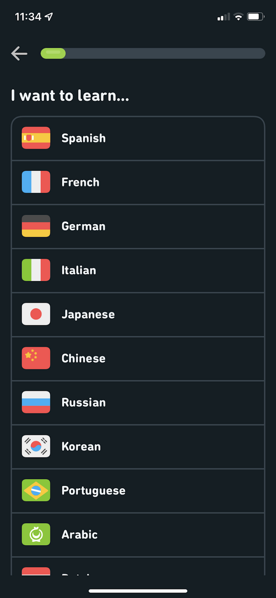
Source: Duolingo
Asking this question achieves two things.
One is that it motivates the user. Research shows that setting goals improves a student’s autonomy, making them responsible for their own success.
In Duolingo’s case, it helps the user stay committed to learning through the app.
The second is that it allows Duolingo to tailor the app to the user’s goals. And as we know, personalization is a fantastic way to improve engagement.
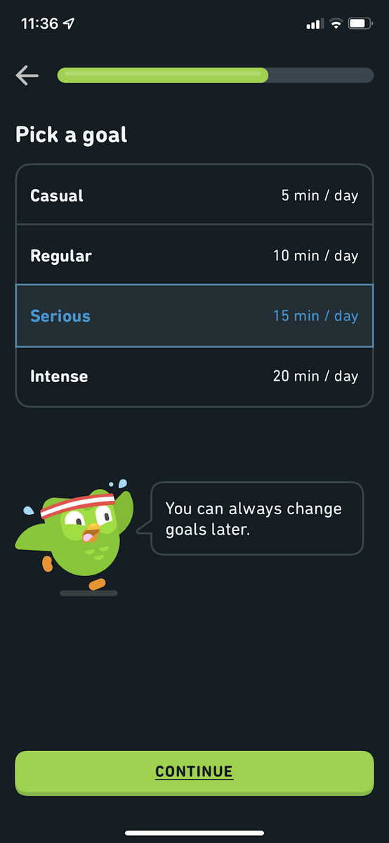
After this, the app will also ask you how much time you want to commit to learning.
Source: Duolingo
This is a classic tactic for habit formation because the user subconsciously blocks off that period for learning.
Attaching labels like Regular or Serious can even bring out a user’s competitive side (“I’m really serious about learning! Of course, I can commit 15 mins a day!“).
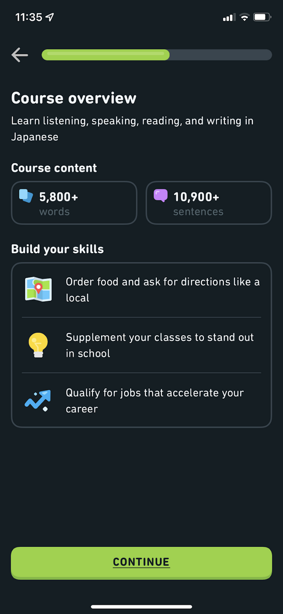
After this, the app then presents an overview of the course. Again, this is great for setting expectations.
It even shows you how it will change your life once you finish the course, further motivating the user.
Source: Duolingo
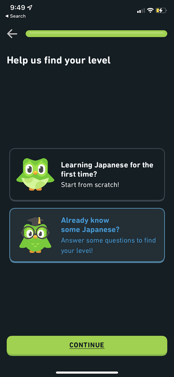
Next comes arguably the most important phase in onboarding any learning app: segmentation.
You always want to determine a user’s skill level and deliver content that fits that. If not, you’ll risk overwhelming beginners or insulting intermediate users.
Duolingo approaches this with a straightforward question: “Are you new to this language?”
Source: Duolingo
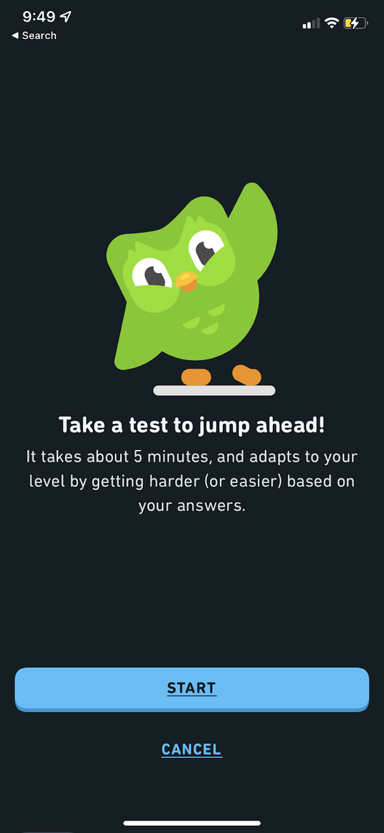
If the user answers with a no, they need to go through a placement test to prove it.
This is a good approach since most people usually aren’t able to accurately estimate how good they actually are at a particular skill.
Thus, a test ensures a more objective assessment.
Source: Duolingo
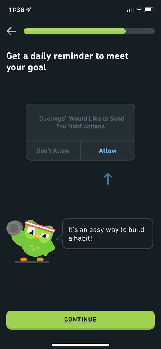
Lastly, the app will also ask the user for permission to turn on notifications and, more importantly, why it will benefit them.
This is always a must for any onboarding process, as it helps make the user more receptive to your messaging.
Source: Duolingo
And there you have it.
Duolingo’s onboarding is effective because it’s progressive and personalized.
It’s also a good example of properly motivating your users from the beginning so that they stick with the app long-term.
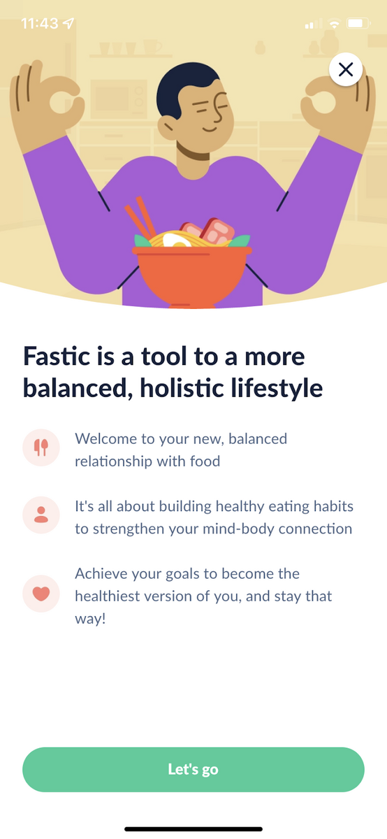
Fastic is an intermittent fasting (IF) app that solves a particular dilemma with many dieting apps—misinformation.
Fastic’s onboarding is an excellent blend of personalization and education.
It ensures that users know how to do IF properly, which helps them stick with the regimen and the Fastic app for longer.
Let’s highlight a few key areas that made Fastic’s onboarding effective.
First, they start with a benefits-oriented onboarding. Like Duolingo’s example above, this is great for motivation.

Source: Fastic
Like any decent fitness app, they ask health questions to personalize the experience. This includes the usuals like the user’s current and target weight, as well as their height.
This is good for goal setting as it gives users a sense of purpose on why they should commit to the app.
It even asks the user for hindrances in reaching their goal. Fastic can then customize the experience to minimize them as much as possible.
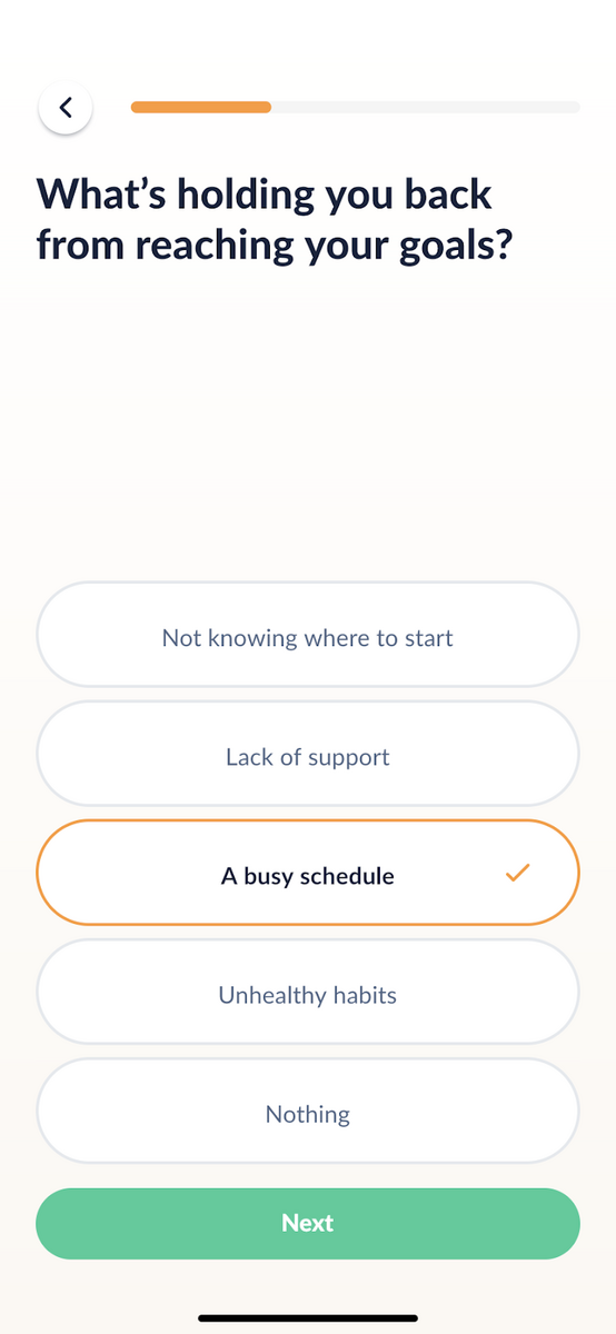
Source: Fastic
Then, Fastic includes a question that many apps never bother with:
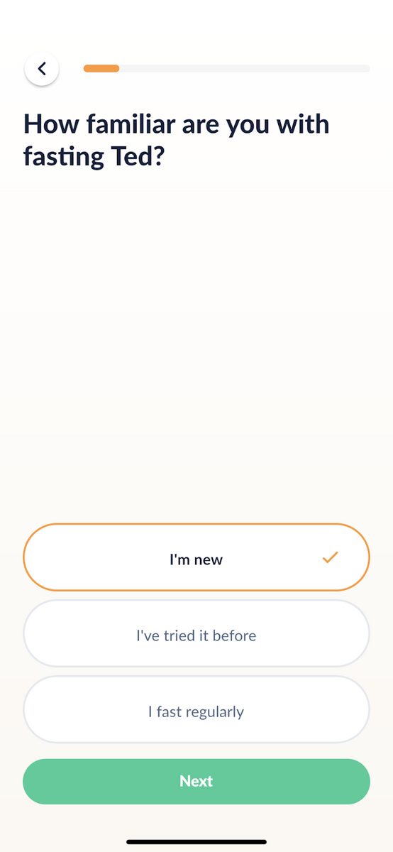
Source: Fastic
This segmentation question assesses a person’s experience to provide the appropriate amount of education for the user.
And we feel user education is one of the things that Fastic’s onboarding gets right.
For example, when you tap I’m new in the above prompt, the app will give you a primer to IF.
Source: Fastic
And the education doesn’t stop there. Fastic regularly intersperses tidbits of information throughout the onboarding process.
This is a great way to make content more digestible for users.
Fastic also takes the time to establish credibility during onboarding by showcasing the health experts behind the app.
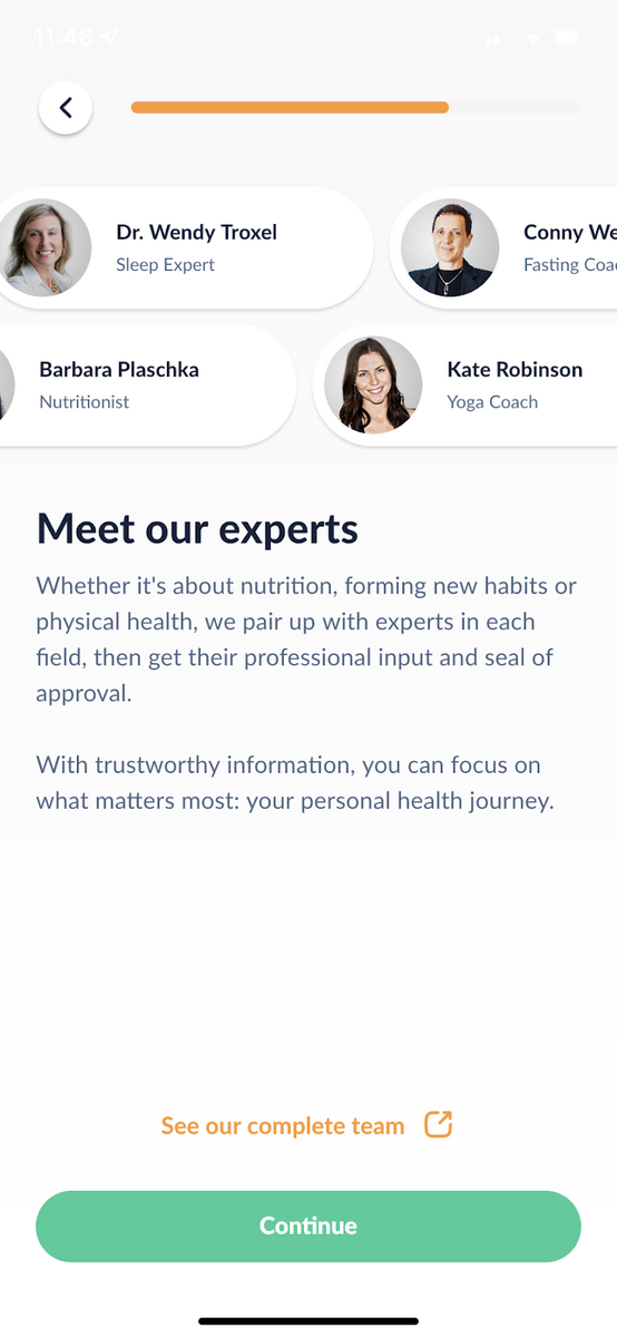
Source: Fastic
The app further enhances that trust by being transparent. Fastic will ask you if you have any medical conditions and, if you do, inform you of the risks of doing IF.
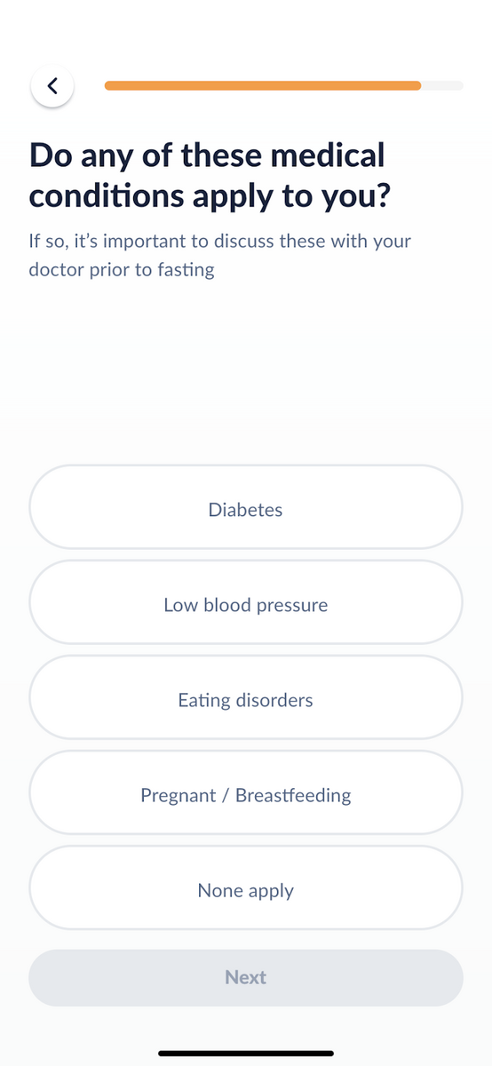
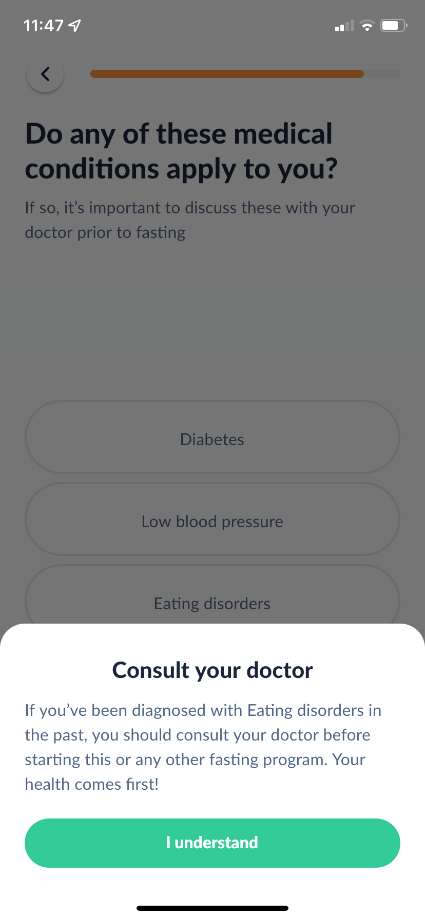
Source: Fastic
Finally, Fastic gives a very compelling and data-backed reason for turning on notifications:
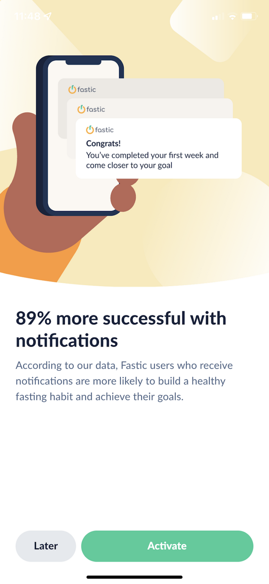
Source: Fastic
Indeed, there are other elements in Fastic’s onboarding that are exceptionally well done.
But what we like most about it is precisely the way they encourage their users to trust them,as this is a fundamental aspect of the success of any app.
Expensify is an expense tracking app for both individuals and businesses. And we cover it here thanks to its unique approach to onboarding.
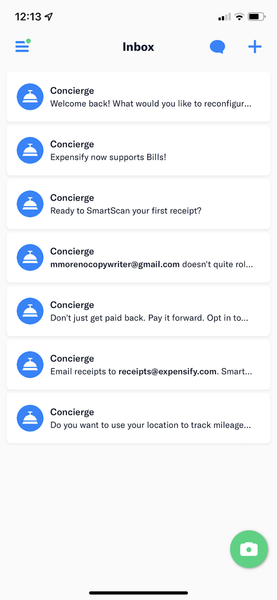
Unlike many apps, Expensify employs a non-linear approach to onboarding handled by their Concierge feature:
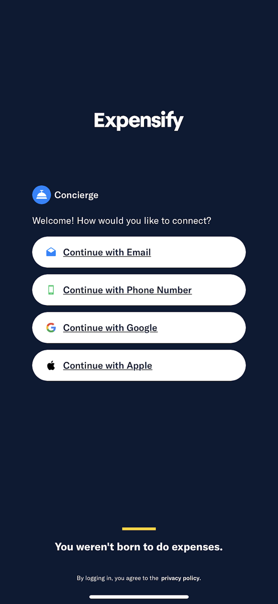
Source: Expensify
Think of that feature as a virtual assistant who informs you of important tasks.
These are listed in the Inbox section of the app, much like how you would receive important documents in a tray at work.
The metaphor is spot on, considering many Expensify users are entrepreneurs and corporate employees. Also, studies have shown that familiarity breeds trust.
Source: Expensify
The Concierge approach also means you don’t need to go through the onboarding process in a fixed order. Instead, you can skip some steps if you want to or do it later.
Thankfully, the Inbox layout means that the tasks are conveniently laid out like a to-do list, allowing you to go back easily.
Each Concierge message also focuses on a single task without ever overwhelming the user. It also explains why each action matters and the potential benefits.
For example, this is how the Concierge asks you to enable location detection.
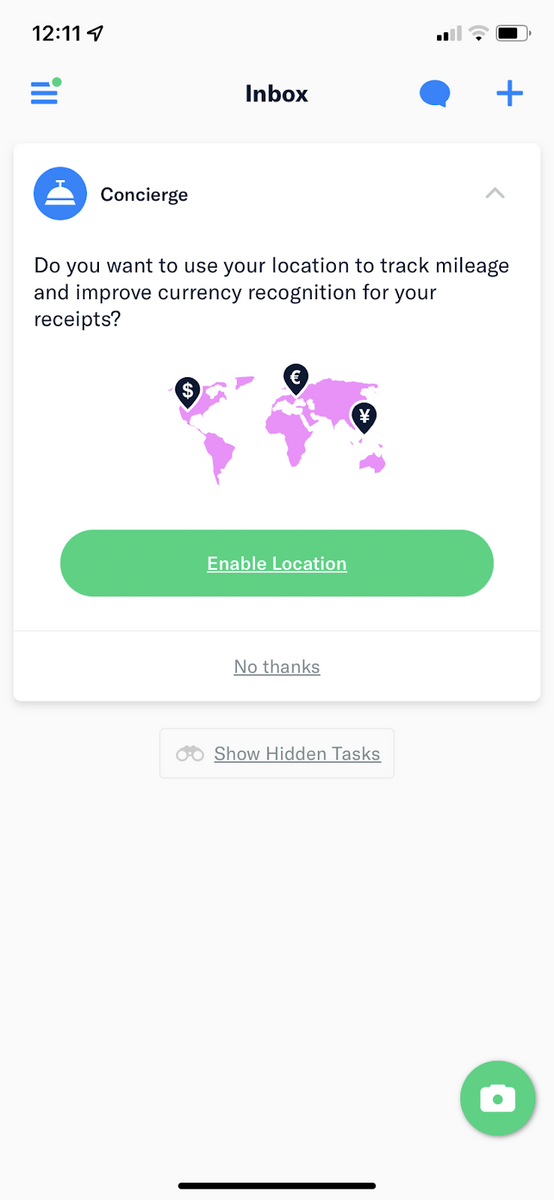
Source: Expensify
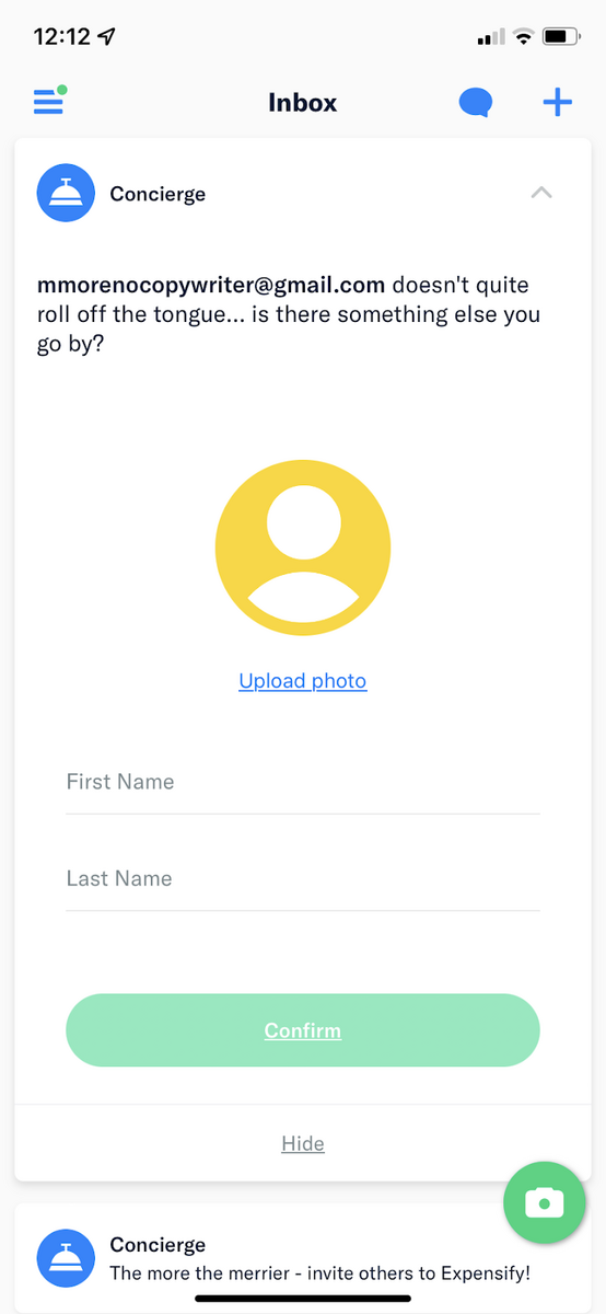
We also like the Concierge’s casual tone, despite this being an app for business users. It gives the app a more relaxed approach to what can be a stressful task (tracking bills).
Nevertheless, it never gets too casual or disrespectful, which is a nice balance.
Source: Expensify
We like how Expensify’s onboarding gives users a sense of control and freedom over the process, while the layout ensures that they don’t miss out on anything important at the same time.
The award-winning app Evernote is cited by many as having one of the best onboarding sequences in its category.
In this section, we’ll highlight what we think are the key elements that make it special.
First off, there are the prompts that ask the users about their goal for using Evernote. Standard stuff, to be sure.
But what the app does differently is to tie these goals to specific features in the app.
Here’s a good example:
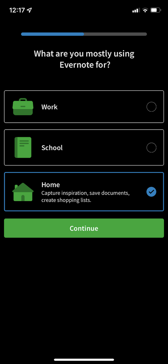
Source: Evernote
Note that when the user picked Home, the app listed down all the home-related tasks that they can track with Evernote.
Here’s another example: when the user states that they want to be more organized with the app, the onboarding tells them how immediately:
Source: Evernote
This is a good goal-setting tool, and it also sets the Evernote app to personalize the app experience.
After a few more prompts, the user is immediately led to the Home screen of the app. And this is where the real onboarding begins.
Instead of forcing the user, Evernote allows them to explore the app independently.
Prompts at key moments ensure that users get guidance with each new section they encounter.
Source: Evernote
The last thing we want to highlight is gamification in Evernote’s onboarding.
As a beginner, you’re given a list of tasks you need to accomplish, teaching you how the app works in the process. You’ll also get tokens with each task you finish:
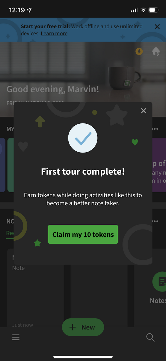
Source: Evernote
Tokens allow you to level up and gain new titles such as Adventurer or Librarian that you can show off to the Evernote community.
It’s a subtle reward, but one that’s motivating nonetheless.
As you can see, Evernote’s onboarding is seamless and easy to digest. But the best thing about it is that it utilizes gamification and a progressive approach to great effect.
Todoist is an amazing little to-do app with one of the shortest onboarding sequences we’ve ever seen. But that doesn’t mean it’s not effective; in fact, it’s one of its strengths.
Once you open the Todoist app, you’ll be greeted with a standard sign-up screen. Then, you’ll be asked to turn notifications on.
Source: Todoist
After that, it asks you to create your first task. It also includes a button called Establish a daily habit that can motivate the user by showing the benefits of habit formation.
Source: Todoist
And then you’re immediately brought to the Home screen of the app. So, is that the end of the onboarding? Not quite.
Todoist’s onboarding uses a tutorial approach delivered via demo content. Users will see this as one of the default tasks with a waving hand and the words Welcome.
It’s inviting and stands out from the relatively minimalist user interface so that users won’t miss it.
Source: Todoist
When you tap on it, this screen appears:
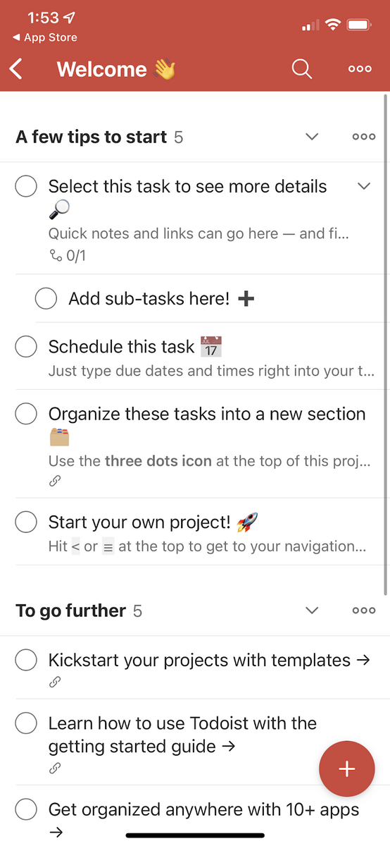
Source: Todoist
The genius of this demo content is that it’s part tutorial, part checklist.
It gives you all the tasks you need to accomplish, just like any other onboarding sequence, but without forcing it.
At the same time, it also contains tips and instructions on doing the Todoist app’s major tasks.
This is great for people who might already be familiar with similar apps or are in a hurry to populate their list with tasks.
Then, they can go back to the Welcome demo content if they would like to explore Todoist’s unique features.
Source: Todoist
The demo content also populates the to-do list so that users are not confronted with a blank screen.
In UX design terms, this is what’s called an empty state, and it can be demoralizing to a user. By providing default content, you give them something to start on.
We believe Todoist proves that simplicity can be a powerful and effective onboarding approach.
You Need a Budget is a budgeting app based on a unique Four Rules concept, which also boasts a great approach to onboarding.
First, let’s talk about the opening screen. It uses a benefits-oriented onboarding, but with a different take.
Instead of listing down the benefits, they let successful users do it for them via testimonials.
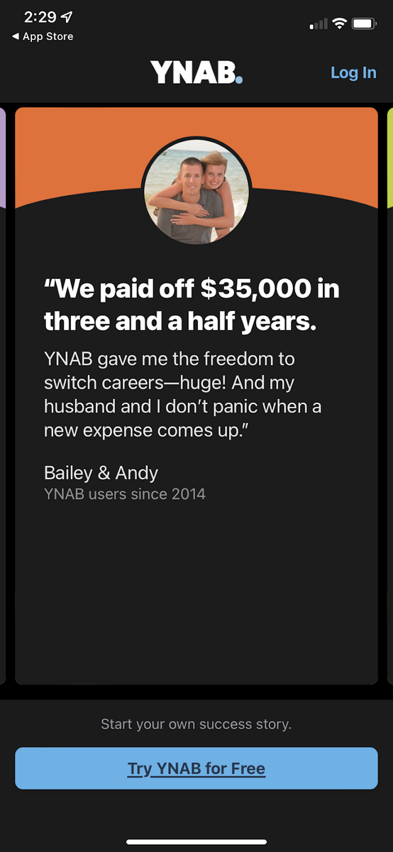
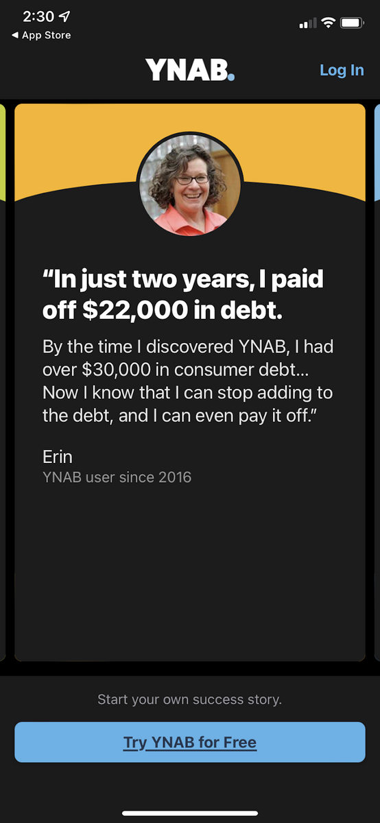
Source: You Need a Budget
This is an exceptionally powerful approach because it communicates many things simultaneously.
Not only does it illustrate the benefits of using the app, but it also proves that the app’s concept works.
Social proof also creates a feeling of “if others can do it, so can I!”
YNAB’s onboarding adopts the approach of learning by trying.
The app immediately asks you to estimate your expenses, link your bank account, and assign every dollar to a cost.
This is the core of the app’s Four Rules concept that we mentioned earlier.
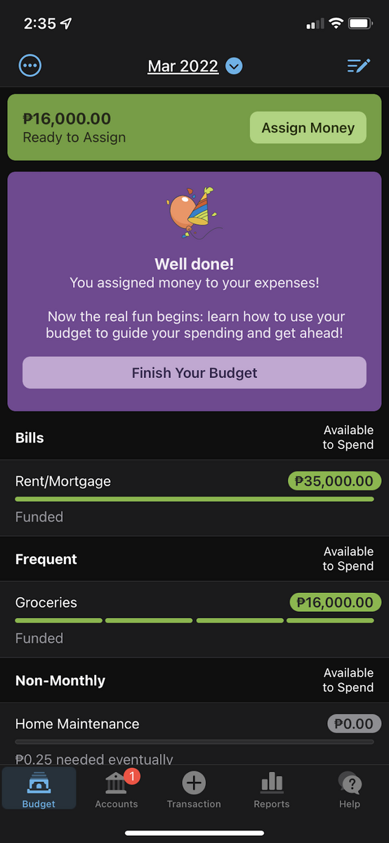
Source: You Need a Budget
It might feel intimidating at first, but the app does a good job guiding you throughout the process. It also provides some automation to make it easier.
For example, the app can auto-assign your budget for you.
Once you’ve created a budget, that’s the only time the app will explain what you just did.
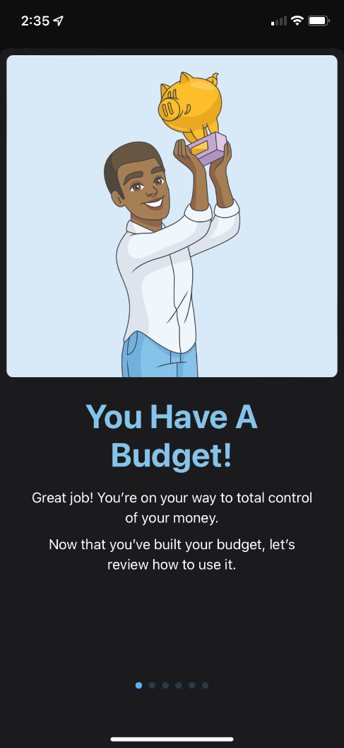
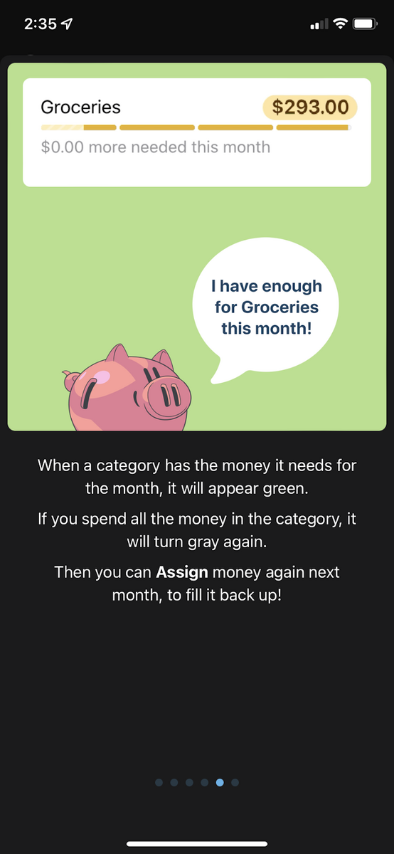
Source: You Need a Budget
Focusing on the doing first makes it easier to explain concepts to the user later. It also gives users that first win without intimidating them with theories beforehand.
No doubt, budgeting is a complex and unsavory task for many people.
But YNAB’s action-focused onboarding did a good job of showing that it can be easy.
We hope these examples have given you ideas to improve your onboarding.
The truth is that there’s no right or wrong way to onboard your users – there’s only the way that works.
As long as you have great retention numbers and happy users, you’re golden.
Need help designing an app with an excellent onboarding sequence? Don’t hesitate to contact us!

Mario makes every project run smoothly. A firm believer that people are DECODE’s most vital resource, he naturally grew into his former role as People Operations Manager. Now, his encyclopaedic knowledge of every DECODEr’s role, and his expertise in all things tech, enables him to guide DECODE's technical vision as CTO to make sure we're always ahead of the curve. Part engineer, and seemingly part therapist, Mario is always calm under pressure, which helps to maintain the office’s stress-free vibe. In fact, sitting and thinking is his main hobby. What’s more Zen than that?
How do you engage, educate, and gain the trust of app users quickly enough so they don't leave? We share the key fintech app onboarding tips to achieve that.

Onboarding is both art and science and part experimentation. That can make it challenging to implement—but only if you don’t know what you’re doing.