6 most common app onboarding mistakes to avoid

What’s the number one reason people uninstall an app?
Chances are, it’s frustration. Many users are frustrated because they don’t know how to use an app.
Indeed, a 2020 study by Wyzowl backs this up, revealing that 80% of users will drop an app if they don’t understand it.
That’s why onboarding is an important part of the process—it ensures users are comfortable with your app from the word go.
But watch out: onboarding can do more harm than good if not set up properly. In particular, you should try and avoid these six common mistakes:
Creating a lengthy process
A key challenge in onboarding is to give as much information to get new users up to speed without boring them.
Remember, the real goal of onboarding is to “minimize the time users need to learn an app”.
Unfortunately, it’s easy to overdo it. And the effects on your users will be disastrous, as revealed by this infographic from Clutch:
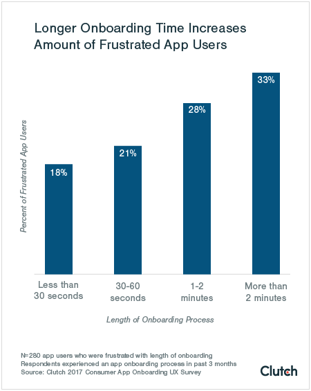
Source: Clutch
However, it’s wise to treat the above numbers as rough guidelines. That’s because onboarding times will naturally vary across niches.
For example, a banking app will ask for more user requirements; thus, it should have a significantly longer onboarding process.
Contrast this to a timer app, which can get by with just a splash screen.
So rather than aiming for an absolute time, it’s better to evaluate every step of your onboarding process and find out if it’s truly necessary and valuable.
To do this, it’s useful to have an app analytics tool like UXCam that will tell you how many users drop off at every stage of your onboarding.
This is called a drop-off report, and it looks something like this:
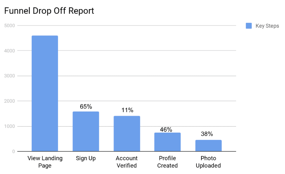
Source: OpenView
With this report, you’ll see the conversion rate at each step of your onboarding funnel. This allows you to try and remove steps to improve your numbers.
Because as you can see above, the longer the onboarding lasts, the more users drop off.
Whenever I consider which steps to keep or remove, I ask myself two simple questions.
One, will this benefit the user?
This is probably the most crucial question to ask, not just with onboarding but also with the whole app development process.
If the answer is not 100% yes, take that step out. Chances are, users will feel it’s only wasting their time.
Two, can I do this later?
As a rule, it’s best to ask for more demanding steps, such as signing up, only after onboarding.
Not only will it streamline your process, but you’ll also have a better chance at compliance. Let’s explore why this is in the next section.
Forcing users to sign up before they’ve tried the app
Asking users to create an account right away might seem like a logical first step, but it’s rarely beneficial. In fact, it can scare users off.
Source: Piwik
That’s because signing up for an account is asking too much right away. It’s like proposing on the first date!
Just like dating, you need to make a good impression first. And you can do this by letting users experience your app first and delay account registration as much as possible.
This process is called gradual engagement. One of its biggest advocates is Luke Wroblewski, Product Director at Google. Here’s his take on it:
“With gradual engagement, we can communicate what our mobile apps do and why people should care by actually allowing people to interact with them right away. We can capitalize on all the hard work it takes to get a download instead of turning 75% of our potential audience away with sign-up requirements.”
Many retail stores and e-commerce websites are big proponents of gradual engagement.
Notice that you can already start browsing through their products and even add items to a shopping cart.
It’s only when you checkout that you’re required to create an account. Indeed, sometimes it’s even optional.
Now, if you must ask users to register during onboarding, it helps if you tell them the benefits of doing so. That can reduce friction and resistance.
The Hotels.com app does a fantastic job with this. When you open the app, it encourages you to sign in by giving you a compelling reason.
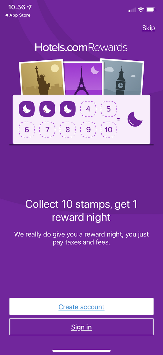
Source: Hotels.com
Also, note that signing up is optional. You can browse through hotel deals and book your stay without ever having to create an account.
Of course, the app still subtly reminds you to sign up throughout. But chances are you’ll be so happy with the app that you won’t mind doing it.
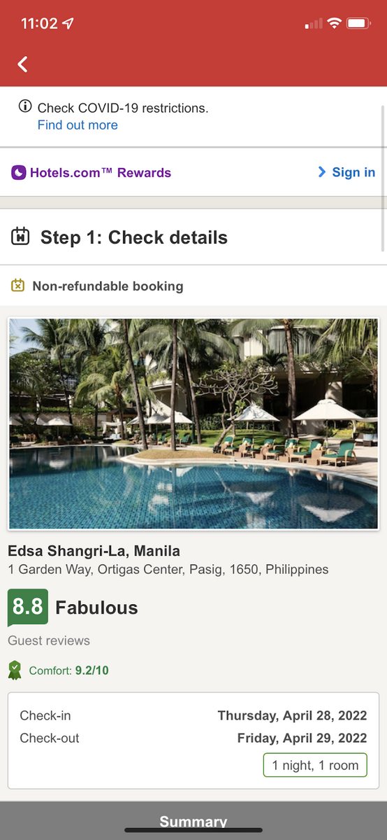
Source: Hotels.com
Sometimes, however, asking users to register before using the app isn’t possible. One good example is a personal finance app that depends on a person’s bank account to work.
But even in these cases, it’s still a good idea to follow Hotels.com’s example and tell users why they need to register.
And the best way to do this is to focus on value instead of features—something that, unfortunately, many apps fail to do.
Focusing on features instead of value
One crucial error many developers make is to list down the app’s features during onboarding.
While there’s nothing wrong with this, it’s simply not enough to pull users to your app. Often, it will just bore them.
Because, remember: users don’t care what your app does. They only care about what it can do for them.
So the key here is to focus on your app’s benefits – or the value it can provide.
Communicate clearly how your app can change a user’s life, and you’ll get more buy-in from them.

Source: DECODE
Let’s take a dieting app, for example. Instead of saying that the app has a recipe feature, you can rather say never worry about what to cook ever again.
Another example is a to-do list app. Instead of stating that your app has a color-coding feature, frame it as a way to organize your tasks, so you don’t miss out on anything.
Here’s a real-world example from the JIRA app.
Instead of getting into the technical details of the app’s features, the onboarding focuses on results such as staying connected or responding quickly—all valid concerns of large software teams.
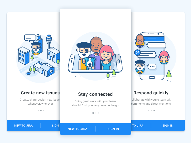
Source: UX Planet
Notice that in the above examples, we focused on a pain point the user has. The best value statements should do that to make everything much more compelling.
And you can only do this if you truly know your target audience. If not, you risk promising a value proposition users don’t care about. Worse, it can even alienate them altogether.
That’s why proper market research is important when first forming your app idea. Give out surveys, talk with people in your target market, or do a feasibility study.
Uncover the issues and aspirations that keep them up at night. Do whatever it takes to know them deeply.
It’s extra work, but it’s guaranteed to make your onboarding much more impactful.
Failing to use permission primer screens to your advantage
A permission primer is a pop-up dialog that asks for your user’s permission to do something.
Often, this is to request that they enable notifications or to turn on a feature of their phones, such as the camera or microphone.
Asking for permission is now a best practice that every app developer does. But what many don’t do is use it to their full advantage.
Here’s what we mean.
Look at this screenshot:
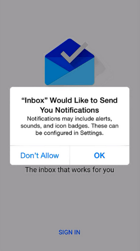
Source: Dropsource
Notice that it only asks permission to turn on notifications. It doesn’t state why the user needs to do this or how they can benefit.
This doesn’t help build trust at all, which is important if you want to retain them. At best, not stating a reason will make users skeptical.
At worst, it will lead them to turn off notifications entirely.
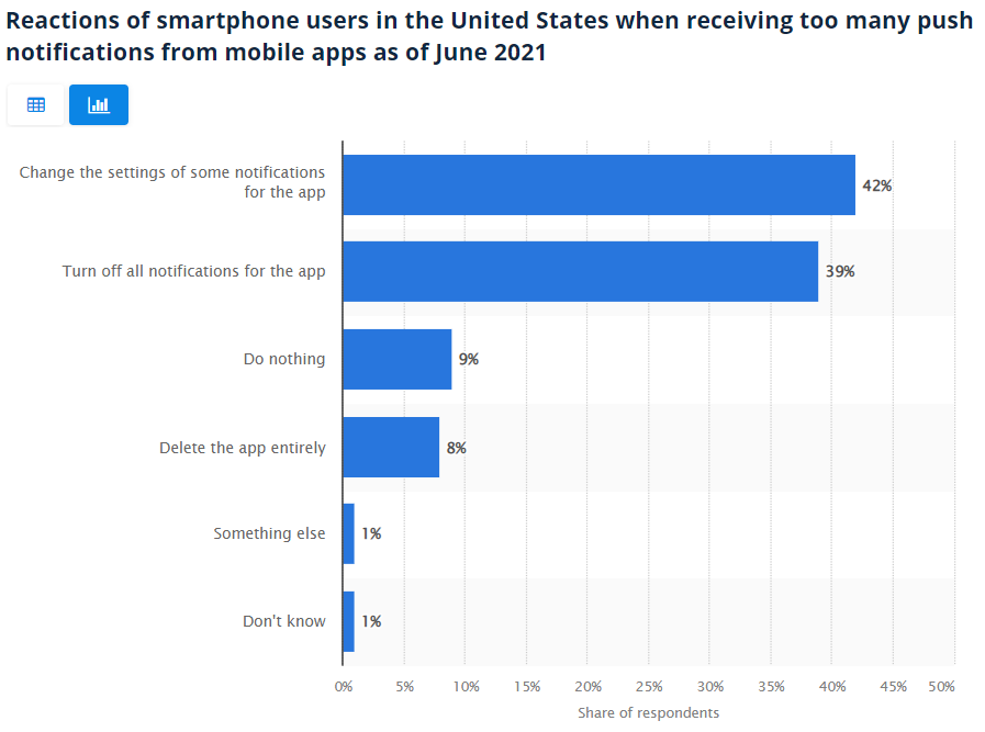
Source: Statista
But if users know that notifications are helpful beforehand, chances are they won’t disable it.
As you can see, the most successful approach to permission primers is to always state the benefits of saying yes.
A good example is the Starbucks app asking users to turn on Location Services. Normally, this is something that many people are hesitant to do due to privacy concerns.
But by stating how it can deliver a better app experience, the company increased the chance of their consumers saying yes.
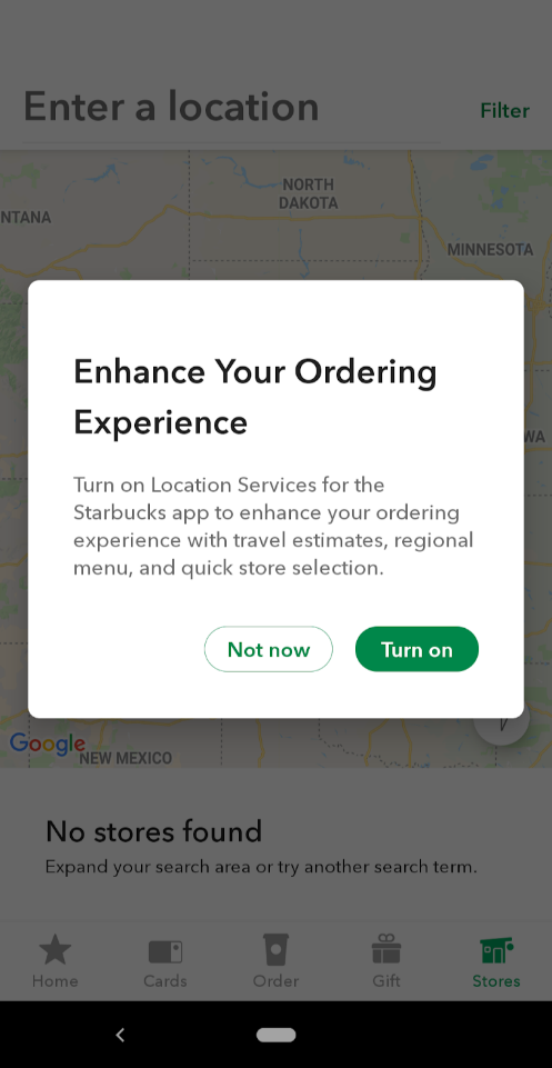
Source: Appcues
However, in some cases, explaining why isn’t necessary. For example, when Google Maps asks for your location when planning driving directions, the reason is obvious.
The user doesn’t need any elaboration.
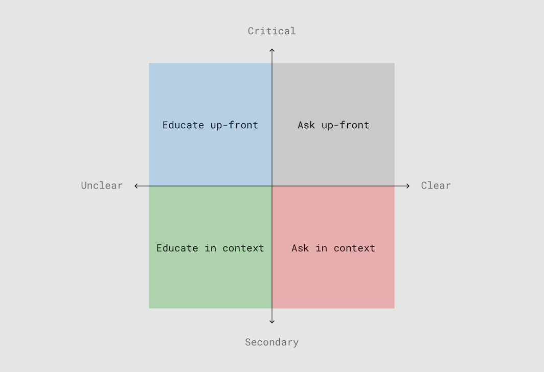
Google released some guidelines for approaching permission primers.
The idea is that critical and clear permissions can be asked immediately without explanation, but unclear and secondary permissions benefit from more information.
Source: Material.io
But when in doubt, it always pays to explain rather than omit. It’s just better for trust building.
Not delivering what’s promised
As we said before, trust should be the number one thing you’re building during onboarding. And nothing breaks trust by breaking a user’s expectations.
This is exactly what’s happening with a new wave of apps in the fast delivery space, which promise users they’ll get anything they want—in mere minutes. One of these is the Gorillas app.
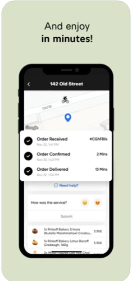
Source: Gorillas
But many experts are saying that the business model is unprofitable. Indeed, the original promise of the Gorillas app was “groceries at your door in 10 minutes.”
They recently changed it to “in minutes” because they found what they were advertising was just unrealistic.
It can be tempting to overpromise during onboarding to hook users in, but that’s not a viable long-term strategy.
In fact, it’s the quickest way to erode trust and lower your retention.
But it’s not just the big picture promises you need to keep; you also need to make do with the small ones as well. And nowhere is this truer than with their data and privacy.
Indeed, when you look at the building blocks of trust in a mobile app, you’ll find the top ones all have to do with personal data.
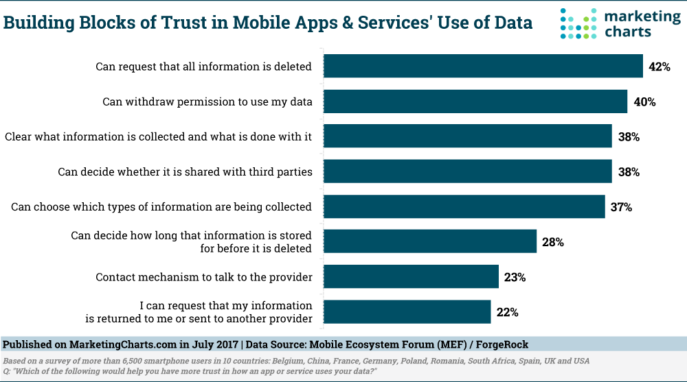
Source: Marketing Charts
Giving users complete control over their data is one of the best moves you can make to establish trust.
But when you give them the option not to share their data with third parties, honor that promise, even if they won’t find out.
Indeed, delivering on your promise might seem obvious and trivial. Yet, in today’s competitive landscape, developers sometimes want to make shortcuts.
Resist the urge. It’s always better to underpromise and overdeliver.
Not providing support for onboarding
Many apps make the mistake of leaving users hanging after the onboarding process. But this is a bad idea, since not everyone will get it right away.
Plus, for complex apps, it’s virtually impossible to cover all features in such a short time.
Thus, you should still continue to support your users throughout.
A good way to do this is with pop-up dialogs that appear when users first use a feature or reach a screen. Here’s an example from the Evernote app:
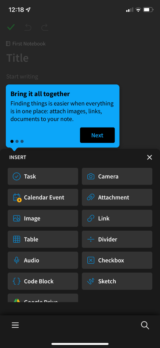
Source: Evernote
This is a good option because help appears only when the user needs it, so it doesn’t overwhelm them with too much information.
Another good technique is to incorporate tutorial-style content throughout the app. Here’s how the Notion app does it:
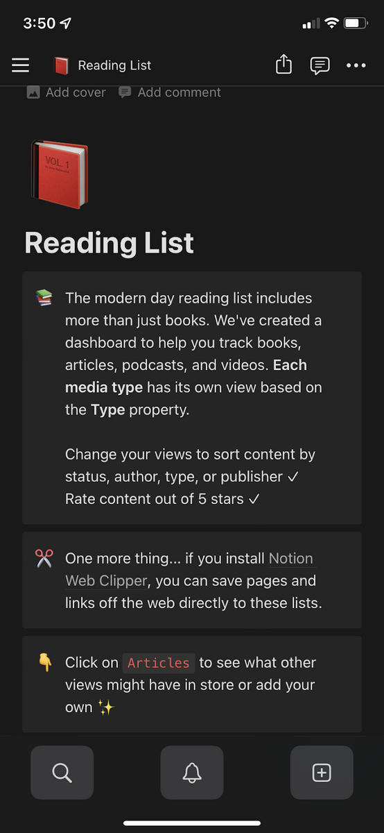
Source: Notion
Again, this type of support is contextual, so users will remember it much better. Plus, they can edit these instructional items, so they don’t need to create from scratch.
Finally, don’t forget to have learning resources like help articles and links somewhere in the app.
This is especially important for apps that deal with complex topics like finance and health.
Remember, most apps only have an annual retention rate of just 35%, from a 30-day rate of 66%.
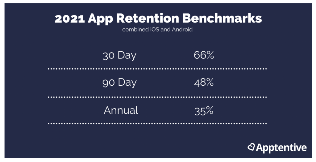
Source: Apptentive
That’s a lot of dropped users. But if you continue to support your users on day 365 as you did on day 1, you’ll have a much better chance of keeping them.
Onboarding is a balancing act
Real talk: onboarding is not easy. It’s not as simple as doing a product tour or asking people to sign up.
It’s an involved process where you need to balance giving value and asking for too much of your users’ time.
But once you pull it off, it can single-handedly bring your retention numbers up. It’s that powerful!
So take the time to craft a fantastic onboarding sequence. It’s well worth the effort!