App mockup: all there is to know

If there’s something that can single-handedly cause app failure, it’s poor UX. Close to 70% of online businesses fail because of it.
It also doesn’t help that UX is notoriously hard to get just right, despite its simple goal.
UX is so crucial that the Interaction Design Foundation recommends that 40% of an app’s budget go to UX research and design.
Fortunately, app developers have powerful UX tools at their disposal to ensure the success of their design. One of these is the mockup.
What is an app mockup?
An app mockup is a detailed representation of your app design. It contains all the final UI elements such as typography, copy, colors, and visuals like icons and photos.
Sample content will also be used, but dummy text is also acceptable.
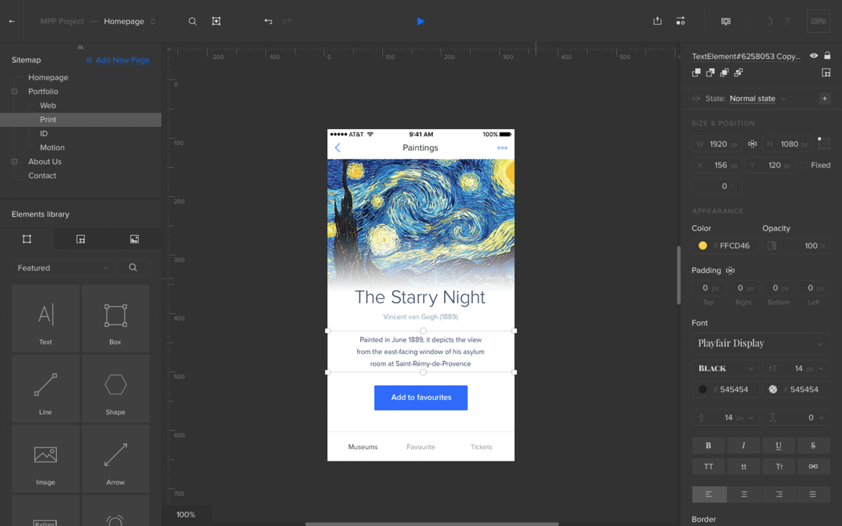
A typical mockup looks like this:
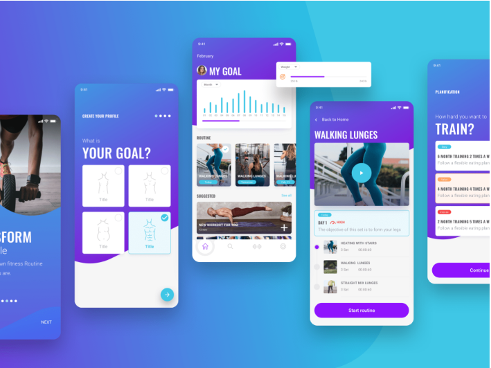
Source: Invision App
As you can see, you can already mistake it for the actual app. But a crucial distinction with mockups is that they’re static, which means users can’t interact with them.
There’s another way of looking at it: mockups are more like screenshots of your final app.
Now, many people often confuse mockups with wireframes and prototypes. Though there is some overlap in how they look and function, each is distinct.
Here’s a rundown of the differences:
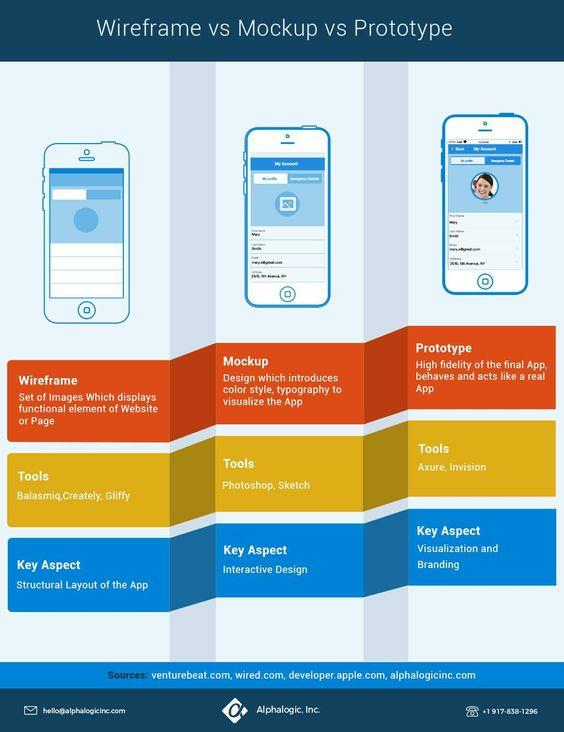
Source: Alpha Logic
In short, wireframes are for laying out the basic structure and flow of your app. That’s why they’re devoid of design elements so that the viewer can focus on function and features.
On the other hand, prototypes are working pre-final versions of your app. Their purpose is to test the UX and behavior of your app against real users to gather feedback.
Since they contain interactive elements, they’re also the most challenging to develop.
Finally, mockups are primarily design tools. Their purpose is to communicate aesthetics, UI, branding, and some aspects of UX.
In many ways, mockups are like high-fidelity wireframes but with more focus on the visuals.
During the design process, they often sit between a low-fidelity wireframe and a working prototype—more detailed than the former but lacking the user interaction of the latter.
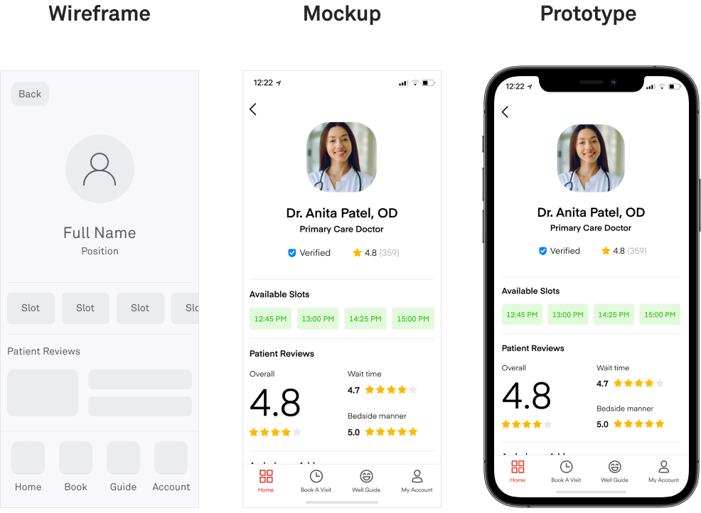
Source: DECODE
The number one beneficiary of mockups is the design team. Mockups can be a great tool for rapidly iterating and refining your app’s visual design since they’re easy to create.
And once you have a final mockup, front-end developers will have an easier time translating it into a working app because all the elements are there.
Developers will also get a lot from seeing which interactive UI elements they need to code.
Granted, mockups take a lot of work to create. But it’s often worth it, especially once you experience the benefits. So let’s talk about that next.
Why create a mockup for a mobile app?
Mockups, when used properly, can give your app numerous advantages. Let’s go over some of them in the following sections.
They allow you to get valuable UX feedback
Mockups are valuable tools for boosting your UX because it allows other people to give you accurate feedback.
Remember, the viewer judges a close representation of the final design and not just a concept.
Therefore, they can give better usability, color scheme, and screen layout suggestions.
You can even do mockup testing, where you share your app design to end-users for feedback. One effective method is the Five Second Test. Here’s how it works:
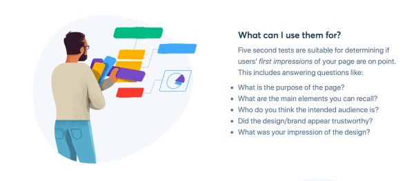
Source: Five Second Test
Rapid exposure forces respondents to notice only the major elements and general purpose of every app screen.
Therefore, refining your app design according to feedback from this test can help make it more intuitive and user-friendly.
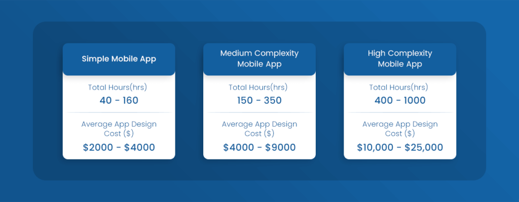
They can save you time, money, and effort
A mockup is primarily a planning tool. By laying the design out, you and your team spot potential UI issues early on.
This is invaluable for saving you a lot of time and effort.
Consider that the average cost to design even a simple app can range from $2,000 to $4,000.
Revisions are even costlier, which Mindsea estimates can be up to $7,500 for just four screens.
Source: Glowid
Mockups ensure that you maximize your spending and avoid unnecessary costs by only going through the design process once. In addition, it’s way cheaper and faster to revise a mockup than it is a working app.
They can get you stakeholder buy-in
Mockups are an important tool for building trust with clients and partners early on.
You can use it to convince them that your design approach is on the right path, which streamlines the approval process throughout development.
And if you’re trying to get investors to invest in your app project, mockups are the best way to impress them. For example, you can include it in your pitch deck, as Uber did here:
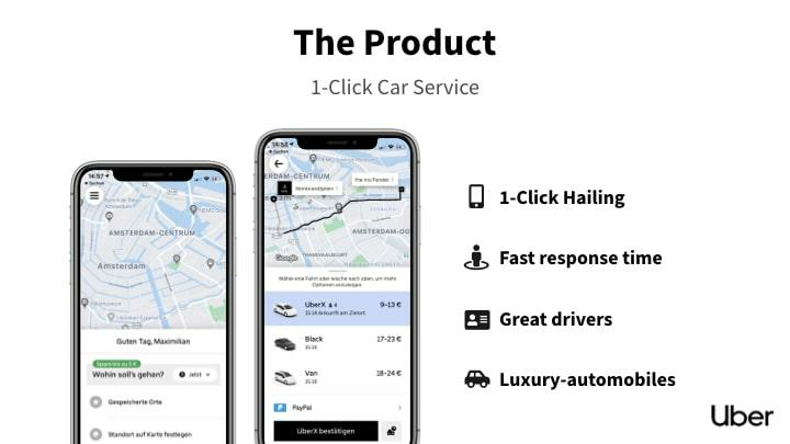
Source: Base Templates
As you can see above, a mockup and a few words were enough to communicate the idea behind Uber instantly.
Streamlines app development
Together with wireframes and prototypes, mockups are the most important blueprints of your app.
They’re like your team’s guiding light, ensuring that everyone works on the same vision and direction.
With mockups, designers can have a clear reference on the exact design and aesthetics they’ll need to produce.
Likewise, developers will know which UI elements and features they need to create.
Even UX copywriters benefit because they can optimize the length of their copy based on the allotted space in the mockup.
Without mockups, development can take twice as long due to mistakes and revisions.
What does the mobile app mockup usually contain?
The typical mockup should contain two main components: information architecture and design elements. In the following sections, we’ll take a look at both those elements.
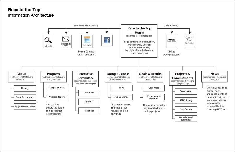
Information architecture
Information architecture (IA) is simply how information is structured in your app.
This is arguably the most crucial element of UX because a user will get lost trying to find what he needs without it.
Source: Carol Tompkins
While users won’t see IA directly in your mockup and app, they will feel it. That’s because IA influences aspects like screen layout and navigation, impacting UI design.
In other words, IA is the function that drives the form of your mockup.
For example, your mockup should clearly show the navigation scheme of your app.
However, before focusing on the look and feel, you should determine how your navigation can ensure easy access to information based on IA patterns.
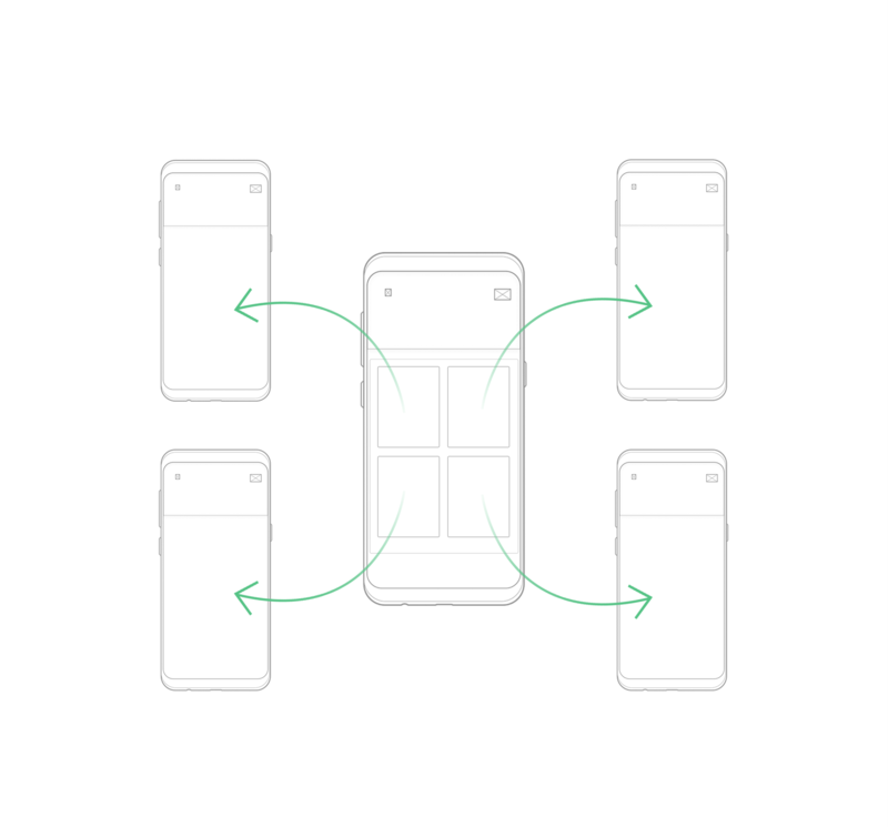
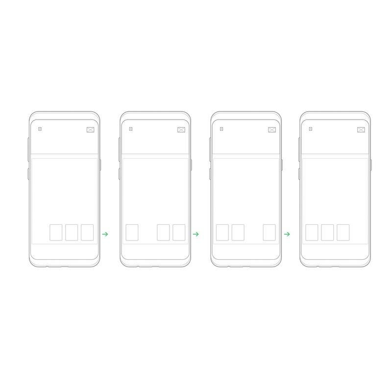
For example, a common IA pattern in apps is the hub and spoke, where users must return to the home screen to navigate to other sections of the app.
Thus, the home screen will contain the bulk of the navigation elements.
Source: App Likely
Compare this to the Tabbed View model, where screens are organized in tabs that can be reached anywhere in the app.
The navigation system here will most likely be an always-visible menu bar on the bottom of the screen.
Source: App Likely
The point here is that IA is all about broad strokes. It’s like creating the structure of a house first based on its overall purpose.
Only after you’ve completed that part of the task can you decorate with design elements.
Design elements
Design elements refer to the visual components you see on the mockup. This includes the overall UI and individual parts like buttons, icons, and text.
There are five types of design elements any mockup should have.
First, branding is the overarching design theme of the whole app.
It tells you things like the overall aesthetic for your app or the appropriate tone for your copy to keep in line with your company’s image.
A vital part of branding is the logo, which often doubles as the app icon. Ideally, the theme and vibe of the logo should be close to the UI design to ensure a cohesive experience, as Duolingo did here:
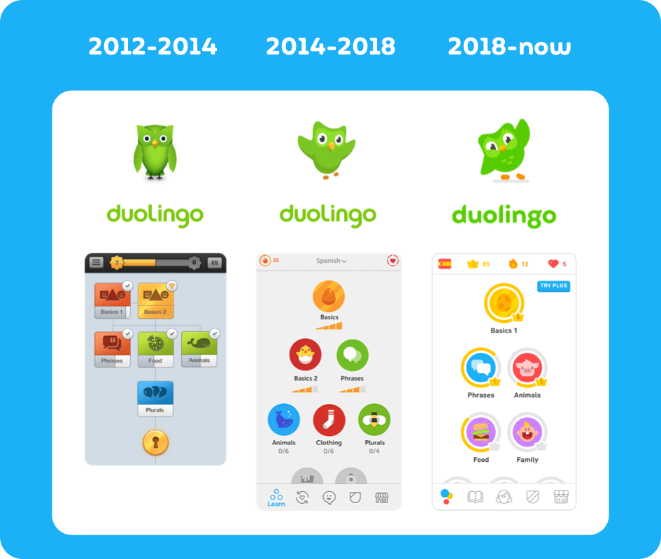
Source: Duolingo
Next is the color palette of your app—which can also be a part of branding, but it doesn’t have to be. Color is crucial because it accomplishes two things.
First, it helps with visual hierarchy, or the way things are arranged in a design according to importance.
For instance, call-to-action (CTA) buttons are often in bright colors like red—regardless of the color scheme otherwise used by the brand— to make them more noticeable.
The other function of color is to convey mood and emotion. To illustrate, take a look at this infographic from the Logo Company:
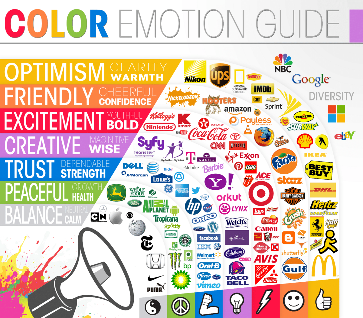
Source: The Logo Company
A color mismatch can disorient the user and affect UX. For instance, using a red theme in a fintech app might not be the best approach since it doesn’t reflect a feeling of safety and reliability.
Another important design element is the typography. Like color, the type of font communicates emotion as well.
But more than just the type of font, aspects like size, spacing, and even the shape of the text blocks matter, too.
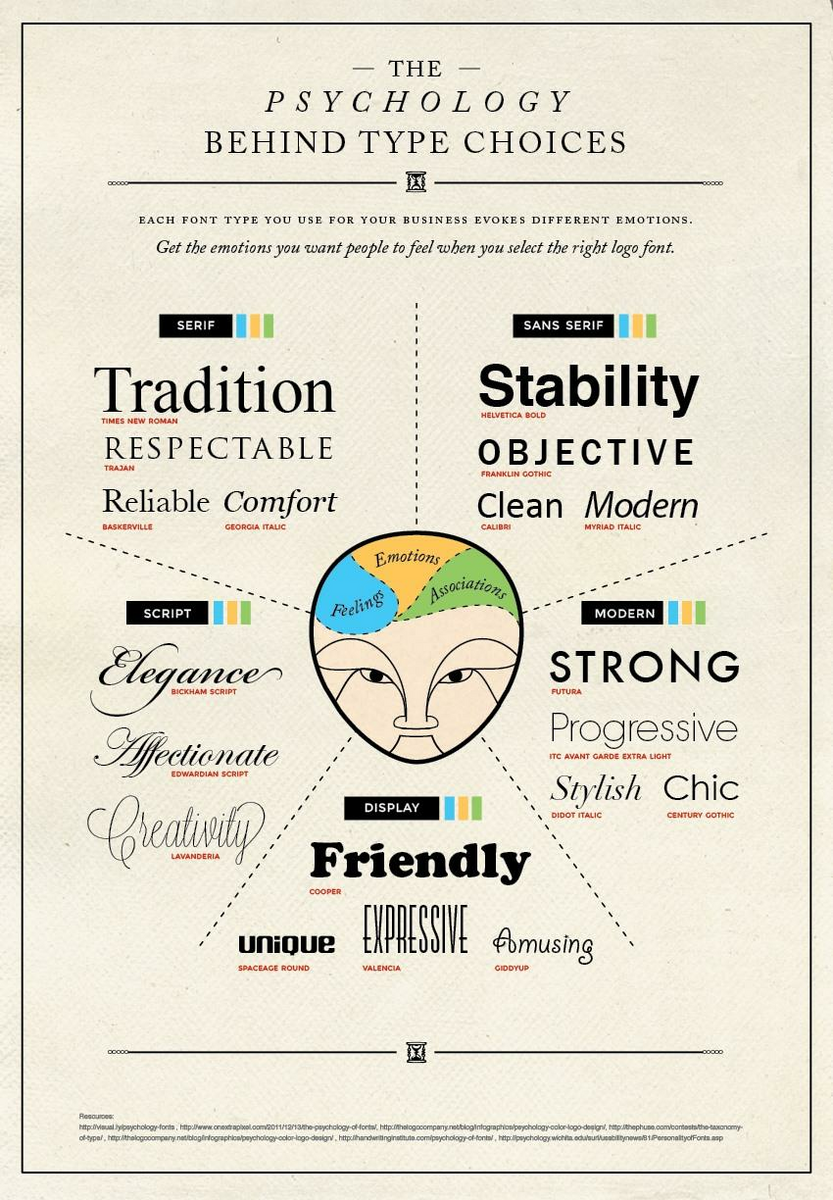
Source: Crazy Egg
The fourth element entails UI elements such as buttons, tabs, and menu icons. The shape, size, general design, color, and placement of these components also matter in a mockup.
Lastly, your mockup should use images and other visuals. Even the simplest app should have them, as they can make an otherwise boring UI much more engaging.
Best practices for app mockup design
Now that you know the ingredients of a good mockup, it’s time to discuss some best ways of putting them together.
Start with UI kits and templates
Creating mockups doesn’t necessarily mean doing everything from scratch. You can speed things up by using UI kits and templates.
There are thousands of editable designs available on the Internet. You can simply buy one that closely matches the theme you’re going for.
Some UI tools, like Figma, also provide these templates in-platform.
Then, it’s just a matter of tailor-fitting the UI elements for your purposes.
Source: Speckyboy
For simple apps, you can even use the default UI elements provided by Apple and Google. This is a good option if you don’t want or can’t afford to hire a UI designer.
Use the same tool for creating wireframes and mockups
Ideally, you want to use only one tool to design wireframes, mockups, and prototypes. At the very least, you should use tools compatible with each other.
That’s because you’ll most likely be building from one step to another. For instance, it’s faster to take your wireframe and design your mockup on top of that.
If you’re just doing it in one tool, the process will be more seamless.
One good example of a comprehensive tool is UXPin.
Source: CMS Critic
The software allows you to take your design from low-fi wireframing through prototyping, eliminating the time-consuming hop from one software to another.
Use UI patterns
Knowing and applying the right mobile app design principles is vital when doing a mockup. One of these that will make mockups easier is the use of layout patterns.
Layout patterns dictate how you arrange crucial UI elements that align with how humans read. There are two types: the F-pattern and the Z-pattern.
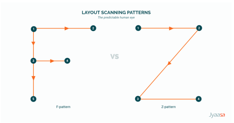
Source: Line Design Medium Page
The F-pattern is mostly used for app screens that have lots of text. The Z-pattern, meanwhile, is best for UI that is heavy on visuals.
Using these two patterns properly can help make your mockup—and UI design—much more user-friendly.
Start with the smallest screen
When you’re developing an app for multiple screen sizes, it’s best to start with the smallest one first.
Doing this forces you to create a UI that will work well on all your target devices by eliminating unnecessary elements.
What’s more, it’s much harder to compress a larger UI into a smaller space than it is to do the opposite.
For this reason, you should also use vector images (such as SVG) as much as possible. This is because they can scale without losing definition, unlike raster images (like JPG or PNG).
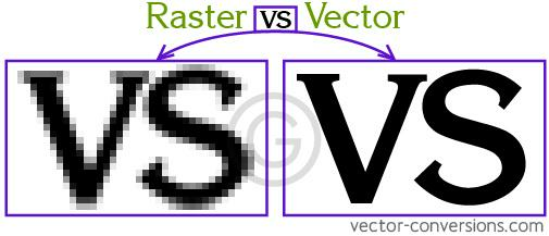
Source: vector-conversions.com
These are just some of the best practices to help make your mockups seamless to create. But we have one last tip to cover: making your mockups developer-friendly.
How to collaborate with developers on mockups?
While mockups are mostly for designers, you shouldn’t leave developers out of the equation.
After all, they need to translate your mockup into a working app, so nothing should get lost in translation.
Web developer Krista Rae gave a very nice benchmark for knowing when you’ve succeeded:
“My goal when working with a designer is to be able to put the finished website and their mockup side-by-side without them being able to tell the difference. That’s the kind of experience you should expect.”
To ensure that happens, it’s important to keep developers in the loop – even during design reviews.
Aside from being in the know, developers can warn you of technical issues in the design.
It’s also a good practice to add annotations to your mockup. This is useful for explaining dynamic elements that might not be readily apparent in a static image.
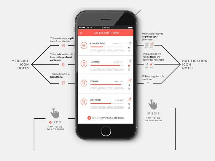
Source: Vandelay Design
Lastly, once you pass a mockup to a developer, include an asset package.
This includes all the images, graphics, and other files needed to implement the mockup design into the final app.
A good mockup starts with proper wireframing
A good mockup is an essential element of creating a well-designed, user-friendly app.
It helps you get client buy-in and ensures that you put your resources into the most effective elements when creating the final product.
We hope you find our overview of the best components and practices to implement when creating a mockup helpful.
Should you have any questions or need help creating your own mockup or app, don’t hesitate to get in touch!