
6 benefits of app wireframing that will motivate you
If you're looking to create a mobile app, wireframing is one of the best ways to get started. To motivate you, we cover six benefits of app wireframing.
Much like a house needs a blueprint, apps need a wireframe.
They’re the skeleton that gives general direction and structure to your app. Without a wireframe, you risk creating an aimless mess that doesn’t fulfill its intended objectives.
However, like any tool, wireframing can be a double-edged sword.
In the wrong hands, it can be a huge drain on your time and resources. At worst, it can confuse your team members and key stakeholders.
Therefore, knowing the right way to wireframe is crucial. And you can start by avoiding these six common mistakes.
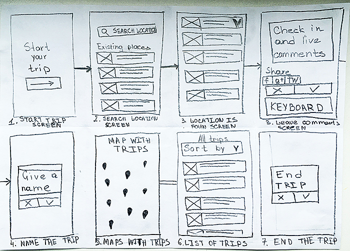
Mobile apps might be a digital medium, but that doesn’t mean analog methods like paper-based sketching don’t have their place.
On the contrary, drawing on paper is the best and fastest way to start wireframing:
Source: UX Movement
That’s because translating your idea into a wireframe is harder than you think.
Consider the idea that kickstarted Uber: “what if you could request a ride from your phone?”
It was certainly novel and innovative. But, then, how would you implement that in an app? What would the interface look like?
What’s the process of booking a ride? Will it be user-friendly?
Sketching can help you answer questions like that by allowing you to visualize your idea.
Drawing on paper is fast, so you can rapidly test out as many ideas as possible to see which one will work. In addition, revisions take very little effort.
In contrast, drawing on a computer is much more involved and time-consuming. Try timing yourself drawing a square on paper vs. a computer to see what we mean.
Best of all, sketching is easy and inexpensive. You don’t need any fancy tools or drawing skills to do it. And you can sketch anywhere inspiration hits you, even on a napkin.
No wonder the most successful apps and websites—such as Twitter—all started as simple drawings on paper.
Source: Twitter
So, what are some good tips for sketching?
First, remember that speed is the name of the game.
Thus, focusing on the details can slow you down at this point. The best approach is to use simple shapes like squares to represent elements on the screen.
Then, supplement that with text to explain certain parts of the sketch.
As long as you can communicate your app idea clearly, even a rough sketch like this will do the trick:
Source: Agente Studio
Another useful tip is to try the Crazy Eights method, a sprint design process often used at Google Ventures.
It involves drawing eight sketch ideas in just five minutes, or around 40 seconds per sketch.
Seems fast, doesn’t it?
It’s essentially visual brainstorming. The idea is to force you to focus on idea generation rather than worry about your drawing.
And even if you don’t produce great sketches with the method, it’s a great way to get your creativity flowing.
Source: Google Ventures Library
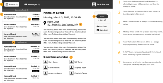
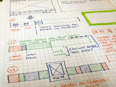
Our last tip is to annotate your sketch. This is perhaps the most important ingredient of any wireframe, even the hi-fi ones you’ll build later.
We’ll talk more about annotations next.
Annotations are the notes that further explain certain parts of your sketch or wireframe.
Without these labels, you risk communicating wrong or incomplete details to other stakeholders.
Source: UX Planet
Certain aspects of an app can’t be conveyed with a simple static wireframe, especially if it’s a sketch.
Dynamic elements and user interactions are prime examples.
For instance, you can use annotations if you want to explain what happens when a user swipes left on an app element.
You can also annotate to describe app elements with hidden/inactive states and the conditions that will activate them.
Source: UX Movement
But perhaps the most vital role of annotations is to clarify the logic behind your choices.
Why did you use a particular navigation system? What’s the reason you omitted the search bar on the home screen? What’s the purpose of this feature?
These are just some of the questions your annotations must answer.
Source: Volodymyr Melnyk
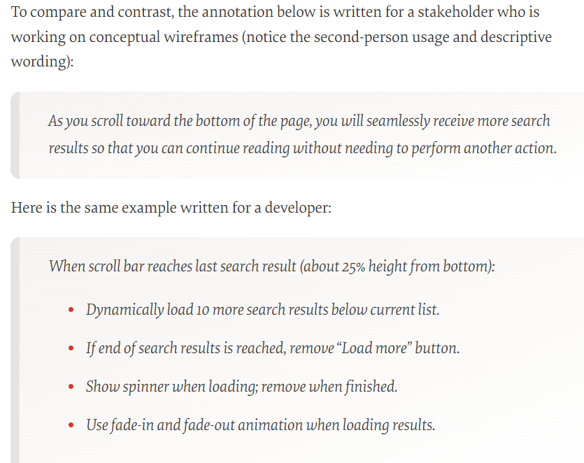
When writing annotations, take note of whom you’re writing them for. According to product design expert Dan Saffer:
[bctt tweet=”There are typically five audiences for wireframes: clients (internal or external), developers, visual designers, copywriters, and, most importantly, your future self.”]
Knowing your audience is important because you want to align your message to their goals.
Clients, for instance, care about how your app will fulfill the project brief and solve their business goals. Thus, they would want to see that in the wireframe.
On the other hand, developers need to know how each feature and screen will work. That gives them the technical details to implement it properly in the final app.
Here’s an example of how you can write the same annotation for two different audiences, courtesy of Smashing Magazine:
Source: Smashing Magazine
Notice how the first annotation focuses on the benefits of the feature while the second one is concerned with the exact behavior.
Poorly written annotations will cause confusion. Internal stakeholders won’t be able to translate your wireframe accurately into a working app.
On the other hand, external stakeholders might misinterpret your design and mistakenly ask for changes that won’t achieve the app’s objectives.
Annotations might seem like an additional chore. But they can save you and your team a lot of headaches and unnecessary work down the line.
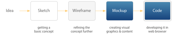
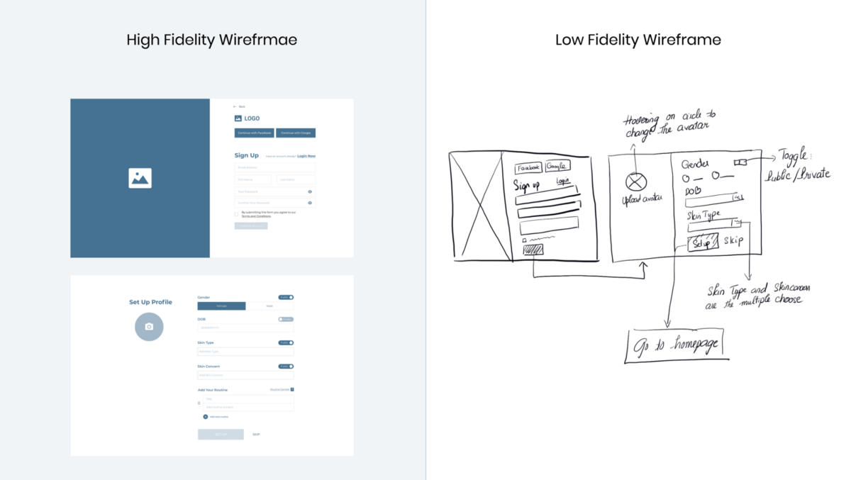
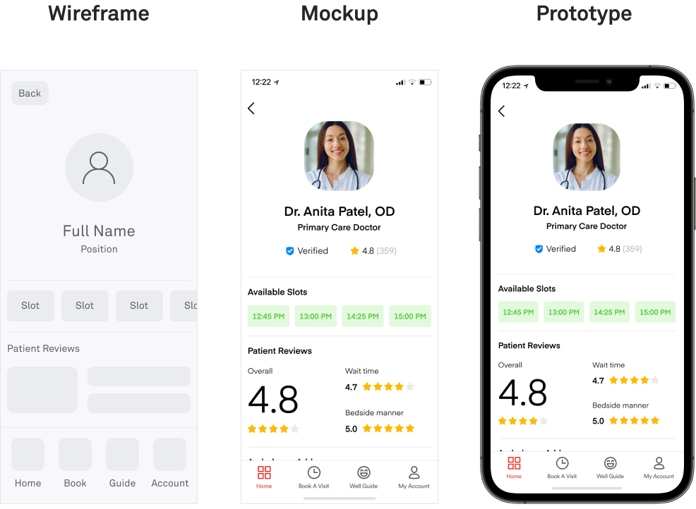
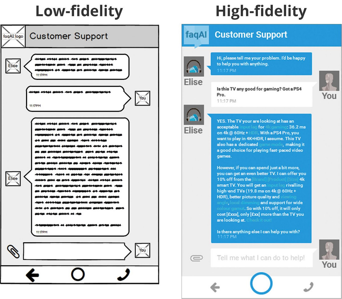
Fidelity—or the level of detail—is another important decision when wireframing.
There are generally two levels of fidelity: low and high. Of course, there are various shades between them, which we refer to as mid-fidelity wireframes.
You can see the distinction in this illustration:
Source: UX Collective
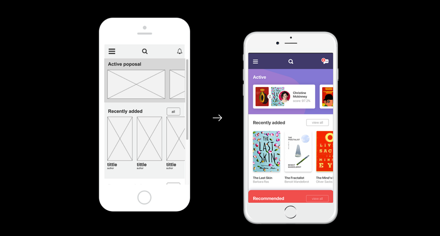
Low fidelity (low-fi) wireframes are as simple as it gets. We’ve already discussed sketching above, which is one example.
This type of wireframe is characterized by simple shapes with close to zero details. Boxes called placeholders represent complex elements like graphics and icons.
Text is used liberally to label parts of the wireframe.
The goal of a low-fi wireframe is to communicate the general idea of the app.
It also illustrates the different areas of the screen and how the app flows from one screen to the other.
Source: Pixelfridge
Low-fi wireframes are best during the early stages of development when you’re still refining the app design and flow.
That’s because low-fi wireframes are easy and inexpensive to change. As a result, they’re essential for rapidly gathering feedback and revising the design in response.
High fidelity (hi-fi) wireframes, on the other hand, are much more detailed. They already contain some of the aesthetics and visuals to be used in the final version.
Most also include interactive elements and user interaction.
The flip side is that hi-fi wireframes take longer to build due to the added complexity.
Because hi-fi wireframes closely approximate the real thing, they’re also called mockups or prototypes.
Source: DECODE
Hi-fi wireframes are ideal if you’re already committed to an app design but want users to test it first.
They’re also the preferred way to ask for feedback from clients who might not be savvy enough to appreciate a low-fi wireframe.
Knowing which wireframe fidelity to use and when is crucial for making the best use of your time and resources.
Using a hi-fi wireframe when a low-fi will suffice wastes time and effort.
In addition, rapid design iterations are challenging with a hi-fi wireframe, unnecessarily prolonging the early stages of app development.
On the opposite spectrum, using a low-fi wireframe during the later stages isn’t as effective.
You can’t properly measure UX among your users, nor can you properly test the flow of your app. Feedback from external stakeholders might not be as accurate, too.
Imagine if you had to beta test the left screen instead of the right one—you’d probably get undeserved, negative feedback.
Source: O’Reilly
But picking the right wireframe fidelity is just the first step. There’s still the danger of adding too many details. So, let’s talk about that next.
Wireframing is all about balance and restraint. The last thing you want is to put too many details because it will only distract the viewer.
Patrick Lynch and Sarah Horton, in their Web Style Guide, illustrate this point in their definition of a wireframe:
“Wireframes force teams to stay focused on the information architecture and structural design without getting sidetracked by the distraction of the visual layer.”
But the risk isn’t just with the internal team. Design elements like color and typography can also sidetrack clients into giving the wrong feedback.
For instance, instead of commenting on the flow and function of the app, stakeholders might be hung up on the color of the menu bar or the aesthetics of the logo.
Source: Azoora
These things are undoubtedly important to UX. But design critiques are best reserved for later stages when all app pieces are already in place.
That’s why most experts suggest doing your wireframe in monochrome. However, if you’re going to use color, it should be a tool to highlight elements rather than a design element.
Well-known wireframing authority Jakub Linowski says it best:
“Perhaps it has something to do with the tradition that colour is often avoided at the wireframe level. I still use colour just to emphasize certain elements, and red for actions.”
Here’s an example:
Source: Ergomania UX
As you can see, color is used to successfully differentiate elements on the wireframe above.
So, if you’re not going to focus on aesthetics on your wireframe, what should you emphasize?
Anything that describes the user’s journey in your app. Like how they get from one screen to another or what problem each app screen is trying to solve.
It should also communicate your information and app architecture so developers know the technologies and services they’ll need.
Branding and visual design are important, but that’s not the wireframe’s job.
Wireframing is already a time-consuming and involved process. But it can become unnecessarily harder if you do it for every screen.
You don’t need to do that. In fact, it does more harm than good.
After all, wireframing is the art of efficiency, according to the Interaction Design Foundation.
And being efficient means only focusing your time and energy where it matters.
So, how do you know which ones you should wireframe?
It pays to start with your flow. That way, you’ll know the core screens in your app—the ones that will break your flow if removed. These screens are the ones you should prioritize.
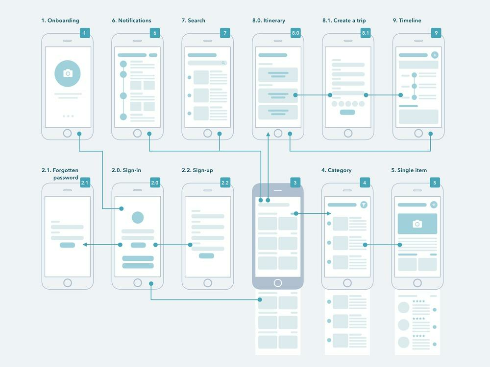
Source: Dribbble
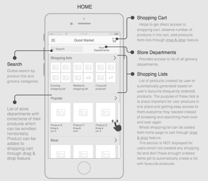
There will undoubtedly be other screens in the above example, such as a user profile or preferences screen.
But seeing as it’s not vital to the main app flow, it can be safely omitted from wireframing (if only during the early stages).
If you’re working on multiple variations of a screen, it’s best to wireframe only a template.
For example, in an e-commerce app, you often only need to wireframe the product screen template.
It’s a waste to wireframe every product screen for each category you have, even if they have slight differences.
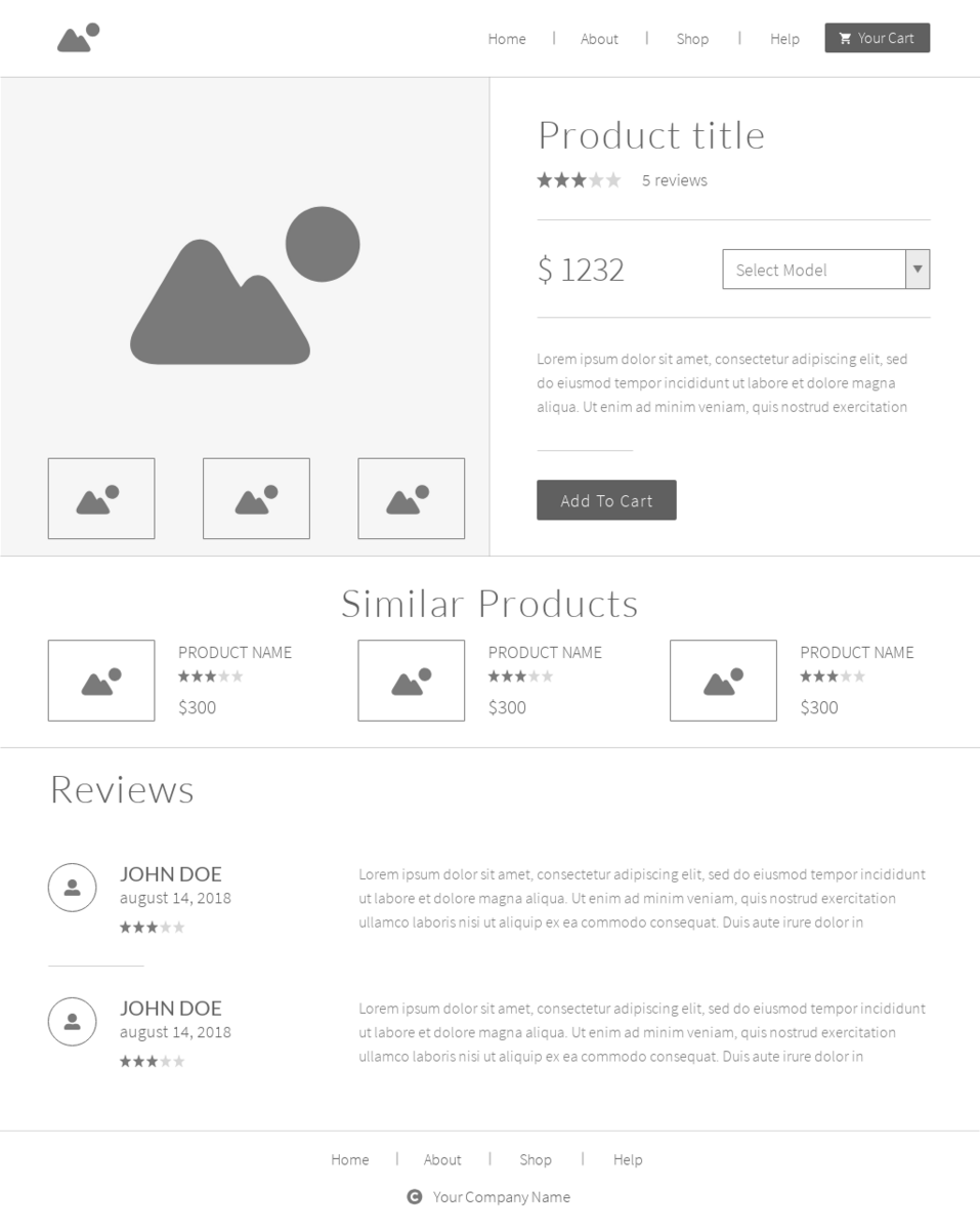
Source: Moqups
Remember, wireframing is all about speed. So the faster you communicate your app idea visually to stakeholders, the better.
Incomplete wireframes and rough sketches have their place in the app development process. But showing them to clients can be detrimental.
Many developers and agencies like to keep their clients in the loop with work in progress reports.
However, there are better tools to do that, and an unfinished wireframe isn’t one of them.
The danger lies in miscommunication and confusion. People who aren’t design-savvy can’t appreciate a rough sketch like this:
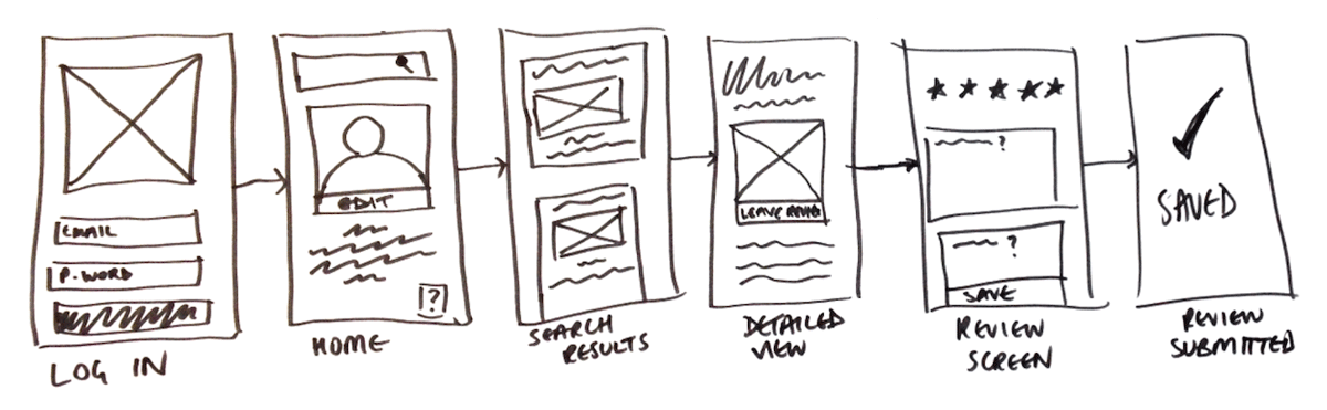
Source: Career Foundry
Clients can also get hung up on design choices you used during an incomplete wireframe, which might change.
Unfortunately, they might look for these elements later on, which will complicate your process.
Always treat your wireframes as a standalone entity that can speak for itself.
That’s why we’ve talked about using annotations and removing unnecessary details to give your wireframe a clear voice.
If your wireframe can’t do this yet, try to keep it among your team first.
Having the right approach to wireframing should be a key consideration for any developer.
Apart from the many benefits you’ll reap, it gives you the best chance to design an app that will stand out in today’s competitive market.
Want to learn more about wireframing?
Check out our all-in-one guide here. We also have a rundown of the best wireframing tools that might interest you.
We hope this guide was helpful in getting you to avoid the most common pitfalls of wireframing.
They’re the skeleton that gives general direction and structure to your app. Without a wireframe, you risk creating an aimless mess that doesn’t fulfill its intended objectives.
However, like any tool, wireframing can be a double-edged sword.
In the wrong hands, it can be a huge drain on your time and resources. At worst, it can confuse your team members and key stakeholders.
Therefore, knowing the right way to wireframe is crucial. And you can start by avoiding these six common mistakes.
Mobile apps might be a digital medium, but that doesn’t mean analog methods like paper-based sketching don’t have their place.
On the contrary, drawing on paper is the best and fastest way to start wireframing:
Source: UX Movement
That’s because translating your idea into a wireframe is harder than you think.
Consider the idea that kickstarted Uber: “what if you could request a ride from your phone?”
It was certainly novel and innovative. But, then, how would you implement that in an app? What would the interface look like?
What’s the process of booking a ride? Will it be user-friendly?
Sketching can help you answer questions like that by allowing you to visualize your idea.
Drawing on paper is fast, so you can rapidly test out as many ideas as possible to see which one will work. In addition, revisions take very little effort.
In contrast, drawing on a computer is much more involved and time-consuming. Try timing yourself drawing a square on paper vs. a computer to see what we mean.
Best of all, sketching is easy and inexpensive. You don’t need any fancy tools or drawing skills to do it. And you can sketch anywhere inspiration hits you, even on a napkin.
No wonder the most successful apps and websites—such as Twitter—all started as simple drawings on paper.
Source: Twitter
So, what are some good tips for sketching?
First, remember that speed is the name of the game.
Thus, focusing on the details can slow you down at this point. The best approach is to use simple shapes like squares to represent elements on the screen.
Then, supplement that with text to explain certain parts of the sketch.
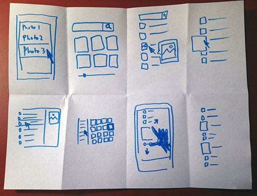
As long as you can communicate your app idea clearly, even a rough sketch like this will do the trick:
Source: Agente Studio
Another useful tip is to try the Crazy Eights method, a sprint design process often used at Google Ventures.
It involves drawing eight sketch ideas in just five minutes, or around 40 seconds per sketch.
Seems fast, doesn’t it?
It’s essentially visual brainstorming. The idea is to force you to focus on idea generation rather than worry about your drawing.
And even if you don’t produce great sketches with the method, it’s a great way to get your creativity flowing.
Source: Google Ventures Library
Our last tip is to annotate your sketch. This is perhaps the most important ingredient of any wireframe, even the hi-fi ones you’ll build later.
We’ll talk more about annotations next.
Annotations are the notes that further explain certain parts of your sketch or wireframe.
Without these labels, you risk communicating wrong or incomplete details to other stakeholders.
Source: UX Planet
Certain aspects of an app can’t be conveyed with a simple static wireframe, especially if it’s a sketch.
Dynamic elements and user interactions are prime examples.
For instance, you can use annotations if you want to explain what happens when a user swipes left on an app element.
You can also annotate to describe app elements with hidden/inactive states and the conditions that will activate them.
Source: UX Movement
But perhaps the most vital role of annotations is to clarify the logic behind your choices.
Why did you use a particular navigation system? What’s the reason you omitted the search bar on the home screen? What’s the purpose of this feature?
These are just some of the questions your annotations must answer.
Source: Volodymyr Melnyk
When writing annotations, take note of whom you’re writing them for. According to product design expert Dan Saffer:
[bctt tweet=”There are typically five audiences for wireframes: clients (internal or external), developers, visual designers, copywriters, and, most importantly, your future self.”]
Knowing your audience is important because you want to align your message to their goals.
Clients, for instance, care about how your app will fulfill the project brief and solve their business goals. Thus, they would want to see that in the wireframe.
On the other hand, developers need to know how each feature and screen will work. That gives them the technical details to implement it properly in the final app.
Here’s an example of how you can write the same annotation for two different audiences, courtesy of Smashing Magazine:
Source: Smashing Magazine
Notice how the first annotation focuses on the benefits of the feature while the second one is concerned with the exact behavior.
Poorly written annotations will cause confusion. Internal stakeholders won’t be able to translate your wireframe accurately into a working app.
On the other hand, external stakeholders might misinterpret your design and mistakenly ask for changes that won’t achieve the app’s objectives.
Annotations might seem like an additional chore. But they can save you and your team a lot of headaches and unnecessary work down the line.
Fidelity—or the level of detail—is another important decision when wireframing.
There are generally two levels of fidelity: low and high. Of course, there are various shades between them, which we refer to as mid-fidelity wireframes.
You can see the distinction in this illustration:
Source: UX Collective
Low fidelity (low-fi) wireframes are as simple as it gets. We’ve already discussed sketching above, which is one example.
This type of wireframe is characterized by simple shapes with close to zero details. Boxes called placeholders represent complex elements like graphics and icons.
Text is used liberally to label parts of the wireframe.
The goal of a low-fi wireframe is to communicate the general idea of the app.
It also illustrates the different areas of the screen and how the app flows from one screen to the other.
Source: Pixelfridge
Low-fi wireframes are best during the early stages of development when you’re still refining the app design and flow.
That’s because low-fi wireframes are easy and inexpensive to change. As a result, they’re essential for rapidly gathering feedback and revising the design in response.
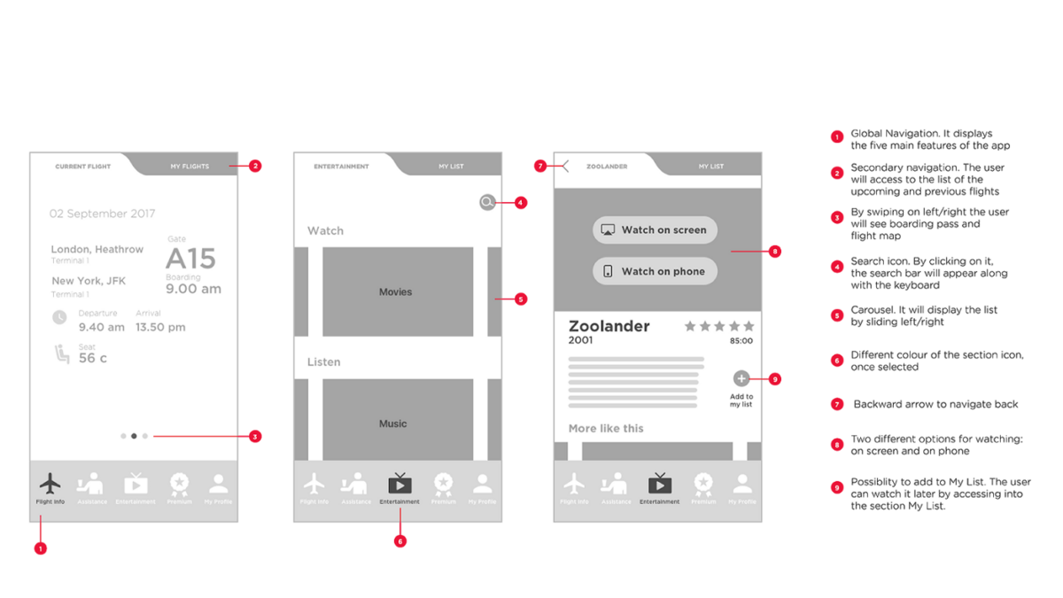
High fidelity (hi-fi) wireframes, on the other hand, are much more detailed. They already contain some of the aesthetics and visuals to be used in the final version.
Most also include interactive elements and user interaction.
The flip side is that hi-fi wireframes take longer to build due to the added complexity.
Because hi-fi wireframes closely approximate the real thing, they’re also called mockups or prototypes.
Source: DECODE
Hi-fi wireframes are ideal if you’re already committed to an app design but want users to test it first.
They’re also the preferred way to ask for feedback from clients who might not be savvy enough to appreciate a low-fi wireframe.
Knowing which wireframe fidelity to use and when is crucial for making the best use of your time and resources.
Using a hi-fi wireframe when a low-fi will suffice wastes time and effort.
In addition, rapid design iterations are challenging with a hi-fi wireframe, unnecessarily prolonging the early stages of app development.
On the opposite spectrum, using a low-fi wireframe during the later stages isn’t as effective.
You can’t properly measure UX among your users, nor can you properly test the flow of your app. Feedback from external stakeholders might not be as accurate, too.
Imagine if you had to beta test the left screen instead of the right one—you’d probably get undeserved, negative feedback.
Source: O’Reilly
But picking the right wireframe fidelity is just the first step. There’s still the danger of adding too many details. So, let’s talk about that next.
Wireframing is all about balance and restraint. The last thing you want is to put too many details because it will only distract the viewer.
Patrick Lynch and Sarah Horton, in their Web Style Guide, illustrate this point in their definition of a wireframe:
“Wireframes force teams to stay focused on the information architecture and structural design without getting sidetracked by the distraction of the visual layer.”
But the risk isn’t just with the internal team. Design elements like color and typography can also sidetrack clients into giving the wrong feedback.
For instance, instead of commenting on the flow and function of the app, stakeholders might be hung up on the color of the menu bar or the aesthetics of the logo.
Source: Azoora
These things are undoubtedly important to UX. But design critiques are best reserved for later stages when all app pieces are already in place.
That’s why most experts suggest doing your wireframe in monochrome. However, if you’re going to use color, it should be a tool to highlight elements rather than a design element.
Well-known wireframing authority Jakub Linowski says it best:
“Perhaps it has something to do with the tradition that colour is often avoided at the wireframe level. I still use colour just to emphasize certain elements, and red for actions.”
Here’s an example:
Source: Ergomania UX
As you can see, color is used to successfully differentiate elements on the wireframe above.
So, if you’re not going to focus on aesthetics on your wireframe, what should you emphasize?
Anything that describes the user’s journey in your app. Like how they get from one screen to another or what problem each app screen is trying to solve.
It should also communicate your information and app architecture so developers know the technologies and services they’ll need.
Branding and visual design are important, but that’s not the wireframe’s job.
Wireframing is already a time-consuming and involved process. But it can become unnecessarily harder if you do it for every screen.
You don’t need to do that. In fact, it does more harm than good.
After all, wireframing is the art of efficiency, according to the Interaction Design Foundation.
And being efficient means only focusing your time and energy where it matters.
So, how do you know which ones you should wireframe?
It pays to start with your flow. That way, you’ll know the core screens in your app—the ones that will break your flow if removed. These screens are the ones you should prioritize.
Source: Dribbble
There will undoubtedly be other screens in the above example, such as a user profile or preferences screen.
But seeing as it’s not vital to the main app flow, it can be safely omitted from wireframing (if only during the early stages).
If you’re working on multiple variations of a screen, it’s best to wireframe only a template.
For example, in an e-commerce app, you often only need to wireframe the product screen template.
It’s a waste to wireframe every product screen for each category you have, even if they have slight differences.
Source: Moqups
Remember, wireframing is all about speed. So the faster you communicate your app idea visually to stakeholders, the better.
Incomplete wireframes and rough sketches have their place in the app development process. But showing them to clients can be detrimental.
Many developers and agencies like to keep their clients in the loop with work in progress reports.
However, there are better tools to do that, and an unfinished wireframe isn’t one of them.
The danger lies in miscommunication and confusion. People who aren’t design-savvy can’t appreciate a rough sketch like this:
Source: Career Foundry
Clients can also get hung up on design choices you used during an incomplete wireframe, which might change.
Unfortunately, they might look for these elements later on, which will complicate your process.
Always treat your wireframes as a standalone entity that can speak for itself.
That’s why we’ve talked about using annotations and removing unnecessary details to give your wireframe a clear voice.
If your wireframe can’t do this yet, try to keep it among your team first.
Having the right approach to wireframing should be a key consideration for any developer.
Apart from the many benefits you’ll reap, it gives you the best chance to design an app that will stand out in today’s competitive market.
Want to learn more about wireframing?
Check out our all-in-one guide here. We also have a rundown of the best wireframing tools that might interest you.
We hope this guide was helpful in getting you to avoid the most common pitfalls of wireframing.

Ante is a true expert. Another graduate from the Faculty of Electrical Engineering and Computing, he’s been a DECODEr from the very beginning. Ante is an experienced software engineer with an admirably wide knowledge of tech. But his superpower lies in iOS development, having gained valuable experience on projects in the fintech and telco industries. Ante is a man of many hobbies, but his top three are fishing, hunting, and again, fishing. He is also the state champ in curling, and represents Croatia on the national team. Impressive, right?
If you're looking to create a mobile app, wireframing is one of the best ways to get started. To motivate you, we cover six benefits of app wireframing.

If you’re curious about what a mobile app wireframe is and how to create one, this all-in-one wireframing guide will provide you everything you need to know.

We’ve highlighted 14 major mobile development mistakes. We hope this comprehensive list goes a long way in setting your product up for success.