Knowing the right UX writing principles you’ll manage to avoid a lot of pain in your software design. You could’ve created the greatest app known to man, but if the intended user can’t use it easily it was all for nothing.
Maybe you did put great care into design. The app’s interface might be in accordance with the newest UX trends, it might be intuitive and easy to look at. It won’t matter much if the writing’s bad, though.
That’s the reason UX writing is so important. You can’t provide the user with the best possible experience without working hard on what’s written in the app. It isn’t easy, though, but don’t worry.
Here, we’ll guide you through the best UX writing principles, and provide you with practical advice to make your apps better.
Let’s start with the basics before we get into UX writing principles. What does UX design stand for? It stands for User Experience design. UX design is an all-encompassing term, meaning everything from UI (user interface) design to usability.
UX writing is a crucial part of UX design. Without it, everything else falls apart.
If you didn’t bother with UX writing something like this might happen:
“User, you can attempt to access the registration form by clicking here.” Sounds awful, right?
If the example didn’t make it clear, let’s define the term. Writing for UX means writing every single word inside an app. It can be a mobile app or any form of software.
It also means writing the best possible version of the needed information. You have to take into account a plethora of things, from thorough research to UX writing principles in order to craft the right sentence for the best user experience.
The purpose of UX writing
Sometimes a good way to explain something is to compare it with something else. We’re gonna use copywriting to explain UX writing.
As a copywriter, your main goal would be to entice the reader into action. Copywriting is focused on marketing and promoting your brand or product.
Copywriters
Enticing language
Sales-oriented
Work with marketers
Tell stories
Can work alone
UX writers
Useful language
Product-oriented
Work with designers
Share conversations
Can’t work alone
Writing for UX, however, is a different story. The person using your app already bought it. There’s no need to entice them any further (unless you’re making mobile games with microtransactions).
What’s your goal then? Simply put: Your goal is to help the user navigate the app and use it easily for its intended purpose.
We helped dozens of startups and established businesses with their UX writing. Let us help you as well.
Let’s say you’re using Robinhood, a fintech app. You’re most likely there to trade and research stocks. Doing that effortlessly, quickly, and intuitively means a lot to you.
The job of a UX writer is to, along with UX designers and developers, create an environment for you to achieve just that.
UX design for fintech apps can be slightly different from other forms of design though, so keep that in mind.
We’ve covered the what and the why. Now let’s cover the how as we dive into the first on the list of UX writing principles.
UX writing principle no. 1: clarity above all
Writing for UX is -among other things- a skill of crafting the clearest sentence you can think of. When looking at clarity you should always have a few questions in mind:
Will the user understand what the sentence is saying?
Does the sentence correctly represent the information it’s trying to convey?
Is the sentence simple?
Is the wording exact and not vague?
These questions can serve as a guideline for testing UX writing clarity. Here are some other ways to make your writing more direct.
Avoid jargon
Most people in the world aren’t developers. Their computer knowledge is marginal at best. That’s why it’s important for your UX writing to be completely free of any technical jargon.
From the patterns, we can see the users most often skim content, looking for important words or phrases.
You should especially look out for the F-pattern since it’s the most prevalent among users.
But how can you use this information to create a better user experience? It’s simple.
Make the content more digestible. If there’s a lot of information you want to give the user you should consider writing it in a list or bullet points.
Also, the more precise the writing is, the clearer it should be. This brings us to our second on the list of UX writing principles.
UX writing principle no. 2: be concise
Space restrictions are the biggest challenge for UX writers. Especially if you’re working on a mobile app. That’s the reason being concise made it to the list of key UX writing principles.
What does concision actually mean, though? It means explaining or writing information or instructions in the most effective way possible. That’s not a very concise way of putting it.
Concision means precision. There it is.
Being concise doesn’t exactly mean to make something shorter, although it mostly does happen that way. It means that every word is there for a reason and that superfluous words are removed. Let’s look at some examples.
There and that
It’s mostly unnecessary to use these words. Instead of saying “There has been an error” you can say “an error occurred”
Similarly, instead of writing “The code that you entered is invalid”, write “The code you entered is invalid”, better yet “You entered an invalid code” or, best of all: “Invalid code”.
Unnecessary information
You should only say what is necessary for the user to know. Let’s look at an example below.
The user already understands there has been a Sign-in error. Instead of repeating information, you can convey it through 1 statement instead of 2. “Wrong password” already implies an error has occurred.
Being concise is also important when taking cognitive load into account. Imagine your user is lifting something. With their brain. That something is your words, explanations, and instructions. You want to make that weight as light as possible for them.
Useful tip: Write something for your UX design. Now cut out one word at a time and see if it still makes sense. If it does, cut it out permanently.
UX writing principle no. 3: usefulness is key
One of your main jobs as a UX writer is to provide value to the user. You must help them in the best way possible at every step of their journey. Usefulness, one of the key UX writing principles, is all about that.
You should always look for ways to guide the user in the direction they want to go. A good way to do that is by crafting a great CTA (call to action).
After you’ve handled the CTA design, its placement, its size, and all the other important stuff that makes CTAs effective, you should think about what to write inside. That’s something we call microcopy. Basically, Microcopy is copy with less space to use.
Your user will want a clear picture of where you’re taking them. Here’s how to do it:
Exact wording You don’t want to be vague with your users if you want to be helpful. You’re not marketing anything, you’re making it easy for them.
Active voice Passive voice is a bad idea in any form of writing and UX writing isn’t an exception. You want the user to continue using the app and have a good experience. That can’t happen with wording such as: “There are available cars near you”. What you should be aiming for is: “Get a ride.”
Provide relevant info The user wants to know what’s going to happen when they click something. Write with the next page in mind and give them a clear hint about that.
Apart from a CTA, you should always try to be helpful to the user. Let’s say you made an app for room booking. The user just tried to make a reservation on a date when the room is unavailable.
Instead of only saying that the room isn’t free, you should also add something helpful, such as: “You can try these dates instead” and then lead the user to available dates.
UX writing principle no. 4: be consistent with your tone and brand voice
The importance of voice and tone consistency cannot be overstated when we talk about UX writing principles. Before we get into how to achieve it there’s something that needs to be made clear.
You are your voice. When you know who you are, or in this case who your brand is, being consistent becomes inevitable.
How do you learn who the brand is? Well, ask yourself: If the brand were a person, how would you describe them?
Are they passionate and energetic? Are they playful? Are they a serious no-nonsense type of person?
Also, it’s important to always take the intended user into consideration while thinking about your brand voice.
A user can identify with a well-crafted brand voice.
When you understand who your brand is, tone blunders such as this won’t happen:
“Oops. An accident happened. Don’t worry! Here’s how to fix it!”
“User, you were erroneous in your ways. There’s no way back.”
Such a difference in tone would be easily corrected since there’s a jarring contrast between the 2. It gets harder when the difference is less noticeable.
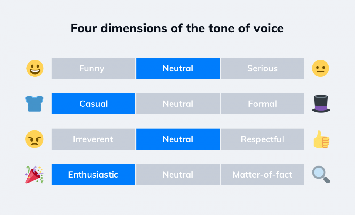
Tracking tone consistency across your app becomes easier when using this table. The idea for it originates from the Nielsen Norman Group as they set out to create more useful advice than: “Be consistent. Be authentic. Be unique.”
Let’s try to craft some sentences using different dimensions. In this scenario, we welcome the user to the login screen of an app. For the first example we’ll pick funny, casual, irreverent, and enthusiastic:
“Go away! We don’t want you using our awesome app!”
This sort of welcome could be risky so we don’t suggest trying it at home. Let’s now go the opposite route with serious, formal, respectful, and matter-of-fact:
“Welcome to xyz app. Please log in.”
This one can be thought of as boring by some, so you should use it with caution as well.
Let’s make things a bit trickier. What happens when you mix funny, formal, irreverent and matter of fact?
“Hello. Log in and you will access the app. Hooray.”
Playing around with the table can be a great creative exercise, while also being a useful tool.
A consistent brand voice should lead to a consistent tone but you should always double-check just to be sure. Now let’s finish our UX writing principles list with the final one.
UX writing principle no. 5: apply empathy
Last but definitely not least is empathy. A list of UX writing principles wouldn’t be complete without it.
It means putting yourself in the user’s shoes. What does the user want? What could the user want? How can I improve their experience?
You should be able to anticipate their concerns and confusion. Have I made this section clear enough? What else might interest the user on this page? What might worry them?
You can identify problems easily just by asking yourself simple questions and trying to look at the app from the user’s point of view.
Here’s a good example of applied empathy in UX writing.
You can see how Airbnb correctly anticipated what might worry the user on this screen. All you have to do is try to look at the screen as if you were the user.
Another good way to improve UX writing is by performing user research. An empathy map is an effective way to do that. Through it, you can learn exactly what the user says, thinks, does, and feels. You can use that knowledge to improve your UX writing immensely.
There are 4 quadrants in the map, each one revealing one dimension of the user’s interaction with the app.
The says quadrant reveals to you, during user research, what the user might say about the app. Here it’s a good idea to ask questions.
The thinks quadrant is trickier. Here, you must analyze the user, and try to understand what is left unsaid. What are they thinking while using the app? There could be many reasons why they’re not saying certain things, but it’s your job to be perceptive and find out.
The does quadrant is all about what the user physically does. Are they checking the web when something’s unclear about the app? Are they looking for information on forums? Are they frowning while using the app? That last question might sound silly but it could be a crucial bit of information.
The Feels quadrant is the last one. It’s all about emotion here. What does the user feel while using the app? Are they frustrated with the app? Even worse, does the app bore them? If so, why?
When it comes to applying empathy in UX writing, looking at things from the user’s perspective is crucial.
Conclusion
Let’s summarize our UX writing principles:
Clarity
Concision
Usefulness
Tone and voice consistency
Empathy
Using all these principles won’t guarantee success, but not using them will certainly guarantee failure.
Easy reading is damn hard writing
American novelist Nathaniel Hawthorne
The maxim holds true for UX writing as well. Hopefully, we made it a bit easier for you with our list of key UX writing principles. If you need more advice on UX writing, UX design or app development in general feel free to talk to our experts.
Achieving excellent UX is a huge challenge, but it’s not impossible to get it right. Have a look at these fintech app UX tips to increase your chances.
Have you ever considered how amazing it is that the iPhone, a powerful and complex device that can rival a desktop computer, doesn't come with an instruction manual? Yet, we instinctively know how to use it. That's the power of a user-friendly product.
If you’re curious about what a mobile app wireframe is and how to create one, this all-in-one wireframing guide will provide you everything you need to know.