

6 wireframing mistakes to avoid for your mobile app
We will discuss six app wireframing mistakes you can make and provide some good tips for avoiding them.
Wireframing is one of the most crucial steps in mobile app development.
Designing without a wireframe is like building a house without a blueprint.
Technically, you can do it, but the results probably won’t be great.
Though they might seem simple, designing them can be deceptively complex.
And learning from successful wireframe examples can give you a sense of what works and doesn’t, even if it’s your first time doing it.
That’s why we’ve gathered 20+ of the best wireframe designs to inspire you.
Let’s dive in!
Let’s quickly cover the basics – what exactly is a wireframe?
A wireframe is an initial sketch of your app’s UI and can even be a rough sketch on paper.
Think of it like a blueprint for your app – it’s a simple, basic 2D outline that gives you a rough idea of its design elements and features.
It’s a great way to quickly sketch and test out ideas and concepts without investing a lot of time and money.
Here’s what a typical wireframe looks like:
The point of a wireframe is to quickly visualize ideas and then gather feedback to refine them before moving on to the next step in the design process.
Wireframing will also help you fix major structural issues in your user flow and user journey very early on, so you’ll avoid having to do major redesigns down the line.

You’ll be talking with our design experts.
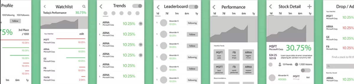
There are several types of wireframes, but the two most common are low-fidelity and high-fidelity wireframes.
Now, we’ll show you what they look like.
Low-fidelity wireframes are a simple outline that uses only basic shapes and text to represent UI elements.
They can be both simple paper sketches or basic digital outlines – low-fidelity wireframes are what people usually think of when you say the word “wireframe”.
Here’s what a paper sketch wireframe looks like:

As you can see, it’s really simple – and that’s the point.
Low-fidelity wireframes focus on the layout of UI elements and the screen flow, so they don’t need color or images.
As the name suggests, high-fidelity wireframes are the exact opposite of low-fidelity wireframes.
They’re a lot more detailed and include elements like colors, images, and fonts.
Here’s a side-by-side comparison between the two:
High-fidelity wireframes closely resemble the final design and are used to improve things like the layout of UI elements and information architecture.
They’re also a good foundation for mockups and prototypes.
But, you should remember they’re still wireframes so you should avoid adding unnecessary details and create them as quickly as possible.
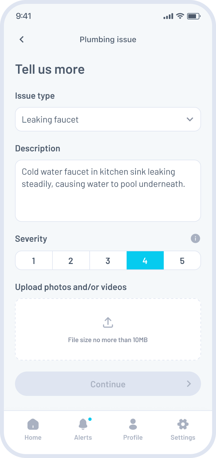
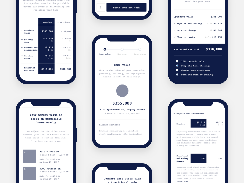
Like any fintech app, loan apps should simplify a complicated process. And we think the app depicted by this mid-fidelity wireframe by Ryszard Cz does the job perfectly:
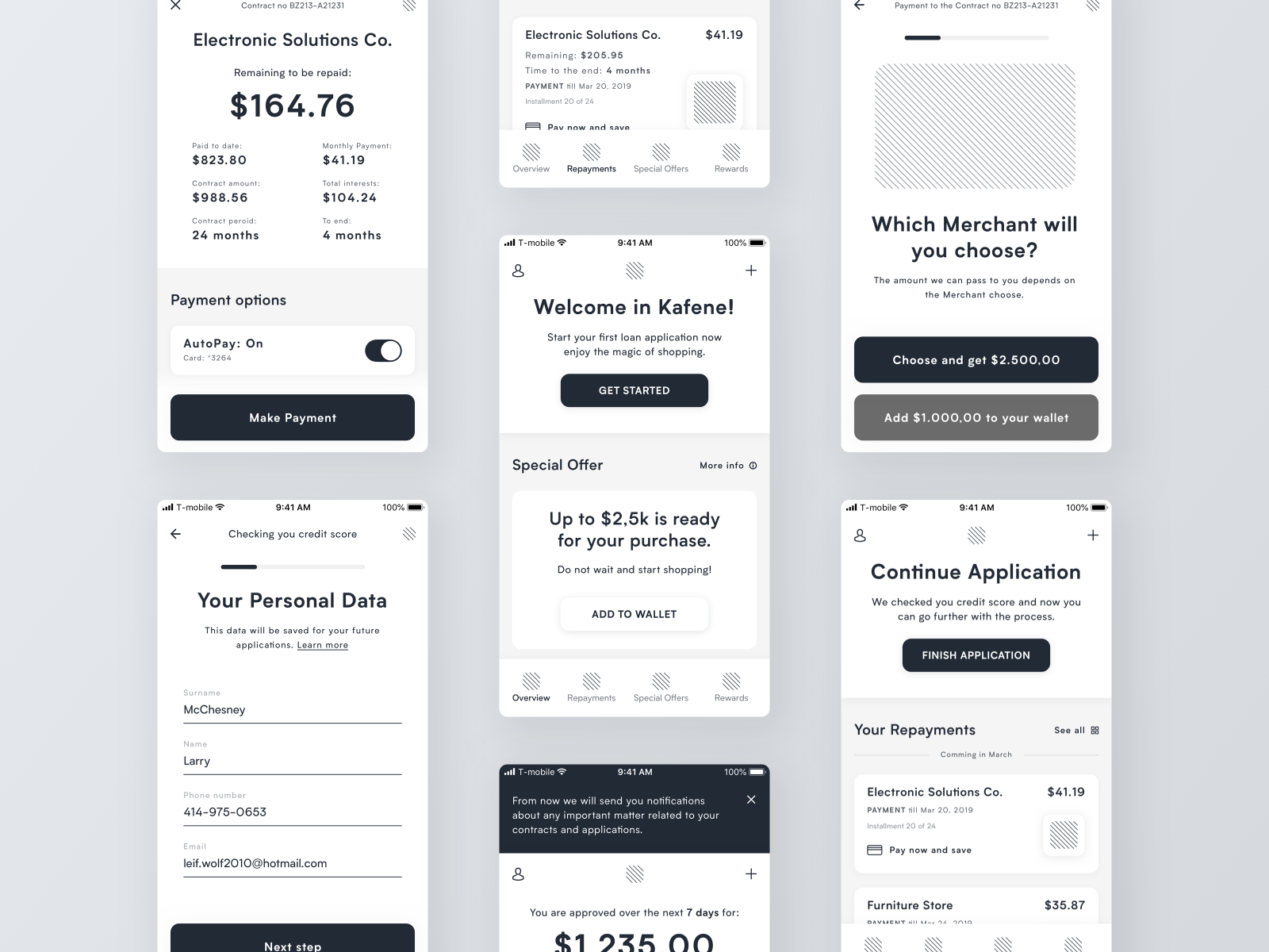
source: Ryszard Cz | Dribbble
The wireframe design did a great job laying out a clear loan processing flow for people who might not have any experience applying for one. It’s also very transparent.
This is most apparent on the first screen, where the user can view all the important details of their loan.
Everything is presented in a beautiful and minimalist UI that doesn’t need visuals or graphics to shine. Indeed, one could easily mistake it for screenshots of the actual app.
That, in a nutshell, is what a great wireframe should deliver.
The challenge with wireframes is to lay out the flow of your app clearly but quickly. This low-fidelity wireframe by Fernando Aleta for the Podline app overcame that issue:
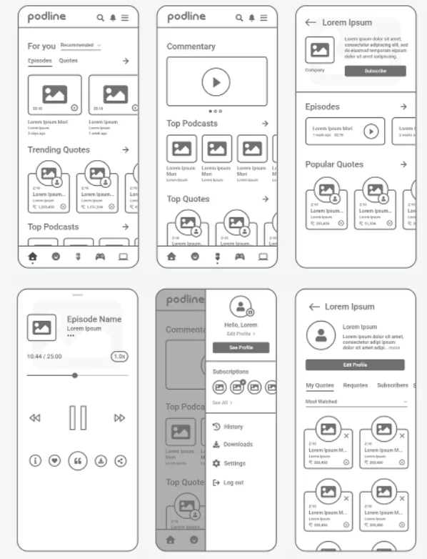
source: Fernando Aleta | Behance
The use of simple shapes and stock icons undoubtedly accelerated the production of this wireframe.
But the artful use of these elements made the layout and flow of the app crystal clear as well.
A good touch might be to add annotations to explain certain unique features. For instance, the Quote icon allows the user to record snippets of the podcast while listening.
Adding a label would’ve made that clearer.
Nevertheless, as far as implementations go, this is a simple yet effective wireframe design you can adopt.
Unique app concepts are the ones that benefit most from wireframing.
This creation by Piotr Kazmierczak is a travel app that helps users manage hikes, with some gamification and social elements thrown in.
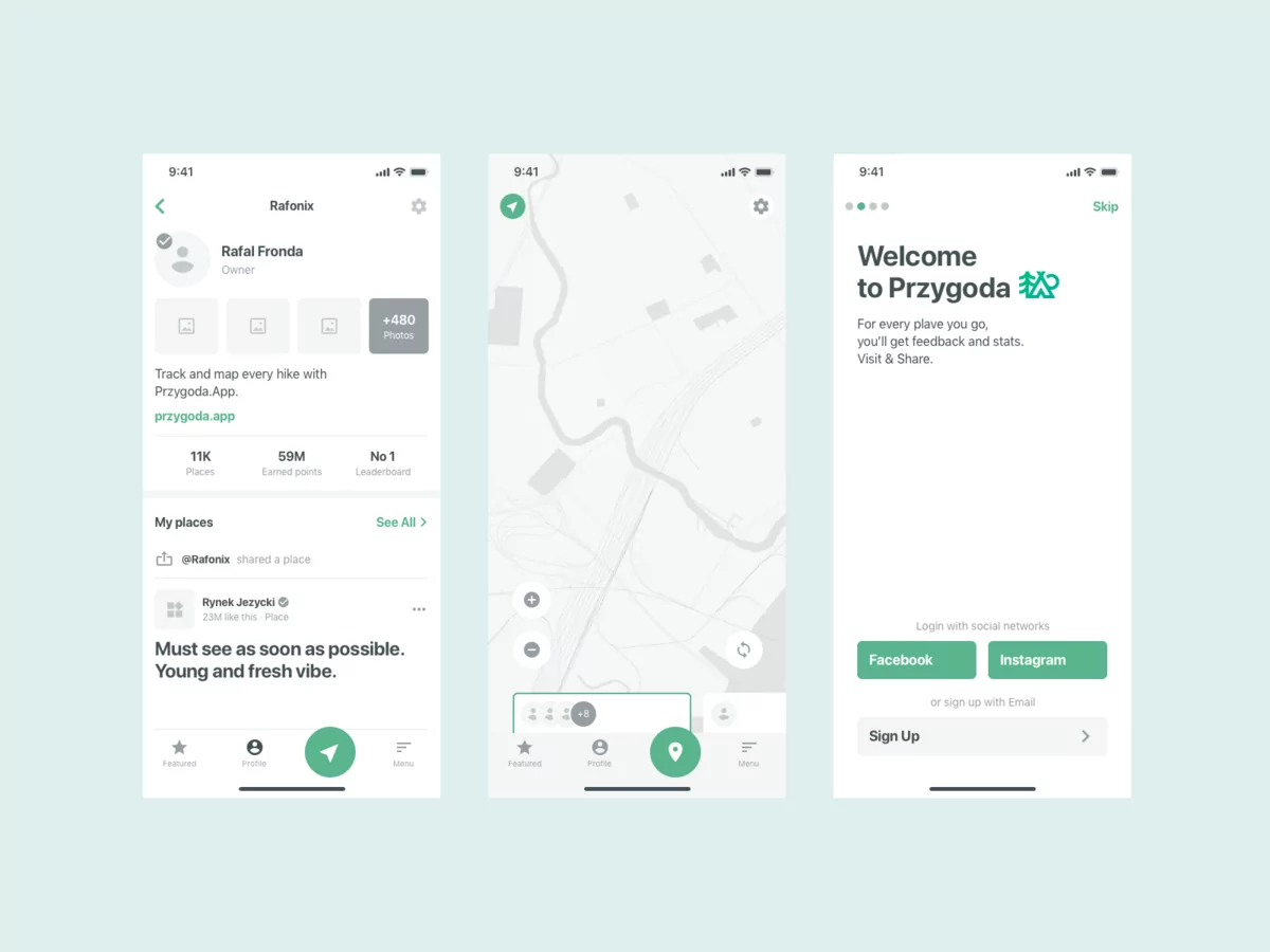
source: Piotr Kazmierczak | Dribbble
This is clearly a high-fidelity wireframe, as it already looks polished with icons and a map screen.
What’s good, though, is that they also used relevant copy and content instead of the generic lorem ipsum dummy text.
The wireframe also manages to convey the essence and purpose of the app without any annotations. That’s the benchmark of a great wireframe.
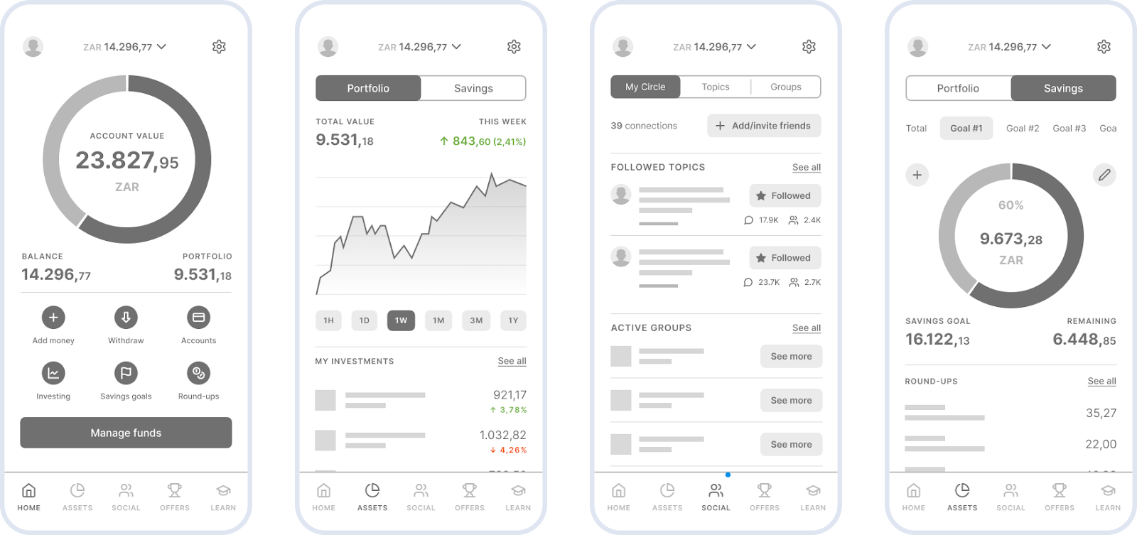
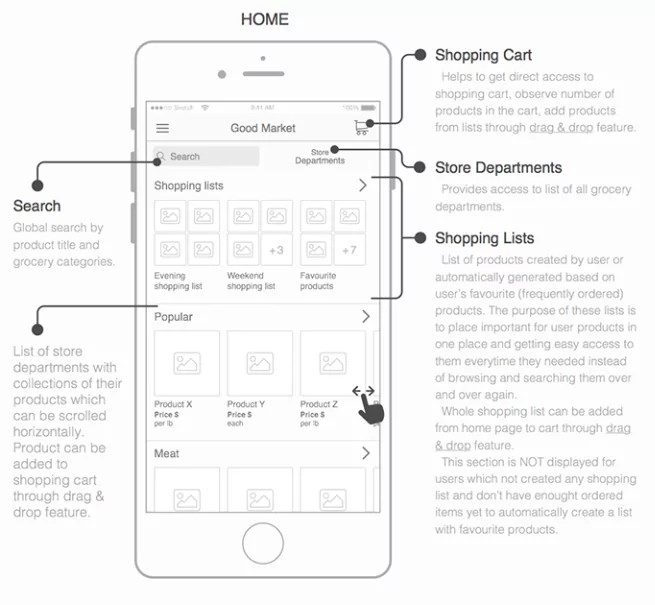
Analytics can be a big challenge for UX/UI designers – how do you present a lot of data on a small screen?
The answer is focus and simplicity.
And that’s exactly what we did when we designed this wireframe for a financial analytics app.
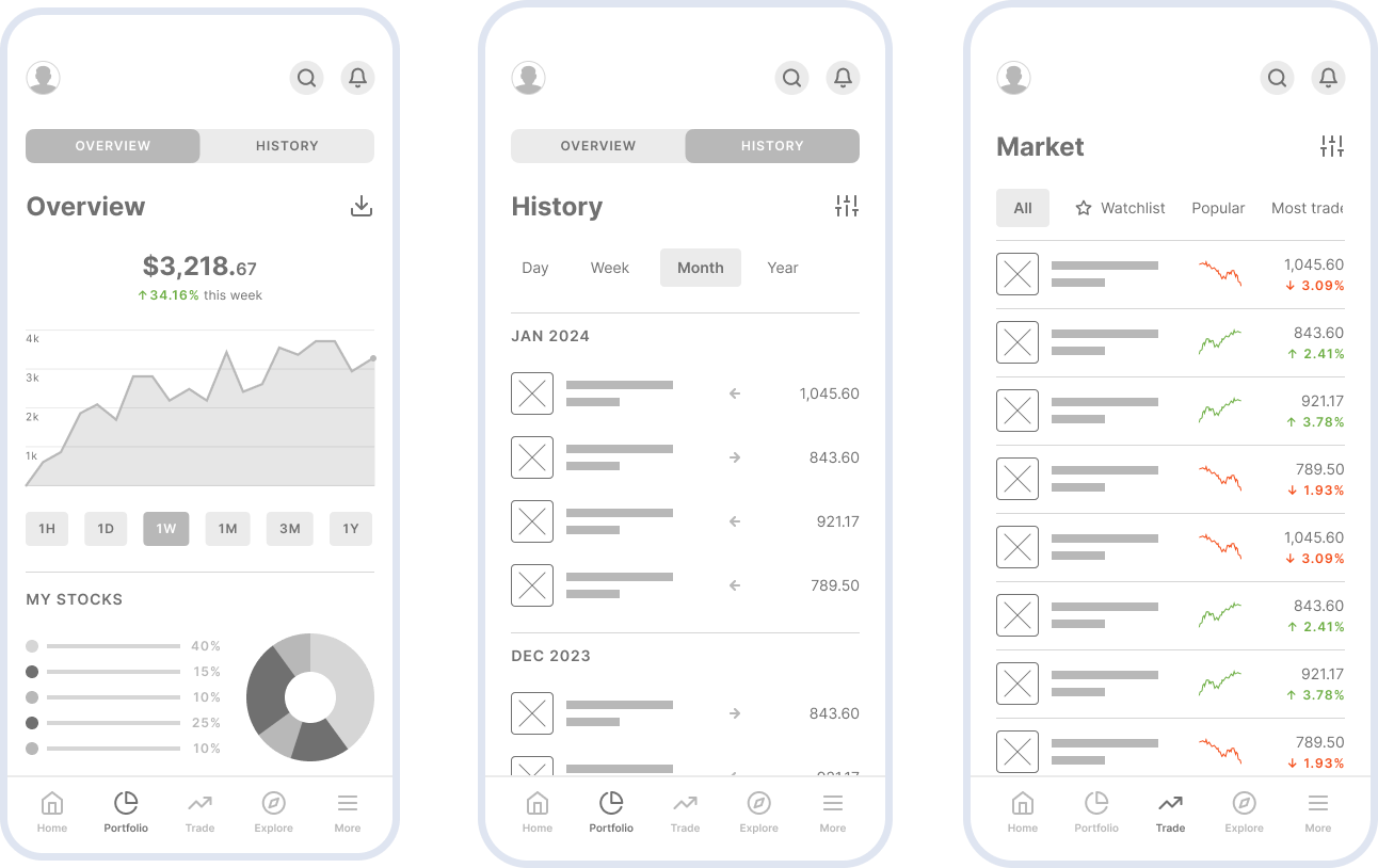
We had to come up with an intuitive way for users to digest a lot of data – and charts were the answer.
On top of that, we created a clear visual hierarchy so users could understand the information at a glance.
And once we added colors and other visual elements, here’s what the wireframe looked like:
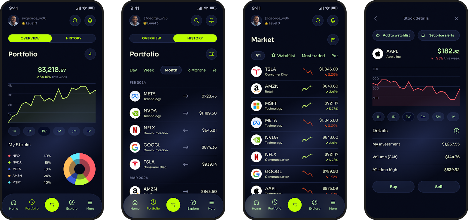
There’s a lot of data presented here, but it isn’t overwhelming or difficult to understand.
And that’s exactly why wireframing is so useful.
As mentioned in this article, wireframes are not about design but flow and structure.
That’s why it can be beneficial for apps with complex processes, like money transfer apps, to have a wireframe that looks like a flowchart.
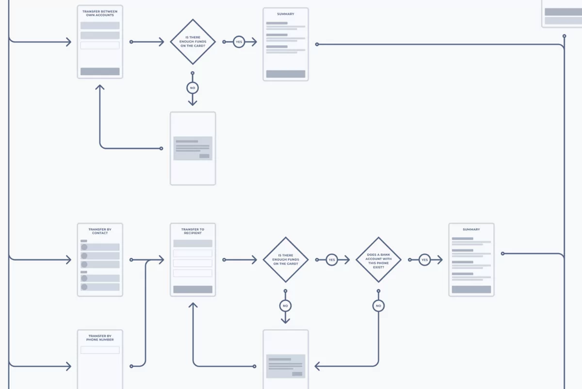
source: Vadim Kendyukhov | Behance
The above is just a small snippet from a wireframe flowchart by Vadim Kendyukhov.
Notice that each screen is only a rough representation with almost zero detail.
But thanks to the very detailed user flow, you can still visualize what each screen looks like in your head.
This is a fantastic example because it’s a functional wireframe that can benefit everyone.
It gives developers a roadmap of the app’s logic while offering designers context to build effective UI.
How simple can a wireframe be? That’s one question that Villi R. answered in his wireframe design:
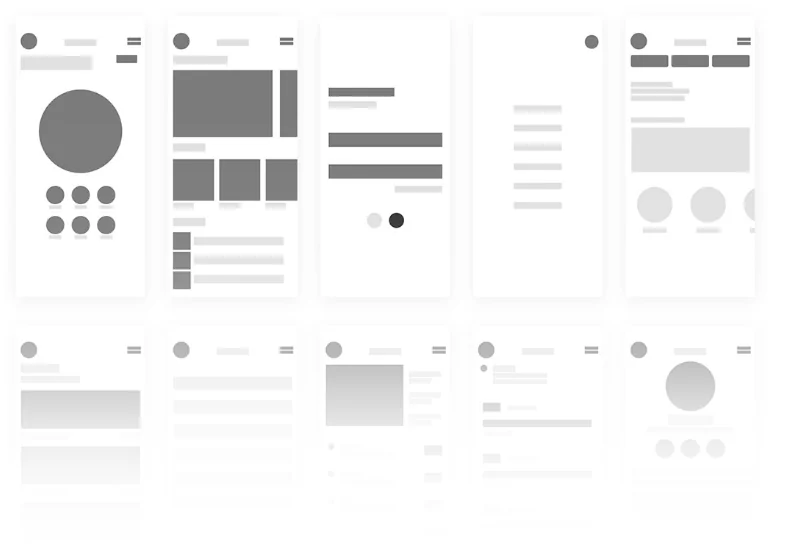
source: Villi R. | Behance
True, it looks too simple to the point of being abstract. However, there’s a logic behind this approach.
By toning down the wireframe into simple blocks, it’s much easier to visualize and focus on the overall layout of each screen without any visual distraction.
Indeed, this example shows the versatility and flexibility of wireframing. There’s no single right approach—as long as it’s helping your plan out your app, it’s fair game.
Prioritization important information is crucial for a successful design.
A great example of that is this task management app wireframe by Isaac Popoola.
source: Isaac Popoola|Medium
The most important information, like progress stats and a button to add new tasks, is prominently displayed and easy to spot.
And wireframing is the perfect time to experiment and nail your app’s information hierarchy.
A risk of doing simple wireframes is that not everyone might be able to understand them.
It’s a good practice to ensure that you can still communicate the idea of your app is through annotations.
Here’s a low-fidelity wireframe of a weather app, courtesy of Matt Sclarandis. We’ve included the resulting high-fidelity wireframe beside it for comparison.
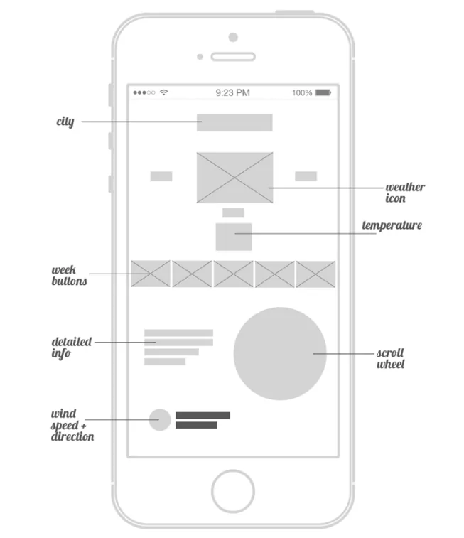
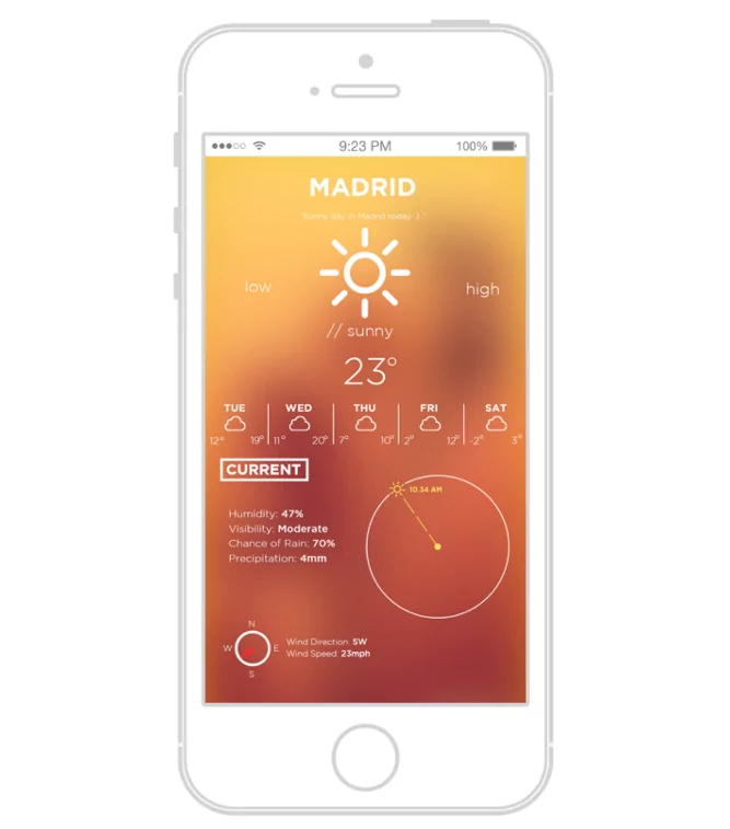
source: Matt Sclarandis | Behance
Using annotations can speed up the wireframing process. Moreover, it minimizes the danger of your idea getting lost in translation.
For instance, instead of designing a weather icon in the above example, the author simply annotated it.
Remember, the ideal wireframe process requires speed and clarity. Annotations can give you both.
The next wireframe is from UX designer Dheeraj Dr_u for Car Mate, a car rental platform.
He used a combination of both high and low-fidelity wireframes to develop the UI idea from scratch.
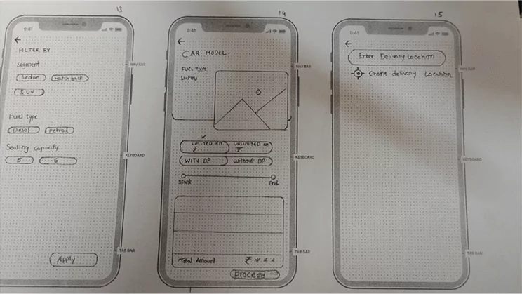
source: Dheeraj D_Ru | Behance
As you can see, his low-fidelity wireframes are simple sketches. Drawing on paper is an effective way to start wireframing because it’s fast and easy.
That can speed up your ideation process.
To make it even easier, you can use gridded templates to guide you when drawing, as with the example above.
If you want to know how much detail should go into each stage of wireframing and prototyping, designer Michelle Lock can show you.
Here’s the progression of her wireframe (from low to high fidelity) for the scavenger hunt app History Hunt.
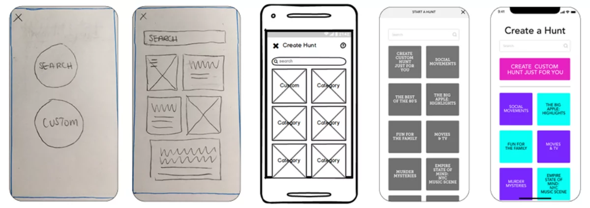
source: Michelle Lock | Notion Page
Notice how the final UI was completely different from how it started. This shows the power of wireframing as an ideation tool, especially since the designer started with sketches first.
It also shows that focusing on the app idea and flow first makes the app design process much easier later.
Anami Chan’s Sundayz app highlights the importance of wireframing in presenting a familiar yet unique app idea.
It has a specific purpose—to help people plan the perfect beach day based on weather information.
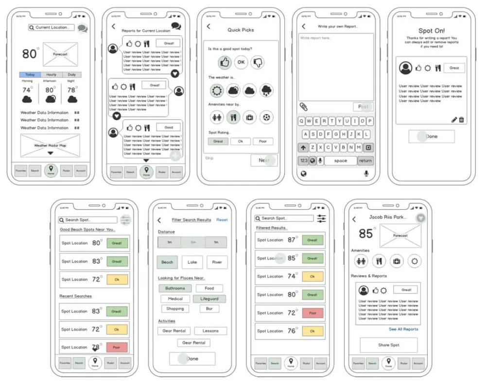
source: Anami Chan/Career Foundry
Visual elements like color aren’t usually recommended for early wireframes, but they worked great in the above example.
Specifically, the use of color to emphasize the app’s features (such as using color codes to denote which beach spots are OK).
Icons also worked well to illustrate the many possibilities users can expect in the app.
The next wireframe example is from designer Annie Tang, and it highlights an unorthodox, but surprisingly effective process.
Her redesign of a real estate app screen was done backward. She opted to start with a high-fidelity concept, then trimmed it down to a low-fidelity version:
source: Annie Tang | Dribbble
Her reason made sense. She wanted to switch to low-fi for testing purposes since it enabled testers to focus on each screen’s content and flow instead of aesthetics.
It just goes to show the flexibility of wireframing. As long as you know why you’re doing it, feel free to experiment.
Even though wireframes are planning tools themselves, it helps if you use other methods to help plan your wireframing process.
For example, let’s look at a donation app case study by Maritina Tsouvala.
From the get-go, she began the process with a task diagram. This told her the actions and goals users needed to do on each screen.
That way, she can strategically design the UI to remove as much friction as possible.
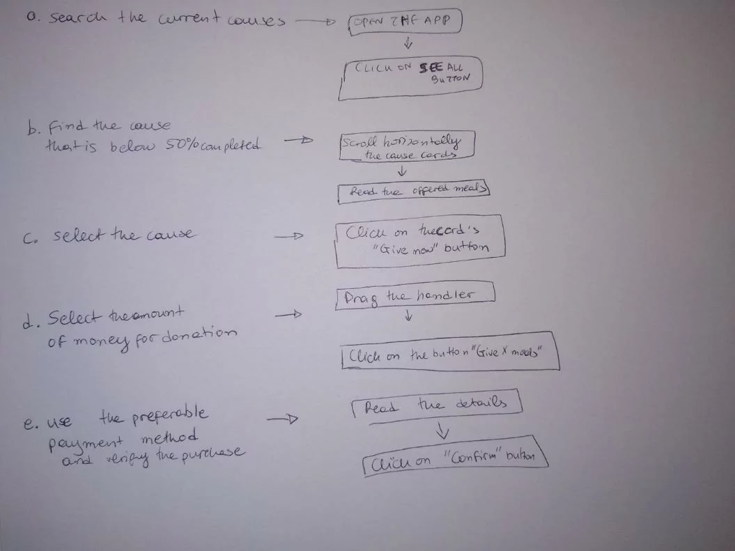
source: Bootcamp
With that information, designing the wireframe became more straightforward.
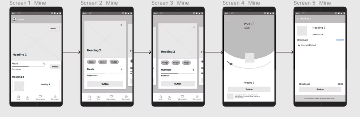
source: Bootcamp
Indeed, wireframes aren’t the only tool you have at your disposal. You have other methods and techniques to make the app development process easier and faster.
Creating an expense tracker app can be challenging because you need to present a large amount of data on-screen.
And a well-designed wireframe is key if you want to do it right – that’s what we focused on when designing this app.
We focused on breaking down the data into an easily digestible format using donut charts and line charts.
And by doing this, we made sure that the app was intuitive, user-friendly, and easy to use.
Trading apps are often some of the most data-intensive and complex software on your mobile phone.
It takes meticulous planning and design work to make them user-friendly without minimizing their capabilities.
That’s why wireframing is a crucial aspect of developing trading apps. Here’s an example from BullsEye.
source: BullsEye | Behance
Notice how each screen is jam-packed with information but never feels cluttered.
Clever use of visual hierarchy (where bigger elements have more importance) and color helped make the wireframe clear.
For comparison, here’s the final design of the app:
source: BullsEye | Behance
Proper planning and foresight provided by low-fidelity wireframing help achieve those results.
Mission-critical apps like road assistance need to have an intuitive and straightforward user flow so that users can get immediate help in an emergency.
The Towed app, designed by Siddhartha Pandey, provides a great example of a high-fidelity wireframe for just such an app.
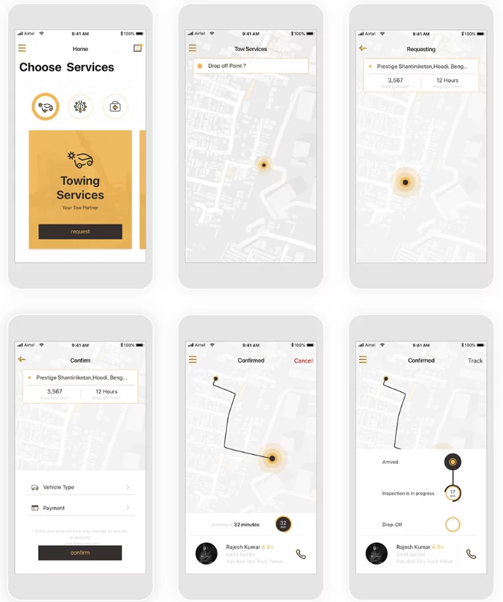
source: Siddhartha Pandey | Behance
We included this example because it is well-designed, while also clearly showing the process behind the app.
The idea is so apparent and easy to understand that there’s no need for annotations.
For transportation-based service apps like deliveries and ride-hailing, this is a good wireframing template to follow.
Annotations are powerful because they can communicate things that static images simply can’t, such as animations and interactive elements.
Not only that, but they also help convey the logic behind your choices.
Here’s an example from designer Volodymyr Melnyk:
source: Volodymyr Melnyk
As you can see, the designer used annotations to describe what the key UI elements do and sometimes what they’re for.
Such detailed descriptions are beneficial to developers, designers, and even clients.
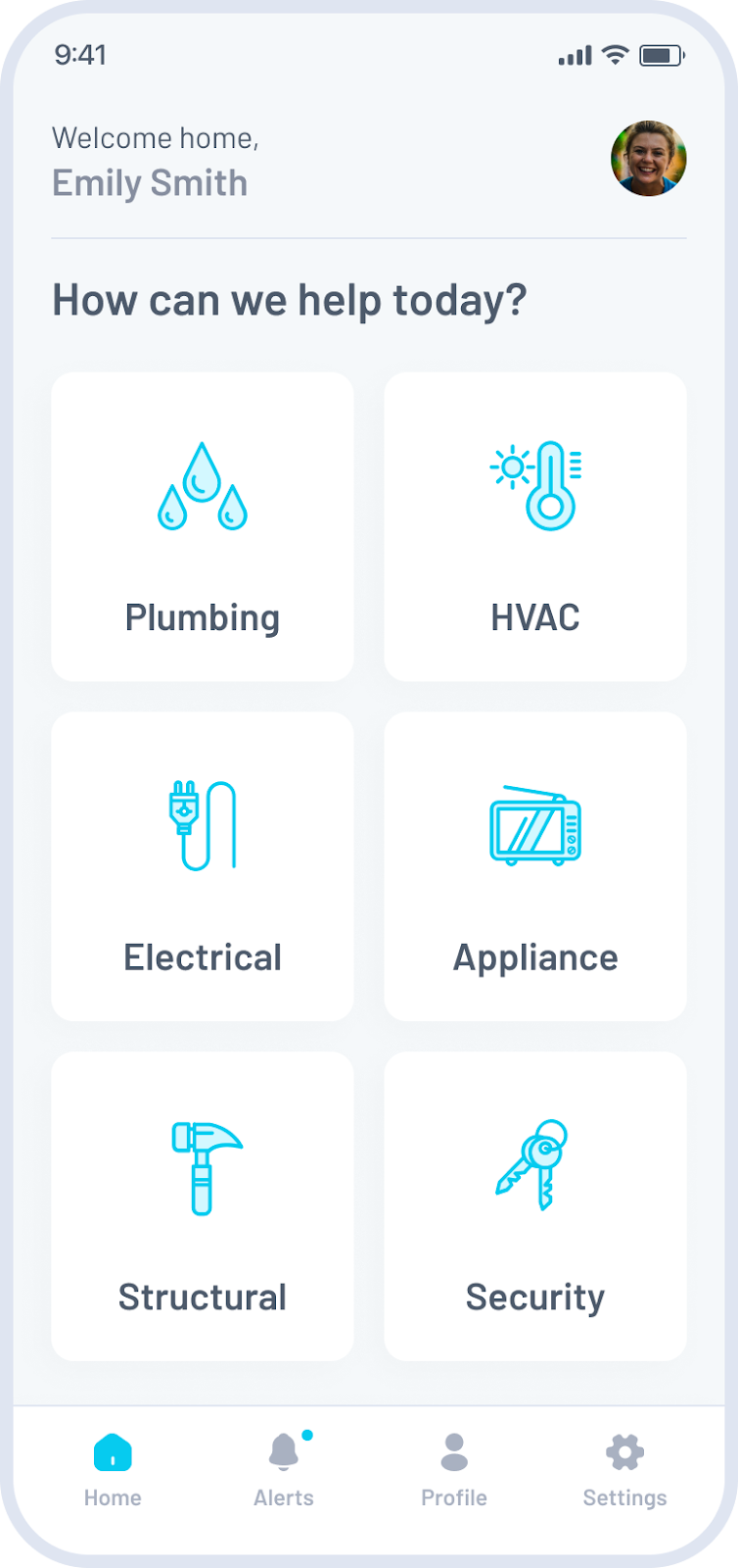
Every well-designed app successfully balances functionality and usability.
And this high-fidelity wireframe we designed for a home maintenance app is a perfect example of that in action.
And this high-fidelity wireframe we designed for a home maintenance app is a perfect example of that in action.
Our goal was to make reporting maintenance issues seamless and efficient for the end user.
So, how did we make that happen?
We created a straightforward layout and used clear, visually distinct icons to make the app as user-friendly as possible.
And that’s why you should apply those principles, too.
Another key feature great designs share is consistency.
Consistent navigation and layout patterns help your users easily understand and interact with your app.
And this wireframe we built for a medical appointment management app is a great example.
Here, we made sure each screen has a predictable layout and a clean design so users can easily find the information they need.
And that’s key to a great experience.
What’s the secret to building a great wireframe?
It’s focusing on layout and functionality first – this way, your app will follow key UX principles from the start.
That’s exactly what we did when we built this high-fidelity telecom app wireframe.
First, we clearly segmented different sections of the app so users could easily find the information they needed.
Then, we used high-contrast colors to further highlight key elements we wanted users to interact with.
And the final result?
A clear and intuitive wireframe.
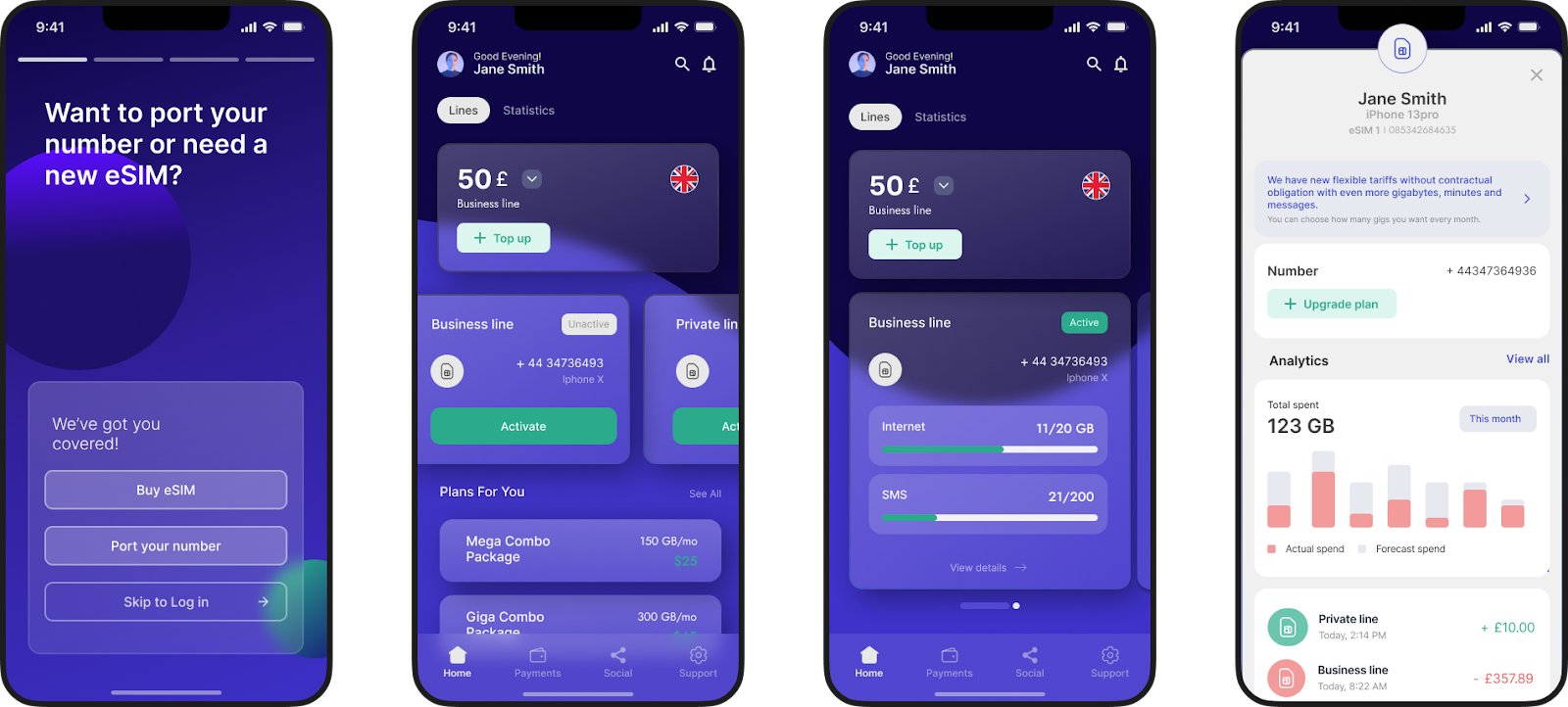
Juggling a bunch of different SaaS vendors can be a huge challenge, especially for big companies.
Keeping track of different pricing plans, contract changes, and the total cost involved can be tricky – and choosing the right ones to partner with isn’t easy, either.
This high-fidelity wireframe we designed for a SaaS purchasing app shows how you can solve those problems.
Here, we focused on creating a clear visual hierarchy to guide users’ attention to the most important information first.
We achieved this by using color coding, cards, and clear typography.
And that’s exactly what you should do, too.
We designed our next wireframe example for a property management app.
And the keywords here were simplicity and ease of use.
Property management isn’t an easy task, so we created a clean, minimalist design without unnecessary details and visual clutter.
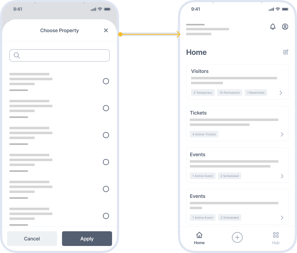
And the end result?
A user-friendly design that allows users to effortlessly and efficiently manage their properties.
Finally, here’s a wireframe for a school app for parents, designed by UI designer Kishore.

source: Kishore
Apps that involve a variable number of dynamic content (such as this school app) require proper layout. Not doing so can risk overwhelming users with too much content on-screen.
But thanks to wireframing, the above app managed to get that under control.
And the use of simple elements and placeholders means it probably took only a short time to put together.
Hopefully, these 20+ examples have nudged your app’s wireframing in the right direction.
However, it’s not just the role models and successful examples you should look into.
You must also be aware of the key mistakes many designers make when wireframing. You can check them out in our article here.
Or, you can simply hire a software product development agency to handle your wireframing and app development. Feel free to reach out if you want to get started.

Antonija is a powerhouse when it comes to product design. She's skilled at detecting pain points and client needs during product discovery and turning them into stunning user experiences. And with her technical background, her designs don't just look great - they work and solve real problems, too. In her spare time, she enjoys creating motion designs, animations and posters. When she's not designing, you can find her hitting the gym and daydreaming about her ideal work spots in either Zadar or Amsterdam, whichever feels right at the moment.
We will discuss six app wireframing mistakes you can make and provide some good tips for avoiding them.

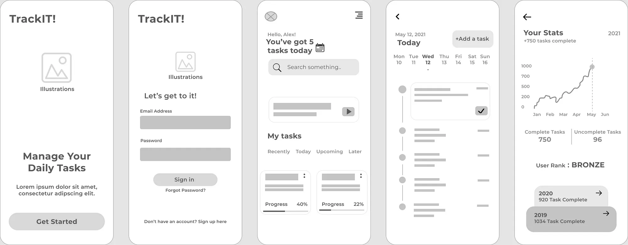
If you're looking to create a mobile app, wireframing is one of the best ways to get started. To motivate you, we cover six benefits of app wireframing.

If you’re curious about what a mobile app wireframe is and how to create one, this all-in-one wireframing guide will provide you everything you need to know.