Your retention rate is perhaps the most critical metric for app success. The math is simple: the more users you keep, the better your revenue potential.
Unfortunately, good retention rates are notoriously hard to maintain. Industry-wide, 73% of users uninstall an app after only 90 days.
It’s a discouraging benchmark, no doubt.
But it’s entirely possible to beat these statistics. You just need plenty of dedication and the right retention strategies.
Make onboarding easy and intuitive
Consider that onboarding is the first impression users have of your app. Thus, you need a seamless and intuitive onboarding experience to retain them.
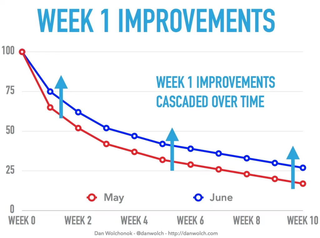
Dan Wolchonok of Reforge shared an interesting case study of an onboarding improvement he did at Hubspot.
The result was an average 15% increase in user retention rates.
Source: Dan Wolchonok
Why is this happening? Well, one of the goals of onboarding is to get people to competently use your appas fast as possible.
This eliminates confusion and allows users to reap the benefits of your app more quickly. In a nutshell, better onboarding means higher retention rates.
However, onboarding can also be harmful if not done right.
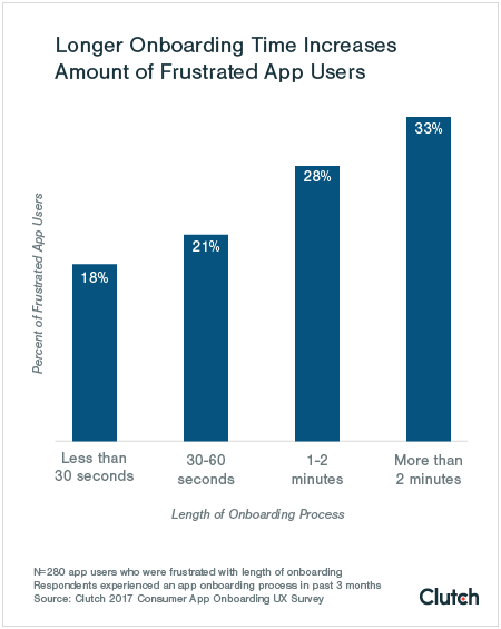
For instance, a Clutch survey revealed that even an extra minute of onboarding could frustrate 28% of users. At the two-minute mark, this number rises to 33%.
Source: Clutch
We can conclude that making the onboarding as short as possible is important for improving retention.
One of the ways you can do this is by only asking for the minimum amount of information.
For example, is there a value in asking for a person’s birthday in your app? If it’s not directly contributing to the user experience, think twice.
You should also think of ways to eliminate filling forms entirely.
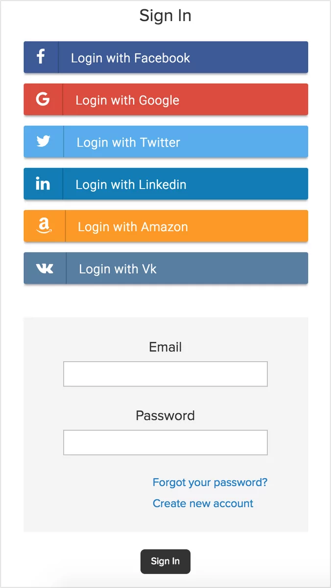
For instance, instead of asking a user to create an account, why not use one-click sign-ups?
By leveraging their Facebook or Google accounts, you can cut registration time dramatically.
Source: Ecwid
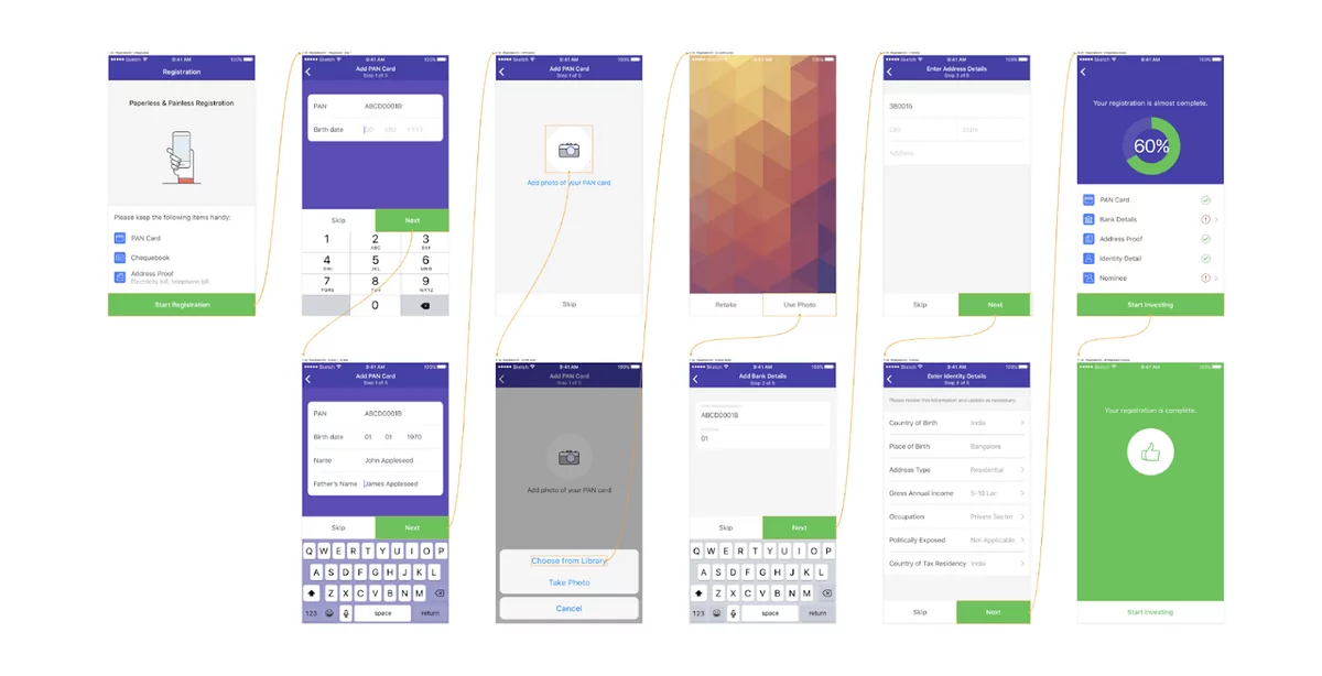
Sometimes, though, you can’t avoid a long onboarding (for example, if you’re in the finance sector and require lengthy KYC processes).
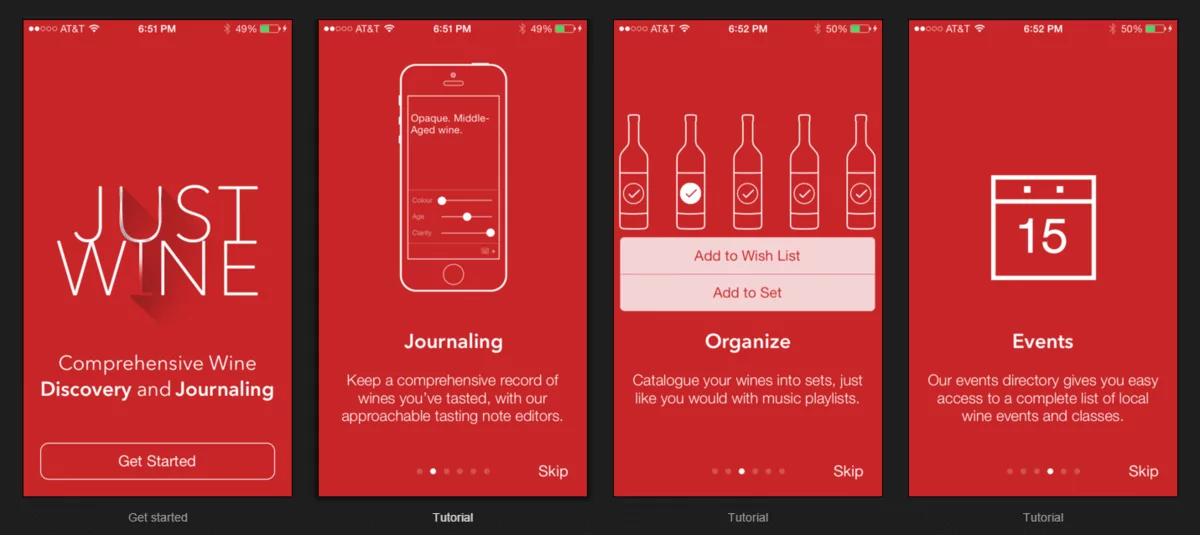
In these cases, try to divide it into smaller chunks across multiple screens to make it more manageable.
Here’s a good example from the investment app Fisdom. Imagine if you had to condense this into a single onboarding screen!
Source: Toptal
A good onboarding experience is one that allows users to skip it entirely. Some people simply don’t want the hand-holding.
Perhaps they’re power users who want to explore the app at their own pace, or they’re already familiar with how it works.
Source: Apptimize
But above all, your onboarding should communicate one thing clearly: your app’s value proposition. So let’s explore that in the next section.
Highlight the app’s value during onboarding
What is your value proposition? It’s your app’s biggest “why”—the main benefit people will get if they use it. And if you want to attract and retain users, you need to put it front and center.
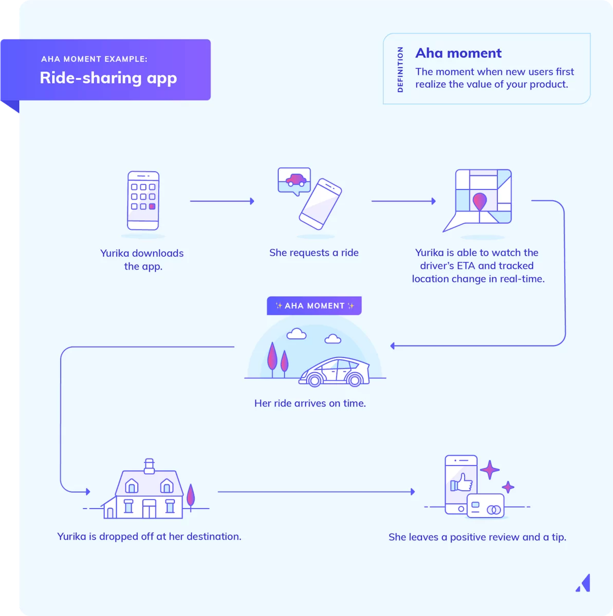
Consider that your goal in onboarding is to get users to their Aha!-moment; the point where they tell themselves: “I need to use this app!”
For example, in a ride-sharing app like Uber, that Aha!-moment looks like this:
Source: Appcues
The best way to achieve this is to focus NOTon what the app can do but on how it can change the user’s life.
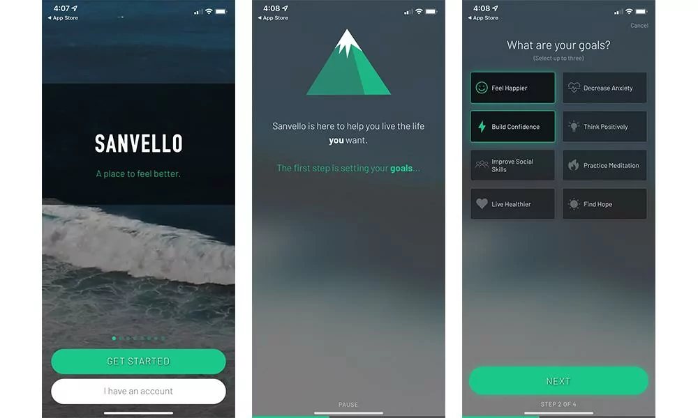
Here’s an example from the mental health app Sanvello.
Source: DECODE
See how the app starts with the core benefit: “a place to feel better.”
Also, note that the onboarding allows users to set goals, which are also the many ways the Sanvello app can change a person’s life (like “live healthier” or “find hope”).
You can also blend your value proposition with a key app feature.
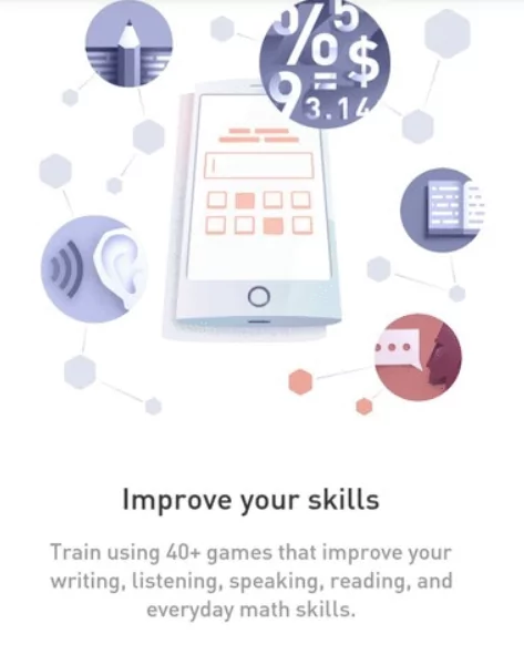
For example, the Elevate app states that you can improve your mental skills every day (value proposition) by playing over 40+ games (feature).
Source: UX Planet
Now, if you’re struggling to formulate your value proposition, don’t worry. There’s an approach to it.
You just need to consider four elements.
The first one is the value or benefit that users will get from your app. In our previous example, this was “improve your skills” or “feel better.”
Next, strive for clarity by using everyday language. So instead of saying “solving your mental health issues”, try something more straightforward, like “feel better” instead.
The third is differentiation. How is your value proposition different from your competitors?
In Elevate’s case, they might stand out from other brain training apps because of their games based on scientific research.
The last is conciseness. Once you have your value statement, try to distill it into a single sentence.
For example, think of how Steve Jobs defined the value proposition of the iPod as having “a thousand songs in your pocket.”
But probably the most important aspect of crafting a value proposition is to know your market inside and out through market research.
Only then can you create a value statement that resonates with your intended users.
Personalize the user’s experience
Adding a personal touch makes people feel that the app experience was tailor-fit for them. In other words, it shows that you care. Unsurprisingly, this can impact retention.
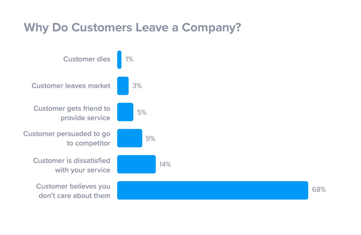
On the flip side, not caring is the biggest reason users abandon a brand, app, or product, according to Super Office.
Source: Super Office
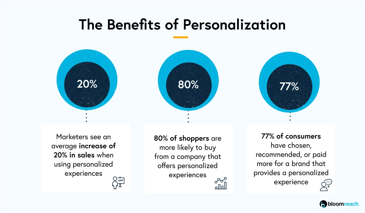
However, personalization isn’t just about keeping customers. It can also boost your revenue as well.
According to Bloomreach, 80% of consumers are more likely to choose a brand that personalizes their experience.
Source: Bloomreach
Personalization comes in many forms, the simplest of which is referring to the person by name within the app. But that’s just the beginning.
Personalization is most effective when it modifies the entire app experience to fit the user’s journey and skill level.
That way, you avoid overwhelming them with features that they don’t need or understand.
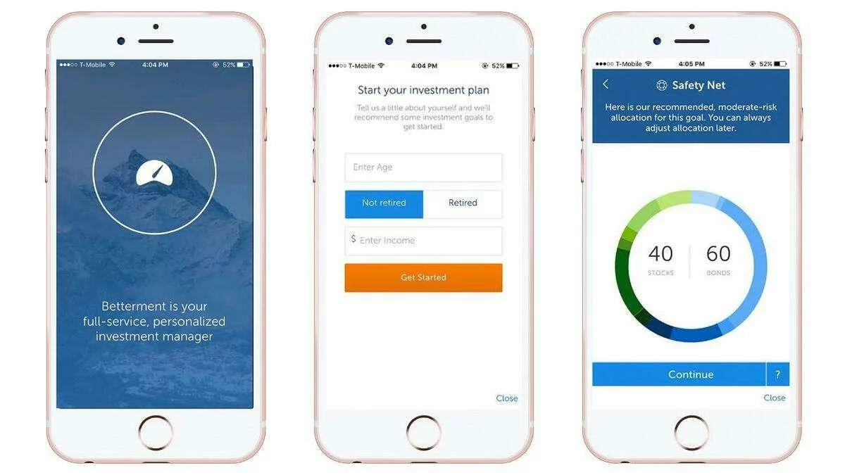
This is essential for stock apps, where the app must match the person’s trading experience and risk tolerance to minimize costly financial mistakes.
The Betterment app approaches this by evaluating the user during onboarding, then modifying the app experience accordingly.
Source: Go Banking Rates
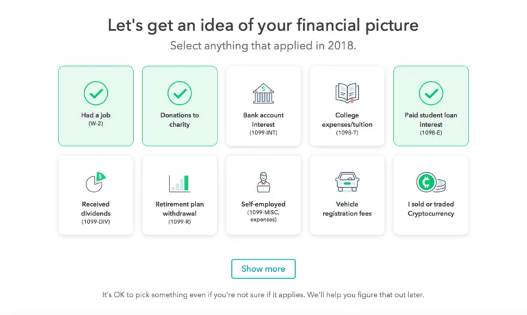
Another great example of personalization in the financial space is TurboTax.
During onboarding, the app will ask about the user’s financial milestones during the year. It will then only suggest features based on those choices.
Source: Storyly
TurboTax’s approach is a smart way to create a comprehensive, feature-packed app without exposing users to unnecessary complexity.
Personalization should also be dynamic. Sometimes, a user’s preference won’t be apparent until they’ve used the app for some time.
Moreover, tastes often change. That’s why your app should adjust accordingly.
Streaming apps like Netflix and Spotify are masters of this. For example, Netflix recommends new shows based on what the person has already watched.
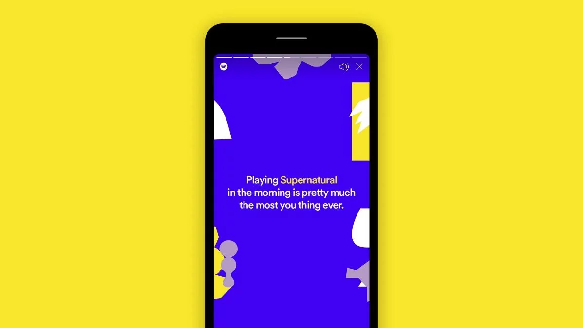
Spotify is also a proponent of personalization, most recently its Only You campaign.
It involves a customized playlist based on a fun questionnaire and songs the user played in the past. It will also present funny tidbits like this:
Source: Spotify
When any user sees this, it will make them feel that Spotify truly understands them.
Indeed, personalization is a crucial app retention tactic. Because while an intriguing value proposition and user experience will attract users, personalization will keep them hooked.
Leverage in-app messaging and notifications
In-app messaging and notifications are excellent tools for retaining users, especially if they’ve been away for a while.
Because sometimes, users just need a subtle reminder to go back to an app.
Aside from this, they’re also effective engagement tools. For example, they can be a fantastic way to welcome new users with special offers, as Groupon did.
Source: Hi5
This isn’t just anecdotal evidence. Numbers also tell a similar picture.
For example, an Airship study revealed that apps that haven’t used push notifications before could see retention rates shoot up by 190% once they do.
But like anything powerful, these tools are also prone to abuse and overuse. Surveys show that sending too many irrelevant notifications is the number one reason people uninstall apps.
So if you want push notifications and in-app messaging to work in your favor, it helps to follow a few best practices.
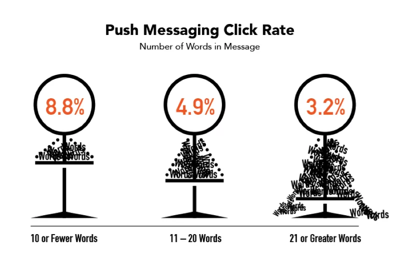
The most important thing is to keep them short and simultaneously catch your user’s attention.
The key approach here is to distill the essence of the notification into as few words as possible. The sweet spot is ten words or fewer, according to a Localytics study.
Source: Hi5
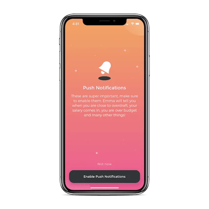
Users should also be able to control the notifications and in-app messaging they receive.
To increase the chances that they don’t turn it off outright, it helps if you explain the benefits of keeping them on.
Here’s an example from the Emma app:
Source: Telerik
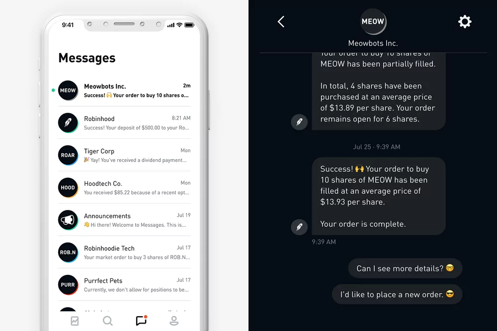
Push notifications and in-app messages should also be relevant. Valuable content is preferred over marketing-focused messages.
For example, Robinhood’s in-app messaging sends crucial information about a user’s chosen stocks. Over time, people will rely on the news, undoubtedly increasing retention.
Source: Robinhood
Combining notifications and personalization makes for an even more powerful retention strategy.
It ensures that any messaging you send will be appreciated and even anticipated by your user.
Look at how the weather app Sunshine delivered a personalized forecast—much to the user’s delight.
Source: Hi5
As you can see, notifications and in-app messages can be a game-changer. The key is to keep the user’s needs in mind and refrain from being too focused on advertising.
Gamify the experience
If there’s one strategy that can skyrocket your retention rates, it’s gamification. Adding game elements to your app can really hook your users.
Almost every app, from fintech to fitness, uses gamification to great success.
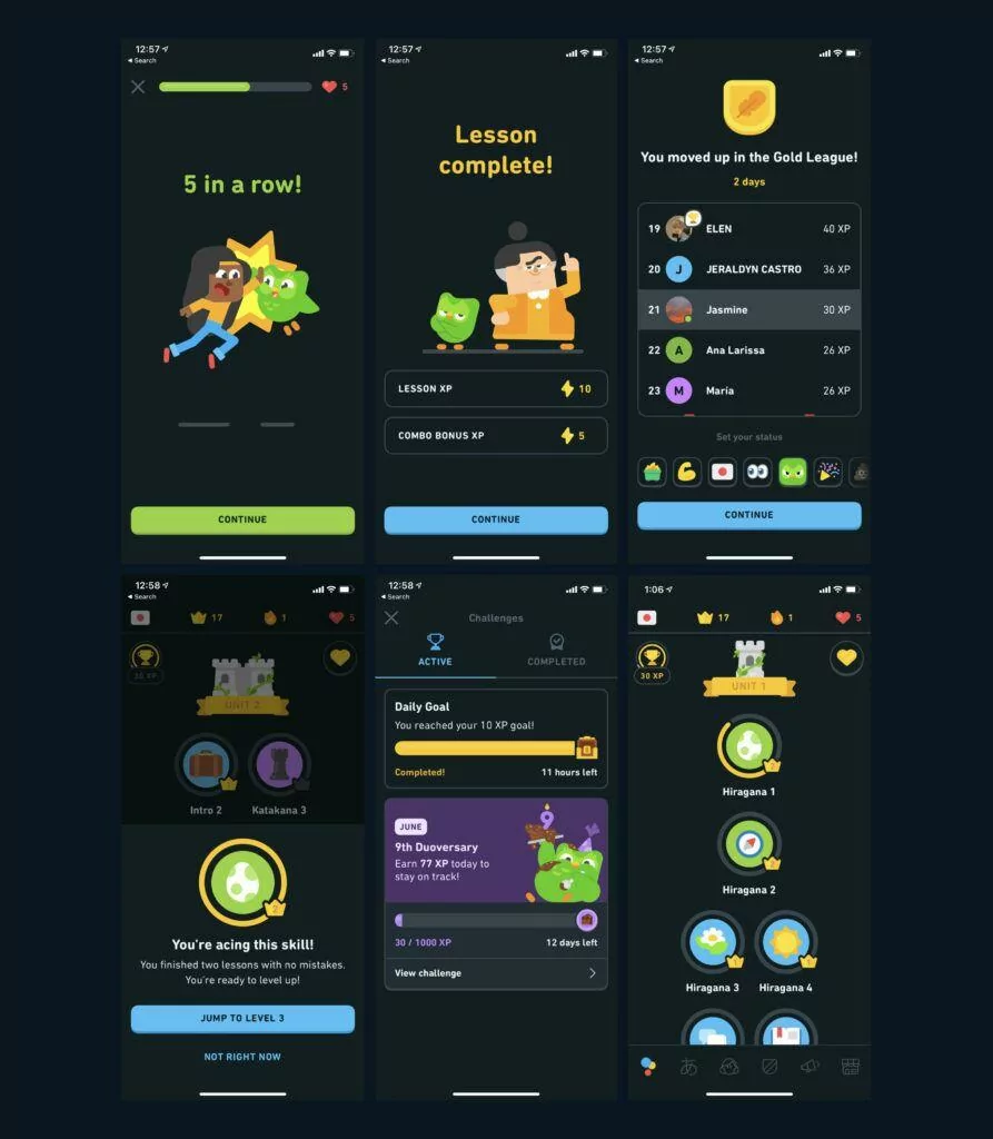
But one of the more interesting case studies is the language app Duolingo.
Source: Raw Studio
You’ll see gamification in every inch of the app. Lessons are presented in a progression system, where you “level up” as you complete more tasks or learn more words.
It also has a leaderboard feature to compare yourself against your family and friends.
It even uses app notifications as a gamification tool. Duolingo is notorious for overdoing this, but in their case, it works.
The reason is that the constant barrage has a surprisingly motivating effect.
Source: Raw Studio
Their gamification efforts translated to a big win for the app. Duolingo’s user base is now more than 300 million strong.
Duolingo’s approach was a hit because it satisfied the following five gamification components.
Users had a clear goal that they wanted to reach. Next, the app sets rules to achieve this goal, which is to take the daily language lessons.
Feedback is in the form of progress bars and levels, which show how far along the user is to their goal.
Users also get a reward in the form of XP points. Lastly, the app creates motivation through leaderboards and daily notifications.
Note, though, that gamification need not be complex. It will be effective as long as your elements hit that intrinsic need for motivation and reward.
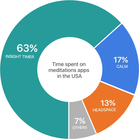
For example, the Insight Timer app uses streaks to encourage users to stick to a meditation habit.
And the reward is a simple star and recognition from the community.
It seems trivial, but it works surprisingly well. Insight Timer is now outperforming other bigger meditation apps in its space.
Source: Insight Timer
But while pride and accomplishment are effective motivators, nothing beats the satisfaction of getting an actual reward.
Offer perks to engaged app users
Discounts, deals, and other perks are some of the most effective ways to get users back to your app.
And this is true even if the person has already uninstalled your app.
A Google study shows that 30% of lapsed users will consider using an app again if offered a discount. Thus, offering perks can be a last-ditch effort to re-convert lost users.
Gamification consultant Yu-kai Chuo explains why this works:
“It is better to attract people into an experience using extrinsic rewards (gift cards, money, merchandise, discounts), then transition their interest through intrinsic rewards (recognition, status, access).“
There are many ways to incentivize app users. One good approach is to give users points, which they can then exchange for various prizes.
This presents users with better flexibility to get the rewards that they want.
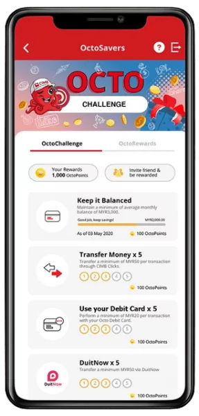
A good example is the Octo Challenge from the Malaysian digital bank CIMB.
Users can earn points for completing challenges, like maintaining a set balance or doing transactions. These points can then be exchanged for discounts and rebates.
Source: Money Thor
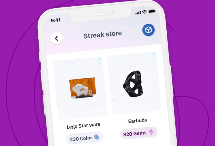
The Streak app is another example of an in-point system (called Streak coins). But since the app is geared more towards teens, the prizes also match that demographic.
Source: Streak
But it isn’t always beneficial for users to know what they will receive in exchange for a particular action. Game design author Wendy Despain explains why:
“If the player knows exactly what reward they are going to get for a specific action, it removes any surprise from the equation […] the experience leaves [the reward] feeling flat and unengaging.“
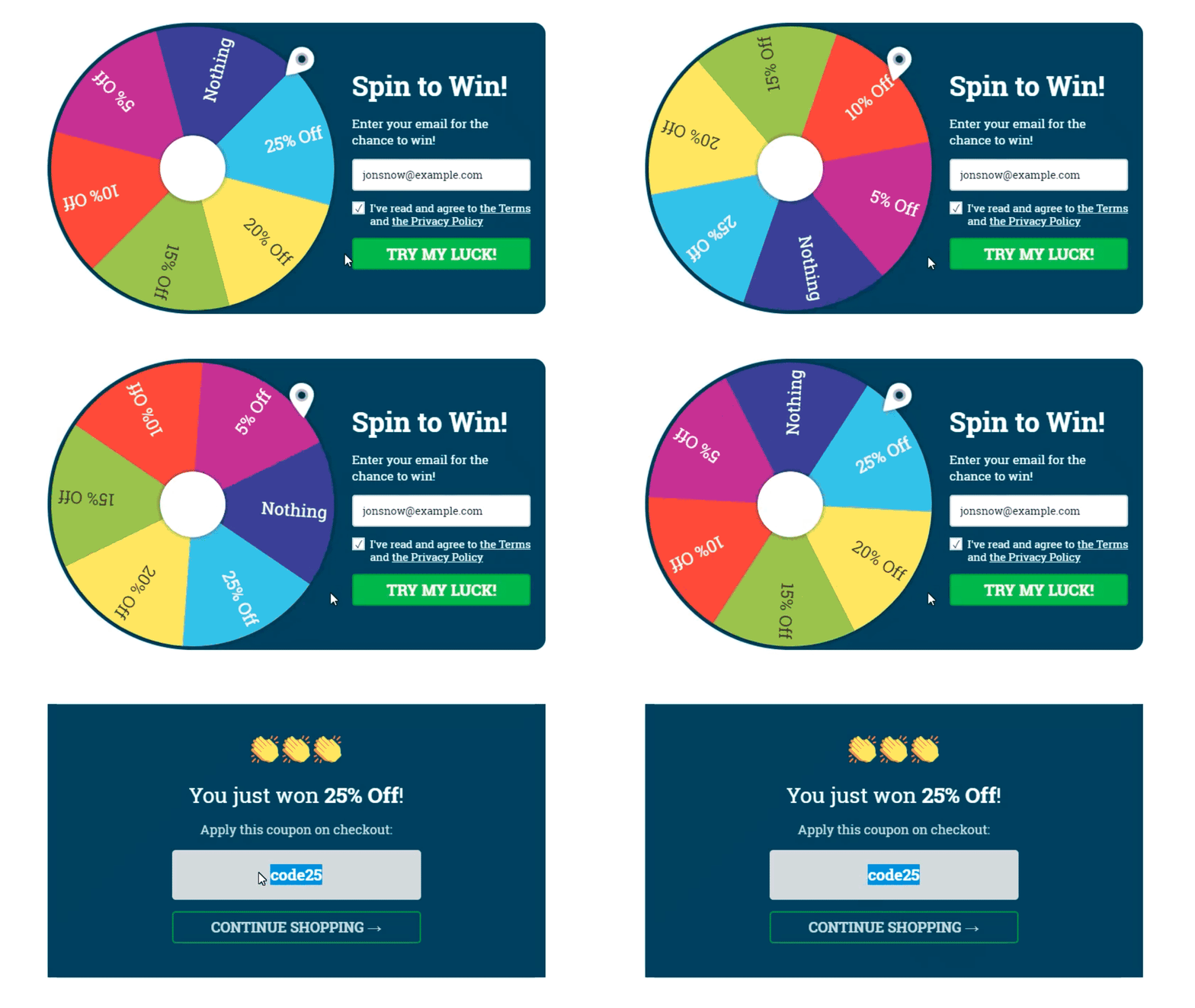
Thus, your incentive program should introduce a sense of chance and uncertainty to become more effective. A popular approach for doing this is the prize wheel.
Source: Convertful
Prize wheels are effective because you know the possible prizes, but you’re unsure which one you’ll get.
This creates a sense of curiosity and excitement for potential future wins, which is sometimes much more motivating than the prize itself.
Which user retention strategy will you try today?
All of these strategies should be part of any app’s user retention campaign.
However, that doesn’t mean you should implement them all simultaneously.
It’s far better to focus first on a tactic or two, see the results, and optimize as needed.
Then you can slowly layer new strategies on top of that. This ensures that you get results faster.
Which one should you start with, though? Because it’s not always an obvious choice.
Well, maybe we can help! We can use our vast app development experience and expertise to pinpoint where retention efforts will have the biggest impact.
So, contact us today, and let’s talk!

