99.5% of apps fail.
Not exactly comforting words for an app developer.
But we’re not here to discourage you. In fact, we want to arm you with the knowledge that will help you become part of the 0.5% that do succeed.
Here’s the insight: there are plenty of reasons apps fail. However, a big chunk of that is simply due to a lack of visibility.
In other words, those apps are not reaching their intended users.
The solution? App store optimization, or ASO.
By optimizing a few key parameters in your app page, you can make yourself more visible to your audience.
Here’s how to do it.
Include user-oriented keywords
Keyword optimization is one of the basic app store optimization strategies—and the one you should get right.
It involves using the right words in your app’s title and metadata field so that it appears when people search for those particular keywords.
If you’re familiar with search engine optimization (SEO), ASO is very similar.
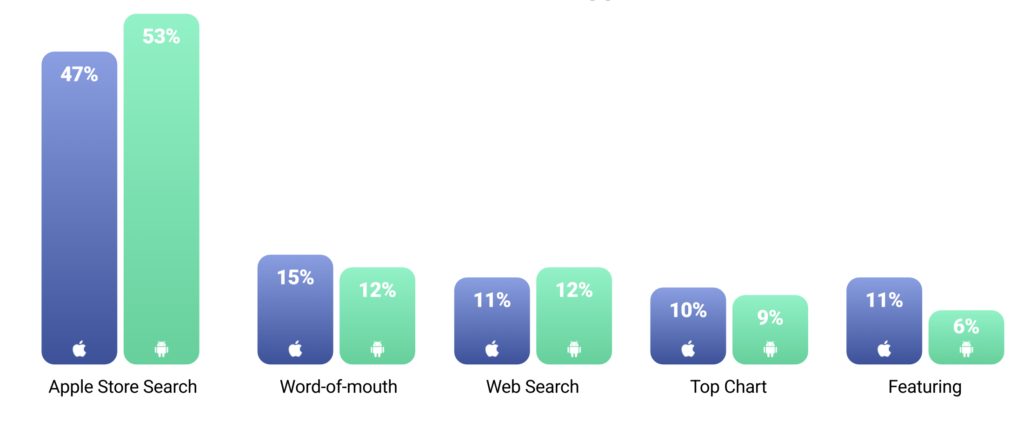
Keyword optimization is crucial for increasing your app’s visibility. This is especially true since search is the number one method people use to discover new apps.
Source: Splitmetrics
Your app should also aim for keywords that help apps rank as high as possible in the app store, ideally within the top 3–10.
That’s because 75% of downloads come from the top three results, according to Laurie Galazzo of App Tweak.
Coming up with relevant keywords might sound trivial. But it can be notoriously difficult in practice, requiring hours of research and plenty of trial and error. Fortunately, there’s a science to it.
The first step is to assess how your current keywords are doing with a tool like AppTweak or App Radar.
For example, let’s say you’re the developer of the meditation app Fit Mind.
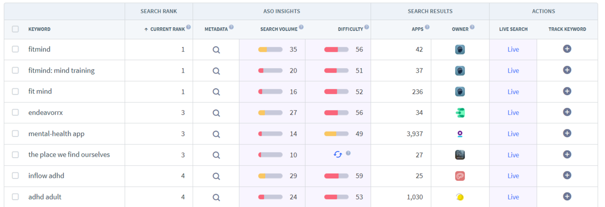
Using a tool like App Radar, you can determine which keywords your app ranks for:
Source: DECODE / App Radar
This tells you which keywords your app appears in and how well it ranks. You’ll also know how many apps are currently vying for every keyword, as well as the top app result.
Two crucial pieces of information here are search volume and difficulty. Search volume tells you how many apps are ranking for that keyword. Difficulty determines how hard it is to reach rank #1 in that keyword.
Ideally, it would be best to target keywords with high search volume but low difficulty.
Lots of potential interest and lower competition means you can easily gain visibility in these keywords.
A good example of this strategy in action is the audio app Audiomack.
Instead of ranking for common but difficult keywords dominated by the likes of Spotify and Pandora, Audiomack went a different route.
It focused on alternative keywords that its big competitors ignore, such as rap music.
As a result, it ranked number 1 on these keywords and brought 481 more monthly downloads.
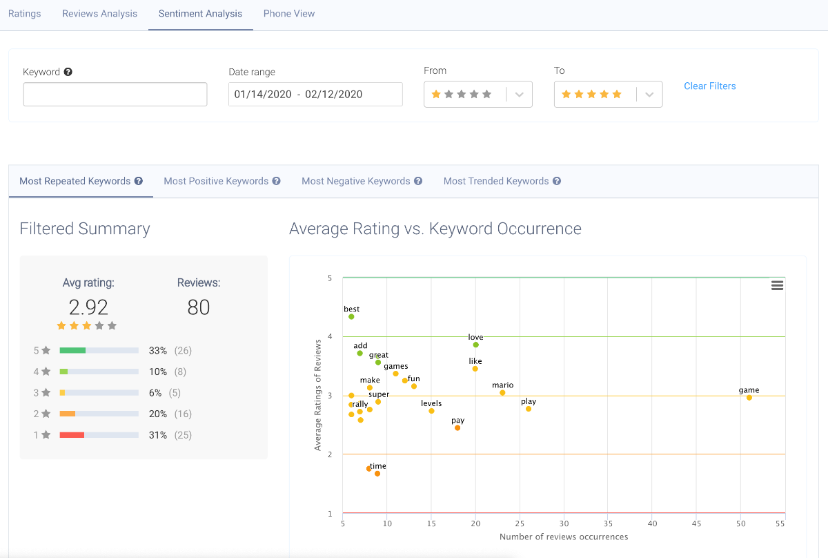
Your app reviews are another unexpected source of keywords. With tools like App Tweak’s Review Sentiment Analysis, you can discover the common keywords people use to describe your app.
Source: App Tweak
Once you have a list of keywords, it’s important to learn how to use them effectively.
However, unlike website SEO, you only have limited places to put them. This includes the title, subtitle, and keyword metadata.
There are also character limits in place, so you need to be smart about choosing your keywords.
Your app’s description is also a good place to put keywords, but only for the Google Play Store.
The Apple App Store, contrary to what most think, doesn’t include descriptions in its search algorithm; thus, any keywords you put in the app description there will not contribute to your ranking.
But despite this, your description still plays a crucial role in ASO. We’ll explore why in the next section.
Write a compelling description
Your app’s description is often the make-or-break component that can influence users to install your app—or abandon it entirely.
Once your app title and icon have done their job of attracting a person to your app page, it’s the description’s job to convince them to download it.
That might mean illustrating your app’s value proposition or sharing some social proof.
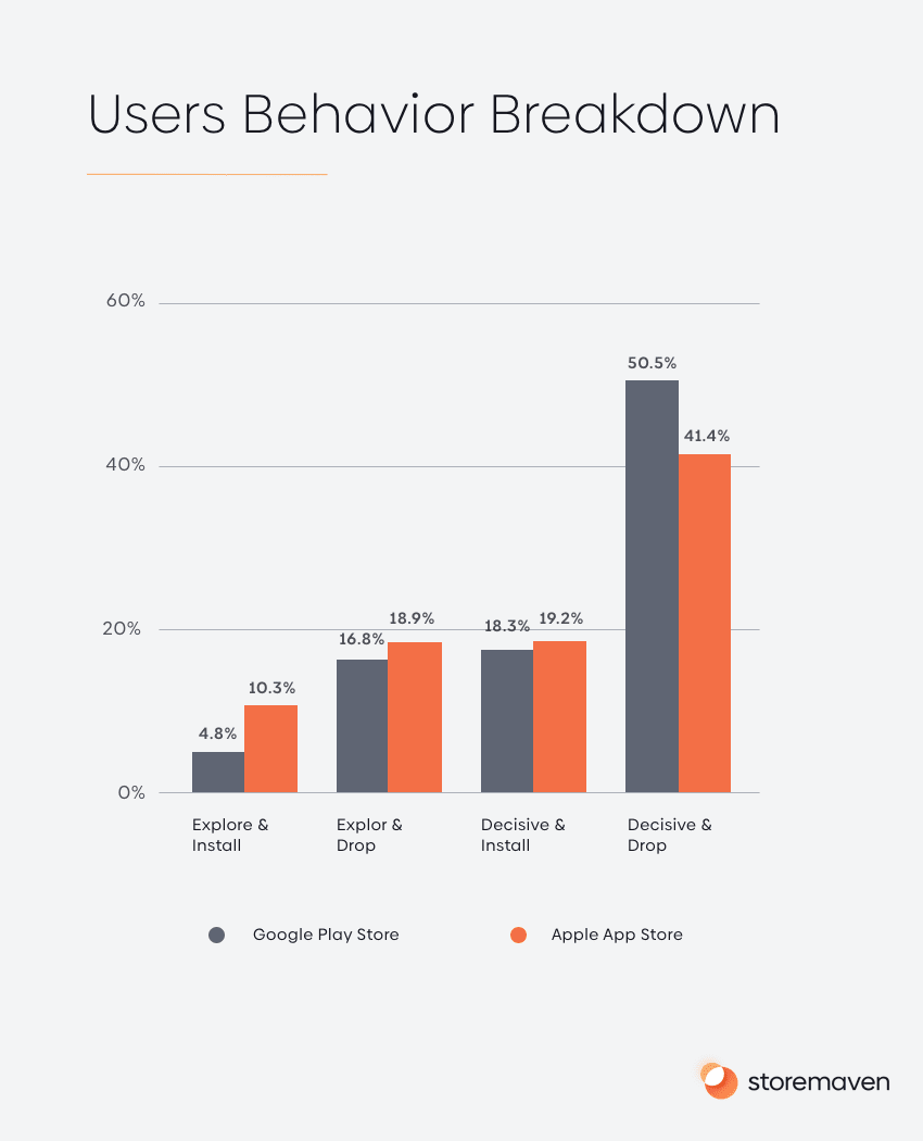
Optimizing your app description is even more important if you consider these user behavior statistics:
Source: Storemaven
Capturing the so-called explorer users – regardless of their smaller percentage – can do a lot to improve your overall install rates.
Also, consider that these users are typically more valuable because they invest time in knowing an app first before downloading it.
In your app description, the first few lines are the most crucial. This is where you need to grab their attention.
This short snippet initially shows on your app page, with everything else hidden. After that, users need to click on the More button to reveal the rest of your description.
The problem? Only 5% of Google Play users and 2% of Apple App Store users do this.
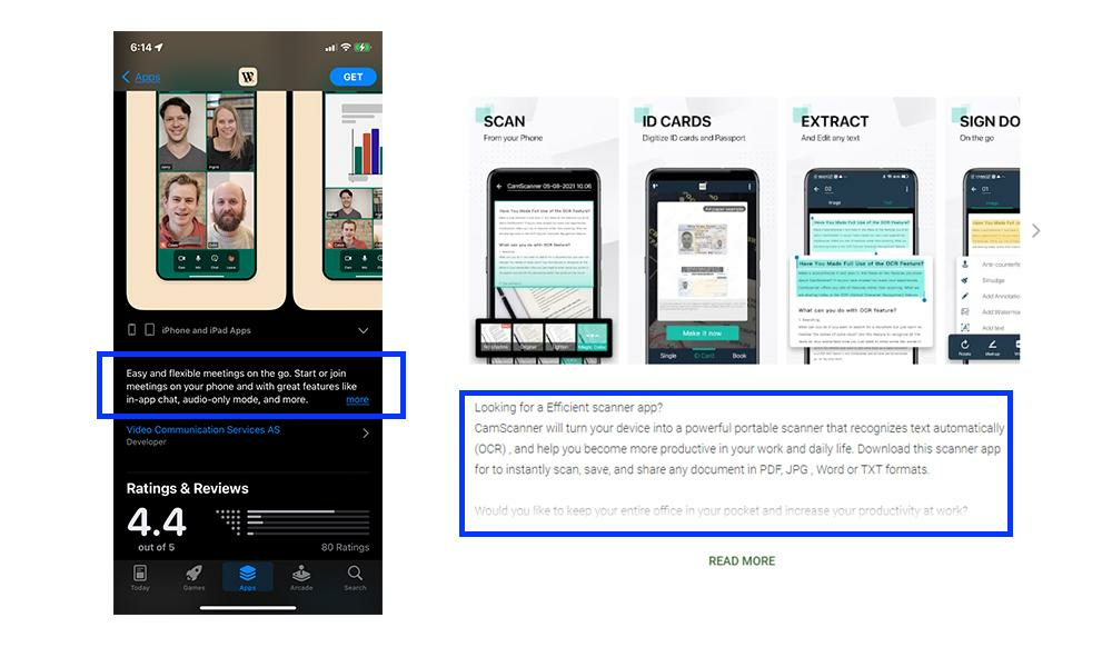
That means the majority of visitors to your app page will only see this short section:
Source: DECODE
Not much to work with, right? That’s why you need to be smart with this limited real estate.
The most common approach is to open with your app’s elevator pitch—a concise description of what your app does and what its biggest benefit is.
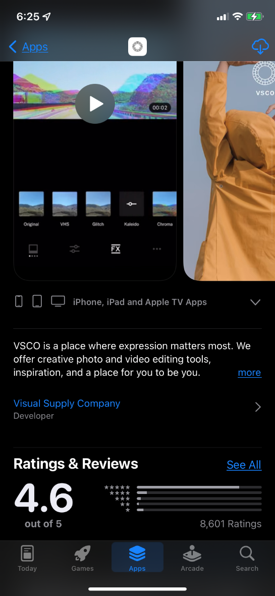
For example, look at how the photo app VSCO condenses its unique identity in the first lines of the app description:
Source: DECODE
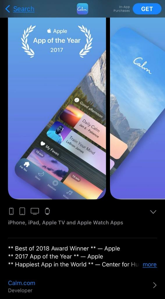
Alternatively, you can also include any awards or social proof that your app has won. This is an instant way to establish credibility and even create a little FOMO (fear of missing out) in the user.
After all, if most people think it’s a great app, it must be good enough to download.
A good example is the meditation app Calm.
Notice how they list their Apple App Store awards first due to the bigger credibility they bring.
Source: DECODE
Often, a well-crafted opening line is enough for users to download your app, or at the very least, click on the More button.
At this point, the rest of the description should drive the point home. This is your last chance to list all the benefits, features, payment information, and other details you missed.
Lastly, don’t forget to include a call-to-action (CTA). Studies show that placing a CTA can drastically improve your conversion rates by triggering your users to make a decision.
Indeed, the app description can be extremely powerful at sealing the deal. But one other element has been shown to have a bigger impact on install rates.
Optimize visual elements
The visual elements on your app page, such as your app icon, screenshots, and videos, have a massive impact on your ASO, sometimes more than textual components.
The reason is simple: humans are highly visual creatures. That means we process visual cues much more efficiently.
For example, just think of how you instinctively know that red means danger or a skull symbol indicates a hazardous material.
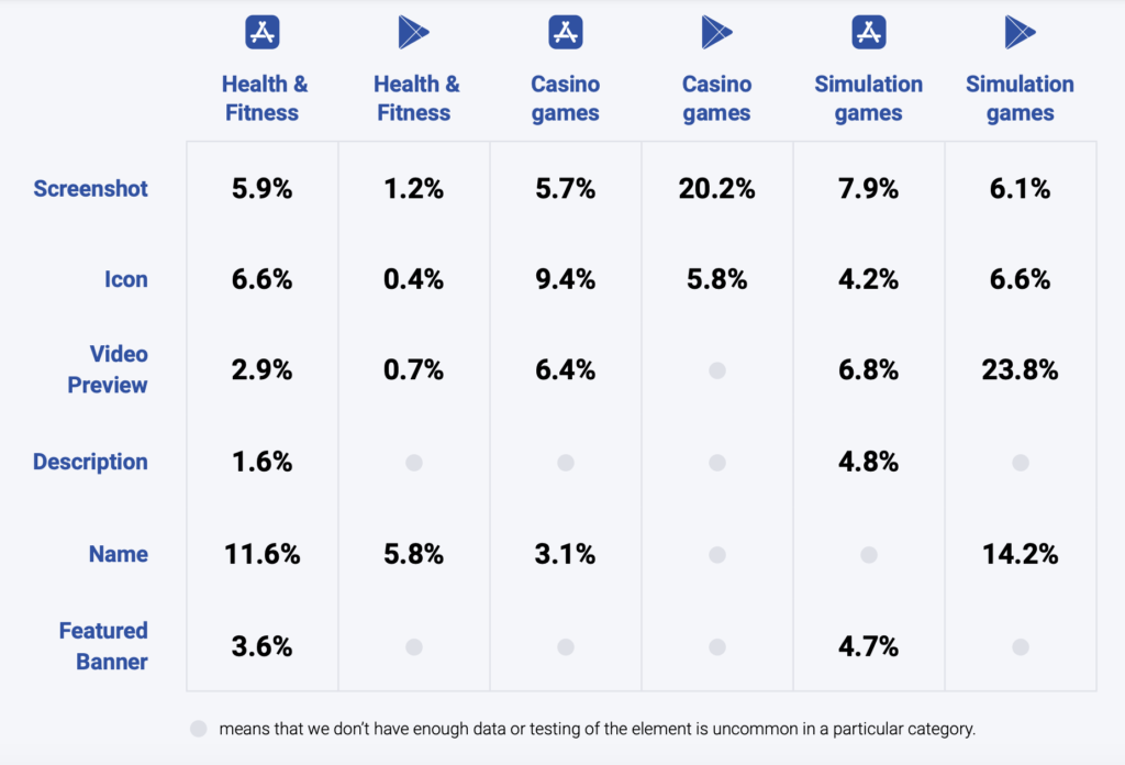
Take a look at this study by Splitmetrics, where they analyzed how much the major elements of an app page can improve conversion rates:
Source: Splitmetrics
The above study tells you two things.
The first one is that visual elements working together can dramatically improve the chances of users installing your app. For example, in simulation games, that’s an impressive 36.5% uplift.
The second is that certain visual elements are more effective in some niches than others.
For example, screenshots are incredibly important for casino app users (as shown above) but not so with health and fitness.
Knowing benchmarks like these can help you focus your optimization efforts more efficiently.
Now, let’s do a quick rundown of how to optimize the major visual elements on your app page.
The app icon is undoubtedly the most important visual element. Other than the title, the icon is often why a person will click on your app in search results. When done right, it can even impact your conversion rate.
One such example is this case study of a dream interpreter app. By simply changing the icon, the app achieved a whopping 49.4% conversion rate improvement.
There are several approaches to optimizing your app icon, depending on your situation. If you have a fairly recognizable brand, like Facebook or Pinterest, it will often suffice as an icon.
Source: ASO Mobile
Games tend to do well if they capture the essence of the gameplay in the icon. Notice how you already have a rough idea of what the game is about when you look at these icons:
Source: ASO Mobile
Next up is the gallery, where you can put screenshots of your app.
But while this is a common and fairly effective strategy, it’s better to use this space to highlight your app’s key benefits and features as well.
This acts as an additional persuasive element to convert users.
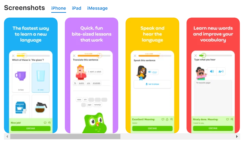
The language app Duolingo does this very well. They combine screenshots with the core benefits of using their app.
Source: Duolingo (App Store)
You can also use videos as a visual element in ASO. They’re mostly used in games because users like to see a gameplay preview before they will download.
If your app has a unique feature that you want to demonstrate, this is a good place to do so as well.
Lastly, the most important piece of advice: always test. Even the tips you read here are mere suggestions, and the only way to find out if they work for your particular situation is to test.
Choose the right categories
Picking your app category might seem trivial, but it has a surprisingly big impact on your ASO.
And the reason is due to two things: relevancy and competition.
Putting your app in the relevant category will help it become more visible to the users who will download it most.
For instance, if you have a diet app, people who want to lose weight will most likely browse in the Health and Fitness category.
A second reason why categories matter, yet one that most developers don’t put much thought into, is competition.
Sometimes, you can place your app in more than one category. For example, our diet app example above can also be placed in the Food and Drinks category.
On the other hand, Linkedin can be placed in either the Business or Social Networking groups.
When you have this option, it’s better to pick the category with lesser competition. This is because it will be easier to get noticed here than in more popular categories with many big-name apps with large marketing budgets.
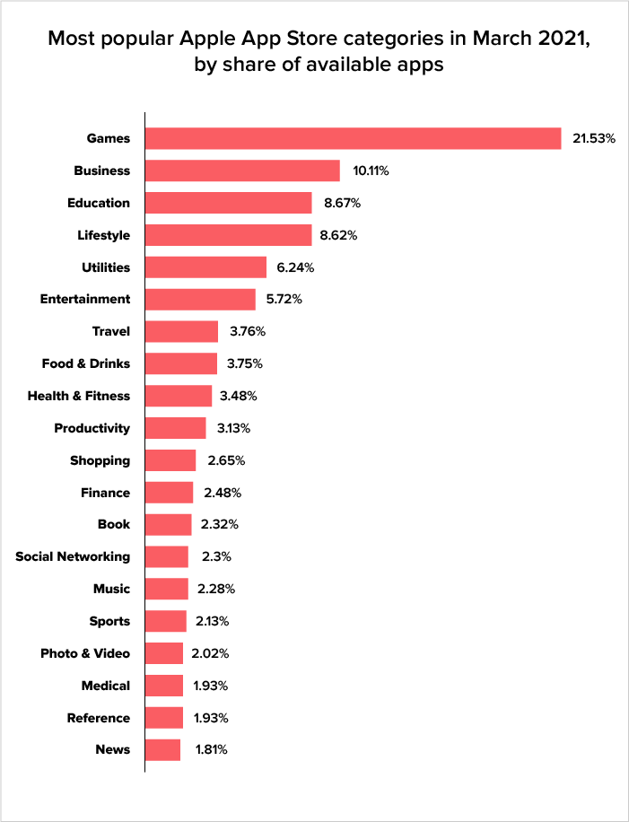
To illustrate, take a look at this survey by Mobile App Daily.
Source: Mobile App Daily
Taking our diet app example, would it be better to place it in the Health and Fitness or Food and Drinks category?
Statistics show that it’s better to put it in the former rather than the latter.
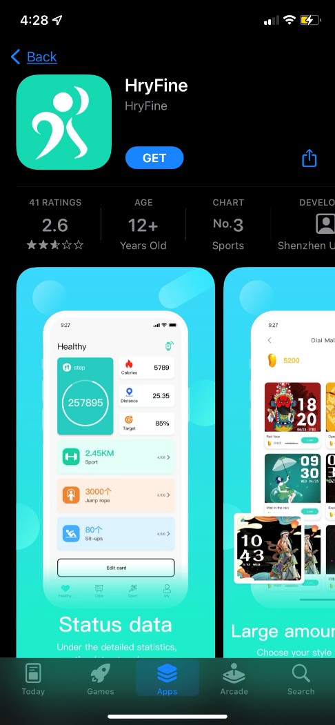
The HryFine app is an interesting example of this in action.
Source: DECODE
The app connects with a fitness bracelet to record exercise and sleep data. Thus, it would make sense to place it in the Health and Fitness category.
However, probably due to the lower competition in the Sports category, the developer chose it instead.
The result? It’s ranked #3 in the Top Free apps in the Sports category, despite the low 2.6-star rating.
Sometimes, changing app categories will involve making drastic changes to your app page, such as changing the icon or screenshot.
So be prepared to take this step. As always, monitor and test frequently to see which category gives you the best results.
Foster positive user feedback
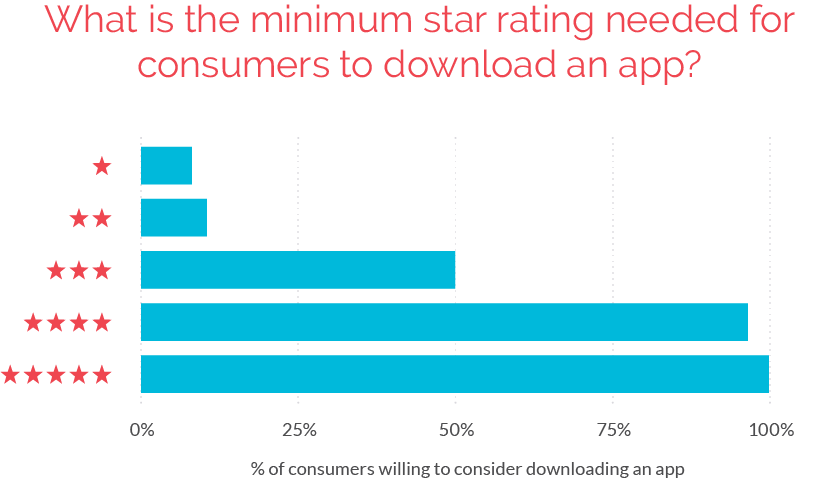
User reviews are one of the most powerful visibility and conversion tools you have at your disposal. Thus, getting more of them can boost your ASO dramatically.
Human nature makes social proof exceptionally effective. When others rave about a product, people have a need to experience it, too. An Apptentive study backs this up:
Source: Apptentive
On the technical side, app store search algorithms consider reviews and ratings when ranking. So the more of them you have, the higher you’ll appear in search results.
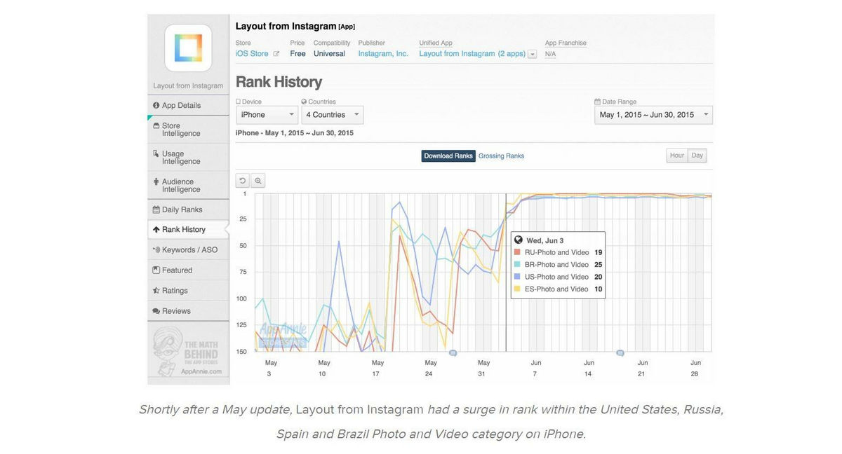
This is what happened when the app called Layout from Instagram launched back in 2015.
When they released a key update a few months later, they saw a surge of positive ratings and reviews, as well as a sudden uptick in their app store rankings shortly after:
Source: CS Agents
So, how do you attract more positive reviews on your app page?
The easiest is to simply ask users for them. However, timing is crucial. Make sure they’ve experienced your app first for a reasonable period.
Also, consider asking them after they’ve completed a task or level, as they might feel the most satisfied then.
Of course, these strategies will only work if you have a fantastic app user experience, to begin with.
Encouraging users to post reviews with a subpar app will only do more harm than good!
All of this points to the most important lesson of all—quality matters.
ASO is just one piece of the puzzle
You can implement the best ASO strategies in the world, but it won’t cover up for a subpar app. Engineer an exceptional UX for your users, and you’re already halfway through the ASO battle.
With DECODE’s expertise and track record in developing winning apps, we believe we can help you with that!
Contact us today, and let’s talk!

