
4 types of mobile app onboarding to know about
This article will explore four types of app onboarding you should know about and hopefully give you an idea of how to approach onboarding on your next app.
Onboarding is perhaps the most fundamental tool for improving your app’s user retention. It’s the reason we’ve written extensively on this topic (such as our primer here).
But it’s more than just setting up accounts or turning on notifications.
Onboarding is about personalizing the experience and making users comfortable with your app as quickly as possible.
Unfortunately, it can be challenging to achieve the perfect onboarding sequence. There are a dozen mistakes you can easily commit. Here are the top six.
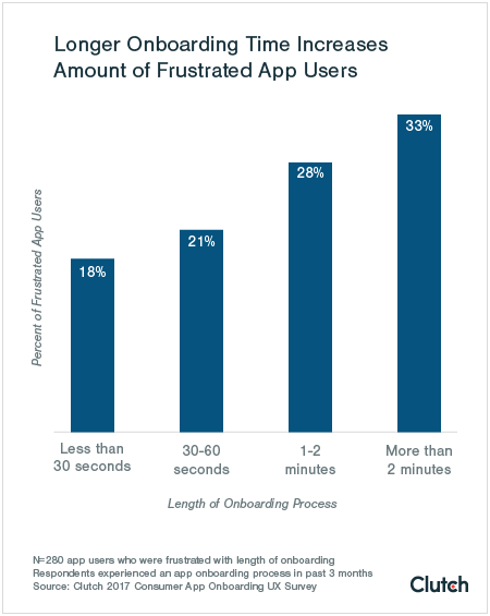
One of the biggest mistakes in onboarding is making it too long. Overstaying your welcome can bore or frustrate the user—and is worse than not doing onboarding at all.
A Clutch study backs this observation. It found that 18% of users feel frustrated by an onboarding sequence that lasts for 30 seconds or less.
But add another minute, and the percentage of frustrated users jumps to 28%.
Source: Clutch
Remember, your goal with onboarding is to turn your users into knowledgeable users as fast as possible. Thus, a shorter sequence will serve you well.
This is especially important when your onboarding involves a walkthrough of your app. If it’s too long, you risk overloading users with too much information they can’t remember.
It can also frustrate most people who are eager to use your app immediately.
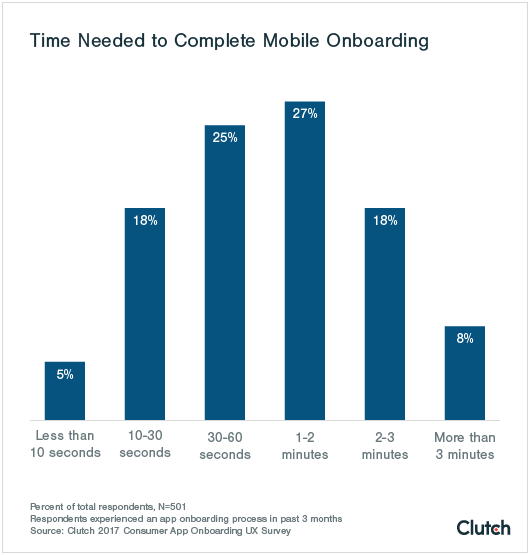
So, what’s the ideal length?
The same Clutch study also surveyed companies on their onboarding length and found that 1—2 minutes is a good average to shoot for.
Source: Clutch
Of course, this is just a ballpark. The actual length of your onboarding will depend on several factors.
For instance, apps that involve complex UIs or gestures will require a longer walkthrough.
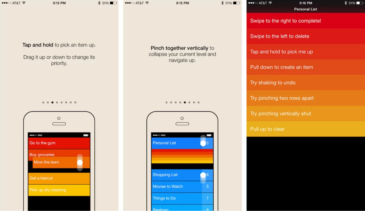
But more than the length, the quality of your app walkthrough matters. After all, if it’s engaging enough, users won’t mind even if it lasts for ten minutes.
The best way is to make your walkthrough interactive. You’ll instantly stand out by doing so because most apps opt for static walkthroughs like this:
Source: Shopify
The above approach is largely ineffective because it doesn’t actively involve the user. They’ll also have difficulty remembering information because they don’t practice doing it.
Studies show that learning by doing can improve retention by as much as 75%.
Source: UX Booth
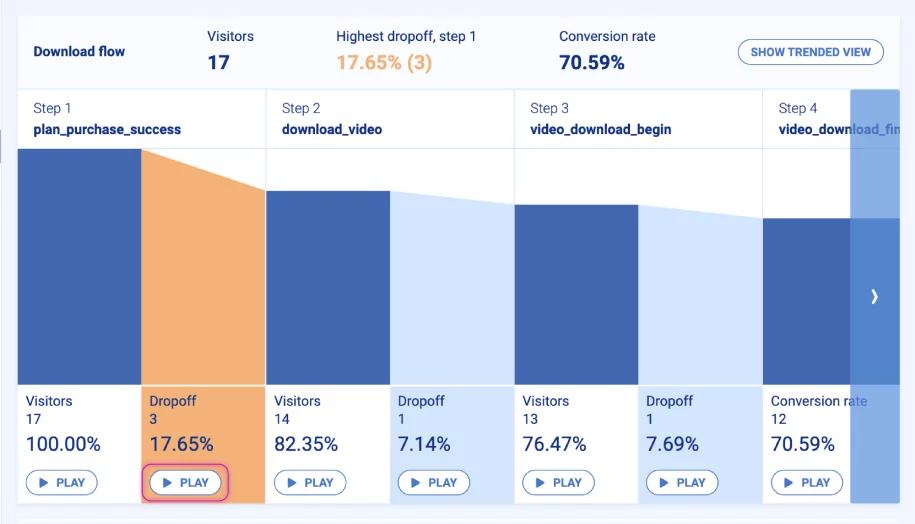
But the best way to optimize your app walkthrough length is to monitor it. You can do so with an event-based funnel report.
This tells you how many users drop off at every point of your sequence, so you can quickly spot problematic areas.
Are people quitting on a specific step? Then maybe consider dropping it.
Source: Smartlook
One last thing to remember: no matter how short and engaging your onboarding is, there will always be users who want to skip it entirely.
Not allowing them to do so would also be a big mistake.
Users should always be able to drop out of your onboarding at any point.
Remember that not everyone wants to go through app onboarding or walkthroughs.
For instance, an experienced user might already know how to use a similar app. Forcing them to go through a tutorial that doesn’t let them skip the basics can be insulting and frustrating.
Some people might be in a hurry to use your app or simply want to explore and learn things independently.
There’s always a sizable group of users you risk turning off if you don’t implement skippable onboarding.
Fortunately, it’s quite easy to do—simply add a Skip button to every onboarding screen.
Source: Birgitta Run Sveinbjornsd | Dribbble
However, ensure that the Skip button is noticeable in your UI. You might be tempted to make it as small or obscure as possible so users can ignore it.
But that will risk frustrating people because they’re going to feel tricked.
If you have interactive Help elements like tooltips or pop-up windows, it’s best to allow users to turn these off as well.
Alternatively, you can use a Get Started or Login link instead of a skip button. This is preferable if you require users to register for an account before accessing the app.
Source: Ganesh Kumar | Dribbble
However, a piece of advice: asking users to sign up right away can be another onboarding mistake. We’ll delve into that in the next section.
For many apps, asking users to sign up right away during onboarding might make sense. Most apps are doing it, after all. But it can be a critical mistake.
The reason? It’s asking too much from a user—just like it’s appropriate to ask a big favor from a stranger you just met.
And asking users to register is a huge ask. Just look at the following statistic:
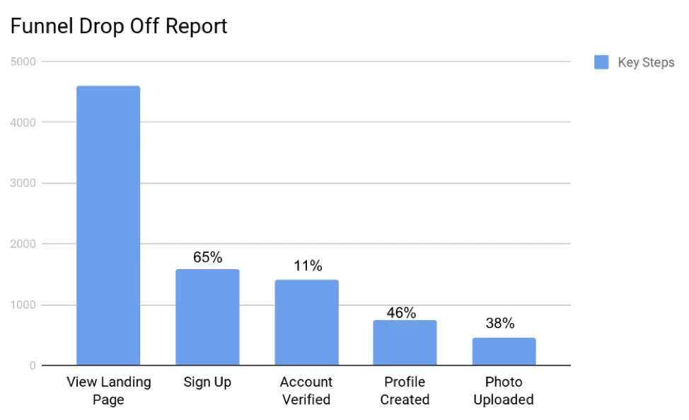
Source: OpenView
Notice the drastic drop in users when users need to sign up for an account.
To get around this, it’s best to delay signing up as much as possible. The best approach is to allow users to explore the app first or even make it entirely optional.
This is one of the best ways to foster trust with the user. It signals that you’re willing to give value before demanding users for anything.
For example, look at how the streaming app Vevo allows users to skip onboarding and sign-up to jump straight to the app.
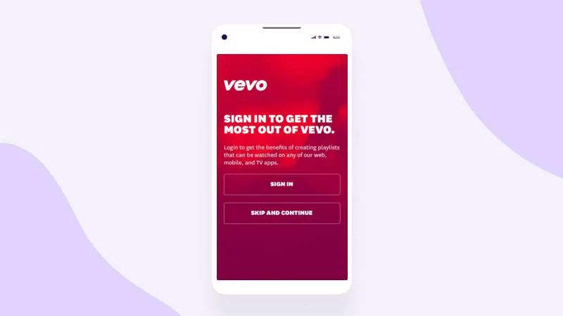
Source: Apps Flyer
If you need to have users sign up at the beginning of the onboarding sequence, try making it as seamless as possible.
The easiest way is through social logins that allow one-click registrations. This prevents the time-consuming step of filling out forms.
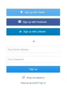
Source: Evergreen Feed
You can also adopt a gradual approach to signing up.
For example, the crypto trading app Coinbase asks only the bare minimum to create your account.
Then, it allows you to explore the app freely. You only need to finish your account setup if you’re ready to make a transaction.
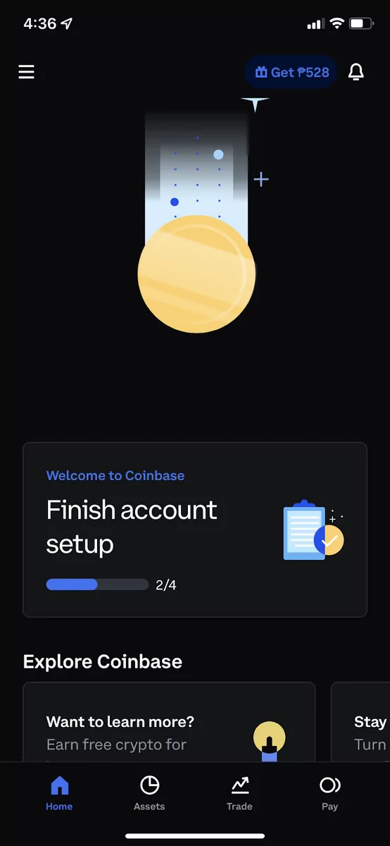
Source: Coinbase
To encourage users to sign up, it pays to let them know the benefits of doing so. The Hotels.com app, for example, doesn’t require users to register to book hotels.
But taking the time to create an account is enticing, as it gives them the chance to get free hotel stays.
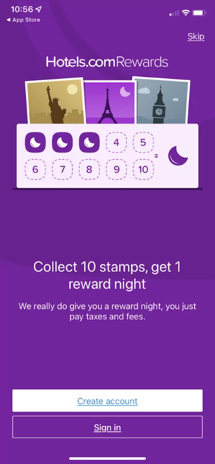
Source: Hotels.com
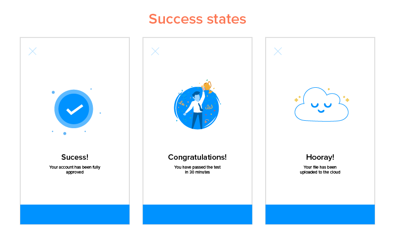
A good rule of thumb to remember here, as with anything else in your onboarding, is this: it’s all about the user. Sometimes, that means celebrating their successes as well.
When it comes to designing your app’s UX, the best piece of advice we can give is always to appear human.
The language you use and the way you interact with your user should mimic that of a real person.
And the most important of these is the social aspects, such as congratulating users when they accomplish something in your app.
Source: Appinventiv
Compared to the other mistakes on this list, this one seems subtle. But the effect it will have on your user is profound.
Recognizing a user’s win, no matter how small, rewards them with a sense of pride and achievement.
It then wires them psychologically to seek out this good feeling, thus encouraging them to complete your onboarding.
This is especially crucial if you just asked for something demanding from them, like creating an account.
Source: Szandra Karakai | Dribbble
Another good app that practices this is Slack. Apart from a congratulatory message, the app also has a confetti animation to make it a big moment for the user.
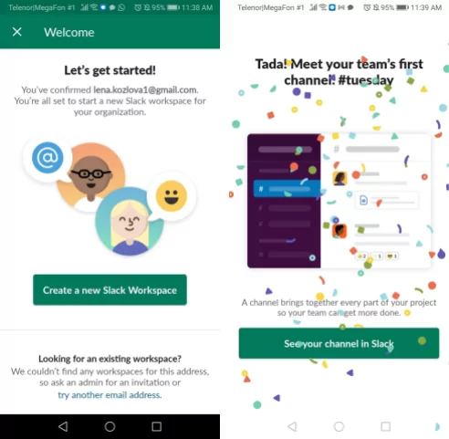
Source: Pushwoosh
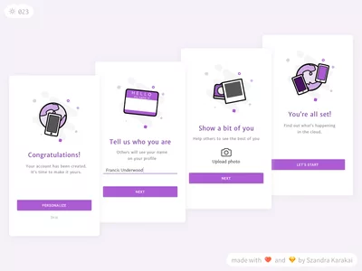
You can even take it one step further by rewarding your user’s successes.
For example, Notion has a list of onboarding tasks that users can do at their convenience.
To encourage compliance, the developers rewarded credits for every task completed, which users can credit towards a Pro subscription plan.
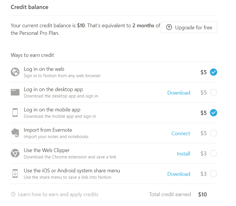
Source: Notion
Giving users rewards during onboarding can also spur them to use the app more. A good example is the travel app Ixigo, which offers free credits after users sign up for an account.
Chances are, they’ll book a flight to use those free credits and (assuming they had a great experience) will continue to do so.
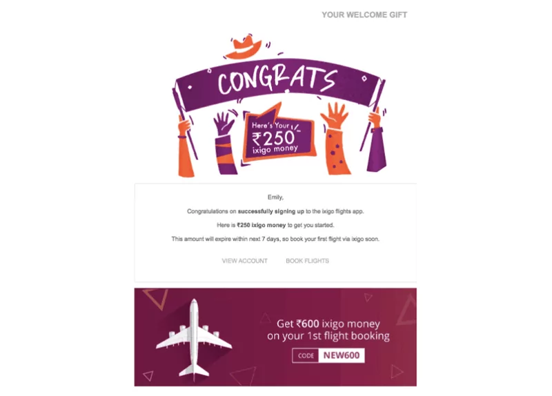
Source: Strivecloud.io
Luckily, this onboarding mistake is easy to avoid. You just need to show more empathy and think like a user.
As we said in an earlier section, asking for too many things from a user during onboarding can turn them off.
Besides log-ins, another big sin is flooding them with too many permission requests.
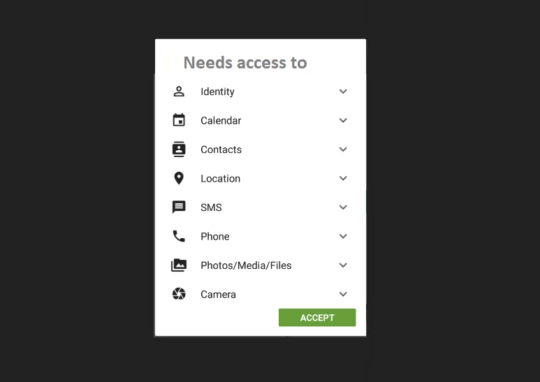
Source: The Green Programmer
Not only is this overwhelming for the user, but it can also raise red flags. Someone is guaranteed to be reluctant at this point because they might think your app is a security risk.
Doing this is like a stranger asking to enter your house. It’s too much to ask early on, isn’t it? They need to establish trust first.
We think the Fastic app did a good job in this regard. During its extensive but engaging onboarding, it first focused on the benefits of using the app for intermittent fasting.
Only towards the end do they ask permission for notifications.
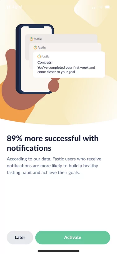
Source: Fastic
Also, notice how they laid out the benefits of turning on notifications. This is a great approach you should use every time you ask permission from the user.
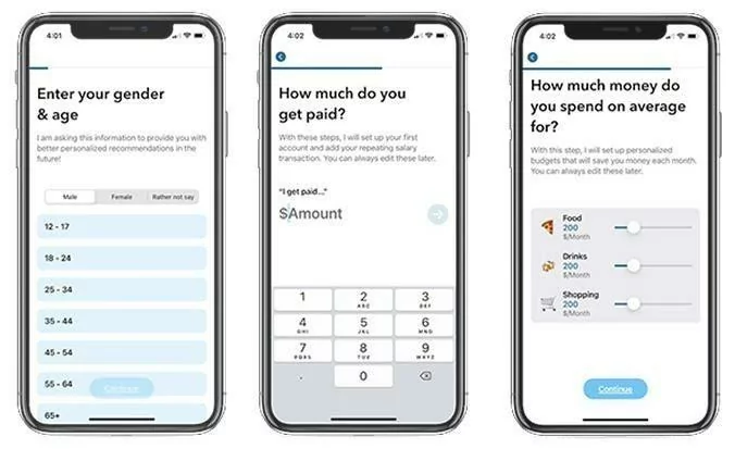
Look at how the MoneyCoach app clearly states why it’s asking for each piece of information from the user. This level of transparency is great for putting users’ minds at ease.
Source: Telerik
Timing is critical when asking for permissions. It ensures you don’t send too many requests. In addition, asking at the time when the user needs it the most provides a positive response.
For instance, the Cluster app only asks access to your contact list when you’re about to invite friends. Chances are you want to do that, so you’ll happily oblige with the permission request.
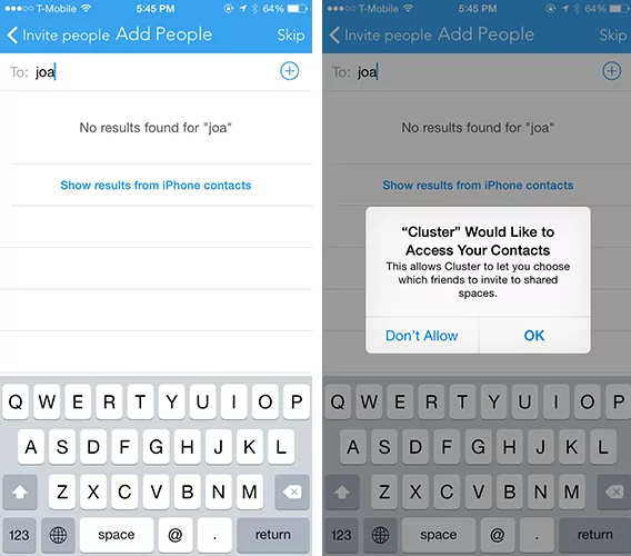
Source: Taplytics
Remember, first impressions are important. Giving value first and being mindful of the user are two crucial tips to achieve the best response to permission requests.
Too much of anything is harmful. It’s the same during your app onboarding. Specifically, you shouldn’t give too many hints or tips.
For one, this can make your UI overcrowded with many tooltips and pop-up windows during an app walkthrough. This can overwhelm and confuse users with too much information.
But giving unnecessary hints on well-known features can also waste space and effort. At worst, it will come across as patronizing or insulting.
Here’s an example pop-up dialog from Citi:

Source: User Pilot
The above tooltip is unnecessary because everyone already knows what a search bar does.
Here’s another example from the YouTube app for Android:
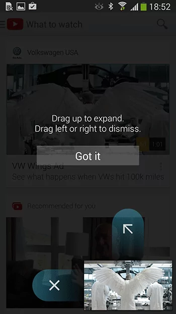
Source: Apptimize
Again, the instruction is pointless because it’s a common gesture for many apps.
It’s better to use subtle visual cues or icons to convey this information, like how the following symbol indicates that an element can be dragged.
Source: UX Movement
Here, it’s important to know the technical level of your users. For instance, a casual photography app might need to explain certain features to a newbie.
But doing the same with a professional photography app might be inappropriate because chances are your users will be photography experts.
Know your target audience. It’s perhaps the most valuable onboarding advice we can give.
Onboarding is a deliberate process that requires an equally intentional design to get right.
Putting together a few onboarding screens or doing a simple product tour won’t cut it these days.
You need to take the time to know your audience and optimize your onboarding to fit them. And it would be best if you did this periodically.
Because the needs and goals of your market will change. So, too, should your onboarding.
Need some inspiration? We covered six apps with the best onboarding sequences we’ve seen. You can check it out here.

Marko started DECODE with co-founders Peter and Mario, and a decade later, leads the company as CEO. His role is now almost entirely centred around business strategy, though his extensive background in software engineering makes sure he sees the future of the company from every angle. A graduate of the University of Zagreb’s Faculty of Electrical Engineering and Computing, he’s fascinated by the architecture of mobile apps and reactive programming, and a strong believer in life-long learning. Always ready for action. Or an impromptu skiing trip.
This article will explore four types of app onboarding you should know about and hopefully give you an idea of how to approach onboarding on your next app.

This article will explain what mobile app user onboarding is, how it can be used, and when to use it.

In this article, we will explain how onboarding can do more harm than good if not set up properly. In particular, we will go through the 6 most common app onboarding mistakes you should avoid.