They say an idea is only as good as its execution. This is particularly true with software development. Though great apps often stem from great ideas, not all great app ideas become great apps.
There are many factors at play in the process of turning creative ideas into a cohesive mobile app experience.
While it may be quite challenging to keep all the thinking and planning in one place, mobile app wireframing makes a tremendous difference in building the app you’ve long envisioned.
[bctt tweet=”If you’re curious about what a mobile app wireframe is and how to create one, this all-in-one wireframing guide will provide you everything you need to know. “]
What Is a Mobile App Wireframe?
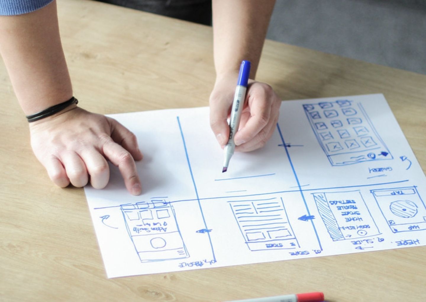
In simple terms, a mobile app wireframe is a two-dimensional sketch that serves as a visual guide and illustrates how an application will work.
A wireframe doesn’t represent the full design of the app, but only the key screens and interface elements. The app owner and development team can use a wireframe to agree and clarify the entire project’s direction and scope.
Though wireframing was originally exclusive to web design and Computer-Aided Design (CAD), the practice has become an integral part of app development.
Designers use boxes, gray lines, shapes, and placeholders for mobile app wireframes to achieve a comprehensible visual presentation.
At the initial stage, a wireframe is not a high-fidelity graphic design containing detailed design elements such as logos, font specifications, and actual images. Instead, it is essentially similar to an architectural plan or schematic diagram.
We know exactly how to develop and build awesome products from scratch. From native and cross-platform iOS and Android apps to specialized web applications.
User Experience (UX) designers often create it as a guide for the developers on how to begin the entire development process.
Thanks to its simplicity, designers, developers, and production teams can deliberate and modify design ideas collaboratively without significant cost implications.
What Should a Wireframe Include?
Designers and development teams sometimes approach wireframing differently. For example, a low-fidelity wireframe and a high-fidelity wireframe differ in the complexity and precision of the illustrations.
However, irrespective of the model adopted, there are certain design elements every standard mobile app wireframe must include.
As a bare minimum, a good mobile app wireframe should reflect the following:
- Content hierarchy
- Space distribution
- Possible app user actions
- App features
- Transitions between app pages
In essence, by glancing at a wireframe, anyone must be able to recognize the different features that will be integrated into the app. They should be able to see the space that has been allocated to these features as well.
Similarly, the designer wants to include important navigational features such as search and filter buttons, which customarily go to the top of the page.
Most wireframes make use of grayscale only.
This means the designers need to do a lot of shading: lighter shades of grey for lighter colors and darker shades for deeper colors.
In some high-fidelity wireframes, we could see some color once in a while. Colors such as red and blue are often used to show warnings and suggested actions, respectively.
Since it’s a basic two-dimensional sketch, a mobile app wireframe may not perform well when depicting certain interactive User Interface (UI) features.
Interface elements such as dropdown menus, show-hide functionality, and hover actions may be difficult to illustrate.
Why Is Mobile App Wireframing Important?
The decision to wireframe your mobile app will do your development project a lot of good. If executed properly, an app wireframe bridges that seemingly massive gap between your initial thought process and the final user-focused product.
If you’re facing significant challenges in visualizing an all-inclusive app experience from the start of the project, wireframing helps you piece the numerous concepts and ideas together.
Here are some of the most important ways a mobile app wireframe will prove indispensable on your project:
1. A Wireframe Helps You Understand Your App Better
While your app idea is still raw and yet to be implemented, it’s essential to define its purpose. This is crucial for building a successful app.
Why will the user want to download or use your app?
One easy way to answer such a question is to document the use cases.
By investing in wireframing, you get to (virtually) go through every step of the development process. This helps you explore and clarify how well your app achieves its purpose.
2. It Keeps the Development Process User-Centric
With the help of use cases, wireframes also help to focus on the user as much as possible. Without a visual representation, it’s difficult for designers to measure how effective the user’s interaction with the interface will be.
A wireframe defines the context and incentive behind user actions. With these in mind, you can modify your design to make task execution as seamless as possible.
3. You Get to Save Time and Money on Design or Code Overhaul
Unlike high-level UI/UX design elements, wireframes are cheap and easy to make. Whether it’s a pen-and-paper or digital wireframe, there are many resources you can use to complete a wireframe screen in a few hours or even minutes.
If there are modifications to implement, you can also do so at little or no cost at all. Contrarily, you’ll need lots of time and money to redesign or rewrite a complete app’s code.
In the same vein, you get to analyze and possibly enhance the UX before even starting the design or development process.
By optimizing the number of screens necessary to execute different tasks, you also make navigation as intuitive as possible.
Types of Wireframes
As earlier hinted, not all wireframes are the same. Depending on the type of app you want to build, you may need to tweak your approach to wireframing.
For certain projects, wireframing simply involves sketching on paper.
For others, it entails creating prototypes that are very close to the final product. The main task, in either case, is to communicate design ideas effectively.
In general, designers often employ three types of mobile app wireframes:
- A low-fidelity wireframe
- A mid-fidelity wireframe
- A high-fidelity wireframe
When wireframing, it’s vital to bear in mind that no wireframe type is a one-size-fits-all solution.
In some cases, a less detailed wireframe may be enough to reach an agreement with stakeholders.
Whichever the case, ensure to test, innovate, and implement feedback always along the way.
Now, let’s take a closer look at the different types of wireframes.
Low-Fidelity Wireframe
This is as basic as wireframing gets. A low-fi wireframe is a less-detailed visual representation of content hierarchy and page structure and layout.
It focuses on user workflow and often serves as a starting point for establishing project goals and user flow.
A wireframe of this type usually includes image placeholders, blocks, filler text, etc.
Mid-Fidelity Wireframe
This type of wireframe improves significantly on the low-fi model. While it still omits specific high-level details such as exact images, it now adds more refinement.
A mid-fi wireframe will contain varying text weights and proper content spacing. Designers still use only white and black here but express color variation with shades of grey.
High-Fidelity Wireframe
High-fi wireframes are the most detailed pixel-specific type of wireframes available.
They use final copies, text hierarchy, hover states, and other UI elements to represent everything going into the final design.
The Difference Between Mockups, Wireframes, and Prototypes
Now that we’ve established the basic concept of wireframes, let’s differentiate them from two other design components, people often confuse them with.
Though they all form the earlier steps of an app development sequence, wireframes, mockups, and prototypes differ in some ways.
The major distinction between these diagrams is in their fidelity or level of detail.
As a result, each of them serves a different purpose, applied at different development stages.
From lowest-fidelity to highest-fidelity, wireframes rank first, followed by mockups, and prototypes appear last on the scale.
Here’s the order of their application.
Wireframes
Whether low-fi, mid-fi, or high-fi, wireframes come first in the design process.
In the initial stages of design, designers use wireframes to communicate ideas, turning them into relevant visual concepts.
Though high-fi wireframes may be clickable or simulate individual user interactions, they do not focus on the app’s final look and feel.
Mockup
Going a step further, a mockup can be seen as a more detailed and realistic wireframe.
Though still static, it contains more UI and visual details.
At this stage, the designer replaces the wireframe’s grey lines and placeholders with rich colors, graphics, and typography. Actual buttons and navigation graphics also make their way in.
Mockups improve on feedback received at the wireframe stage and focus on the user’s interpretation of the brand.
Prototype
At the topmost rung of the ladder, a prototype improves the mockup with high-fidelity UI elements and animations.
Unlike high-fidelity wireframes, prototypes behave and act like the final product. You can use them to test for potential problems before proceeding to development.
Wireframes, mockups, and prototypes all have their place in the app development process. And there are many digital tools available for creating each one.
Step-by-Step Guide for Creating User-Centric App Wireframes
Considering how vital a role wireframing plays in mobile app development, you want to follow the right approach when going about it. From developing an optimized user flow concept to producing a working prototype, there are practical, easy-to-follow steps you can follow.
In the following paragraphs, we’ve put together ten steps that can help you create your ideal user-centric mobile app wireframe.
1. Map Out Your Target User’s Flow
Before putting pen to paper, it’s necessary to clearly define your target user’s flow. Put simply, a user flow is a chart that details the specific steps a user can take to complete a task.
Such a chart helps you define the number of screens you want to include in your app and how you want users to interact with them.
[bctt tweet=”A precise user flow serves as a foundation for designers to gain a clear picture of the type of wireframe they need to create.” url=”no” via=”no”]
User flows are often basic diagrams that consist of basic shapes such as boxes and arrows.
Since users can follow different paths while attempting to execute the same task, a user flow may not always be linear.
Nevertheless, whatever form they take, user flows should always focus on simplicity and clarity.
Depending on the nature of your project, you may choose to collect user feedback even at this stage. Input from future app users often proves very useful in building the choice workflow for them.
2. Sketch the Core Elements
Once you’ve defined your app’s user flow, you need to visualize its core elements.
You can start with an outline and go on to refine it as much as you desire. Sketch the main stages that form the user’s interaction.
In most cases, these would be the entry point, steps to completion, and final interaction.
Sketching this type of path for every target user action is an easy way to effectively and exhaustively visualize the user flow.
At this level, it might be best to avoid any digital tool and stick strictly to paper. This decision can boost your creativity and flexibility significantly, and you need both at this stage.
While sketching your user’s flow, strive to work from the target user’s perspective. What’s the purpose of a particular app page? How well does it help the user achieve their goal(s)?
After providing answers to these questions, get feedback, and iterate to get the best working sketch possible.
3. Create a Mobile Frame
The next thing you need to do is establish a particular frame you’ll use all through the wireframing process.
Aside from providing a visual constraint that helps you optimize space on each screen, a frame also gives structure to your design and mimics a working prototype closely.
For the best results, you should opt for a simple rectangle with identical dimensions as your target device. Of course, there is always a range of devices you’re designing for, but it is good to start with the base device model.
This may be a much easier task for iOS apps.
For example, when designing for iOS devices in 2021, the dimensions of the iPhone SE should be the ideal option.
On the other hand, Android devices are a little more complex since they come in different dimensions from numerous manufacturers. In this case, you should focus on the aspect ratios of the target devices.
4. Determine Layout With Boxes
Now, you’re getting into the main tasks of your wireframing process. At this point, your priority should be setting out a clear visual hierarchy system for your content.
To achieve this, you need to create a content layout using boxes of varying sizes.
Remember, the focus here isn’t the content itself yet, but the structure of the wireframe and how you want the content to be presented.
The layout boxes should represent how you want the user to process each page’s information. The sizes of the boxes and their order should cater appropriately to this.
In other words, the more important information should go in bigger boxes from top to bottom and left to right. This replicates the usual order users follow when scanning mobile screens.
5. Wireframe Key Design Patterns
One of the principal goals of a good UX design is to deliver the user an experience that is both intuitive and attractive. Using familiar UI design elements is a good way to achieve this.
Familiarity helps users rely on their device usage history while trying to navigate your unique app.
In both Android and iOS development circles, there are common design patterns that designers employ.
These key design patterns are similar to reusable content blocks. They are an easy go-to solution for creating a familiar UX for different apps.
While design patterns can be useful for solving basic problems such as global navigation, retaining creativity is still paramount. Designers often limit the use of these patterns to certain elements such as the bottom tab bar, side drawer, and the Floating Action Button (FAB).
6. Add the Copy
Having defined the structure of your wireframe, it’s time to add the actual copy to it. This means you want to replace all the content placeholders and dummy text with bits and pieces of the final copy.
Remember, you want to get rid of all dummy text at this stage.
You should also keep an open mind and be ready to experiment freely here.
As you start bringing in actual copy, you may discover that some UI elements aren’t a perfect fit for the screen.
Consequently, it could make sense to tweak your existing layout accordingly or even throw out entire sections of your current design. Innovate, test, and iterate as much as necessary.
7. Make Sure It Scales Well
When we talked about building a mobile frame, we recommended you to start with a base device model.
Now that you’ve established a proper content hierarchy structure, it’s essential to monitor how your existing content scales out on other screen sizes.
Even on iOS, content designed for an iPhone SE screen may not appear great on an iPhone 12 Pro Max (750 x 1,334 vs. 1284 x 2778 pixels). Beyond visual appearance, UX may be impacted as well.
Therefore, you need to check out how the layout looks on each device frame and decide which changes are required.
8. Connect the Pages
Up until now, you’ve only designed individual app screens. While this is great work in itself, your app is not a collection of individual disjointed screens.
On the contrary, it is a functional product with multiple interacting screens and its wireframe design should be shipped as such.
Connecting your app pages with a UX flow helps the development team to understand how your app will function as a whole.
UX flows also expose navigational gaps that may have earlier gone unnoticed. For example, you may discover the need to introduce an additional screen between two consecutive screens to deliver a more seamless experience.
For ease, assign reference numbers to each app page.
A reference number system helps you connect screens more efficiently and enhances collaboration with other team members and stakeholders.
9. Test Your Work
At long last, your wireframe is now looking more cohesive and refined than ever. However, just before you ship it, it’s important that you test your design decisions to see how effectively and accurately each element achieves its purpose.
In the context of wireframing, the emphasis of design testing is user interaction.
More often than not, designers tend to test their designs only after developing a working prototype. However, it’s possible to test design flow and practicability even at the wireframe level.
Digital wireframing tools (we will mention a few later) allow you to link your wireframes and generate simple clickable prototypes.
The aim here is to see how the screens interact with one another in a typical user environment. We’ll talk more about these digital tools later on.
10. Turn Your Wireframes Into Prototypes
Finally, it’s time to transform your ready wireframe into a prototype. As we mentioned earlier, this simply means adding more details to your wireframe and producing a high-fidelity design that resembles the final product.
In some development circles, designers refer to wireframes as low-fi prototypes.
By adding more UI elements, a high-fi clickable prototype provides a more realistic and engaging experience that helps you to:
- Bring your design to life
- Communicate your design decisions more precisely
- Validate your assumptions
- Gather even more feedback
Prototyping software like Adobe XD will come in handy here.
Top Tools for Mobile App Wireframing
From our breakdown, wireframing may appear to be an elaborate process, especially for newbies. Fortunately, after much evolution, there are now many powerful digital tools that simplify the process significantly.
Though there is no one-size-fits-all solution to wireframing, certain characteristics set some wireframing tools apart.
A great wireframing tool should ship with stable software and ready-made templates that enhance wireframing at different levels of fidelity.
As promised earlier, here are five solid options that we’ve tried out ourselves and highly recommend.
Balsamiq
Arguably the best tool for low-fi wireframing out there, Balsamiq’s ease of use makes it a favorite among many designers.
It ships with a drag-and-drop editor and an extensive offering of pre-built templates. More experienced designers can also upload their assets and tweak the layout.
Sketch
This is another powerful wireframing tool well known for its vector editing, prototyping, and collaboration features.
Sketch relies extensively on reusable components called ‘Symbols’ and supports a wide variety of plugins that extend its functionality. On the downside, it’s not cloud-based like most of the products on this list and only works with macOS.
Zeplin
Zeplin excels primarily as a collaboration tool between designers and developers. It offers a great editing interface and integrates well with other third-party software such as Adobe XD and Sketch.
Figma
Entirely cloud-based, Figma poses as an all-in-one design tool without missing the mark by much. All in your browser, you can create your wireframe and prototype it in one place.
With its real-time collaboration capabilities, the tool makes it possible for multiple designers and stakeholders to work on the same project simultaneously.
Justinmind
Last but not least, Justinmind is a feature-packed resource that would be impossible to leave out of this list. When it comes to high-fi wireframes and prototypes for mobile apps, there’s hardly a better option.
Its support for animations, transitions, and numerous other interactive elements makes it ideal for mobile app wireframing. Irrespective of your project needs, at least one of these tools should be a perfect match for wireframing your mobile app.
Conclusion
Wireframing has become increasingly prevalent in mobile app development.
The rationale behind this is simple: a good app wireframe helps you understand both your app and its target user better. It also optimizes the amount of time and resources you spend on design.
In this article, we shared vital tips and tools that can serve as a good foundation for your app design journey.
From user flow mapping to prototyping, you have everything you need to successfully create your ideal mobile app wireframe.

