Let's take a closer look at how the Software Testing Life Cycle (STLC) framework works and what testing phases every mobile app goes through.
Guide to mobile app usability testing
Everyone agrees that user experience (UX) is crucial for app success. But surprisingly, many developers don’t prioritize it enough.
Case in point: only 55% of businesses conduct UX testing.
The truth is that UX isn’t something you get right the first time—and certainly not without involving your end-users.
That’s why usability testing is so important. If you don’t do it, you risk developing an app based on the wrong assumptions.
Equally risky, however, is conducting usability testing incorrectly. Here’s how to do it right.
Table of Contents
What is mobile app usability testing?
A usability test is a non-functional test that focuses primarily on user experience (UX).
It evaluates an app for its user-friendliness, UI design, and whether it’s solving the end users’ problems as intended.
In other words, it answers a simple question: can the target audience use my app?
Usability testing allows you to uncover design flaws, improve flow, and discover user behavior before launching the app.
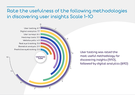
It’s the number one tool you have for optimizing your UX.
A study by User Fountain backs this up:
Source: UX Matters
Usability tests are often done near the middle or end of app development, usually with a prototype or minimum viable product (MVP).
But they can also be done during the wireframing stage. In fact, this is one of the best times to do it since you can quickly incorporate user feedback before you code.
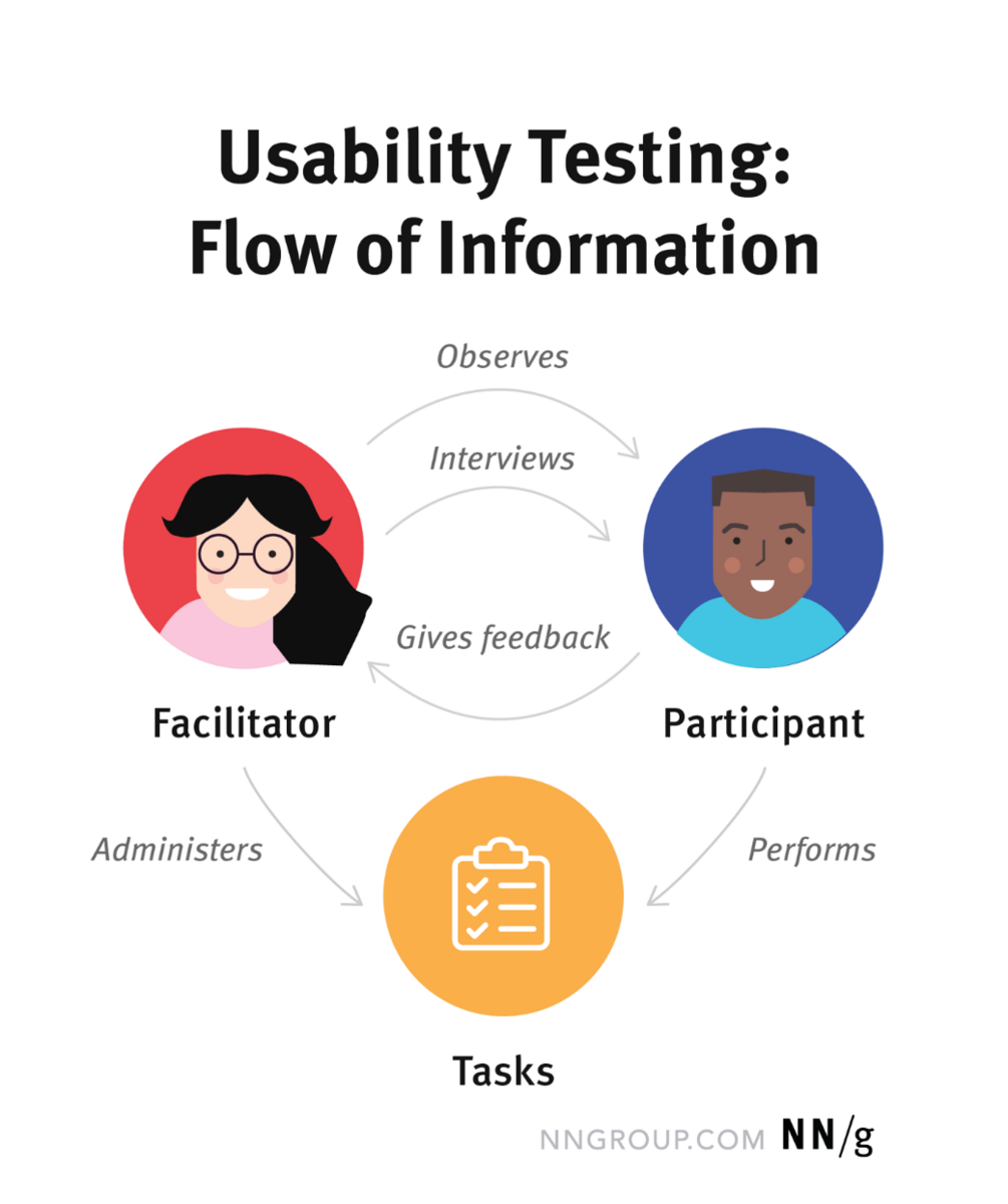
Here’s what a typical usability test process looks like:
Source: Nielsen Norman Group
You’ll notice there are three components of a usability test.
The first is the participant or the person who will do the test. For the best results, they need to be an existing user of your app or a similar one.
If this isn’t possible, you can get someone that shares the same persona (such as goals, pain points, and user journey) as the end-user.
For instance, if you’re testing a keto dieting app, you could recruit current users of a competing app.
Alternatively, you can also get people who already do the diet but haven’t used any keto apps yet.
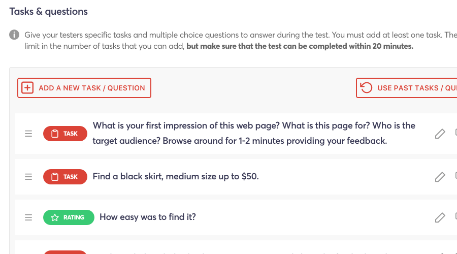
The next component is the task. These are the actions, goals, or scenarios designed to evaluate an aspect of the app.
Source: UserFeel
For instance, if you want to test an e-commerce app’s checkout flow, a task might state: “Please buy Product X from the app using a credit card as a mode of payment.”
The last component is the facilitator. Their biggest responsibility is to guide participants throughout the testing session without influencing their decisions or behavior.
Some tests don’t have a facilitator—in this case, a website or app can guide the participant instead.
That’s usability testing in a nutshell. Now that you know the what, let’s discuss the why.
The objectives of a usability test
Like any software testing approach, you should always start your usability test with a clear objective in mind.
In other words, what do you want to evaluate? Is it the UX of the user interface? Or do you want to determine if your app’s features are a good fit for the market?
What are the exact results you’re seeking?
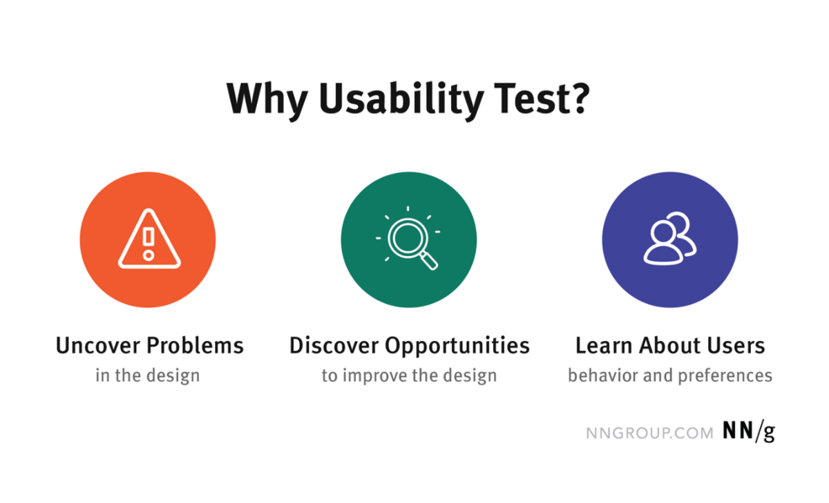
Generally, your objectives will be a variation of any of these three primary uses of usability testing:
Source: Nielsen Norman Group
However, these are best used only as starting points because they’re too generic. An objective of “I want to uncover problems in the design” is bound to get you general feedback.
You need something more specific.
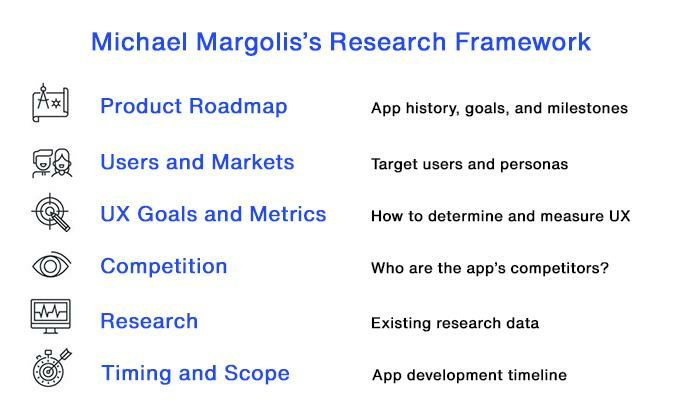
To help you out, you can implement the method used by Michael Margolis of Google Ventures.
Source: DECODE
It works like a checklist for going through the major aspects of your app’s development.
For each section, you can ask questions to clarify what your team already knows and what they don’t. That gap gives you insights to form your test objectives.
For instance, you can look at the product roadmap and ask questions regarding the app’s development history.
You might then discover that a specific feature was designed based on a hunch. What you don’t know is if this hunch is correct.
Thus, you can create usability test cases to evaluate this specific feature.
Nailing a specific objective helps you prioritize which items you want to test, as well as the correct metrics to measure them. This will end up saving you time and effort.
Benefits of mobile app usability testing
The biggest benefit of usability testing is that it can reduce your costs. You can catch UX mistakes early, saving you costly revisions later in the process.
Indeed, the earlier you do usability testing, the bigger the savings.
Jakob Nielsen, who is called the guru of Web page usability by the New York Times, revealed that it’s 100 times cheaper to fix issues before writing a single line of code.
He further adds that:
Source: Nielsen Norman Group
Usability testing is also crucial to raise your retention rates. It allows you to understand your target users’ behavior, wants, and needs.
This gives you the insight to revise your app to better fit into that profile.
The result? You deliver better UX, and users end up happier and sticking to your app for longer.
Having fresh perspectives is important in app development, and that is what usability testing can provide.
The problem with internal teams is that they’re too close to the problem. In time, they tend to develop biases that make it difficult to evaluate your app objectively.
Testing with someone with zero previous experience and knowledge of your app can offer the most honest feedback that you can get.
They can also uncover issues that might not be obvious to you.
Different app usability testing methods
Usability testing comes in many forms, each suitable for a specific app or scenario. But before we discuss the types, let’s first delve into the considerations behind each.
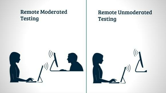
First, usability testing can either be moderated or unmoderated.
Source: Monika Adarsh | Medium
A moderated test involves a facilitator guiding the participant throughout the session. They are also there to ask follow-up questions or offer further clarification.
As such, moderated tests tend to produce the most in-depth feedback. But they’re also expensive and time-consuming.
An unmoderated test is when participants are free to complete the tasks themselves without supervision. It’s useful for capturing a user’s natural behavior while interacting with your app.
It’s also cheap and can be scaled easily, but your insights don’t tend to be as in-depth.
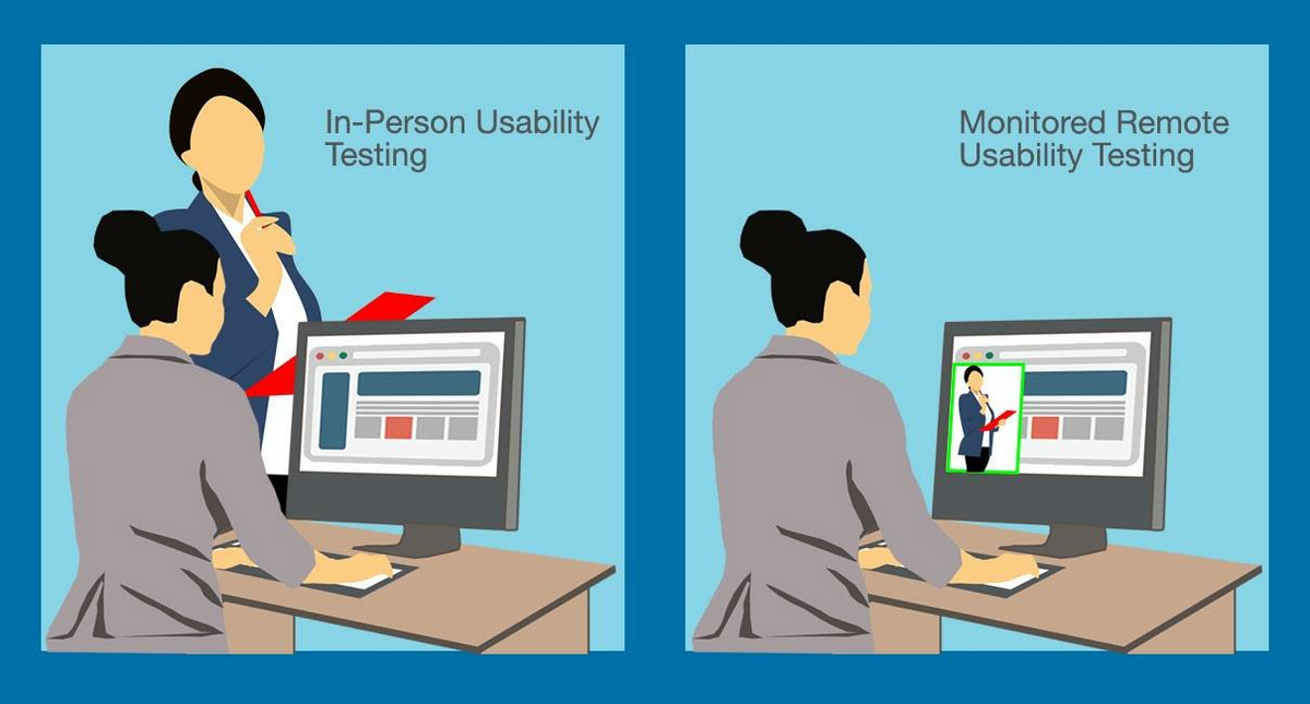
Testing can also be done remotely or in person.
Conducting remote tests is the cheaper and more flexible option—thus, it’s far easier to convince participants to join. In-person tests are generally harder and more expensive to organize. However, it does give you insights into certain non-verbal clues that you can’t get with a virtual session.
Source: SiteTuners
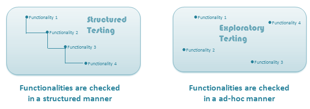
Lastly, you can also conduct scripted or exploratory testing
Scripted testing tells the participant what they should do step-by-step. The advantage is that the process is consistent and repeatable. That is useful for evaluating a specific feature or flow.
On the other hand, exploratory testing gives users the freedom to interact with the app. This allows them to discover bugs and unexpected gaps in your UX.
You can also observe a user’s natural behavior.
Source: H2K Infosys
When you combine all of these factors in different ways, you get various usability test types. Let’s look at some examples.
Lab usability testing is a moderated test conducted in person with carefully selected participants.
It offers developers the best control over the process, making it great for minimizing bias. It’s also ideal for standardized tests since the testing environment is repeatable.
The main drawback of lab testing is that it’s expensive and time-consuming to do at scale.
Thus, you can test only a small subset of your target audience. In some cases, this may not be enough to draw useful conclusions.
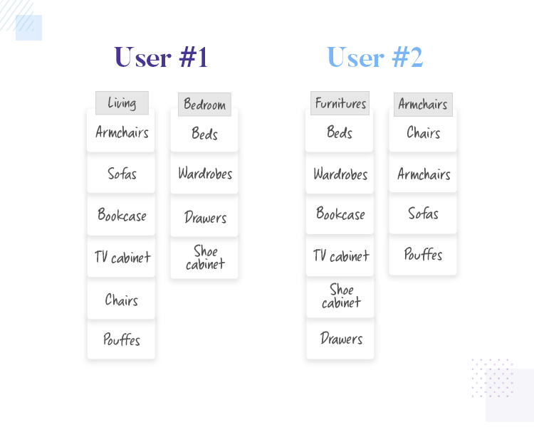
Next, card sorting is a moderated approach used to test an app’s navigation and information architecture.
Here, participants must categorize virtual or physical cards representing items in your app, such as screens or menu options.
Card sorting aims to see how different users would organize information. That gives developers insights into how to arrange that in the app that would make sense for the user.
However, card sorting is limited in use due to its narrow scope.
Source: Just in Mind
Guerilla testing is also another form of moderated, in-person testing. But the difference here is that participants are selected randomly.
This type of testing allows you to rapidly evaluate your app against a large number of people from diverse backgrounds. It can give you fresh insights from different perspectives.
That said, guerilla testing isn’t suitable for every app. If you cater to a specific group or niche, this type of shotgun testing is ineffective and can lead to misleading results.
These are just some examples of usability test approaches you can try out. Of course, you can always experiment with different methodologies and see which suits your app best.
Steps to take for successful mobile app usability testing
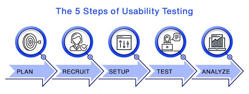
A typical usability testing can be divided into five steps:
Source: DECODE
The first and most important step is to plan the test. This is where you need to determine your test objective and the metrics to measure them with.
This will inform you on how to design your test, including the best approach to use.
It also helps you uncover any financial and logistical problems early to ensure a smooth process during test day.
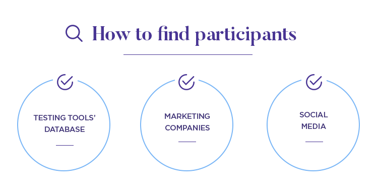
The next step is to recruit participants. Here, you have a few options depending on your budget, time constraints, and testing goals.
If you have the budget, the easiest approach is to outsource recruitment to marketing companies or research agencies.
While expensive, it allows you to get quality and relevant participants with minimal effort.
Alternatively, you can also recruit people yourself. Note that you might have to give an incentive to get people to join.
For instance, you can offer a free subscription or in-app discounts for testers.
Source: Just in Mind
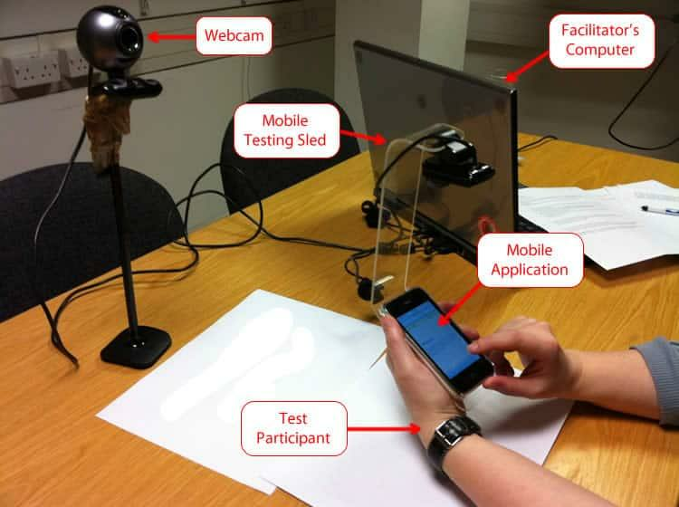
The next step is to set up the test environment. This ensures that everything the participant needs to complete the test will be ready, thus ensuring a smooth session.
It also guarantees that your environment is controlled so that it won’t influence test results.
For the typical usability testing session, you’ll need a device with the app pre-installed. Don’t forget checklists, test cases, manuals, and other relevant documentation.
Also, set up the necessary equipment if you’re doing remote testing or want to record the session.
Source: Usability Geek
With everything ready, it’s time to conduct the test. It’s a straightforward step – users follow a test script, and you record their observations.
It’s best to encourage participants to think out loud while they’re using the app. That allows you to uncover their mental patterns and behavior much more effectively.
The last step is to analyze the test results. Sometimes, these will be much more direct, such as when participants give written feedback. Mostly, however, you need to extract insights yourself.
For instance, if you’re watching a video recording of a participant using the app, you can look for clues. Were they visibly frustrated with a particular section?
Did they take too long to complete a certain task? That might indicate friction in your app.
Once you have some feedback, compare them with other participants’ results. Are there common complaints? That should be a good place to start.
Other types of software testing to consider
Usability testing might be an effective testing methodology, but you won’t survive solely with it.
The most successful apps need to go through numerous rigorous testing methodologies to become ready for launch.
In fact, if an app fails, you can probably attribute that to poor or insufficient testing.

