
Mobile app design process: how to design a great app
We will teach you all about mobile app design process to achieve a great mobile app design.
“If a picture is worth 1,0000 words, a prototype is worth 1,000 meetings.”
These are the words of David and Tom Kelley, the founders of the design consultancy firm IDEO. And they encapsulate the benefits of app prototyping perfectly.
Prototyping helps you uncover issues and discover opportunities for improvement.
It gets all stakeholders and end users involved, so you receive as many insights from as many perspectives as possible.
Assuming, of course, that you do it right.
Unfortunately, there are many ways to get prototyping wrong. Here are some of the most common ones.
Creating a prototype just for the sake of it is, perhaps, the top mistake most developers make.
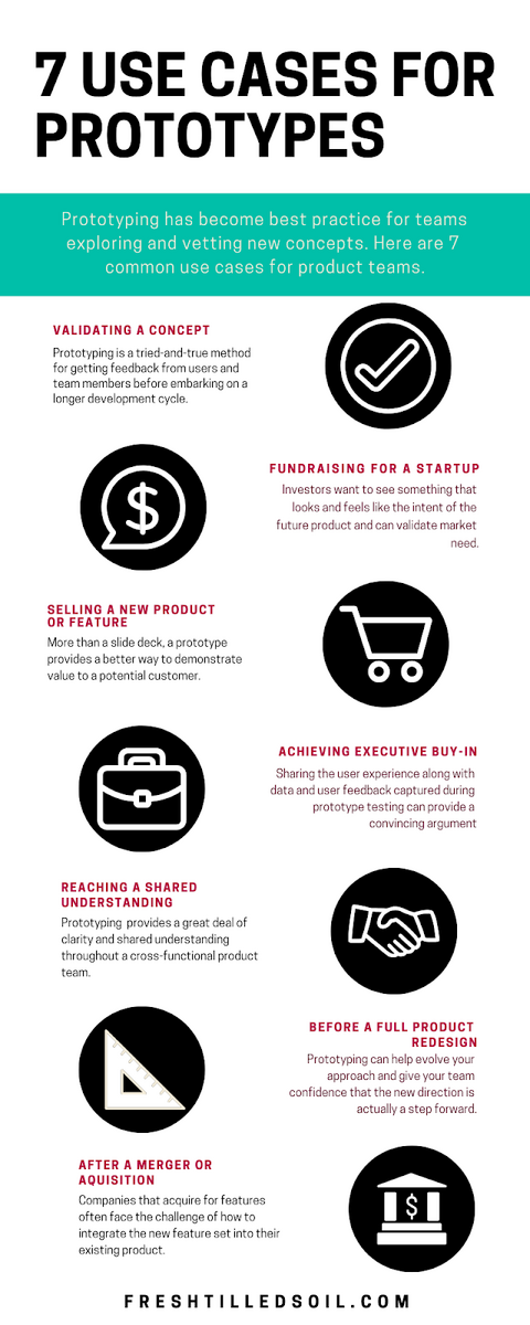
Just like your final app, you need to identify the purpose of your prototype.
Why do you need it? Is it to evaluate your app’s UX? Or do you want to test only a specific feature or aspect?
To give you an idea, here are some typical reasons for prototyping:
Source: Medium
Figuring out your prototype’s goal is crucial because it allows you to focus only on the tasks that will achieve it.
Not only can it save a lot of time and effort, but you can also develop your prototype much faster.
For example, suppose you want your prototype to test only the app navigation scheme. In that case, your designers won’t need to work as much on the UI.
But if you plan to attract more investors with your prototype, it needs to look as polished as possible.
It pays to start with a SMART goal for your prototype. SMART is an acronym, and it stands for Specific, Measurable, Achievable, Relevant, and Time-bound.
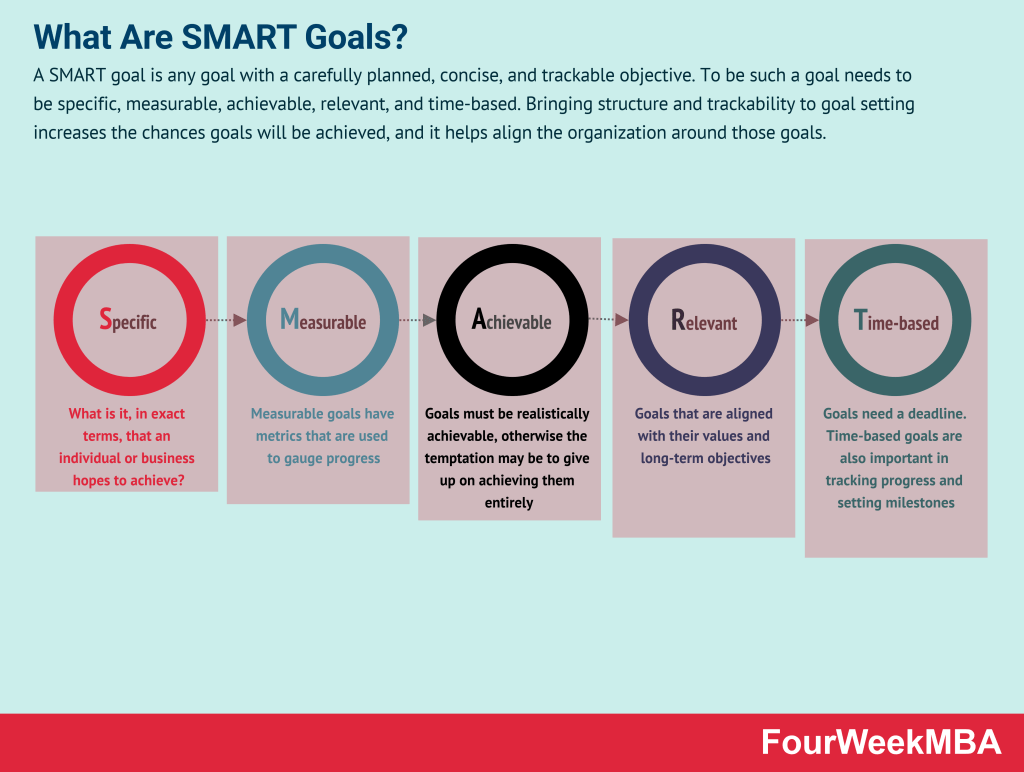
Source: FourWeekMBA
Using SMART goals is a great way to ensure that your prototype’s purpose, audience, and timeline are clear.
For example, let’s say you want to use your prototype to raise funds for your delivery service app. A smart goal might be the following:
“I want to raise $100,000 with a Kickstarter campaign by December 2022. To do this, I need to create a prototype that showcases the convenience and user-friendliness of my app.”
With this statement, you already have an idea of the work ahead.
Since you’re targeting individual investors on Kickstarter, you want the prototype to be as polished as possible. Thus, your designers need to work on the visual aesthetics and UX.
Also, you already have a deadline, so you can easily create a timetable to hit it. And because you have a specific goal ($100,000), you know which metrics you need to track.
The bottom line is that you need your goals to be your primary focus. They will drive every decision you make for your prototype.
Defining your prototype’s purpose is just the beginning. Next, you must craft a clear plan on how to achieve it.
A design plan defines the visual assets you need to create for the prototype and in which order.
It’s often in the form of a checklist that your design team can tick off as they complete each deliverable.
Planning is important because it helps keep your design team on track.
Without it, your designers might spend too much time on a minor element, diverting their attention from more important matters.
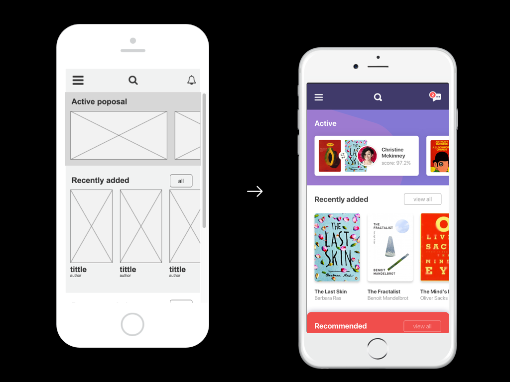
The best place to start your prototype design plan is with a wireframe. This is a sketch or low-resolution outline of your app screens.
Simple shapes like squares and circles serve as placeholders to indicate where UI elements should be.
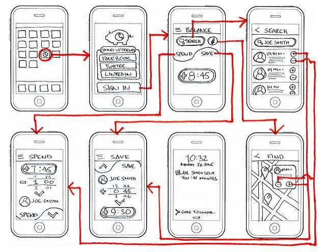
Source: Icons8
The benefit of a wireframe is that it tells you exactly what screens and assets you need for your prototype.
This enables everyone to plan ahead and give a reasonable estimated time for their completion.
In the above example, you can see that the wireframe includes a map screen.
Your development team might tell you that this will take more time than expected to implement in your prototype.
Thus, you can safely adjust your timeline to compensate.
Once you have a finalized wireframe, you can derive a list of graphic assets and tasks needed to bring it to fruition.
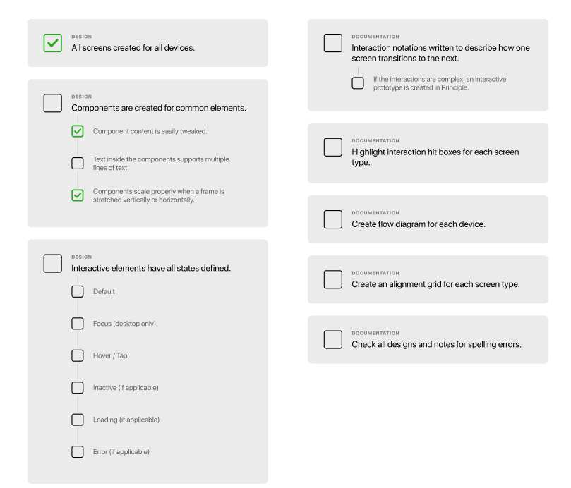
Source: Figma
A design plan is a tool that, surprisingly, not many development teams use.
But by clearly defining the design requirements of your prototype, you have a big chance of accomplishing it on time and within budget.
Fidelity refers to the level of detail in the prototype.
Lower fidelity prototypes will use simple lines and shapes with zero graphics and colors.
In contrast, a higher fidelity prototype contains everything you’ll find in the final app, including icons, images, and animations.
The difference between fidelities is stark when you look at them side-by-side.
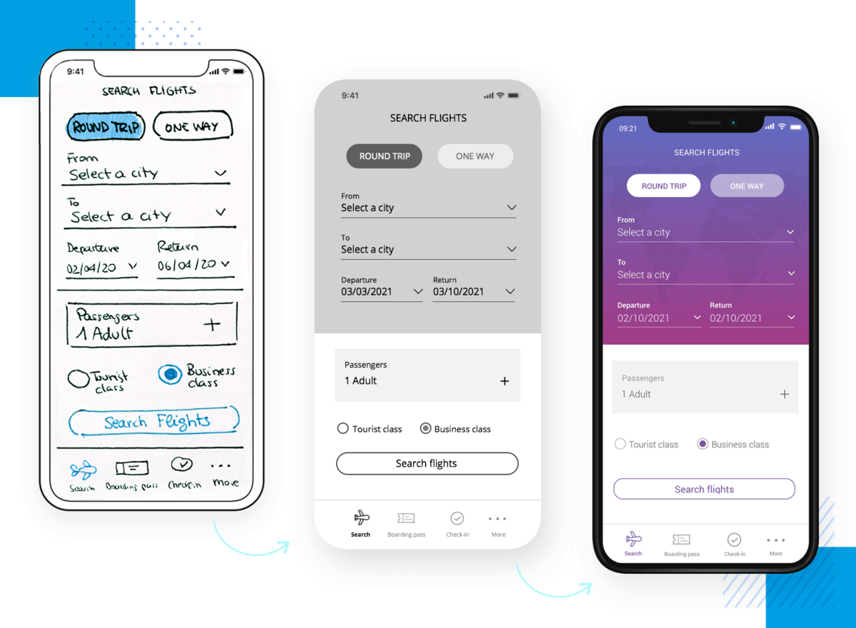
Source: Justinmind
A common mistake is to use low-fidelity when high-fidelity would be more suitable, and vice versa. This can lead to wasted time and effort. Plus, the prototype can take too long to develop.
So, when do you use each?
Low-fidelity prototypes are best used as an internal validation tool. Thus, you’ll often see them during the earlier stages of development.
They’re great for testing functionalities, UI ideas, and navigation schemes before presenting them to the public. They’re also great for keeping stakeholders and clients in the loop.
One of the best characteristics of a low-fidelity prototype is that they’re easy to create since they use minimal design.
Thus, it’s your best option if you want to have your prototype as quickly as possible.
Plus, if you’re planning to build a high-fidelity prototype down the line, starting with low fidelity isn’t such a bad idea.
Source: Medium
A high-fidelity prototype is great as an external validation tool.
That means it’s intended for showing to people outside your development team, such as end users and prospective investors.
This is because these people usually aren’t design-savvy enough to judge a low-fidelity prototype properly. They need the experience to be as close to the final app as possible.
Because of this, high-fidelity prototypes are also preferred for usability testing. They can also evaluate advanced functionalities, animations, gestures, and complex UI elements.
One common tendency among designers is to get carried away with their work and design too many elements with too many details.
Unfortunately, this habit can make the prototype unnecessarily complex. Not to mention it eats up too much time and effort.
Remember, a prototype’s main goal is to gather feedback and suggestions from people. If it’s too cluttered, it becomes difficult to revise rapidly.
You’ve lost your prototype’s biggest advantage.
Indeed, what you’re designing might not even be what the user needs.
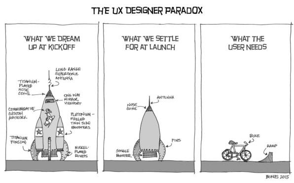
Source: Fast Company
But if you and your team tend to overdesign, don’t beat yourself (or them) up for it. It’s a natural human tendency to get absorbed in design work.
Plus, it’s easy to drag and drop multiple UI elements in most prototyping tools, so the temptation is there.
The best way to avoid this is to have a plan and stick to it. This is where having a clear goal and design plan for your prototype is vital.
It’s also a good idea to have regular design review sessions with the team to ensure everyone follows the plan.
This allows you to spot designs that are deviating, so you can correct them early.
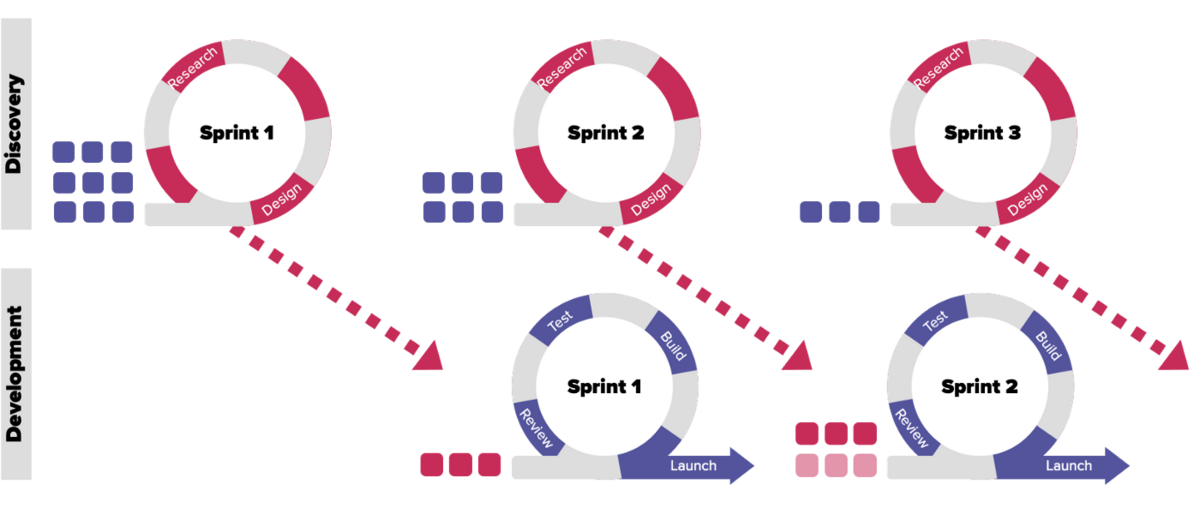
You can do this with a dual-track Agile methodology, where design and development processes run in tandem.
Source: Iryna Draguntseva
Of course, we’re not saying that you shouldn’t be adaptable. If you find a better design approach or element, by all means, go with it. But there must be a purpose and team consensus behind it.
When designing a prototype, you shouldn’t forget UX principles. Otherwise, you may create something that is difficult for a non-technical audience to navigate.
Of course, this presents a dilemma because not all elements in a prototype are interactive. So, how would a user know which ones to interact with?
An obvious approach is to label them with tooltips. You can create what’s similar to an interactive tour, where you guide the user through the prototype with contextual hints.
You can even explain non-interactive elements to give them an idea of what to expect in the final app.
Source: Toptal
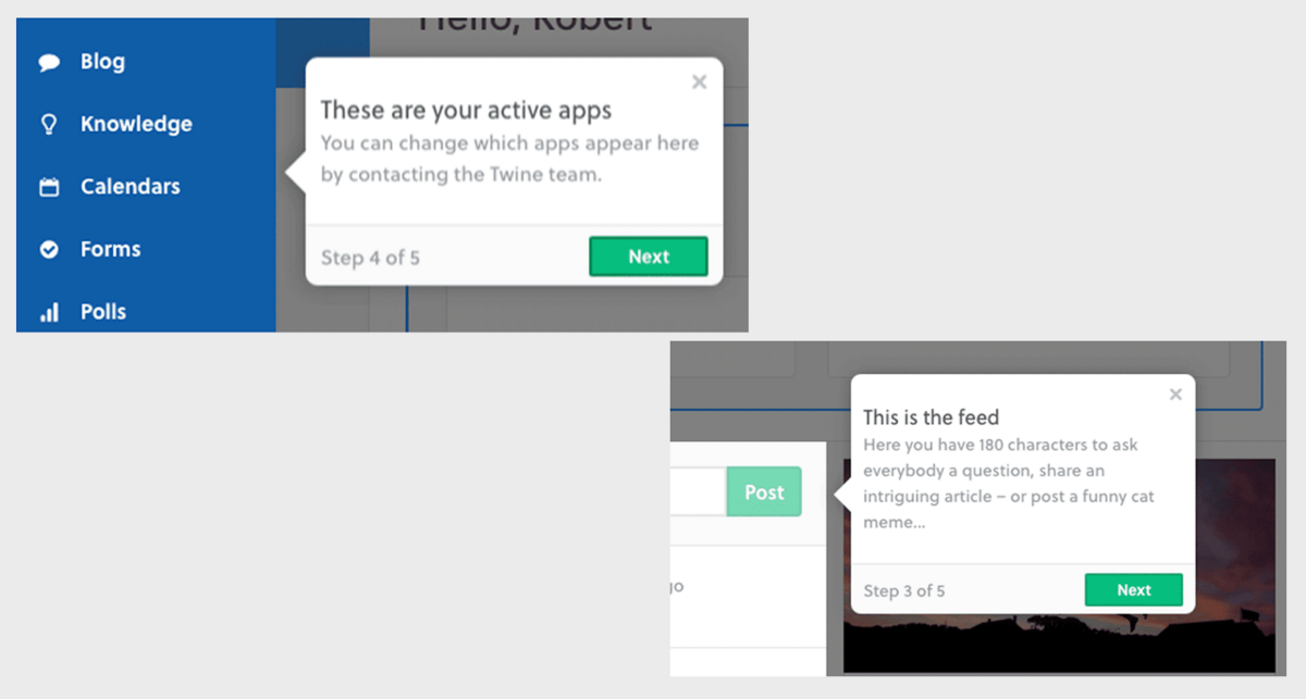
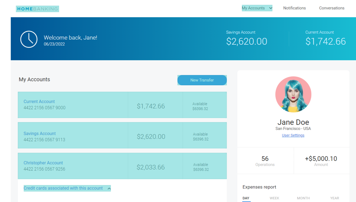
But a more elegant solution is to highlight active elements.
One example is the banking UI prototype from Justinmind. Here, they placed a blue box over clickable elements.
It’s a subtle way of guiding users throughout the app without overcrowding the interface with too many instructions.
Source: Justinmind
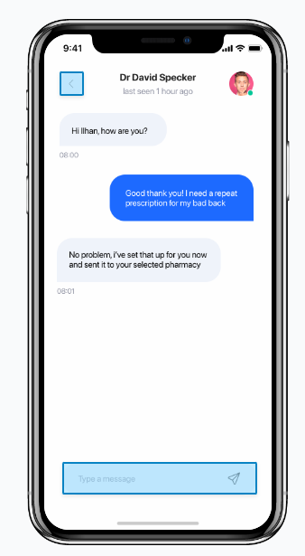
Another good approach to make your prototype less complicated for users is to simulate certain interactions. This is useful for substituting human input in a prototype.
For instance, this doctor booking app prototype simulates a chat function through scripted messages.
These are generated when the user taps on the text box. That way, the user still gets a feel for how the app will function.
Source: Marvel App
The bottom line is that you should try to make your prototype as simple as possible for users.
If a certain amount of complexity can’t be avoided, the next best thing is to guide them through subtle visual hints.
As designers, it’s natural to feel attached to your work. In most cases, that’s fine. But not in a prototype.
Remember that a prototype is a validation and feedback tool. By this definition, it’s going to change frequently and rapidly.
There’s a big chance your initial prototype design won’t make it to the final app.
The folks at Invision summed this concept up when they said:
“Think of a rapid prototype as a disposable artifact.”
The danger of attachment to your idea is that you become resistant to change. You’ll become biased when accepting feedback—even if it would improve your prototype.
In other words, emotional attachment will limit your app’s potential.
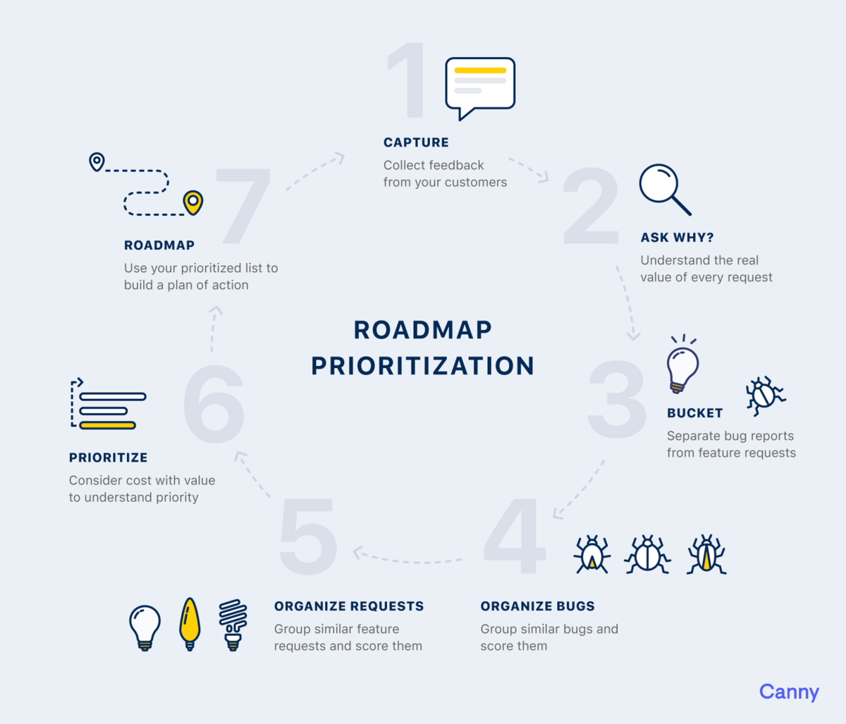
To avoid this, try to be objective when encountering criticisms of your prototype. And the best way is through the 5 Whys technique.
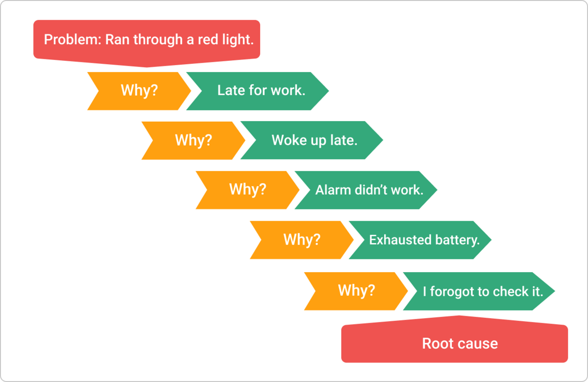
Source: Kanbanize
The framework is pretty straightforward—when someone sends you feedback, you simply ask “why?”, then get their answer.
Then, ask for reasoning for that response. Repeat this process five times or until you get to the root of the issue.
The advantage of asking why is understanding where the person is coming from. Maybe they had a different perspective that allowed them to spot something in your prototype that you didn’t.
At the very least, asking why will allow you to separate useful feedback from shallow ones.
As we mentioned above, a prototype will sometimes fail. And that’s preferable since it’s through these failures that you get to refine and improve your app.
Admittedly, it’s difficult not to take these failures personally. Many designers get discouraged when their prototype or design gets rejected. As a result, it could affect their work.
If you or your designer has this kind of thinking, the first step is to realize that it’s not your fault. Rejection is a perfectly valid human emotion.
Once you’re aware of this, the next step is to adopt a fail-forward mindset.
This means that you accept failure as necessary for success—just as it is in reality.
Software development, in general, is an iterative process where you repeatedly build upon previous failures to create the best version of your app.
Source: Canny
What’s important is to look at failure with a critical and objective eye. Because there will always be opportunities for you to improve and refine your app idea—you simply need to look for them.
We hope you’ve committed these common mistakes to memory, so you can avoid them when developing your app prototype.
The bottom line is that prototyping is hard—but that shouldn’t discourage you! There are plenty of ways to overcome that difficulty.
The best approach is to partner with an agency like DECODE. With our experience and expertise, we believe we’re the best fit to guide your prototype and app project forward.
Interested in working with us? Get in touch with us today, and let’s talk!

Petar leads Shake (DECODE’s sister company) as CEO, delivering the product to a growing number of happy, innovative clients. Day-to-day, he ensures the engineering, design, product, marketing and sales teams all work in harmony. Before moving to Shake, Petar led DECODE. Although an engineer by schooling, his natural talent soon saw him making an impact on the marketing, sales and branding side of things. Petar’s passions include architecture, skiing, sailing, and a good glass of red wine.
We will teach you all about mobile app design process to achieve a great mobile app design.

This article will explain the differences between wireframe, mockup, and prototypes. It will also explain when you should use each.

There's no easy way to achieve great UX design. This article will discuss mobile app design best practices to help you create a successful app.