
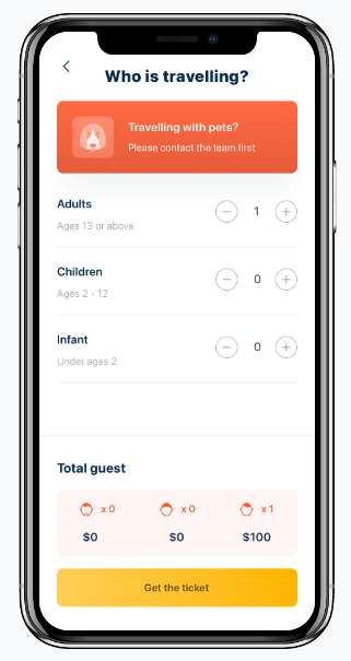
20+ mobile app wireframe examples to inspire you
Designing wireframes can be deceptively complex. To help you out and inspire you, we'll cover 20+ mobile app wireframe examples in this article.
No developer has ever come out with the perfect app right off the bat. The app must undergo a stringent series of testing, testing, and even more testing to achieve perfection.
One of the best tools for doing this is the prototype.
A prototype is an interactive mockup of your mobile app. It feels like the final version, only with limited or simulated functionality.
Running prototypes is crucial in app development because it allows you to test the flow and function of your app against real users.
This can give you the insights that enable you to further refine your app.
But as with anything else, there are a million ways to do it wrong and only a few ways to do it right. Here are a couple of those best practices.
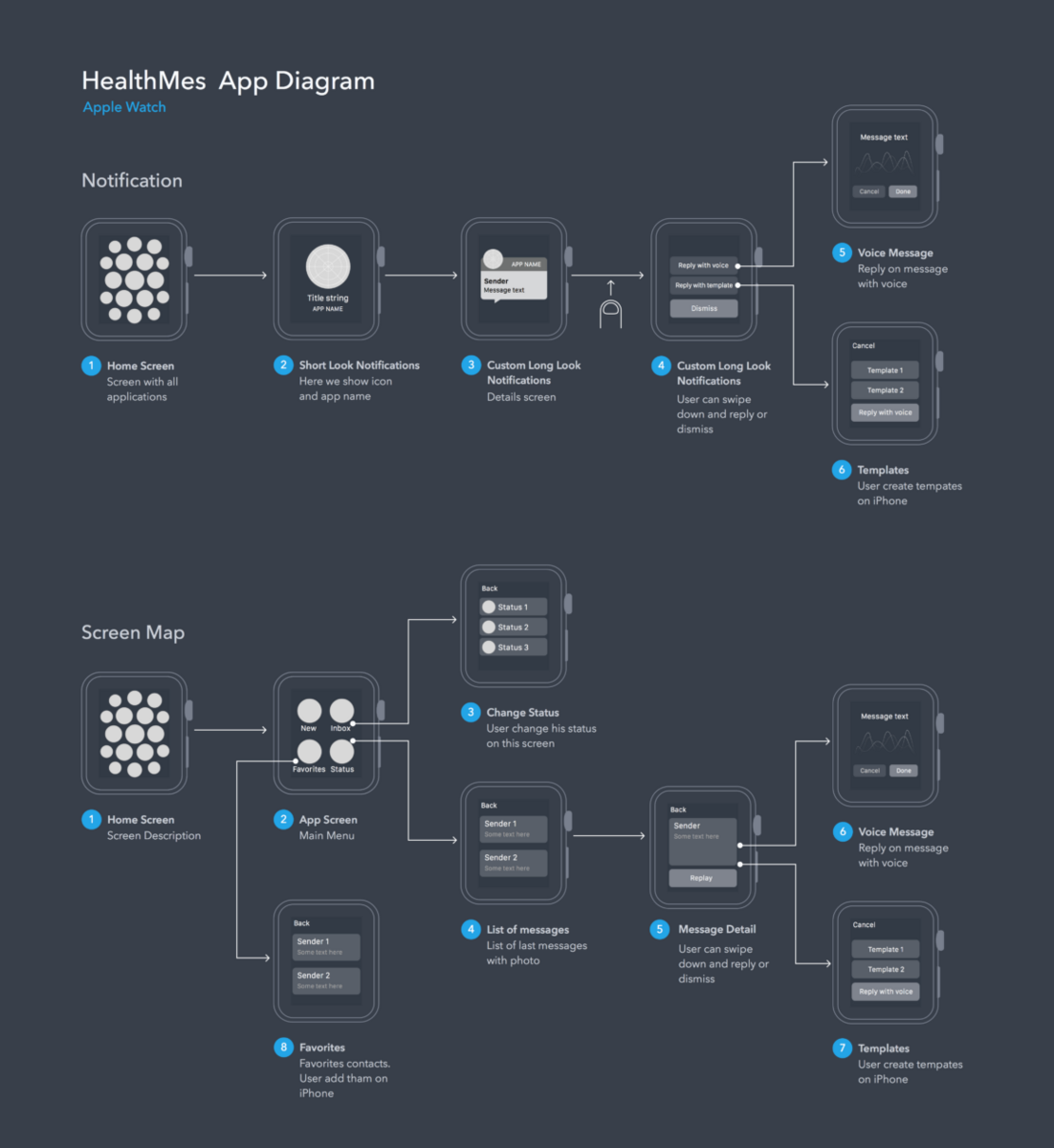
The user flow is a diagram illustrating the path users take when doing specific tasks on your app.
It documents the moment someone opens your app, then branches out depending on their actions.
Here’s an example from designer Marian Mota:
Source: Marian Mota | Dribbble
User flows are vital steps not just for prototyping but as early as the wireframing stage.
It allows you to spot problem areas and eliminate steps that might lead to friction before you even create your prototype.
You’ll also have a reasonable estimate of how many screens you need, thus helping you avoid unnecessary prototyping work.
Discovering and fixing design problems early through user flow diagrams can save you lots of time and money.
Jakob Nielsen, considered the king of usability, summed this up best in his statement:
“Ten times the impact if you discover a needed design change early, and 100 times cheaper to make the change.”
But the best user flow diagrams can’t be made in a vacuum. After all, it’s about what’s best for the user, so you need to involve them.
It’s, therefore, crucial to conduct proper market research and find their pain points, habits, and frustrations.
Then you can incorporate these insights when creating your user flow.
Remember, you might believe that your app’s flow is great, but do your users think the same?
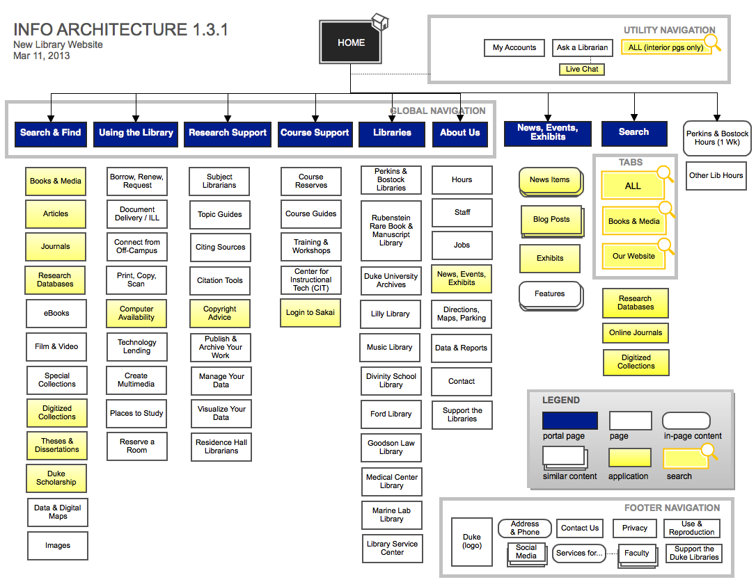
Apart from your user flow, you might also need to map out your app’s information architecture (IA). IA is a diagram that depicts how data and information are categorized in your app.
It’s especially important for apps that involve volumes of content or screens.
Here’s what a typical IA looks like:
Source: Duke University
IA works in tandem with a user flow because it helps you categorize information in a way that makes sense for the user.
It can also tell you the best hierarchy when creating your app’s navigation system.
When developing your IA, it’s worthwhile to conduct a card sorting test with your target users. Here’s how it works:
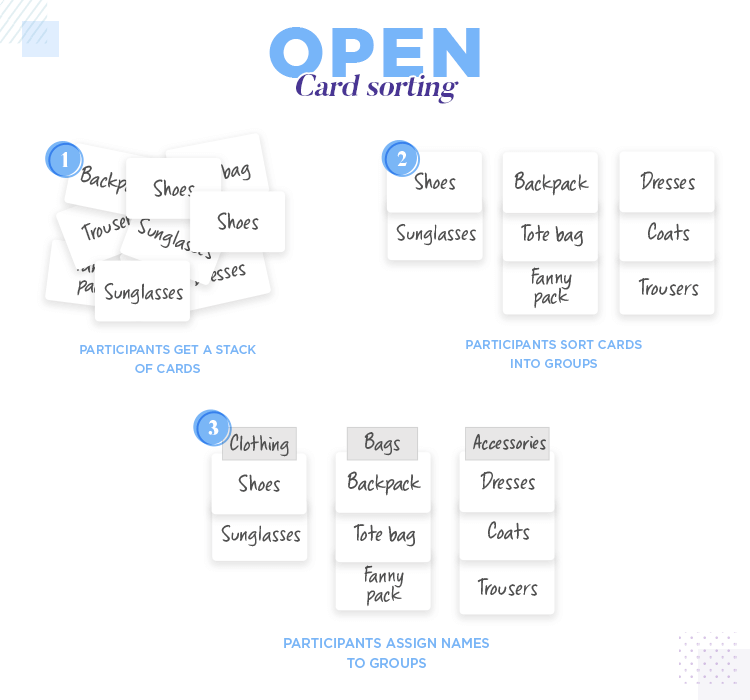
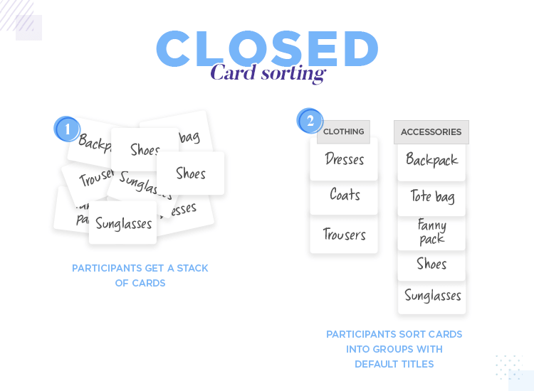
Source: Just in Mind
Card sorting is like peering into the mind of your user. You’ll know how they categorize information in their heads so that you can mimic that in your app.
And that’s the purpose of a user flow and IA diagrams. They help you look at your app from your user’s perspective, thus allowing you to design an app experience that fits that.
Many developers believe you should put as much detail into your prototype as possible since it’s the pre-final version. This can be a mistake.
True, there’s much more going on in a prototype compared to a wireframe or mockup, as this infographic shows.
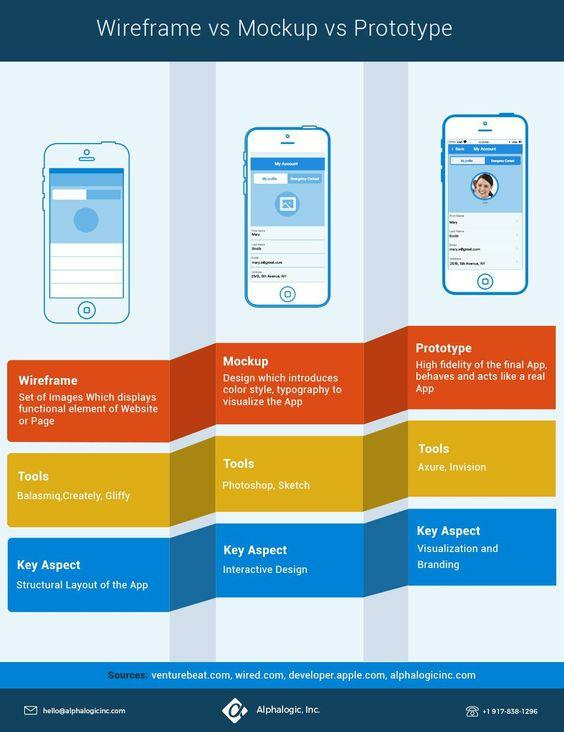
Source: Alpha Logic
However, that doesn’t mean a prototype should contain every detail and feature.
Remember that prototypes test your app’s functionality. They exist to quickly validate your app with users, get feedback, and implement changes.
This rapid iteration means your prototype must be as lightweight as possible.
The goal isn’t to make a perfect version but rather a good enough one that you can rapidly test.
To achieve this, you need to keep only the details that matter. Don’t include colors, typography, designs, and other visuals that don’t contribute to the functionality of your app.
These will only distract the user.
Instead, to test the visuals and aesthetics of your app, you’ll want to do a mockup instead. You can check our app mockup primer here.
Source: Speckyboy
So, how do you achieve the ideal detail level for prototypes?
First, use colors only when it serves a function, such as highlighting key elements or indicating a state change. If possible, use a monochrome (black and white) color scheme.
As an example, we have a screenshot below from a banking website prototype from Just in Mind.
Notice how colors are used sparingly and strategically in the prototype. Specifically, it uses red and green to depict a positive and negative amount, respectively.
Blue is also used to highlight clickable links and buttons.
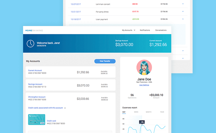
Source: User Interviews | Just in Mind
Next, remove any images and visuals unless needed to reinforce a UI element.
In the above example, a photo was used to communicate the idea that the user’s profile photo appears in the upper right corner of the screen.
Avoid fancy animations. If you need to depict certain elements moving around the screen, keep it as simple as possible.
Don’t use any effects, as they tend to be time-consuming to develop and can slow down the prototype’s performance.
Lastly, realize that you don’t need to include all features in your prototype. This bit is important—one that warrants a separate section.
Like the level of detail, you shouldn’t include every feature in your prototype. Ideally, it will only contain around 20% of the app or website’s full functionality, according to a Forbes article.
Thus, it’s best to prioritize the features to include in the prototype. What these are will depend on the specific parts of your app you want to test.
Let’s go back to our previous example from Just in Mind:
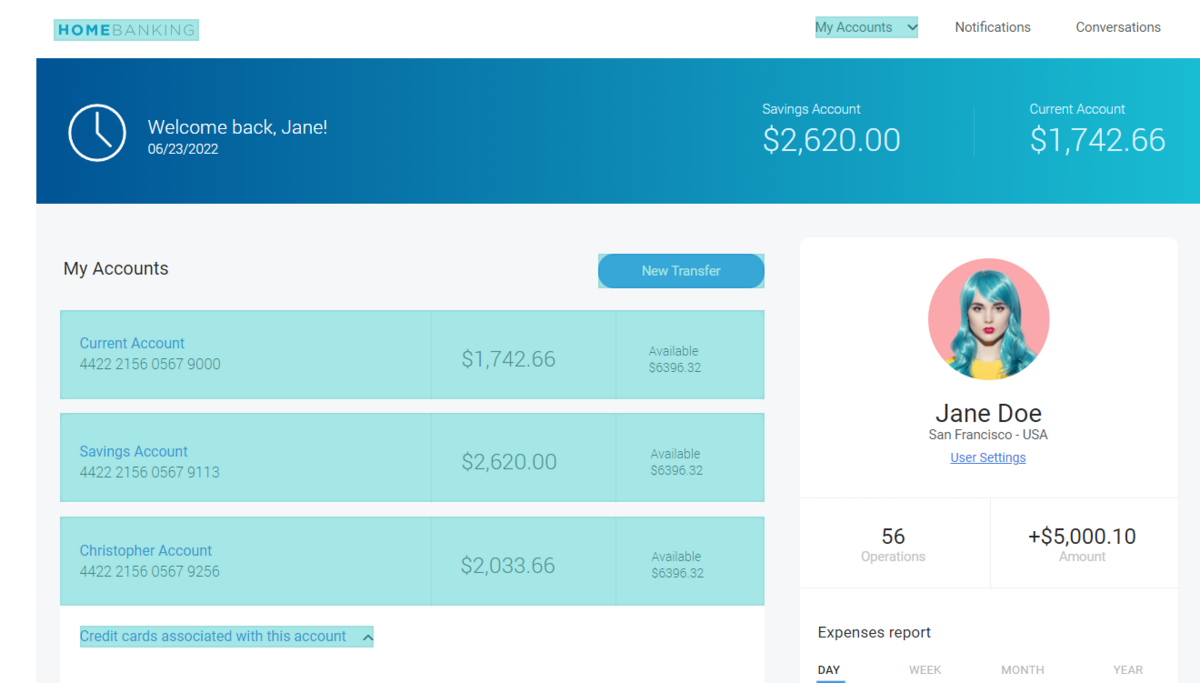
Source: Just in Mind
The areas in light blue highlights are the only clickable (working) parts of the prototype. Links, such as Notifications and User Settings, are static.
This is deliberate since these features don’t need to be tested.
If you can’t decide which features to include, a good rule of thumb is to focus on your value proposition, which is the biggest or unique benefit users can get from your app.
Focus on the features that deliver that.
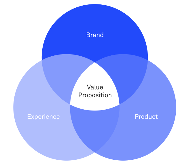
Source: DECODE
For example, if you have a ride-hailing app like Uber, your prototype should probably focus on features that allow users to book a ride.
Settings, notifications, or transaction history might be important to the end-user, but it’s not a priority for testing right now.
You should also streamline the prototyping flow by simulating certain parts.
As an example, let’s look at this doctor booking app prototype. Instead of typing in the chat feature, the user clicks on the message box to start a simulated conversation with the doctor.
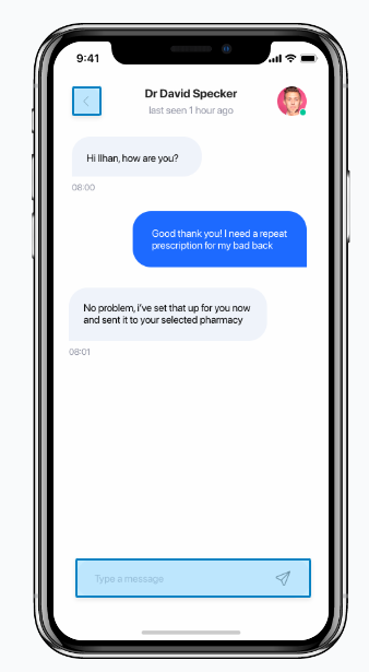
Source: Marvel App
You’ll also notice that, while you can click on any of the icons on the home screen, they all lead to the same list of doctors.
Source: Marvel App
Simulating certain features like this is an essential prototyping tactic. It helps you test the flow of the final app without having to code everything.
You save time and effort, which is what a good prototype should do.
So far, we’ve touted that less is more in prototyping. However, you shouldn’t make it too barebones that it becomes a wireframe.
In particular, you shouldn’t use placeholders in your prototype. This is where real content plays a significant role, as it gives users a better sense of the function and purpose of your app UI.
In the example below, a user will have zero idea of what the left screen is for. Only by adding real content can they piece together its purpose.
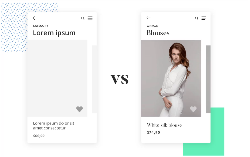
Source: Just in Mind
The real copy of the app (versus lorem ipsum dummy text) is particularly important to include. After all, dummy text can’t give instructions or direct users to elements of the prototype.
It can also confuse users about what’s happening, reducing their ability to judge your prototype properly.
Source: Marvel App
However, don’t confuse using real with actual content. The concept of using “good enough” assets also applies here.
In other words, try to write copy as it would appear in the final app, but don’t burden yourself with perfecting it. You can always tweak it later on. The most important thing is that it’s clear.
Source: dddribbble
The bottom line is that using real content can improve your prototypes’ clarity, thus allowing you to gather much more accurate feedback from users.
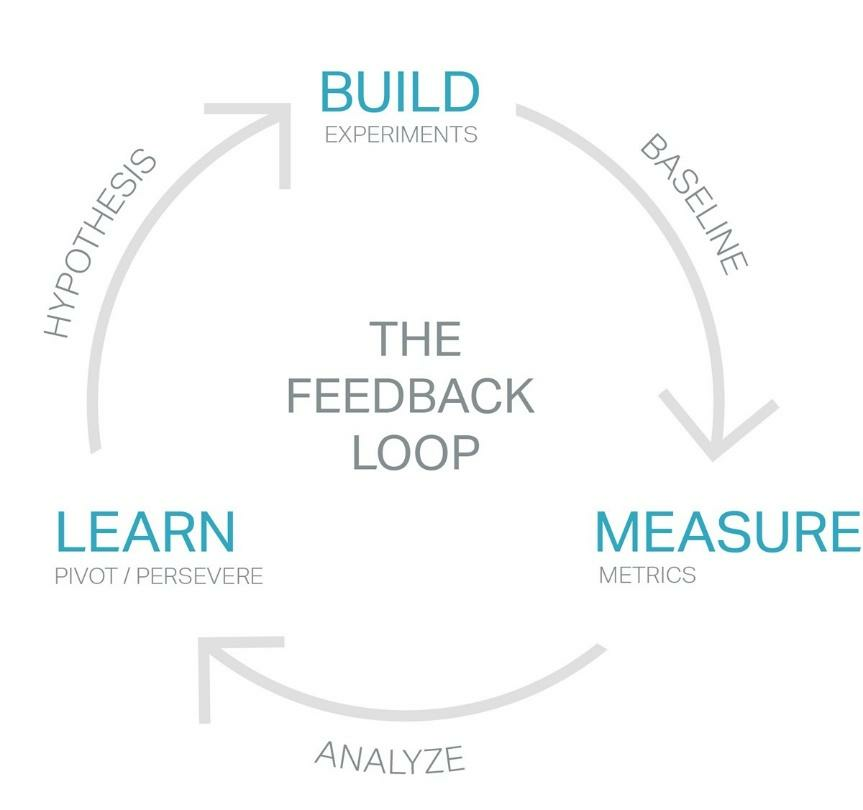
Ultimately, prototyping is all about giving your users an opportunity to express their opinions of your offer.
And if you’re not incorporating these into your app, then you’re not maximizing your prototype’s potential.
That’s why it’s crucial to keep your prototyping process as lightweight as possible.
The idea is to quickly tweak your prototype based on user feedback so you can test it again. This feedback loop repeats until you and your end users are satisfied with the final prototype.
Source: Prototypr
Like anything else, though, it can be hard to accept negative feedback, especially if you’ve dedicated quite a bit of time to your prototype. This is a natural reaction for any app developer.
The best way to overcome this is to have a be glad to fail mindset. Recognize that prototypes are impossible to be 100% error-free.
You should also view feedback and failures as blessings since it’s an opportunity to fix mistakes and make your app better.
However, that doesn’t mean you should entertain every piece of feedback you get. Making everyone happy isn’t practical.
Instead, try looking at what the majority of users are saying. Are they pointing to a common flaw? Then it might be worthwhile to fix it.
But if something frustrates only one person out of a hundred, then it might be safe to ignore unless it’s an easy fix.
In the end, feedback is just another tool to direct your decisions and it’s you and the development team who has the final say. Just ensure it’s in line with what the users want.
It’s important that you run your prototypes on the actual devices your target audience will be using. There are two main reasons for this.
One is that you can verify if your app is adjusting to the screen resolution of various devices.
This is especially important since there is a wide variety of dimensions, even within the same OS family.
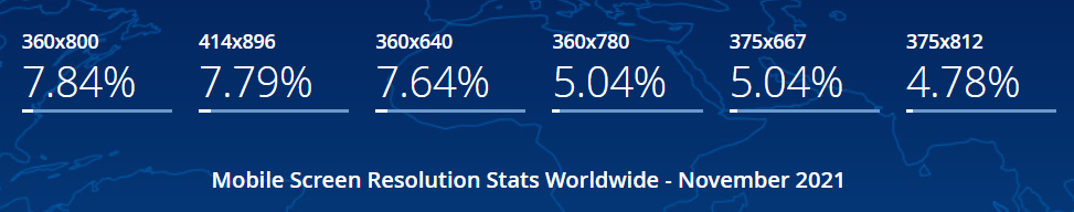
Source: Statcounter
If you don’t do this, you risk your UI layout breaking when you launch your app.
The other reason is ergonomics.
People hold their devices in various ways, affecting the areas of the UI they can comfortably reach with their thumb. You can see it as the green zones depicted in this infographic:
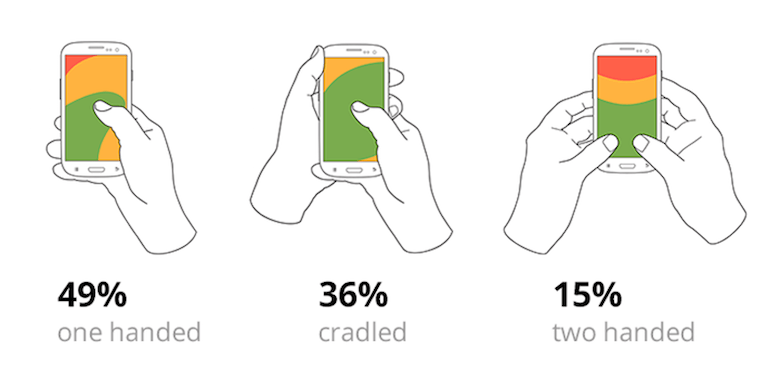
Source: Smashing Magazine
Screen sizes play a role, too. Generally, larger screens will have smaller green zones, which is why you must test your prototype on various devices.
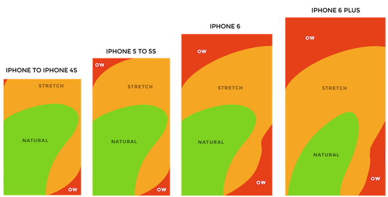
Source: Smashing Magazine
You want to design your UI such that it’s comfortable for the majority of screen sizes and grip styles. And this is something you can only test if your prototype is deployed on an actual device.
Prototyping is a fantastic tool. But it won’t be as amazing if you don’t get the foundations right first.
Because a prototype is only possible through careful planning, sketching, and wireframing.
If you didn’t do these steps beforehand, you risk having an app prototype that’s not as effective as it should be.
So our best prototyping tip is to invest the time and effort to create the best wireframes.
Want to learn how? You can read our wireframing primer here. Then, check out our list of 18 wireframe examples that will inspire you.

Mario makes every project run smoothly. A firm believer that people are DECODE’s most vital resource, he naturally grew into his former role as People Operations Manager. Now, his encyclopaedic knowledge of every DECODEr’s role, and his expertise in all things tech, enables him to guide DECODE's technical vision as CTO to make sure we're always ahead of the curve. Part engineer, and seemingly part therapist, Mario is always calm under pressure, which helps to maintain the office’s stress-free vibe. In fact, sitting and thinking is his main hobby. What’s more Zen than that?
Designing wireframes can be deceptively complex. To help you out and inspire you, we'll cover 20+ mobile app wireframe examples in this article.

This article will provide you with some tips and tricks for improving mobile app user retention.

If you’re curious about what a mobile app wireframe is and how to create one, this all-in-one wireframing guide will provide you everything you need to know.