How to design a user-friendly onboarding in fintech apps
First impressions matter, especially in the cutthroat world of fintech.
With more than 26,000 startups worldwide vying for your users’ attention, it takes more than an innovative idea and a visually stunning app to stand out.
This is where onboarding comes in. You need to engage, educate, and gain the trust of someone—all within the first few minutes.
Not an easy task at all!
So how do you design an onboarding sequence that gets this right? Here are some tips:
Table of Contents
Understand what onboarding in fintech means
Compared to other apps, onboarding serves a much more vital function in fintech. In fact, it’s fundamental to the entire user experience.
That’s because fintech onboarding involves many compliance and data gathering processes, on top of familiarizing the user with your app.
That’s a lot of responsibility to bear. And the way to succeed is to cover all the key aspects of fintech onboarding.
The most important is Know Your Customer (KYC). These are the processes you use to verify the identity of your user.
The goal is to confirm that they are who they say they are, not just an alias. It’s a key component in fighting identity theft, money laundering, and fraud.
Most fintech apps and financial institutions won’t allow users to make transactions unless they pass KYC checks. That’s because AML regulations and banking laws often require firms to do so for compliance.
Here’s an overview of this process:
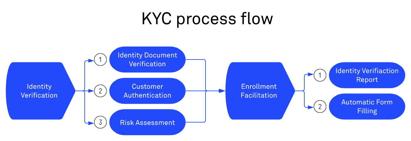
Source: DECODE
There are many ways to go through KYC, including asking for verified documents and a photo for proof.
Unfortunately, however, fraudsters are becoming more and more sophisticated in fooling KYC tests.
Hence, there are advanced techniques like Liveness Detection Technologies that can verify a photo or video’s authenticity.
Onboarding is also when you can gather a user’s information for the app to work properly.
For a banking app, for example, you’ll need to ask for the person’s bank account details to access their balance, such as with Mint:
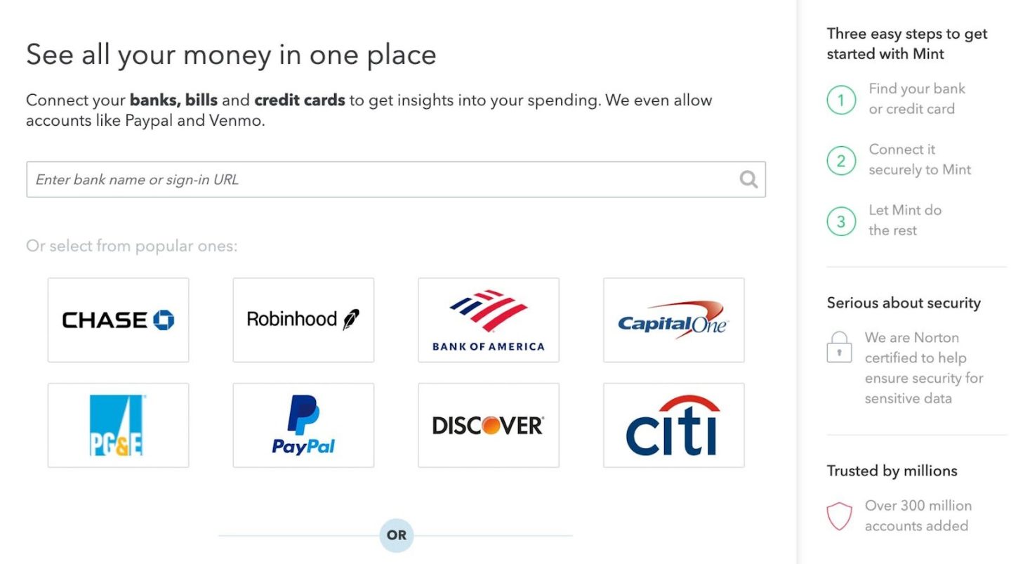
Source: User Zoom
Many fintech apps also need to gather information to give users a personalized experience. This is most apparent with investment apps like Wealthfront.
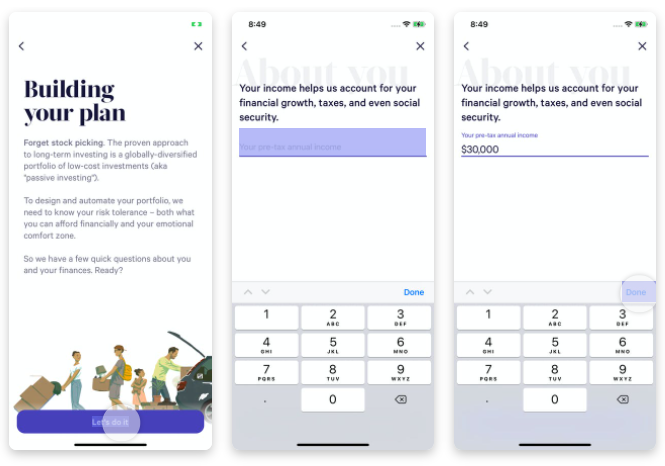
Source: Wealthfront
Before the Wealthfront app can suggest an investment plan for you, it needs relevant information like your annual income, goals, and even your age. This allows the algorithm to offer a safe recommendation based on your ideal risk tolerance.
Lastly, your onboarding should help guide people to use your app. Remember that fintech exists to make financial services much more accessible.
Part of that is simplifying these processes to everyday users.
There are many approaches to this, depending on the nature of your fintech app. A benefits-oriented onboarding process, for example, puts the main upsides of using the app front and center.
On the other hand, a progressive onboarding approach walks your users through the app.
If you’d like to learn more about the best ways to onboard your users, you can check our excellent app onboarding guide here.
Understand the importance of good user onboarding
Knowing what onboarding entails is one thing. But to give your full commitment to the process, you need to understand the why behind it.
Generally speaking, onboarding is a crucial tactic to keep your retention rates up.
And with today’s saturated market, it’s getting harder and harder to do this with your app competing against a sea of choices.
The sad truth is that close to 80% of users will uninstall an app. And only 32% of users will ever use it more than ten times.
Reasons can vary from confusion to disinterest, but the common denominator is always the loss of engagement.
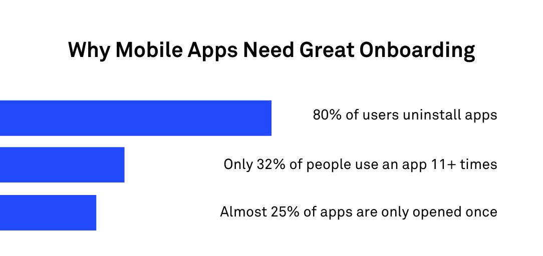
Source: DECODE
Interestingly, fintech has higher retention averages than most apps, according to the recent Global App Trends Report. In general, 12% of fintech app users returned after a month of usage, compared to just 8% in other app categories.
While that’s beneficial for you as you try to make a name for yourself in that niche, you should also be aware of the flip side of this statistic: it means that many fintech apps are really good at their retention and onboarding strategies.
So if you want a chance, you should up your game as well.
But more than just keeping your numbers up, you should invest in proper onboarding for the sake of your users. That’s because it’s vital for a safe experience.
Processes like KYC are not only for compliance but also for keeping your users safe from fraud.
On top of that, onboarding allows them to set up biometrics, two-factor authentication, security questions, and other security protocols to help protect their data.
Be careful, however. There’s also such a thing as too much onboarding.
If the process is too long, it can bore users and lead them to drop out entirely. At best, an extended process can add unnecessary expense to your app development.
The key is to minimize the time it takes for the user to learn your app.
But the bottom line is this: the most important reason to have a proper onboarding process is to gain your user’s trust. This is perhaps the most important factor in the success of any fintech app.
We’ll discuss why in the next section.
Establish trust right away
Onboarding with your fintech app is just like dating, according to the folks at Invision. When users first launch your app, you only have less than a minute to get them hooked in.
That means not only engaging them but gaining their trust as well.
Unfortunately, trust is still a big hurdle with fintech. According to a McKinsey study, only 27% of US users trust a fintech service over a traditional bank.
To be fair, trust in big financial institutions is roughly the same (around 30%). Nevertheless, the issue here is the low number itself, and not the comparison between the two.
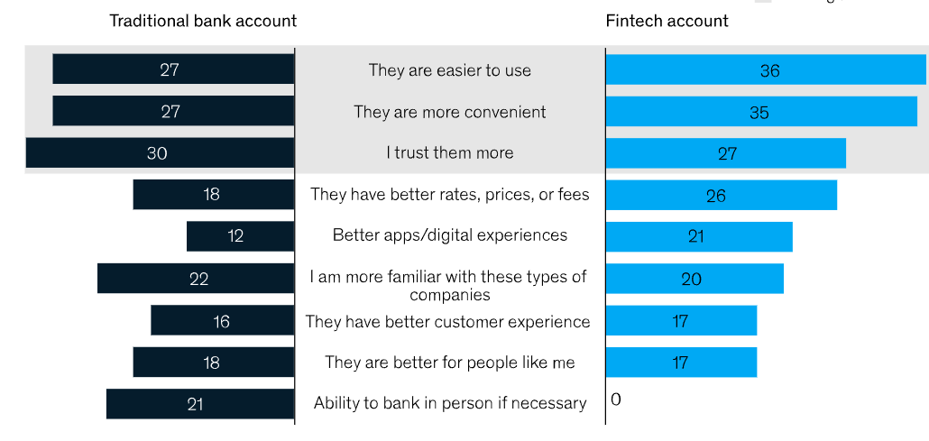
Source: McKinsey
Trust is important when you want to ask users to do something. That should go without saying.
After all, imagine if you just met someone, and the first thing they ask is your credit card details. Would you give it? Of course not. You need to trust that person first.
It’s pretty much the same with your users. The greater the request (like asking for sensitive information), the more trust is required.
So, how do you establish trust with your user?
The best way is to be as transparent to your user as possible. That means explaining to them why you need each piece of information and how giving it to you benefits them.
There’s also another psychological reason behind this, as Robert Cialdini explains in his popular book Influence:
“A well-known principle of human behavior says that when we ask someone to do us a favor, we will be more successful if we provide a reason. People simply like to have reasons for what they do.”
The MoneyCoach app applies this advice quite well. While it does ask a fair amount of personal questions, it gives a very good reason for each request. And it’s always to the benefit of the user.
Take a look:
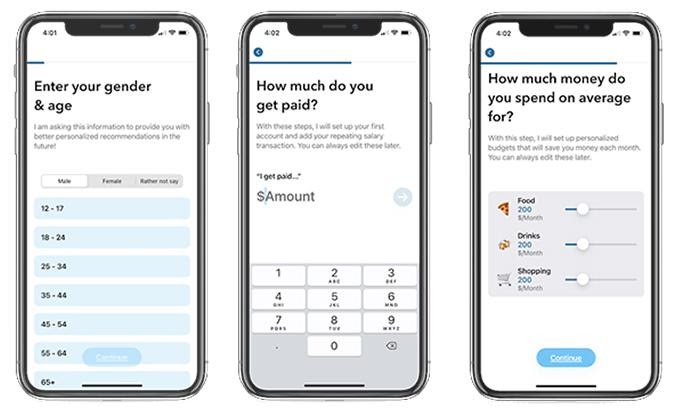
Source: Telerik
Another example is the Chase app. The recent iOS update requires apps to expressly ask users permission to track them or use their location. It’s making people nervous, but Chase explains the reason behind it to allay those fears.
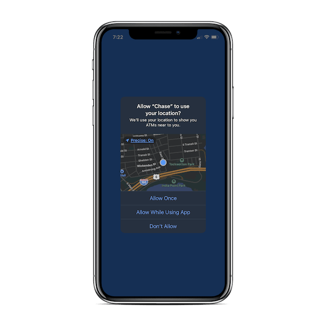
Source: Telerik
The only mistake that Chase made, though, was to have this pop up the moment the user opens the app. A little trust-building beforehand would’ve been helpful.
For instance, a good trust-building tactic is letting users take the app for a test run first.
That provides more value upfront, which helps build trust and momentum.
This is what the Indian investment app Fisdom did. By letting users explore the app first, users learned to trust the app enough not to mind the tedious KYC process later.
The last way of making people trust you is to make them feel secure. We’ll explore that in the next section.
Add safety precautions
The main reason why people are reluctant to share data with fintech apps is that they believe they’re not safe.
And who can blame them?
There are far too many instances of bank fraud, data misuse, and breaches in recent memory, and that’s making customers wary.
A BIS study on the US market reflected this sentiment. It found that Americans trusted big financial institutions more with their data than they did fintech firms, or even government agencies.
The biggest reason why is fear of identity theft:
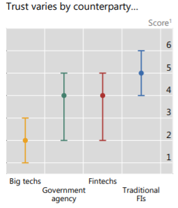
Source: BIS.org
As a fintech app, you need to do a lot of reassuring to overcome these statistics.
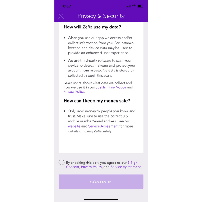
Sometimes, it’s as easy as telling them directly, like how Zelle explicitly states in their Privacy Policy and Terms of Use:
Source: Telerik
Of course, the best way is to demonstrate just how secure your users’ data is within your app.
That starts with basic authentication and authorization protocols like biometrics and two-factor authentication. You can also mention how you use technologies like data encryption to safeguard sensitive information.
On top of this, you can also include added precautions to boost your app’s security.
A good example is an automatic logout feature that kicks in after a short period of inactivity.
While it can be annoying to have to re-login every time, the added security it brings will be appreciated by your users.
Another is the liberal use of notifications, which alerts the user on key activities like receiving payment or getting close to overdraft. While constant pop-ups can be annoying in other apps, they’re highly appreciated and even necessary in fintech.
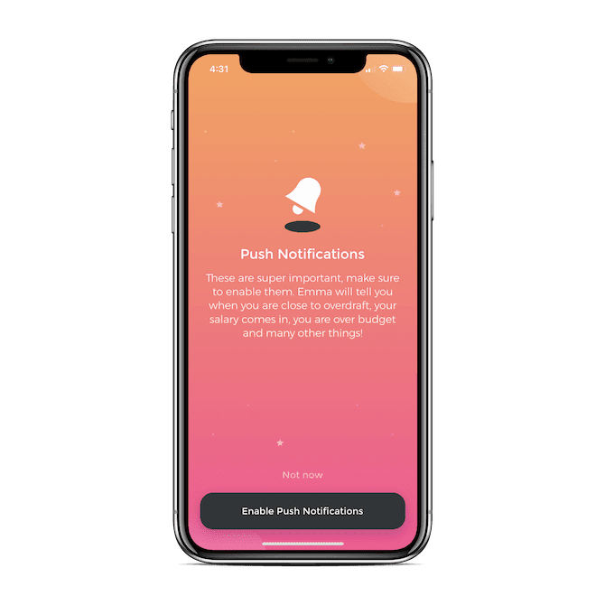
To sum up, don’t be afraid of adding friction to your app onboarding to make your app more secure.
For example, setting up 2FA or requiring authentication for every transaction might be an added step. However, in this case, it’s a necessary one for the user’s welfare.
Don’t force information collection
As fintech app developers, we know the importance of gathering data. However, we sometimes tend to go overboard with it. And this can be a source of annoyance for your users.
The key is only to ask for information that’s needed at the moment. And (we really want to emphasize this point) always look at data collection from the user’s point of view.
If the time they give in filling out a questionnaire isn’t worth the benefit they’ll be getting, don’t do it.
A key tactic for this is to include a “Skip” button so users can opt out of certain forms. It’s also worthwhile to give them alternatives instead of manually entering their info in a lengthy form.
The Fisdom app does this very well for its KYC process, which spans five ridiculous pages.
However, they found out that the app can derive key details from a person’s permanent account number or PAN (which every Indian citizen has). Doing this cut the process by half.
Nevertheless, you need to be transparent when doing this—always let your users know what you’ll be getting from them.
A 2021 study by The Clearing House revealed that 75% of responders were unaware that their apps were gathering data without their knowledge, even when the app was turned off or deleted. That’s never good for trust-building.
Therefore, giving your users an alternative way to provide information is useful. It also
Make onboarding seamless
The key to making onboarding work is to make it easy, effortless, and engaging for your users. That gives you a higher chance that users will go through it.
This formula from the UX Collective perfectly encapsulates the gist of what we’ve been talking about so far in this article:

Source: DECODE
In other words, the fewer times people ask “why?” or “what?” during your onboarding, the faster it will be.
So, how do you achieve this?
First, make sure your forms are very straightforward. Don’t make them too long so that people will hate doing it.
If you need multiple pieces of information, consider breaking them into chunks. Also, always give people the option of resuming it later without starting again from scratch.
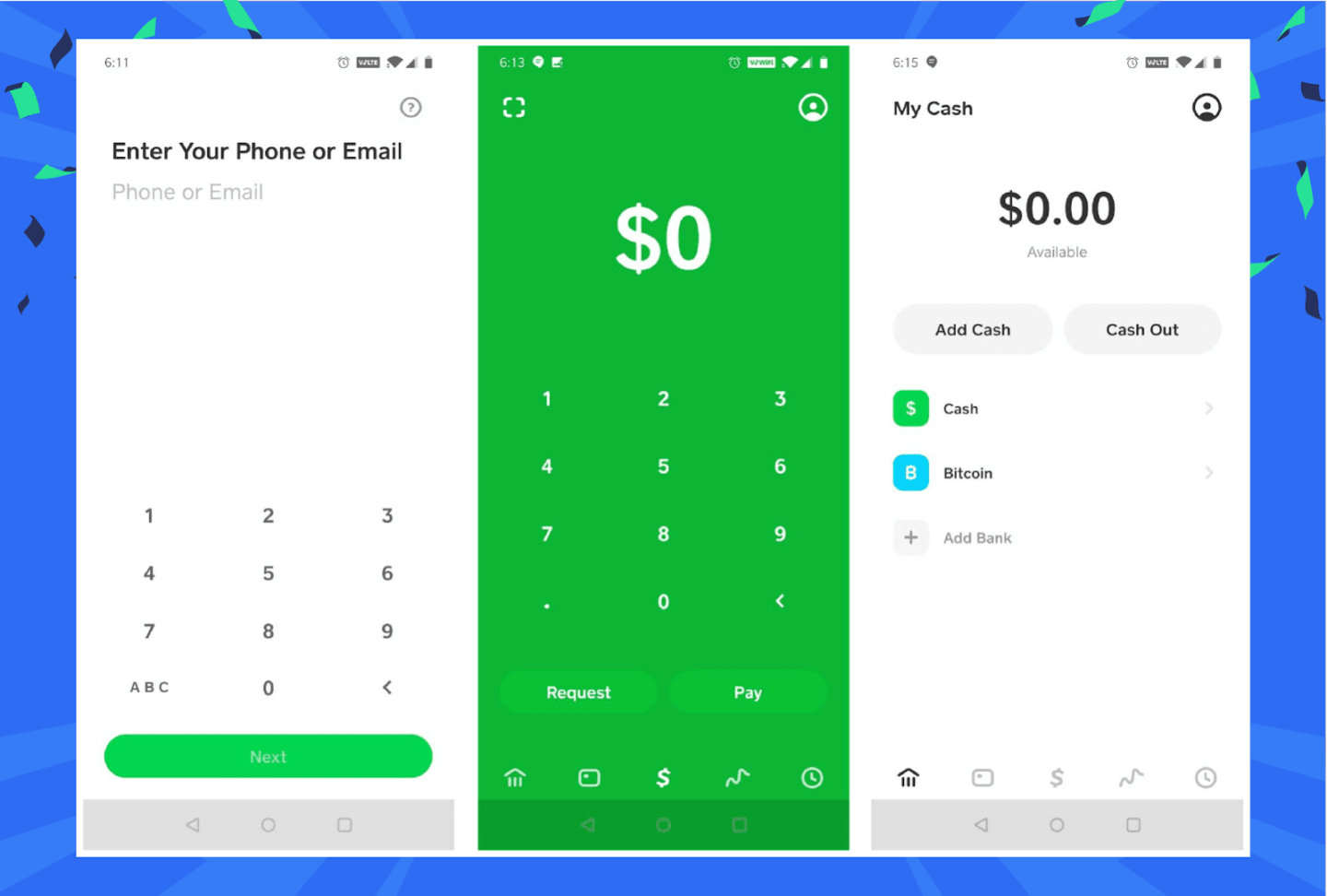
This is especially true for registering new users because you want them to start using your app as fast as possible.
The Square Cash App is a good example, as it only requires either a phone number or email:
Source: Clever Tap
With that said, it’s useful to provide a way for users to see the progress of their onboarding. Doing so sets expectations of how long the process takes, plus it gives them a psychological boost to complete the process.
While not a fintech app, Linkedin illustrates this process nicely with their Profile Strength metric, encouraging you to finish your profile as part of onboarding.
As a bonus, it also shows the benefits of hitting each milestone:

Source: Linkedin
Gamification is also a popular and excellent strategy for making the onboarding process more engaging. You can make it even more so by incorporating game mechanics like rewards and stickers.
Finally, don’t forget your visuals.
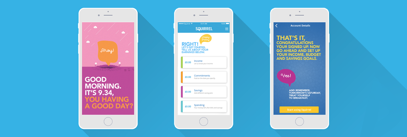
The smart use of images and animation can help make your onboarding more engaging and interesting. Adding a “human touch” can make it even better, as what the Squirrel app illustrates:
Source: Sophie Stirling
In short, you want to make onboarding and the use of your app in general as pleasant for the user as possible.
Proper onboarding is key to a successful fintech app
Onboarding plays such an important role in a fintech app that you can’t afford just to slap together a few screens and call it a day.
Instead, it’s something that you really need to think about and integrate well into the overall app experience.
It’s a tall order, especially on top of the already many challenges of fintech app development.
But get your onboarding right, and it will reward you with happy, engaged, and trusting users.
