When you’re developing an app, wireframes and mockups are among the most powerful tools in your arsenal.
As with anything else, planning is key to a successful app. Wireframes facilitate this process by allowing you to place your ideas on paper, so you can rapidly iterate them.
They’re also a great way of communicating your app concept to stakeholders.
But if your wireframe itself is confusing and difficult to understand, it becomes a problem, because it fails to fulfill its purpose and can even do more harm than good.
The solution is annotation.
Annotations help give wireframes a voice, providing context and explanations that can further clarify certain elements and concepts in a wireframe.
Here’s an annotation primer to get you started.
What are wireframe annotations?
Annotations are text explanations that further clarify certain sections of the wireframe.
They’re often used to describe features that aren’t readily apparent with static wireframes, such as animations, interactions, or dynamic content.
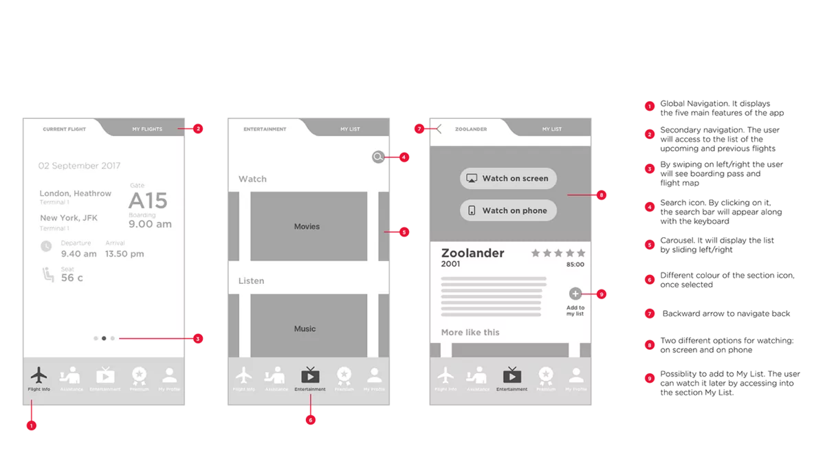
In the example below, notice how the annotations describe what happens when users tap on certain elements or perform gestures like swiping.
Source: Chaymae Lougmani | Behance
Sometimes, annotations can explain the logic and motivation behind design choices in the wireframe.
For example, why would you choose a hamburger menu instead of a menu bar at the bottom of the screen? You can use an annotation to explain why.
Here’s another example:
Source: Aboli Champhekar-Maydeo | Quora
In the above wireframe, the designer defends her choice to go with a sticky navigation bar. It was an unconventional choice, so annotations were necessary.
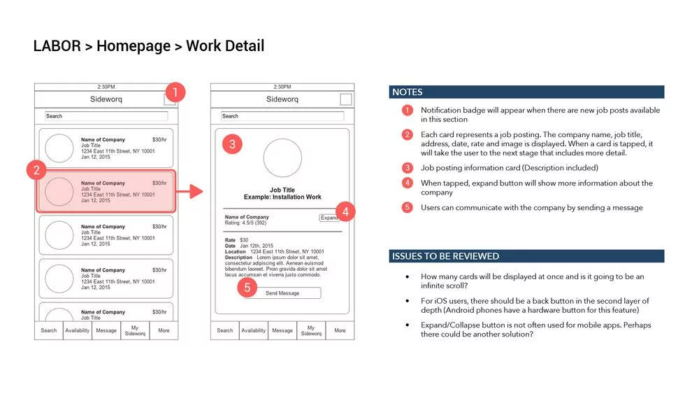
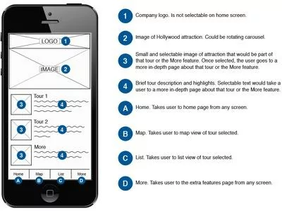
Lastly, annotations can also include best practices, recommendations, or even pending issues. Here’s an example:
Source: John Kim
Stating the pending issues to be resolved is a good way to get the viewer to think from a certain angle. This can make wireframe annotations into a more collaborative tool.
The best thing about annotations is that they’re very flexible. They can explain or expound anything in your wireframe.
Why are annotations important?
Annotations are crucial to communicating the intent of your wireframe as clearly as possible.
A blog post from leading wireframing tool Balsamiq nicely describes the benefits of using annotations as follows:
“To speak for the wireframe’s designer when she isn’t there.”
The problem is that many things in a wireframe can get lost in translation. The design idea you have in your head might come across differently when put on paper.
Or viewers might need to understand the context before they can appreciate your decision.
Unfortunately, a simple misunderstanding or miscommunication can cost companies as much as $625,300 per year for a medium-sized company.
Source: Search Engine Land
Miscommunication is especially devastating during app development.
For example, your developer might incorrectly interpret an element, causing them to code it wrongly. Unfortunately, revising this oversight later can cost you significantly more.
In fact, usability guru Jakob Nielsen estimates that changes made after coding are 100 times more expensive than those caught earlier.
Annotating your wireframes can ensure this never happens.
It allows you to document everything clearly so that everyone on your team is on the same page.
This is crucial for some elements that need special instructions, such as accessibility requirements.
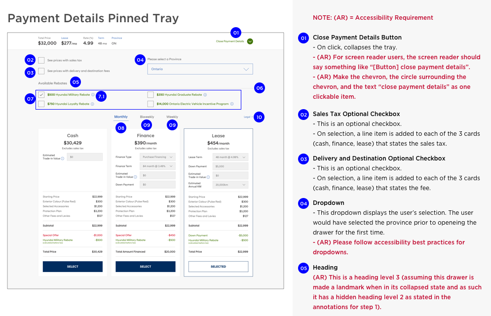
In the example below, note that the annotations provided instructions on specific steps for accessibility rather than simply saying “make this element accessible.”
Source: Adobe
Annotations can also increase your chances of getting your wireframe approved by external stakeholders, be it upper management or clients.
Often, these people don’t have the details, context, or the technical know-how to judge your app decisions properly, so you need to elaborate on them with annotations.
Source: Visual Objects
In essence, annotations help you paint a complete picture of your wireframe. It ensures your app idea gets approved and built exactly as you intended.
Who are annotations for?
According to Dan Saffer, Creative Director at Smart Design:
“There are typically five audiences for wireframes: clients (internal or external), developers, visual designers, copywriters, and, most importantly, your future self.”
These stakeholders will each look at your wireframe in different ways, so you need your annotations to match.
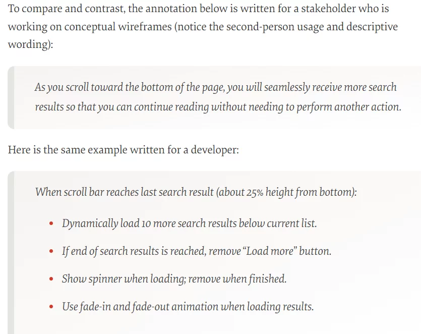
Developers, for instance, are concerned with implementation. Thus, you need to indicate the exact behavior and purpose of each element.
On the other hand, visual designers look more at the UX of the app, so annotations need to describe from a user’s perspective.
Here’s an annotation example that reflects this:
Source: Smashing Magazine
Notice how the first annotation is much more narrative and focused on the UX benefits.
The second, meanwhile, is a step-by-step description of the behavior of that element – useful information if you want to build it.
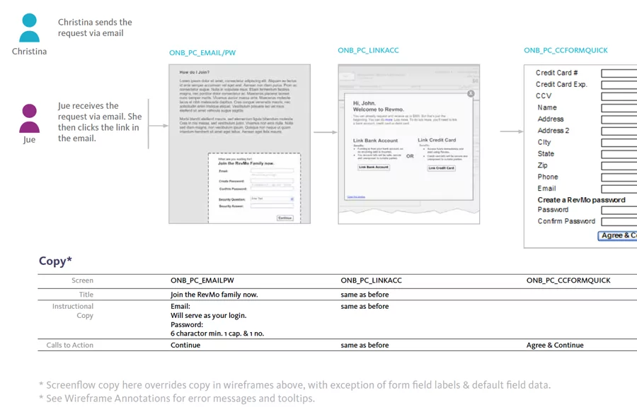
Annotations can also help UX copywriters know which specific body copy and call-to-actions (CTAs) to write. Here’s a good example:
Source: Balsamiq
The above shows that annotations aren’t just limited to labeling app elements. Any added text, as long as it’s helping you communicate your wireframe clearly, is acceptable.
Adding to that, you should also write annotations for your future self.
It’s easy to forget your reasoning behind the wireframe, especially after incorporating feedback from multiple people.
Annotations document your thought process, so you can go back to an old idea or clarify it moving forward.
Source: Balsamiq
As you can see, wireframes are useful to many stakeholders. With annotations, you ensure that these people interpret your idea the right way, even if they have different motives and biases.
What to annotate
In theory, you are free to annotate any and every part of your wireframe if you wish. Of course, doing so can be time-consuming and unnecessary.
Here are the primary elements to consider annotating.
Start with dynamic components that involve user interaction, hidden states, or event-driven functionality.
These would be challenging to illustrate with a static wireframe, so annotations are always necessary.
This wireframe is a good example:
Source: UX Movement
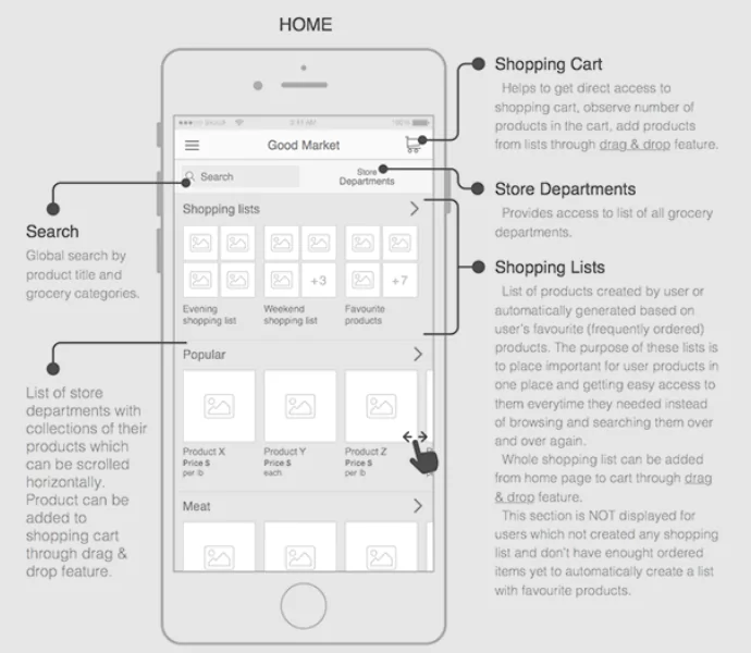
Next, if you have any features that are implemented differently, those might require clarification. For instance, this annotation explains the app’s take on the shopping lists feature:
Source: Volodymyr Melnyk
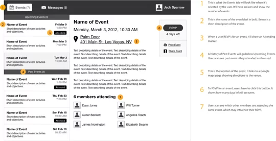
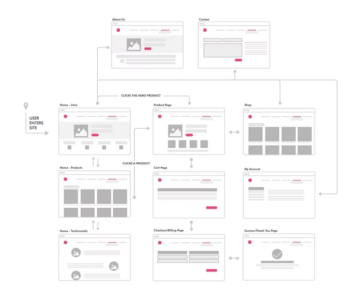
Annotations are also useful for wireframes that describe an app’s flow. These can detail certain actions, effects, or behaviors as the user goes through the app. Here’s how it can be applied:
Source: Dixie Pacheco | Behance
Annotations are also helpful for documenting pop-up messages like error dialogs. In fact, a good wireframe should include error handling UI and copy because it requires careful planning.
Lastly, you should annotate CTAs like signup buttons and links, then indicate what they do. For example, this wireframe states what happens after the user taps on interactive elements.
Source: Jen Blatz | Dribbble
Figuring out what to annotate is one thing. But when do you do it?
When to annotate
As a rule of thumb, the simpler the wireframe, the more you need to annotate. That means sketches will need to be annotated more extensively than a high-fidelity mockup.
A rough wireframe with only simple shapes and placeholders will be very difficult to understand without any context.
Therefore, annotations lay out the context and narrative that can help fully communicate the purpose of your wireframe.
Look at the below example. Imagine seeing it for the first time without annotations. Chances are, you won’t know anything that’s going on.
Source: UX4Sight
There are two approaches on when to do annotations—during or after wireframing.
After wireframing seems like the obvious approach, but it has its shortcomings. You might forget why you included a certain element or how it’s supposed to behave.
Unless you document everything separately, you’ll begin to second-guess your wireframe.
Annotating as you’re wireframing is the better approach. It allows you to record every thought and logic, so you don’t forget.
The act of documenting also forces you to think through the process.
Best practices for creating wireframe annotations
Annotating might seem simple, but they are easy to get wrong and risk further miscommunication. Here are some best practices to consider:
Keep annotations short
Conciseness is a key characteristic of a good annotation. Remember, they exist to clarify your wireframe.
If they’re long and rambling, they might confuse your audience even more. But don’t make them too short either, to the point of being vague.
A good approach is not to base it on length. Rather, focus on the minimum number of words to communicate your point effectively.
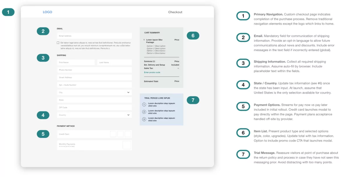
For instance, the annotations on this wireframe might seem wordy, but every sentence actually contributes to the overall explanation.
Source: Konrad
Annotating isn’t that different from UX copywriting. Get straight to the point, only include what’s necessary, and edit ruthlessly.
Number your annotations
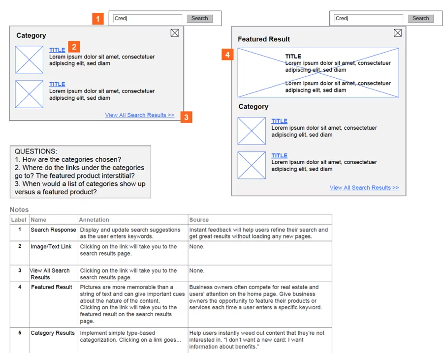
A good, common practice is to number your annotations.
The advantage here is that it keeps your wireframes clean and organized. Using arrows to link the element to the annotation can add unnecessary clutter.
In addition, numbering allows you to place all your annotations in one column, thus making it easier for the viewer to read. Also, adding new annotations is simpler this way.
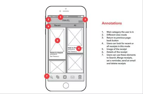
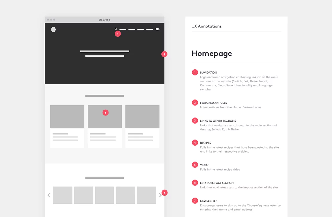
When placing number labels, make sure that they stand out from the rest of the wireframe. If possible, use a high-contrast color not present anywhere else on our wireframe.
A good example is depicted below:
Source: The Marvel Journal | Medium
Notice how the red numbered icons are visually distinct from the black and white color scheme of the wireframe.
When using annotations, visibility is key – you don’t want the viewer to mistake the numbered icons as part of your UI.
Focus on user benefits
Annotations shouldn’t just focus on the element or what it does. It should also emphasize the benefits to the user experience.
The simplest way to do this is to add a reason behind each choice.
For instance, instead of saying “this is a hidden menu bar,” expand it by stating: “This is a hidden menu bar.
We used it because it helps make the UI less cluttered and more user-friendly.”
Focusing on benefits is vital for clients since it can give them a better idea of how the end-user will accept the app.
But even if you’re talking to a developer, laying out the benefits is still useful as it gives them context while developing.
Best annotated wireframe tools
Most wireframing and mockup tools offer the ability to annotate. These can be very convenient since you can do it as you’re designing the wireframe.
Balsamiq is one of the tools that have a robust annotation feature. It gives designers a wide range of annotation elements for various situations. Here are a few of them for reference:
Source: Balsamiq
As you can see, it’s easy to annotate wireframes in Balsamiq. What’s more, since you use the same elements, you can standardize annotations across projects or teams.
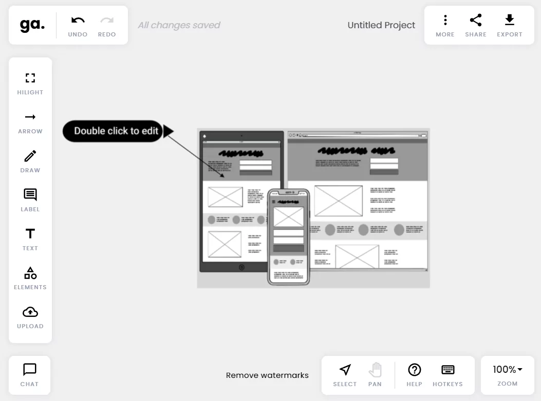
However, if you want to annotate after creating the wireframe, a good tool is Good Annotations.
It’s a web-based tool that you can use to annotate anything. Simply upload the wireframe, and you’re good to go.
Source: Good Annotations
You can click and drag elements from the toolbar to place annotation elements on your wireframe.
You can also add common shapes like stars and checkmarks to enrich your annotations further.
A good application of this tool is as a convenient revision and feedback tool.
When you send your wireframe, someone can upload it to Good Annotations and then include their feedback as annotations. The fact that it’s online means everyone can do it anywhere.
Annotations are all about clarity
Wireframes need clarity. The last thing you want is to miscommunicate or mislead stakeholders and your development team. Without annotations, you risk this happening.
Fortunately, annotations are easy to incorporate into any wireframe. You just need to take the time and effort to gather your thoughts and document them.
Sure, it might take some work, but it’s an act that will pay dividends later on.
Want to learn more about wireframing? Check out our excellent starter guide here. We also have a list of 18 of the best wireframe examples here for inspiration.


