
5 ways to use AI in front-end development
Using AI in front-end development is a game-changer - here, we'll talk about 5 ways you can do it.
The tools we use in web app development significantly impact the effectiveness of our projects.
Among them, Storybook is a remarkable tool that transforms how we develop and visualize user interfaces across various JavaScript frameworks.
This blog is intended for developers and teams who want to optimize their UI component development, regardless of the specific framework they use.
We’ll explore the essence of Storybook, a tool that goes beyond framework boundaries and redefines UI component development.
Let’s get into it!
Storybook is a front-end workshop environment that helps devs create, organize, and test UI components in JavaScript applications.
Initially developed for React, Storybook now supports a variety of JavaScript frameworks, including Angular, Vue, and even HTML.

The most significant advantage of Storybook is that it enables developers to isolate components, letting them build and refine UI elements in a standalone environment without requiring a parent application or framework.
The Storybook’s isolation is not just a visual representation of components.
Still, it creates a dedicated space where minor UI parts, such as buttons, modals, inputs, and others, can be developed, tested, and fine-tuned in detail.

You’ll be talking with our technology experts.
Storybook focuses on components individually, ensuring each element can withstand various states and scenarios, thus creating robust and reusable code.
It acts as a living library for components, serving as a single source of truth where developers can view the latest version of each component, interact with them, and view their different states and variations.
This environment is crucial for maintaining consistency across large teams and projects as it provides a unified view of the components in use, fostering better communication and consistency.
All of this means Storybook is more than just a tool; it is a game-changer for UI development.
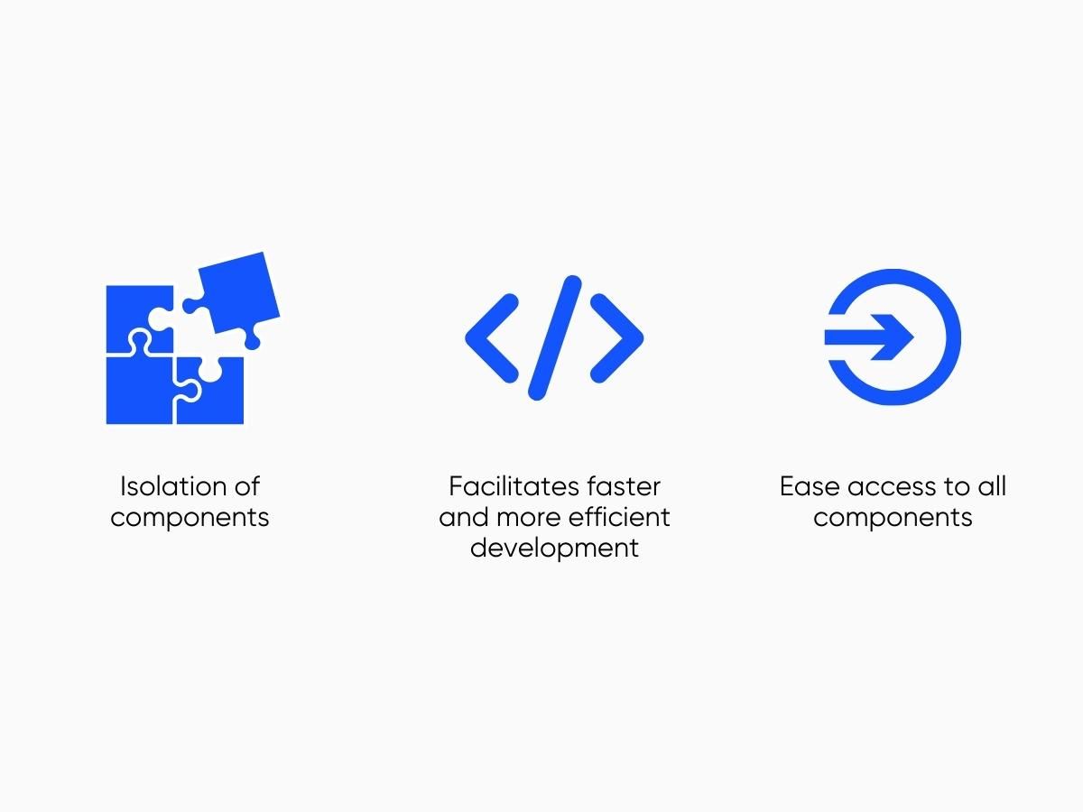
Storybook has become a vital tool for UI developers, offering a range of benefits that make the development process smoother and improve the quality of the end product.
source: CleanCommit
Here are the key benefits of using Storybook:
Component isolation: Storybook excels in isolating components. It means developers can build and test UI components separately from the main application. This isolation is advantageous in larger projects where components must be reusable and consistent.
Enhanced collaboration: Storybook bridges the gap between designers and developers by providing a shared space for components. This shared space allows for real-time collaboration and immediate feedback, which enhances the overall design and development process.
Interactive documentation: Storybook generates interactive and up-to-date documentation from your components. This documentation makes it easier for new team members to understand existing UI components and for designers to visualize the implementation of their designs.
Integration with testing tools: Storybook integrates various testing tools, allowing developers to perform visual, snapshot, and interaction testing on components. This integration helps identify and fix UI issues early in the development process.
Installing and setting up Storybook for UI development is a straightforward process, but it requires attention to detail, especially regarding your technology stack and project setup.
Please ensure you’ve set up your project with a JavaScript framework like React, Vue, Angular, or others before installing Storybook.
Remember that Storybook is not intended for empty projects.
So here are the steps for installing Storybook:
Step 1
Use the Storybook CLI by running npx storybook init in your project’s root directory. This command will install the necessary dependencies, set up scripts to run and build Storybook, add a default Storybook configuration, and some boilerplate stories to get you started.
Step 2
After installation, a setup wizard will guide you through Storybook’s main concepts and features, such as organizing the UI, writing your first story, and testing components.
Step 3
To form a Storybook, run the storybook command. It will launch a development server and open Storybook in your browser, typically showing a welcome screen.
smanjit Your project may have specific requirements that require further configuration of the Storybook.
For instance, you might need to adjust Storybook’s build configuration, especially if you see errors in the CLI. It could involve setting up presets for technologies like Create React App, customizing the Babel configuration, or tweaking the Webpack configuration.
If Storybook builds but errors appear in the browser, check if your component code compiles/transpiles correctly for the browser.
If a story fails to render, it might be because the component expects certain conditions or context. You can use decorators in the .storybook/preview.js file to wrap stories in the necessary context providers.
If your project uses static files or resources, configure Storybook to serve these files by specifying a static folder to serve from when starting up.
If the CLI doesn’t detect your framework, or if you have a custom environment setup, you can manually specify the framework using the –type flag.
For projects using Webpack 4, upgrading to Webpack 5 is recommended, as Storybook now uses Webpack 5 by default.
Remember to regularly update Storybook to use new features, bug fixes, and performance improvements.
Following these steps, you can install and configure Storybook for your UI development project.
However, each project has unique requirements, so you should customize the setup to fit your specific needs.
For detailed guides and troubleshooting tips, refer to the official Storybook documentation (Storybook Docs) and their setup guide (Setup Storybook).
Storybook offers a comprehensive suite of features that greatly enhance developing and testing UI components. Here are some of its core features:
CSF is a straightforward way to write component stories in Storybook. Here’s a basic example for a Button component:
import React from 'react';

import { Button } from './Button';

export default {

  title: 'Button',

  component: Button,

};

export const Primary = () => <Button primary>Click me</Button>;

export const Secondary = () => <Button>Click me</Button>;
In this example, Primary and Secondary are different stories for the Button component.
MDX allows you to write long-form documentation and embed live components.
MDX document combines documentation written in Markdown with embedded live examples of the Button component. More on this later.
To integrate accessibility checks, you must first install and register the @storybook/addon-a11y addon. Here’s a brief setup example:
npm install --save-dev @storybook/addon-a11y

Then, in your .storybook/main.js, add the addon:

module.exports = {

  addons: ['@storybook/addon-a11y'],

};
With this setup, Storybook will automatically run accessibility checks on your components.
This addon lets you view the source code for your stories. Install and register it as follows:
npm install --save-dev @storybook/addon-storysource

Then, in .storybook/main.js:

module.exports = {

  addons: ['@storybook/addon-storysource'],

};
After this setup, a new tab will appear in your Storybook interface, showing the source code for each story.
To mock API responses, integrate with tools like Mock Service Worker (MSW).
First, set up MSW in your Storybook configuration.
Then, define the reactions you want to mock within your story:
import { rest } from 'msw'

export const handlers = [

  rest.get('/api/user', (req, res, ctx) => {

    return res(ctx.json({ username: 'admin' }))

  }),

]
This setup allows you to control the data received by your component in Storybook.
These examples show how to leverage Storybook’s features in your UI development workflow. For more comprehensive guides and advanced usage, refer to the official Storybook documentation: Configure Storybook and Storybook Adoption Guide: LogRocket Blog.
In Storybook, ‘stories’ are the fundamental building blocks.
They’re practical examples of your components in specific states. Understanding how to write compelling stories is critical to leveraging the full potential of Storybook.
This section will guide you through the concept of stories and provide a step-by-step approach to writing them.
A story in Storybook represents a single visual state of a component. Think of it like a snapshot of your component under certain conditions.
For example, a button component might have different stories for its default state, hover state, disabled state, etc. These stories not only serve as visual test cases but also act as live documentation for your components.
You typically create a new file (e.g., Button.stories.tsx) in your project’s stories directory to write a story. This file will contain the story definitions for a specific component. Here’s a simple example to illustrate:
import type { Meta, StoryObj } from '@storybook/react';

import { Button, ButtonProps } from './Button';

const meta: Meta<typeof Button> = {

  component: Button,

};

export default meta;

type Story = StoryObj<typeof Button>;

export const Primary: Story = {

  args: {

    primary: true,

    label: 'Button',

  },

};

export const Secondary: Story = {

  args: {

    label: 'Button',

  },

};
In this example, we have created two stories for Button: a primary and a secondary button. Each story uses a “template” that takes arguments (args), allowing you to control the component’s props.
By following these guidelines and practices, you can write compelling and practical stories in Storybook, enhancing your UI components’ development and documentation process.
For more insights and detailed guidance on writing stories in Storybook for your projects, visit the official Storybook website here and here.
Dynamic documentation in Storybook is a powerful feature that can transform your stories into comprehensive and living documentation.
You can further enhance this feature using MDX (Markdown with embedded JSX) and Doc Blocks, which provide a clear and concise understanding of your components’ functionality.
Storybook Autodocs enables the automatic generation of documentation pages for your UI components. Add a tags configuration property to your story’s default export to set this up.
Storybook then infers relevant metadata such as args, argTypes, and parameters and generates a documentation page positioned in the root level of your component tree in the sidebar.
export default {

  title: 'Components/Button',

  component: Button,

  tags: ['autodocs'],

};
Storybook offers default support for documentation pages, but you can extend this with additional options in your .storybook/main.js|ts|cjs file.
You can replace the default documentation template with a custom one by opening your .storybook/preview.js|ts file.
This custom template can include metadata headers, interactive tables for args and argTypes, and an overview of other stories.
MDX is beneficial for non-React projects or when JSX-handling isn’t configured. It allows you to combine Markdown documentation with live, interactive examples of your components.
You can attach an MDX file to a component and its stories or control the location of the docs entry in the sidebar. MDX allows for more customized documentation.
Here’s an example of an MDX document that combines Markdown documentation with live components:
import { Meta, Story, Canvas } from '@storybook/addon-docs/blocks';

import { Button } from './Button';

<Meta title='UI/Button' component={Button} />

# Button Component

The Button component is used to...

<Canvas>

  <Story name='Primary'>

    <Button primary>Click me</Button>

  </Story>

</Canvas>
In this MDX example, the <Meta> tag sets up the component metadata, and the Markdown headers and text provide thorough documentation.
The <Canvas> and <Story> elements then embed a live, interactive example of the Button component.
Doc Blocks defines the page template for automatic docs within MDX and as part of the docs page template.
Many of these blocks can be customized via parameters, allowing you to filter out specific props or change the appearance of the documentation.
These blocks include ArgTypes, Canvas, Controls, and Story. Doc Blocks can be used within MDX to further enhance your documentation.
Here’s how you might use some common Doc Blocks:
import { Description, ArgsTable, Primary } from '@storybook/addon-docs/blocks';

import { Button } from './Button';

<Description of={Button} />

<ArgsTable of={Button} />

<Primary>

  <Button primary>Primary Button</Button>

</Primary>
In this MDX example, <Description> provides a detailed description of the Button component, <ArgsTable> displays a table of the component’s args, and <Primary> showcases the primary story of the component.
Storybook allows you to create your Doc Blocks. This is useful if you must document specific aspects of your project not covered by the existing blocks.
By leveraging these features, you can build a sustainable documentation pattern that suits your needs, whether for a component library, a design system, or any other project.
For more detailed information on setting up and customizing dynamic documentation in Storybook, refer to the official Storybook documentation on Automatic Documentation and Storybook and Doc Blocks.
Testing and debugging in Storybook involves various methodologies and tools to ensure the robustness and quality of UI components. It is a multifaceted process that includes interaction testing, visual regression testing, and automated testing.
Interaction testing validates the functional aspects of UIs, particularly for more complex UIs like pages.
It involves setting up the component’s initial state, simulating user behaviors such as clicks and form entries, and checking if the UI and component state update correctly.
Storybook facilitates this process in the browser, making it easier to debug failures. You can write these tests using a play function connected to a story, which simulates user behavior and verifies the underlying logic.
Storybook’s interaction add-on mirrors the Testing Library’s API, so if you are familiar with Testing Library, you should find Storybook’s interaction tests approachable.
Here’s an example of how you might set up an interaction test for a button component:
import { within, userEvent } from '@storybook/testing-library';

export default {

  title: 'Example/Button',

  component: Button,

};

export const DefaultButton = {

  args: {

    label: 'Click me',

  },

  play: async ({ canvasElement }) => {

    // Accesses canvas element

    const canvas = within(canvasElement);

    // Simulates a click action on the button

    await userEvent.click(canvas.getByText('Click me'));

    // Add assertions here to check if the UI updates correctly

  },

};
In this example, the play function simulates a user clicking the button, and you can add assertions to check how the UI updates in response.
Visual testing is another crucial aspect of Storybook testing. Integrating visual testing at the component level is imperative to catch UI bugs early in the development process.
Tools like Percy can be combined with Storybook for visual regression testing. Percy compares images across browsers and is compatible with testing tools like Cypress, TestCafe, WebdriverIO, and Playwright.
This approach helps validate UI early, eliminating bugs and improving the release cycle.
For visual regression testing with Percy, you would typically set up your tests to capture screenshots of your components in different states. Here’s a basic setup for visual testing:
import { withPercySnapshot } from '@percy/storybook';

export default {

  title: 'Example/Button',

  component: Button,

  decorators: [withPercySnapshot],

};

export const Primary = () => <Button primary>Primary</Button>;
In this example, withPercySnapshot is a decorator that instructs Percy to take a snapshot of the ‘Primary’ state of the Button component for visual testing.
Automated testing plays a significant role in the Storybook ecosystem. The Storybook test runner allows transforming stories into executable tests powered by Jest and Playwright.
This can be especially useful as Storybook grows, automating the process of running all tests. Tests can be executed via the command line or in a CI server.
The test checks that the play function runs without errors for stories with a play function.
For automated testing, you might set up your Storybook stories to be testable with Jest and Playwright.
Here’s how you might configure your Storybook to enable this:
// .storybook/main.js

module.exports = {

  stories: ['../src/**/*.stories.js'],

  addons: ['@storybook/addon-links', '@storybook/addon-essentials', '@storybook/addon-interactions'],

  framework: '@storybook/react',

  core: {

    builder: '@storybook/builder-vite',

  },

};
In this configuration, the @storybook/addon-interactions addon is added for interaction testing. The test runner will execute all interaction tests and catch broken stories.
Building components in isolation is another advantage of Storybook.
The environment allows developers to build components in isolation, focusing solely on the element without considering other application parts.
This isolated development is beneficial for identifying all edge cases and reducing redundant development efforts.
However, there are also challenges in Storybook testing, including:
In summary, Storybook testing is a comprehensive approach that involves interaction testing, visual regression testing, and automated testing, all contributing to an efficient and robust UI development process.
For more details, refer to the Storybook Documentation on Interaction Tests and LambdaTest’s comprehensive guide on Storybook Testing.
To deploy Storybook projects, there are several key steps you need to follow, whether you’re working with a simple application or a complex one managed by Nx, an extensible build framework.
The first step involves building Storybook as a static web application, which can be achieved using a built-in command in Storybook that is pre-configured for most supported frameworks.
The command to build Storybook as a static web app is usually run in your project’s root directory: `npm run build-storybook` This command will produce a static version of your Storybook that any web server can serve. To preview this locally, you can use `npx serve ./.storybook`
Once you have built your Storybook as a static web app, you can deploy it to various hosting services. For instance:
There are some considerations you need to keep in mind while deploying your Storybook projects:
Customizing build for performance: For larger projects or when reduced build times are essential, you may need to customize the production build of Storybook. This involves adjusting settings in your `main.js|ts` configuration file.
CI/CD integration: Integrating Storybook into your CI/CD pipeline is crucial for automated testing and deployment. This ensures that changes are reviewed and tested before being merged and deployed.
In summary, deploying Storybook involves building it as a static web application and then choosing a suitable platform for hosting, like Chromatic or Vercel.
The process can be automated in a CI/CD pipeline for efficiency.
Nx offers additional tools and methodologies for managing Storybook in larger, more complex projects, facilitating testing, documentation, and deployment.
For more detailed steps and configurations, refer to the official Storybook documentation on publishing Storybook, guidance on deploying Storybook with Vercel, and best practices from Nx for Storybook.
If you’re looking to improve your knowledge and skills in using Storybook, some great resources are available to help you. Here are some essential resources that offer detailed guides, tutorials, and insights into using Storybook effectively:
Storybook’s official website offers free in-depth guides with code samples.
These tutorials are tailored for professional front-end developers and cover various aspects of using Storybook, including creating UI components, building and maintaining design systems, and different testing techniques.
You can explore these tutorials on the Storybook website.
This guide provides a comprehensive overview of Storybook, including practical use cases, examples, and alternatives.
It covers creating MDX documents, using the Story Source add-on for better code visibility, and setting up Mock Service Worker (MSW) for mocking API responses.
Additionally, it provides insights into accessibility checks and a wide range of add-ons to enhance Storybook’s capabilities.
For more information, visit their website.
This tutorial is perfect for beginners and covers the basics of using Storybook with React.
It walks you through creating your first story, viewing it in Storybook, and using the story in a React app.
Additionally, it discusses some of the most popular features of Storybook, such as stories, design systems, add-ons, and testing.
For more details, check out Snipcart’s tutorial.
As we conclude our exploration of Storybook, it is evident why it has become a preferred tool for modern UI development.
Storybook is a comprehensive platform that enables the development, testing, and documentation of UI components across various JavaScript frameworks.
It has been adopted by leading companies such as Airbnb, GitHub, and Stripe and offers several benefits that streamline the UI development process and enhance collaboration between designers and developers.
If you’d like to learn more about all things tech, you can check out our blog!

Using AI in front-end development is a game-changer - here, we'll talk about 5 ways you can do it.

Golang is quickly becoming the go-to choice for many engineers due to its efficency and simplicity. Here, we'll explore why that's the case and how Golang came about

In this article, we cover everything you need to know about React Query and how to use it to make great web apps.