
Wireframe annotations: a complete guide
This guide will walk you through the basics of wireframe annotations, including why they're important, how they work, and how to use them.
It’s no secret that wireframes are incredibly beneficial to your app’s success.
They’re crucial planning tools that will lead you to a more user-friendly, functional, and cost-effective app.
In some cases, wireframing could even reduce your cost overruns by up to 95%.
However, understanding that you need a wireframe is one thing, but implementing it is an entirely different matter, as it’s very easy to make mistakes.
Unfortunately, a wireframe done incorrectly will do more harm than good.
To help you, we’ve laid out a step-by-step guide on how to wireframe your app the right way.
Contrary to what most think, the first step in wireframing isn’t sketching. It doesn’t involve a pen or paper at all.
To create an effective wireframe that solves your user’s problems, you first need to know what those problems are. Not doing so is like going into the project blind.
Dan Ritzenthaler, the Senior Product Designer at Hubspot, sums it up perfectly:
“I get very uncomfortable when someone makes a design decision without customer contact.”
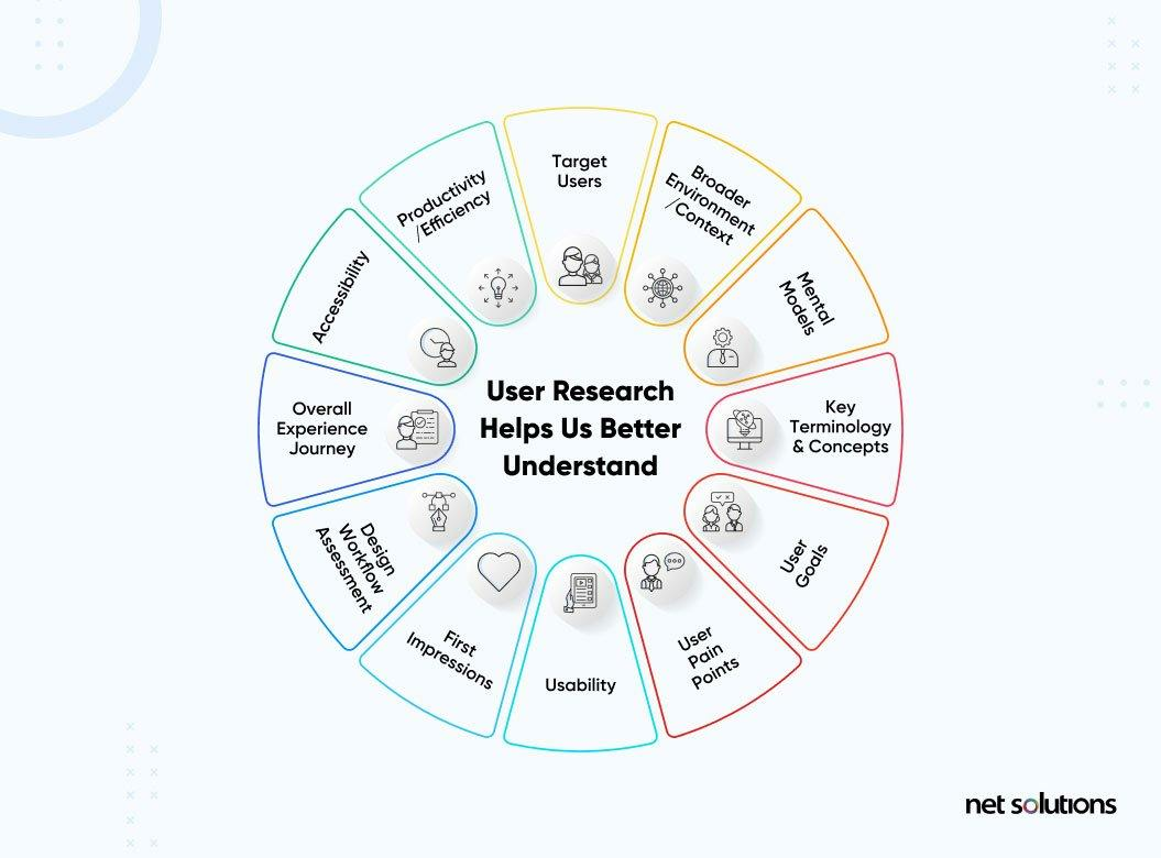
That’s why UX research should be your first step.
Your primary goal here is to understand your users fully, including their needs, pain points, and behaviors. Once you’ve uncovered these, it will guide you to design effective UX solutions for them.
As Net Solutions puts it, UX research helps you achieve a human-centered design.
Source: Net Solutions
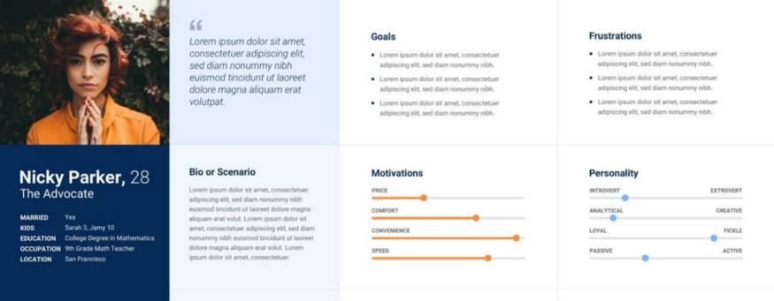
One of the most crucial things you’ll do during this phase is to build your user’s UX persona.
Similar to a marketing persona, this is an idealized representation of your target user, including their goals, frustrations, and motivations.
It tells how a typical user will behave, so you can tailor the app experience for them.
For instance, if your user’s persona says they’re price sensitive, you’ll probably go with a free app with ad-driven monetization.
Source: Ergomania UX
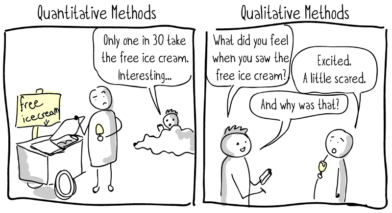
To build personas, you need a wealth of user data that UX research can give. There are two primary methods—qualitative and quantitative.
Qualitative research focuses on why a person behaves a certain way. It’s often done through interviews with open-ended questions that encourage users to expound on their answers.
This research method can give you deeper insights into the features your users want.
Quantitative research, on the other hand, focuses on what a person does. It focuses on numbers and figures.
The main advantage of this method is that it’s easier to do at scale via online surveys or analytics.
Below is a good illustration of the differences:
Source: Ikon International
UX research methods can also be either attitudinal or behavioral.
Attitudinal is talking directly to the person and listening to their answers. Interviews are one of the more popular forms of attitudinal research.
Behavioral is observing what a person does, then inferring insights from their actions.
Combining all these dimensions gives you a wealth of UX research techniques, as this chart shows.
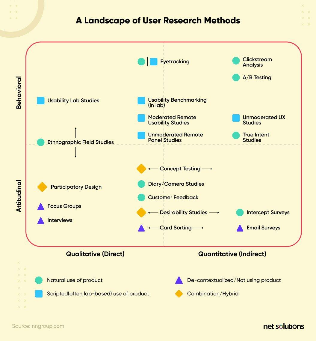
Source: Net Solutions
Regardless of your chosen method, the ultimate goal is to gather enough insights about your user. Once you have that, the next step is to plan out the app flow.
Before you sketch a wireframe, there are important factors to consider.
How many screens will your app have? How will the user interact with them? And how will they move from one screen to the next?
To answer these questions, you’ll need to define the user flow of your app.
A user flow is a diagram that defines the user’s path when performing specific tasks. Here’s an example by Anami Chan for her Sundayz app wireframe case study.
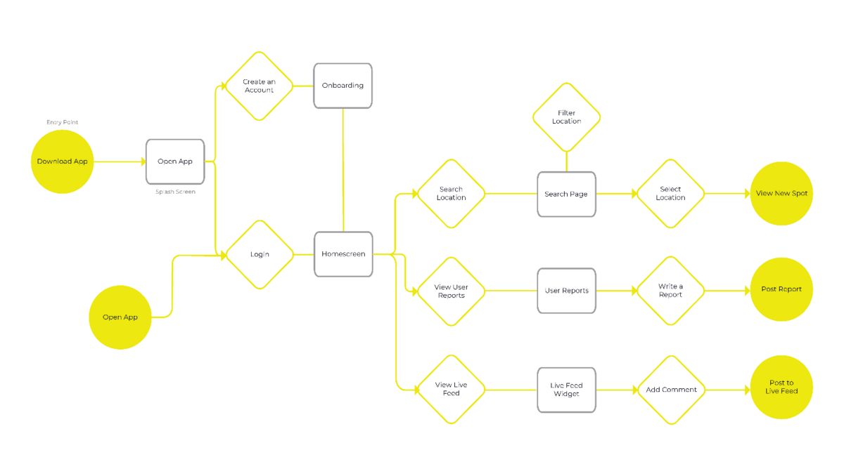
Source: Anami Chan Design
User flows are important for visualizing the user’s journey in your app. It also helps you achieve better UX by creating the most efficient path from point A to B.
For wireframing, its most important advantage is that it tells you in advance how many screens your app will have.
That prevents you from sketching screens unnecessarily, saving you plenty of time and effort.
Another important thing to help with user flow is your app’s information architecture (IA). This tells you how information is organized in your app.
It’s especially important for site navigation and how menu items are categorized.
Sitemaps are one of the best IA tools in app development. It shows all the features and screens of the app and how they’re interconnected.
As an example, here’s the sitemap of a dessert website.
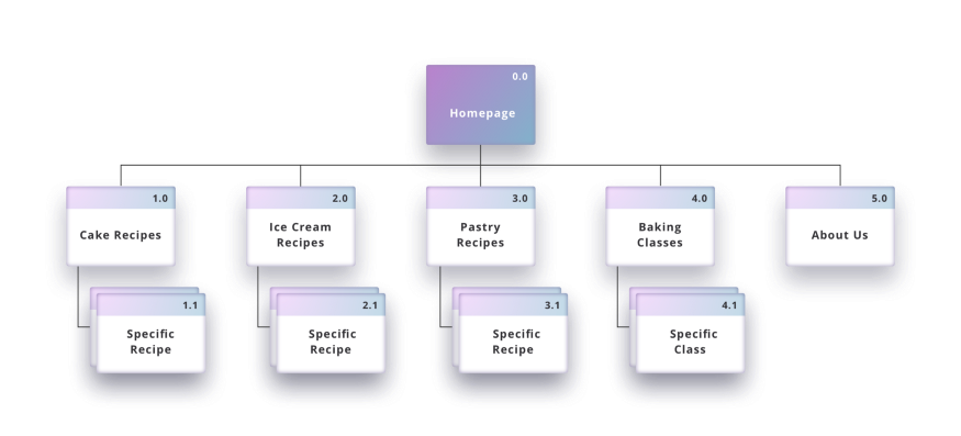
Source: UX Collective
Card sorting is one of the most effective methods for researching and verifying your app’s IA.
It involves asking participants to categorize cards representing items in your app, such as screens or features.
How your users organize these cards will give you insights to help you structure your app’s information and navigation system.
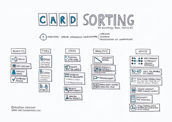
Source: Adobe
At this point, you should have a conceptual bird’s eye view of your entire app. With this information, you’re ready to delve into the details with a sketch.
Some developers might go straight into creating wireframes at this point. However, we advise doing some rough sketches first.
The advantage of sketching is that you can quickly develop screen UI concepts. You can show it to others for feedback, then revise it just as easily.
Source: UX Movement
Sketching your wireframes first is also cost-efficient.
According to UX pioneer Jakob Nielsen, sketching (or paper prototyping as he calls it) can help you spot UX issues before coding, making them 100 times cheaper to fix.
The main consideration in this step is speed. Because of this, sketches are often rough but should be understood by the viewer.
To achieve this, use simple shapes and placeholders. Label it with text explanations throughout to clarify certain sections.
Here’s a good level of detail to aim for:
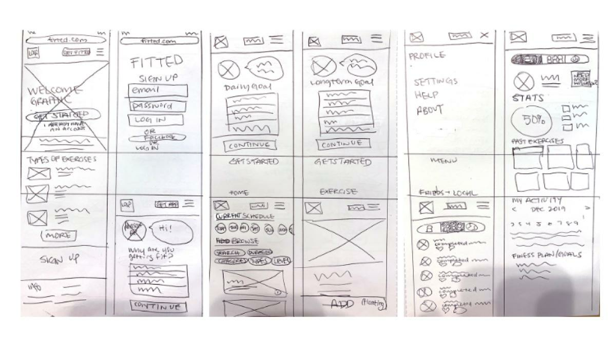
Source: Career Foundry
The above sketch probably took a short time to put together, yet it communicates the app idea quite effectively.
At this point, it would be helpful to also incorporate the app flow into your sketch. That way, you can plan out the buttons and menu items that link one screen to another.
It also helps you further refine the app flow.
For example, while sketching, you might realize that two screens can be combined into one through a good UI layout.
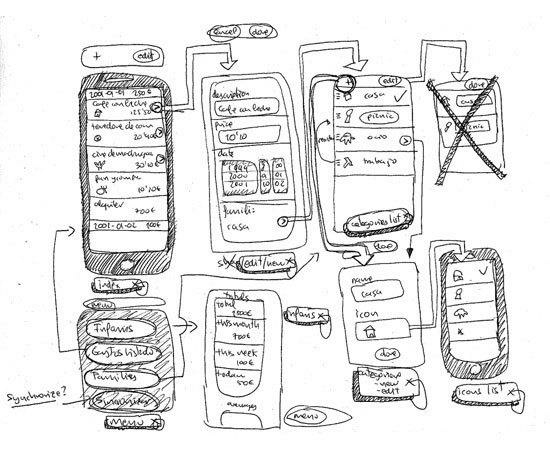
Source: Fernando Guillen
Before we move on to the next step, we’d like to leave you with a great method when doing your sketches.
It’s called Crazy Eights, a popular sprint design process used at Google Ventures.
The exercise is simple—participants should draw eight sketches in five minutes (or roughly 40 seconds per sketch).
As you can imagine, the drawings you’ll get will be pretty rough, as the below photo shows:
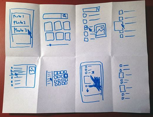
Source: Google Ventures Library
But that’s okay because the quality of the drawings doesn’t matter. The point is to force yourself to generate ideas rapidly without dwelling on how the sketches look.
It’s like visual brainstorming on steroids.
But no matter how you approach sketching, it should be the starting point of any wireframing pipeline.
Once you’re happy with your sketches, it’s time to turn them into wireframes.
Start by deciding the fidelity or the level of detail of your wireframe. These run the spectrum from low to high fidelity:
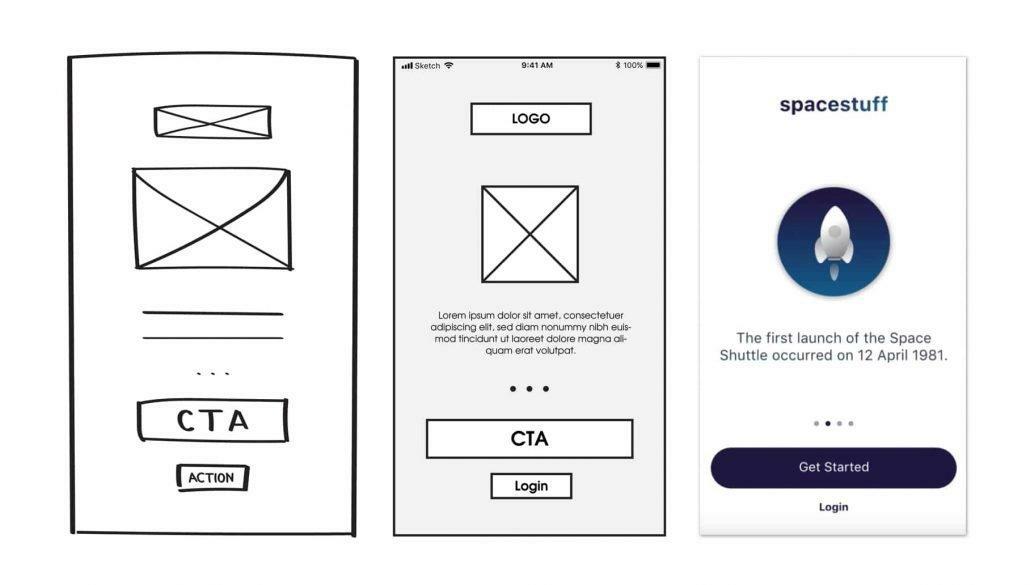
Source: Mentormate
Different fidelities will have different use cases.
Low-fidelity wireframes are best used to communicate the layout and structure of the app. It’s often useful early in app development.
High-fidelity wireframes focus more on the aesthetics and visual feel of the app. Therefore, it’s geared more towards the latter phases.
Whichever fidelity you pick, next up is to determine your wireframe’s mobile frame and dimensions.
Source: Balsamiq
The more crucial decision here is to pick the right screen size.
This can be a challenge if you’re developing a cross-platform app as you need to accommodate a range of devices.
In this case, going for the middle screen size is a good option.
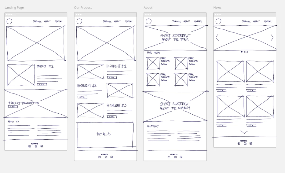
Your next concern will be the visual hierarchy, or the way elements are arranged on-screen in terms of priority.
The best approach here is to separate your UI into zones, like below:
Source: Miro
Zoning is the broad stroke that can help you organize your UI layout more effectively.
From here, it’s easy to fill in the details by adding buttons, image placeholders, and sample copy.
At this point, you can even show the user flow and interactive elements. UX designer Risa Nakajima illustrates how you can do this effectively in a static wireframe:
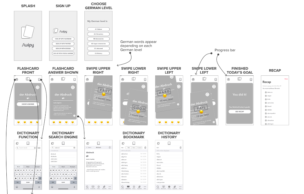
Source: Risa Nakajima
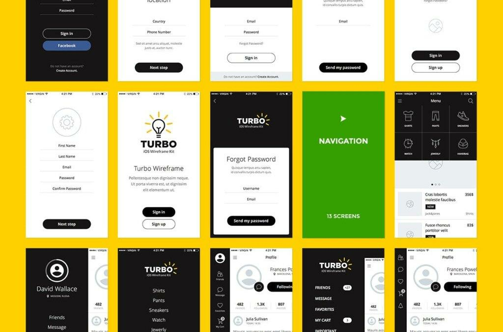
Finally, note that you don’t have to create a wireframe from scratch. Many wireframe templates and kits can help cut your process time dramatically.
Best of all, most of them are free.
Good examples include Blokk Wireframe Kit and Turbo iOS Wireframe Kit.
Source: UI Garage
Your wireframe will form the foundation of your entire app. Everyone, from the developers to designers, will rely on it. So, make sure it’s the best that it can be.
The first version of your wireframe isn’t likely going to be the best and the last. To refine it further, you need to gather feedback from important stakeholders.
The easiest approach is to send it to your colleagues and have them jot down their impressions of it.
You can also ask specific questions to ensure they don’t miss out on key sections of the wireframe.
But if you want the best insights, it helps to plan out your wireframe testing carefully – treat it as you would any software testing process.
The best way is to use the various usability testing methods at your disposal.
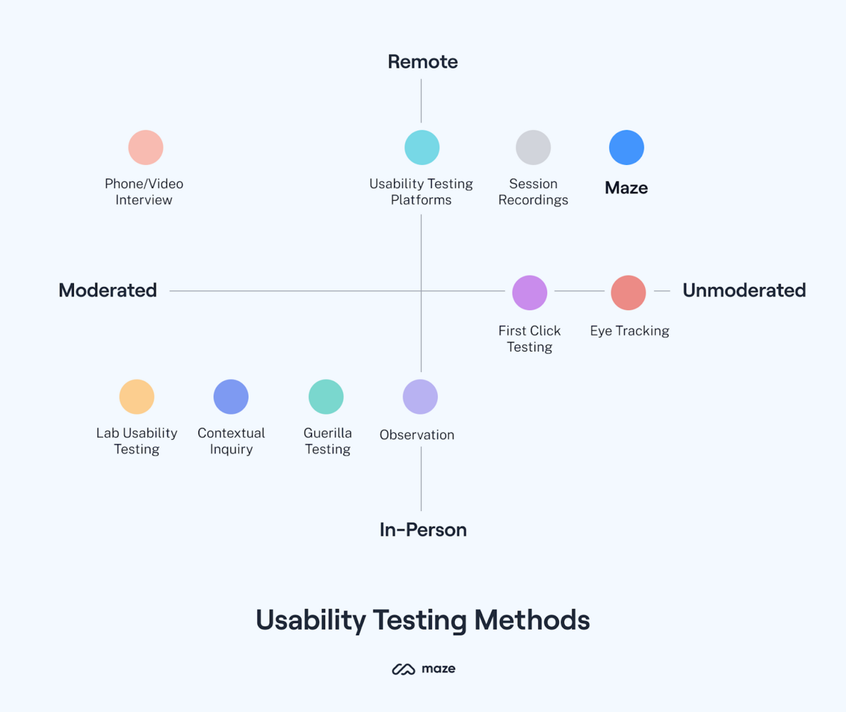
Source: Maze
Your chosen method will depend on your goals, budget, and time constraints.
Unmoderated tests, for example, are easier to conduct at scale. However, moderated usability tests like lab testing and interviews can offer deeper insights, although they cost more.
If you want to learn more about usability testing, check out our article here.
Also, it might be worthwhile to test your wireframe with end-users. That way, you can verify if your design assumptions fit well with them.
Of course, testing is useless if you’re not going to refine your wireframe with the insights gained.
Then, repeat user tests with each new iteration, stopping only when you and your team are satisfied with the final version.
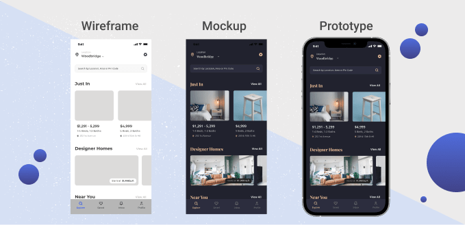
A wireframe is useful as a reference tool for your development team. But it becomes its best when turned into a prototype or mockup.
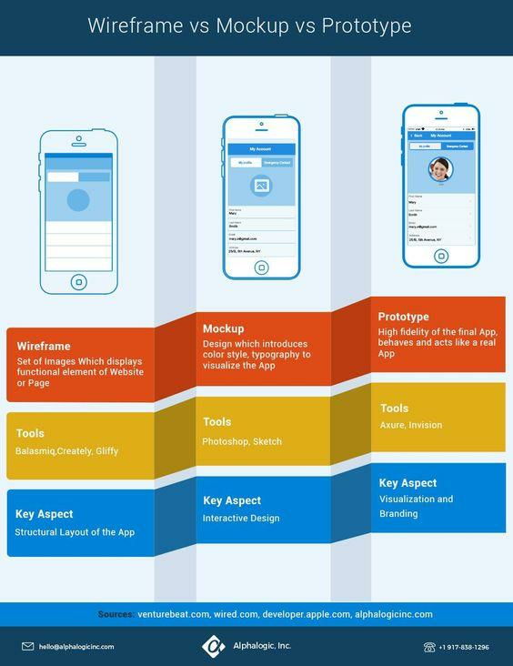
Source: Alpha Logic
A prototype is a working pre-final version of your app. That means a user can interact with it, just like any app.
The only difference is that the behavior is canned since it doesn’t contain the app logic yet.
Prototypes are indispensable for testing the UX of your app before launch. It verifies if the user flow, layout, information architecture, and visual hierarchy work for the user.
In many ways, prototypes are the ultimate validation for your wireframe.
You can also turn your wireframe into a mockup. It’s similar to a wireframe but with a focus on aesthetics. Visual designers mostly use it to finalize the look and feel of the app.
Source: Pixetic
You can use various tools to turn your wireframes into prototypes. The most popular is Sketch, but you can also use Adobe XD or Figma.
Wireframing might seem straightforward at the surface, but a lot is going on underneath.
It takes plenty of research, analysis, collaboration, and testing to arrive at a wireframe design.
But the prize—a user-friendly app—is well worth the effort.
Need wireframing inspiration? We’ve gathered 18 of the best examples of wireframing in this article.

Petar leads Shake (DECODE’s sister company) as CEO, delivering the product to a growing number of happy, innovative clients. Day-to-day, he ensures the engineering, design, product, marketing and sales teams all work in harmony. Before moving to Shake, Petar led DECODE. Although an engineer by schooling, his natural talent soon saw him making an impact on the marketing, sales and branding side of things. Petar’s passions include architecture, skiing, sailing, and a good glass of red wine.
This guide will walk you through the basics of wireframe annotations, including why they're important, how they work, and how to use them.

We will discuss six app wireframing mistakes you can make and provide some good tips for avoiding them.

If you're looking to create a mobile app, wireframing is one of the best ways to get started. To motivate you, we cover six benefits of app wireframing.