1.3K 5-star reviews for the stock trading app
Product discovery for a finance management platform
Our client decided to revolutionize the South African financial landscape with a finance management app. And we decided to help.

SHORT
summary
Industry
FinTech
Location
United Kingdom
Timeline
7 weeks
Services
Product discovery
Team
Solution Architect
UX/UI Designer
Project Manager
Product Manager
A youthful and innovative UK startup approached us with a FinTech app idea. They envisioned the product as an all-in-one place for young adults to manage their finances. And here’s the kicker: The market they’re aiming for is South Africa, where similar apps haven’t broken in yet.
The challenge
The client wanted to create a “Revolut for South Africa”, and bring digital finance management to the area.
The challenges they faced were twofold:
- Ensure further investments — For a startup still in the seed stage, it’s key to keep the ball rolling on their product. The aim is to give potential investors confidence that the product is worth investing in.
- Test idea viability — Other than technical feasibility, for a FinTech app like this to function, you need bank partnerships. While that isn’t a problem in Western markets, South Africa posed considerable obstacles.
The solution
To get serious investments, you need something more tangible than an idea. At the very least, you should have wireframes that show the product logic.
But ideally, you should design an interactive prototype.
You also need to create solution architecture that makes sure your product is technically feasible.
Lastly, as a FinTech product of this type, you need to research the financial infrastructure of the area. If you don’t have a bank supporting you, you don’t have a product.
And accomplishing these 3 points is exactly how we decided to help the startup.

How we got there
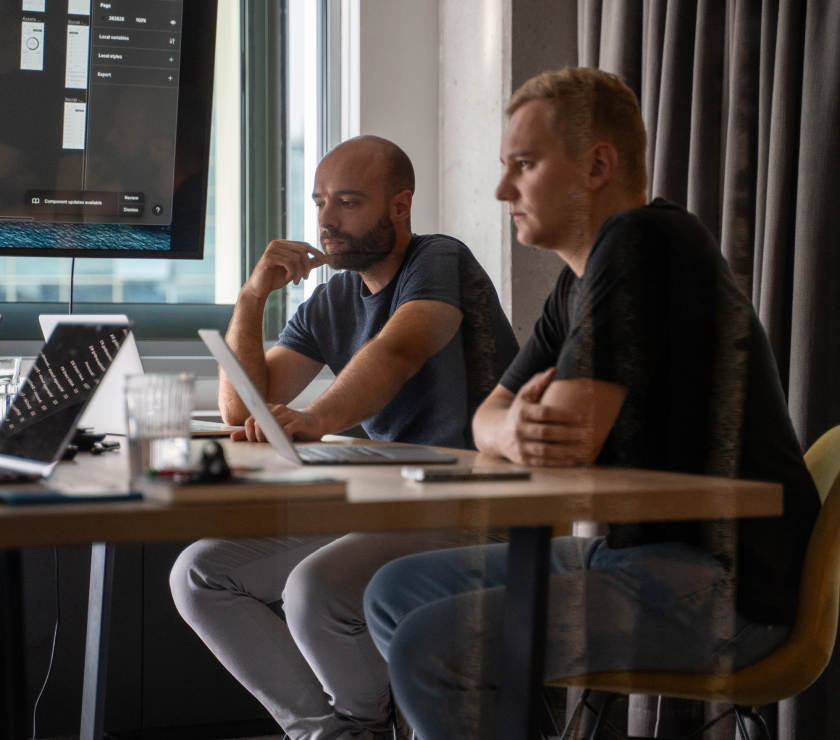
We assigned a multi-disciplinary, dedicated team consisting of four experts to our innovative clients, ready to help them get their product going.
The team outlined and then followed through on this process:
- Project scope
- Competitive analysis
- Functionality prioritization
- Features
- Software architecture
- Design plan
- User journey & flows
- UI design of key screens
- Clickable prototype
Along the way, we’ve been in constant contact with the client, making sure they’re always in the loop and that we meet all of their requirements.

Our impact
User & market research
There was scarcely any competition for this sort of product in SA, so we’ve researched other similar solutions across the globe.
We’ve also researched the target audience (young adults) and tested the prototype with them to gain valuable feedback.
Solution architecture
We researched necessary 3rd party integrations and vendors so we could ensure that the client’s product could actually be created.
We’ve also contacted local banks to see if integrations with them could be possible.
User flows & journeys
In the user journey, we’ve detailed what sort of user emotions to expect and how to guide them in the right direction.
Then, we’ve outlined the screens the product needs to lead the user to their desired outcome logically.
Wireframes
Our UX/UI design team sketched out mid-fidelity wireframes informed by the user flow they created previously.
UI of key screens
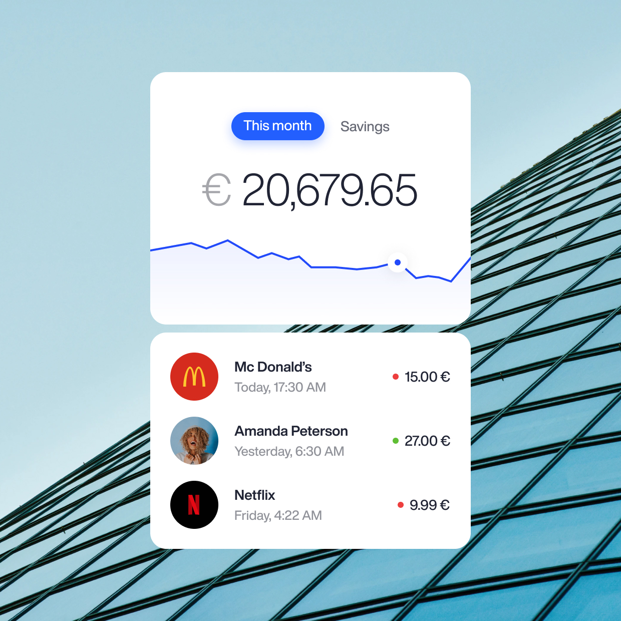
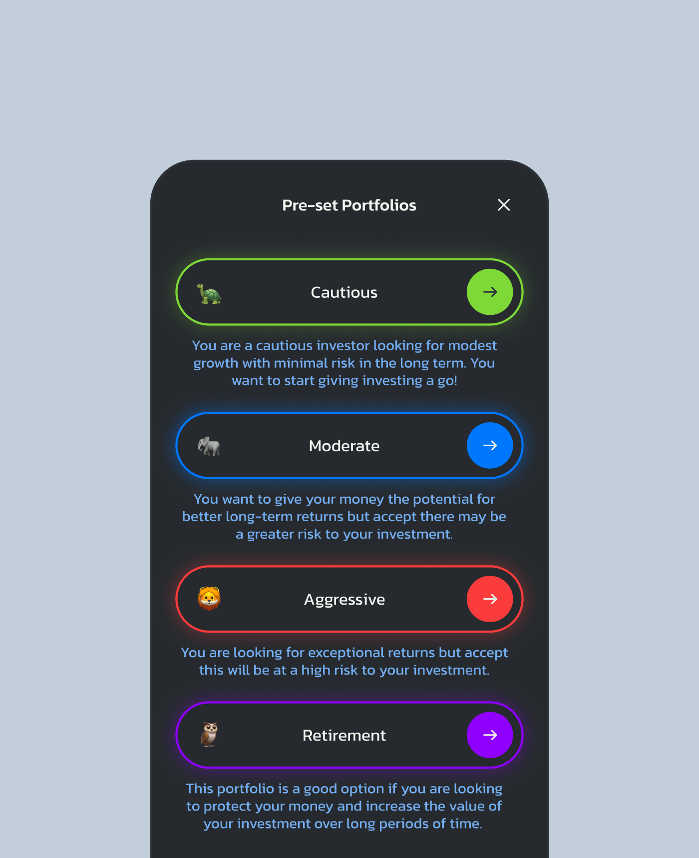
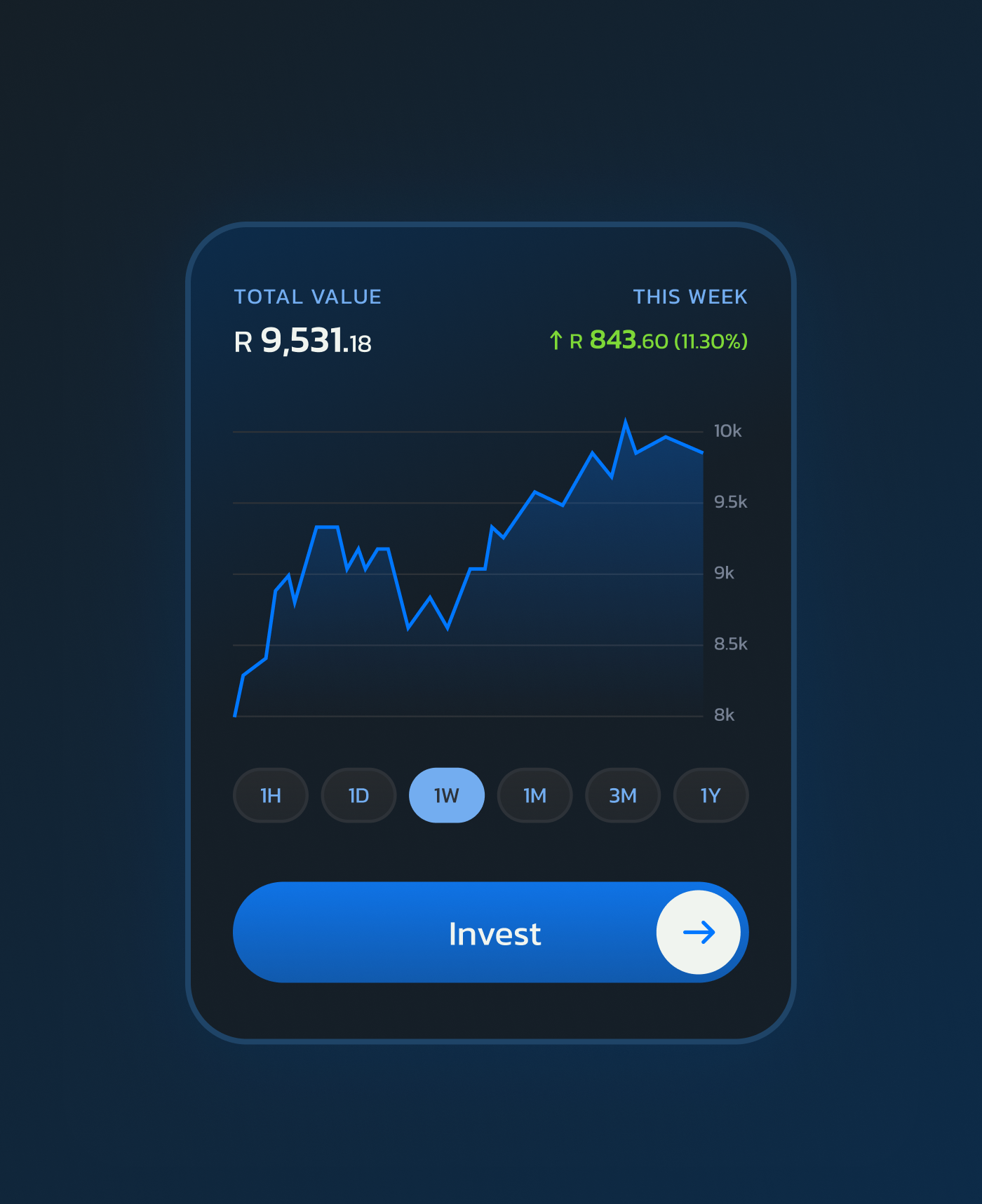
We’ve created 20 key screens, such as the home screen, portfolio, and savings.
We’ve emphasized the youthful nature of the product’s target audience.
Interactive prototype
Our work culminated in a fully clickable, interactive prototype using the previously designed screens.
This way, the client could feel the end product before writing a single line of code. Most importantly, the prototype would be a perfect addition to an investor pitch.
Our tools

Figma/Figjam
Our UX/UI team created wireframes, user journeys, an the prototype using these tools. They’re also great for collaboration with all stakeholders, even those with little technical expertise.

Google Workspace
Whether it was using Google Docs, Sheets, or Slides, the G Suite came in handy when collaborating with the client.

Useberry
This is how we test our Figma designs. Our target users’ feedback is crucial to us and we want to hear all of it.

Think with Google
Provides researchers with a comprehensive platform offering valuable data-driven insights, trends, and consumer behavior analysis to inform strategic decision-making processes.
Outcome
The startup is currently in new rounds of funding and we prepared them for a successful pitch with:
- An interactive prototype
- Airtight solution architecture
- And thorough market research
Many new and exciting features are in the works and we’re looking forward to expanding our partnership.
9
Discovery workshops
20
UX/UI screens
1
Functional prototype
WANT A PRODUCT LIKE THIS ONE? — LET’S TALK
Just fill in the short form below, or skip to the bottom to arrange a chat directly with our client strategy specialist. Either way, we’ll be back in touch as soon as we can to arrange an informal call.
Don’t worry, any information you give us will only be stored for business purposes. Find out more in our Privacy Policy.

Arrange a chat with Ivor, our client strategy specialist.

