
Great tips for managing an external development team
If you need help managing an external development team, this article will provide six tips to get you started.
If you own a car, you’re probably aware that you need to track many things, such as mileage and your last oil change, so you can know if it’s performing well or if it needs repairs.
It’s the same with a development team.
You need KPIs—key performance indicators—to tell you how your development team is doing. They allow you to evaluate and improve their performance objectively.
Without KPIs, you would effectively be managing everything blindly.
Here are some metrics you’ll likely use with your external development team.
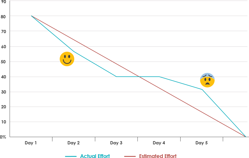
The sprint burndown metric tells you how quickly an outsourced team can complete their work in a particular sprint.
One of the ways you can visualize this is with a burndown chart. Here’s a breakdown of its components.
The X-axis of the burndown chart depicts the days in the current sprint. The Y-axis, meanwhile, measures the work or effort done.
Two lines are then plotted. One measures the estimated work required, while the other measures the actual output completed in a certain period.
Source: Visual Paradigm
A sprint burndown chart is an excellent tool because you can tell, at a glance, whether a project is on track.
Managers can know early if progress is falling behind, so they can adjust accordingly.
Now, the actual effort line won’t be 100% aligned with the estimated effort line—that’s normal due to variations or changing requirements.

You’ll be talking with our technology experts.
But if it diverges dramatically and consistently, it could indicate a problem.
For instance, if the actual effort line is significantly higher than the estimated effort, it could be a sign of scope creep.
This is generally bad because it could stretch project deadlines or cause burnout.
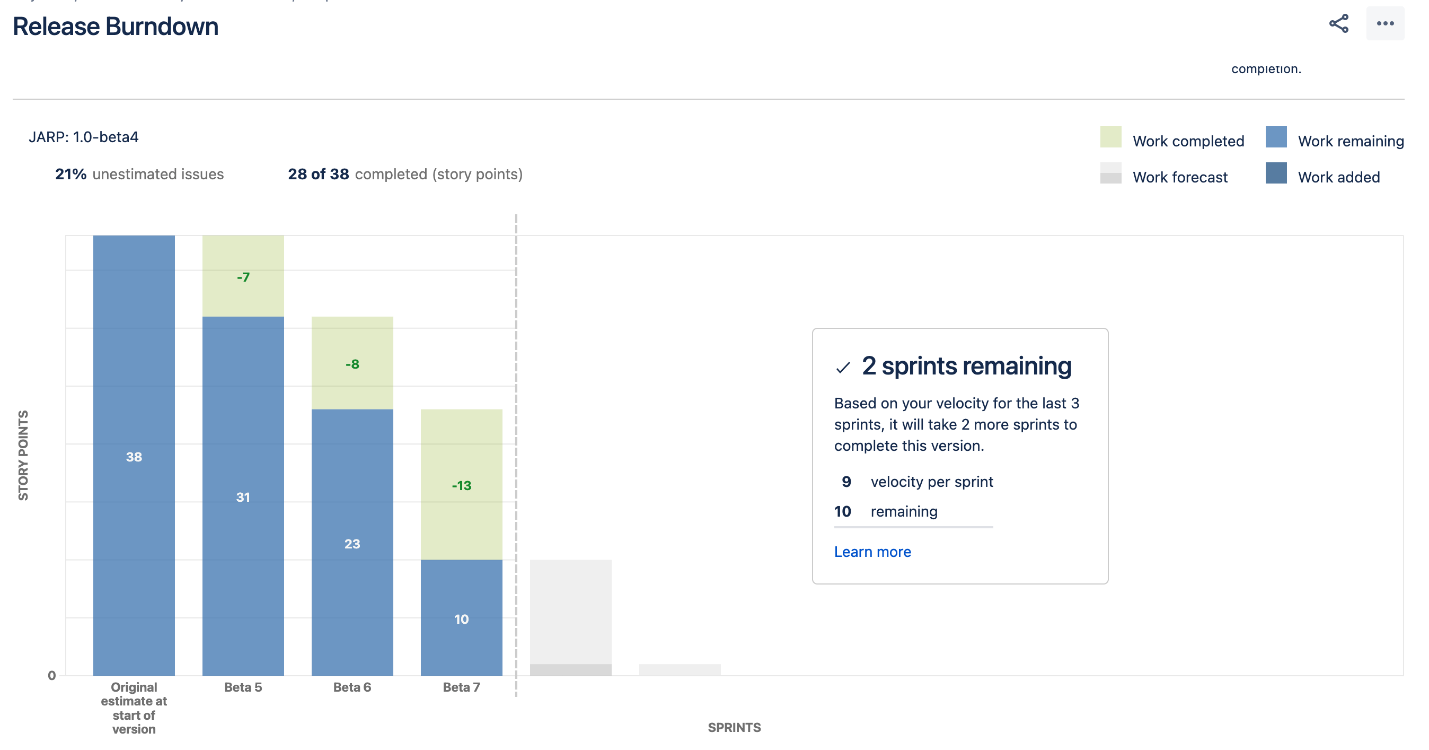
The release burndown KPI measures how much work is left for the outsourced team before the software can be released.
Source: Atlassian
A release burndown chart gives similar benefits as a sprint burndown chart.
It can tell you whether your team is on track or not to complete the project. It can also indicate possible productivity or burnout problems.
But release burndown can be more useful as a planning tool.
It can tell you how many sprints you’ll need to complete before launching an app, based on your team’s performance on previous sprints.
This can help you predict future milestones much more accurately. The more sprints you do, the better your forecasts.
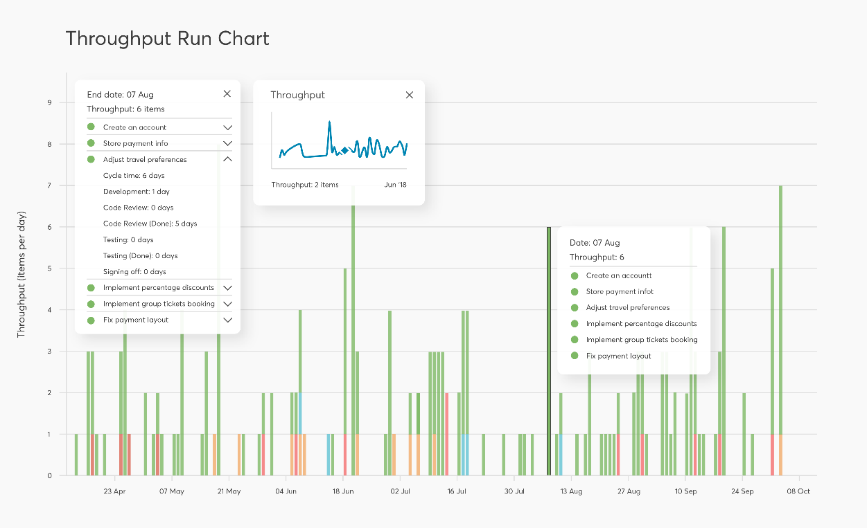
Throughput is simply the amount of work your team completed in a certain period. Sometimes, the throughput is expressed as a weekly or monthly average.
It’s important to note that the throughput chart doesn’t consider the tasks the team is working on—just the finished ones.
Source: Nave
You can get a rough idea of your team’s productivity by studying the throughput graph trend.
If the overall throughput graph goes down, that means the team’s productivity is decreasing. This could be a sign that your team is encountering issues or difficulties.
The graph can also be used as a predictive tool. Using past performance as a reference, you can estimate how much work a team can complete in a given day.
This allows you to create better project timelines.
Ultimately, though, throughput gives you limited insight on its own. It would be best to pair it with further analysis to determine the true cause of the findings.
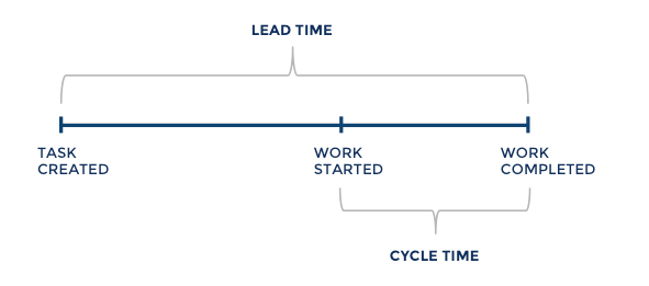
Lead time measures the time needed to turn a software draft into a full release. Put another way, it tells you how fast the dev team can complete an app project.
This one’s easy to measure.
Simply log the day you sent a development team your request and again when you launch your app. The period in between is the lead time.
Now, it’s important to distinguish lead time from cycle time, which is the actual time spent working on the product.
On the other hand, lead time includes cycle time plus other phases like planning and hiring.
Source: Screenful
Long lead times can happen for many reasons. Taking too long in the concept ideation stage is one of them.
Sometimes, if the agency is busy and can’t respond to client queries immediately, it can lead to longer lead times.
Cycle time measures the time it takes to complete a task after beginning it.
This excludes any relevant but miscellaneous tasks like planning and setup—only actual development work counts.
Like throughput, the cycle time can help you spot productivity issues when viewed as a chart. If your team’s average cycle increases over time, it’s time to investigate further.
Cycle time can also be a useful planning tool. External teams can review the time they spent working on project tasks in the past.
That way, when you ask them to do similar work, they can estimate the time necessary for completion with much more accuracy.
You can also review the cycle time of your dev team and look for trends. Maybe you notice that they take too long in testing tasks, so you can find ways to optimize them.
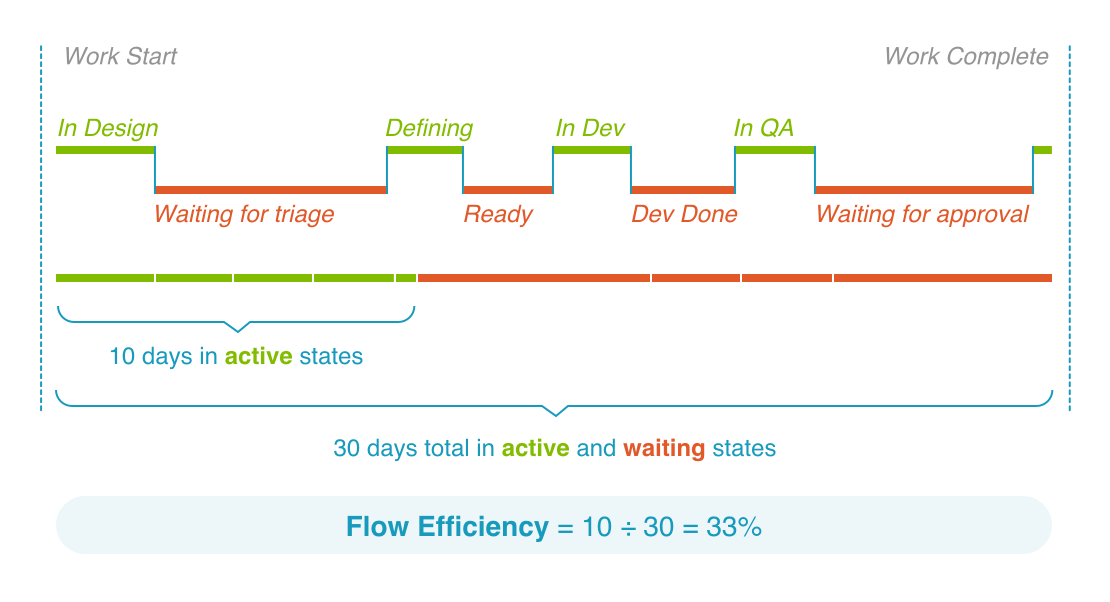
Flow efficiency is a ratio that measures your team’s active time (spent on actual work) versus the total cycle time.
For instance, if it took your team 20 days to complete a sprint but only five of those were spent on actual work, then their flow efficiency would be:
5 days / 20 days = 25%
That means your team only had 25% productive time—and the other 75% was spent waiting, likely due to delays or waiting for approval from another party.
Source: Tasktop
It’s crucial to remember that 100% flow efficiency is nearly impossible.
In fact, veteran development teams in rapid turnaround projects only hit a 40% efficiency flow. When onboarding a new external dev team, you should expect it to start at around 15%.
A better use of flow efficiency is analyzing bottlenecks in your pipeline. You can pinpoint which area introduces the longest wait times and then try to find quicker workarounds.
See if your flow efficiency improves after you implement those changes.
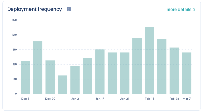
The deployment frequency metric tracks how often your software team can deploy their code.
Whenever your team moves a source code to production, that counts as a deployment. This can be anything from completing a bug fix or releasing a code for a new app feature.
Deployment can be measured weekly, bi-weekly, or monthly, depending on the size or complexity of the project.
Source: Codacy
Deployment frequency is one of the key KPIs for evaluating your team’s overall efficiency, productivity, and skill.
Teams that release code more often can launch apps or update bugs faster.
Small, more frequent code releases can also lead to a higher deployment frequency, which is desirable.
This is because smaller but more constant deployments are generally easier to build, test, and integrate into the app build, leading to faster iterations.
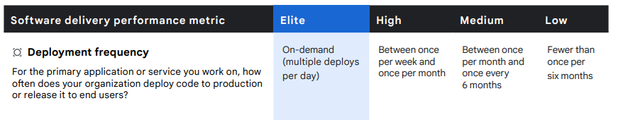
So, what’s a good deployment frequency to aim for? Google’s Accelerate State of DevOps report provides some benchmarks.
Source: Google
But again, you should treat these numbers as just guides. It’s a better option to track your deployment frequency to figure out ways to improve it over time.
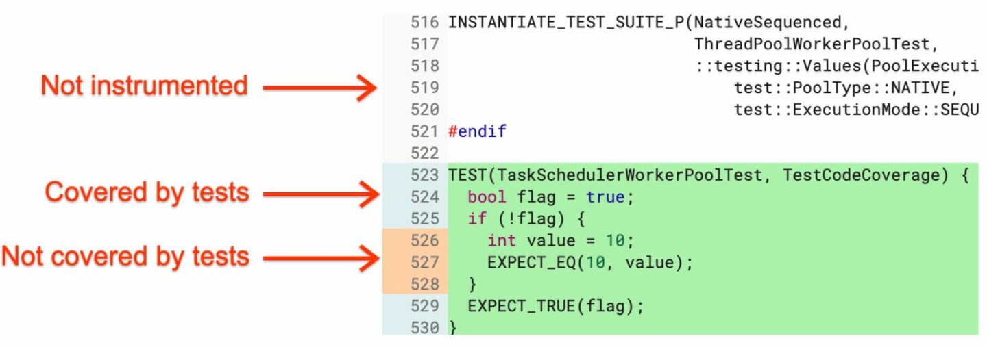
Code coverage measures the executed lines of code which were validated while running automated tests. It’s calculated by dividing the tested code by the total lines of code.
For example, if you have 60% code coverage, that means only 60% of that code was validated.
Source: Developer Experience
The fact is that it’s nearly impossible to test all lines of code in the system with automated tests. This can be a problem because any unvalidated code can be a source of critical bugs.
Thus, your team should strive to get as close to 100% code coverage as possible without compromising code quality and testing integrity. 80% is a good percentage to aim for.
Code coverage can also tell you how well your team’s testers are creating test cases. If it’s low, that can indicate that a test script is not thorough enough and should be improved.
Code churn measures how often your software development team revises its source code. Whenever a developer revises, adds, or deletes lines of code, that counts as churn.
Therefore, code churn is a useful measure of the actual productivity of your team beyond the total lines of code written.
As an example, look at the visual below. Jason’s productive code—the lines actually submitted to production—is far less than his churned code.
It means that while he might have written the most code, a big chunk of it was just wasted.
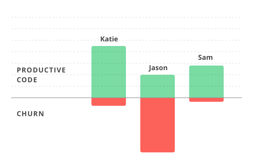
Source: Plural Sight
A high code churn rate means your development team is frequently reworking a piece of code, which is a sign of poor coding skills.
It can also indicate that your developers misunderstood the project requirements.
Aside from productivity issues, high code churn could result in less stable software. That’s because editing increases the chances of introducing more errors into the code.
Nevertheless, it’s important to note that achieving zero code churn is impossible. A good benchmark to aim for is a churn rate of 20% or less.
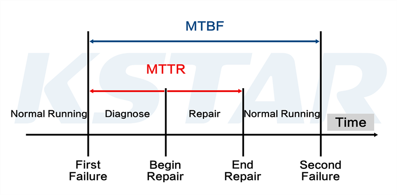
Mean time between failures (MTBF) measures the average time between software failures.
You can calculate it by dividing the total uptime of your software by the number of failures encountered.
So, for example, if your app encountered six critical bugs in 30 days, the MTBF is five. That means your app fails every five days.
Source: Limble
MTBF is primarily a measure of reliability, but it can also gauge your development team’s coding and testing skills.
A low MTBF means that the team did excellent work developing and testing the software.
The only limitation of MTBF is that it doesn’t consider downtimes. But that’s what the next metric is for.
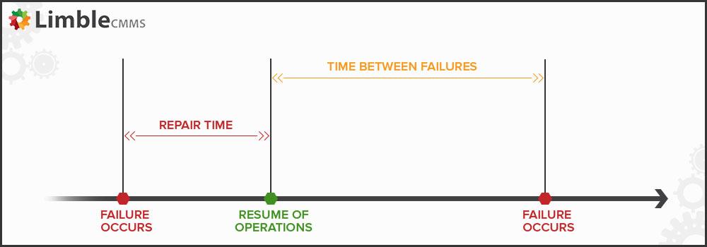
Mean time to repair (MTTR) is the time the development team takes to repair software from when it failed.
To measure it, get the total downtime for a given period, then divide that by the number of failures encountered.
So, for example, if your system was down for 60 minutes across three incidents, then your MTTR is 20 minutes.
That means it takes you 20 minutes on average to bring your software back up.
Here’s an example of MTTR alongside MTBF.
Source: KStar
Combined with MTBF, MTTR is a more comprehensive measure of your software’s reliability.
That is because it considers both the time it takes to repair the software and your team’s reaction to the failure.

Make your software product successful with monthly insights from our own Marko Strizic.
And like MTBF, it also helps you gauge the capability and speed of your development team to resolve problems.
The lower your MTTR, the shorter your downtime and the less revenue you lose.
KPIs can give you some of the most useful insights when working with a development team.
But what’s more important is what you do with them. See, even the most comprehensive KPIs will be wasted on an incompetent manager.
That’s why KPIs should go hand-in-hand with effective team management.
Need help in this area? Check out our article on managing your dedicated software development team.

A seasoned software engineering executive, Marin’s role combines his in-depth understanding of software engineering processes (particularly mobile) with product and business strategies. Humbly boasting 20+ years of international experience at the forefront of telecoms, Marin knows how to create and deliver state of the art software products to businesses of all sizes. Plus, his skills as a lifelong basketball player mean he can lead a team to victory. When he’s not hopping from meeting to meeting, you’ll find Marin listening to indie rock, or scouring the latest IT news.
If you need help managing an external development team, this article will provide six tips to get you started.

Outsourcing is the trend right now. This article will guide you through the process of hiring an IT outsourcing company.

In this article, we will discuss the best practices for working with a external development team.