It’s no secret that great UX is the secret sauce for app success.
However, not everyone does it well—or at all! Surveys found that roughly half of all apps don’t do UX testing. No wonder 70% of online businesses fail due to poor UX.
Of course, the simple reason for this statistic is that UX might be simple, but it’s notoriously hard to get right. There are many things to consider, from the UI design to the efficiency of your onboarding.
But there’s a surprising factor that many people overlook—native apps actually give better UX overall than hybrid or cross-platform.
Here’s how.
Seamless device compatibility
Compatibility is perhaps one of the best reasons UX on a native app is so great. The app is so well-tailored to the OS that it operates seamlessly for the user.
For instance, native apps can automatically adjust their screen size and resolution to fit the device.
This is more important than you think because there’s a wide variety of device resolutions in the market today, even within the same OS.
The Mobile Screen Resolution Stats from Statcounter shows this pretty clearly:
Source: Statcounter
If your app doesn’t account for all these variations, you risk breaking your UI layout. And that’s not even counting the more substantial resolution differences on future devices.
At worst, this can negatively impact your UX.
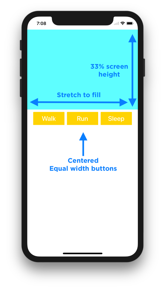
Native apps solve this dilemma by including UI resizing features in their SDK. iOS developers, for example, have access to Auto Layout. It works by setting constraints on each UI element, and the app will automatically maintain these constraints in real-time.
Source: Super Easy Apps
Using this feature also helps your app adapt to user-initiated changes, such as when the user rotates the screen or enters the split view on an iPad. This fluidity allows your app to fit in with however the user wants to work—definitely a big plus for UX.
Because native apps run directly on top of the OS, they are also more compatible with the underlying device hardware, such as the battery and memory.
More importantly, they give unprecedented access to device capabilities such as the camera, microphone, accelerometer, and gyroscope.
This is crucial for high-performance applications like augmented reality (AR) or 3D games that push devices to their limits. Nowhere is this more apparent than in Niantic’s popular Pokemon Go app.
Source: Pokemon Go
If you’re not familiar, Pokemon Go is an AR game where players can interact with their surroundings to catch virtual Pokemon.
Because of its innovative gameplay, the app requires fast and direct access to the camera, GPS, gyroscope, and accelerometer. In addition, it also needs to integrate with a third-party app, Google Maps.
All of this would simply not be possible with a non-native app.
Even if a hybrid app gained access to the hardware, it would be unlikely to guarantee a smooth performance to meet the gameplay standards of Pokemon Go.
High performance levels
All things equal, the performance levels of a native app can beat that of a hybrid or cross-platform version.
This is what Linkedin found out first hand. In 2013, they switched from a hybrid app running HTML5 to fully native development.
Kiran Prasad, senior director for mobile engineering, revealed why:
“We have definitely shifted from HTML5 to native. The primary reason for that is, we’re seeing that more and more people are spending more time in the app, and the app is running out of memory.”
He also emphasized the effect using a native approach had on the UI:
“The second reason we’ve gone native is trying to get some of the animations—the spinners and the way they work—getting that smoothness, we felt like we needed native to do that well.”
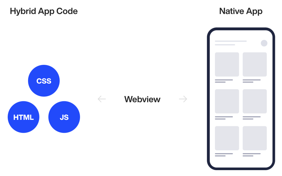
This advanced performance is due to the fact that native code runs directly on the operating system. This is in sharp contrast to a web app, which requires an intermediate layer to execute, thus slowing things down.
Source: DECODE
The second reason is that native development generally has fewer bugs because developers need only focus on one programming language for one OS. That allows them to use all the techniques available to optimize their apps for that platform.
This is one of the problems with cross-platform. While many cross-platform tools like React Native have high code reusability, it’s not 100%.
Sometimes, you still need to tweak every app version to fit a platform. This can introduce errors.
In addition, native development provides much better programming and debugging tools, leading to a more polished app. This was also one of the realizations Linkedin had.
Prasad notes:
“If you look at Android and iOS, there are two very large corporations that are focused on building tools to give a lot of detailed information when things go wrong in production. On the mobile web side, getting those desktop tools to work for mobile devices is difficult.”
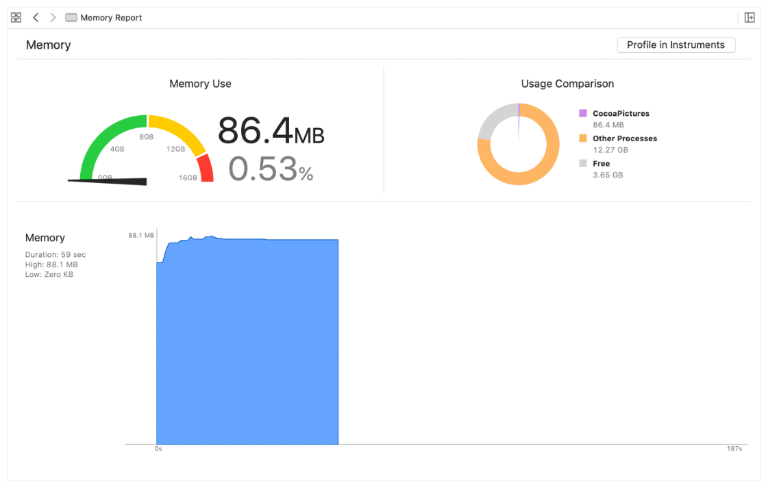
For example, Apple’s iOS IDE Xcode includes a Debug navigator showing how much memory an app uses.
This knowledge helps developers optimize their code to prevent crashes due to memory overflow:
Source: Apple
Android also has its own memory debugging tool, Memory Profiler, included in its Android Studio IDE. In addition, it also provides memory management functions that developers can call in-code.
And lastly, native app developers are the first to get the latest SDK of each platform. This allows them to use the best functions and tools to improve their apps’ performance further.
In contrast, it takes time for cross-platform tools like Xamarin or React Native to adopt these SDK changes.
Consistency with the OS design
If you want your app to be consistent with the look and feel of your target OS, then native development is the way to go.
But why is this important?
To explain why we refer to Jakob’s Law. This is a UX principle coined by Jakob Nielsen of the Nielsen Norman Group. It states that:
“Users spend most of their time on other sites. This means they prefer your site to work the same way as all the other sites they already know.”
This is the power of familiarity in action. It means that when your app is already familiar to a user, they’ll be more successful at using it to complete their tasks, as they won’t have to exert so much energy on finding their way around the app itself.
Design familiarity is a great shortcut for achieving great UX. By leveraging your user’s existing app mental model, you can help reduce the learning curve and improve retention rates. The experience will also feel much more natural and intuitive to them.
You can see this in action with iOS and Android. Each platform has its own UI behaviors, elements, and interactions with their particular nuances.
If your app deviates from the culture of that platform, however minor, the users may be uncomfortable.
For example, Android users will be familiar with the “floating action” icon—a cross symbol on a circle.
Pressing this will bring up the primary actions on the given app page. iOS apps, in contrast, will have a cross sign on the upper right corner of the screen, near the title bar:
Source: Lean UI Design Blog
Putting a floating button on an iOS app might seem okay, but it will likely surprise your users.
Achieving a native look is much easier when you’re already doing native development. This is because the SDK of each platform will have a library of UI elements and templates that you can easily use.
This also saves time since you won’t need to create these components from scratch.
For example, Apple allows you to define translucency and blur effects through its Materials UI library.
IOS also gives developers comprehensive guidelines to help them stay true to the native look of iOS apps.
The challenge with cross-platform development is that it’s much trickier to adopt a native look. At best, you’ll need to tweak the UI for every platform, which requires added work.
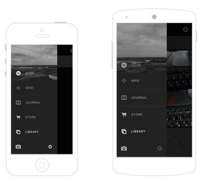
There are, of course, exceptions. One example is the VSCO Cam app, which adopts a custom UI that’s identical to both iOS and Android:
Source: Smashing Magazine
However, examples like the above are few and far between. What’s more, it requires you to design a UI layout from scratch, which is not exactly easy and cheap.
On the other hand, using the native look library for your app means you get a proven UI with minimal time and effort.
Native apps work offline
One of the more overlooked aspects of UX is an app’s ability to work offline. This is another area where native apps have the upper hand.
That’s because native apps are offline by default. They run on the device itself instead of a web page that must be retrieved from a web server (as with hybrid apps). And the only time your native app needs an internet connection is if it needs to send or receive data.
And if you think that doesn’t apply to apps that need online functions, think again.
Take the Evernote app, for example. When you go offline, the app just doesn’t stop working.
Instead, it still allows you to create notes or view limited versions of them on your phone.
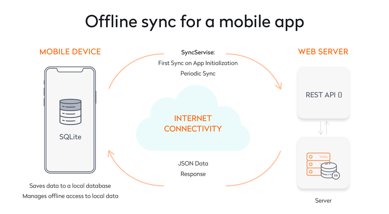
Then, when you go online, the app automatically syncs your local data with the one on the web server.
This method is called offline sync, and it’s an effective way of ensuring your app works seamlessly offline.
Source: Yalantis
This is also how Google Drive handles being offline. You can still access and edit offline copies of your documents. Any changes made during this time will automatically be updated when you go online.
Imagine the frustration when you can’t open a critical document because you lost your internet connection.
And that, in a gist, is why offline capabilities are important for UX. You want an online app to be responsive even when offline. This is especially true for mission-critical apps in healthcare and finance.
Native apps make this possible by allowing you to preserve as much of the functionality of your app as possible, so there’s minimal disruption to your user’s workflow.
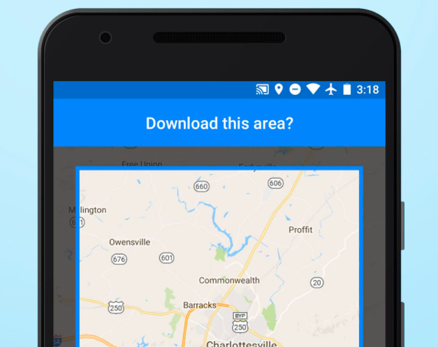
For example, apps like Spotify, Kindle, and Google Maps allow you to save data offline to use it without a connection.
Source: Ting
This feature is indispensable for travelers who don’t necessarily have access to the internet in a foreign country.
Enhanced security for the user
When people think of UX, they often don’t think of security first. But in many ways, it’s one of the crucial aspects of great UX.
After all, what use is a beautiful and user-friendly UI if it puts your user’s data and privacy at serious risk?
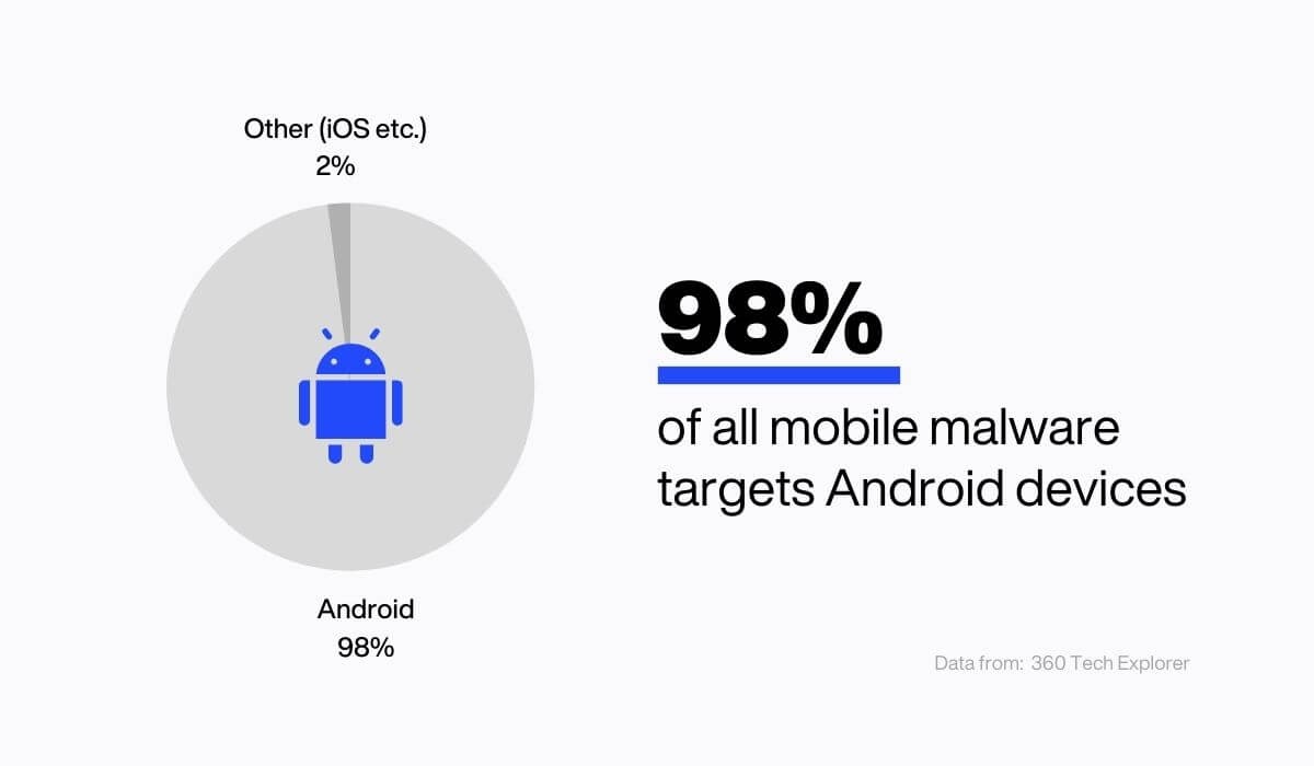
And the dangers are real, especially if you’re developing for Android users:
Source: DECODE
Fortunately, going native can help you boost your app’s security considerably. And it’s for the simple reason that most native apps need to go through a strict vetting process to get listed.
If you’ve read our app store guide, you’ll know how rigorous Apple App Store guidelines can be. In particular, they will subject your app to a round of stress and performance tests designed to break it.
The good news is that every app that Apple approves has a high chance of being free from security vulnerabilities, malware, and viruses.
In fact, a study showed that only 0.01% of all malware on mobile are found in either the Apple App Store or Google Play Store.
Besides this, native app developers also have more security tools at their disposal.
For instance, they can utilize SSL certificate pinning, which is far more effective than SSL certificates to stop man-in-the-middle (MITM) attacks.
Source: DECODE
Code obfuscation also works better on native code. This is where you make the source code indecipherable (without changing its logic) so that hackers have a hard time reverse-engineering it.
There’s so much more that goes into UX
While native apps inherently have better UX, that’s just a tiny piece of the puzzle.
Achieving a truly remarkable user experience requires a more holistic approach that touches on every aspect of your app.
It’s not easy, but it’s worth it in the end.
And if you need some help to make the process a little easier, give us a call! We’ll help you craft the best UX for your next app project.


