
Differences between a mobile app POC, prototype, and an MVP
This article will discuss the three most common app validation tools—POC, prototypes, and MVPs, and explain the differences between them.
Have you ever heard of the jam experiment?
In 2000, two psychologists ran a test on two supermarket displays, one with 24 different kinds of jams and the other with only 6.
Surprisingly, the display with fewer jams generated more sales.
It perfectly illustrates the paradox of choice—too many options can overwhelm a person and confine them into inaction.
This is a lesson that you can take into app development.
We believe that packing an app with a lot of features can make it robust and versatile when in fact, it makes it more confusing.
But how do you know which features to prioritize?
Here are six methods you can use.
MoSCoW stands for Must Have, Should Have, Could Have, and Will Not Have. The acronym is a convenient reminder of the four categories that make up this matrix.
Here’s the breakdown of each:
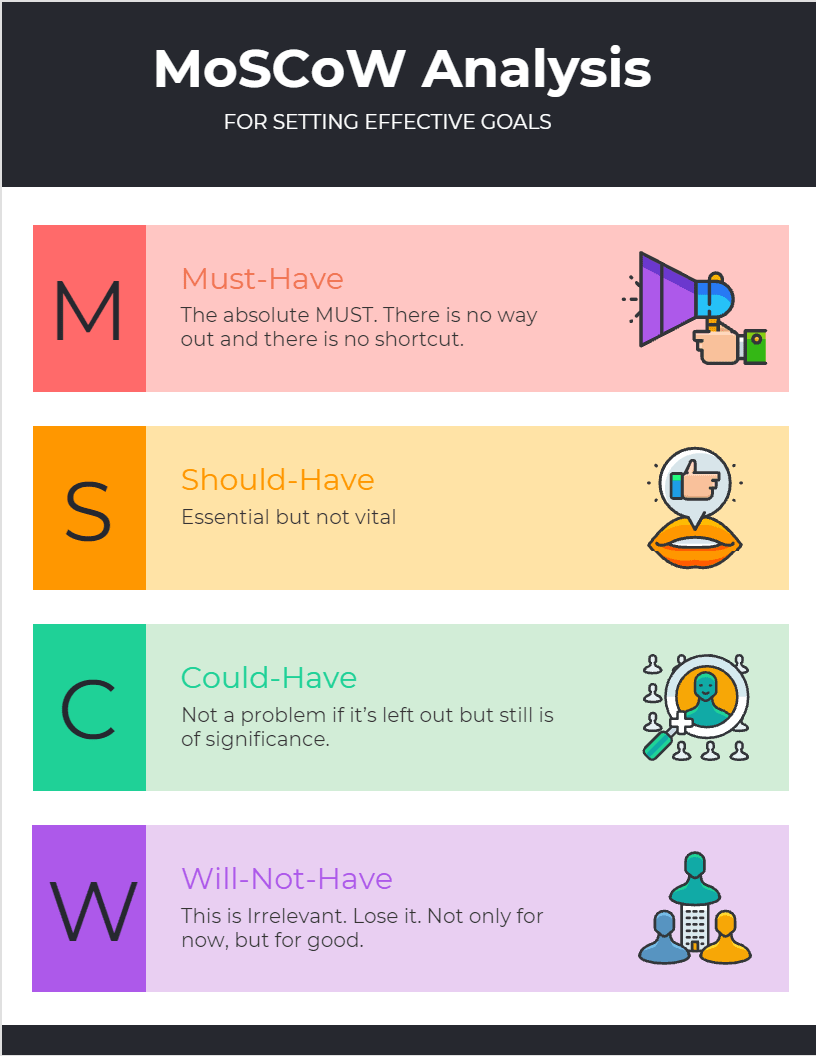
Source: Project Cubicle
Must-haves are the core features of your app. Your app cannot fulfill its primary function without them, so they’re non-negotiable.
For example, the function of a ride-hailing app like Uber is to allow riders to book a ride with a driver. To fulfill this role, you need to implement several core features depicted below.
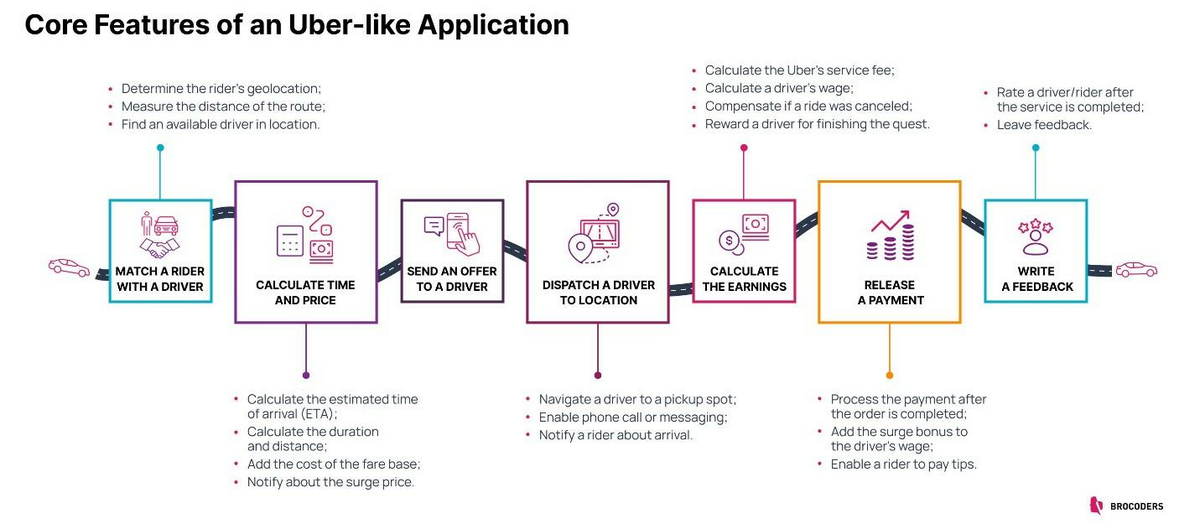
Source: Brocoders
A good way to gauge if a feature is a must-have or not is to try removing it from the app. Can the app still achieve its goal and solve the user’s problem?
If the answer is no, then the feature you’re dealing with is a core feature.
For example, removing the calculate time and price feature in the above list will completely break the app.
On the other hand, if a feature is very relevant, but can be delayed or worked around, it’s considered a should-have. They are important, but the app can still work without them.
In the ride-hailing example above, a should-have feature might be fare splitting. It can be very valuable in the right situation, but without it, a person can still book a ride as normal.
A could-have feature is not paramount, but plays a role in the user experience. Usually, these functions enhance usability, such as visual changes to the interface.
In the above example, a could-have feature might be the ability to book luxury vehicles for more discerning riders.
Now, tagging features as should-have and could-have doesn’t mean you won’t implement them.
It just means you’re prioritizing the must-haves for your MVP and reserving the others for a future release or update.
But if a feature is categorized as will-not-have, it should be left out of the app entirely. That means it doesn’t fulfill any purpose in the app, nor will it enhance the user experience.
The MoSCoW matrix provides a good guideline on the categories in which you can put your features. However, it can be limited because it doesn’t tell you how to categorize them.
That’s where the feature priority matrix comes in.
The feature priority matrix is similar to the MoSCoW matrix in that it groups features into different categories.
But the difference here is that this approach also includes three additional metrics—effort, impact, and risk.
You can use these to evaluate each feature to know which category they belong to.
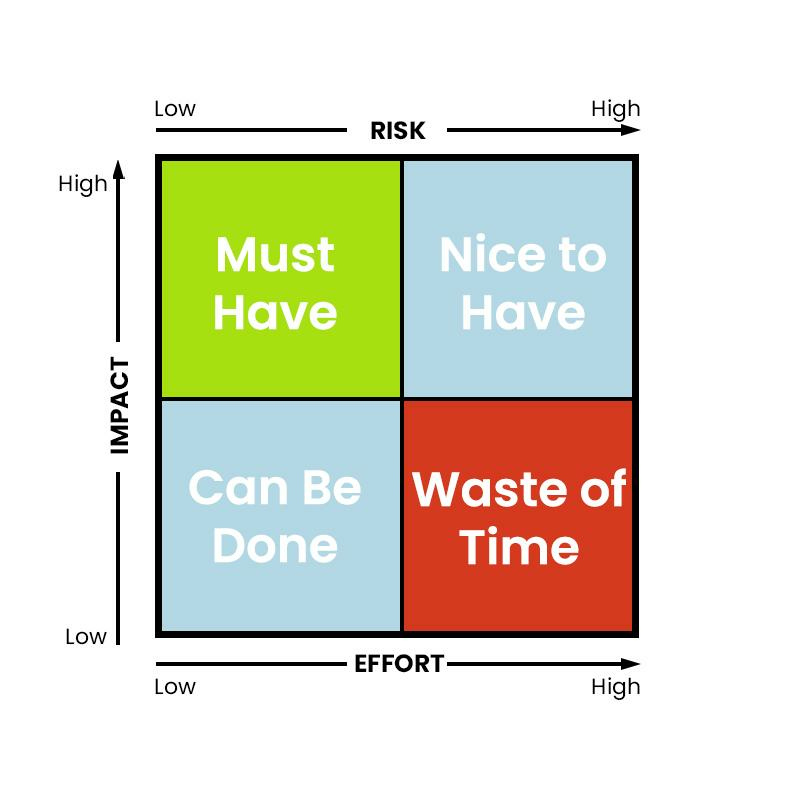
Source: DECODE
First, let’s talk about the three metrics.
Impact describes the feature’s importance to the user experience and your app’s goals. The higher the impact, the more value they bring.
By definition, core features have the highest impact.
Effort measures how difficult it is to implement a feature. Features with high effort require more time, skills, and money to develop.
Risk tells you if a feature poses a security issue. High-risk features can break your app or cause data breaches, so you’ll need more time to secure them.
Using this method is simple. You take each feature and rank it against these three metrics. Then, you place them in the appropriate quadrant in the matrix according to the results.
Features that have high impact but low effort and risk are the must-haves. They are the non-negotiable core features that you need to include in your app.
Nice-to-haves are features that still have a significant impact but also involve more effort and risk. Thus, the best approach is to put them off until the final app version or a future update.
Can-be-dones have minimal impact and thus aren’t that important to your app. But because they involve low effort and risk, it’s easy to include them in your final app.
Mostly, these are aesthetic features like changing the color scheme or UI layout.
Finally, you have features that are a waste of time.
As the name suggests, you should leave them out of your app because they deliver zero value yet require high effort and risk management.
Story mapping is a method that prioritizes features from the user’s perspective. It is so named because it involves users’ actions while using the app—forming a story of sorts.
The biggest benefit of story mapping is that it’s very straightforward. You simply list all the features and categorize them into the various user activities in your app.
Here’s an example of a story map for a document management app.
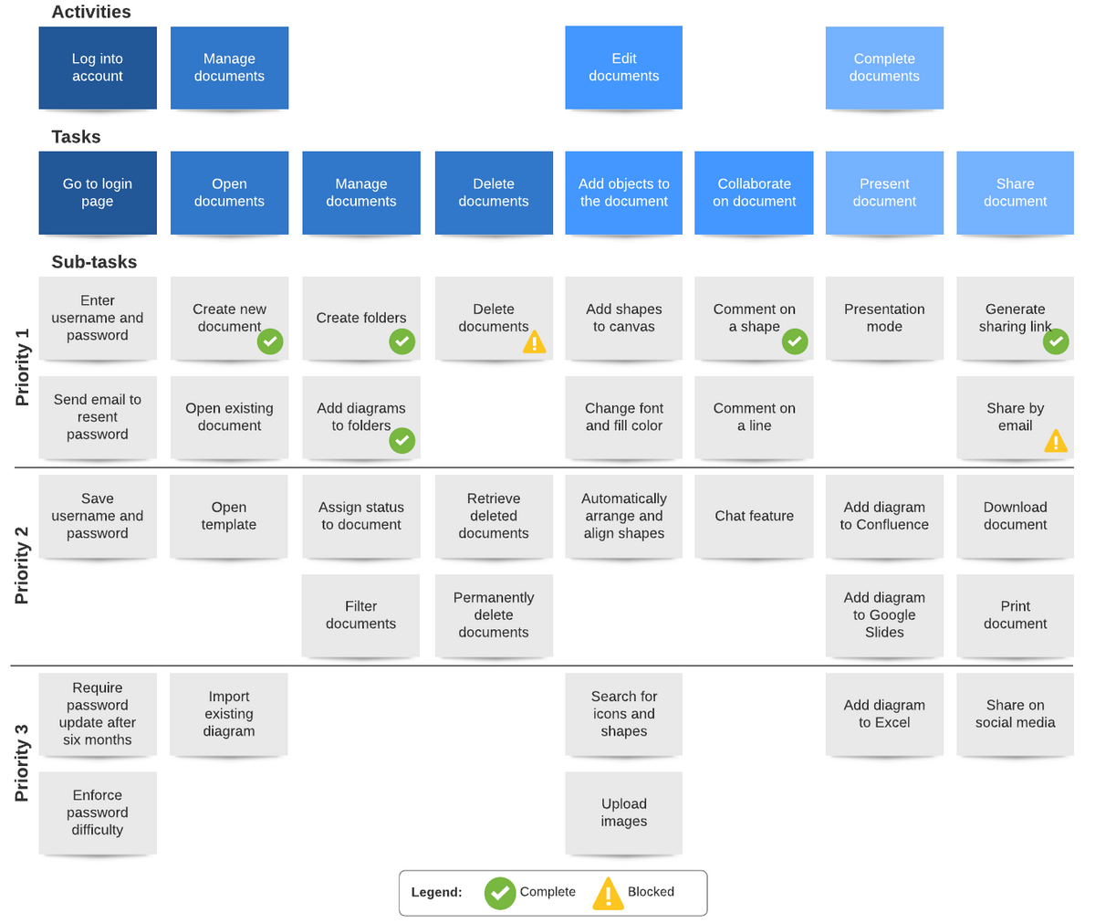
Source: Lucid Chart
The top column represents the major sections or activities in the app, such as logging in or opening documents.
Underneath those, there are features that support or contribute to that activity. Finally, you then rank them based on the value they bring to users.
In the above example, generating a share link when sharing documents might have the biggest impact, according to user interviews. Hence, why it’s high on the priority list.
Other features, like credit card support, might be valuable but since they are not as vital, you can put them off for later.
One benefit of story mapping is that it forces you to take the user into account. Keeping in mind how they might use the app allows you to break down features further into sub-tasks.
Doing this is useful if you only have a vague idea of how you’ll implement a particular activity.
Here’s an example:
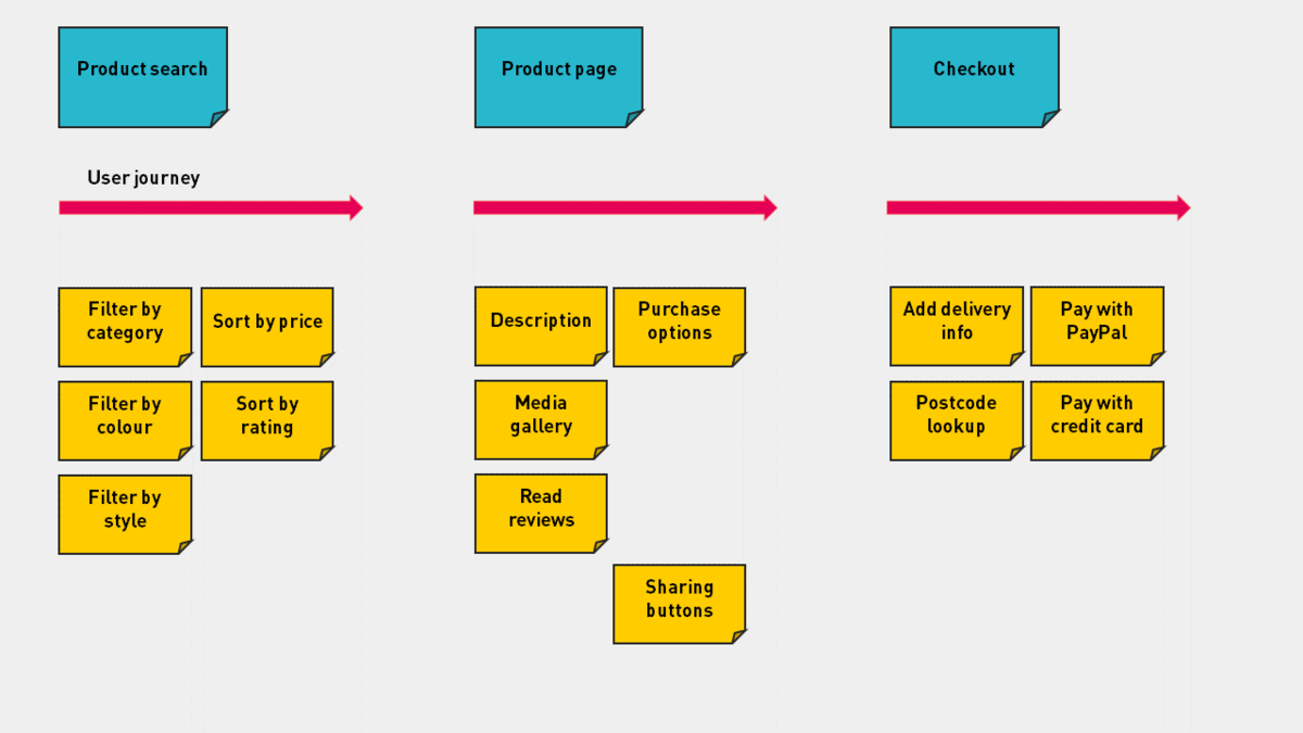
Source: Manifesto
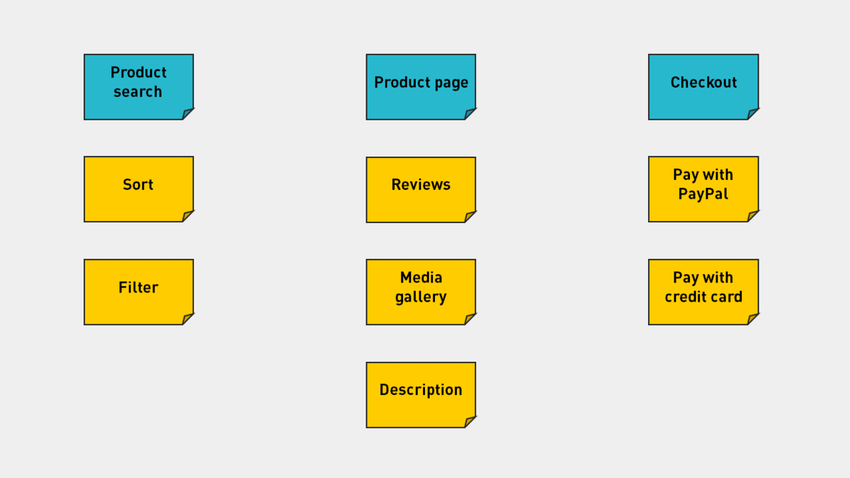
On the left diagram, notice how the features are very general or vague, such as sort or filter.
But applying the user journey helps you imagine how they’ll use your app, which allows you to arrive at more specific tasks like filtering by color or sorting by price.
Story mapping is an iterative process that helps you prioritize features that truly matter to your audience.
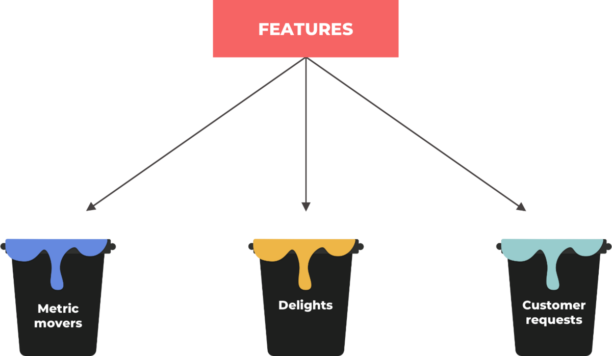
This prioritization method involves sorting features into buckets representing a particular goal or stakeholder. The goal is to see if your app is balanced or needs work in one or several aspects.
You can have any number of buckets, depending on the nature of your app. But the classic approach involves these three:
Source: DZone
The metric movers bucket includes features that help your app achieve key performance indicators (KPIs) and meet business goals.
Mostly these are the essential app metrics such as churn rate, customer lifetime value (CLTV), client acquisition cost (CAC), and monthly average users (MAU).
The delights bucket focuses on features that bring satisfaction and happiness to users.
They are mostly related to user experience (UX) functions like navigation, UI design, and engaging animations.
The customer requests bucket are features you didn’t include in your app but users want to see. Mostly, these are not critical to the app’s functionality but can enhance UX.
For instance, if you have an e-commerce app, you might get requests for more payment methods.
Once you have all features in their proper buckets, you can incorporate them into a roadmap so that you can track each during development.
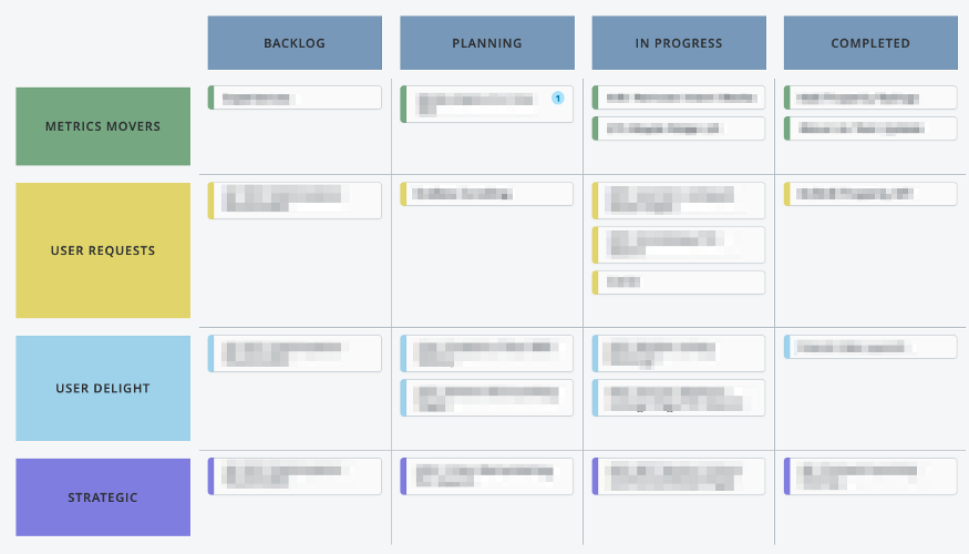
Source: Brent Johnson | Left Travel
The main advantage of the bucket method is that it’s easy to see if your app is lacking in certain areas.
For instance, suppose you have too many features in the delights bucket but none in the metric movers bucket. In that case, your app might be well-loved, but it will fail to generate revenue.
However, a big limitation of this method is that it can only tell you the features you need to focus on, but not which one to do first.
There’s also the risk of including too many or few buckets, which can lead to inaccurate insights.
Thus, using the bucket method with another one on this list might be the best approach.
The Kano model uses feedback from customers as a guide to prioritize features. It’s named after Noriaki Kano, who developed the method in 1984.
What sets the Kano model apart from other methods is that you prioritize based on how well your customers will react to a feature.
The goal here is to achieve customer satisfaction and loyalty.
Because of this, the Kano model is arguably the most user-centric prioritization method on this list.
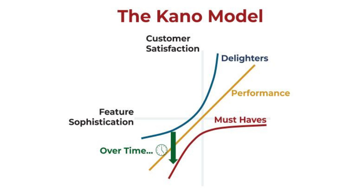
At the heart of the Kano model is this chart:
Source: Prodify
It might look complicated, but the Kano method is pretty simple. Here’s how it works.
First, you need to get what users think of each feature you want to evaluate. You can do this through interviews, surveys, or focus groups.
Your goal is to find out how excited people are with them.
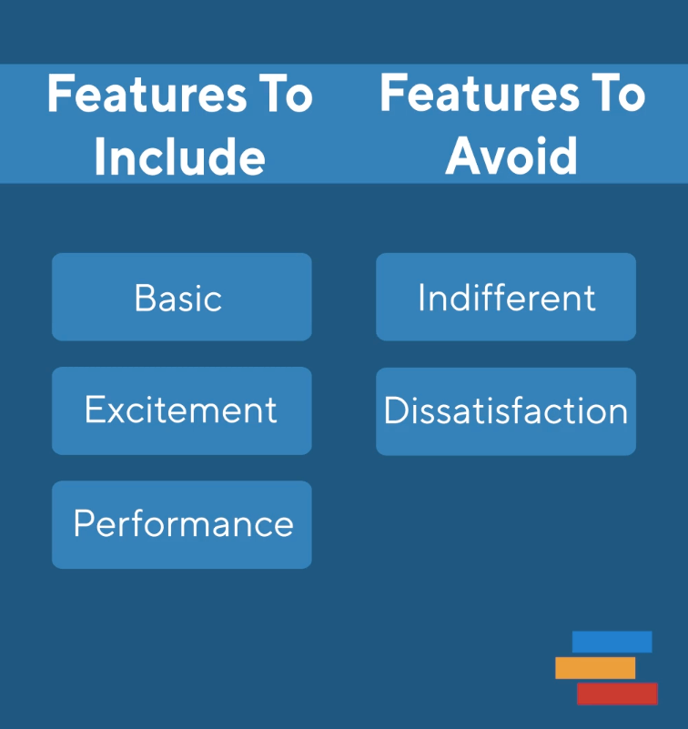
Then categorize them into one of three groups that Kano identified as the most crucial for user satisfaction:
First are the must-haves. These are the features that your customers expect your app to have. For instance, in an online storage app, this would be the ability to upload files to the cloud.
However, because they are the bare minimum, customer satisfaction tends to dip the more you invest in them. That’s where the two other groups come in.
Performance features are vital for your app. Customers will pick your app over a competing one based on those features.
In our online storage app example, a performance feature might be the ability to choose from various storage plans.
Excitement features are ones your customers don’t expect, but are delighted with if you have them in your app.
They are the best investment since they generate immense customer satisfaction proportionate to your effort.
Any feature that doesn’t fit into these three categories will probably cause indifference or dissatisfaction and must be avoided.
Source: Product Plan
In short, the Kano model is very effective at finding the best features that will make you stand out in the market.
The only drawback is that developing them involves more work since you must do extensive market research first.
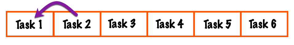
This prioritization method takes inspiration from bubble sort, a popular algorithm for sorting items in an array.
The goal is to compare the importance of every feature with every other feature on the list, then rank accordingly.
Implementing this method is simple.
First, place all of your features in the list. Then, compare feature #1 with #2 and determine which is more important.
If feature #2 is more important, switch their places so that feature #2 is now at the top of the list.
Source: Zapier
After that, compare the next two features on the list and swap as needed. Continue doing this until you reach the end of the list.
You iterate through this feature, comparing in pairs and swapping them as required. You stop only when every item on the list is sorted from most to least important.
The main advantage of the bubble sort technique is its simplicity.
But it’s also too simple, as there’s no framework to determine which feature is more important—it’s largely based on your opinion.
Thus, we recommend using the bubble sort only to get things started. It’s best to combine it with another method to refine your list further.
We hope we’ve enlightened you on the different feature prioritization methods and their different advantages.
But even with these techniques on hand, it can still be difficult to prioritize features. Know, though, that the effort is worth it.
Keeping only the most crucial functionality in your MVP or app can help you deliver a more focused and polished user experience.
Not to mention it can make development cheaper and faster.
Of course, you can make things easier with a little help from an experienced agency like DECODE.
And we’re here for you. Get in touch with us today, and let’s discuss your project.

Ante is a true expert. Another graduate from the Faculty of Electrical Engineering and Computing, he’s been a DECODEr from the very beginning. Ante is an experienced software engineer with an admirably wide knowledge of tech. But his superpower lies in iOS development, having gained valuable experience on projects in the fintech and telco industries. Ante is a man of many hobbies, but his top three are fishing, hunting, and again, fishing. He is also the state champ in curling, and represents Croatia on the national team. Impressive, right?
This article will discuss the three most common app validation tools—POC, prototypes, and MVPs, and explain the differences between them.

We'll discuss seven common MVP mistakes that you should avoid to make the process of building your MVP much easier.

In this article, we'll discuss the importance of the mobile app MVP. Find out why big-name apps used it and why you should as well.