As Dale Carnegie, probably one of the most influential self-help authors of all time, once said: “An hour of planning can save you 10 hours of doing.”
The genius of this nugget of wisdom is that it applies to any area in life—mobile app development included.
Indeed, changing or unclear requirements is one of the top reasons many software projects fail.
And one of the key planning tools that can help you here is app wireframing.
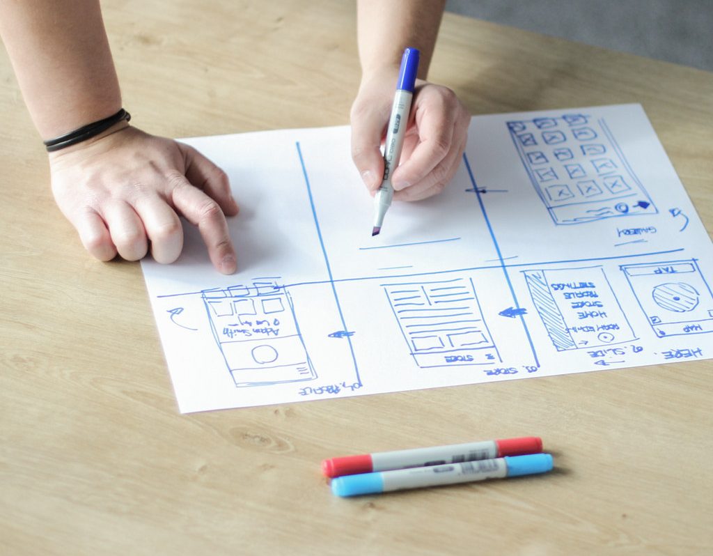
Wireframes are the blueprints of your mobile app. They are the visual representation of your idea, distilled into a few sketches and user flows.
They might seem simple, but they are exceptionally powerful. Here are just some of the benefits they can bring to your project.
Wireframing pushes you to thoroughly research your end user
Wireframes are all about defining the user’s journey while using your app. It makes sense, then, to know them inside and out.
But while thorough market research is a piece of advice you’ll often hear in app development, not everyone does it properly. If you wish to maximize wireframing, there’s no going around it.
Why? You need research to create use cases, which are the clearly defined steps users take to perform a task in your app.
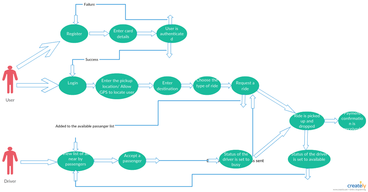
For example, here is the use case for a ride-hailing app like Uber:
Source: Creately Pinterest page
As you can see, it gives you a rough overview of how getting a ride works in the app.
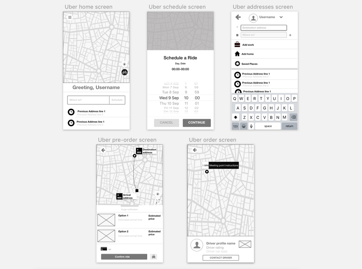
Each step in the diagram can correspond to a screen, button, or feature. This is then translated into a wireframe.
Source: Antigone Anagnostellis Medium page
Without a use case, creating the wireframe would become a guessing game.
But if you take the time to research your audience, you’ll get valuable insights that will arm your wireframing efforts.
In particular, user research can help you determine the true underlying problem that your target audience is trying to solve.
That will allow you to focus on the solution front and center in your wireframing.
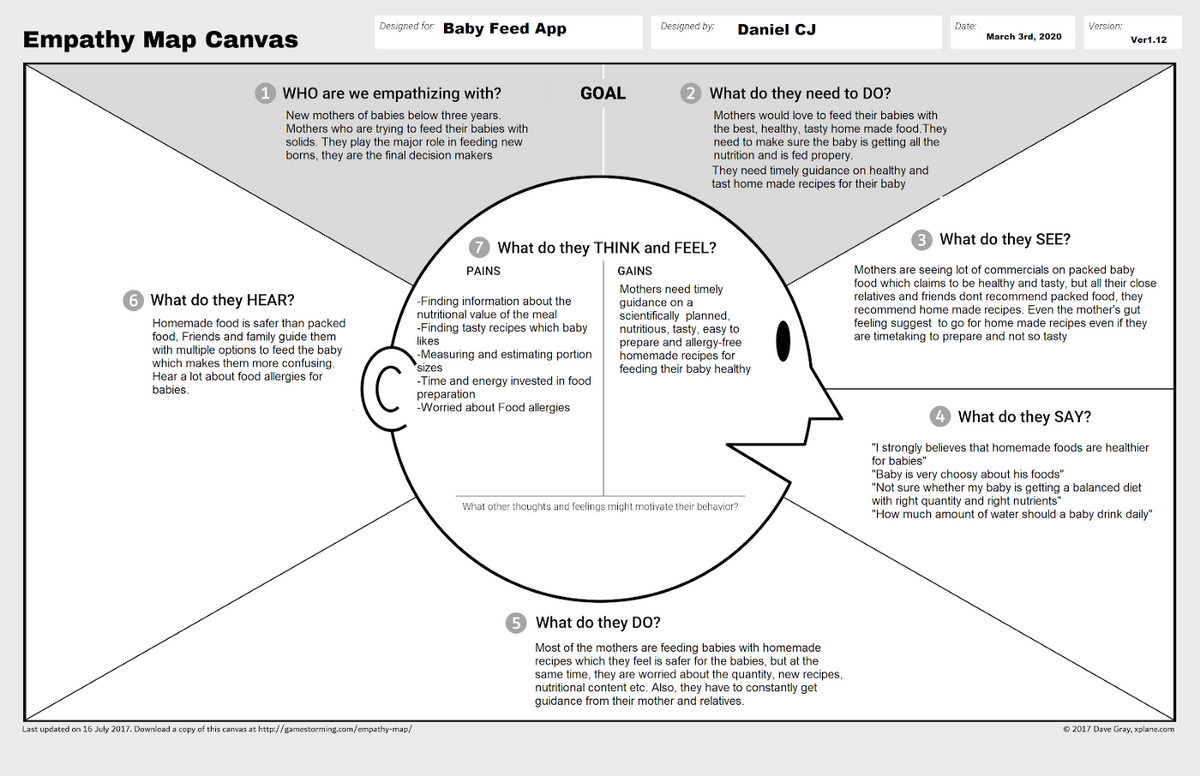
A good tool to use here is the empathy map. It’s a simple diagram that can guide you during user interviews to make sure you hit all the relevant points.
Then, later on, it can double as a centralized reference guide for your target user’s insights.
Here’s an example of an empathy map, courtesy of Daniel CJ, for a baby feed app:
Source: Daniel CJ
But how would you use such data for wireframing?
Let’s look at Airbnb as an example.
With the advent of the Covid-19 pandemic and the work-from-home phenomenon, the company realized that a segment of their users had greater flexibility than ever before.
To serve this emerging sector, Airbnb introduced the Flexible Search option.
Instead of picking exact travel dates first, this feature allowed users to select their ideal vacation (like a weekend trip or month-long excursion) before choosing from a list of available dates.
Knowing what these users really need (a better way to fit travel to their flexible schedules) made it easy for Airbnb developers to design the use case and wireframe to implement this in the app.
Source: Bootcamp
If you think about it, wireframing is about transforming your market research into a visual form. And, like anything else, it should always start with sound, accurate data.
It helps you visualize the mobile app architecture
Wireframing doesn’t only help you visualize the aesthetics of your app. It also helps you plan out the underlying system.
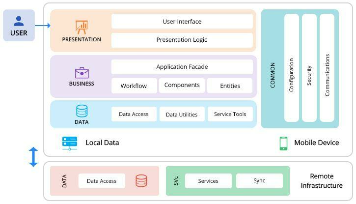
This is called the app architecture, and it describes all the components needed to run the app.
This includes data access methodologies, third-party tools, and other services running in the background.
Here’s what an example of app architecture looks like in a nutshell:
Source: Peerbits
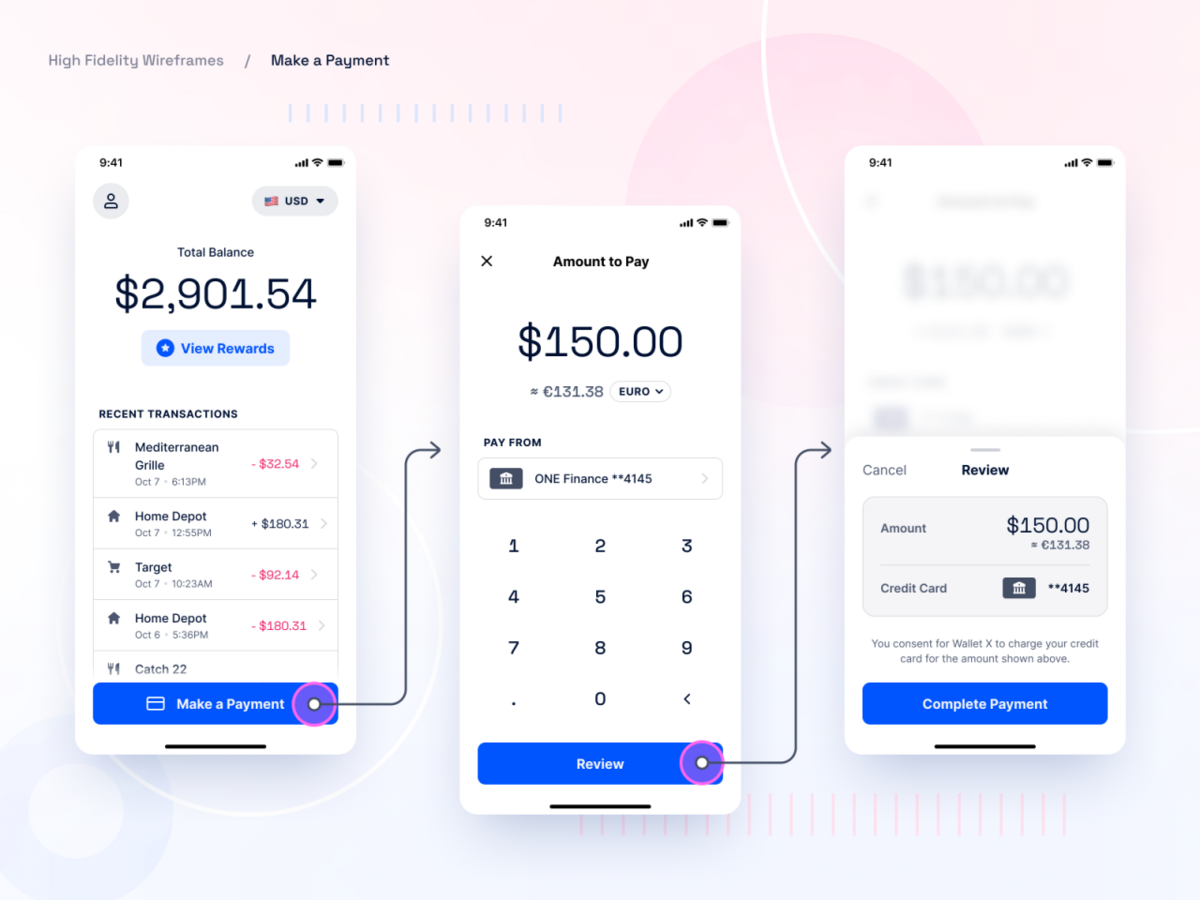
For example, let’s say you’re building the wireframe for a personal finance app—specifically, the send payment feature.
By fleshing it out, you realize that you need a way to connect to the user’s bank account to complete the payment and start thinking about putting authorization protocols in place.
Thus, thanks to the wireframe, you’ll know that you need an open banking API and an authentication plug-in as part of your app’s architecture.
Source: dddribbble
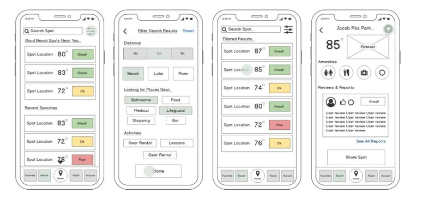
Another example is the Sundayz app, a student project by Anami Chan. Its goal was to be the one-stop shop for users to plan the perfect day at the beach.
After extensive market research, the developer concluded that a find beach spot feature was the best approach to solve the target user’s problem.
And since these people travel in groups, it would also be beneficial if they could share these selected spots with their companions.
Source: Anami Chan
From the wireframe alone, the developer can conclude that a map display screen and a messaging module will be vital parts of the app’s architecture.
You’ll quickly realize just how powerful wireframing is for planning out every aspect of your app. That’s reason enough to include it in your developer toolkit.
But there are more benefits you can look forward to.
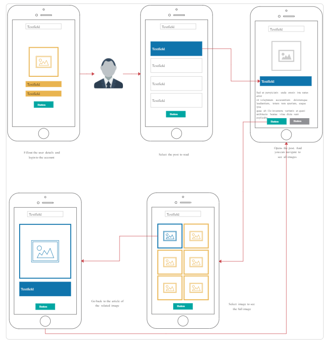
You can create an optimal user flow
Perhaps the best benefit of wireframing is that it gives you a complete overview of your user flow.
User flow is a key consideration if you want to achieve fantastic UX. If it’s too difficult to get from one point in your app to the other, it can cause users to drop.
Eliminating the number of steps is vital here—which you can do much more effectively by visualizing the journey with a wireframe.
Source: Creately
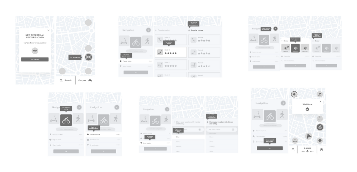
Here’s a UX case study from the navigation app Waze that showed the effectiveness of wireframes in action.
It involves implementing the new Pedestrian feature, which allows non-drivers to use the app to navigate.
Using a user flow diagram, the UX designer created a testable wireframe prototype of the new feature.
Source: Bianca UX
The ability to conduct usability testing early in the development process is one of the biggest advantages of mid to high-fidelity wireframes.
In the case of the Waze case study, the design team discovered that the initial user flow was too long. Thus, they reduced the number of screens and optimized the entire UX.
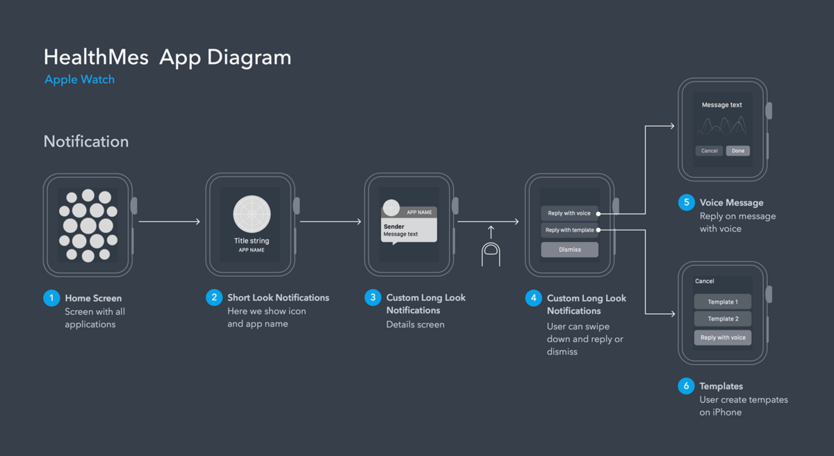
Better navigation is one of the beneficiaries of an effective user flow.
It allows you to plan out how users move through the app and then streamline it by adding shortcuts or eliminating unnecessary paths.
This is especially crucial in the limited screen real estate of Apple Watch apps, where you don’t have much space to work with.
Source: Just in Mind
But the most important purpose of user flows is to create the best experience for your audience.
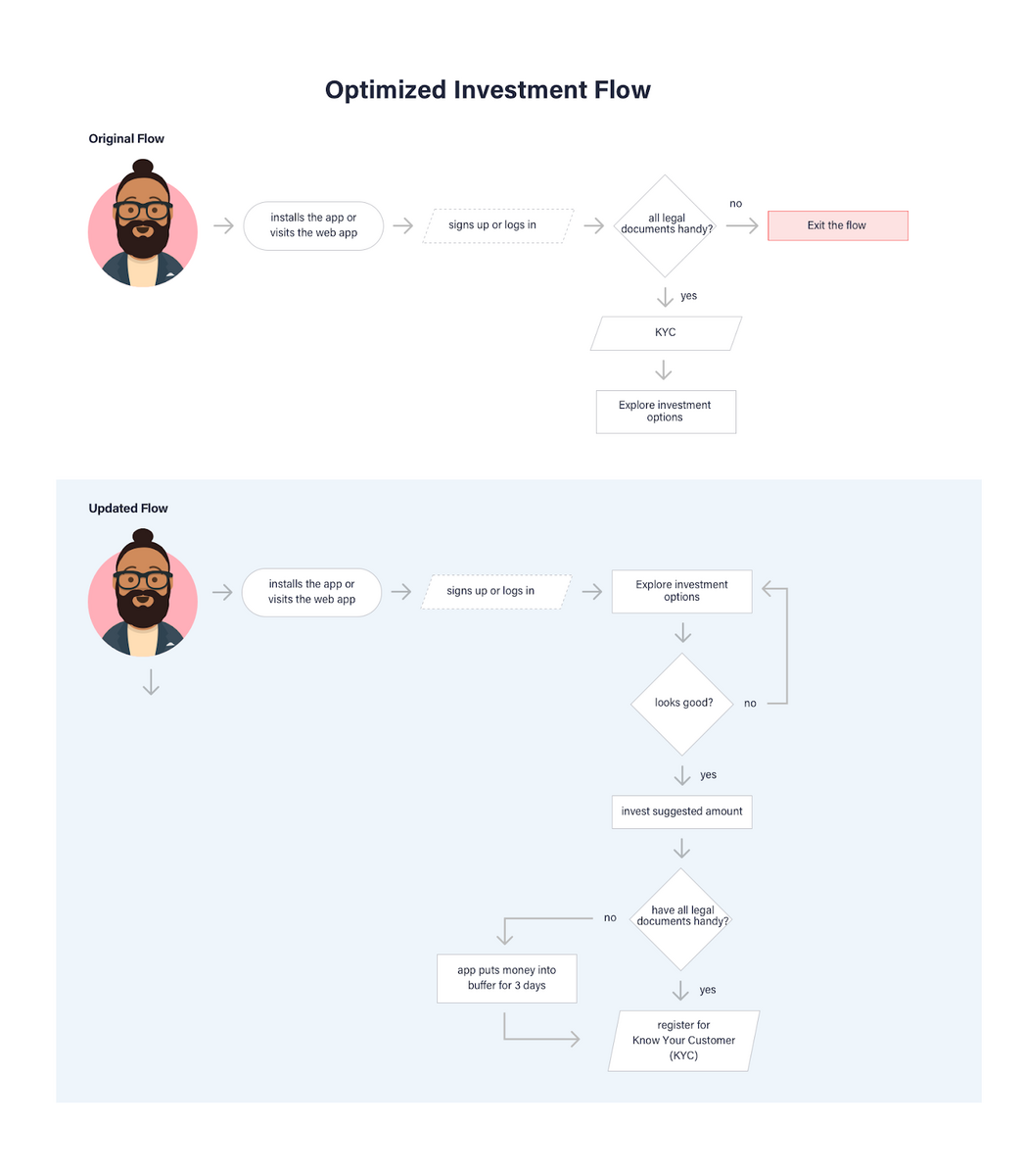
Fintech app Fisdom discovered this when they did their user flow and wireframing.
They decided that the KYC process was a big pain, so they turned it over its head. Instead of being early in the process, it came later.
Source: Toptal
Perhaps the best summary of how wireframing and user flows can help you comes from UX designer Josh Maynard:
“I found the user flows and user stories to be incredibly helpful as we’ve already thought about every possible screen and scenario and there aren’t any surprises during design. This makes it so much easier for me (the designer) to stay focused and know what to work on.”
Ultimately, this leads to one of the best benefits of all, which we cover in the following section.
You are able to save up on resources
You might feel that you’re devoting many resources to wireframing. But the huge cost and time savings you get make every investment more than worth it.
That’s because wireframing forces you to analyze and test everything before committing to a single line of code.
Thus, you tend to spot UX issues much earlier, saving you the time and money spent on revisions.
In fact, some experts estimate that wireframing allows you to reduce your app’s cost overruns by a whopping 95%.
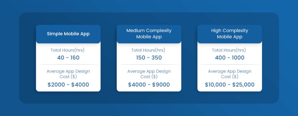
The truth is that app design can be a significant part of your total development costs. For even a simple app, this can range from $2,000 to $4,000.
Source: Glowid
Redesigns can be even more costly. Estimates by Mindsea place it at around $1,500 to $7,500 for a simple app with just three or four screens.
For more complex apps, this can balloon up to $1 million.
Wireframing can help reduce these costs altogether. Considering that the typical expense of such a process is only around $100 – $600, clear cost savings can be made.
Plus, wireframes are much easier and cost next to nothing to revise.
This is the 1-10-100 rule in action. It states that the cost to change something in a software project gets higher at the later stages.
Source: Interaction Design Foundation
Wireframing—which can be considered early prototyping—can prevent you from being on the wrong side of this rule.
It’s not just about losing money, though. Achieving proper UX through wireframing can also impact your bottom line.
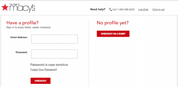
The Guest Checkout feature is a great example.
Just a few years ago, the standard procedure was to ask shoppers to sign in to an account before they could check out from an e-commerce store.
But it turned out this was a UX mistake, as many often forget their password.
The solution? Allowing users to checkout without logging in. It’s a simple user flow tweak that generated an extra $300 million for the site per year.
As a result, guest checkout is now a common feature in most e-commerce sites.
Source: ClickZ
But it’s not just time and money that’s at stake. There are also secondary, but no less important, factors such as team harmony, stress, and work culture.
As a result, an app wireframe can become a unifying element of a development team, ensuring that the project goes smoothly.
Wireframing helps to minimize future issues
Wireframing is, by nature, a preventive process.
After all, you’re trying to explore every possibility to find the best UI and UX combination for your app. As a result, you can uncover issues much earlier.
And as we know, it’s much easier and cheaper to fix these the earlier they come.
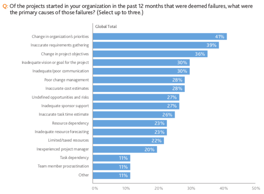
Wireframing can help solve many of the top reasons many software projects fail, such as changes in project objectives and undefined opportunities and risks.
Source: Project Management
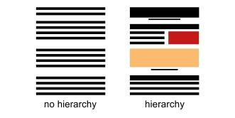
Wireframing works because it gives you a clear overview of your app’s visual hierarchy and user flow. Therefore, you can spot patterns that you can’t otherwise see in any other form.
For example, wireframing is great for preventing issues with your app’s information hierarchy.
It also avoids a cluttered screen, which is one of the top blunders that can lower your app’s UX.
Source: Bridgewater Learning
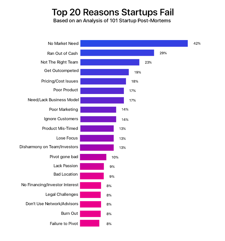
Wireframes can even prevent you from making the ultimate mistake of all: creating an app that the market doesn’t need.
Source: Chrome Infotech
Indeed, wireframes are your best insurance policies for costly UX mistakes that rear their ugly heads later.
Your design process becomes iterative
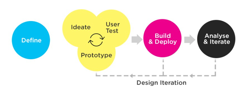
Wireframes make an iterative design approach possible, which can speed up development times drastically.
Source: Bootcamp
See the yellow portion?
That’s the essence of wireframing. It’s about rapidly testing an idea against end users and clients with a rough but workable prototype.
This process gives users feedback that they can quickly implement on the next prototype, which will be tested again.
This iteration repeats until all UX roadblocks are solved, and a satisfactory wireframe is achieved.
The great thing about this approach is that it can involve every stakeholder, not just the development team.
End users, clients, and even investors can all understand the gist of the app thanks to the visual simplicity of wireframes.
Want to know more about wireframing?
We hope we’ve sparked your interest in implementing wireframes in your development process.
It’s a simple way to communicate your vision to the rest of the team, ensuring everyone is on the same page.
Overall, it’s the best investment you can give to your app’s success.
Want to learn more about wireframing? Check out our excellent primer here. You can also read our rundown of the best mobile app design tools in this article.

