Have you recently downloaded a new mobile app? If you have, chances are you’ve gone through a guided tutorial or a welcome screen that explains what the app does.
This is called onboarding, and it’s one of the most common strategies to improve app retention and engagement.
The idea is to get people up to speed right away and start using the app as quickly as possible. The more they use the app, the better chances of getting them hooked.
The problem? Not a lot of apps and companies do it right.
However, that also means there’s plenty of opportunities for you to improve your onboarding game.
In this article, we’ll go through some mobile app onboarding best practices to help you get there.
What Is App Onboarding?
Onboarding involves walking a new user through an app so they can get value out of it quickly as possible.
To do that, the onboarding process focuses on three key areas: setup, education, and personalization.
Setup is the first step of onboarding, where the user registers for an account with the app.
Next is education, which teaches the features and benefits of the app. It’s often done through guided tutorials, where pop-ups tell the user what to do or where to tap.
Lastly, some apps also gather data during onboarding to personalize the app’s content and settings.
Does Your Mobile App Need Onboarding?
For most apps, some form of onboarding is essential to give users a positive experience during the crucial first weeks.
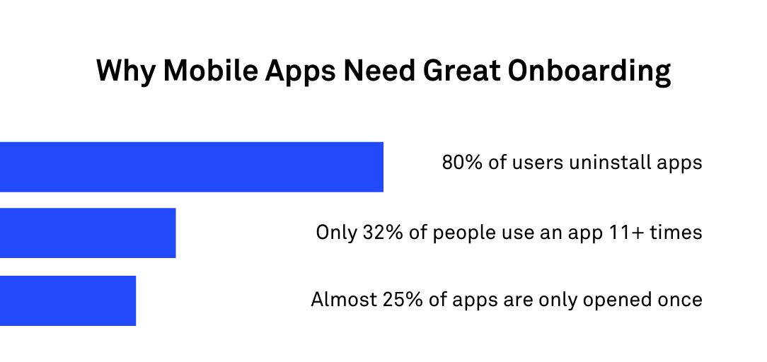
Otherwise, they can get confused and frustrated, eventually uninstalling your app altogether (which is what 80% of users do).
Keeping users engaged with an app is a big challenge for most developers. The statistics say it all – only 32% of people continue using an app more than 11 times, and close to 25% of apps are only opened once.
The good news is that proper onboarding can drastically improve these numbers.
The big question is not whether your app needs onboarding but how involved it has to be: not every app requires a thorough process.
After all, an extended onboarding process can add unnecessary expense and prolong the time it takes the user to actually start using the app.
The key is to minimize the time users need to learn an app.
For example, a simple splash screen summarizing key features might suffice for a basic calculator app.
On the other hand, if it’s a dieting or food app, the onboarding will be much more extensive. You’ll need to collect personal data to tailor-fit the content and features based on the user’s situation.
Types of App Onboarding
There are many approaches to onboarding or flows that you can use, depending on your app’s nature and target users. We cover some of the common ones next.
Benefits-Oriented Onboarding
This onboarding approach puts the benefits of using your app front and center.
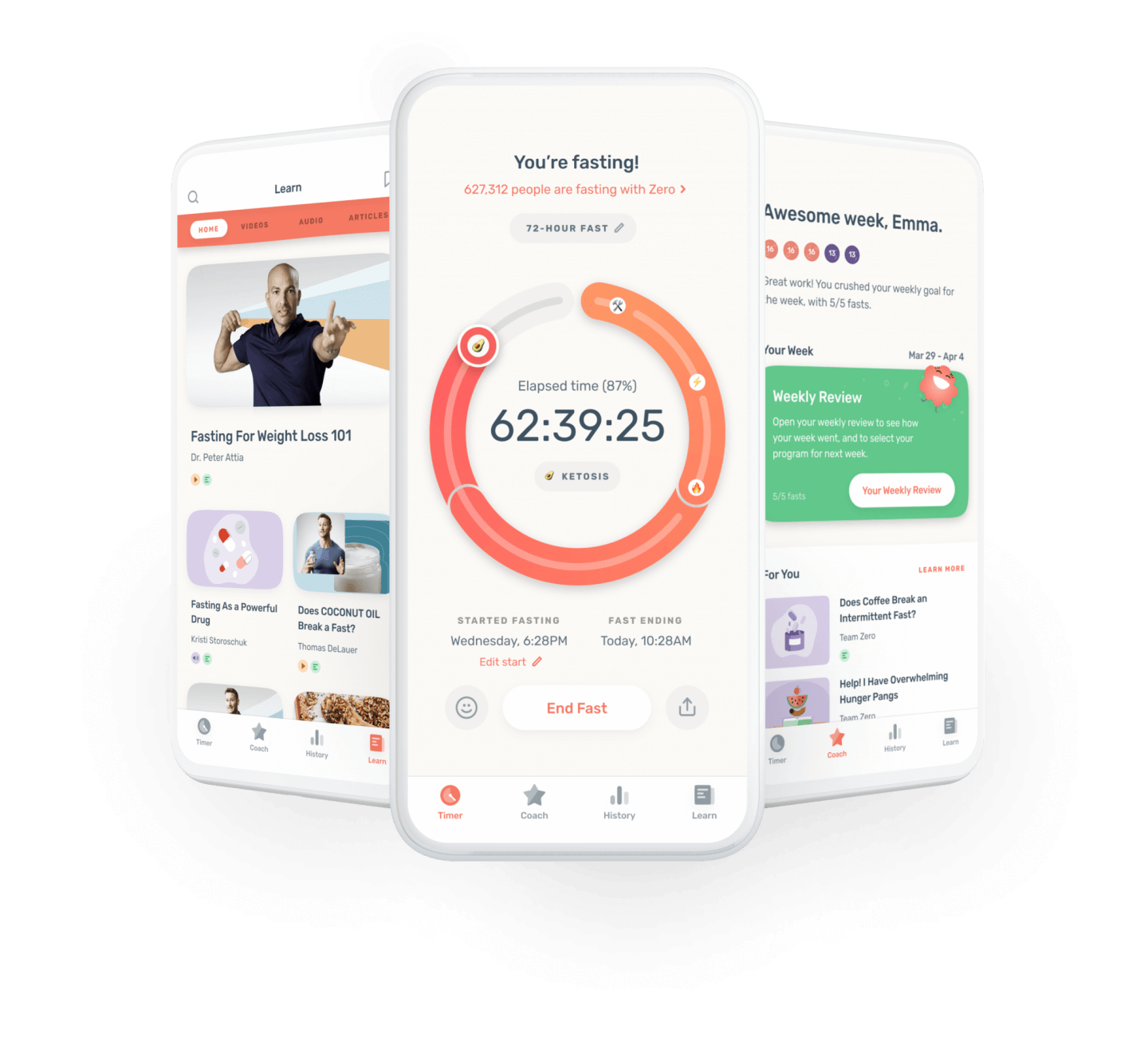
The idea is to encourage users to engage with the app by telling them how they’ll benefit from it—be it by getting more things done (task management app) or losing weight fast (intermittent fasting app like Zero).
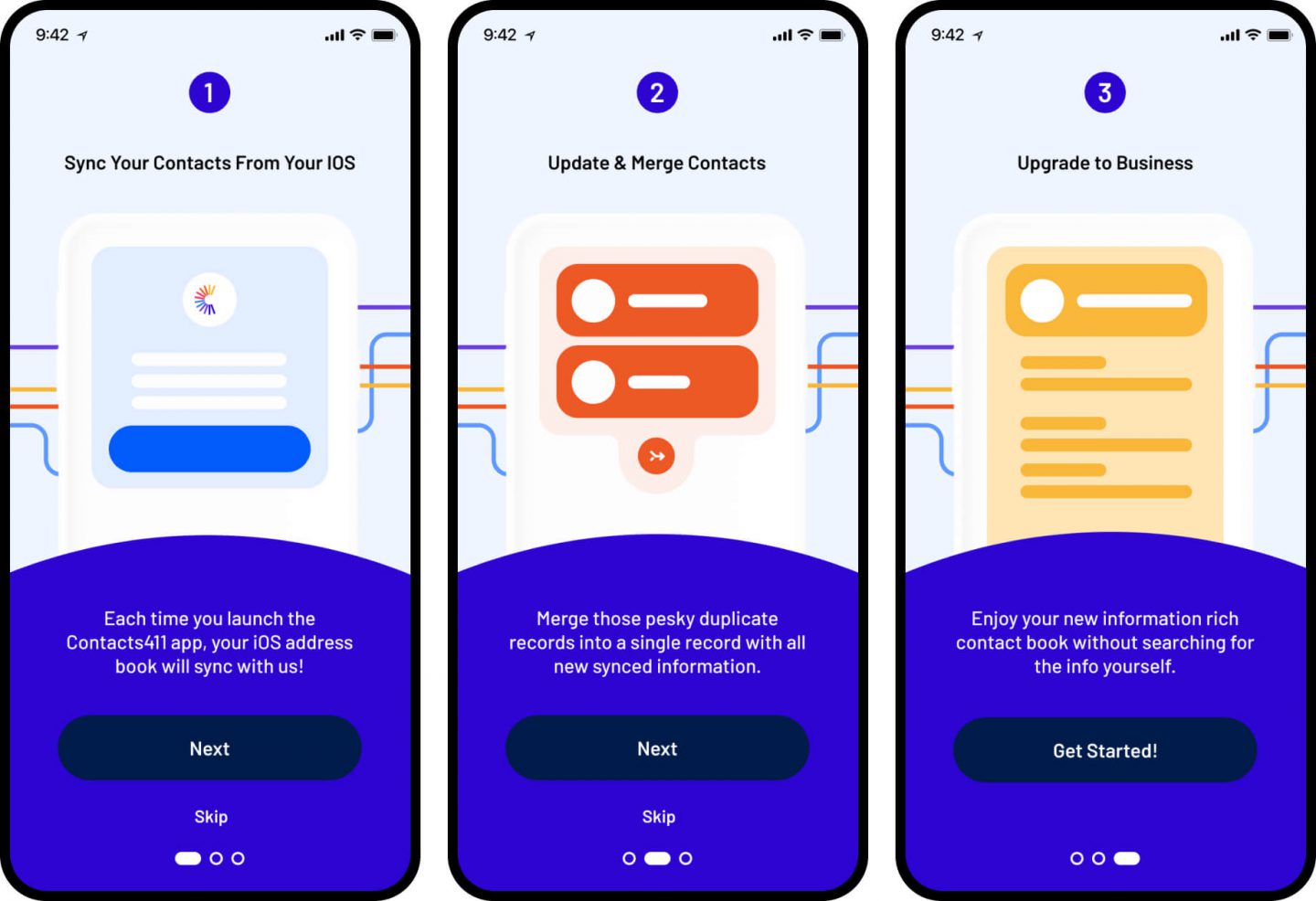
Benefits-oriented onboarding often uses a slideshow presentation, with every slide discussing one key benefit. The last slide then invites the user to sign up for an account or start using the app.
The benefits-oriented approach is best for apps that require an account since some users are often reluctant to sign up.
Connecting their values to your app’s benefit is the magic ingredient that gets them over this hurdle.
When implementing benefits-oriented onboarding, it’s best to present at most three core benefits. Too much, and you risk boring or overloading users with irrelevant information.
Also, get straight to the point with clear, concise language.
One of the best examples of this type of onboarding is the one used by the Evernote app.
Features-Oriented Onboarding
In sharp contrast to the benefits approach above, features-oriented onboarding explains when and how to use the app. It’s similar to the benefits approach in that they both use slideshow presentations.
The only difference is that this onboarding method focuses on features and functionalities instead.
Using features-oriented onboarding is best for apps with complex or innovative functions that might be perceived as difficult or challenging.
The approach shows users that your app is easy to use, removing any friction or hesitation.
With features-oriented onboarding, focusing only on the three most important features is more crucial than ever.
Since most apps have a long list of functions, there’s the temptation to add more to your onboarding. Resist the urge, as this can overload and confuse your users.
Also, don’t include obvious features that every app user already knows, such as the menu bar. These only serve to annoy your users and waste their time.
Progressive, Action-Oriented Onboarding
Progressive onboarding is an interactive walkthrough that explains features and benefits as users go through your app.
It uses pop-up windows or tooltips that only appear when the user needs to know about them.
This onboarding approach is one of the most effective because most users prefer to learn while doing.
It allows them to use an app straight away without getting bogged down with too much information upfront.
It’s the same reason most people never read an instruction manual before using a device.
Progressive onboarding is particularly beneficial for apps with complicated interfaces, hidden features, or unique gesture controls. Explaining all of these in one go can be overwhelming, so it’s best to present it gradually.
The most important thing with progressive onboarding is timing.
You shouldn’t overload the user with too much information at any given time. Don’t hold your users’ hands all the time, either.
Give them enough freedom to explore the app in their own time.
One of the more unique progressive onboarding methods is by the Slack app, which uses test projects and their Slackbot chatbot to explain features naturally.
Best Practices for Mobile App Onboarding
Onboarding is a fantastic technique for getting users engaged, but it can also backfire if not implemented correctly.
Here are some best practices to steer you in the right direction.
Know Your Target Audience
Realizing what users care about is key to creating a solid onboarding process—and it starts with knowing them well enough.
Knowing your target audience is an often-quoted adage in marketing, but it’s equally crucial in onboarding.
If you don’t understand your users, you run the risk of over or under-explaining your app and alienating them in the process.
One crucial aspect to know about your ideal users is their level of technical knowledge.
The onboarding process for beginners, or those who are not comfortable with technical terms, should be simple yet thorough.
Refrain from using jargon or fancy words, explain steps clearly, and focus on essential benefits.
In contrast, advanced users already have a certain level of technical know-how, so it’s best to use their language and avoid too much hand-holding.
If you’re creating a retouching app for professional photographers, for example, it’s best to talk in photography terms.
A busy entrepreneur, on the other hand, wants to get things done right away. Onboarding that gets straight to the point will be much more appreciated here.
Prioritize Your Value Proposition
Leading with your app’s value proposition is the best way to create an effective onboarding process.
Your value proposition is a statement that tells the biggest benefit of using your app. It highlights why your app is unique and how it’s going to change a user’s life.
Naturally, you’d want to make it front and center in your onboarding.
Far too many apps, however, don’t prioritize their value proposition. They often stop communicating it after the download page or bury it somewhere in the Help section.
You need to realize that your value proposition isn’t just a marketing tool. It’s to remind your user why they should use your app constantly.
If users get excited about what’s to come, it will help keep them engaged.
Remember – people don’t care what your app does. They only care about what it can do for them.
When crafting your value proposition, the most critical element is focus. It should clearly explain your app’s benefits using only a few words, with no sales talk or jargon.
At the same time, your value proposition should be compelling, even inspiring. You want the user to believe that their life will be so much better if they continue using your app.
There are many great examples of value propositions that can guide you if you’re stuck writing your own, from Slack to Uber.
Focus on the Core Features
A significant part of onboarding is presenting your app’s features. Users need to understand them, so they can use your app and achieve the value proposition you promised them.
However, you can’t just list down every feature your app has.
Remember, too much information can delay the onboarding process unnecessarily and can lead to burnout.
Instead, your onboarding should focus only on the core features – the essential or innovative functionalities that are most relevant to your users.
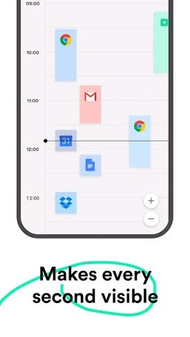
A good example is the Timely app. Their onboarding picked only the features relevant to its users, like the ability to log time anywhere through either the iOS or desktop app.
While it undoubtedly has more features than that, these core features best represent how the app works and why people should use it.
If you have multiple features you want to highlight, you can always present them progressively through in-app messaging or tip boxes that pop up after the first app launch.
Know When to Ask For Things
With today’s privacy issues, people are much more reluctant to share personal data.
Thus, if your app requires personal information from users, you need to know when and how to ask for it.
In other words, don’t bombard your users with notifications and pop-up windows asking for permission.
Blindly requesting information without any explanation isn’t ideal either. It can leave users feeling uncomfortable and doubtful, deleting your app just to be on the safe side.
A rule of thumb is to postpone permissions as much as you can. Wait until your user has engaged with the app for some time.
Just like any relationship, you want to build trust before asking for something as substantial as their personal information.
When it’s time to ask for their data, you should always tell them why you need it.
Stating the reason also forces you to only ask for data necessary to provide a fantastic app experience – and nothing more.
One way to get better opt-in is to present a feature or benefit before asking for permission.
For example, an app can explain how its Share feature allows users to connect with their friends, but they need to allow access to their camera and contacts first.
Streamline App Onboarding
Simplicity is the hallmark of excellent onboarding, whether it’s the sequence of steps or the UI design of each onboarding screen.
Streamlining the process helps users get engaged with your app as fast as possible.
An extended onboarding process can do more harm than good.
A few years ago, a survey by Clutch revealed that even just a minute of onboarding time frustrated more than 28% of app users. Adding another minute jumps the figure by as much as 33%.
There are many ways to streamline onboarding.
One is to keep the process as short as possible by dividing it into smaller, manageable steps. Filling out a form, for example, is best done across multiple screens instead of one long page.
Creating an account is also a step that most people find too tedious and time-consuming.
You can speed up the process with one-click sign-ups using their existing accounts like Facebook or Google.
The design of the onboarding plays a role, too.
Choose images over text whenever possible because not everyone wants to read through a lengthy explanation.
Utilizing plenty of negative space also helps keep your UI uncluttered, giving a feeling of joy and relaxation that makes people want to go through your onboarding.
Personalization Is Key
Personalizing the app experience can improve your user’s retention and is the best reason to gather data during onboarding.
The truth is everyone wants to feel unique and special. Tailor-fitting your app to a user’s situation makes them feel much more connected and engaged.
While adding a user’s first name in the app’s Home screen may be the first thing that pops into your head when you think of personalization, it’s not the only way.
A better approach is to alter the app based on demographics or behavior.
The already-mentioned diet and exercise apps are some of the best examples of this approach.
These apps always ask whether a user wants to lose weight or gain muscle and then send exercise videos or customized meal plans based on their choice.
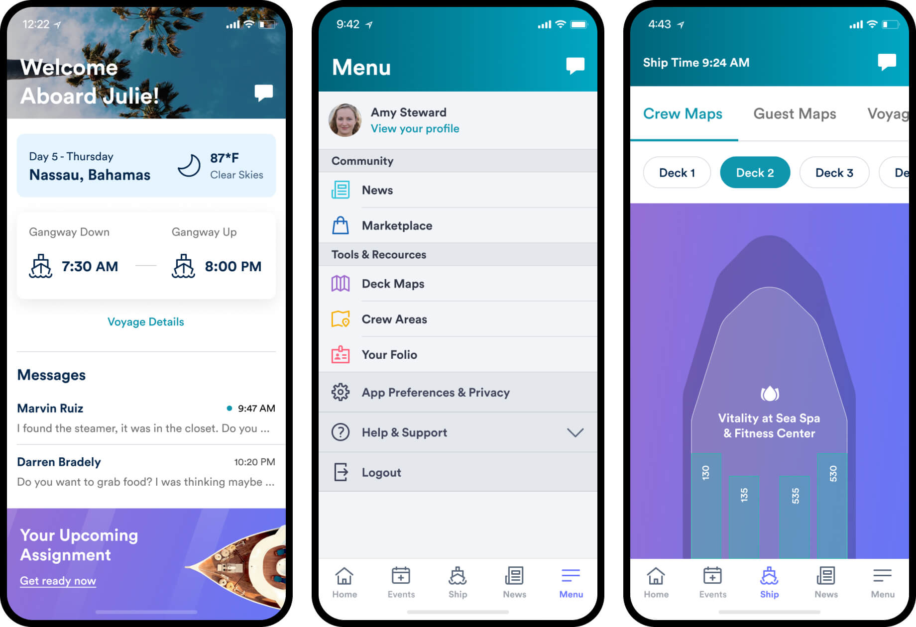
Another example is a news app that delivers relevant articles or content that changes depending on a user’s location. We created a mobile app for crew members onboard the Royal Caribbean ocean liners which are personalized to each user.
Health and wellness apps like Headspace also recommend certain meditation routines depending on users’ goals.
Personalization can also go beyond the app and complement other user touchpoints.
You can, for example, send an onboarding email when someone first uses your app or remind them if they’ve been inactive for a while.
By sending personalized messages at the right time and context, they can be much more well-received.
Gamify User Onboarding
Treating your onboarding like a game is one of the most effective strategies to engage users enough that they’re motivated to go through with the process.
The reason behind this is simple – everyone loves to play games. Close to 70% of Americans (or 210 million people) are gamers, and 90% of them play on mobile.
Games are so addicting because they tap into a person’s competitive nature and their desire to win.
You can incorporate various game mechanics and strategies into your onboarding to hijack these tendencies for your benefit.
Using a progress bar is one of the basic gamifying techniques you can do. Giving users an idea of which onboarding stage they are in subtly motivates them to finish it.
It’s especially useful for long processes that require multiple steps, such as setting up an account.
Another element that makes games particularly addicting is the rewards systems.
Badges, stickers, leveling up—anything that acknowledges users for sticking with your app is a great motivational tool.
Even if the reward carries no real-world value, the psychological effect of getting the achievement is enough to give a substantial boost.
Above all, be creative with your approach.
For example, instead of explaining a concept to users, you can do a quiz instead.
Making your onboarding as interactive and fun as possible is key to successfully gamifying it for maximum engagement.
Include Product Tours
A product tour is a live walkthrough that guides users on how to use your app. It can be one of the best ways to onboard someone because they learn by doing.
Information is also presented gradually and in context, so people tend to remember better.
Since a product tour acts as a guide, it must have a clear structure that moves users through the basic tasks they can do with your app.
Each step should be well-defined, telling them the exact action they need to take and why.
Point them to each upcoming step in the process, and so on, until the task is completed.
The language you use in a product tour is just as important as the content.
Aim to be warm and friendly. Never sound like you’re lecturing your users; instead, strike a balance between letting users explore and guiding them.
Using subtle UI elements like tooltips and hotspots is also ideal when presenting information in a product tour. It ensures you don’t disrupt the user experience too much.
Finally, note that while a product tour is fantastic, not everyone will appreciate it.
Some users will already be familiar with a similar app to yours, or they might prefer exploring independently.
For the sake of these users, always make your product tour – indeed, your entire onboarding process—optional. This brings us to our next point.
Allow Users to Opt-Out and Skip
Your onboarding should always be optional, regardless of how helpful or amazing it is.
As we touched in the previous section, not everyone wants to be hand-held when learning an app.
Savvy users, in particular, open an app to solve a problem as quickly as possible.
Not allowing them to opt-out or skip through the onboarding process is a surefire way to annoy them.
Adding a “Skip” button on every onboarding screen is the most straightforward way to approach this.
If you have any interactive tutorials, tooltips, or pop-up Help windows, users should be able to turn those off as well.
On the flip side, you should also provide a way for users to go back to your onboarding process whenever they want.
Just because a user skipped through it the first time doesn’t mean they don’t want it. Maybe they wanted to but were in a hurry at the time.
Allowing them to review the onboarding process ensures they don’t miss out.
Track App Use
As with most aspects of your app, you should be tracking how users are going through your onboarding. Only then can you know if it’s effective and how you can improve on it.
The most relevant metrics here are your churn and retention rate. If users quit using your app within days of downloading it, your onboarding process can be the issue.
It’s a sign to take a closer look.
However, while both of these metrics are crucial to track, they have their limits. They can tell you when your onboarding isn’t working, but they don’t tell you why.
That’s where qualitative metrics like user recordings and heat maps come in.
By watching how users go through your onboarding, you’ll know where the bottlenecks and opportunities are.
If most users skip through a particular part of your process, then you should optimize that or remove it entirely.
This is just the tip of the iceberg when it comes to monitoring your app.
There are plenty of other qualitative and quantitative metrics you can track. For a more thorough discussion, check out our helpful article here.
The Right Onboarding Is the Key to Retention
Onboarding is both art and science and part experimentation. That can make it challenging to implement—but only if you don’t know what you’re doing.
As long as you lead with your value proposition and keep your onboarding easy and fast for your users, you’ll reap the rewards this retention strategy can give.
Of course, onboarding is just one small part of what makes an app successful. For other factors that you need to consider, check out these 14 mistakes you need to avoid.

