
How DECODE builds software: an inside look at our development process
Inside DECODE’s software development process and how we turn complex ideas into reliable products.
Design and development don’t always see eye to eye.
Designers hand over a Figma file. Developers open it and start guessing. Which color token is right? What spacing should they use? Are those states final or still in progress?
That back-and-forth slows everyone down.
The real issue isn’t how good your design and development teams are.
It’s that they’re working in different systems. When naming, structure, or tools don’t match, handovers become harder than they should be.
The fix is to connect design and development through shared language, structure, and tools.
In this article, you’ll learn 7 practical ways to do that, ranging from consistent naming in Figma to documenting components, syncing with Storybook, and building a continuous process.
Let’s dive in!
Key takeaways:
Table of Contents
Designers and developers often butt heads because they don’t speak the same language.
Designers name layers or components based on how they think, while developers work with variables, classes, and tokens.
The fix is simple: create a shared language inside Figma.
This starts with using consistent naming conventions that mirror what developers see in their codebase.
When color variables in Figma follow the same naming patterns as CSS tokens, or when spacing is labeled with familiar values like spacing-xs, everyone understands what’s being referenced.
Here’s what you should do:
This consistency removes guesswork.
Developers no longer need to ask, “Which blue is this?” or “Is that padding or margin?” They can read the Figma file and instantly understand how to implement it in code.
To make this system even more effective, introduce tokenization.

source: Figma Community
Tokens are standardized values – like color shades, spacing, or typography – that designers use to build every element.
For example, instead of manually setting a specific red for a button background, you define a variable such as color-primary-500. Developers can then reference that same token in code.
When tokens are visible in Figma Dev Mode, developers can inspect any component and see the exact variable used.
If a token wasn’t applied, Dev Mode shows the raw pixel value. This reinforces accountability and encourages designers to stay systematic.
Using consistent naming conventions means everyone works from the same foundation.
And that’s the best way to reduce misunderstandings and make handovers smooth.
The bigger a project gets, the easier it is to lose structure.
That’s where component thinking and Atomic Design come in.
Together, they turn scattered screens into a systematic, scalable design framework that developers can easily understand and build from.
Component thinking means treating every part of the interface as a reusable building block.
Instead of designing individual pages, you define components – buttons, inputs, modals – that can be assembled in countless ways.
Each component has a clear purpose, a defined hierarchy, and consistent behavior.
The Atomic Design methodology, developed by Brad Frost, gives that structure a name and a framework.
It breaks the system down into 5 levels – atoms, molecules, organisms, templates, and pages – each one building on the last.
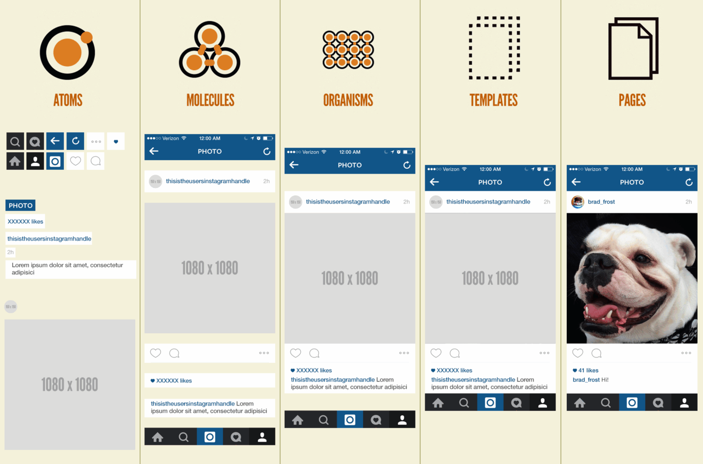
source: Brad Frost
This hierarchy helps both designers and developers understand how components fit together and where changes should happen.
Here’s why this approach works:
On top of being a design philosophy, Atomic Design is also a shared workflow.
Designers create a component library in Figma. Developers mirror that structure in tools like Storybook, starting with the smallest units and building upwards.
When both sides follow the same logic, the handover stops being a blocker.
Static screens can only tell part of the story.
That’s why prototyping in Figma is an essential part of the handover process. Prototypes show how the design actually works.
It gives developers a complete picture of what the design should feel like, not just how it should look.
Prototypes help visualize interactions you can’t show in static layouts. They show exactly how elements should behave when users click, hover, or wait.
For example, designers can show the animation of a skeleton loading state, set precise timings in milliseconds, and make sure developers understand every detail before writing a single line of code.
Here’s how prototyping bridges the gap between design and development:
While prototypes are most often used for presentations or usability testing, they’re just as valuable during handover.
Developers can reference the prototype side by side with Dev Mode to see exactly how different components behave.
Your design team should treat prototyping as a communication tool.
It adds context, removes assumptions, and lets developers implement interfaces that match the designer’s intent precisely.
The handover used to be a guessing game.
Developers had to open Figma, inspect layers, and hope they were interpreting the design correctly. With Figma Dev Mode, that guesswork is gone.
It gives developers a dedicated environment built around their workflow, with all the technical details they need right in front of them.
When Dev Mode is turned on, developers see only what’s relevant to them, like spacing, variables, tokens, and component properties.
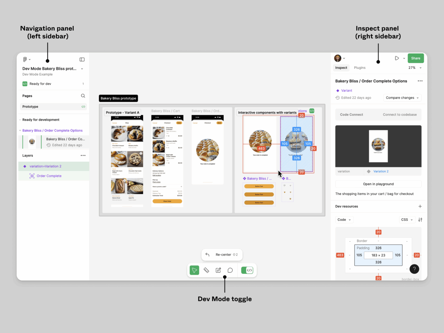
source: Figma
The interface feels familiar, with a layout similar to Chrome DevTools, so developers can immediately understand distances, layers, and relationships between elements.
Here’s what makes Dev Mode so useful during handover:
To take it a step further, Dev Mode integrates with VS Code through dedicated extensions.
Developers can copy layout CSS, color variables, and export SVGs directly from Figma without leaving their coding environment.
The result is a transparent, efficient workflow where developers always have the latest information and don’t have to rely on static PDFs or secondhand explanations.
When used properly, Dev Mode becomes a shared workspace where design and development overlap.
Syncing components between Figma and Storybook is critical.
It creates a continuous link between design and development, ensuring both sides work from the same source of truth.
Storybook is an open-source tool developers use to build and test UI components in isolation.
Each component in Storybook should mirror its counterpart in Figma and use the same structure, behavior, and states.
This parallel setup allows designers and developers to validate that what’s coded looks and behaves exactly as intended.
Here’s why this matters:
Both systems evolve in sync: Figma defines the visuals, and Storybook defines the behavior.
Storybook also supports visual regression testing, which automatically flags visual changes when devs update the code.
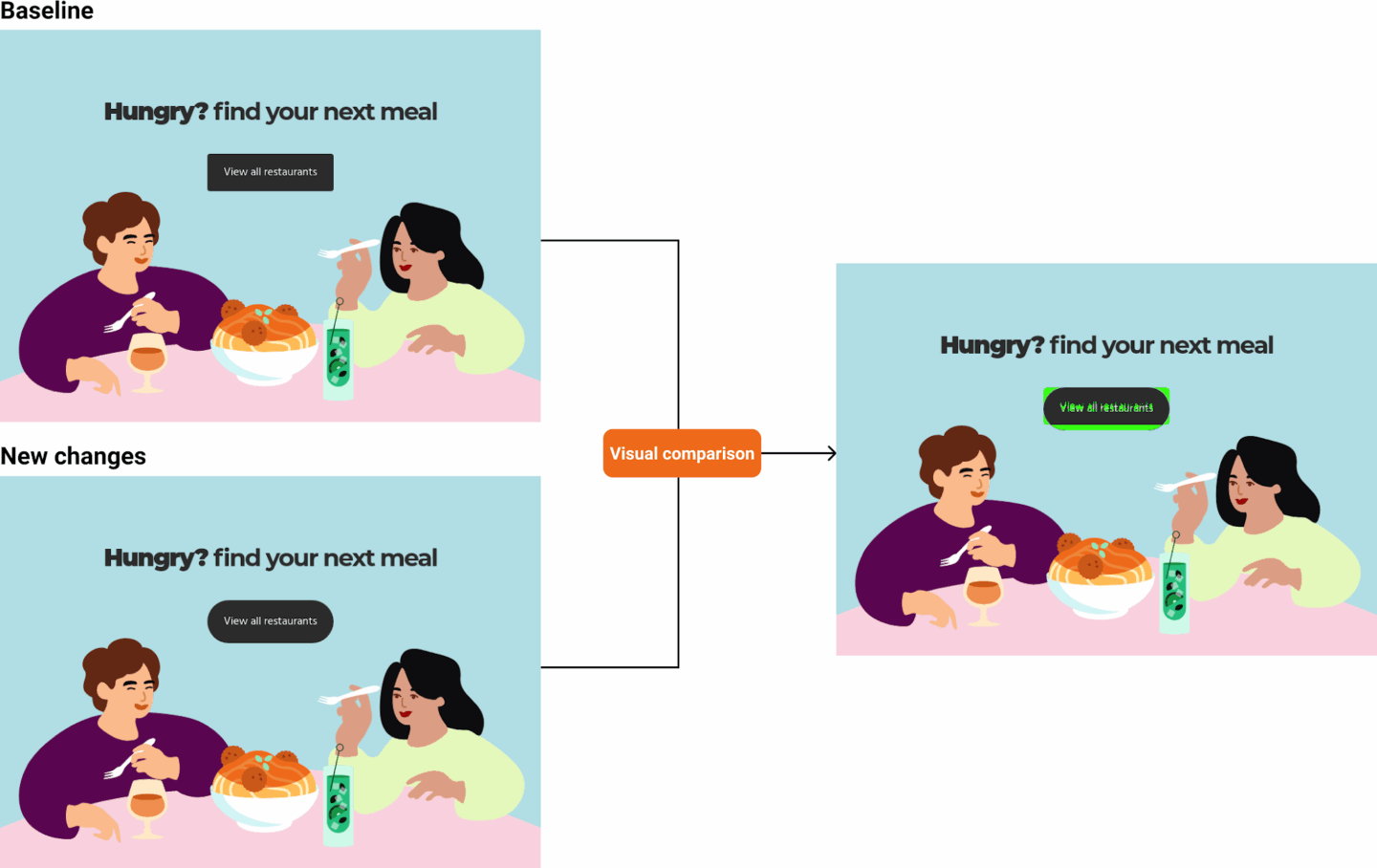
source: Newline
This helps them catch bugs before they reach production and reinforces confidence that the design system is stable.
Your ultimate goal should be full synchronization, i.e. a state where every component in Figma has a coded equivalent in Storybook, maintained side by side.
When both are kept in sync, handovers become part of a single, continuous workflow.
A design system is only as strong as its documentation.
Clear documentation ensures that everyone – designers, developers, QA, and future team members – understands how and why things are built the way they are.
Don’t treat it as an afterthought or a box to tick at the end of a project. It should be an ongoing part of your team’s workflow that supports every decision and update.
At its core, good documentation explains 3 things:
This context prevents confusion and reduces dependency on individual team members.
When everything from variable naming to component behavior is clearly described, new team members can step in without slowing down the process.
And insufficient documentation makes scaling and maintenance much more difficult.
Missing details, like component states or use cases, force devs to guess or backtrack. Here’s how to make documentation practical and sustainable:
Detailed documentation won’t slow your team down. In fact, it will speed them up.
It turns individual knowledge into shared knowledge and gives both designers and developers the confidence that they’re working from the same playbook.
And your design system becomes more than a collection of components.
It becomes a living, evolving reference that keeps projects aligned long after delivery.
Design and development should never feel like two separate phases.
When they do, the handover becomes a wall instead of a bridge.
You want to create a continuous, synchronized process where designers and devs work in parallel, share ownership, and are on the same page from concept to release.
In practice, this means designers don’t just finish a file and move on, and developers don’t wait passively for final screens.
Both sides contribute throughout and refine, review, and improve the product together.
Here’s what that looks like day to day:
This will help you catch issues early and prevent rework later. When both designers and devs are involved from the start, there are no surprises in development.
Like we mentioned earlier, your goal should be to build a workflow where components in Figma and code evolve together.
Treating design and development as one process builds a stronger culture of shared responsibility.
And you get one team solving problems together from start to finish.
A component isn’t ready when it looks finished. It’s ready when it’s structured, documented, and approved by both design and development.
Before marking anything as Ready for Dev, check that:
The Ready for Dev label in Figma should mean the same thing to everyone, i.e. that no further design clarification is needed and the component is safe to build.
Dev Mode gives developers everything they need for implementation, like spacing, tokens, properties, and assets. But it doesn’t replace the full design file.
Developers still need to see how a component behaves in context: how it fits within a layout, how it scales, and how it interacts with surrounding elements.
Having access to the full file lets developers:
Giving them access to both gives developers precision and context, which is what turns good handovers into great ones.
The key is to make documentation a continuous part of the workflow, not a separate task done after development.
The most efficient teams document as they build, in small increments, rather than treating it as a milestone to reach later.
Here’s how to keep it sustainable:
When documentation evolves alongside the product, it stays relevant and accurate without slowing anyone down.
Smooth handovers between design and development take experience and structure. You need a team that understands how design decisions affect real code.
That’s what we do at DECODE.
We’re an EU-based software development company with 13+ years of experience delivering complex products for clients in fintech, healthcare, telecom, and more.
Our designers and engineers work as one team and keep our projects consistent from concept to release.
If you’re looking for a team that can take your product from first sketch to full launch, let’s talk. We’ll set up a short call, learn about your goals, and show you how we can help.

Matej sees product design from every angle. He started in graphic design, studied Economics, and even dabbled in development - giving him a rare mix of structured thinking, client perspective, and deep empathy for users. That 360-degree view helps him design world-class UIs while keeping complex systems intuitive and seamless. A night owl at heart, he’s just as obsessed with typography as he is with the NBA. Whether he's fine-tuning pixels or analyzing late-night basketball games, Matej is all about the details that make a difference.

Inside DECODE’s software development process and how we turn complex ideas into reliable products.

Learn the 8-step UX design process to build intuitive, user-focused software that delivers real value.
Find out how DECODE runs product discovery to cut your risk, help you define what to build, and successfully get your product to market.